Data Sculptures through machine learning algorithms
This is truly amazing work. It’s also scary if you look at this through a different lens. The lens of the human looking at the living machine. Artist Refik Anadol employed machine learning algorithms to search and sort relations among 1,700,000 documents. Interactions of the multidimensional data found in the archives are, in turn, translated into an immersive media installation. More at http://refikanadol.com/
Live Data Sculpture Installation
In mathematics, the inclusion map of one space into another is denoted by the lowercase iota. Light is the single element which can be perceived by the eye. Iota is a led installation inspired by light physics and a research to find the origin of geometry. Corresponding to the focus of the observer, the nature of light and its different phenomena can be seen beyond the perceptivity of the human mind and attempts to translate them into a unified, non-spatial form.
Some design trend data
Great post and data deconstruction. Best viewed from Source
It took a surprisingly long time and about fifteen million get requests to scrape meta data for every upload (as of the end of August ‘13) on Dribbble, the popular design community. I ended up lopping off the first half-year-or-so of activity on the site as the community was growing in fits and spurts and the data were inconsistent and basically all over the place. In sum, my little Heroku-deployed Go app collected information about 638,271 uploads and 3,479,698 taggings, and stored it all in a PostgreSQL database.1
Fig. A: CLICK HERE TO VIEW
In the interest of being a good internet citizen, I rate-limited the hell out of it. Strangely, the scraper looped through the full range of unique upload IDs about a dozen times, and it seemed to pick up a few more uploads each run (albeit only a handful the final time through), which would indicate there was some kind of silent failure occurring. If these numbers seem off or my method seems flawed, I’m interested in hearing about it.
I’ve included the taggings-per-upload ratio in Fig. A to add meaning to the trend data that follows. Since 2010, the average Dribbble upload went from having less than 4 tags to over 6, so an increase in incidence of a particular tag could indicate nothing more than users’ increasingly prolific tagging (i.e. a change in Dribbble usage behaviour, not a trend in web design). I considered normalising the later spark-lines against that increase, but my eyeballing of the data suggests that the increase in tagging coincides with an increase in tags (the size of the tag set increased). There might be a clever way to properly normalise the data to diminish the change in Dribbbler usage and highlight actual data but until I figure that out or somebody emails it to me, be aware you’re looking through a glass darkly.2
The rise of ‘flat design’
Dark glass or not, there are a few striking vistas. The most spectacular is the rise of flat design. The community’s usage of the ‘flat’ tag was a rounding-error above zero until the late autumn of 2012 when it began a rapid ascent. (It’s probably not worth noting that Scott Forstall departed Apple on 29 October 2012 — but you don’t need to be Tim Cook to know which way the wind blows.)
Fig. B: Rise of ‘flat’ on Dribbble, CLICK HERE TO VIEW
In August of 2013, more than one in every ten Dribbble uploads was tagged ‘flat’. But Fig. Bcharts two trends, really. One is the rise in a style of visual design that’s been called flat, which is typified by a lack of texture, gradient, drop shadow. And the other trend is the propagation of the term ‘flat’ to describe this style of design. Charting related stylistic tags (‘minimal’, ‘simple’, ‘metro’) suggests a trend that’s no less obvious, but perhaps a little less dramatic.
If the conversation within the software design community over the past year is any indication, we might expect the trend in Fig. B to be mirrored by a precipitous decline in the use of skeuomorphism. Of course the word skeuomorphism was really only introduced as a shibboleth among the proponents of so-called ‘flat design’, as a pejorative description of an outmoded look.
Fig. C: ‘Skeumorphism’ on Dribbble, CLICK HERE TO VIEW
The word ‘skeuomorphism’ was first used as a tag in June of 2011 by Eugene Cheporov (and ‘skeuomorphic’ predated ‘skeuomorphism’ by a couple of months: Joshua Blankenship tagged an upload with itin September of that year). Its use since then has been extremely seldom (peaking in January 2013 with a meagre fourteen taggings out of more than 20,000 uploads), and often self-conscious (the first upload tagged ‘skeuomorphic’ was titled Because there aren’t enough skeuomorphic shots on Dribbble…).
Fig. D: Google Trends, CLICK HERE TO VIEW
But uploads of the style that came to be pejoratively called ‘skeuomorphism’ were far more prevalent far earlier. Take a look through some Dribbble uploads from 2011: there’s a lot of carefully stitched upholstery, glossy leather, and slickly rendered machinery.3 So I tried to find some related tags to use as a proxy. ‘Noise’ and ‘texture’ both overlap with the style that I would call ‘skeuomorphic’ (not in its proper sense, but the gaudy, drop-shadow-y style it’s come to mean). They also constitute trends of their own (and even overlap with ‘flat’ more than never), so, as ever, it’s a dark glass.
Popular mobile platforms
Fig. E: Mobile computing platforms on Dribbble, CLICK HERE TO VIEW
It is, I am sure, an extremely significant indicator of the developer ecosystems of the major mobile computing platforms of the moment that iOS is about ten times as popular as Android within the Dribbble design community. In Android’s best month, about one in a hundred uploads were so tagged; in iOS’s, about one in ten. And woe betide Windows Phone, for which there isn’t even enough data to mock.
Read from this what you will; I don’t have the heart for it. But the data is pretty definitive: iOS has the critical mass of designer mind-share.
Type trends
The reason I began this little-big-data adventure was because I had a hunch we’d seeMark Simonson’s Proxima Nova suffer a dramatic decline in usage the moment Hoefler Frere-Jones made available for web-use the typeface for which Proxima so often has been called to mimic, Tobias Frere-Jones’s Gotham. I thought a) the entire project would be reasonably quick; b) it’d make a very satisfying graph; c) glory. Proxima Nova’s use on the web has often struck me as we-want-a-web-font-but-also-want-Gotham. I admit I’ve done the very same once or twice. It’s a poor imitation, but bold and in caps, it ticks a lot of the same boxes.
Fig. F: Sans-serifs on Dribbble, CLICK HERE TO VIEW
Of course: the data are too subtle for my ham-fisted brain. Gotham’s usage since 2010 is basically in decline. I suppose it’s probably in decline since 4th November 2008. And, again, its decline here is not necessarily meaningful: this may be highlighting changes in the Dribbble community, changes in Dribbble usage patterns, or actual changes in the typeface’s relative popularity. And Proxima Nova does follow the sort of trend we might have expected. It rises, presumably roughly with Typekit’s own usage, and then tapers off much like Gotham, whose coat-tails it supposedly rides.
I’ve included a few other popular sans-serifs to round out the picture. Poor Helvetica, presumably in decline since its Hustwit-driven revival in 2007. Myriad gets surprisingly little attention on Dribbble, considering how much real-world usage it sees. That humanist Open Sans looks like it’s on the way up. There isn’t much data yet, but I imagine in another couple of years we’ll be able to chart it satisfyingly against Freight Sans and extrapolate some far-fetched conclusions about their respective platforms (Typekit vs Google Fonts).
Fig. G: Serifs on Dribbble, CLICK HERE TO VIEW
My attempt to reproduceFig. F but for serif type families was a complete failure. Fig. G demonstrates just how unsatisfying the data are in this regard. Is serif usage more fragmented? Or less exciting to tag? I suppose people have been (this is just my own hunch, not based on any formal data) using serifs for text and sans-serifs for display type, and Dribbble tends to highlight display text more than nicely typeset paragraphs. Nevertheless, it’s curious.
Pardon our progress
This data took far too long to collect, and far too long to (very amateurishly) analyse. There’s a lot to be improved about the analysis, most of which I’ve mentioned as it’s come up above. Dribbble itself is a limited sample, and the data I’ve collected isn’t normalised against changes in Dribbble’s community or usage patterns. Similarly, I’ve collected all tags on all uploads to Dribbble. It might make more sense to limit our data to uploads or uploaders that have a modicum of credibility (i.e. somehow incorporate the ‘like’ or ‘follower’ counts), or even somehow weigh data-points correspondingly. It might be interesting to chart the spread of tags across the community. (Do tags begin in the periphery and spread inward, or do they begin with the dribbblerati and spread outward?) And finally: is there any way to address the fact that Dribbble uploaders don’t consistently tag in a useful or elucidatory way?
Fig. H: Big (American) holidays on Dribbble, CLICK HERE TO VIEW
I can nowise claim any kind of even passing statistical know-how, so I’ve uploaded a ~70mb CSV to Github. Please do fork, analyse, graph, chart, blog, correct, augment.4 That beautiful and meaningful chart I was fantasising about (with the rise of ‘flat’, decline of ‘skeuomorphism’, resurgence of ‘Gotham’, and short-lived reign of ‘Proxima Nova’) didn’t quite materialise. But I’m reasonably happy with Fig. H.♦
Data by Luke ~ Mobile Devices Per Day
Data Monday: Mobile Devices Per Day
Last year, I illustrated the importance of mobile by highlighting how many devices enter the World each day compared to the number of people born per day on our planet. The ratio was striking. Looking at the same figures today is even more sobering.
The End of 2011
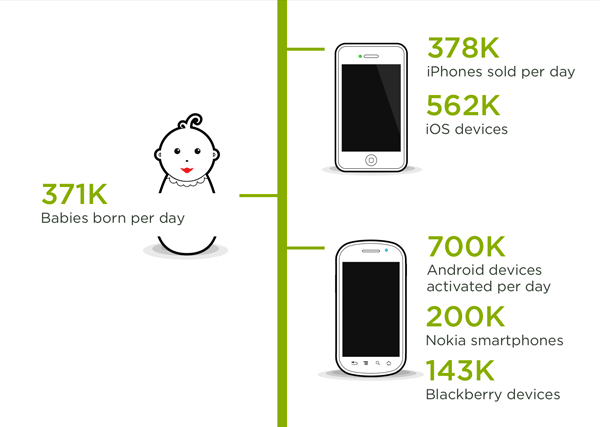
The total of smartphones entering the World per day was about 1.45M devicescompared to 371,124 births.
The End of 2012
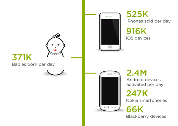
The total of smartphones entering the World per day was about 3.6M devices again compared to the same 371 thousand births.
Hope you’ve got you multi-device design strategy in order.
Why Mobile Matters
When I initially proposed the idea of Mobile First over three years ago, there were a lot of skeptics. The situation today has a lot more people convinced that taking mobile seriously matters. But just in case some people remain unconvinced, here’s a really vivid way of explaining the situation.
Number of Mobile Devices

Every day 371,124 children are born across the World.
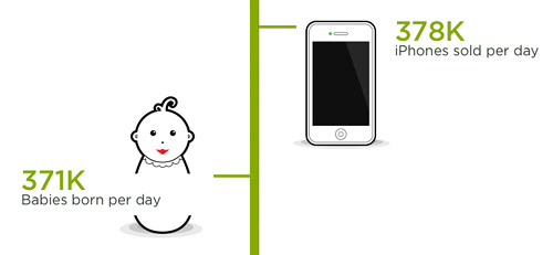
Every day 377,900 iPhones are sold across the World.
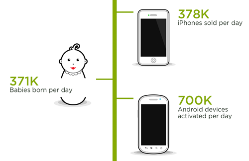
Every day 700,000 Android devices are activated across the World.
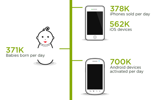
Looking at the total of iOS devices (iPhones plus iPads and iPod Touches) sold per day brings the total of Apple mobile devices sold per day to 562,000. Together with Android devices that’s 1.27M mobile devices sold or activated per day compared to 371,124 children born.
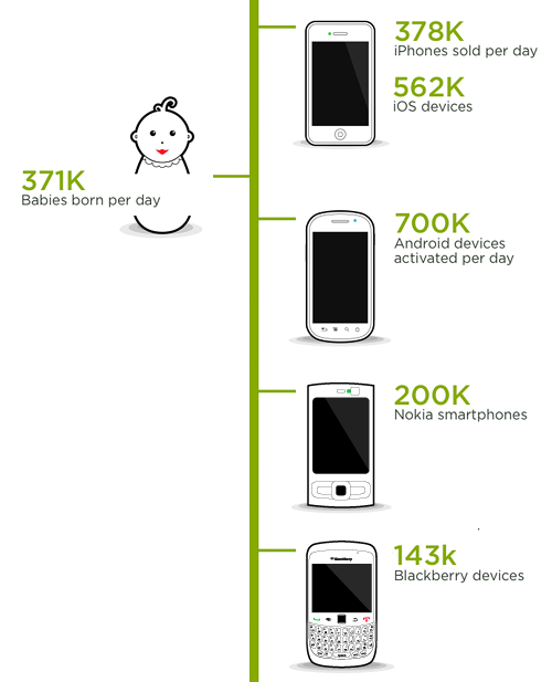
But there’s more. Nokia sold 200,000+ smartphones a day (and 958k feature phones). RIM sold 143,000 Blackberries a day at the end of 2011. This brings the total of smartphones entering the World per day to about 1.45M devices again compared to 317,124 births.
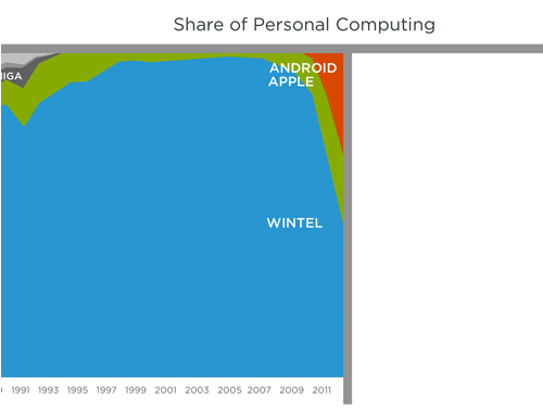
Share of Personal Computing
Clearly there’s a lot of mobile devices coming into the World. That’s having a huge impact on the personal computing market. Looking at data compiled by Asymco, the first 15 years of personal computing consisted of a few manufacturers trying to figure things out (Amiga, Atari, Apple).
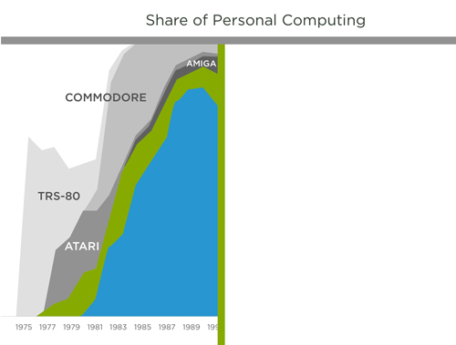
The next 15 years were completely dominated by Microsoft’s WinTel platform with Apple barely hanging on.
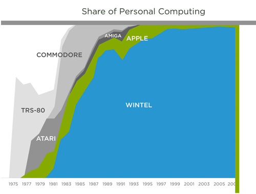
Fast forward to the past 3 years and you can see a huge shift underway. Apple and Android are eating into personal computing in a massive way. That’s because today’s mobile devices aren’t just phones they’re the most personal form of computer we have: always with us, always connected, and highly capable.
Real Opportunity
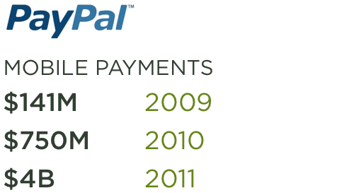
As mobile devices take over personal computing, a lot of opportunity is created for software companies and services. Consider mobile payments on PayPal. In 2009, mobile payments totaled $141 million. At the end of 2011, that number had grown to $4 billion. You read that right from $141 million to $4 billion over the course of three years.
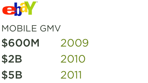
eBay has seen a similar trend. eBay reached $5 billion in mobile GMV (gross merchandise volume) in 2011, more than doubling 2010′s GMV of $2 billion. This was up from $600 million in 2009.
Hopefully this sample of data points helps some mobile skeptics see the opportunity we’re facing. If you need even more convincing check out my ongoing series of data posts for a deeper look at the mobile market and beyond.
Where the internet lives [Google Data Centers]
Article: Source
Click Here for Google Data Center Street View

Look around on the web, and you’ll find plenty of photographs of Google’s colorful offices in Mountain View (AKA the Googleplex) and around the world. Finding images shot from inside the company’s tightly-guarded data centers is much harder, since only a handful of employees are allowed to roam the spaces where the “web lives.” However, Google recently invited photographer Connie Zhou inside a number of its high-tech data centers. Gorgeous photographs resulted — images that show incredible scale, mind-numbing repetition, and quirky colors.
The massive server rooms house tens of thousands of servers that handle your searches and all of the services offered by the search giant.


Google says that the rainbow-colored pipes aren’t just for show; the colors help the employees quickly determine which is which.


Wired’s Steven Levy was also invited to tour the data centers, and has written up a fascinating piece on his experience. In an interview with Morning Edition’s Steve Inskeep, he states,
What strikes you immediately is the scale of things. The room is so huge you can almost see the curvature of Earth on the end. And wall to wall are racks and racks and racks of servers with blinking blue lights and each one is many, many times more powerful and with more capacity than my laptop. And you’re in the throbbing heart of the Internet. You really feel it. [#]
Want to roam around the buildings yourself? Check out this Street View page that provides a virtual tour of the buildings:
You can see high-res versions of these photos and many more over at a new website Google set up, called “Where the Internet lives.”
Gold. Interactive Lobby Information Visualization. Together with our partners, we produced this interactive information visualization for a permanent exhibition taking place in their foyer. It shows data about gold production, trade and about the company itself in a series of interactive animated graphs. The user can toggle between various visualizations which are shown on a 3x3 monitor matrix using a touchscreen terminal.
- interactive
- interaction
- installation
- design
- led
- light
- art
- technology
- projectionmapping
- projectmapping
- robotics
- ui
- mobile
- projection
- interactivedesign
- lightdesign
- apple
- web
- 3d
- ux
- userinterface
- lightart
- robot
- artinstallation
- touchscreen
- application
- app
- webdesign
- touch
- motion
- responsive
- adobe
- multitouch
- future
- robots
- drone
- photoshop
- productdesign
- ledinstallation
- lightsculpture
- video
- user experience
- iphone
- creative
- interactivelight
- digitalart
- motiondesign
- ar
- 3dprinting
- responsivedesign
- augmentedreality
- drones
- kinetic
- data
- development
- kinect
- microsoft
- display
- immersive
- process
- painting
- timelapse
- dronerobotics
- 3dprojection
- ios
- vr
- virtualreality
- earth
- ai
- device
- user interface
- engineering
- laser
- lightpainting
- kineticsculpture
- lightinstallation
- touchinstallation
- animation
- programmableleds
- graffiti
- interactions
- neon
- performance
- leapmotion
- watch
- mobiledesign
- pixel
- environment
- exoskeleton
- interactiveenvironment
- sound
- lcd
- social
- leds
- lukew
- artlight
- patterns
- internet
- carui
- November 2011 128
- December 2011 65
- January 2012 25
- February 2012 27
- March 2012 33
- April 2012 31
- May 2012 16
- June 2012 32
- July 2012 20
- August 2012 37
- September 2012 24
- October 2012 34
- November 2012 31
- December 2012 6
- January 2013 21
- February 2013 11
- March 2013 10
- April 2013 35
- May 2013 45
- June 2013 10
- July 2013 49
- August 2013 33
- September 2013 40
- October 2013 57
- November 2013 31
- December 2013 28
- January 2014 86
- February 2014 49
- March 2014 24
- April 2014 40
- May 2014 6
- June 2014 9
- July 2014 1
- August 2014 34
- September 2014 30
- October 2014 45
- November 2014 21
- December 2014 6
- January 2015 5
- February 2015 17
- March 2015 18
- April 2015 14
- May 2015 1
- June 2015 10
- July 2015 4
- August 2015 1
- October 2015 11
- March 2016 4
- December 2016 18
- September 2017 6
- October 2017 13
- November 2017 5
- June 2018 8
- July 2018 2
- November 2018 7
- February 2019 8
- March 2019 6
- July 2019 1
- August 2019 1
- October 2019 1
- July 2020 5
- November 2020 9
- December 2020 1
- January 2021 1
- April 2021 1
- May 2021 9
- June 2021 3
- August 2022 3
- May 2023 2
- September 2023 1
- May 2025 6