From the Front Lines of Multi-Device Web Design
It’s hard enough to design a great mobile or Web site but what about experiences that span these devices and more? Join Luke for a set of lessons learned designing Web products that attempt to embrace simultaneous and sequential multi-device use. What worked and, more importantly, what didn’t?
Is The Corporate Website Dead?
According to some trend watchers, a little research, and a few live examples, the corporate website as we know it may be ready for some disruptive evolution.
To put it more plainly, the corporate website may be dying a slow and painful death.
Corporate website visits for most large brands are declining. Your best content is lost among too much product promotion. And more attention is being stolen away by more progressive brands who have started acting like publishers and displaying content that your customers actually want to consume.
This is not just headline bait. There appears to be a growing consensus that the corporate website as an online brochure displaying “About Us,” “Our Products,” “Latest News About Us,” and “Speak To A Representative” isn’t working.
There is some convincing research to support this:
- According to Webtrends, nearly 70% of Fortune 100 corporate websites experienced declines in traffic, with an average drop of 23%.
- 90% of website traffic comes from just 10% of the content and more than 50% of the traffic is from just 0.5% of the content. ~ InboundWriter
- 60-70% of B2B marketing content goes unused. ~ Sirius Decision
- 60% of the buyer journey is complete before prospects reach out to vendors. ~ CEB
I guess this shouldn’t be a surprise. We’re all watching the slow death of the newspaper industry. We’ve heard a lot of talk about how brands need to act like publishers. We’ve seen major advertisers talk about how their advertising is evolving into something more closely resembling content marketing.
Now that there is a steady drum beat decrying the death of the corporate website, I sought to get to the bottom of this to see if we’re actually going to see some real change. And after reviewing some of the research and reading up on the evidence, I think there just might be something to this trend.
Why Your Corporate Website Should Die
In early 2011, Forbes Contributor Christine Crandell wrote that the customer experience for most buyers is inconsistent and disconnected.
She pointed at the corporate website as a “traditional marketing vehicle” (ouch!) that companies should abandon due to the overwhelming evidence that most visitors scan the page and leave because they are not looking for information about your products. She believes corporate website visitors are looking for useful information such as best practices tips, human stories and the ability to interact with real people.
Her guidance to corporate website owners:
Rather than boring your customers to death, there is a clear opportunity to put the dull corporate website to rest. Then resurrect it as a platform for true community engagement that functions as a hub for interaction.
Corporate Websites Should Facilitate Moments of Authentic Interaction
All the way back in January, 2010, Brand Consultant Simon Mainwaring penned “The death of corporate websites” blog. He declares that “the online presence of a brand will increasingly become the sum of its social exchanges across the web and not the website that many currently call home.”
He also defines a massive change in the role of the brand manager to become one of a “social officer, facilitating as many moments of authentic interaction with consumers each day as possible.”
Four years on Mainwaring contends that “this shift is largely complete as we see brands shifting their media weight from traditional to social media, sharing stories across multiple channels and responding in real time, and training their employees to become social media brand advocates. So while the corporate website persists, it has now been reframed as a point of departure for customer engagement, rather than a destination.”
Content Is King And The Corporate Website Is Dead
A few brands are getting into this game and they are not looking back. In November, 2012 the Coca-Cola company declared the death of its own corporate website. They re-launched their website under the tagline of “The Coca-Cola Journey. Refreshing The World, One Story At A Time” which featured content driven by their “Unbottled” blog.
I had met their super-sharp Group Director of Digital Communications and Social Media, Ashley Brown a few months before this announcement and was just blown away by what they were doing.
Even more important, is that they paused 6 weeks in, looked at the data and realized that what they thoughtwould resonate with their audience wasn’t working.
They endured their way through an “editorial scramble” based on hard data and implemented a new design and content strategy based almost completely on the kinds of stories their audience wants. According to Ashley:
Replacing a transactional corporate website with a digital magazine upended how we work
He continued:
The corporate website is dead and “press release PR” is on its way out.
Michele Mehl agreed that the corporate website is dead when she talked about how Coke successfully turned their website into an online news channel in her article on Geekwire.
Brand Publishing Is Not Just For Consumer Brands
I know what you’re thinking. Coke is not a B2B Marketer. But I believe the evidence they pointed to, the cultural shift they implemented and the approach they took to make content their main product are all just as relevant to B2B marketing professionals.
Maybe even more so. The B2B decision process is harder, longer and more complex. Delivering effective information and telling stories that build trust are still the cornerstone of effective B2B marketing.
Luckily, just in time for my research on this article, Sam Fiorella at Sensei Marketing published “Why Build a Corporate Blog Instead of a Corporate Website?” According to Sam:
Our goal is not to promote ourselves but our thinking; our website is not a sales tool but an educational one.
They realize that the main goal of their site is to build relationships and trust. Not to promote their products. And they also realize that this is a gamble. I think they are onto something. And I wish them luck!
I realize this nearly 1,000 words is a lot to take in. Thank you if you made it this far! Now, please share your thoughts in the comments below. And please follow along on Twitter, LinkedIn, Facebook and Google+ or Subscribe to the B2B Marketing Insider Blog for regular updates.
Change your focus and design “Content First”
Content is king, it always has been and always will be. Content is why users visit your site, subscribe to your newsletters and follow you on social media. Content is the single most important aspect of your website yet for some projects that I’ve worked on, content seems to be one of the last things to be taken into consideration by clients when it comes to the redesign and rebuild of their site.
“Content First” is a term that I’ve been using for a while. As someone who doesn’t have a background in content writing or strategy, I’ve found it particularly difficult to express myself about this in more than 140 characters while at the same time not resembling verbal diarrhoea… so here goes.
Where “Content First” came from
Having your client’s content before starting the design process isn’t the be all and end of designing content-first. “Content First” is about giving the website’s content first priority over every other aspect in the design process. This is a concept I learned to realise after years of mocking up homepage layouts with nothing more than filler text and placeholder images or a fuller idea of what the client wanted to achieve.
As designers it’s not only us who are required to take on a “Content First” mindset, this is a process that will require the full co-operation of our clients. Communication is always a vital part of the client/designer (agency) relationship and it may take some convincing on your part to help guide your clients towards a content first methodology. I think we can all for forgiven at times for expecting too much from our clients with regards to knowledge and/or experience in the web but for content first to work, you will need to work hand in hand with your client to make sure that their goals are achieved.
Being asked by a client to ‘mockup a few ideas’ seems great at first, you can create a few layouts, throw in some filler text and some placeholder images and you think you’re there. You feel good, you’re happy that you’ve been able to turnover some designs for a client that you really want to impress and you PDF those designs up to send them over for feedback. You provide design concepts hoping to get the ball rolling on the project, give the client some idea of where to start from and ideally provide some inspiration to get the client on a similar level of enthusiasm as you.
This is where it can all start to go wrong. Designing blind like this may actually have the opposite effect on the client, seeing designs they might not have been expecting from an initial meet may actually result in them ‘reassessing’ the project and leaving you in a position to claw back the positivity that was originally invested in the relationship.
Changing Focus
How many times have we been asked to use ‘filler’ content and stock imagery so that the client can gauge and approve the layout of their new site? The correct answer is too many. The benefits of adopting a content first method can include optimised, relevant and efficient content which will increase awareness, visitors and ultimately sales but the process can also result in an overall more efficient project. Would working with Lorem Ipsum do this? If you answered yes to this, you’ve been very fortunate thus far.
By having content that you and the client have worked closely on to hand rather than dropping in filler text, not only are you already closer to a more complete, finalised design that can be signed off for development, but your design is a lot more content focussed and will give the client a more accurate idea of how their message is going to be delivered to the website’s visitors.
Say no to Lorem Ipsum
Lorem Ipsum and, to an extent, content management systems have given clients a get out clause of supplying designers with finalised and approved content before the design process gets underway. If I had a pound for every time I’ve heard “we’ll know what to supply when we’ve seen the design” or “we can replace the text in the CMS anyway can’t we?” I’d have been able to retire years ago on the interest alone. It is lazy on the client’s part for not being particularly bothered about supplying content until later and dangerous on the designer’s part to rush through the design process without it and underestimate the effect final content would have on the mockups.
5 lines of Lorem Ipsum in your mockups may initially fit well and the client might love how it looks but what happens as soon as the client eventually replaces the filler text and either shoehorns their own content into the design or they realise that they don’t really need 3 calls to action? The design breaks and you’ve wasted time.
Wasting time is dangerous for both the designer and the client. Time wasted can result in slipping deadlines, disgruntled management and what about the knock on effects with budget? Would your client be happy to continue paying for you to produce concept work with content they’ve not supplied? How many concepts would you be happy supplying until you’ve realised that the fee you’ve quoted is resulting in a smaller rate by the day?
The lesson I’ve learned is that I’m an idiot for designing a site with filler content and an even bigger idiot for developing a site designed with filler content. All problems and issues that would be avoided by using a content first design process.
Designing “Content First”
We design for the web, a singular entity that isn’t defined by a device’s resolution but a format with only one constant – the content. By designing “Content First” we’re stripping away all of the nonsense and focussing on what is important. Designing “Content First” is about gathering your client’s assets and laying them out within the design in order of importance, optimising the content for a web audience and ensuring that the message(s) and/or features that the client wants to get across to their users is consistent across all devices.
It’s a workflow that puts content at the centre of the focus, not the style, not the transitions between slider frames, but communicating the goals/product/mission in a user friendly fashion and one that I have found greatly beneficial.
Discuss using a content first method with your clients, as I previously mentioned it may require some arm-twisting as it will require more involvement from them but the benefits far outweigh the negatives. By adopting a content first design process your projects will become much more efficient with fewer design iterations, more accurate design mockups, less time wasted while waiting for assets and from the client’s point of view, projects will meet not only deadlines but budgets too.
Why you should move that button 3px to the left
When a product is close to launch, I become a perfectionist. Each misaligned element or awkward interaction is like a thorn in my side. There’ll be a dozen tiny implementation mistakes that taunt me each time I run into them. Everything seems so broken.
But to everyone else on the team, the product seems fine! It’s functional. They ask, “Will moving that button by 3 pixels really improve our product?” They argue, “The last time we fixed a small design bug, the product didn’t feel any different.” And so the team moves onto the next big idea and the next set of features.
If you’re anything like me, this situation can be incredibly frustrating. As designers, we are held responsible for the overall quality of the experience. Yet we’re at the mercy of our teams. We can design beautiful, intricate, delightful details — but we can’t build, test, and deploy them all.
How do we convince our engineering and product counterparts to care about design fit and finish? I’ve struggled with this issue many times. Here’s what I’ve learned.
It’s not design for design’s sake
Designers notice the gap between functional and delightful, and that’s why we obsess over the little details. (littlebigdetails.com) But there’s a very real tradeoff between perfecting the design details and building more functionality: getting the details right often means moving slower.
So it’s not enough to say “it looks better this way”. Designers need to make a case for why the team should spend time on fit and finish.
Trust increases when we get the details right
Customers judge online credibility by evaluating visual design, copywriting, and interactions. If trust matters to your business, then design details should matter too. Check out the academic literature on the topic of interface design and trust, or look into Stanford’s Web Crediblity Project.
Mint, Square, and Simple have all done a fantastic job of getting design details right, and earning customer trust. They all began as unproven products, yet customers trusted them to store financial details, process payments, and safeguard accounts.
Usability improves when we get the details right
The MailChimp logo makes me smile every time! The lack of clutter on the Google homepage is so peaceful. The glossy pixel-perfection of Apple interfaces is delightful. They got the design details right, and it’s creating a positive emotional state, but why does that matter?
There’s a curious brain hack at work here. Our minds are deeply tied to emotional states. Being frustrated or happy changes the way we approach problems. I have certainly been in a bad mood, gotten confused by a product, and found myself repeatedly smashing a button to no effect. In my frustration, I try the same thing, justharder. But it doesn’t help me accomplish my goal.
When we’re happy, using an interface feels like play. The world looks like a puzzle, not a battle. So when we get confused, we’re more likely to explore and find other paths to success. There’s a whole book on this topic: Emotional Design by Don Norman. But here’s the important bit: Getting design details right can create positive emotional states that actually make products easier to use.
Batch up the work
If your product needs a massive helping of fit and finish, fixing one issue won’t do much to delight you or your users. Filling one pothole won’t turn a bumpy street into a smooth one — you’ll barely notice the change!
So here’s the trick: Batch up UI bugs into one sprint. If your team regularly holds a fix-it day to squash bugs, then piggyback on that habit and hold a design fix-it day. As a designer, you can do advance work like putting all the changes into a spreadsheet or bug tracker and prioritizing issues.
On the day of the sprint, everyone can just focus and crank through the list. Maybe you don’t fix everything — that’s OK. The small changes you do make will add up, and by the end of the day your product will be noticeably better. That makes everyone feel great and it’ll be easier to get people focused on fit and finish issues in the future.
Polish as you go
I really screwed up the first time I tried to keep quality high as we were building features. It always started fine: an engineer and I would agree to a design, I’d send him a few mockups, and the next day he’d show me the progress. What I saw: a sloppy version of my design. Ugh.
I’d moan and complain and point out all the mistakes, which wasn’t any fun. So the next time he was less likely to ask for my feedback, quality slipped further, and I became more upset. Classic death spiral.
I came to realize that when a feature is 90% done from an engineering perspective, it can still feel about 10% done to a designer. Now I get excited about the functionality and celebrate that there’s only a bit of surface details to finish before the feature is perfect.
I also try to build in triggers for feedback sessions while engineers are in context. I’ll say, “Grab me right before you check this in.” That way we can go over any small changes while all the files are open and checked out.
Avoid customization icebergs
Designing a custom button in Photoshop is easy — that’s the part of the iceberg we can all see. Below the surface it takes a lot of effort to get the details right: building pressed and inactive states, preventing text highlighting on double-click, adding right-to-left support, testing accessibility, and so on.
I often hit this iceberg when I stray from native controls. For example, Ajax interactions require more polish than basic web pages. Custom mobile menus require more polish than the built-in version. If the team doesn’t have the time to polish custom UI, it’s often better to stick to the boring native controls that work.
Those are some of the techniques that I’ve learned over the years to get design details built. And I’ve noticed along the way that teams vary widely in their culture around quality. Some teams obsess over the details and take their time. Other teams tend to launch sloppy products fast.
I’m interested in how teams create norms for quality. How do you create a culture where a team can quickly come to agreement about whether to spend more time on design details? What has worked for you? What hasn’t? Let’s discuss in the comments below.
Resource: Good Kickoff Meetings
http://goodkickoffmeetings.com/
Resources from my SXSW 2011 presentation, Your Meetings Suck and It’s Your Fault.
These resources are identical if you attended my workshop at UX London, UX Week, or UI16.
If you work at a design agency, government agency, university, for-profit, not for-profit, or even a wish-I-had-profit, you break your work down into projects. Every project has to start somewhere. Traditionally we call those first meetings “kickoff meetings.”
The metaphor of a football kickoff for a meeting implies a time in the project where the game is just beginning, but that implied simplicity is deceptive. The reality of a kickoff in football is that a lot of analysis and preparation happened off of the field before the ball is kicked. Unfortunately that amount of thought and effort doesn’t traditionally go into project kickoffs.
I decided to undertake a different approach to kickoff meetings, applying design thinking, constraints, and interactive exercises to develop a kickoff framework that was more similar to a playbook of activities I could pull from to begin to define and begin to solve problems for clients. I am in the business of creating experiences for the web, and although these exercises are designed to support that type of process, you might find them useful in putting together kickoffs for other kinds of projects as well.
Whether you get one useful idea from this site, or it helps you plan a multi-day, 60 plus person kickoff meeting, I hope you find this site helpful in building trust, energy, and positive culture around a successful project beginning.
Two that stuck out to me:
Design Studio/Prototyping Exercise
http://goodkickoffmeetings.com/2010/04/design-studioprototyping-exercise/
The 20 Second “Gut” Test
http://goodkickoffmeetings.com/2010/04/the-20-second-gut-test/
A responsive process. Brad Frost for TechCrunch

I got shot out of a cannon at the beginning of 2013. I had been contemplatinggoing out on my own for a while, so I decided to reach out to the great Josh Clark for career advice. In addition to providing me a ton of great advice, he asked if I’d be interested in working on a potential project that was in the midst of coming together. Of course my answer was yes, and for the next few months began working on a redesign of TechCrunch.
The Team
I had the honor of working alongside some of the smartest and nicest people I’ve ever met on this project (and thankfully most of us ended up working onEntertainment Weekly right afterwards). Here was our crew:
- Josh Clark steered the ship. He got the team together, led the design process, constantly managed the client relationship, and gave off positive vibes that carried us through a lot of long nights.
- Jennifer Brook is an absolute beast. Never before have I seen someone conquer content and information architecture so adeptly.
- Dan Mall led visual design on the project. Dan constantly amazed me at how thoughtful, utilitarian, and gorgeous his designs were. It was an honor to work with him.
- Jonathan Stark slung some serious JavaScript. It was my first time working with a bonafide JS expert, so I did my best to learn all I could from him. He also helped me with my abysmal Git/Github skills, and for that I’m eternally thankful.
- Kristina Frantz brought to the table some serious project management chops, which were essential in managing our entirely remote team.
- And as for me, I coded the HTML and CSS for the site. As it turns out, there was a lot to create, so thankfully Pon Kattera and Greg Sarault stepped in and helped me prototype a ton of stuff. I most certainly couldn’t have done it without them!
We all worked remotely, and since the majority of the team were also frequent speakers we found ourselves collaborating on this project while criss-crossing the globe. Our calls would start with “Greetings from Stockholm!” “Greetings from Chicago!” “Greetings from Sydney!” It was pretty wild, but hey, we got the job done.
The Process
Our merry group of makers had the opportunity to revisit what the modern Web design process looks like, and this post is going to step through how we did things.
Set expectations
A lot of the failure to move into the Post-PSD Era has been a problem ofsetting the right expectations with clients and colleagues at the beginning of the project.
We did our best to help the client understand the reality of the Web landscape, and that because our website was going to be fluid, our process needed to match.

We helped everyone understand that development is an essential part of the design process. A few months before starting the TechCrunch project, I was deep in my thoughts working out what would ultimately become atomic design. I had even begun work on a tool that would allow me to establish a robust pattern library and stitch together interface patterns to form pages. That tool would eventually evolve into Pattern Lab. I introduced everyone to atomic design and demoed Pattern Lab for them. We talked about the benefits of creating a robust design system versus an ad hoc collection of page templates. Everyone seemed to get it without any wailing or gnashing of teeth.
Kickoff and Planning
We kicked the project off at TechCrunch’s office, where we conducted stakeholder interviews, did a 20-second gut test, and design studio exercises to get everybody aligned. You can read more about the exercises because we repeated these effective exercises for Entertainment Weekly, and I used them for my current redesign of the Pittsburgh Food Bank website.
Sketching
Armed with insights from the kickoff meeting, we retreated back to New York to comb through the site, establish content types, talk information architecture and brainstorm interaction design together. After that Jennifer rolled up her sleeves and got to work organizing the mountains of Post-its and sketches the group had generated.
establishing site-wide patterns
Jennifer did a hell of a job setting up some global patterns for the sites, establishing what she referred to as “rivers” and “islands”. Rivers are lists of objects like news stories, while islands were featured content areas.


The great thing about establishing these site-wide patterns was that I was able to immediately represent these patterns as organisms in Pattern Lab. Because of the blocky, gray-scale nature of Jennifer’s sketches, I was able to quickly recreate all the sketches in HTML using a simple .fpo class. Once established, creating and modifying wireframes was as easy as copying and pasting an include.
In addition to translating Jennifer’s sketches into FPO blocks in Pattern Lab, I was able to get to work right away on a whole slew of molecules and organisms. Just by looking at TechCrunch’s existing site I knew I could roll up my sleeves and start marking up a whole host of things: text elements (bold, emphasis, blockquote, pullquote, etc), image types (logo, post image, avatar, etc), forms (search, newsletter, submit a story, contact, etc), ads, and a whole lot more.

We knew that ads throw in a monkey wrench into a responsive sites, so I created FPO ad unit atoms and chucked all the ad requirements into the HTML wireframes right out of the gate.
establishing visual direction
While Jennifer was working on information architecture and I was setting up molecules and organisms in Pattern Lab, Dan was hard at work establishing visual direction.
Because TechCrunch is a destination for people to read, Dan thought a logical place to start exploring would be type. So using Typecast, he created some type combinations to facilitate conversation with the client.

The client was able to comment on type (“That’s too blocky” or “Number 3 is a little too thin”) by looking at real type displayed in the browser, the same place where their users will ultimately be experiencing the site.
Rolling Up Our Sleeves
Once we had a solid sense of information architecture, visual direction, and HTML scaffolding, we were able to really get into the weeds to start designing things.
html wireframes
Jennifer blocked out all of the different page templates, accounting for variants of a template (such as how the homepage looks during a live event versus a normal news day).


And I was right there behind her creating each page template, which consisted of the appropriate molecules and organisms. Slowly but surely, I started replacing those FPO divs with marked-up molecules and organisms.

Now, these HTML wireframes looked absolutely hideous. But that’s alright because at this stage in the game I was just getting everything wired up. Layout, color, and other visual design-related stuff would come later.
element collages
Armed with insights from type and branding explorations, Dan went to work creating element collages of the interface. Element collages are a bit more tangible than a style tile, but still not a full-on comp. Here’s one that demonstrated how things might adapt across multiple screen sizes:

The great thing about this is that he didn’t have to worry about what the footer or featured post area was going to look like in order to get the client’s feedback. By honing in on one organism rather than a whole page, the client was able to focus on getting the header right rather than getting distracted by what FPO image Dan might have decided to use on a homepage comp. Element collages allowed us to have the right conversations at the right time.
Once the client was comfortable with the header direction, I would take that direction and start styling it up. I started with the global header and footer:

Now this is where things start getting weird, because what began their lives as HTML wireframes were slowly transforming into the final designs. I thought this would be awkward from a client relations standpoint (we certainly had a lot of internal conversations about how to address this), but ultimately because they were involved in the process the entire way they understood what was going on. Because they had a better perspective on where the design was coming from, we were able to get feedback on certain components despite the fact that the rest of the site guts still looked like grayscale throw-up.
comps
Believe it or not, we did indeed create a few full comps. Gasp! Horror!
But the difference between this and all the other projects I’ve ever worked on is that we didn’t lead with the comps. By the time Dan made some comps (for the homepage and featured article page), we had established many of our key molecules and organisms, and had an understanding of the systematic nature of our design.
We presented the comps to the client, and they’d come back with some (usually) minor change requests. I’d then take the comps and their feedback and make the requested changes in the browser, so that we weren’t dwelling in Photoshop any more than we had to. Dan and I would Skype and chat through the issues to ensure the initial vision remained intact.
behind the scenes photoshop
And so it went. We’d create visual styles for particular organisms, and design full comps if absolutely necessary. I would style each organism appropriately, and slowly but surely replace the remaining grayscale blocks with detailed styles.
Sometimes things just weren’t looking right in the browser. Maybe a few components didn’t not look quite right sitting next to each other. In these instances, I’d bring them to Dan’s attention, who would screenshot the working code and shift things around to solve the design problem. We’d talk about it and I’d get back to work implementing his suggestion.
After a while, we realized that a whole lot of the Photoshop documents being created weren’t ever intended for the client to see. Instead, these little Photoshop hotfixes were created to help me style things better in the browser. Strange days indeed.
The Final Push
We worked hard styling each of the templates, and addressing every variation in a template. What does an article look like when there’s zero comments? What about when there’s 60? What does a topic page look like for a product versus a company versus a person? What does an event page look like before, during, and after an event? We created a new page for each template variation. Here’s what the final page list looked like in the Pattern Lab menu:

That’s a lot of pages.
Once the templates were complete, we cross-browser, cross-device tested everything (we had been testing on different browsers and devices throughout, but only on a subset during core development). From the design end of things, Dan went through and created an incredibly detailed list of minor design tweaks that tightened things up and got things ready for final delivery to be implemented into their WordPress backend by the fine folks at10up (who by the way were involved throughout the course of this process). What was great is that we weren’t just handing over a bunch of templates, but rather an intentional, robust design system that can be built upon and evolved.
After some time the site went live. It was a long few months, but I think our hard work paid off.
Lessons Learned
So that’s that. Here’s some things I took away from the project:
- It’s not Agile–So we didn’t do the traditional waterfall approach. So we must have been Agile right? I don’t really think so. I think there’s a false dichotomy between waterfall and Agile, but at the end of the day I don’t know what I’d call our process. All I know is that we communicated a lot, collaborated like I’ve never collaborated before (keep in mind that we were all remote throughout the entire process), and we were honest with ourselves and the client.
- Work in parallel–There’s so much work that can be done in parallel.

From day one, information architects and content strategists can begin organizing information, visual designers can start exploring type, color, and texture, and developers can set up tools, patterns, and components. As some point in the process, a discipline might serve more as consultant for the other disciplines, while other times they’re burning hot creating things. As time goes on, the creating/consulting role shifts, but no one is ever fully out of the picture.
- Slowly build fidelity–This process reminds me a lot of subtractive sculpture.

You start out with a big slab of rock, and slowly chip away to get the rough shape of the form you’re creating. You take another pass at it to get a better sense of the object you’re trying to extract from the stone. You take another pass to start getting a bit more detailed. Eventually, you start honing in on a particular aspect of the form: a face, the arms, or the torso. Slowly but surely you detail each section of the sculpture until you’ve arrived at the final form.
Only unlike stone sculpture, we have Cmd+Z.
There’s a lot more to be said about this project, and hopefully I’ll get the opportunity to explore them further. In the meantime, check out the site, and look out for more posts from the rest of the team.
Relying Too Much on Screen Size
As people continue to go online using an ever increasing diversity of devices, responsive Web design has helped teams build amazing sites and apps that adapt their designs to smartphones, desktops, and everything in between. But many of these solutions are relying too much on a single factor to make important design decisions: screen size.
What’s Wrong With Screen Size?
It’s not that adapting an interface to different screen sizes is a bad thing. Quite the opposite. It’s so important that key metrics like conversion and engagement usuallyincrease substantially when Web sites adjust themselves to fit comfortably within available screen space. For proof, just look at how mobile conversion rates increase significantly more in responsive redesigns than PC conversions do.
So if adapting to different screen sizes can have that kind of positive impact for a business, what’s the risk? As the kinds of devices people use to get online continue to diversify, relying on screen size alone paints an increasingly incomplete picture of how a Web experience could/should adapt to meet people’s needs. Screen size can also lead to bad decision-making when used as a proxy for determining:
- If a browser is running on a mobile device or not
- If Network connections are good (fast) or bad (slow)
- If a device supports touch, call-making, or other capabilities
There’s still no relationship between screen size and bandwidth. Instead, we should ensure our work’s as light as possible *for everyone*.
— Responsive Design (@RWD)
None of these can actually be accurately inferred from screen size alone but they are comfortable assumptions that make managing device diversity substantially easier. The harsh truth however, is that output (screen size and resolution) is only one third of the equation -at best. Equally important to determining how to adapt an interface are input capabilities and user posture, which sadly screen size doesn’t tell us anything about.
Let me illustrate with a few specific examples.
Screen Size Limits
On tablets, PCS, and TVs, Microsoft’s Windows 8 platform allows any app, including the Web browser, to be “snapped” to the side of a screen thereby letting people interact with it while using another application in the primary view. As an example, the Windows 8 calendar application can be snapped alongside the weather app when making your daily plans.

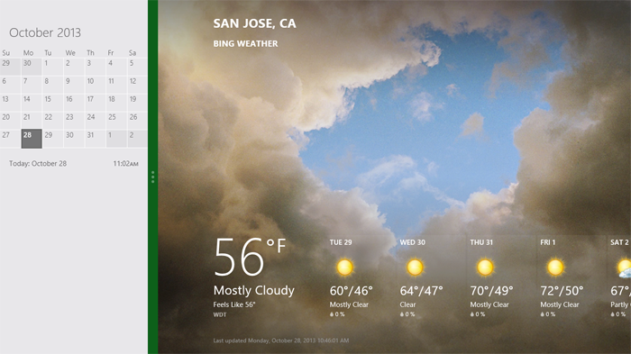
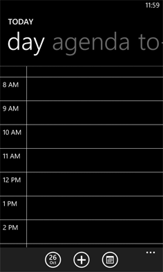
Notice though, that the default view of the calendar application on Windows Phone 8 is quite different than the snapped view of the same app on a tablet, PC, or TV. They are both using the same amount of screen width (in relative pixels), but the mobile interface starts with a daily agenda instead of a small month view by default. The controls are also adjusted to the mobile form factor as you can see in the image below.

We can debate about why these differences exist and if they should or not but the bottom line is there’s more than screen size being taken into account in these application designs.
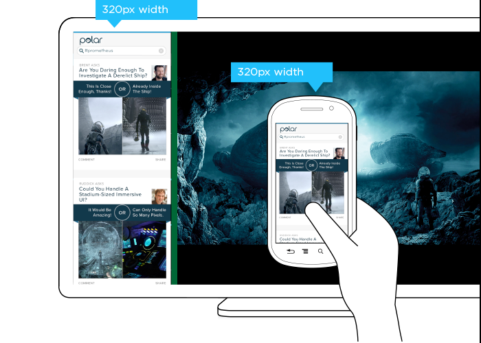
This simple example illustrates the challenge for Web designers. On Windows Phone devices, Internet Explorer uses 320 pixels for its device-width (the width it renders content at). On Windows 8 tablets, PCs, and TVs, snap mode uses the same 320 pixel device-width to lay out Web pages docked alongside other apps.
So with a responsive Web design, people get the same interface on a smartphone that they get in snap mode on a TV screen due to the same device-width (320 pixels). You can see this illustrated in the image below.

But should the interface be the same? A TV is usually viewed from about 10 feet away, while the average smartphone viewing distance is about 12 inches. This has an obvious impact on legibility for things like font and image sizes but it also affects other design elements like contrast. So a user’s posture (in this case viewing distance) should be taken into account when designing for different devices.
The input capabilities of a TV (D-pad) can differ wildly from a those of a mobile device (touch) or in some cases be the same (voice). Designing a simple list interface for d-pads requires a different approach than a creating a similar listing for use with touch gestures. So available input types should also be considered in a multi-device design.
When you take user posture and input capabilities into account when designing, an interface can change in big or small ways. For instance, contrast the design below for Windows 8 snap mode on a TV compared to a mobile version of the same feature.
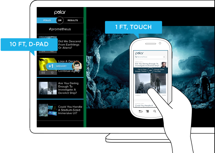
While the screen size (320 pixel device-width) has stayed consistent, the interface has not. Larger fonts, a simplified list view, inverted colors, and a lot more have changed in order to support a different user posture (10 ft away vs. 12 inches), and different input types (d-pad vs. touch). As you can see, screen size doesn’t give us a complete picture of what we need to know to design an appropriate interface.
Before you dismiss this as an isolated use case on Windows 8 devices, note that Android smartphones and tablets also offer the ability to interact with multiple applications side by side and Android-powered TVs won’t be far behind. In fact, we’ve already got Android eyepieces like Google Glass that pose similar challenges.
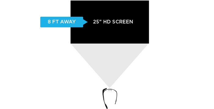
Google Glass allows you to view applications and Web pages using a display that projects information just above your line of sight. The official specs describe the Glass display as a “25 inch HD screen viewed from 8 feet away.” So right up front, viewing distance matters.

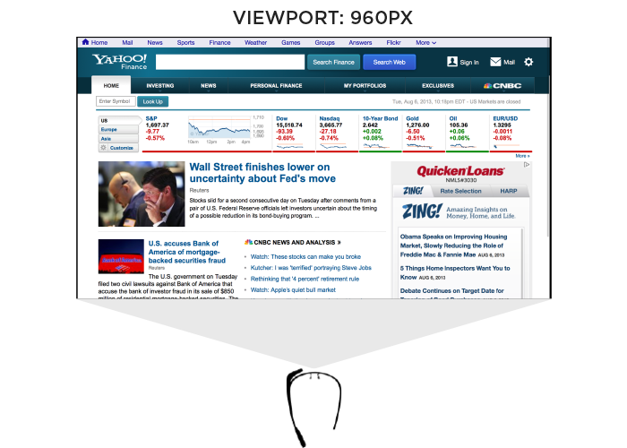
Like most mobile Web browsers, Glass uses a dynamic viewport to resize Web pages for its screen. On Glass the default viewport size is set to 960 pixels and pages are scaled down accordingly. So if someone is viewing the Yahoo! Finance site, it displays like this in the Glass browser (below). Essentially, it is shrunk down to fit.

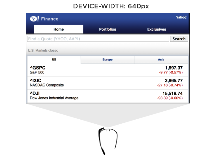
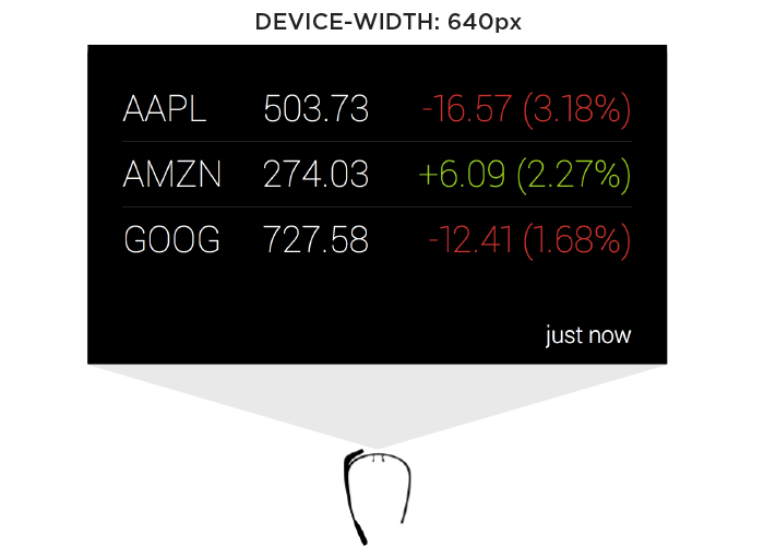
The Web browser on Glass also allows pages built responsively to adapt to a more suitable device-width. In this case, 640 pixels. So a Web page designed to work across a wide range of screen sizes would render differently on Glass. Given that 600 pixels is a common device-width for 7 inch tablets, the page you’d see on Glass would look more like the following -adapted for a smaller viewport size.

In addition to the Web browser, Google Glass also includes a number of “glassware” applications built with the same Web technologies used to create Web pages. One of these apps provides access to stock price changes -very similar to what you see displayed prominently on the Yahoo! Finance site. However, the presentation of this information is very different. As you can see in the image below it’s been designed as if you are viewing a 25” screen from 8 feet away. This design is much more suited to a wall-sized display than a small tablet screen.

This Glassware interface is also designed to make scrolling through information using the touchpad on the side of Google Glass (which comfortably supports sweeping left/right and up/down gestures) fast and easy.
So again user posture and input capabilities inform how to design for a specific device. Screen size alone doesn’t tell us enough.
Supporting Everything
In order for an interface to adapt appropriately to different output, input, and user posture, we need to know what combination of the three we’re are dealing with at any given time. On the Web that’s been notoriously difficult. We can’t tell TVs from smartphones or what devices support touch without relying on some level of user agent detection, which is often looked at dubiously.
Because of this, Web developers and designers have smartly decided to simply embrace all forms of input: touch, mouse, and keyboard for starters. While this approach certainly acknowledges the uncertainty of the Web, I wonder how sustainable it is when voice, 3D gestures, biometrics, device motion, and more are factored in. Can we really support all available input types in a single Web interface?
A similar approach to user posture is increasingly common. That is, an interface can simply ask people if they want a lean-back 10 foot experience, a data dense 2 foot experience, or something more suited for small portable screens. This makes user posture something that is declared by people rather than inferred by device. Once again, this kind of “support everything” thinking embraces the diversity of the Web whole-heartedly. However it puts the burden on each and every user to understand different modes, when they are appropriate, and change things accordingly. (Personally I feel we should be able to provide an optimal experience without requiring people to work for it.)
Ultimately trying to cover all input types and all user postures in a single interface is a daunting challenge. It’s hard enough to cover all the screen sizes and resolutions out there. Couple that with the fact that an interface that tries to be all things to all devices might ultimately not do a good job for any situation. So while I embrace supporting the diversity of the Web as much as possible, I worry there’s a limit to the practicality of this approach long-term as the amount of possible inputs, outputs, and user postures continues to grow.
Don’t Assume Too Much
These examples are intended to convey one important point: don’t assume screen adaptation is a complete answer for multi-device Web design. Responsive Web design has given us a powerful toolset for managing a critical part of the multi-device world. But assuming too much based on screen size can ultimately paint you into a corner.
It’s not that adapting to screen size doesn’t matter, as I pointed out numerous times, it really does. But if you put too much stock in screen size or don’t consider other factors, you may end up with incomplete or frankly inappropriate solutions. How people interact with the Web across screens continues to evolve rapidly and our multi-device design methods need to be robust enough to evolve alongside.
Using Content To Define User Experience
In her presentation at Breaking Development in Nashville TN, Steph Hay talked about the importance of narrative in digital experiences. Here’s my notes from her talk on Using Content To Define User Experience.
- The Sesame Street TV show was based on actual research of how kids learned and continually measured to make sure it was reaching their educational goals. They approached content development by isolating chunks of programming, testing it, and continually refining.
- The big paradigm shift was learning first then writing second.
- Content and technology that guides people over time forms a narrative that allows people to act.
- Use cases in software design tend to be very flow-focused and high level. Requirements docs just focus on the what. Content is the missing piece in everything we’re doing.
- When content really works, we can get from point A to B more quickly and easily.
- Use content to explicitly set expectations then meet them regardless of device.
- Design is only part of the narrative, the other half is the real human people that experience what we are designing.
- The “you” orientation of content focuses on the user, not on the company. It positions the customer as the other half of the narrative.
- Features by themselves won’t protect your narrative, you also need relevance.
- There are two kinds of narratives online: setting expectations (through marketing), and functional requirements (through experience).
- Write content first. This is the paradigm shift.
- Many organizations are afraid to write content first because they are used to writing it last. But this results in missing pieces and incomplete experiences.
- State your goal: what are you trying to accomplish, what are your users trying to accomplish.
- You can use tools like Google Keyword builder and Google Analytics to find the language people are using to find you. What terms make sense for them? Use these terms to create a conversation.
- The content is the structure. This is why it makes sense to start there.
- interactive
- interaction
- installation
- design
- led
- light
- art
- technology
- projectionmapping
- projectmapping
- robotics
- ui
- mobile
- projection
- interactivedesign
- lightdesign
- apple
- web
- 3d
- ux
- userinterface
- lightart
- robot
- artinstallation
- touchscreen
- application
- app
- webdesign
- touch
- motion
- responsive
- adobe
- multitouch
- future
- robots
- drone
- photoshop
- productdesign
- ledinstallation
- lightsculpture
- video
- user experience
- iphone
- creative
- interactivelight
- digitalart
- motiondesign
- ar
- 3dprinting
- responsivedesign
- augmentedreality
- drones
- kinetic
- data
- development
- kinect
- microsoft
- display
- immersive
- process
- painting
- timelapse
- dronerobotics
- 3dprojection
- ios
- vr
- virtualreality
- earth
- ai
- device
- user interface
- engineering
- laser
- lightpainting
- kineticsculpture
- lightinstallation
- touchinstallation
- animation
- programmableleds
- graffiti
- interactions
- neon
- performance
- leapmotion
- watch
- mobiledesign
- pixel
- environment
- exoskeleton
- interactiveenvironment
- sound
- lcd
- social
- leds
- lukew
- artlight
- patterns
- internet
- carui
- November 2011 128
- December 2011 65
- January 2012 25
- February 2012 27
- March 2012 33
- April 2012 31
- May 2012 16
- June 2012 32
- July 2012 20
- August 2012 37
- September 2012 24
- October 2012 34
- November 2012 31
- December 2012 6
- January 2013 21
- February 2013 11
- March 2013 10
- April 2013 35
- May 2013 45
- June 2013 10
- July 2013 49
- August 2013 33
- September 2013 40
- October 2013 57
- November 2013 31
- December 2013 28
- January 2014 86
- February 2014 49
- March 2014 24
- April 2014 40
- May 2014 6
- June 2014 9
- July 2014 1
- August 2014 34
- September 2014 30
- October 2014 45
- November 2014 21
- December 2014 6
- January 2015 5
- February 2015 17
- March 2015 18
- April 2015 14
- May 2015 1
- June 2015 10
- July 2015 4
- August 2015 1
- October 2015 11
- March 2016 4
- December 2016 18
- September 2017 6
- October 2017 13
- November 2017 5
- June 2018 8
- July 2018 2
- November 2018 7
- February 2019 8
- March 2019 6
- July 2019 1
- August 2019 1
- October 2019 1
- July 2020 5
- November 2020 9
- December 2020 1
- January 2021 1
- April 2021 1
- May 2021 9
- June 2021 3
- August 2022 3
- May 2023 2
- September 2023 1
- May 2025 6