RESPONSIVE PHILOSOPHY

The next generation of the responsive web.
Responsive design, which allows designers and developers to build websites that adapt to every screen size, is one of the most empowering web tools to be adopted in the last decade.
When responsive design will make sense for your application
A few months ago, I found myself in a Twitter debate over whether or not responsive design can work for web apps.
While it was a fun debate, trying to answer the question of whether or not responsive design makes sense for your app is futile. Let me explain.
We don’t have a common understanding of what responsive means.
I wrote about my struggles with figuring out what is “responsive” recently. People think they know what others mean when they say something is responsive, but our definitions often differ.
The best responsive designs use much more than responsive design. When that is the case, it is easy to find faults with any given responsive implementation that can be used to say, “Well, that’s not really a responsive design.”
What happens when you use responsive web design, but add to it things that seem to be at odds responsive design? Is it possible to add something that make it no longer responsive? If so, where is the line?
What is a web app?
If responsiveness has a murky definition, “web app” is considerably worse. Jeremy Keith has long argued that “like obscenity and brunch, web apps can be described but not defined“.
Chris Coyier recently polled his readers about whether or not it was useful to distinguish between “web apps” and “web sites”.
While people agree that the distinction is important, there was little consensus on what the distinction was. Chris summarized his findings thusly:
I was kind of hoping we could get somewhere close to a solid distinction between these two classifications, but I don’t think it’s going to happen. There is very little agreement and heaps of opinion.
So any time we’re discussing web apps, we’re going to have trouble agreeing on what we’re talking about. Discussing responsive web apps is just asking for trouble.
A case study in different perspectives
Here is a timeline of articles and discussions that illustrates my point perfectly:
June 17, 2013 — Responsive design Web apps – good or bad?
On a content only site it [responsive design] probably is very wise to start small and scale up. But in a highly interactive functional UI the UX will be damaged by the time you scale up. Or vice versa. Take a demanding environment such as online betting or a tipping platform. The users needs are potentially very different between device environments.
July 4, 2013 — Why Responsive Web Design is a Must for Gambling Sites
I personally have no doubts that responsive web design will become an official standard for all good web pages and web content design to comply in the future, sonow is the right time for you to start using it on your gambling and sports betting sites.
June 13, 2013 — Case Study: Betting on a fully responsive web application
Kambiis one of the top sports betting providers and their services include popular sports from all over the world…At Kambiwe went all-in on this bet and decided to build a web application that scales across the board. The value was clear, unified development process and consistent user experience on all platforms…Fully responsive web applications is not just a pipe dream anymore*. With the right mindset, tools and processes it all becomes possible.
July 9, 2013 — I point to Kambi as an example of responsive design being used for a web app. Nick Finck replies:
To summarize:
- Gambling apps are too complex to use responsive design.
- All gambling apps should be responsive.
- A case study of how a popular gambling app was built to be responsive.
- The gambling app in the case study is too light-weight.
Therein lies the problem. Even when we have a specific niche app/site (e.g., gambling), we can’t agree on the definitions. We have a case study of how a gambling app was made responsive, but we derive different conclusions about how applicable the case study is.
And I’m fine with that. I don’t mind ambiguity. People don’t have to agree.
I just think it points out how futile it is to try to convince others that responsive design for web apps makes sense.
My thoughts on responsive design for apps
For my own part, I believe responsive design for apps is a no-brainer. We’re building apps for clients that use responsive design. I’ve seen large, complex apps for Fortune 500 companies that are in development. I’ve seen what other agencies are working on.
This stuff is coming. And perhaps when enough of these projects launch, we’ll move on from the debate about whether or not responsive design works for apps like we’ve moved on from similar questions about responsive design for ecommerce. (We have moved on, haven’t we?)
But even if I wasn’t fortunate enough to get a behind the scenes look at upcoming responsive app projects, I would still argue that responsive design for apps is inevitable:
Once you start accepting the reality that the lines inside form factors are as blurry as the lines between them, then responsiveness becomes a necessity.
I’m not saying there isn’t usefulness in device detection or looking for ways to enhance the experience for specific form factors and inputs. This isn’t a declaration that everything must be built to be with a single html document across all user agents.
What I am saying is that even in scenarios where you’re fine-tuning your app code and UI as much as possible for a form factor, that the differences in screen size and the various forms of input within a form factor alone will be enough to require you to design in a responsive fashion.
Sure you can build a complex web app without responsive design that only targets tablets, but that app would be limited. There is too much variation in the screen sizes of tablets for a design that isn’t responsive to work on more than a handful of devices.
I’m much more interested in skating to where the puck is going to be, no matter how difficult, than to fixate on what is easiest to do now.
We’re focused on helping our customers make their apps work across devices. And that means taking on many complex challenges. Making apps responsive is just one of them.
So how will you know when responsive design makes sense for your app?
When you decide it does and put in the hard work to make it so. The rest of the discussion is just noise.
A responsive process. Brad Frost for TechCrunch

I got shot out of a cannon at the beginning of 2013. I had been contemplatinggoing out on my own for a while, so I decided to reach out to the great Josh Clark for career advice. In addition to providing me a ton of great advice, he asked if I’d be interested in working on a potential project that was in the midst of coming together. Of course my answer was yes, and for the next few months began working on a redesign of TechCrunch.
The Team
I had the honor of working alongside some of the smartest and nicest people I’ve ever met on this project (and thankfully most of us ended up working onEntertainment Weekly right afterwards). Here was our crew:
- Josh Clark steered the ship. He got the team together, led the design process, constantly managed the client relationship, and gave off positive vibes that carried us through a lot of long nights.
- Jennifer Brook is an absolute beast. Never before have I seen someone conquer content and information architecture so adeptly.
- Dan Mall led visual design on the project. Dan constantly amazed me at how thoughtful, utilitarian, and gorgeous his designs were. It was an honor to work with him.
- Jonathan Stark slung some serious JavaScript. It was my first time working with a bonafide JS expert, so I did my best to learn all I could from him. He also helped me with my abysmal Git/Github skills, and for that I’m eternally thankful.
- Kristina Frantz brought to the table some serious project management chops, which were essential in managing our entirely remote team.
- And as for me, I coded the HTML and CSS for the site. As it turns out, there was a lot to create, so thankfully Pon Kattera and Greg Sarault stepped in and helped me prototype a ton of stuff. I most certainly couldn’t have done it without them!
We all worked remotely, and since the majority of the team were also frequent speakers we found ourselves collaborating on this project while criss-crossing the globe. Our calls would start with “Greetings from Stockholm!” “Greetings from Chicago!” “Greetings from Sydney!” It was pretty wild, but hey, we got the job done.
The Process
Our merry group of makers had the opportunity to revisit what the modern Web design process looks like, and this post is going to step through how we did things.
Set expectations
A lot of the failure to move into the Post-PSD Era has been a problem ofsetting the right expectations with clients and colleagues at the beginning of the project.
We did our best to help the client understand the reality of the Web landscape, and that because our website was going to be fluid, our process needed to match.

We helped everyone understand that development is an essential part of the design process. A few months before starting the TechCrunch project, I was deep in my thoughts working out what would ultimately become atomic design. I had even begun work on a tool that would allow me to establish a robust pattern library and stitch together interface patterns to form pages. That tool would eventually evolve into Pattern Lab. I introduced everyone to atomic design and demoed Pattern Lab for them. We talked about the benefits of creating a robust design system versus an ad hoc collection of page templates. Everyone seemed to get it without any wailing or gnashing of teeth.
Kickoff and Planning
We kicked the project off at TechCrunch’s office, where we conducted stakeholder interviews, did a 20-second gut test, and design studio exercises to get everybody aligned. You can read more about the exercises because we repeated these effective exercises for Entertainment Weekly, and I used them for my current redesign of the Pittsburgh Food Bank website.
Sketching
Armed with insights from the kickoff meeting, we retreated back to New York to comb through the site, establish content types, talk information architecture and brainstorm interaction design together. After that Jennifer rolled up her sleeves and got to work organizing the mountains of Post-its and sketches the group had generated.
establishing site-wide patterns
Jennifer did a hell of a job setting up some global patterns for the sites, establishing what she referred to as “rivers” and “islands”. Rivers are lists of objects like news stories, while islands were featured content areas.


The great thing about establishing these site-wide patterns was that I was able to immediately represent these patterns as organisms in Pattern Lab. Because of the blocky, gray-scale nature of Jennifer’s sketches, I was able to quickly recreate all the sketches in HTML using a simple .fpo class. Once established, creating and modifying wireframes was as easy as copying and pasting an include.
In addition to translating Jennifer’s sketches into FPO blocks in Pattern Lab, I was able to get to work right away on a whole slew of molecules and organisms. Just by looking at TechCrunch’s existing site I knew I could roll up my sleeves and start marking up a whole host of things: text elements (bold, emphasis, blockquote, pullquote, etc), image types (logo, post image, avatar, etc), forms (search, newsletter, submit a story, contact, etc), ads, and a whole lot more.

We knew that ads throw in a monkey wrench into a responsive sites, so I created FPO ad unit atoms and chucked all the ad requirements into the HTML wireframes right out of the gate.
establishing visual direction
While Jennifer was working on information architecture and I was setting up molecules and organisms in Pattern Lab, Dan was hard at work establishing visual direction.
Because TechCrunch is a destination for people to read, Dan thought a logical place to start exploring would be type. So using Typecast, he created some type combinations to facilitate conversation with the client.

The client was able to comment on type (“That’s too blocky” or “Number 3 is a little too thin”) by looking at real type displayed in the browser, the same place where their users will ultimately be experiencing the site.
Rolling Up Our Sleeves
Once we had a solid sense of information architecture, visual direction, and HTML scaffolding, we were able to really get into the weeds to start designing things.
html wireframes
Jennifer blocked out all of the different page templates, accounting for variants of a template (such as how the homepage looks during a live event versus a normal news day).


And I was right there behind her creating each page template, which consisted of the appropriate molecules and organisms. Slowly but surely, I started replacing those FPO divs with marked-up molecules and organisms.

Now, these HTML wireframes looked absolutely hideous. But that’s alright because at this stage in the game I was just getting everything wired up. Layout, color, and other visual design-related stuff would come later.
element collages
Armed with insights from type and branding explorations, Dan went to work creating element collages of the interface. Element collages are a bit more tangible than a style tile, but still not a full-on comp. Here’s one that demonstrated how things might adapt across multiple screen sizes:

The great thing about this is that he didn’t have to worry about what the footer or featured post area was going to look like in order to get the client’s feedback. By honing in on one organism rather than a whole page, the client was able to focus on getting the header right rather than getting distracted by what FPO image Dan might have decided to use on a homepage comp. Element collages allowed us to have the right conversations at the right time.
Once the client was comfortable with the header direction, I would take that direction and start styling it up. I started with the global header and footer:

Now this is where things start getting weird, because what began their lives as HTML wireframes were slowly transforming into the final designs. I thought this would be awkward from a client relations standpoint (we certainly had a lot of internal conversations about how to address this), but ultimately because they were involved in the process the entire way they understood what was going on. Because they had a better perspective on where the design was coming from, we were able to get feedback on certain components despite the fact that the rest of the site guts still looked like grayscale throw-up.
comps
Believe it or not, we did indeed create a few full comps. Gasp! Horror!
But the difference between this and all the other projects I’ve ever worked on is that we didn’t lead with the comps. By the time Dan made some comps (for the homepage and featured article page), we had established many of our key molecules and organisms, and had an understanding of the systematic nature of our design.
We presented the comps to the client, and they’d come back with some (usually) minor change requests. I’d then take the comps and their feedback and make the requested changes in the browser, so that we weren’t dwelling in Photoshop any more than we had to. Dan and I would Skype and chat through the issues to ensure the initial vision remained intact.
behind the scenes photoshop
And so it went. We’d create visual styles for particular organisms, and design full comps if absolutely necessary. I would style each organism appropriately, and slowly but surely replace the remaining grayscale blocks with detailed styles.
Sometimes things just weren’t looking right in the browser. Maybe a few components didn’t not look quite right sitting next to each other. In these instances, I’d bring them to Dan’s attention, who would screenshot the working code and shift things around to solve the design problem. We’d talk about it and I’d get back to work implementing his suggestion.
After a while, we realized that a whole lot of the Photoshop documents being created weren’t ever intended for the client to see. Instead, these little Photoshop hotfixes were created to help me style things better in the browser. Strange days indeed.
The Final Push
We worked hard styling each of the templates, and addressing every variation in a template. What does an article look like when there’s zero comments? What about when there’s 60? What does a topic page look like for a product versus a company versus a person? What does an event page look like before, during, and after an event? We created a new page for each template variation. Here’s what the final page list looked like in the Pattern Lab menu:

That’s a lot of pages.
Once the templates were complete, we cross-browser, cross-device tested everything (we had been testing on different browsers and devices throughout, but only on a subset during core development). From the design end of things, Dan went through and created an incredibly detailed list of minor design tweaks that tightened things up and got things ready for final delivery to be implemented into their WordPress backend by the fine folks at10up (who by the way were involved throughout the course of this process). What was great is that we weren’t just handing over a bunch of templates, but rather an intentional, robust design system that can be built upon and evolved.
After some time the site went live. It was a long few months, but I think our hard work paid off.
Lessons Learned
So that’s that. Here’s some things I took away from the project:
- It’s not Agile–So we didn’t do the traditional waterfall approach. So we must have been Agile right? I don’t really think so. I think there’s a false dichotomy between waterfall and Agile, but at the end of the day I don’t know what I’d call our process. All I know is that we communicated a lot, collaborated like I’ve never collaborated before (keep in mind that we were all remote throughout the entire process), and we were honest with ourselves and the client.
- Work in parallel–There’s so much work that can be done in parallel.

From day one, information architects and content strategists can begin organizing information, visual designers can start exploring type, color, and texture, and developers can set up tools, patterns, and components. As some point in the process, a discipline might serve more as consultant for the other disciplines, while other times they’re burning hot creating things. As time goes on, the creating/consulting role shifts, but no one is ever fully out of the picture.
- Slowly build fidelity–This process reminds me a lot of subtractive sculpture.

You start out with a big slab of rock, and slowly chip away to get the rough shape of the form you’re creating. You take another pass at it to get a better sense of the object you’re trying to extract from the stone. You take another pass to start getting a bit more detailed. Eventually, you start honing in on a particular aspect of the form: a face, the arms, or the torso. Slowly but surely you detail each section of the sculpture until you’ve arrived at the final form.
Only unlike stone sculpture, we have Cmd+Z.
There’s a lot more to be said about this project, and hopefully I’ll get the opportunity to explore them further. In the meantime, check out the site, and look out for more posts from the rest of the team.
Relying Too Much on Screen Size
As people continue to go online using an ever increasing diversity of devices, responsive Web design has helped teams build amazing sites and apps that adapt their designs to smartphones, desktops, and everything in between. But many of these solutions are relying too much on a single factor to make important design decisions: screen size.
What’s Wrong With Screen Size?
It’s not that adapting an interface to different screen sizes is a bad thing. Quite the opposite. It’s so important that key metrics like conversion and engagement usuallyincrease substantially when Web sites adjust themselves to fit comfortably within available screen space. For proof, just look at how mobile conversion rates increase significantly more in responsive redesigns than PC conversions do.
So if adapting to different screen sizes can have that kind of positive impact for a business, what’s the risk? As the kinds of devices people use to get online continue to diversify, relying on screen size alone paints an increasingly incomplete picture of how a Web experience could/should adapt to meet people’s needs. Screen size can also lead to bad decision-making when used as a proxy for determining:
- If a browser is running on a mobile device or not
- If Network connections are good (fast) or bad (slow)
- If a device supports touch, call-making, or other capabilities
There’s still no relationship between screen size and bandwidth. Instead, we should ensure our work’s as light as possible *for everyone*.
— Responsive Design (@RWD)
None of these can actually be accurately inferred from screen size alone but they are comfortable assumptions that make managing device diversity substantially easier. The harsh truth however, is that output (screen size and resolution) is only one third of the equation -at best. Equally important to determining how to adapt an interface are input capabilities and user posture, which sadly screen size doesn’t tell us anything about.
Let me illustrate with a few specific examples.
Screen Size Limits
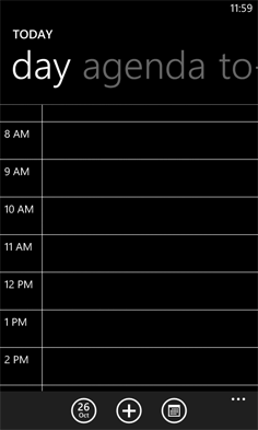
On tablets, PCS, and TVs, Microsoft’s Windows 8 platform allows any app, including the Web browser, to be “snapped” to the side of a screen thereby letting people interact with it while using another application in the primary view. As an example, the Windows 8 calendar application can be snapped alongside the weather app when making your daily plans.

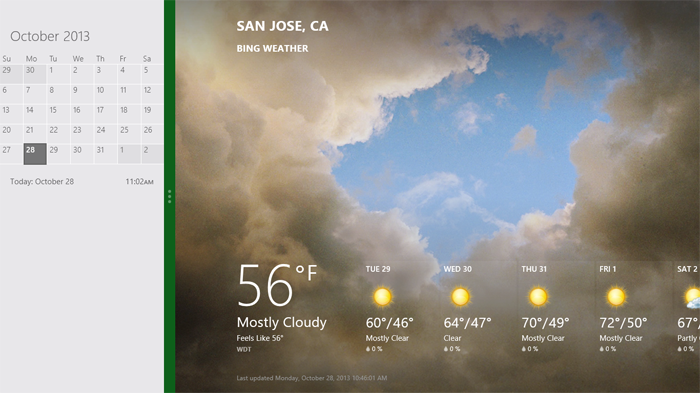
Notice though, that the default view of the calendar application on Windows Phone 8 is quite different than the snapped view of the same app on a tablet, PC, or TV. They are both using the same amount of screen width (in relative pixels), but the mobile interface starts with a daily agenda instead of a small month view by default. The controls are also adjusted to the mobile form factor as you can see in the image below.

We can debate about why these differences exist and if they should or not but the bottom line is there’s more than screen size being taken into account in these application designs.
This simple example illustrates the challenge for Web designers. On Windows Phone devices, Internet Explorer uses 320 pixels for its device-width (the width it renders content at). On Windows 8 tablets, PCs, and TVs, snap mode uses the same 320 pixel device-width to lay out Web pages docked alongside other apps.
So with a responsive Web design, people get the same interface on a smartphone that they get in snap mode on a TV screen due to the same device-width (320 pixels). You can see this illustrated in the image below.

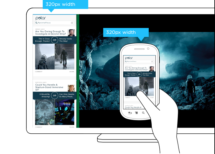
But should the interface be the same? A TV is usually viewed from about 10 feet away, while the average smartphone viewing distance is about 12 inches. This has an obvious impact on legibility for things like font and image sizes but it also affects other design elements like contrast. So a user’s posture (in this case viewing distance) should be taken into account when designing for different devices.
The input capabilities of a TV (D-pad) can differ wildly from a those of a mobile device (touch) or in some cases be the same (voice). Designing a simple list interface for d-pads requires a different approach than a creating a similar listing for use with touch gestures. So available input types should also be considered in a multi-device design.
When you take user posture and input capabilities into account when designing, an interface can change in big or small ways. For instance, contrast the design below for Windows 8 snap mode on a TV compared to a mobile version of the same feature.
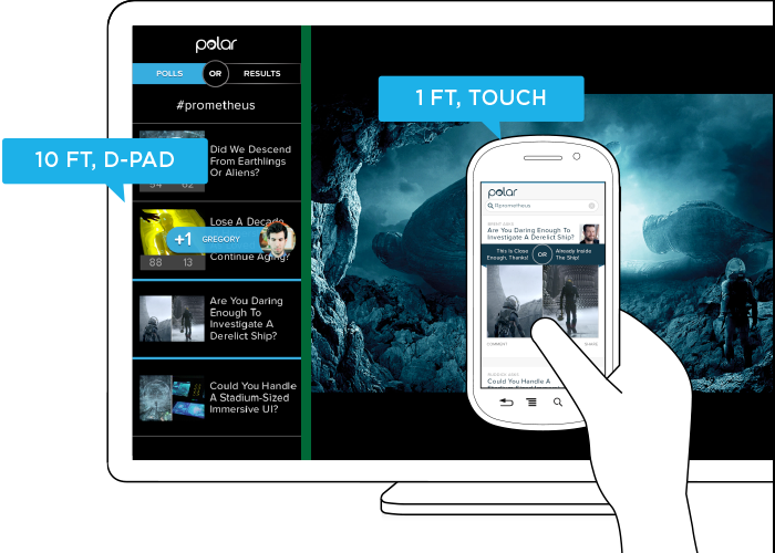
While the screen size (320 pixel device-width) has stayed consistent, the interface has not. Larger fonts, a simplified list view, inverted colors, and a lot more have changed in order to support a different user posture (10 ft away vs. 12 inches), and different input types (d-pad vs. touch). As you can see, screen size doesn’t give us a complete picture of what we need to know to design an appropriate interface.
Before you dismiss this as an isolated use case on Windows 8 devices, note that Android smartphones and tablets also offer the ability to interact with multiple applications side by side and Android-powered TVs won’t be far behind. In fact, we’ve already got Android eyepieces like Google Glass that pose similar challenges.
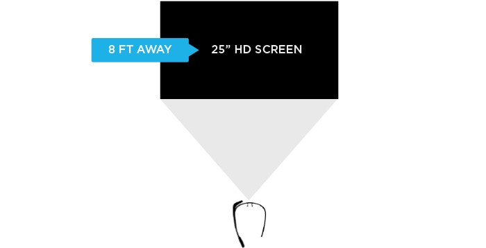
Google Glass allows you to view applications and Web pages using a display that projects information just above your line of sight. The official specs describe the Glass display as a “25 inch HD screen viewed from 8 feet away.” So right up front, viewing distance matters.

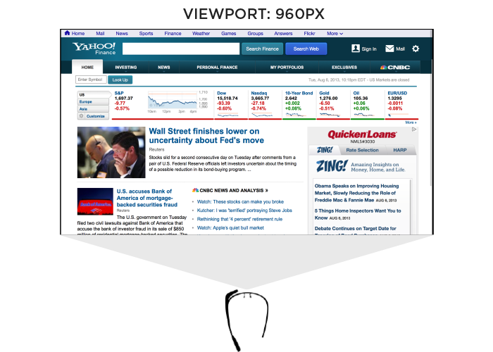
Like most mobile Web browsers, Glass uses a dynamic viewport to resize Web pages for its screen. On Glass the default viewport size is set to 960 pixels and pages are scaled down accordingly. So if someone is viewing the Yahoo! Finance site, it displays like this in the Glass browser (below). Essentially, it is shrunk down to fit.

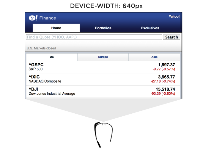
The Web browser on Glass also allows pages built responsively to adapt to a more suitable device-width. In this case, 640 pixels. So a Web page designed to work across a wide range of screen sizes would render differently on Glass. Given that 600 pixels is a common device-width for 7 inch tablets, the page you’d see on Glass would look more like the following -adapted for a smaller viewport size.

In addition to the Web browser, Google Glass also includes a number of “glassware” applications built with the same Web technologies used to create Web pages. One of these apps provides access to stock price changes -very similar to what you see displayed prominently on the Yahoo! Finance site. However, the presentation of this information is very different. As you can see in the image below it’s been designed as if you are viewing a 25” screen from 8 feet away. This design is much more suited to a wall-sized display than a small tablet screen.

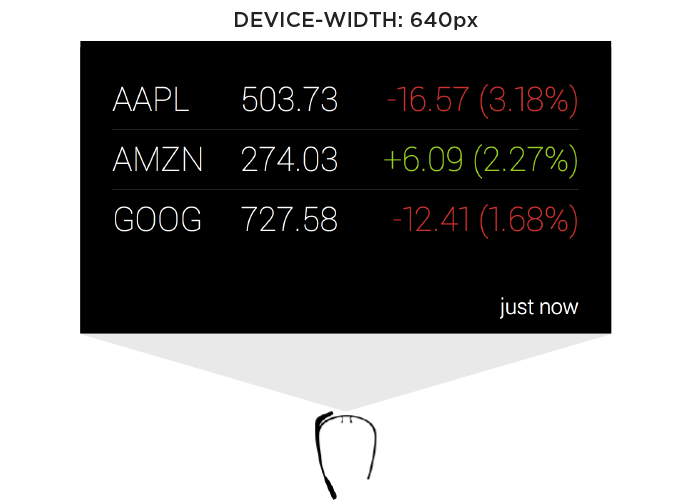
This Glassware interface is also designed to make scrolling through information using the touchpad on the side of Google Glass (which comfortably supports sweeping left/right and up/down gestures) fast and easy.
So again user posture and input capabilities inform how to design for a specific device. Screen size alone doesn’t tell us enough.
Supporting Everything
In order for an interface to adapt appropriately to different output, input, and user posture, we need to know what combination of the three we’re are dealing with at any given time. On the Web that’s been notoriously difficult. We can’t tell TVs from smartphones or what devices support touch without relying on some level of user agent detection, which is often looked at dubiously.
Because of this, Web developers and designers have smartly decided to simply embrace all forms of input: touch, mouse, and keyboard for starters. While this approach certainly acknowledges the uncertainty of the Web, I wonder how sustainable it is when voice, 3D gestures, biometrics, device motion, and more are factored in. Can we really support all available input types in a single Web interface?
A similar approach to user posture is increasingly common. That is, an interface can simply ask people if they want a lean-back 10 foot experience, a data dense 2 foot experience, or something more suited for small portable screens. This makes user posture something that is declared by people rather than inferred by device. Once again, this kind of “support everything” thinking embraces the diversity of the Web whole-heartedly. However it puts the burden on each and every user to understand different modes, when they are appropriate, and change things accordingly. (Personally I feel we should be able to provide an optimal experience without requiring people to work for it.)
Ultimately trying to cover all input types and all user postures in a single interface is a daunting challenge. It’s hard enough to cover all the screen sizes and resolutions out there. Couple that with the fact that an interface that tries to be all things to all devices might ultimately not do a good job for any situation. So while I embrace supporting the diversity of the Web as much as possible, I worry there’s a limit to the practicality of this approach long-term as the amount of possible inputs, outputs, and user postures continues to grow.
Don’t Assume Too Much
These examples are intended to convey one important point: don’t assume screen adaptation is a complete answer for multi-device Web design. Responsive Web design has given us a powerful toolset for managing a critical part of the multi-device world. But assuming too much based on screen size can ultimately paint you into a corner.
It’s not that adapting to screen size doesn’t matter, as I pointed out numerous times, it really does. But if you put too much stock in screen size or don’t consider other factors, you may end up with incomplete or frankly inappropriate solutions. How people interact with the Web across screens continues to evolve rapidly and our multi-device design methods need to be robust enough to evolve alongside.
Multi-Device Web Design: An Evolution
As mobile devices have continued to evolve and spread, so has the process of designing and developing Web sites and services that work across a diverse range of devices. From responsive Web design to future friendly thinking, here’s how I’ve seen things evolve over the past year and a half.
If you haven’t been keeping up with all the detailed conversations about multi-device Web design, I hope this overview and set of resources can quickly bring you up to speed. I’m only covering the last 18 months because it has been a very exciting time with lots of new ideas and voices. Prior to these developments, most multi-device Web design problems were solved with device detection and many still are. But the introduction of Responsive Web Design really stirred things up.
Responsive Web Design
Responsive Web Design is a combination of fluid grids and images with media queries to change layout based on the size of a device viewport. It uses feature detection (mostly on the client) to determine available screen capabilities and adapt accordingly. RWD is most useful for layout but some have extended it to interactive elements as well (although this often requires Javascript).
Responsive Web Design allows you to use a single URL structure for a site, thereby removing the need for separate mobile, tablet, desktop, etc. sites.
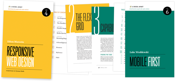
For a short overview read Ethan Marcotte’s original article. For the full story read Ethan Marcotte’s book. For a deeper dive into the philosophy behind RWD, read over Jeremy Keith’s supporting arguments. To see a lot of responsive layout examples, browse around the mediaqueri.es site.
Challenges
Responsive Web Design isn’t a silver bullet for mobile Web experiences. Not only does client-side adaptation require a careful approach, but it can also be difficult to optimize source order, media, third-party widgets, URL structure, and application design within a RWD solution.
Jason Grigsby has written up many of the reasons RWD doesn’t instantly provide a mobile solution especially for images. I’ve documented (with concrete) examples why we opted for separate mobile and desktop templates in my last startup -a technique that’s also employed by many Web companies like Facebook, Twitter, Google, etc. In short, separation tends to give greater ability to optimize specifically for mobile.
Mobile First Responsive Design
Mobile First Responsive Design takes Responsive Web Design and flips the process around to address some of the media query challenges outlined above. Instead of starting with a desktop site, you start with the mobile site and then progressively enhance to devices with larger screens.
The Yiibu team was one of the first to apply this approach and wrote about how they did it. Jason Grigsby has put together an overview and analysis of where Mobile First Responsive Design is being applied. Brad Frost has a more high-level write-up of the approach. For a more in-depth technical discussion, check out the thread about mobile-first media queries on the HMTL5 boilerplate project.
Techniques
Many folks are working through the challenges of designing Web sites for multiple devices. This includes detailed overviews of how to set up Mobile First Responsive Design markup, style sheet, and Javascript solutions.
Ethan Marcotte has shared what it takes for teams of developers and designers to collaborate on a responsive workflow based on lessons learned on the Boston Globe redesign. Scott Jehl outlined what Javascript is doing (PDF) behind the scenes of the Globe redesign (hint: a lot!).
Stephanie Rieger assembled a detailed overview (PDF) of a real-world mobile first responsive design solution for hundreds of devices. Stephan Hay put together a pragmatic overview of designing with media queries.
Media adaptation remains a big challenge for cross-device design. In particular, images, videos, data tables, fonts, and many other “widgets” need special care. Jason Grigsby has written up the situation with images and compiled many approaches for makingimages responsive. A number of solutions have also emerged for handling things likevideos and data tables.
Server Side Components
Combining Mobile First Responsive Design with server side component (not full page) optimization is a way to extend client-side only solutions. With this technique, a single set of page templates define an entire Web site for all devices but key components within that site have device-class specific implementations that are rendered server side. Done right, this technique can deliver the best of both worlds without the challenges that can hamper each.
I’ve put together an overview of how a Responsive Design + Server Side Componentsstructure can work with concrete examples. Bryan Rieger has outlined an extensive set of thoughts on server-side adaption techniques and Lyza Gardner has a complete overview of how all these techniques can work together. After analyzing many client-side solutions to dynamic images, Jason Grigsby outlined why using a server-side solution is probably the most future friendly.
Future Thinking
If all the considerations above seem like a lot to take in to create a Web site, they are. We are in a period of transition and still figuring things out. So expect to be learning and iterating a lot. That’s both exciting and daunting.
It also prepares you for what’s ahead. We’ve just begun to see the onset of cheap networked devices of every shape and size. The zombie apocalypse of devices is coming. And while we can’t know exactly what the future will bring, we can strive to design and develop in a future-friendly way so we are better prepared for what’s next.
Resources
I referenced lots of great multi-device Web design resources above. Here they are in one list. Read them in order and rock the future Web!
- Effective Design for Multiple Screen Sizesby Bryan Rieger
- Responsive Web Design (article) by Ethan Marcotte
- Responsive Web Design (book) by Ethan Marcotte
- There Is No Mobile Web by Jeremy Keith
- mediaqueri.es by various artisits
- CSS Media Query for Mobile is Fool’s Gold by Jason Grigsby
- Why Separate Mobile & Desktop Web Pages? by Luke Wroblewski
- About this site… by Yiibu
- Where are the Mobile First Responsive Web Designs? by Jason Grigsby
- Mobile-First Responsive Web Design by Brad Frost
- Mobile-first Media Queries by various artists
- The Responsive Designer’s Workflow by Ethan Marcotte
- Responsible & Responsive (PDF) by Scott Jehl
- Pragmatic Responsive Design (further details) by Stephanie Rieger
- A Closer Look at Media Queries by Stephen Hay
- Responsive IMGs — Part 1 by Jason Grigsby
- Responsive IMGs — Part 2 by Jason Grigsby
- Device detection as the future friendly img option by Jason Grigsby
- Responsive Video Embeds with FitVids by Dave Rupert
- Responsive Data Tables by Chris Coyier
- RESS: Responsive Design + Server Side Components by Luke Wroblewski
- Adaptation (PDF) by Bryan Rieger
- How I Learned to Stop Worrying and Set my Mobile Web Sites Free by Lyza Danger Gardner
- The Coming Zombie Apocalypse by Scott Jenson
- Future Friendly by various artists
Mobile first: Luke Wroblewski interview
The Mobile First philosophy has radically changed how professionals approach Web design and become the way companies as diverse as Facebook and IBM build their products.
The Mobile First approach is to start designing for mobile devices — which typically have less screen size and less capabilities than desktops — and progressively enhance the product; so that desktops get an enhanced site experience rather than mobiles getting a pared down one.
We grabbed the opportunity to interview Luke Wroblewski, who first defined the Mobile First concept back in 2009, about how he used the principle to create Polar at his latest startup, Input Factory Inc. where he is co-founder and CEO.
How did you get started building apps and what kept you fascinated?
The first mobile apps I worked on were during my time at Yahoo! I joined the Yahoo! Search team back in 2005 and a bit later was heading up a small “tiger team” focused on ideas for products that were 3 to 5 years out. At that time I was fascinated with where the web was going and in particular with mobile.
We started out building some experiences for newer Nokia devices, as Nokia was the big player back then. Soon after though, Apple announced the app store for iOS and we jumped into iOS applications as well. At the time we were experimenting with services that connected mobile apps to networked TVs and more traditional computers like laptops and desktops. It was a really great opportunity to explore what was coming and we came up with a bunch of concepts that I’m still passionate about today.
I think that’s what keeps me interested in this space. You can see the future: more connected devices of every shape and size; interactions between those devices; more real time access to useful information, services, and people –it’s all coming. But these things don’t just appear out of thin air. They take years of effort, trial and error to make real. So I keep at it because I keep seeing a more and more exciting future ahead.
When developing a product, how do you identify a gap in such a saturated market?
I don’t. If a market is saturated I think that’s a great sign it’s interesting on a number of levels. For me, its much more important to focus on problems I can understand and actually do something about. When you have deep experience in an area, you can often see a future other people can’t.
For instance, I’ve dug really deep into web form and mobile design. I even wrote two popular books on these topics. So I feel like I’ve increased my ability to see problems in these areas. And when I look across the Internet I see lots of people eager to share their opinions and get the opinions of others. But the solutions out there are just really bad.
You’ve got surveys that basically consist of multiple pages of form elements: checkboxes, radio buttons, text fields, and so on. Because they’re so painful to complete, companies are paying people to take these surveys and even then the participation rates are really low. I look at this and think: we can do better.
It doesn’t really matter if there are a lot of companies out there with apps for making surveys or soliciting feedback. If you see a problem and think you can do a better job solving it, that’s the on-ramp. That may sound overly confident but I think you need confidence to get out there and start doing your own thing. You have to believe in it or no one else will.
Why is the Mobile First approach a better way to do things?
Well the reasons have been stacking up over the years. But when I outlined the idea originally I pointed to three main reasons: growth, focus, and innovation.
Growth is pretty obvious these days. More than 2 million modern mobile devices enter the world each day. Compare that to the 371,000 children born per day and you can quickly see how these numbers add up. All these devices connected to networks is a huge opportunity and many companies are now feeling it in their stats as mobile begins to take over other kinds of devices in usage.
Focus comes from the natural constraints of mobile. These devices need to be portable, so their screens are small, they connect to networks anywhere and everywhere with varying success, and they get used in very diverse environments often full of distractions. These constraints push you toward more focused, simplified solutions. You can only fit so much on the screen, people often have to wait for it, and they’re unlikely to give you their full attention. So make it easy to understand and use and focus on the important things first. Mobile is a great forcing function for simplicity.
But mobile isn’t just about constraining yourself; quite the opposite. There are lots of things that make mobile experiences more powerful and engaging. Not least of which is the fact that mobile devices can be used all the time and just abut anywhere. That not only creates new uses but also means people can be connected throughout the entire day.
If that weren’t enough, due to the capabilities of mobile devices, we have new ways of creating experiences. Thanks to local detection technology, we know where people are down to 10 meters. Thanks to integrated cameras and microphones we can take in visual and audio input, process it, change it, and share it. Thanks to motion sensors we can tell where a device is in three-dimensional space, and the list goes on.
It’s easy to dismiss these capabilities as technology for technology’s sake. Instead think of them as new techniques or paints on your design palette. With them, you can paint a totally unique user experience that allows you to innovate and move beyond existing solutions that came about before these technologies were available to us.
How do you know your design is hitting the mark, especially when aiming for speed and simplicity?
Well, you can test for both. In fact, that’s exactly what we did for our app, Polar. We designed Polar for mobile first and foremost so speed and simplicity were, of course, top of my mind. Earlier I mentioned that we thought we could make collecting and sharing opinions fast, easy, and fun, almost the exact opposite of what most survey tools are like online today.
Polar is our first attempt to do that. The most important interactions in Polar are collecting and sharing opinions and, as a result, we spent a lot of time trying to get those interactions right. To make sure they were fast and easy, we used one-handed, timed tests. Our goal was to allow anyone to vote on 10 polls or create a new poll in under 60 seconds.
If you design for the extremes, the middle usually works itself out. To quote Dan Formosa at Smart Design: When they designed garden shears, they tested them with people who had arthritis. If this “extreme” case could use the garden shears, then anyone could. That’s the same approach we take with timed, one-thumb use. If you can make it work for that extreme it will work for everyone.
Is there anything you can do from a design perspective to make sure that people who download the app actually use it?
Sure. Let them actually use it. In all seriousness, so many apps start off the process by wanting to tell you all about themselves and having you tell them all about you. Fill in this form, give us your phone number, take this intro tour, and so on. All this instead of just letting you get in and start using the app you’re spending all your time memorizing which gestures the app has and connecting to Facebook.
No actually, you’re skipping past all that trying to actually use the app. So my approach is just get to the good stuff. Let me say, however, that I know this approach is controversial. There are a number of examples out there that show forcing registration up front increases your sign-up numbers. Which means you increased the number of people who filled out a form. But they’ve never used your service. They might not even know what it is, so how valuable are these users?
I’m biased toward people who’ve seen and used the app, then decided to sign-up as a result. That means they liked what they saw enough to take the next step. The total number of sign-ups may be lower but the number of qualified users may end up being higher. At least that’s our approach!
Have you heard horror stories of people screwing up their signup process in their products?
The best one I saw recently was published by Greg Nudleman. It was an app for finding nearby restrooms made by Charmin. The intro process was so labor intensive that Greg very appropriately titled his write up: Let Them Pee!
You’ve use the term “gradual engagement” a lot in the past when you talk about sign up process, can you elaborate on what that is?
Sure. Gradual engagement is an alternative to the sign-up form issue I just described. Through gradual engagement, we can communicate what apps do and why people should care by allowing them to actually interact with them in gradual ways.
For example, Polar is all about sharing and collecting opinions. So we allow anyone opening the app for the first time to vote on the polls they see. 88% of people who download the app do just that. We hold on to all their votes locally so if they ever take the next step on the “walkway” (when you want to leave a comment or create a poll of your own), all your votes carry over to your account. This is what I mean by gradually getting people to understand and use your service. It’s about creating a clear and welcome “pathway” vs. putting up walls.
There has been much debate recently over whether improved device capabilities will render mobile-first obsolete, where do you stand on this?
I certainly hope all our devices keep getting better and that we develop new ways of interacting with information and with each other. So I’m not building a moat around mobile or anything. That said, the idea of having a connected device with you anywhere and everything is really powerful.
For proof, just look at Flurry’s recent analysis of user sessions and activity across all phone and tablet sizes. The clear winner for both was the “medium” sized (3.5”-5”) phone. I think this is a testament to the value of a portable computer that you can turn to at any moment for answers, conversations, and frankly just about anything. That kind of mobility and its importance does not show any signs of letting up in the near future. So I’m still really bullish on mobile.
We’d like to thank Luke for taking the time to answer these questions.
Do you take a Mobile First approach? What stops you from using an app or mobile site? Let us know in the comments.
Featured image/thumbnail, mobile internet image via Shutterstock.
Mobile: Never Use Native Drop-Downs for Navigation
Many responsive mobile sites are using native drop-downs (as in: a select tag) for main navigation and many plugins have beendeveloped for this specific purpose, yet our usability research shows that this is a poor strategy. On the tested m-commerce sites that used native drop-downs for navigation, the test subjects showed decreased control and overview of the menu items.
During testing, nearly all subjects scrolled up and down category lists before selecting an option, many explicitly stating that they wanted to see all the categories before selecting one – even if they felt they had spotted a good match early in the list, the subjects still scrolled the remaining items just to make sure they knew what their other options were (before then scrolling back and selecting the good match). The subjects exhibited the same behavior on homepages where they often scrolled up and down to get an idea of what their options were, even if they saw what they were looking for right away.
This strong tendency towards scanning all options before selecting one is at the core of why native drop-downs are a poor choice for navigation. When open, a native drop-down only utilize ~50% of the screen, which made it needlessly difficult for the subjects to get an overview of their options.

With only half of the screen used to display the available options, users will have a difficult time scanning and comparing the available options. To make matters worse, the drop-down often starts out at the top with only 3 options visible to the user (left image), and even when scrolled to align optimally, no more than 5 options can be seen at once (right image).
Another issue with the navigation options only taking up 50% of the screen is that the scroll area for those options is similarly small. The smaller scroll area resulted in less accurate scrolling as there was so little room to “drag” the content that many subjects flicked to scroll instead (which of course is a much more inaccurate way of scrolling).
Finally, we also observed a few instances where subjectsmistook the navigation for filtering options. This was especially true of category and search result pages where subjects were on the lookout for filtering options and then simply jumped to the conclusion that the drop-down was such a feature.
Solution: Custom UI Drop-Downs
It’s very important to underscore that drop-down navigation isn’t bad at all, it’s native drop-downs (as in: a select tag) which are unsuitable for navigation due to the way they have been implemented in the major smartphone operating systems (such as iOS and Android).

While the navigation at The Boston Globe is very similar to how the native drop-down works in terms of interaction (you first click “Sections” and then a set of simple items are revealed) it is significantly better because the options aren’t limited to a dialog but can take up the entire screen if necessary. In the above all 10 items are shown at once; quite the improvement in terms of overview, scannability and “scroll control” when compared to the meager 5 items that can be shown in a native drop-down dialog. (The navigation items on Boston Globe are, however, on the short end, being only ~5,3mm tall.)

Another benefit of implementing custom drop-down UIs for navigation is that you have complete control over the design of the options. This means you can optimize the design and layout of the shown options (which you can’t with a native drop-down).CSS-Tricks, shown above, is a great example of this where, when expanded, the menu items are displayed in two columns and each has a descriptive icon next to it. It can also be more subtle, like the earlier Boston Globe example where arrows have been added to indicate virtual space.
During testing the subjects had no issues using these types of custom UI navigation as long as they followed basic design conventions, had adequate hitarea sizes (device manufacturers recommend a minimum of ~7×7mm), and the trigger elementwas designed as a link / button (so that the subjects knew it was clickable).
It should be noted that native drop-downs are not poor for all purposes – they can work well in forms where keeping page context can be as important as the options themselves. However, native drop-downs should not be used for main navigation as they simply afford too little overview of the available options and are needlessly difficult for users to scroll accurately.
Responsive Web Design Summit talk, 'Measuring Web Performance'
On Tuesday, April 16, 2013, I was lucky enough to give the opening talk on the web performance day of RWD Summit presented by Environments for Humans. This is the short description for the talk:
Today, a web page can be delivered to desktop computers, televisions, or handheld devices like tablets or phones. While a technique like responsive design helps ensure that our web sites look good across that spectrum of devices we may forget that we need to make sure that our web sites also perform well across that same spectrum. More and more of our users are shifting their Internet usage to these more varied platforms and connection speeds with some moving entirely to mobile Internet.
In this session we’ll look at the tools that can help you understand, measure and improve the web performance of your web sites and applications. The talk will also discuss how new server-side techniques might help us optimize our front-end performance. Finally, since the best way to test is to have devices in your hand, we’ll discuss some tips for getting your hands on them cheaply.
This presentation builds upon Dave’s “Optimization for Mobile” chapter in Smashing Magazine’s ”The Mobile Book.”
Article: Source
- interactive
- interaction
- installation
- design
- led
- light
- art
- technology
- projectionmapping
- projectmapping
- robotics
- ui
- mobile
- projection
- interactivedesign
- lightdesign
- apple
- web
- 3d
- ux
- userinterface
- lightart
- robot
- artinstallation
- touchscreen
- application
- app
- webdesign
- touch
- motion
- responsive
- adobe
- multitouch
- future
- robots
- drone
- photoshop
- productdesign
- ledinstallation
- lightsculpture
- video
- user experience
- iphone
- creative
- interactivelight
- digitalart
- motiondesign
- ar
- 3dprinting
- responsivedesign
- augmentedreality
- drones
- kinetic
- data
- development
- kinect
- microsoft
- display
- immersive
- process
- painting
- timelapse
- dronerobotics
- 3dprojection
- ios
- vr
- virtualreality
- earth
- ai
- device
- user interface
- engineering
- laser
- lightpainting
- kineticsculpture
- lightinstallation
- touchinstallation
- animation
- programmableleds
- graffiti
- interactions
- neon
- performance
- leapmotion
- watch
- mobiledesign
- pixel
- environment
- exoskeleton
- interactiveenvironment
- sound
- lcd
- social
- leds
- lukew
- artlight
- patterns
- internet
- carui
- November 2011 128
- December 2011 65
- January 2012 25
- February 2012 27
- March 2012 33
- April 2012 31
- May 2012 16
- June 2012 32
- July 2012 20
- August 2012 37
- September 2012 24
- October 2012 34
- November 2012 31
- December 2012 6
- January 2013 21
- February 2013 11
- March 2013 10
- April 2013 35
- May 2013 45
- June 2013 10
- July 2013 49
- August 2013 33
- September 2013 40
- October 2013 57
- November 2013 31
- December 2013 28
- January 2014 86
- February 2014 49
- March 2014 24
- April 2014 40
- May 2014 6
- June 2014 9
- July 2014 1
- August 2014 34
- September 2014 30
- October 2014 45
- November 2014 21
- December 2014 6
- January 2015 5
- February 2015 17
- March 2015 18
- April 2015 14
- May 2015 1
- June 2015 10
- July 2015 4
- August 2015 1
- October 2015 11
- March 2016 4
- December 2016 18
- September 2017 6
- October 2017 13
- November 2017 5
- June 2018 8
- July 2018 2
- November 2018 7
- February 2019 8
- March 2019 6
- July 2019 1
- August 2019 1
- October 2019 1
- July 2020 5
- November 2020 9
- December 2020 1
- January 2021 1
- April 2021 1
- May 2021 9
- June 2021 3
- August 2022 3
- May 2023 2
- September 2023 1
- May 2025 6