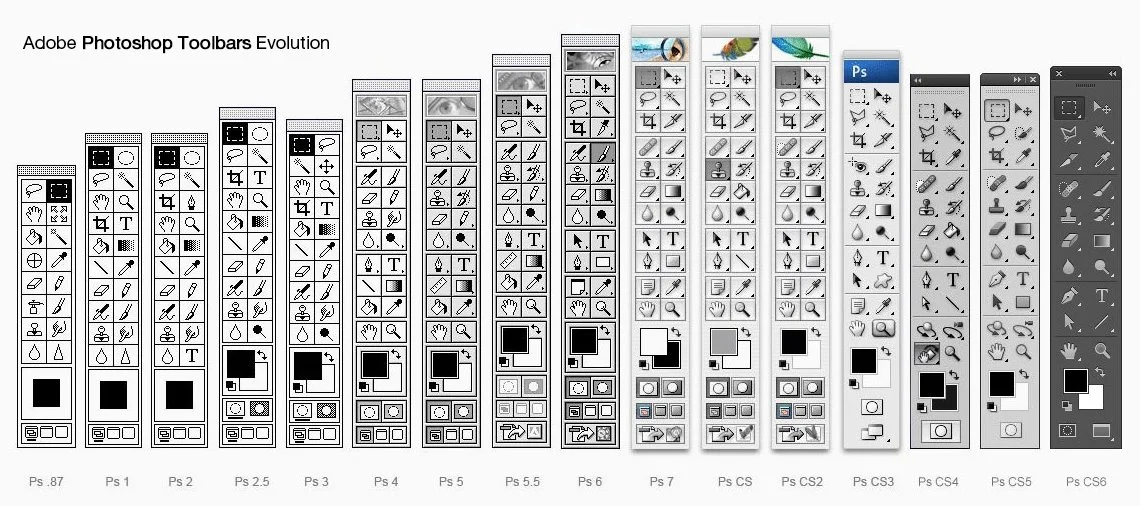
25 Years of Photoshop
To celebrate the tool that has helped shape creativity, artists from all over the world contributed their most amazing dreams-and their working files with layers. These PSDs were then animated layer by layer to create a film made in Photoshop. #Photoshop25
13 Quick Tips for Designers
Here’s a collection of useful tips to help save you some time. These are not big, detailed tutorials, just quick and easy tips that take a few seconds and are worth knowing – no matter how long you’ve been designing.
Tip for Sharper Circles

When working with tiny pixel shapes it’s very important to get the right sharpness on an image. This is incredibly difficult when you’re working with circles and round corners. This tip from Isaac Grant shows us one way to avoid the messy pixels. It’s simple, but I’d never considered it!
Copy Color’s Hex Code

Copy Color’s Hex Code. I only recently learnt of this feature. A very small tip that could save you a lot of time in the long-run.
Harmonious Color Schemes

Erica Schoonmaker shows us how to build Harmonious Color Schemes. She has a quick tip on Dribbble, but there’s also a 3 Minute Video that goes into a little more detail. A very useful tip for working with colour.
Enrich Colors with Gradient Maps

Enrich Color palette with Gradient Maps is a tip from Jimena Catalina that works brilliantly for photos and illustrations.
Proper Border Radius

Proper Border Radius. When placing a round corner box inside of another, it’s important that you adjust the border radius to offset the distance between them. Here’s one quick way of understanding, and doing that.
Shaping Textfields in Photoshop

Shaping Textfields in Photoshop is a tip that I wish I’d have known sooner. It’s a lot easier to do than it seems and it comes in handy a lot!
The Power of Gradient Maps

Bjango gives us a lovely run down of what Gradient Maps are, and how they can be used with a lot more accuracy and control. I’ve always loved Gradient Maps as a Photo Effect, but I find myself using them more and more lately in UI design, this post on Bjango opened my eyes for sure.
Expand and collapse all layers

A very quick tip to help you quickly tidy your layers & groups. I do this just before saving my PSD to make it easier to explore when I re-open it.
Double Exposure Photographs

How to Create Double Exposure Photographs in Photoshop. Not exactly a tip, but a very quick and easy technique to learn.
Correct Pixel Snapping

Pixel Snapping alone is helpful, but when using complex shapes, and re-sizing them, the pixel snapping doesn’t snap those transformations very well, and you get messy pixels. This simple keyboard shortcut fixes that with ease! Watch now.
Isolation Mode in Photoshop CC
A little gem that can help make your life easier when working on complex .psd files with tons of layers. Isolation Mode unclutters your Layers panel by only displaying the layers you’re currently working on.
Photoshop Tricks and Shortcuts

Photoshop Layers tricks and shortcuts is a very nice round up of time saving tips and keyboard shortcuts inside Photoshop.
Bonus: Photoshop Etiquette

Photoshop Etiquette is a complete guide of the most effective way to do things in Photoshop. Nobody likes inheriting muddy PSDs, and Photoshop Etiquette’s purpose is to help you improve the clarity of yours.
Repurposing Photoshop for the Web
Like any overzealous teenager aspiring to be a Web designer back in 1999, I found myself in an “Electronic Design” class, behind the wheel of one of thoseold-school aqua iMacs. If you found yourself in a similar situation, chances are you were given Adobe Photoshop as your vehicle for designing the Web. For me, it was version 6.0.
No matter which version you had, undoubtedly you know someone who can “trump” you by having adopted an earlier version. We designers take much pride in this, in case you hadn’t noticed.

One of these likely makes you nostalgic. (Image: Design You Trust)
It’s not a stretch to say that Photoshop was once regarded as the quintessential Web design tool, a sign that its fandom reached more than just photographers. Refrigerator magnets, pillows and eventattoos have shown homage to the unmistakable UI. Let’s face it: Photoshop is the software we’re identified with, and its place in Web design history is substantial.
I was careful to choose the word “history” there because that’s what it’s seemingly becoming.
(Smashing’s note: If you enjoy reading our articles, you’ll love our Smashing eBook Library. Get immediate access to all Smashing eBooks with 70% discount and vote on the topics you’d like to learn more about. You won’t be disappointed. Learn more…)
Falling Out Of Love
Yes, unlike anything else in the realm of Web design, we collectively have a love-hate relationship with Adobe’s flagship software. While we love it for the common aptitude and experience we share, we hate it for its shortcomings. The pain points of using Photoshop to design for the Web are well documented and support the staunch anti-Photoshopian’s cause to remove it from their process. In fact, complaining about Photoshop has become so commonplace that it’s not just a rite of passage, but rather the signature of a true Web designer.

As our needs changed, Photoshop couldn’t quite keep up. (Image: Derrick Diemont)
THE SOFTWARE’S PAIN POINTS
- Crashes
True story: about 95% of instances of Mac OS X’s beach ball (or, as I affectionately refer to it, the pinwheel of doom) occur while using Photoshop. OK, so I can’t back that up with actual data, but I venture to say this is a common experience, especially for those of us attempting to “Save for Web.” Familiar with that nauseous feeling you get when the program hangs and you haven’t saved in a long time? Yeah, that alone makes you rethink using Photoshop. - Text rendering
I’ve always found rendering the most basic of fonts as anything like the browser ends up doing to be incredibly difficult for Photoshop. Helvetica ends up looking like a mess, and coming close usually takes much tinkering with a few settings. This wouldn’t be problematic, except that the goal of comping is to show an accurate representation of what a website will look like. - Lack of interactivity
At the end of the day, designing static comps doesn’t adequately translate how elements are intended to behave through interaction. When presenting comps to the client, discussing these points is possible, but that’s less than ideal for complex interaction. I’ve found myself using terms like “If you can imagine…” far too often in an attempt to show something as simple as a hover state. - Expense
While we hem and haw over whether to buy an icon set for $5, realize that Photoshop is far and away the most expensive piece of software in the common Web design toolset. A new purchase of it will run you $700 USD. Upgrades help, and Creative Cloud has been nothing short of genius, but the investment in Photoshop is still monstrous compared to that of wireframing tools, code editors and FTP clients.
THE PROCESS’ PAIN POINTS
- Expectations
The environment of Photoshop provides complete design control, because every pixel we manipulate can be exported to our expectations. When we actually develop for the Web, browsers aren’t as predicable (I can think of one in particular that’s none to kind, but I digress). No manner of fixes or hacks will produce an exact match of our Photoshop comp. - Presentation
When attempting to convey responsive Web design, presenting static comps of full pages is less than ideal. The options are few and difficult: create numerous sizes of a single page, or try to explain verbally how a design will shift. I find neither to be practical or completely accurate, because innumerable device sizes are in the wild. - Double the effort
A Photoshop comp is a visual representation of what a website or app could be, but not a functional one. This becomes problematic in the scope of effort required, with a comp being produced and then reproduced through Web technology (HTML, CSS and JavaScript). Additionally, the detail of the production is quite considerable — static comps are typically pixel-perfect and fully fleshed out, and front-end development carries the same goal. - The big reveal
Ever worked hard on a design, spent hours polishing that last drop shadow on a button, exported a JPEG and then gotten nervous five minutes before a meeting because you have no assurances on whether the client will even understand the comp, much less like it? That’s true with many presentations, but the Big Reveal exacerbates this feeling. When your design process doesn’t include sharing any work in progress when comping, naturally it will lead up to a huge moment when you finally tell them to open a file or click a link. Wouldn’t it be nice if the client was involved in style-related decisions earlier than this?
Photoshop Misunderstood

Is it really a battle between tools?
OK, I think we’ve thoroughly bashed Photoshop enough at this point, although it’s important to realize where your tools fall short so that you can adapt (if you haven’t already). While there are plenty of jimmy-rigged workarounds to the aforementioned pains, and the right combination of settings will potentially ease those pains, there should be an easier way.
The most significant response has been to design directly in the browser. CSS3 provides many of the style elements that we had in Photoshop (such as rounded corners, drop shadows and gradients), and preprocessors such as LESS and Sass are great ways to speed up our workflow. These have become so popular, in fact, that there’s been much clamoring about trashing Photoshop altogether and using HTML and CSS exclusively, from start to finish.
Let’s not go overboard, right?
An important distinction is made by some designers that’s worth noting: the browser is the delivery vehicle of our designs, while image editors serve the purpose of creative exploration. Just because we have the ability in code to replicate what an image editor can output doesn’t mean it’s always the best environment for it. Those of us who learned Web design through Photoshop (or Fireworks) find value in being able to transform design elements without the abstraction of a text editor and, for the most part, have gotten quite good at it.
“As such the browser lacks even the most rudimentary tools like the ability to draw lines or irregular objects through direct manipulation.”
– Designing in the Browser Is Not the Answer written by Andy Budd.
The notion that image editors have no place in our workflows is also faulty in this regard: we’ve purposed them to have a particular and quite heavy focus in our workflow. We’ve used Photoshop as the canvas for our design, when it’s apparent that the browser is better suited because it’s ultimately where the design will live. However, Photoshop still has worth, and arguably much worth, in our processes, just not as the canvas. Confused? That’s OK. I’ll explain.
A workflow you may be familiar with is such: sketch, wireframe, produce the visual design in a graphics editor, develop said design in HTML and CSS. Skipping Photoshop assumes that we “design” in the HTML and CSS phase. The tricky part in doing that is determining what a suitable design deliverable is, which we’ll get to momentarily. Naturally, the question becomes, What do we do with Photoshop, now that we’re in the browser?
PHOTOSHOP AS A HIGH-FIDELITY SKETCH PAD

What if Photoshop were used as a high-fidelity sketch pad? (Image: Kyrie Eleison)
I propose that an image editor is still handy when executing design via HTML and CSS, and it has everything to do with sketching. An essential part of the “old” way, where we produced the design comp in Photoshop, is that we were allowed to experiment in a “visual” environment. Photoshop allows you to directly manipulate the very foundations of design: line, shape, text and color.
While HTML and CSS are great for executing the design, experimentation is abstracted because code isn’t directly manipulating any design foundation. It’s a layer removed. This isn’t to say that good design can’t come from a code-only approach; rather that the experimentation of design finds a natural home in an image editor, which may be helpful to many of you who, like myself, prefer such an arena.
Consequently, I’m in favor of a yin and yang approach, leveraging Photoshop for what it’s good for (experimentation), and code for what it’s good for (implementation). For me, leaving one out of the party makes it difficult to be creative and practical when designing. Avoiding code and producing full-page comps in Photoshop, while great for some, gives me headaches when considering responsive Web design and having to reproduce entire pages again in HTML and CSS. However, skipping Photoshop altogether puts me face to face with the browser for design, which works for some elements (navigation bars, blocks of text), while other elements pose a creative stumbling block (“hero graphic” banners and their headlines, sidebar calls to action).
It’s a balancing act. I don’t think you can say, “Design everything in the browser,” just like you can’t say, “Never get into the code.”
– Jason VanLue
For today’s Web design process, I view Photoshop as a high-fidelity sketchpad: expensive, I realize, but it does everything we need it to and we’ve used it for ages. It’s a tool that we’re quite proficient and efficient at. Whereas it used to be our literal canvas, Photoshop can now become our “palette,” as the browser becomes the canvas. We prototype designs in the browser, but turn to Photoshop every so often to ideate, and eventually implement those quick creations in code, concurrently.

Are you still using Photoshop as a canvas? Try using it as a palette.
“I still use Photoshop, but I use it differently. It’s no longer for prescribing exactly what a site should look like. Instead, it’s used for quick layout exploration and asset creation.”
– Where to Start written by Trent Walton.
Getting Responsively Unstuck With Page Layers
A far too familiar situation is designing in the browser and getting stuck figuring out what to do in those strange in-between widths. Confining the content to a single column works for the narrowest width, and your hypothetical wider four-column design gets really squished at 500 pixels or so. I continually find myself in this mode of coding a bunch of potential solutions, none of which looks intentional. Same for you?
Here’s an idea: use Photoshop. I know that everything probably exists in the browser, instead of the full-page comps that we said were so problematic. Who would ever want to build a website only to have to make a version of the semi-finished product in Photoshop? Well, what I’m about to suggest will sound completely backwards. Hang tight!

Page Layers is a unique app that could find its way into your workflow.
I’ve gotten used to a tool named Page Layers to do the work for me. I’m sure you’ve heard of PSD-to-HTML tools, but this one is HTML-to-PSD! At first, I had no idea what I would ever use this for. Then it dawned on me that those moments when I’m stuck designing in the browser and would be better off using Photoshop to directly manipulate some things (i.e. without fiddling with CSS) is a perfect use of Page Layers.
Quite simply, you load the website that you’re working on in the app, at the width you’re having some difficulty with, drag the PSD icon to your desktop, and fire it up. The app gives you a PSD with all of the page elements on separate layers, making it easy to experiment with. I’m still getting my head around it, and it’s not without its flaws. Creator Ralf Ebert says that text and vector interpretation is tricky but hopefully on the way.
Deliverables
This might sound good in theory, but what do you show to a client for approval if you’re going to be using a combination of Photoshop “sketches” and the browser? Glad you asked.
Before we delve into methods of delivery, the important lesson in any of them is that the client should be involved in the design process much earlier than they would have been otherwise. To some extent, the Big Reveal can’t be avoided, because any time you present a visual design for the first time, a certain “unveiling” takes place. However, we can focus our clients on specific objectives if we involve them early enough, such as approving the layout in a wireframe or prototype, or approving styles in any of the formats discussed below.
STYLE TILES
Style Tiles are based on a concept pioneered by Samantha Warren, who likens them to “the paint chips and fabric swatches an interior designer gets approval on before designing a room.” Designed in Photoshop, they are a variety of visual “tiles,” each containing styles for headings, subheadings, link text, buttons, colors, patterns and backgrounds. In delivering Style Tiles, the focus is on approving style, independent of layout and form (for example, responsive Web design). The emphasis is on iterating to find a suitable style to become the “system” of a website, and not on a pixel-perfect layout that will need to be redone in HTML and CSS. In doing so, a significant amount of time is saved from having to edit multiple full-page comps.

Samantha Warren’s Style Tiles are a great approach, leveraging Photoshop for discussions about style.
For many, this approach keeps the ideation squarely in Photoshop, which is familiar and comfortable. If there’s a knock on this approach, it’s that Style Tiles do require a bit of vision on the part of the client. Granted, setting proper expectations will help to bridge the gap, although for some chains of approval, communicating how the tiles “represent” the final product can be difficult.
STYLE PROTOTYPES
I hinted at this approach earlier, so here’s an attempt to spell it out plainly. Referring to our wireframes, we begin by identifying which elements and content are crucial to the visual language of the website. For example, the logo, main navigation bar, hero graphic and location-finding widget may all be uniquely styled elements, whereas the main blocks of text and the sidebar links wouldn’t be as integral to the visual impact of the page, per se.

They might look like full-page comps, but Style Prototypes just leverage important brand and modular elements. (Image: Dave Rupert)
I believe this deliverable should be in the browser and should be responsive. In my experience with using Style Prototypes, I’ve tried not to get hung up on fixing small inaccuracies that occur at certain breakpoints or on cross-browser bugs, because the objective is to gain approval on a design direction. The conversations, both internally and with the client, are steered to assess style only.
The main benefit of this approach is that it generally transitions into the final build of the website remarkably well, yet providing entire pages wasn’t necessary. Photoshop is truly a sketch pad here, because the deliverable is an HTML and CSS document. That said, one disadvantage of this method is that if you don’t define how much you’ll be mocking up, it’s easy to get carried away and include elements that contribute little to the look of the website, using more time and resources than necessary.
ELEMENT COLLAGES
Arising from his recent redesign project for Reading Is Fundamental, Dan Mall has offered an interesting approach in Element Collages. Those who feel most comfortable using Photoshop to work out these ideas can simply export a JPEG, while those who feel the browser enables them to better express the ideas can make a prototype.
This format represents how I begin to think about designing a site. I often have ideas for pieces of a site in bursts. A full comp often requires ideas to be fully realized. An element collage allows me to document a thought at any state of realization and move on to the next.
– Dan Mall, “Element Collages”
What’s great about this approach is that it brings a comfortable amount of context to Style Tiles by executing those styles on particular elements. If working through ideas in the browser proves to be problematic this early in the process, then Element Collages done entirely in Photoshop are a great alternative to Style Prototypes. Any way you look at it, it’s another approach that circumvents having to make static full-page comps early on for approval.

The folks at Clearleft have employed Element Collages as a deliverable of responsive Web design.
Whatever approach you use for design deliverables, the idea I’m proposing is to repurpose Photoshop’s role into something that helps you have a discussion of style far removed from specific discussions of page layout and content. Multi-device design dictates that we design systems, not specific page layouts. We can use Photoshop to create reusable assets and ideas simultaneously with browser deliverables such as prototypes. But remember, without setting proper expectations with the client, any new method will become confusing compared to any previous Web design experiences they’ve had.
Tools
If the idea is to move quickly between Photoshop and the browser, then Photoshop’s default settings and interface leave something to be desired. Thankfully, a wide range of tools, extensions, actions and apps exist that will help.
SLICY
Using “Save for Web” can be an arduous process, one that doesn’t always produce usable results. I recommend getting Slicy, which exports your layers to files independently. If you’re using Photoshop to create assets for the browser, this is your tool.
WEBINK WEB FONT PLUGIN

If nothing else, WebInk’s Webfont Plugin will save you the few bucks of buying desktop fonts for comps.
Remember when we were knocking Photoshop for its type rendering? What’s worse is that there’s no way to try out fonts from your Web font subscription in anything other than the browser. Thankfully, Extensis’ WebInk service has a plugin that gives you access to its library as you experiment in Photoshop.
BJANGO IOS ACTIONS
Unequivocally “the mother lode of time-saving actions,” this list from Marc Edwards will make your life much, much easier. If it’s useful, it’s included: a panel of the most-used Photoshop tools, scaling a document by 200% or 50%, testing for color-blindness and much more. It’s free, so there’s really no reason not to have it.
CSS HAT OR CSS3PS
Until recently, Photoshop didn’t have a way to export CSS attributes for the elements you create (admittedly, Fireworks has, but I digress). If you don’t have the latest version, then CSS Hat andCSS3Ps are solid alternatives. If you do have CS6, the differences between the built-in feature and these plugins isn’t much, although the plugins might take longer to display results and are also more accurate at times.
LAYERVAULT

Famously flat designed, LayerVault boosts production through collaboration.
When Photoshop becomes your sketch pad rather than your canvas, like pages, you can bet more PSDs will be lying around. LayerVault is a great app for collaborating and sharing your ideas before they hit the browser.
WEBZAP
If you’re looking to experiment with layout in Photoshop, then the WebZap plugin makes comping incredibly speedy. You can choose from a number of predetermined layouts for elements such as headers, navigation and footers. If you work with Element Collages, WebZap is a great tool for getting down a quick baseline of each element so that you can get right into styling.
PIXELDROPR
PixelDropr is like an ammo holder for Photoshop.
Part of being fleet of hand between Photoshop and the browser is creating reusable assets.PixelDropr is a fantastic plugin that enables you to drag and drop assets (icons, buttons, photos, etc.) from a panel onto your document.
INVISION
For some, static comps are still a viable design deliverable, but they need some basic interactivity. InVision is an app that turns your static comps into “Protocomps.” Even when the comp is just a few elements, using InVision is a quick and efficient way to make it interactive.
Repurposing Fireworks, Sketch, Pixelmator, Etc.
The principle of “refining your tools” certainly isn’t isolated to Photoshop. Any image editor, when used to fit your workflow (instead of vice versa), can be a wonderfully liberating and powerful tool. All Web design apps have their shortcomings, and Photoshop perhaps most famously so.
Yet the fault lies not in our software, but rather in how we integrate it into our workflows. I suppose even when the Ultimate Web Design App comes along, most of us will find something wrong with it. Why? Because we’ve learned to be resourceful and make our tools work for us, whichever tools they are. The right tool, used for the right purpose, at the right time, is more valuable than one that tries to be too many things.
So, Is Photoshop Really Dead?
I could switch code editors, computers, wireframing tools, browser plugins, and more, but I’d be pretty sunk if I had to do a project without Photoshop.
– Dan Mall
I truly believe that, for some of us, Photoshop is an indispensable tool that still has a purpose in our Web design workflows. I tip my hat to those designers who can stay creative using only the browser, but I know I’m not one of them. Whatever tools you use, there are two takeaways I feel strongly about: don’t let anyone stop you from using them, and continue to refine them in ways that support how you work. It’s important that we share how we approach responsive design for those who, like myself, are still trying to figure it out.
Photoshop isn’t dead, but the way you used to use it might be.
MORE PHOTOSHOPPERY
- “12 Photoshop Tools for CS6,” Diego Monzon
- Photoshop Secrets
- “Layer Tags” (in CS6), Bjango
- “Photoshop Is a City for Everyone,” Paul Miller, The Verge
- “Photoshop Add-Ons You Should Be Using,” Oskar Levinson
Pasting Layer Styles
 I guess everyone knows that you can copy/paste layer styles through the menu
 Layer → Layer Style → Copy/Paste Layer Style. But what I missed is a function that will paste effects by adding them to the current layer instead of replacing everything. Let me show the example.
Prologue

Let’s say you have a circle on your canvas with Stroke effect on it and you have in your clipboard style with Inner Shadow. If you’ll paste it via default Paste Layer Style it will replace everything and leave you with sad circle with Inner Shadow:

Not cool. Sometimes I need to apply one global layer style effect (Drop Shadow for example) to few layers that are already have their own layer styles. I have to do add this style manually. Tedious process.
Dear diary
So, to solve this problem I decided to write a script.
When I made it, as usual I wanted to assign hotkey to it. As I wrote before, for working with Layer Styles I have these shortcuts:
1. cmd+ctrl+c — Copy Layer Style
2. cmd+ctrl+v — Paste Layer Style
3. cmd+ctrl+x — Clear Styles
4. cmd+ctrl+t — Scale Effects
And I decided to assign to the script hotkey cmd+ctrl+alt+v.
Imagine my face, when Photoshop showed me this warning:

Photoshop already has this function! And it has same hotkey that I wanted to assign to my script!
Mysterious part

But the most interesting thing is that there’s no such menu item in Photoshop at all. Like they made function, but didn’t added it to the GUI. I guess that’s why warning says, that we can’t assign different hotkey to the “Paste layer effects without replacing the current effects”—we just can’t access this functon in the Keyboard Shortcuts… dialog.
The essence of the post in one picture
So, this time instead of script I have a hotkey for you:

Unfortunately, I don’t know analog combination for the Windows. We tried with my brother to press instead of cmd: grey alt, shift — nothing happened. If someone will find such hotkey for Windows — please reach me out on Twitter or in comments, I’ll update the post.
Yep
I wonder what other hidden functions Photoshop actually have.
Imagine what if …

Colour management and UI design
Most people who design web sites or apps in Photoshop will, at one point or another, have had issues trying to match colours in images to colours generated by HTML, CSS or code. This article aims to solve those problems once and for all.
Colour management attempts to match colours across devices
In the printing world, colour management typically involves calibrating your entire workflow, from scanner or digital camera to computer display to hard proofs to the final press output. This can be quite a tall order, especially when the devices use different colour spaces — matching RGB and CMYK devices is notoriously hard.
When designing or editing for TV, it’s common for the main editing display to be calibrated and for a broadcast monitor to be used — these show a real time proof for how the image might look on a typical TV in a viewer’s home.
In those scenarios, colour management offers many benefits and is highly recommended.
When building web and application interfaces, the situation is a little different. The final output is the same device that you’re using to create the artwork — a computer display. (Please ignore the differences in gamma between Windows, OS X prior to 10.6 and the iPhone for now, as these are covered later.)
There is a catch though. Even though you’re creating your web or app interface on the same device the final product will be shown on, there’s various sources for colours: images (typically PNG, GIF and JPEG), style markup (CSS) and code (JavaScript, HTML, Objective-C etc). Getting them all to match can be tricky.
The goal
When designing websites or app interfaces, we’d like to perfectly match the colours displayed on screen in Photoshop and saved in files with what’s displayed in other applications, including Firefox, Safari and the iOS Simulator. We want the colours to not just look the same, but the actual values saved into files to match the colours we defined in Photoshop perfectly.
Colours can not shift or appear to shift in any way, under any circumstance.

Why is this so difficult?
Photoshop applies colour management to images displayed within its windows and also to the files it saves. This is a bad thing if you’re working exclusively with RGB images that are for web or onscreen UI. With the default Photoshop settings, #FF0000 can display as #FB0018 and #BB95FFas #BA98FD. The exact values will depend on the display and profile you’re using, but differences definitely exist with the default Photoshop settings.
How does Photoshop’s colour management differ to colour management in OS X and Windows?
 OS X’s colour management is applied to the entire display at the very end of the processing chain, after the main buffer in video ram. This means that although colour management is being applied, software utilities that measure colours on screen (like/Utilities/DigitalColor Meter) will still report the same values as you saved in the file or entered into your code. I believe the colour management in Windows Vista and Windows 7 (Windows Colour System) works in a similar fashion.
Photoshop’s colour management is applied only to the image portion of its windows and to the files it saves. This colour correction happens as Photoshop draws the image on screen, so software utilities that measure colours on screen often report different colours to the ones you specified. It’s worth noting that OS X’s colour management is applied on top of Photoshop’s.
The best solution I’ve found is to disable Photoshop’s colour management for RGB documents as much as possible. Doing so forces RGB colours on screen and saved to file to match the actual colour value. If you need your monitor to be calibrated a specific way, then you’ll be best served by changing it at an OS level for web and app design work.
Disabling colour management used to be quite easy in Photoshop CS2 and all versions prior, but now requires a little more skill.
Disabling Photoshop’s RGB colour management
These instructions are for Photoshop CS4 & CS5 on Mac and Windows. Setting up CS3 is very similar.
Step 1 — Choose Edit > Color Settings and set the working space for RGB to Monitor RGB.

Step 2 — If you’re using Photoshop CS6, click More Options and turn off Blend Text Colors Using Gamma, because it changes how non-opaque text is rendered. It should already be off, but if it’s not, turn off Blend RGB Colors Using Gamma as well.

Step 3 — Open a document and choose Edit > Assign Profile, then set it to Don’t Color Manage This Document. This must be done for every single document you work on.

Step 4 — Ensure View > Proof Colors is turned off.
Step 5 — When saving files with Save For Web, ensure Convert to sRGB is turned off. If you’re saving a JPEG file, then also turn off Embed Color Profile (there are some cases where you might want this on for photos, but chances are you’ll want it off for interface elements and icons).
The difference between “Assign Profile” and “Convert to Profile”
Now might be a good time to mention the difference between “Assign Profile” and “Convert to Profile” so you’ll know when to use the appropiate function.
Each Photoshop document contains a colour profile that’s separate to the actual colour data stored for each pixel. “Assign Profile” simply changes the profile in the document, without affecting any of the colour data. It’s a non-destructive action — you can assign a new colour profile to your documents as often as you like without any fear of doing damage. Assigning a new profile may change the way your document appears on screen, but the data contained in the file will be unaltered.
“Convert to Profile” is quite different. It not only assigns a colour profile to a document, but it tries to keep your image looking the same on screen. It does this by processing the colour data contained in the file for each pixel. Converting to a new profile is more likely to maintain the way your document appears on screen, but the data contained in the file will be permanently changed. Use with caution.
If you’re copying layers from one Photoshop document to another, it’s a good idea to ensure both documents have been assigned the colour profile.
Illustrator is the same as Photoshop
If you’d like images saved from Illustrator or imported from Illustrator to Photoshop to match as well, then follow the steps below. These instructions are for Illustrator CS4 & CS5 on Mac and Windows. Setting up Illustrator CS3 is very similar.
Step 1 — Choose Edit > Color Settings and set the working space for RGB to Monitor RGB.

Step 2 — Open a document and choose Edit > Assign Profile, then set it to Don’t Color Manage This Document. This must be done for every single document you work on.

Step 3 — Ensure View > Proof Colors is turned off.
Step 4 — When saving files with Save For Web & Devices, ensure Convert to sRGB is turned off. If you’re saving a JPEG file, then also turn off Embed Color Profile (there are some cases where you might want this on for photos, but chances are you’ll want it off for interface elements and icons).

Gamma differences
Windows has used a gamma of 2.2 since its introduction. OS X has used a gamma of 1.8 for all versions prior to Snow Leopard. Snow Leopard, Lion and Mountain Lion all use a gamma of 2.2. What does this mean? Before Snow Leopard, web pages looked darker on Windows. Thankfully, both operating systems are in sync now, so the same web page design should look very similar on a Mac and a PC that are using the same monitor.
Information about the iOS’s gamma is a little hard to come by, but I believe it’s 2.2. This is one of the reasons why it’s also a good idea to test your interface on an iPhone or iPad.
Device testing
There’s a good chance that your iPhone, iPod or iPad’s screen will look different to your computer’s display. Screen types, warmth of colors and even sub-pixel patterns vary greatly, so you will probably want to tweak the design after seeing everything in situ. Some display types, such as AMOLED, can appear far more saturated and with much higher contrast than typical computer LCDs. Not to mention, seeing your design on the device is exciting.
There are many ways to get your final mockup onto a mobile device. We weren’t happy with the options available, so we built our own tool for the job. Skala Preview lets you view realtime design previews on your device, as you edit in Photoshop. Previewing your design in situ lets you test tap sizes, text sizes, colour, contrast and ergonomics, all at a time where changes can be easily made — during the design process. It closes the loop, meaning you can iterate faster to a better final design.
Handy tools for Mac users
On Mac, moving colors between Photoshop and code can be made easier withDeveloper Picker, Hex Color Picker and Colors (all free).
Conclusion
You’ll now be able to move bitmap and vector images between Photoshop and Illustrator without any color shifts at all, using any method. You’ll also be able to use the color picker in Photoshop to grab a color, then use the same HEX color value in your CSS, HTML, Javascript, Flash or Objective-C code and it’ll match your images perfectly.
I hope this article helped. If you have any questions then feel free to ask us via Twitter.
Pixel Hinting Vectors in Photoshop
Article: Source
Working with vectors in Photoshop provides extreme flexibility, but challenges can arise when anti-aliasing kicks in, particularly when your documents are at 72dpi. Learning how to utilize the pixel grid and becoming comfortable working at high zoom levels in your documents is a requirement if you want to make sure your vector elements are a maximum crispness. I walk through taking a logo from Illustrator into Photoshop and my process for cleaning up the logo’s edges. This is Photoshop geekiness at it’s finest!
- interactive
- interaction
- installation
- design
- led
- light
- art
- technology
- projectionmapping
- projectmapping
- robotics
- ui
- mobile
- projection
- interactivedesign
- lightdesign
- apple
- web
- 3d
- ux
- userinterface
- lightart
- robot
- artinstallation
- touchscreen
- application
- app
- webdesign
- touch
- motion
- responsive
- adobe
- multitouch
- future
- robots
- drone
- photoshop
- productdesign
- ledinstallation
- lightsculpture
- video
- user experience
- iphone
- creative
- interactivelight
- digitalart
- motiondesign
- ar
- 3dprinting
- responsivedesign
- augmentedreality
- drones
- kinetic
- data
- development
- kinect
- microsoft
- display
- immersive
- process
- painting
- timelapse
- dronerobotics
- 3dprojection
- ios
- vr
- virtualreality
- earth
- ai
- device
- user interface
- engineering
- laser
- lightpainting
- kineticsculpture
- lightinstallation
- touchinstallation
- animation
- programmableleds
- graffiti
- interactions
- neon
- performance
- leapmotion
- watch
- mobiledesign
- pixel
- environment
- exoskeleton
- interactiveenvironment
- sound
- lcd
- social
- leds
- lukew
- artlight
- patterns
- internet
- carui
- November 2011 128
- December 2011 65
- January 2012 25
- February 2012 27
- March 2012 33
- April 2012 31
- May 2012 16
- June 2012 32
- July 2012 20
- August 2012 37
- September 2012 24
- October 2012 34
- November 2012 31
- December 2012 6
- January 2013 21
- February 2013 11
- March 2013 10
- April 2013 35
- May 2013 45
- June 2013 10
- July 2013 49
- August 2013 33
- September 2013 40
- October 2013 57
- November 2013 31
- December 2013 28
- January 2014 86
- February 2014 49
- March 2014 24
- April 2014 40
- May 2014 6
- June 2014 9
- July 2014 1
- August 2014 34
- September 2014 30
- October 2014 45
- November 2014 21
- December 2014 6
- January 2015 5
- February 2015 17
- March 2015 18
- April 2015 14
- May 2015 1
- June 2015 10
- July 2015 4
- August 2015 1
- October 2015 11
- March 2016 4
- December 2016 18
- September 2017 6
- October 2017 13
- November 2017 5
- June 2018 8
- July 2018 2
- November 2018 7
- February 2019 8
- March 2019 6
- July 2019 1
- August 2019 1
- October 2019 1
- July 2020 5
- November 2020 9
- December 2020 1
- January 2021 1
- April 2021 1
- May 2021 9
- June 2021 3
- August 2022 3
- May 2023 2
- September 2023 1
- May 2025 6