Cicret Bracelet Turns Your Arm into a Touchscreen Device
With the Cicret Bracelet, you can make your skin your new touchscreen.
A guide for creating a better retina web. Preparing the web for a new era of displays.
It’s been almost one year since Apple released the Retina MacBook Pro, the first device produced for the masses that is not a mobile phone or tablet and offers a screen with an incredibly high pixel density. While almost all major apps for OSX have been updated already to appear in a super crisp look, the web still isn’t retina ready at all. Most web designers and developers out there still produce low-resolution content for the web – which is a bad thing, because retina actually matters.
Why?
Because high-resolution displays are the future. Almost all up-to-date mobile phones and tablets on the market have one and desktop products are now following this trend. I’m sure we will see a lot of new devices with retina displays in the next two years. When launching a new web product these days you should totally optimize it for retina screens since more and more people will be able to enjoy your awesome sharp pixels and less people will be annoyed by your incredibly blurry interface, which caused eye infections before you optimized for retina.
Most people I’ve spoken with about this issue didn’t really understand why optimizing actually matters. Here is a screenshot of a start-up’s website which looks great but isn’t optimized for retina:
– can you see these pixels? Ugh. I’m sorry about this stupid joke. Square, you rock, but you should really take retina serious.
Solutions for background images
Modern browsers support retina screens and are able to serve different assets depending on the device screen density. Basically, you need to know that everything except images are rendered in retina resolution automatically. If your site relies heavily on CSS effects such as gradients, box-shadows, and borders you don’t need to optimize too much at all, apart from the images.
Bitmap background images
If you are using bitmap graphics as background images, you should create versions of these images that have double the resolution of the original image. By using CSS media queries you can serve these high–resolution images automatically to retina devices.
Example
We have two images, one for normal display and one for high-definition displays. I recommend using the same file name for both, but adding “@2x” at the end for the retina assets (known from iOS development).
By adding a CSS media query that detects high-definition displays you can change the image path of the original background-image to the @2x image for those displays. Adding the background size property is important since it will tell the browser the dimensions of the original image (the size the image will actually appear).
/*CSS for basic styling and non-retina image path:*/.icon{width: 100px;height: 100px;background-image: url(icon.png);}/*CSS for serving the retina image to devices with a high "device-pixel-ratio":*/@media only screen and (-moz-min-device-pixel-ratio: 1.5), only screen and (-o-min-device-pixel-ratio: 3/2), only screen and (-webkit-min-device-pixel-ratio: 1.5), only screen and (min-devicepixel-ratio: 1.5), only screen and (min-resolution: 1.5dppx) {.icon{background-image: url(icon@2x.png);background-size: 100px 100px;}}
There is a different technique coming (already implemented in current webkit browsers), called image-sets. With this new CSS feature you won‘t need CSS media queries to overwrite your image path, you can simply serve two different assets and the browser will automatically decide which to download. However, since this is currently only working in webkit browsers I do not recommend using this in production yet.
.icon{width: 100px;height: 100px;background-image: -webkit-image-set( url(icon.png) 1x, url(icon@2x.png) 2x);}
SVG background images
SVG is seriously awesome. As long as your graphics do not contain too many crazy filters and effects that you have stitched together in Photoshop, the chances that you can export your graphics to svg are high (note: does only work for vector graphics, not photos). You should take it even further and create a SVG sprite which contains all your graphics to reduce the amount of http requests. Just use these sprite graphics as you are used to. The amazing part of this technique is that there is absolutely nothing more required to make your graphics look sharp on retina displays.
Example
.icon{width: 100px;height: 100px;background: url(svgSprite.svg) 0 -200px no-repeat;}

– if you are not on a retina device, zoom in to see what’s great about SVGs. They are always sharp.
Unfortunately in the current version of Firefox (19, while I’m writing this), the browser doesn‘t renders SVG sprites in retina resolution – only single image SVG‘s. Hopefully Mozilla will fix this soon. Opera has some serious bugs when it comes to SVG sprites – these will probably be fixed automatically since they are switching to the webkit engine soon.
High-resolution <img>
Serving high-resolution assets for <img> tags works a bit differently. Since the image path isn’t set in the CSS but in HTML you can’t use media queries. Again, there are different approaches to serve sharp images to users with a retina device.
The easy but bandwidth-hungry way
By adding an @2x image by default and resizing it to the original size you are serving the same asset to non-retina and retina devices. This isn’t optimal since the file size of @2x assets is actually a lot bigger than for normal-resolution ones. This means non-retina users are unnecessarily loading the large file, however in some cases it might not matter that much because you are not loading a lot of images or the images are pretty small.
Example
<!-- The image itself is 640x240px. Scaling is done into HTML. --><img src="photo.jpg" width="320" height="120">


– Note: you might only notice a difference between these two photos if you are viewing them on a retina ready device. Image credits: Cristina Strazzoso.
Pro Tip: use jpgs when possible and use a higher compression rate than you would do normally. The guys at Netvlies have proven that in some cases you can have a smaller file size and better quality.
The easy and even more bandwidth-hungry way
Retina.js is another easy way to serve high-resolution assets to retina devices. The pro is that you’re no longer serving big files to non-retina devices. The con is that with retina.js you are serving normal-sized and @2x images to retina devices, which dramatically increases the loading time of your site. In addition, if there is no @2x version of the image available the script will cause a 404 error which is never really nice. The script has a few issues with svg graphics as well – when using a svg image in the src of your <img> it will look for a @2x version which is of course not available since it is not required. I cannot recommend using retina.js if you care about a fast loading time and an empty error console.

– in this example, the missing @2x assets are causing 404 errors.

– when the script is working as expected, retina devices will request the normal sized image first and after downloading the @2x version as well. This means doubled requests and a longer page loading time.
The hard, server-side way
“Retina Images” is a pretty nice solution to serve high-resolution images automatically without double loading resources. It relies on javascript, enabled cookies, PHP, and a modified .htaccess file – if this isn’t a big problem for you it’s probably the best solution to offer your visitors the full retina experience. In case an @2x image isn’t available it will just revert back to the normal sized image. If you are using Wordpress, there is also a plugin available which makes the installation even easier.
A side note about icon fonts
In the last year, icon fonts were hyped pretty hard. Of course, they are a pretty useful way to include glyph icons in your website which can be scaled endlessly, and they are easy to modify by applying CSS. Since it’s a font these icons are retina optimized by default. Still, I can’t recommend using icon fonts when you care about pixel perfection. Almost every browser out there renders fonts in a different way than others, which makes it impossible to optimize icon fonts. Especially on non-retina screens you will often see blurry lines (known as half pixels) and due to different anti-aliasing settings on OSX and Windows, lines might look really bold on one system and thin on another one.

Instead use SVGs – they will appear as you’ve exported them and will not be harmed by browser or OS settings.
Retina-ready favicons
Favicons might be a small part of a website but they are also the part that represents a website link in bookmark bars, news readers, when pinned to a Windows task bar, and on “most visited” tabs in browsers. A blurry favicon next to high-resolution favicons in a bookmark bar will look pretty out of place on a retina display (Twitter and Quora users will know).
I can highly recommend x-icon editor for creating retina-ready favicons in .ico file format. Just upload one 64 x 64 sized image and you can export an .ico file which also includes downsized versions of your uploaded icon. If you need to fine-tune each of the four included icons (64, 32, 24, 16 pixels) you can also upload a single icon for each size separately.

Also, don’t forget to provide Apple touch icons which will be displayed when a website is added to the iPhone/iPad home screen.
Some sites that got it right

– Kickoff App Website, absolutely great - except the non-retina favicon.

– Shipment App Website, great experience but a few non-retina elements into the footer.

– LayerVault Website, perfectly retina optimized - great example for using SVGs to achieve retina optimization.
I hope this little guide helps designers and developers out there to produce better retina content. If you have any questions or know some other tricks to create a better retina web, please let me know in the comments!
How Do Users Really Hold Mobile Devices?
As UX professionals, we all pay a lot of attention to users’ needs. When designing for mobile devices, we’re aware that there are some additional things that we must consider—such as how the context in which users employ their devices changes their interactions or usage patterns. [1] However, some time ago, I noticed a gap in our understanding: How do people actually carry and hold their mobile devices? These devices are not like computers that sit on people’s tables or desks. Instead, people can use mobile devices when they’re standing, walking, riding a bus, or doing just about anything. Users have to hold a device in a way that lets them view its screen, while providing input.
In the past year or so, there have been many discussions about how users hold their mobile devices—most notably Josh Clark’s. [2] But I suspect that some of what we’ve been reading may not be on track. First, we see a lot of assumptions—for example, that all people hold mobile devices with one hand because they’re the right size for that—well, at least the iPhone is. [3] Many of these discussions have assumed that people are all the same and do not adapt to different situations, which is not my experience in any area involving real people—much less with the unexpected ways in which people use mobile devices.
For years, I’ve been referring to my own research and observations on mobile device use, which indicate that people grasp their mobile phones in many ways—not always one handed. But some of my data was getting very old, so included a lot of information about hardware input methods using keyboard- and keypad-driven devices that accommodate the limited reach of fingers or thumbs. These old mobile phones differ greatly from the touchscreen devices that many are now using.
Modern Mobile Phones Are Different
Everything changes with touchscreens. On today’s smartphones, almost the entire front surface is a screen. Users need to be able to see the whole screen, and may also need to touch any part of it to provide input. Since my old data was mostly from observations of users in the lab—using keyboard-centric devices in too many cases—I needed to do some new research on current devices. My data needed to be more unimpeachable, both in terms of its scale and the testing environment of my research.
So, I’ve carried out a fresh study of the way people naturally hold and interact with their mobile devices. For two months, ending on January 8, 2013, I—and a few other researchers—made 1,333 observations of people using mobile devices on the street, in airports, at bus stops, in cafes, on trains and busses—wherever we might see them. Of these people, 780 were touching the screen to scroll or to type, tap, or use other gestures to enter data. The rest were just listening to, looking at, or talking on their mobile devices.
What My Data Does Not Tell You
Before I get too far, I want to emphasize what the data from this study is not. I did not record what individuals were doing because that would have been too intrusive. Similarly, there is no demographic data about the users, and I did not try to identify their devices.
Most important, there is no count of the total number of people that we encountered. Please do not take the total number of our observations and surmise that n% of people are typing on their phone at any one moment. While we can assume that a huge percentage of all people have a mobile device, many of these devices were not visible and people weren’t interacting with them during our observations, so we could not capture this data.
Since we made our observations in public, we encountered very few tablets, so these are not part of the data set. The largest device that we captured in the data set was the Samsung Galaxy Note 2.
What We Do Know
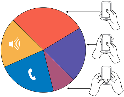
In over 40% of our observations, a user was interacting with a mobile phone without inputting any data via key or screen. Figure 1 provides a visual breakdown of the data from our observations.
Figure 1—Summary of how people hold and interact with mobile phones
To see the complete data set:
Voice calls occupied 22% of the users, while 18.9% were engaged in passive activities—most listening to audio and some watching a video. We considered interactions to be voice calls only if users were holding their phone to their ear, so we undoubtedly counted some calls as apparent passive use.
The users who we observed touching their phone’s screens or buttons held their phones in three basic ways:
- one handed—49%
- cradled—36%
- two handed—15%
While most of the people that we observed touching their screen used one hand, very large numbers also used other methods. Even the least-used case, two-handed use, is large enough that you should consider it during design.
In the following sections, I’ll describe and show a diagram of each of these methods of holding a mobile phone, along with providing some more detailed data and general observations about why I believe people hold a mobile phone in a particular way.
In Figures 2–4, the diagrams that appear on the mobile phones’ screens are approximate reach charts, in which the colors indicate what areas a user can reach with the finger or thumb to interact with the screen. Green indicates the area a user can reach easily; yellow, an area that requires a stretch; and red, an area that requires users to shift the way in which they’re holding a device. Of course, these areas are only approximate and vary for different individuals, as well as according to the specific way in which a user is holding a phone and the phone’s size.
Users Switch How They Hold a Mobile Phone
Before I get to the details, I want to point out one more limitation of the data-gathering method that we used. The way in which users hold their phone is not a static state. Users change the way they’re holding their phone very often—sometimes every few seconds. Users’ changing the way they held their phone seemed to relate to their switching tasks. While I couldn’t always tell exactly what users were doing when they shifted the way they were holding their phone, I sometimes could look over their shoulder or see the types of gestures they were performing. Tapping, scrolling, and typing behaviors look very different from one another, so were easy to differentiate.
I have repeatedly observed cases such as individuals casually scrolling with one hand, then using their other hand to get additional reach, then switching to two-handed use to type, switching back to cradling the phone with two hands—just by not using their left hand to type anymore—tapping a few more keys, then going back to one-handed use and scrolling. Similar interactions are common.
One-Handed Use
While I originally expected holding and using a mobile phone with one hand to be a simple case, the 49% of users who use just one hand typically hold their phone in a variety of positions. Two of these are illustrated in Figure 2, but other positions and ways of holding a mobile phone with one hand are possible. Left-handers do the opposite.
Figure 2—Two methods of holding a touchscreen phone with one hand
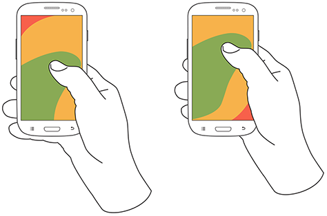
Note—The thumb joint is higher in the image on the right. Some users seemed to position their hand by considering the reach they would need. For example, they would hold the phone so they could easily reach the top of the screen rather than the bottom.
One-handed use—with the
- right thumb on the screen—67%
- left thumb on the screen—33%
I am not sure what to make of these handedness figures. The rate of left-handedness for one-handed use doesn’t seem to correlate with the rate of left-handedness in the general population—about 10%—especially in comparison to the very different left-handed rate for cradling—21%. Other needs such as using the dominant hand—or, more specifically, the right hand—for other tasks may drive handedness. [4]
One-handed use seems to be highly correlated with users’ simultaneously performing other tasks. Many of those using one hand to hold their phone were carrying out other tasks such as carrying bags, steadying themselves when in transit, climbing stairs, opening doors, holding babies, and so on.
Cradling in Two Hands
Cradling is my term for using two hands to hold a mobile phone, but using only one hand to touch the screen or buttons, as shown in Figure 3. The 36% of users who cradle their mobile phone use it in two different ways: with their thumb or finger. Cradling a phone in two hands gives more support than one-handed use and allows users to interact freely with their phone using either their thumb or finger.
Figure 3—The two methods of cradling a mobile phone
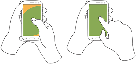
Cradling—with a
- thumb on the screen—72%
- finger on the screen—28%
With thumb usage, users merely added a hand to stabilize the phone for one-handed use. A smaller percentage of users employed a second type of cradling, in which they held the phone with one hand and used a finger to interact with the screen. This is similar to the way people use pens with their mobile devices. (We observed so few people using pens with their mobile devices—only about six—that I have not included them as a separate category in the data set.)
Cradling—in the
- left hand—79%
- right hand—21%
Anecdotally, people often switched between one-handed use and cradling. I believe this was sometimes for situational security—such as while stepping off a curb or when being jostled by passersby—but sometimes to gain extra reach for on-screen controls outside the normal reach.
Two-Handed Use
We traditionally associate two-handed use with typing on the QWERTY thumbboards of devices like the classic Blackberry or on slide-out keyboards. Two-handed use is prevalent among 15% of mobile phone users. In two-handed use, as shown in Figure 4, users cradle their mobile phone in their fingers and use both thumbs to provide input—much as they would on a desktop keyboard.
Two-handed use—when holding a phone
- vertically, in portrait mode—90%
- horizontally, in landscape mode—10%
Figure 4—Two-handed use when holding a phone vertically or horizontally
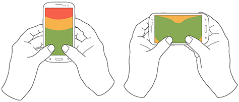
People often switched between two-handed use and cradling, with users typing with both thumbs, then simply no longer using one hand for input and reverting to using just one of the thumbs consistently for interacting with the screen.
However, not all thumb use was for typing. Some users seemed to be adept at tapping the screen with both thumbs or just one thumb. For example, a user might scroll with the right thumb, then tap a link with the left thumb moments later.
Also notable is the overwhelming use of devices in their vertical orientation, or portrait mode—despite theories about the ease of typing with a larger keyboard area. However, a large percentage of slide-out keyboards force landscape use. [5] All ways of holding a phone typically orient the device vertically, but for two-handed use, use of landscape mode was unexpectedly low. Though several of my clients have received numerous customer complaints in app store reviews for not supporting landscape mode.
What Do These Findings Mean?
I expect some to argue that one-handed use is the ideal—and that assuming one-handed use is a safe bet when designing for almost half of all users. But I see more complexity.
Some designers may interpret charts of one-handed use to mean that they should place low-priority or dangerous functions in the hard to reach area in the upper-left corner of the screen. [6] But I wouldn’t recommend that. What if a user sees buttons at the top, so switches to cradling his phone to more easily reach all functionality on the screen—or just prefers holding it that way all the time?
Even if we don’t understand why there are such large percentages for handedness, we cannot assume that people will hold their phone in their right or left hand. When targeting browsers or mobile-device operating systems, I am always uncomfortable ignoring anything with a market share over 5%. That’s a general baseline for me, though I adjust it for individual clients or products. But I would never, ever ignore 20 to 30% of my user base. While I am personally very right handed, now that I have these numbers, I am spending a lot more time paying attention to how interactions might work when using the left hand.
Another factor that I had not adequately considered until putting together these diagrams is how much of the screen a finger may obscure when holding a mobile phone in any of these ways. With the display occupying so much of the device’s surface, this may explain part of the reason for a user’s shifting of his or her grasp. As designers, we should always be aware of what content a person’s fingers might obscure anywhere across the whole screen. Just remembering that a tapping finger or thumb hides a button’s label is not enough.
Now, my inclination to test my user interface designs on devices is stronger than ever. Whether I’ve created a working prototype, screen images, or just a paper prototype that I’ve printed at scale, I put it on a mobile device or an object with similar dimensions and hold it in all of the ways that users would be likely to hold it to ensure that my fingers don’t obscure essential content and that buttons users would need to reach aren’t difficult to reach.
Next Steps
I don’t consider this the ultimate study on how users hold mobile devices, and I would like to see someone do more work on it, even if I’m not the one to carry it out. It would be very helpful to get some solid figures on how much people switch the ways they’re holding their mobile phone—from one-handed use to cradling to two-handed use. Having accurate percentages for how many users prefer each way of holding a phone would be useful. Do all users hold their phones in all three of these ways at different times? This is not entirely clear. It would also be helpful to determine which ways of holding a mobile phone are appropriate for specific tasks. With clear correlations between tasks and ways of holding a phone, we could surmise likely ways of holding devices for particular types of interactions rather than making possibly false assumptions based on our own behavior and preferences.
- See more at: http://uxmatters.com/mt/archives/2013/02/how-do-users-really-hold-mobile-devices.php#sthash.dqoD7V8L.dpuf
Designing Beyond The Device
Interaction Designers need to focus on creating cultural patterns, not screens. How do we do this? We have to understand how meaning gets made in a world of device fragmentation.
More about devicePixelRatio
Article: Source
It occurs to me that my recent post about devicePixelRatio was a bit cryptic and short. So I will givde some extra examples in this post. Also, I did some additional research that takes screen.width into account.
Remember the definition:
devicePixelRatio is the ratio between physical pixels and device-independent pixels (dips) on the device.devicePixelRatio = physical pixels / dips
Here is the test page. It shows the devicePixelRatio of your browser. Note that on most desktops and laptops it’s still 1. Retina laptops show 2 in Safari and Chrome 22, 1 in Chrome up to 21(?) and Opera, and undefined in IE and Firefox. (By the way, the 2 value is not always correct. See below.)
iOS
Similarly, non-retina iOS devices will show 1, while retina devices will show 2. That’s because the actual number of pixels has doubled, but the browser pretends it hasn’t so as not to upset the carefully crafted 320px-wide layouts people made especially for the iPhone. Sites with a meta viewport of device-width should not suddenly become 640px wide, after all. So the dips width remained at 320px, and 640/320 = 2.
On iOS the situation is relatively simple: there are only the values 1 and 2. On most other platforms the situation is also simple because the real physical pixel count is equal to the dips count, which gives a devicePixelRatio of 1.
Android
The main complications come from Android; or rather, from the many modern devices that sport a retina-like display that has significantly more pixels than just 320, most of which (in my collection) run Android.
In fact, Google’s Nexus One was the first device ever, as far as I know, to use dips; even before the iPhone. Meanwhile the Galaxy Nexus and the Galaxy Note both also sport retina-like displays. A closer look at these three devices is instructive.
The Nexus One has a physical resolution of 480x800, but the Android WebKit team decided that the optimal width for a web page viewed in portrait mode was still 320px. Thus the dips abstraction layer remained 320 pixels wide, anddevicePixelRatio became 480/320 = 1.5.
On the same phone, Opera Mobile reached the same conclusion. Its dips layer is also 320px wide, and its devicePixelRatio is also 1.5.
(Incidentally, the BlackBerry Torch 9810 with OS7 also has 480 physical pixels, and the BlackBerry WebKit team decided to stick to adevicePixelRatio of 1. In retrospect it might have been better if they’d moved to 1.5, too; 480px wide sites are somewhat hard to read on the Torch’s display.)
The Galaxy Nexus has a significantly upped pixel count of 720x1200. The Android team decided to up the width of the dips layer, too, to 360px. This makes devicePixelRatio 720/360 = 2. The Chrome team decided on the same, as did TenCent’s QQ browser.
Opera, however, disagreed, deciding to stick with a dips width of 320px. This yields a devicePixelRatio of 720/320 = 2.25. (When I saw this value I thought Opera had a bug here, but it does not. The value is perfectly consistent with the physical and dips widths.)
The Galaxy Note, finally, has a physical pixel count of 800x1200. Here all browsers decided on the same ratio as on the Galaxy Nexus: Android WebKit, Chrome, and QQ stick with 2 (which means a dips width of 400px), while Opera sticks to 2.25, arriving at the slightly odd dips width of 356px.
You still with me? The various browsers are essentially all playing their own game here. That’s perfectly fine as long as they report the correctdevicePixelRatio.
Relation with other properties
Anyway. devicePixelRatio works fairly consistently across browsers (see my earlier report for the exceptions); and the relation betweendevicePixelRatio, physical pixels, and dips is a purely mathematical one, meaning that if you know two of them you can calculate the third.
But how do we find either the dips width or the physical pixel width?
Dips are easy: give your page a <meta name="viewport" content="width=device-width">, read outdocument.documentElement.clientWidth, and most browsers will give you the width of the layout viewport, which now equals the dips width. (Here is the necessary compatibility table.)
If you can’t use this calculation, though, things get more hairy. We’re forced to use the values given by screen.width. But what do these values mean?
If you think their meaning depends on the browser, congratulations! You’re starting to understand the mobile world.
- On iOS Retina devices,
screen.widthgives the width in dips. So both a retina and a non-retina iPad report 768 in portrait mode. - On the three Android devices,
screen.widthgives the width in physical pixels; 480, 720, and 800, respectively. All browsers on the devices use the same values. (Imagine if some browsers on the same device used dips and others physical pixels!)
Vasilis has a nice theory: Apple added pixels because it wanted to make the display crisper and smoother, while the Android vendors added pixels to cram more stuff onto the screen. It’s one way of looking at these differences: it explains why Apple emphasises the continuity from non-retina to retina, while Android concentrates on the raw pixel count.
So what do other browsers on other OSs think? The problem here is that I can use only those browsers that have a different dips count than physical pixel count, and I don’t have too many of those. The single one I could get a clear reading from, IE9 on the Nokia Lumia Windows Phone, agrees with Android and gives the physical pixel count in screen.width. It does not supportdevicePixelRatio, though, so I can’t test it fully.
So my conclusions on the mobile side are:
devicePixelRatiois mostly trustworthy on most browsers.- On iOS devices, multiply
devicePixelRatiobyscreen.widthto get the physical pixel count. - On Android and Windows Phone devices, divide
screen.widthbydevicePixelRatioto get the dips count.
Here’s a nice browser compatibility conundrum. It’s even worse than normal because I’m not sure what the answer should be.
Retina MacBook
Finally, a word about the new retina MacBook. Its devicePixelRatio is (supposed to be) 2, but the situation is more complex than you’d think, because you can change the resolution. What you change is the size of something that’s kind of a dips layer (though not really). In any case, the point here is that devicePixelRatio doesn’t change.
The physical pixel count of a retina MacBook is 2800x1800, and the out-of-the-box resolution is 1400x900. Counting this resolution as kind-of a dips layer, a devicePixelRatio of 2 is correct.
Point is, when you change the resolution to 1920x1200 devicePixelRatioremains 2. Strictly speaking that’s wrong — it should become 1.5. However, you could also argue that a MacBook’s resolution is not the same as a dips layer, in which case devicePixelRatio has a different definition on desktop/laptop. (Which one? Dunno.)
In any case, what Apple has done here is standardise on only twodevicePixelRatio values: 1 and 2. If you see 2 you know that you can serve retina-optimised images, while a 1 says you should serve normal images.
I’m not a big fan of serving special retina images because it makes the web too heavy — especially over a mobile connection. Nonetheless people will do it.
If you use this sort of detection, please remember to build in a case for whendevicePixelRatio is neither 1 nor 2 but, for instance, 1.5 or 2.25.
Update: Turns out Opera’s value depends on the zoom level. And I wouldn’t be surprised if the same goes for other browsers. I did not test this. Maybe later.
- interactive
- interaction
- installation
- design
- led
- light
- art
- technology
- projectionmapping
- projectmapping
- robotics
- ui
- mobile
- projection
- interactivedesign
- lightdesign
- apple
- web
- 3d
- ux
- userinterface
- lightart
- robot
- artinstallation
- touchscreen
- application
- app
- webdesign
- touch
- motion
- responsive
- adobe
- multitouch
- future
- robots
- drone
- photoshop
- productdesign
- ledinstallation
- lightsculpture
- video
- user experience
- iphone
- creative
- interactivelight
- digitalart
- motiondesign
- ar
- 3dprinting
- responsivedesign
- augmentedreality
- drones
- kinetic
- data
- development
- kinect
- microsoft
- display
- immersive
- process
- painting
- timelapse
- dronerobotics
- 3dprojection
- ios
- vr
- virtualreality
- earth
- ai
- device
- user interface
- engineering
- laser
- lightpainting
- kineticsculpture
- lightinstallation
- touchinstallation
- animation
- programmableleds
- graffiti
- interactions
- neon
- performance
- leapmotion
- watch
- mobiledesign
- pixel
- environment
- exoskeleton
- interactiveenvironment
- sound
- lcd
- social
- leds
- lukew
- artlight
- patterns
- internet
- carui
- November 2011 128
- December 2011 65
- January 2012 25
- February 2012 27
- March 2012 33
- April 2012 31
- May 2012 16
- June 2012 32
- July 2012 20
- August 2012 37
- September 2012 24
- October 2012 34
- November 2012 31
- December 2012 6
- January 2013 21
- February 2013 11
- March 2013 10
- April 2013 35
- May 2013 45
- June 2013 10
- July 2013 49
- August 2013 33
- September 2013 40
- October 2013 57
- November 2013 31
- December 2013 28
- January 2014 86
- February 2014 49
- March 2014 24
- April 2014 40
- May 2014 6
- June 2014 9
- July 2014 1
- August 2014 34
- September 2014 30
- October 2014 45
- November 2014 21
- December 2014 6
- January 2015 5
- February 2015 17
- March 2015 18
- April 2015 14
- May 2015 1
- June 2015 10
- July 2015 4
- August 2015 1
- October 2015 11
- March 2016 4
- December 2016 18
- September 2017 6
- October 2017 13
- November 2017 5
- June 2018 8
- July 2018 2
- November 2018 7
- February 2019 8
- March 2019 6
- July 2019 1
- August 2019 1
- October 2019 1
- July 2020 5
- November 2020 9
- December 2020 1
- January 2021 1
- April 2021 1
- May 2021 9
- June 2021 3
- August 2022 3
- May 2023 2
- September 2023 1
- May 2025 6