RESPONSIVE PHILOSOPHY

The next generation of the responsive web.
Responsive design, which allows designers and developers to build websites that adapt to every screen size, is one of the most empowering web tools to be adopted in the last decade.
User Experience Interface Design
Welcome to the UX/UI Design Fundamentals Prep Course for the Bitmaker Labs User Experience & Interface Design 12 week immersive.
This course is intended to develop you as a strong Product Designer with front-end development knowledge. You’ll examine the fundamentals of user-centred design, including user research, information architecture, interaction design, UI design, and usability testing. By the end of the course, you will be able to design and build basic prototypes using Adobe Illustrator, HTML, CSS, basic JavaScript and jQuery.
Structure of this Prep Course
There are five main parts to this prep-course. They are not intended to replace the actual curriculum, but are just here to get you started. It’s essential that you complete each part in order:
Part 1: An Introduction
Part 2: Tools of the Trade
Part 3: Researching Design
Part 4: Learning the Basics of Code
Part 1: An Introduction
Once the course gets started, we’ll have a lot to cover, so it’s important to get a good understanding of the fundamentals to start strong.
While you complete this prep course, you might have questions and may need a hand— that’s awesome. These are three resources to help you out.
1. Designer News: https://news.layervault.com/
Designer News, a community of people in design and technology. Launched on Dec 31, 2012 as a place to discuss and share interesting things in our industry.
Keep an eye out on Designer News to get insights on activity in the design community.
2. Stack Exchange: http://ux.stackexchange.com/
User Experience Stack Exchange is a question and answer site for user experience researchers and experts
3. Quora: http://www.quora.com/User-Experience
A participation-based question-and-answer website where questions are created, answered, edited and organized by its community of users.
Part 2: Tools of the Trade
We’ve broken down this section of the tutorial between all the tools you’ll need to know to make sure you’re well equipped with a jump start into getting down to design & development from Day 1.
1. Get a sketchbook / notebook, a great pencil, and an eraser.
This is the most important part of generating great ideas in design. You don’t have to get a fancy sketchbook, or a fancy pen, so don’t feel the need to splurge. You can pick something up from:
DeSerres: http://www.deserres.ca
Currys: https://www.currys.com
Or the Dollar Store: I’ve loved my Dollar Store notebooks
I recommend to start by getting a big Rodeo notepad to give you room to think things through on paper.
2. Adobe Creative Cloud
It’s important to get a firm understanding of Adobe Illustrator and Photoshop for the work we’ll be doing in this course. We’ll learn how to communicate workflows and create beautiful interfaces.
You can get Creative Cloud here: https://creative.adobe.com/
3. InVision App
Arguably the most important tool in our toolbox, the InVision App let’s you share work, build interactive prototypes with images, and get feedback from users, colleagues, and friends.
Create an account here: http://www.invisionapp.com/
4. Dribbble
Inspiration comes from great people and places. Sign up for a Dribbble account to get inspired by interesting interfaces. Dribbble is a heavily UI focussed site, and helps you get some great ideas for UI’s and Branding. It’s also a great tool to get freelance work if you’re interested in UI focussed work.
Sign up for Dribbble here: https://dribbble.com
5. Google Chrome
It’s free, fast, and easy to use. We’ll be using it to preview work, and manipulate designs live in the browser with built in inspector tools.
Download Google Chrome here: http://tinyurl.com/qxfc8kh
5. Get the Panda App extension for Chrome
Panda App shows is a quick way to see the most popular shots on Dribbble. Every time you open a new browser tab, you’ll get a fit of inspiration.
Download the Panda Chrome extension here: http://usepanda.com/
7. Dropbox
Create a dropbox account. We’ll be using it for storing *everything* and publishing your first site:
Sign up for Dropbox here: http://dropbox.com/
8. Sublime Text
Our favorite text editor! Armed with a number of time saving shortcuts and great syntax highlighting, Sublime Text is a very easy to use text editor. It’s also the industry standard for web developers. The free trial works just fine, although it frequently prompts you to purchase.
Download Sublime Text here: http://www.sublimetext.com/
9. Medium
Medium is a blog publishing platform. You’ll need this for your prep course.
Sign up here: http://medium.com
Your first task is to research and write about these elements of UX Design:
Research on each of these topics, and structure your findings in any way you’d like.
But do write them down on a piece of paper, or post-its, or a notebook.
Then write a series of blog posts on Medium with your findings. Take pictures of your research and include them in your posts.
To help you with structuring your topics, and get you thinking about questioning design, here are the topics of your blog posts. The ultimate point is to take away the ambiguity so that we’ll all be talking the same thing when we kick off the course, and actually tangbile conclusions to with each other.
Part 4: HTML & CSS
We don’t like to think of things in terms of hours, or tasks. We’d just like you to take the time to really dive into, and have fun with a web environment that teaches HTML & CSS.
Our UX/UI Fundamentals course will cover the same concepts that are introduced in this Code Academy course. The magic will be in applying them to real, hands on projects with a design focus.
To prepare, CodeAcademy has a great interactive tutorial to run you through the basics:
http://www.codecademy.com/tracks/web
Completing this code academy prep course is mandatory to start our program. Send section completion screenshots to design@bitmakerlabs.com
Part 5: Design & Code Your First Homepage
After you’ve completed the HTML/CSS course on CodeAcademy, you should be familiar with the basics of how to build a profile page for yourself.
1. Create a narrative
Your profile page should answer the following questions:
i. Who are you? Where are you from?
ii. What do you currently do? What do you want to do?
iii. Let’s see you! Do you have an avatar / picture?
iv. Have you done any type of design related work?
v. Have you built anything lately?
vi. Have you completed a non-design related project?
Answer these questions for that work:
i. Show us a picture / image of it
ii. Give it a title
iii. Describe what it is?
iv. What did you learn from this project?
v. How do you think it relates to UX Design?
2. Sketch a rough layout on paper
Sketch how you’d lay this content out on a single page site. Use your blog post #5 as inspiration and look for examples on Dribbble of designers home pages. Mine for example is pretty old right now (I can’t wait to design a new one with you when the course starts!), but it still tells a pretty good story.
3. Design directly in code
Once you’re done designing, using your sketches of the layout you’d like, and using the inspiration from your research in blog post v, develop a basic 1 page layout with your answers from task 1. Pay attention to things like: font-size for headers, sub-headers, and body copy, and font weight for all of these things as well.
We don’t want you to dwell too much on the prettiness of the colours, so use when deciding on a colour scheme, use this for inspiration (and actual colours!)http://flatuicolors.com/
4. Publish your site on Dropbox
Follow the instructions on this page to host your site on dropbox. It’s the fastest way to get your page out there. Share it on twitter with the hashtag #helloworldUX
http://www.maclife.com/article/howtos/how_host_your_website_dropbox
The Year of Interaction Design Tools
We’re six months in to 2014, and designers have the widest selection of interaction and prototyping tools to date. The community is blossoming, and bridging the gap from mockup to working prototype is now easier than ever.
Inspired by the upcoming Pixate, I’ve compiled a brief breakdown of the state of interaction design tools in 2014.

Webflow
https://webflow.com/
$16+ a month | Web app
Webflow is a web app that allows users to design websites in the browser and that are completely coded and live. Webflow’s friendly WYSIWYG editor gives designers full control over the output, including the appearance on mobile devices.
Webflow is continuously adding new features — including web fonts, video support, continued W3C compliance, interactive states — and it even includes hosting, too.

Marvel
https://marvelapp.com/
Free | Web app
Marvel is a free web app for prototyping for web and mobile designs. With Marvel, work is done entirely online — but syncs with your Dropbox, allowing you to easily pull in mockups from your private or company files. Marvel also supports PSD files — so you don’t have to convert files before creating prototypes.

Macaw
http://macaw.co/
$99 | Mac & Windows
Macaw is a desktop WYSIWYG design tool that outputs working, live code. It’s particular strength lies in creating responsive designs: Macaw’s built-in breakpoint editor makes it easy to create pixel-perfect designs at any screen size.
Although no coding knowledge is required, basic experience with HTML and CSS certainly enhances the final product.

InVision
http://www.invisionapp.com/
Free | Web app
InVision is not strictly an interaction design tool. InVision is used for prototyping and productivity. For prototyping, InVision allows you to add interactive events to static images to demo user interaction. At the same time, InVision’s project management features allow both stakeholders and designers to interact with prototypes before development begins.

Flinto
https://www.flinto.com/
$20 a month | Web app
Flinto allows you to create interactive prototypes that are useable both on the web and on a mobile device. Flinto allows designers to take static images and create prototypes that can be scrolled, rotated, and interacted with however you want.
One particularly enticing feature: Flinto prototypes can be used natively on Android and iOS devices — so, you can interact with your latest Instacart-for-Cats prototype on your own iPhone or Android device.
Quartz Composer
Quartz Composer is a developer tool created by Apple for use in motion graphics. Although not its original purpose, Quartz Composer has been adopted by the interaction design community as a code-free option for showing animation and state change in designs.
Quartz Composer can be daunting at first glance —with a significant learning curve. Luckily, support is growing. Facebook and IDEO have recently released new Quartz Composer libraries to make the program more accessible to first time users.

Origami
http://facebook.github.io/origami/
Free | Mac only
Origami is a Quartz Composer library created by the Facebook Design team to help prototype interaction on mobile devices. It allows designers to easily replicate common animation and interactions that occur on mobile devices — think animating image transitions or button presses.
Like Quartz Composer, Origami is particularly useful for prototyping, but it doesn’t output useable code. Its claim to fame: Origami was instrumental in designing Facebook’s most recent mobile app, Paper.

Avocado
http://labs.ideo.com/2014/05/27/avocado/
Free | Mac only
Like Origami, Avocado aims to improve Quartz Composer by adding a library that mimics common interaction on mobile devices.
While Origami focuses on interaction and animation, Avocado focuses on replicating common UI elements for iOS — for example, a working iOS keyboard — allowing users to prototype ideas for iOS without using any code.

Framer.js
http://framerjs.com/
Free | Javascript framework
Framer.js is a Javascript framework for prototyping event-triggered animation. Framer boasts many features — one being a built-in generator that processes layer groups from your own PSD files and outputs each group into layers that form the basis of your project.
Framer is a Javascript framework — so unlike other options here, it doesrequire an understanding of HTML, CSS, and Javascript. However, it’s not bound to any specific program. You can host it and interact with it anywhere and everywhere.
How designers can create interactive prototypes with Illustrator
At the start of a product idea the designer uses wireframes, mockups and prototypes to get feedback as fast as possible. Balancing the amount of time spent creating these temporary assets and reducing misinterpretation is key.
Tools like Illustrator give the designer the flexibility to experiment and draw without being forced to think about technical constraints early in the process. It’s great for quickly outputting static mockups, though Illustrator does not have great tools built-in to express interactions or different states in the product.
This article explains how you can quickly go from Illustrator to an interactive clickable prototype in the browser without the need for a developer, without writing HTML, in about 10 minutes.
The goal
As an example we’re going to prototype a small fruit application. The end result of this process is embedded below. Try hovering and clicking the first row.
The example contains some common interaction elements like hover states, tooltips, and dialogs. This is all easily layed out in one artboard. There’s no need to export and maintain different PNGs for each state of the product. You don’t have to upload your assets to a 3rd party tool. The technique that is about to be explained just exports one SVG with all the states in it. Sounds good? Let’s get our hands dirty.
Preparing your Illustrator document
There are two things to keep in mind when you’re going make a prototype out of your Illustrator document;
- Create a logical hierarchy and name the important elements (layers, groups and shapes) in your "Layers" palette. Keep in mind that we’re going to export the whole document in one SVG file.
- All elements should live in the same artboard. Hidden elements can later be made visible after a mouse event in the browser. e.g., a dialog can be hidden, but it should be the topmost element.
The name of an element will be used as its ID. This ID is later used to attach mouse event listeners to its element. This is what makes SVG so interesting for prototyping compared to bitmaps; every shape or group is its own element in the browser.
A group’s click area will be exactly the area its child shapes cover. To avoid potential gaps in its hit target you can add a big invisible rectangle (zero opacity) to the group. That rectangle should cover what you want the group’s hit target to be.
 When you’re done mocking up you can export the document as an SVG file using"Save as…" and select "SVG" from the file format list. In the export dialog you can optionally embed the images and fonts used inside the document. If you’re not going to manipulate the text or numbers using JavaScript you can select "Create outlines". This makes sure the fonts look the same on all computers.
The visual part is ready to go. The next step is creating a small separate document to which we’ll add the interactivity.
Setting up the playground
As promised there will be no converting to HTML, but we do need a place to connect the SVG to the interactive instructions. The easiest way to add interactivity through JavaScript and CSS to your document is by having a separate HTML load the SVG into it. By not directly editing the SVG file you can just keep exporting the Illustrator document without overwriting your additions. This will make it possible to iterate fast while still be able to quickly test the different states.
Create an HTML file called “fruit.html” in the same directory as the SVG file with the following contents:
<!doctype html>
<script src="http://code.jquery.com/jquery-1.11.0.min.js"></script>
<script>
  $.get('fruit.svg', function(data) {
    $(document.body).append(data.documentElement);
    init();
  });
  function init() {
    /* Add JavaScript here */
  }
</script>
<style>
  /* Add CSS here */
</style>
You don’t have to understand what’s going on in here. You do have to make sure ‘fruit.svg’ is the actual name of the file you exported from Illustrator. The comments point to where you’re going to paste the instructions from the next chapter.
You now created all three necessary files:
- An Illustrator file in which you can edit the visual part of the prototype.
- An exported SVG file that will be loaded by the browser (do not edit).
- An HTML file that contains the JavaScript.

The HTML is set up to load jQuery. jQuery will later help us add mouse event listeners and animations. The call to $.get() will load the specified SVG document you exported in the previus chapter. Inside the “style” element you can optionally apply CSS to the SVG elements. You could also use it to add a background or other branding to the page.
We’re almost at the fun part. Because the HTML embeds the SVG; both files need to be loaded from the same webserver. This is because of browser security restrictions. If you’re already editing on a webserver you don’t have to do anything. If you are working on your local computer you can use your favorite webserver or open your terminal and go to (type “cd” and drag the folder onto the terminal) the directory the files are in and run:
 python -m SimpleHTTPServer
You can now open your browser and go to http://localhost:8000 . You should see a link to the fruit.html file. Let’s get ready for the final step and add some interactions to the prototype.
Creating interactivity
A typical interaction you’ll want to create is showing a dialog when you click a certain button. We already drew and positioned a dialog in Illustrator and put it in a group called “dialog” and then hid the group.
You can easily show and hide layers, groups and shapes using jQuery’s $() selector. To create some great interactive prototypes you can get a long way with just usingclick, show, hide, mouseenter and mouseleave.
In the following code example we make the “dialog” group visible when the “row1” group is clicked.
$('#row1').click(function() {
  $('#dialog').show();
});
When the “closebutton” group in the dialog is clicked we hide the dialog again.
$('#closebutton').click(function() {
  $('#dialog').hide();
});
Another typical mouse interaction is showing a tooltip when a certain element is hovered over. The tooltip is completely mocked up in the Illustrator file so all we have to is make it visible when the “mouse enters” the “row1” group area. We hide it again when the mouse leaves that area.
$('#row1').mouseenter(function() {
    $('#tooltip').show();
});
$('#row1').mouseleave(function() {
    $('#tooltip').hide();
});
By copy and pasting these two examples you’ll be able to express a lot of different states in a normal application.
Download
I hope you enjoyed learning about this easy way of prototyping. If you love Illustrator like I do, I think you’ll find this process keeps a good balance between iteration speed and expressiveness.
Workflow for Designers
’m currently working on no shortage of responsive projects, all of which have great need for resolution-independent imagery. Since all the cool kids are going the SVG route, I figured I’d try my hand at it too. I seem to have arrived at a decent workflow for creating quick vector assets with really small file sizes. If anything, I’m just writing this down so I can remember it for next time.
A few quick notes
- I’m just focusing on the asset creation here and not details about implementation on either front- or back-end.
- I still do Photoshop comps, so the majority of my workflow centers around Photoshop visualization of elements and/or screens.
- There are a ton of great solutions that can automate this for you. However, if you’re anything like me, some of them may seem either overly complex or feel like a black box, or both. The workflow I describe below is mostly born of my desire to be anal-retentive about asset creation. Hmph.
As an example, let’s try and create the ever-popular social media navigation bar. However, you decide to do it—I assemble mine in Photoshop—my comp looks something like this:

I’ll then go through an measure the size of each icon in Photoshop by using the marquee tool wih the Info palette to get the actual pixel dimensions (shown zoomed in at 1200%):

I’ll then jump into Illustrator and create my vector graphic at that exact size:

I’ll make my document size the exact size of the graphic by choosing Object > Artboards > Fit to Selected Art.

From here, File > Save As… and choose “SVG” as the Format.

Keep the default options checked.

You’re going to have to create fallback PNG graphics, so now is a good time to do that. In Illustrator, Select > All and then Edit > Copy to copy the shape to your clipboard.
Switch back to Photoshop and choose File > New…. Photoshop will assume the new dimensions of the new file to be the dimensions of the shape in your clipboard, so just double check that those are the same dimensions of your vector shape.

Choose Edit > Paste. When the dialog box appears, choose “Pixels.”

Disable the visibility of the Background layer.

Choose File > Save for Web…. Choose the PNG-24 Preset and make sure “Transparency” is enabled.

Edit: in the comments below, Jamie Reynolds mentions generating the PNGfrom Illustrator as opposed to Photoshop. However, I’ve noticed a difference between the output; I find that Illustrator doesn’t do as well as Photoshop does with the aliasing. Check out the bottom row of pixels here; Illustrator makes some poorer choices for clarity, hence my desire to add one more step to generate a better graphic.

You should now have 2 raw files: an SVG and a PNG.

Time to optimize. If you don’t already have them, download and installImageAlpha and ImageOptim. Open ImageAlpha and drag your PNG into the window.

Choose File > Save As… and make sure “Optimize with ImageOptim” is enabled. Decide whether you want to overwrite your image or create a new one. Choose Save.
If ImageOptim isn’t open, this will launch ImageOptim. You’ll see that our original file size of 1KB has been reduced to 574 bytes. Huzzah! Let’s do this for our SVG as well.

Lucky for us, there are some really smart people out there that make our jobs easy. Check out SVGO, a great command line tool for optimizing SVGs. If you’re not into command line, there’s also a GUI called SVGO GUI. That’s my weapon of choice.
Just like ImageAlpha, crack open SVGO GUI and drag your SVG file in.Warning: this will automatically process your file, so if you still want to preserve your original, duplicate it before dragging into SVGO GUI. Voilà! Our 1KB SVG dropped down to 713 bytes.

And there you have it: a manual workflow for designers to create optimizedSVGs and PNGs. Enjoy!
14 Different Ways of Product Design
After my dribbble post with picture of a Diagram with very positive feedback and lot of questions, I was motivated to create this article about my process and what I’ve learned after 2 years of this journey.
It’s a bit hard to say that I’m always using this same process, but you can read it similar to an ideal process. I’ve divided this process into 4 parts — Pre-process, Work process, Post-process and tips for Productivity.

Pre-Process
1. I’m drawing
It doesn’t matter if it’s paper, a notebook or just a small piece of something. I need to share the ideas in my head. I need to put these ideas down where they can be saved and not forgotten. Consequently this means that I have some sketches on my bank statements, bills from restaurants, book covers etc.
 Sketch of old idea
However, for me it is ideal to have something tangible, for example, on Moleskine. It’s always nice to go through these lists from time to time, look at my old ideas and try to reinvent or recreate something for this particular project or different idea.
2. Collecting Pictures
 “An artist is a collector. Not a hoarder, mind you, there’s a difference: hoarders collect indiscriminately, the artist collects selectively. They only collect things that they really love.” — Steal like an Artist (Austin Kleon)
Another pre-process phase is the collecting of pictures, I do this everyday. There is definitely hundreds of styles on how to collect and view these images, however I particularly prefer old school style — Dropbox folder separate to different categories (Dashboards, iOS, Illustrations etc.). Then, when I receive an inquiry or project, I’m going through these images and I’m trying to find inspiration. Dropbox is pre-caching low quality previews of files so you’re able to list them without an internet connection.
3. Moodboard and Preparation
We have plenty of sites for inspiration — Dribbble, Behance, Pttrns, Pinterest etc. and it’s really easy to find similar projects like the one you have. Additionally, it could be a solution for a problem that you’re experiencing and you’re trying to solve.
So when I begin working on a new project, I always prepare a folder with — PSD, Screens, Inspiration and Resources folders. I’m saving everything to the Inspiration folder that I find on the internet and is related to this project.

It should be everything from swatches to full case studies from Behance. Yet it also could be pictures of attractive people if the app has users’ profiles. It sometimes happens that I don’t even use that folder but that’s different story!
Work Process
4. I don’t care about wireframes quality.
I’m not a big fan of spending half a year on wireframes. I also prefer it if a client has prepared wireframes.
A good client is one who has prepared his ideas on paper.
I’m taking wireframes as just more about understanding the purpose and not the actual final result. The final result matters about you and your UI / UX skills and ideas which you want to present. Wireframes can help with the imagination of how many screens you’ll need and what’s the client’s idea.
On another page of the wireframes is a nightmare for the designer in which someone wants just the replication of prepared wireframes and to use the right details from the wireframes. That’s monkey’s job not the designer’s. In this case, every designer would just quickly finish that job and run away from the project like Usian Bolt.
5. PSD — Big Canvas (back to the Illustrator)
When I started 7 months ago at Badoo, I saw how my colleague works (Hi Sasha!), I thought that he didn’t understand how Photoshop works. However, now I’m trying to get into this technique, and in fact this style make sense to me. It’s good to use this style when you’re working on something really big, for example, a web application or a rich dashboard.
Basically, I work with a big canvas for example 8000*5000 pixels. Furthermore, my work isn’t more than just creating one big UI kit. The work is much faster because you see every element together and I can easily see what’s happening in every state. Additionally, it is much quicker to make a screenshot for developers with a small flow or just one states for one thing.
6. All screens in one PSD
In another case, which is not that revolutionary or different. If I’m working on a mobile app I’m working in different extremes. That means — All screens are in one PSD.
 In folder 14 is another 12 designs of graphs
I know in this case it will be better to use Sketch, which could be really helpful with work. But I prefer one instead of 40 because it’s hugely quicker, I can easily pick one element from a different screen and copy that to another folder/screen. So that means if I change the background or a few icons on the top bar, I don’t need to change hundreds of other PSD’s.
7. Folders and Etiquette
I’m a tidy person in every respect — I have one icon on my desktop, folders per clients, per projects. Every folder is structured in the same way as I mentioned before. The same as in PSD. Every of my PSD’s is nicely structured in every folder. I use the rule that if you have more than 8 layers in folder then you should create a new folder. I think about my PSD’s like I’m preparing them for someone else. I’m not a big fan of naming layers because you can easily go through my folders.
But lately I’ve started working with @LukášKus and he always complains that he doesn’t have these folders in AE. Therefore, a particular situation always matters.
If you would like to know anything else about PSD Etiquette you can look at this — http://photoshopetiquette.com/
8. Communication with friends
A network of people who can provide you with relevant feedback is something critical for me. I can easily do mini user testings and listen to what people think about these specific problems This usually opens the doors to other solutions and other points of view for these problems. I do these calls/tests as much as I can in every state of my project or screen. Moreover, it doesn’t matter who you are testing. It could be anyone, I prefer to combine two segments — people from the community, the UX designers and normal regular users. This is because you’re usually working on project for regular users not for designers and UX principals.
9. Diagram
After my client or I prepare wireframes, I prefer to take them and merge them in one PSD. Then I try to think about interactions, what happens when I click here or there. Usually, we find a lot of missing screens and additional errors which clients or I don’t realise, when I was thinking about just one particular screen when I was preparing wireframes. For me, it’s this pre-prototype phase which I don’t consider a double job. It’s actually also a visual overview of all the screens and the elements. When I’m working on 15+ screens project it’s hard to keep the same visual style across the whole app and I can easily break the guidelines.
 3 different types of lines — first a normal line with the number of next screen. Second in app screen. Third — an external app or link
 How it looks with content
 Complete overview
About style — I use the same style similar to a lot of designers, however instead of spending a lot of time with creating these lines across whole canvas, I use circles with the numbers of the next screen. It’s a little bit like gamebooks which I was reading back in the days, but it’s a better solution than creating of printed circuit boards. You can see more states on the picture.
I add a link for the Diagram PSD for a better understanding these diagrams(The iPhone render is done by GraphicBurger)
Post Process — Guidelines
And we are finally close to end of the process, the last part is the creation of the guidelines and the final check for visual consistency. It turns out for me like such an important part of the process for small and also for big projects. Usually, when I work on a big project I want to change something in this part of process and I’m never a 100% sure that I’ve changed every of these properties. I use these for myself and also for developers to be sure that they won’t use 50 shades of grey or 14 different sizes of fonts.
10. Colour Specs
The specification of colours is one of the first thing which I try to keep in mind. It’s really nice in these flat design age to keep as few colours as possible for the buttons and for text. It’s nice to prepare this in your PSD like a painter’s palette or like swatches in Photoshop, which is basically the same.

11. Typo Specification
One other thing which can remind you of the logo specification is the guide for text sizes and the weight of fonts across the application. Again, it’s good for developers, but also for your overview.

12. UI Kits
The UI kit is a really important thing if we are talking about consistency across company apps and websites. It’s also important when you’re working in team of designers or you have more front-end developers who work on that project. I can use a UI kit in way that I’m always taking these elements from UI Kits. Also the developers can easily see how this button will look on hover and they don’t need to ask about everything.
Note: I’ve realised that in big companies, it is a big problem that nobody has heard about these things and teams basically re-create these same CSS lines again and again. Then you realised that you have 3 different interpretations of one button in 3 different applications. So you can’t forget about consistency.
Productivity
13. Todo
My key aspect of tidiness is working with todo lists. It doesn’t matter what type of app or paper you use. I prefer Things by Cultured Code and sometimes piece of the paper. That feeling of completing lists is always great. I was possessed with accepting every project which ends up in my email inbox, but now I’ve realised that it is much too comfortable to focus on 1-2 projects and 100% focus just on these 2 projects and then go to another one instead of fighting with 5 different ones.
“If you chase two rabbits, you will not catch either one.” — Russian Proverb
14. Goals
It’s really nice to know what you want to achieve, but also don’t be too bound to them. I make goals for 14 days (like a sprint) and quarterly goals. Also, I try to set these goals in way that I can achieve some new experiences (for example: make my first animation in After Effects) and also keep working on current things (finish 2 Behance case studies).
And what else?
I don’t use a mouse, just a tablet, I don’t have Tools panel I have learned all keyboard shortcuts. For streaming Photoshop to iPhone I use Skala Preview and I want to learn After Effects and Sketch. For prototyping, I use InVision App for web projects and the newly MarvelApp for iOS designs. It’s quicker for me to work with a pen instead of dragging and swiping on the iPhone screen. I sometimes still work with PopApp for some early prototypes, when I have time on the Tube for clicking and dragging on Screen.
The last few words
It’s really hard to say that I will always complete and follow the exact process for each project, because I sometimes skip some steps or I start in Photoshop if I see that the design in my mind and I have an exact idea about that.
In companies where I have worked, I’m still not experiencing real feedback, user testing and these things where designers can profit and take and experience them for thinking about new projects or updates for the current one. Especially User Testings, these change the thinking about all the things and show us that regular users usually work in completely different ways than we expect.
The End
I’d be happy to hear about your work processes, which steps you usually take in your personal projects or your thoughts about additional steps in my process.
Two Keys to Building a Great Product

In the product group at HubSpot there are two guiding principles to building amazing products, they come from David Cancel and he’s 100% right in my experience:
- Be customer-driven
- Show meaningful progress
Each of these means different things at different stages in the product lifecycle, but they are strong guiding principles from early stage research through MVP to mature product.
Here’s a starting point to think about how to lean into each of these principles, and a view of how that changes as a product comes to market and matures.
Pre-prototype
- Customer-driven: Narrow your focus to your target go-to-market end user. Find where they spend their time, where their pain is. Watch them in their natural environment.
- Meaningful progress: Consider doing a minimum of X interviews, and/or defining the output as being the top Y painpoints to start addressing.
MVP
- Customer-driven: Be insanely impatient to get an early working product in front of one user. That’s the hardest part, getting one person to the point where they would pay, or be seriously disappointed if you took the product away from them. super hard stage, from zero to one user. Then move from one user to ten, another extremely hard stage. Put your cell phone in the product, follow up with people as they use the product, and watch every motion they take using it. Start doing user testing as well.
- Meaningful progress: Live and die by activated user count. From zero to one, and from one to ten.
Growth phase
- Customer-driven: The product team should directly support their customers. When applicable work with sales to understand how to iterate on *validated* learnings - not “all i need to close every deal is XYZ” requests but actual records of painpoints, blockers, competitive landscape, potential for product differentiation, shortcomings against existing solutions, etc. It helps here to have consultative sales folks who don’t do “feature dumps” but rather do a great, scalable job of customer pain discovery. If product/dev can overhear these conversations some magic can happen :)
- Meaningful progress: Measure, chart and distribute to the team: active users, activation rate, recurring revenue, net churn, referral loop, tickets/customer (whatever makes the most sense as a yardstick for product/market fit). Company demo (monthly) of new features LIVE for real customers, not mockups or qa.
Mature product
- Customer-driven: Record and distribute top support inquiry drivers, measure decrease in these drivers month over month. Heavy use of user testing to optimize the core flows and usage patterns in the product.
- Meaningful progress: Measure, chart and distribute to the company: tickets/customer, call drivers (and delta month-over-month), uptime/availability, performance/speed. Continue company demos, include performance improvements in addition to features.
Hope someone out there finds this useful, it’s been a breakthrough for me and my colleagues to embrace these principles and to dive deeper and deeper on both.
Customizing Help & Tips By Input Type
On today’s multi-device Web, your audience might be using a mouse, keyboard, touchscreen, trackpad, or increasingly, more than one of these input types to interact with your service. Given all these possibilities, how do you let people know how they can get things done in your app?
A common way to provide relevant bits of guidance inside an application is throughinline help. Inline help is positioned where it’s most useful in an interface and made visible by default so people don’t have to do anything to reveal it. This makes it an effective way to tell people how to use an interface. But what happens when those instructions vary by input type?
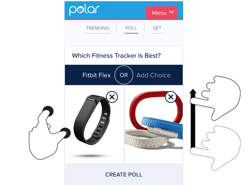
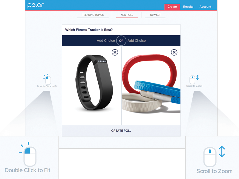
For instance, we recently built a fully responsive Web application that can be used on smartphones, tablets, desktops, and more. In this application, people can add and manipulate images by zooming, resizing, and moving these images around. Depending on the input type their device supports, however, they have different ways of accomplishing these tasks.
To position an image using touch, you simply drag it with your finger. Zooming-in and zooming-out is accomplished through pinch and spread gestures. Sizing an image to fit happens through a double-tap action.
These same features are supported on mouse and keyboard devices as well. To move an image around, click and hold to drag it. Zooming in and out happens with the scroll wheel or a multi-touch gesture on the trackpad. Sizing an image to fit takes a double-click of the mouse.
As you can see, the touch and mouse actions are similar but not the same. We were also concerned that while touch users are quick to pinch and spread when trying to zoom an image, mouse users are less familiar with using scroll wheels and two-finger trackpad gestures to accomplish the same thing. So we wanted to let our mouse users know what’s possible with a few simple bits of inline help.
Easy, right? Just check if someone’s device has a mouse or trackpad attached and reveal the tip. Well, no.
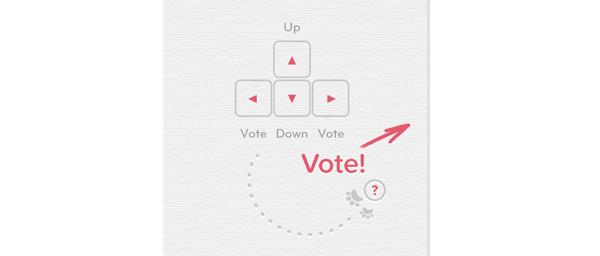
On an earlier project, we faced a similar situation. While our smartphone and tablet users could easily interact with our lists of polls by scrolling and voting with their thumbs, mouse and keyboard users had more work cut out for them. They couldn’t simply keep their fingers in one place and vote, scroll, vote.
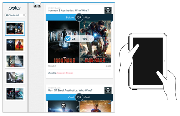
So we developed a keyboard interaction that allowed people to vote with left/right keys and move through polls with up/down keys. While this made keyboard users much faster and effective, we again were faced with a hidden interface: people didn’t know keyboard voting was possible unless we told them.
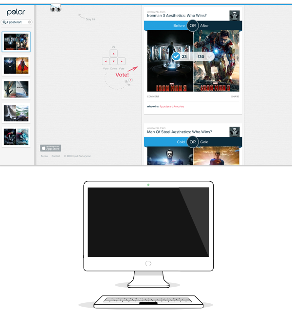
That meant we had to detect if a keyboard was present and surface a simple inline tip that explained the voting interface. After a few failed attempts at doing this, I reached out to friends on the Internet Explorer team at Microsoft. After all, if anyone would have a good handle on how to manage different input types on the Web, it would be the company with a Web browser that not only runs on phones, tablets, laptops, and desktops but hybrid devices and even game consoles as well.
Sadly, we learned there’s not a great way to do this in Web browsers today and browser makers are hesitant to reveal information like this in a navigator.hardware object because of concerns it could be used to fingerprint users. So instead, we opted to proxy the presence of a keyboard using screen width. That is, if the screen is wide we assume there’s a higher chance of a keyboard being present and show the keyboard interface tip by default.
This is the same solution we now have in our new publisher tool. When the screen crosses a certain width, we reveal two inline tips explaining how to zoom and fit an image using a mouse.
As I’ve written before, using screen width as a proxy for available input types is not ideal and increasingly unreliable in today’s constantly changing device landscape. But the alternative solutions don’t seem much better.
For instance, we could provide a help section that explains how to do things with every input type. But then we loose the immediacy and effectiveness of concise inline help. We could wait until someone interacts with the app to determine if they are a touch or mouse user, save that information and display device-appropriate tips from that point on. But even if we get this info up front it can change as people switch between touch screens and trackpads or their mouse.
While the need for input-appropriate help text in a Web application may seem like a small detail, it’s reflective of the broader challenge of creating interfaces that not only work across different screen sizes but across many different capabilities (like input type) as well. Inline help is just one of many components that need be rethought for today’s multi-device Web.
- interactive
- interaction
- installation
- design
- led
- light
- art
- technology
- projectionmapping
- projectmapping
- robotics
- ui
- mobile
- projection
- interactivedesign
- lightdesign
- apple
- web
- 3d
- ux
- userinterface
- lightart
- robot
- artinstallation
- touchscreen
- application
- app
- webdesign
- touch
- motion
- responsive
- adobe
- multitouch
- future
- robots
- drone
- photoshop
- productdesign
- ledinstallation
- lightsculpture
- video
- user experience
- iphone
- creative
- interactivelight
- digitalart
- motiondesign
- ar
- 3dprinting
- responsivedesign
- augmentedreality
- drones
- kinetic
- data
- development
- kinect
- microsoft
- display
- immersive
- process
- painting
- timelapse
- dronerobotics
- 3dprojection
- ios
- vr
- virtualreality
- earth
- ai
- device
- user interface
- engineering
- laser
- lightpainting
- kineticsculpture
- lightinstallation
- touchinstallation
- animation
- programmableleds
- graffiti
- interactions
- neon
- performance
- leapmotion
- watch
- mobiledesign
- pixel
- environment
- exoskeleton
- interactiveenvironment
- sound
- lcd
- social
- leds
- lukew
- artlight
- patterns
- internet
- carui
- November 2011 128
- December 2011 65
- January 2012 25
- February 2012 27
- March 2012 33
- April 2012 31
- May 2012 16
- June 2012 32
- July 2012 20
- August 2012 37
- September 2012 24
- October 2012 34
- November 2012 31
- December 2012 6
- January 2013 21
- February 2013 11
- March 2013 10
- April 2013 35
- May 2013 45
- June 2013 10
- July 2013 49
- August 2013 33
- September 2013 40
- October 2013 57
- November 2013 31
- December 2013 28
- January 2014 86
- February 2014 49
- March 2014 24
- April 2014 40
- May 2014 6
- June 2014 9
- July 2014 1
- August 2014 34
- September 2014 30
- October 2014 45
- November 2014 21
- December 2014 6
- January 2015 5
- February 2015 17
- March 2015 18
- April 2015 14
- May 2015 1
- June 2015 10
- July 2015 4
- August 2015 1
- October 2015 11
- March 2016 4
- December 2016 18
- September 2017 6
- October 2017 13
- November 2017 5
- June 2018 8
- July 2018 2
- November 2018 7
- February 2019 8
- March 2019 6
- July 2019 1
- August 2019 1
- October 2019 1
- July 2020 5
- November 2020 9
- December 2020 1
- January 2021 1
- April 2021 1
- May 2021 9
- June 2021 3
- August 2022 3
- May 2023 2
- September 2023 1
- May 2025 6