How to design for thumbs in the Era of Huge Screens

After years of resistance, Apple’s iPhone 6 announcement last week officially signaled the Dawn of the Era of Huge Screens.
And it’s going to crash into existence in a big way. Just this Monday,Apple announced that they’d sold over four million pre-orders for the phones the opening night of pre-orders. In only one night, they sold almost half of what they sold the entire opening weekend last year for iPhone 5s and 5c.
So it’s looking like the 3.5” and 4” screens of yore will start their inevitable decline very quickly. That means that those of us who’ve gotten comfortable building apps, responsive sites and mobile-optimized web views with the old ways in mind have some learning to do (myself included).
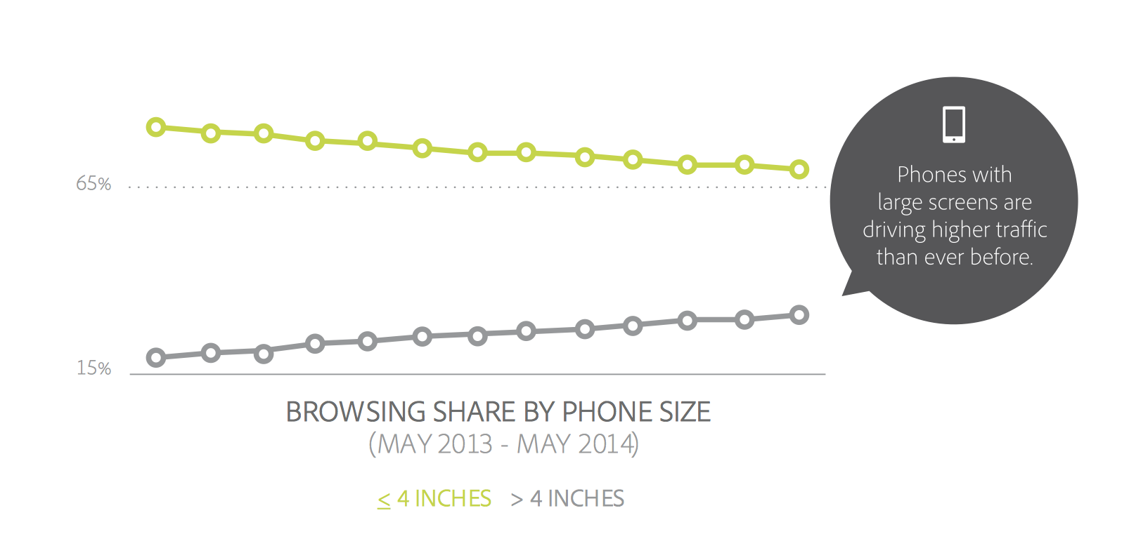
The decline is already in motion. Adobe’s 2014 Mobile Benchmark Report claims that mobile browsing among phones with 4” screens or smaller is down by 11%.
That means that learning how to design for thumbs is now more important than ever. Luckily, it helps that these phone display sizes are going to be practically universal. A cursory examination of the most popular Android screen sizes points to a range of 5.1” and 5.7”.
Apple’s changes will make our lives easier as smaller screen sizes die off. But only if we learn to adapt our designs.
If not, the future is going to be pretty painful for those thumbs.
This is especially important for those of us who’ve only been building iOS apps. All those design tradeoffs we thought we never had to worry about are suddenly right here in front of us — in an avalanche of pre-orders.
DESIGNING FOR THUMBS?
What does it mean to design for thumbs? It means building interfaces that are the most comfortable to use within our thumb’s natural, sweeping arc.
But this gets complicated. We unconsciously adjust the way we hold our phones to reach certain controls in various areas of the screen. During any given day, I’ll wager that you stretch your grip, choke up on the phone, or angle it in ways that make reaching difficult areas easier.
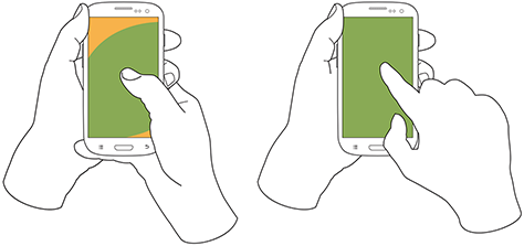
But we have to start somewhere. Research suggests that most of us hold our phones in the following way — with the bottom of the thumb anchored on the lower-right-hand corner:

This assumption comes from a study that mobile expert Steve Hoober conducted with 1,333 people early last year. He discovered that people held their phones in the following ways:
- one handed: 49%
- cradled: 36%
- two handed: 15%
Handedness figures were also instructive:
- right thumb on the screen: 67%
- left thumb on the screen: 33%
Hoober notes that left-handedness figures in the population are around 10%. So the observed higher rate of left-handed use could be correlated with people doing other things at the same time — smoking, riding a bike, drinking coffee, eating currywurst, etc.

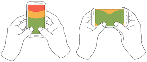
THE THUMB ZONE
The Thumb Zone is a heat map of sorts. It’s a best guess for how easy it is for our thumbs to tap areas on a phone’s screen.
Let’s use Hoober’s research to create a Thumb Zone map representing what seems to be the most common use case:
- one-handed use
- right thumb on the screen
- thumb anchored in the lower-right-hand corner
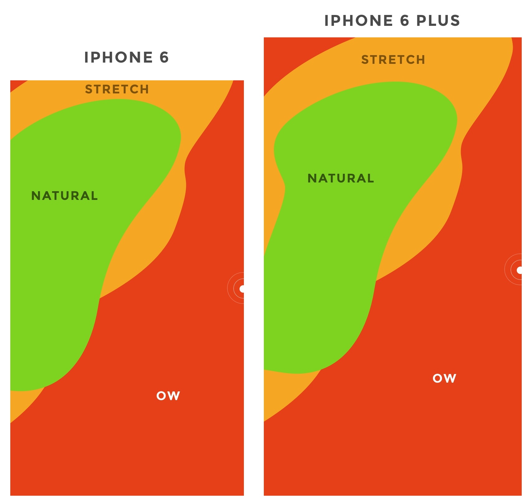
Here's the Thumb Zone heat map applied to every iPhone display size since 2007:

Here's a more direct comparison of the iPhone 6 and iPhone 6 Plus next to each other:

You’ll notice that the “safe” green zone stays roughly the same (more on why the iPhone 6 Plus is different in a second). That’s because our thumbs don’t magically scale with the screen size. And that’s also unfortunate, because I loved Dhalsim in Street Fighter as a kid.
But what changes is the sheer amount of “Ow” space, which becomes startlingly apparent with the iPhone 6 Plus.
Furthermore, you’ll notice how the shape of the “Natural” zone changes for the iPhone 6 Plus. That’s because it requires a different type of grip due to its size, using your pinkie finger as a stabilizer. It surprised me how different the experience was.
A note: my thumb doesn’t reach fully across the phone’s screen. Maybe you have bigger hands than I do. So terms and conditions certainly apply.
CHOKING UP
Let’s analyze how the Thumb Zones change when you shift your grip. Sometimes you might be in a situation where it’s easier to tap the phone with your thumb’s anchor at the vertical midpoint.
Here’s an illustration of this in action for iPhone 6 and iPhone 6 Plus:
REACHABILITY
Choking up might not be necessary, though, with iOS 8's "Reachability" feature. (That is if Apple takes the opportunity to teach people about its existence). By double-tapping the home button (not the same as "clicking" to display running apps), iOS will push the top of the screen down within one's grasp.
And here's how Reachability looks with the Thumb Zone overlaid on the iPhone 6 Plus. Notice anything?

Yes, Apple's demonstration images places the thumb in exactly the "Natural" zone.
Another observation on Reachability, as pointed out by John Gruber: "Reachability on the 6 Plus moves things further down the display, percentage-wise, than it does on the 6 — it’s all about moving the top of the display to a typical thumb’s length from the bottom of the device."
Here's that in action:

WHAT’S IT ALL MEAN?
Mobile screen sizes on the whole are becoming more similar, and that’s a good thing. But it also means that we can’t just treat screens in the 5.5” range simply as a scaled-up version of a smaller phone. Grips completely change, and with that, your interface might need to do so, as well.
I think prototyping will become even more important. So if you haven’t jumped on that train, now’s the time. (PS — I’m launchingXcode for Designers next week, which teaches designers how to build interactive prototypes in Xcode in less than a week. It’s chock-full of videos and has a really great pre-launch discount running right now. Get on the list if you’re at all interested.)
DOWNLOAD THE UPDATED THUMB ZONE TEMPLATES
Want a copy of the Thumb Zone diagram I drew for these screenshots? You’re in luck. You can download them as individual JPGs here.
Download my Thumb Zone templates now
Hopefully this helps with your current project. If you got any value out of it, I'd be grateful if you shared it. You can Tweet it now with one click.
User Experience Interface Design
Welcome to the UX/UI Design Fundamentals Prep Course for the Bitmaker Labs User Experience & Interface Design 12 week immersive.
This course is intended to develop you as a strong Product Designer with front-end development knowledge. You’ll examine the fundamentals of user-centred design, including user research, information architecture, interaction design, UI design, and usability testing. By the end of the course, you will be able to design and build basic prototypes using Adobe Illustrator, HTML, CSS, basic JavaScript and jQuery.
Structure of this Prep Course
There are five main parts to this prep-course. They are not intended to replace the actual curriculum, but are just here to get you started. It’s essential that you complete each part in order:
Part 1: An Introduction
Part 2: Tools of the Trade
Part 3: Researching Design
Part 4: Learning the Basics of Code
Part 1: An Introduction
Once the course gets started, we’ll have a lot to cover, so it’s important to get a good understanding of the fundamentals to start strong.
While you complete this prep course, you might have questions and may need a hand— that’s awesome. These are three resources to help you out.
1. Designer News: https://news.layervault.com/
Designer News, a community of people in design and technology. Launched on Dec 31, 2012 as a place to discuss and share interesting things in our industry.
Keep an eye out on Designer News to get insights on activity in the design community.
2. Stack Exchange: http://ux.stackexchange.com/
User Experience Stack Exchange is a question and answer site for user experience researchers and experts
3. Quora: http://www.quora.com/User-Experience
A participation-based question-and-answer website where questions are created, answered, edited and organized by its community of users.
Part 2: Tools of the Trade
We’ve broken down this section of the tutorial between all the tools you’ll need to know to make sure you’re well equipped with a jump start into getting down to design & development from Day 1.
1. Get a sketchbook / notebook, a great pencil, and an eraser.
This is the most important part of generating great ideas in design. You don’t have to get a fancy sketchbook, or a fancy pen, so don’t feel the need to splurge. You can pick something up from:
DeSerres: http://www.deserres.ca
Currys: https://www.currys.com
Or the Dollar Store: I’ve loved my Dollar Store notebooks
I recommend to start by getting a big Rodeo notepad to give you room to think things through on paper.
2. Adobe Creative Cloud
It’s important to get a firm understanding of Adobe Illustrator and Photoshop for the work we’ll be doing in this course. We’ll learn how to communicate workflows and create beautiful interfaces.
You can get Creative Cloud here: https://creative.adobe.com/
3. InVision App
Arguably the most important tool in our toolbox, the InVision App let’s you share work, build interactive prototypes with images, and get feedback from users, colleagues, and friends.
Create an account here: http://www.invisionapp.com/
4. Dribbble
Inspiration comes from great people and places. Sign up for a Dribbble account to get inspired by interesting interfaces. Dribbble is a heavily UI focussed site, and helps you get some great ideas for UI’s and Branding. It’s also a great tool to get freelance work if you’re interested in UI focussed work.
Sign up for Dribbble here: https://dribbble.com
5. Google Chrome
It’s free, fast, and easy to use. We’ll be using it to preview work, and manipulate designs live in the browser with built in inspector tools.
Download Google Chrome here: http://tinyurl.com/qxfc8kh
5. Get the Panda App extension for Chrome
Panda App shows is a quick way to see the most popular shots on Dribbble. Every time you open a new browser tab, you’ll get a fit of inspiration.
Download the Panda Chrome extension here: http://usepanda.com/
7. Dropbox
Create a dropbox account. We’ll be using it for storing *everything* and publishing your first site:
Sign up for Dropbox here: http://dropbox.com/
8. Sublime Text
Our favorite text editor! Armed with a number of time saving shortcuts and great syntax highlighting, Sublime Text is a very easy to use text editor. It’s also the industry standard for web developers. The free trial works just fine, although it frequently prompts you to purchase.
Download Sublime Text here: http://www.sublimetext.com/
9. Medium
Medium is a blog publishing platform. You’ll need this for your prep course.
Sign up here: http://medium.com
Your first task is to research and write about these elements of UX Design:
Research on each of these topics, and structure your findings in any way you’d like.
But do write them down on a piece of paper, or post-its, or a notebook.
Then write a series of blog posts on Medium with your findings. Take pictures of your research and include them in your posts.
To help you with structuring your topics, and get you thinking about questioning design, here are the topics of your blog posts. The ultimate point is to take away the ambiguity so that we’ll all be talking the same thing when we kick off the course, and actually tangbile conclusions to with each other.
Part 4: HTML & CSS
We don’t like to think of things in terms of hours, or tasks. We’d just like you to take the time to really dive into, and have fun with a web environment that teaches HTML & CSS.
Our UX/UI Fundamentals course will cover the same concepts that are introduced in this Code Academy course. The magic will be in applying them to real, hands on projects with a design focus.
To prepare, CodeAcademy has a great interactive tutorial to run you through the basics:
http://www.codecademy.com/tracks/web
Completing this code academy prep course is mandatory to start our program. Send section completion screenshots to design@bitmakerlabs.com
Part 5: Design & Code Your First Homepage
After you’ve completed the HTML/CSS course on CodeAcademy, you should be familiar with the basics of how to build a profile page for yourself.
1. Create a narrative
Your profile page should answer the following questions:
i. Who are you? Where are you from?
ii. What do you currently do? What do you want to do?
iii. Let’s see you! Do you have an avatar / picture?
iv. Have you done any type of design related work?
v. Have you built anything lately?
vi. Have you completed a non-design related project?
Answer these questions for that work:
i. Show us a picture / image of it
ii. Give it a title
iii. Describe what it is?
iv. What did you learn from this project?
v. How do you think it relates to UX Design?
2. Sketch a rough layout on paper
Sketch how you’d lay this content out on a single page site. Use your blog post #5 as inspiration and look for examples on Dribbble of designers home pages. Mine for example is pretty old right now (I can’t wait to design a new one with you when the course starts!), but it still tells a pretty good story.
3. Design directly in code
Once you’re done designing, using your sketches of the layout you’d like, and using the inspiration from your research in blog post v, develop a basic 1 page layout with your answers from task 1. Pay attention to things like: font-size for headers, sub-headers, and body copy, and font weight for all of these things as well.
We don’t want you to dwell too much on the prettiness of the colours, so use when deciding on a colour scheme, use this for inspiration (and actual colours!)http://flatuicolors.com/
4. Publish your site on Dropbox
Follow the instructions on this page to host your site on dropbox. It’s the fastest way to get your page out there. Share it on twitter with the hashtag #helloworldUX
http://www.maclife.com/article/howtos/how_host_your_website_dropbox
The Year of Interaction Design Tools
We’re six months in to 2014, and designers have the widest selection of interaction and prototyping tools to date. The community is blossoming, and bridging the gap from mockup to working prototype is now easier than ever.
Inspired by the upcoming Pixate, I’ve compiled a brief breakdown of the state of interaction design tools in 2014.

Webflow
https://webflow.com/
$16+ a month | Web app
Webflow is a web app that allows users to design websites in the browser and that are completely coded and live. Webflow’s friendly WYSIWYG editor gives designers full control over the output, including the appearance on mobile devices.
Webflow is continuously adding new features — including web fonts, video support, continued W3C compliance, interactive states — and it even includes hosting, too.

Marvel
https://marvelapp.com/
Free | Web app
Marvel is a free web app for prototyping for web and mobile designs. With Marvel, work is done entirely online — but syncs with your Dropbox, allowing you to easily pull in mockups from your private or company files. Marvel also supports PSD files — so you don’t have to convert files before creating prototypes.

Macaw
http://macaw.co/
$99 | Mac & Windows
Macaw is a desktop WYSIWYG design tool that outputs working, live code. It’s particular strength lies in creating responsive designs: Macaw’s built-in breakpoint editor makes it easy to create pixel-perfect designs at any screen size.
Although no coding knowledge is required, basic experience with HTML and CSS certainly enhances the final product.

InVision
http://www.invisionapp.com/
Free | Web app
InVision is not strictly an interaction design tool. InVision is used for prototyping and productivity. For prototyping, InVision allows you to add interactive events to static images to demo user interaction. At the same time, InVision’s project management features allow both stakeholders and designers to interact with prototypes before development begins.

Flinto
https://www.flinto.com/
$20 a month | Web app
Flinto allows you to create interactive prototypes that are useable both on the web and on a mobile device. Flinto allows designers to take static images and create prototypes that can be scrolled, rotated, and interacted with however you want.
One particularly enticing feature: Flinto prototypes can be used natively on Android and iOS devices — so, you can interact with your latest Instacart-for-Cats prototype on your own iPhone or Android device.
Quartz Composer
Quartz Composer is a developer tool created by Apple for use in motion graphics. Although not its original purpose, Quartz Composer has been adopted by the interaction design community as a code-free option for showing animation and state change in designs.
Quartz Composer can be daunting at first glance —with a significant learning curve. Luckily, support is growing. Facebook and IDEO have recently released new Quartz Composer libraries to make the program more accessible to first time users.

Origami
http://facebook.github.io/origami/
Free | Mac only
Origami is a Quartz Composer library created by the Facebook Design team to help prototype interaction on mobile devices. It allows designers to easily replicate common animation and interactions that occur on mobile devices — think animating image transitions or button presses.
Like Quartz Composer, Origami is particularly useful for prototyping, but it doesn’t output useable code. Its claim to fame: Origami was instrumental in designing Facebook’s most recent mobile app, Paper.

Avocado
http://labs.ideo.com/2014/05/27/avocado/
Free | Mac only
Like Origami, Avocado aims to improve Quartz Composer by adding a library that mimics common interaction on mobile devices.
While Origami focuses on interaction and animation, Avocado focuses on replicating common UI elements for iOS — for example, a working iOS keyboard — allowing users to prototype ideas for iOS without using any code.

Framer.js
http://framerjs.com/
Free | Javascript framework
Framer.js is a Javascript framework for prototyping event-triggered animation. Framer boasts many features — one being a built-in generator that processes layer groups from your own PSD files and outputs each group into layers that form the basis of your project.
Framer is a Javascript framework — so unlike other options here, it doesrequire an understanding of HTML, CSS, and Javascript. However, it’s not bound to any specific program. You can host it and interact with it anywhere and everywhere.
Mobile Nav could be costing you half your user engagement
So, you have a mobile app where there are more pages or sections than can fit on a mobile screen at once. Your first thought might be to create a tabbed design, with a row of tabs along the top or buttons along the bottom.
But wait… that extra row of tabs or buttons wastes a lot of valuable real estate on a small mobile display, so let’s not do that. Instead, let’s move the options into a side menu, or side drawer, as our Android team keep reminding me it’s called.
If your mobile app has multiple views then I would be surprised if this subject has not been vigorously debated by your team:
- Persist all the navigation options on screen at all times so your users have clear visibility of all the main app views and single-click access to them.
- Or, free up screen real estate by moving the options into a side menu.
The side menu has become fashionable on Android but not yet taken off on iPhone… and so another factor that enters the discussion is the desire for your Android and iOS apps to have similar navigation and user journeys, or not.
I thought it worth sharing our experience.
Usability vs. clean design

When we first started zeebox, we began with a tabbed design with a row of buttons along the top. Our reasoning was simple: “Out of sight, out of mind” – i.e. if you don’t see the set of available options then you’re not going to know that they exist.
For example, in the above images, if you don’t see a GUIDE option then how would you know to go to the menu to look for it? And if you discovered it once, would you remember that each time you returned to zeebox? Even if you did, it would be two clicks to get to the guide rather than one.
On the other hand, the design looks so much cleaner without that ugly row of buttons along the top, moving the navigation into a side menu really lets the content breathe.
The idea of moving app navigation off-screen into a side menu – also known as a hamburger menu or navigation drawers – seems to have originated about 18 months ago.
Around Sep 2013 Facebook switched to a new side menu design – or at least my Facebook app did as part of its A/B test. Surely if Facebook was doing this, then it had to be good… right?
The friendly and wonderfully helpful Google Play team suggested thatnavigation drawers (which I’m referring to here as a side menu or side navigation) were the new way to go and would be the preferred design pattern for our Android app.
And so about six months ago, we decided to take the plunge and switch to a side navigation. To make sure people knew about all the available views and options we had the app start up by showing the navigation drawer open:

When we launched the new version the user reviews were great (“Love the new design, 5 stars”).
But when we looked at our analytics, it was a disaster! Engagement time was halved!
It looked like “out of sight, out of mind” really was the case.
The surprising truth
After realizing the gravity of the situation, we rushed out an update two weeks later that restored the top navigation as the default. We also provided a settings option that allowed users to turn on side navigation if they preferred so as to not upset those people who had loved the new side menu.
Anyway, cut to six months later.
The zeebox app has really come a long way in those months, we have a new My TV page that’s a constantly updated personal feed of news, TV shows starting for you, and posts for shows and from people you’re following. The My TV page is the place that our users want to see. But we wanted another go at letting the content breathe, so it was time to try that side navigation experiment again…
However, having learned our lesson, this time we’re going to do it the smart way: we’re going to A/B test it.
Our favorite A/B test tools and methodology
Lately we’ve become big fans of A/B testing, both with users coming into the office to test interactive Flinto prototypes and with A/B configuration built into our production app.
We start by creating mock-ups of various design concepts. We use Flinto to turn those into interactive prototypes that look just like the real thing, but which are built and iterated in minutes or hours.
You can see a couple of our Flinto prototypes here and here – click the links on an iPhone for best effect. Tap an hold anywhere on the page to see where all the interactive hotspots are, then tap on a hotspot as if you’re using the real app.
We advertise for users who love TV, anything from The Voice to Downton Abbey. Twice a week we have four to five people come by our office to our virtual lounge where they try out the various concepts and prototypes we’ve prepared.
Sometimes you’re able to get a clear design winner from that small user sample. But in other cases, like for side navigation, you really need to sample thousands of people using the real app. And for that you need A/B testing.
For mobile app A/B testing, we use Swrve – it’s the most sophisticated A/B testing product I’ve found. It provides not just useful features like Goal Seeking (the A/B test server can automatically switch all users to the best option once a clear winner has been determined) but Swrve also lets you serve customised experiences for every individual user.
For example, if you’re a Comcast subscriber and we notice that you haven’t yet discovered that zeebox can act as a remote control for your Xfinity box, then Swrve could instruct the zeebox app to pop a message telling you about that, with the timing of the message adjusted on a daily basis for optimal effect.
Anyway, we decided to go with a 15/85 test, where 15 percent of users were served the side navigation and 85 percent got the top navigation.
We launched the new version, waited 48 hours, checked the stats… would things be different this time…
The answer was a resounding No.

Weekly frequency was down. Daily frequency was down. Time spent in app was down. The side nav was as big a disaster as the first time round.
The good news is that, thanks to A/B testing, this time we could simply flip a switch on the server and set 100 percent of users to top navigation.
Given that the discussions about top or side nav are very likely a topic of debate in your company, I thought it worth sharing our experience.
Back when we did our above A/B test and concluded that the side nav was not for us, Facebook launched its new navigation on iPhone, with a persistent bottom navigation on every page. So, on iPhone, the app has a persistent lower navigation.
However, on Android it’s, well… variable. Looking at Facebook on my Android phone (below left) vs. on my colleague’s phone (below right), Facebook must be A/B testing this right now as some people are seeing top navigation and others side navigation. I’d love to know what Facebook are seeing in terms of engagement with each…

When does side navigation ever come into play?
My take-away from all of this is that if most of the user experience takes place in a single view, and it’s only things like user settings and options that need to be accessed in separate screens, then keeping the main UI nice and clean by burying those in a side menu is the way to go.
On the other hand, if your app has multiple views that users will engage with somewhat equally, then side navigation could be costing you a great deal of your potential user engagement, and interaction with those part of the app accessed via the side menu.
Hamburger vs Menu: The Final AB Test
In case you missed this post about an AB test on mobile menu icons, make sure you check out the comments. There are some very interesting insights about A/B testing and its shortcomings.
The post went a tiny bit viral, and suddenly it wasn’t just my mother reading this blog.
Three things I learned:
1. This icon has lots of names: hamburger, sandwich, and even hotdog ?! What it actually is, is a list icon. We’ve just co-opted it to mean a navigation menu.
2. When something gets noticed, some people get a little mean (source)
3. One commenter said I was the Dunning–Kruger effect in action. This phenomenon is when you try to sound clever but are actually a dumbass.
Thanks for the vote of no-confidence.
In this hyper-connected world full of rockstar developers and super-smart designers, I’m humbled on a minute-by-minute basis. I might need to start attaching positive affirmation stickers on my laptop.
The Final Hamburger A/B Test
I do enjoy A/B testing, but conclude what you want. I’m not an expert, nor am I advising anything, but sharing what happened on a single website.
Using a commercial A/B testing service can get very expensive very quickly, and well beyond the budgets of small-time web designers and developers. So, hopefully, these posts are helpful for some of you.
If you are using social sharing buttons, you might find these tests interesting.
Variation 1
Bordered list icon (hamburger).

Variation 2
Bordered word menu.

Results
240,000 unique mobile visitors were served the A/B test.
VariationUnique VisitorsUnique ClicksHamburger1205431211Menu1211521455

The test was large enough to achieve statistical significance.
The MENU button was clicked by 20% more unique visitors than the HAMBURGER button.
Where things get interesting is when we break down the data a little:
Unique VisitorsHamburger ClicksMenu ClicksiOS1480979060.61%11430.77%Android872452160.25%2370.27%
There is very little difference in the Android user preference, but their lack of engagement is disturbing.
Interpretations
Hamburger icons may appear to be ubiquitous, but they are not the only option.
There is an issue that is much more important:
Android users are almost 3x less likely to click a navigation button than iOS users.
Why?
Caveats
- These are the results from one website (see more about demographics here).
- The test was done using some in-house code, so I cannot guarantee the perfect execution of code across all devices. I do not have time or capacity to rigorously test code like the big commercial AB testing services like Optimizely. Bear in mind that to run this test with Optimizely would have cost $859 (I kid you not).
- I can’t measure intent with this test. I’m measuring clicks on a webpage. Maybe the user thought menu as a list of food to order. Maybe they wondered what the hamburger icon was and tapped it. Who knows. AB testing cannot tell you this.
How Do Users Really Hold Mobile Devices?
As UX professionals, we all pay a lot of attention to users’ needs. When designing for mobile devices, we’re aware that there are some additional things that we must consider—such as how the context in which users employ their devices changes their interactions or usage patterns. [1] However, some time ago, I noticed a gap in our understanding: How do people actually carry and hold their mobile devices? These devices are not like computers that sit on people’s tables or desks. Instead, people can use mobile devices when they’re standing, walking, riding a bus, or doing just about anything. Users have to hold a device in a way that lets them view its screen, while providing input.
In the past year or so, there have been many discussions about how users hold their mobile devices—most notably Josh Clark’s. [2] But I suspect that some of what we’ve been reading may not be on track. First, we see a lot of assumptions—for example, that all people hold mobile devices with one hand because they’re the right size for that—well, at least the iPhone is. [3] Many of these discussions have assumed that people are all the same and do not adapt to different situations, which is not my experience in any area involving real people—much less with the unexpected ways in which people use mobile devices.
For years, I’ve been referring to my own research and observations on mobile device use, which indicate that people grasp their mobile phones in many ways—not always one handed. But some of my data was getting very old, so included a lot of information about hardware input methods using keyboard- and keypad-driven devices that accommodate the limited reach of fingers or thumbs. These old mobile phones differ greatly from the touchscreen devices that many are now using.
Modern Mobile Phones Are Different
“I’ve carried out a fresh study of the way people naturally hold and interact with their mobile devices.”
Everything changes with touchscreens. On today’s smartphones, almost the entire front surface is a screen. Users need to be able to see the whole screen, and may also need to touch any part of it to provide input. Since my old data was mostly from observations of users in the lab—using keyboard-centric devices in too many cases—I needed to do some new research on current devices. My data needed to be more unimpeachable, both in terms of its scale and the testing environment of my research.
So, I’ve carried out a fresh study of the way people naturally hold and interact with their mobile devices. For two months, ending on January 8, 2013, I—and a few other researchers—made 1,333 observations of people using mobile devices on the street, in airports, at bus stops, in cafes, on trains and busses—wherever we might see them. Of these people, 780 were touching the screen to scroll or to type, tap, or use other gestures to enter data. The rest were just listening to, looking at, or talking on their mobile devices.
What My Data Does Not Tell You
Before I get too far, I want to emphasize what the data from this study is not. I did not record what individuals were doing because that would have been too intrusive. Similarly, there is no demographic data about the users, and I did not try to identify their devices.
Most important, there is no count of the total number of people that we encountered. Please do not take the total number of our observations and surmise that n% of people are typing on their phone at any one moment. While we can assume that a huge percentage of all people have a mobile device, many of these devices were not visible and people weren’t interacting with them during our observations, so we could not capture this data.
Since we made our observations in public, we encountered very few tablets, so these are not part of the data set. The largest device that we captured in the data set was the Samsung Galaxy Note 2.
What We Do Know
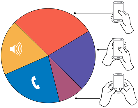
“In over 40% of our observations, a user was interacting with a mobile phone without inputting any data via key or screen.”
In over 40% of our observations, a user was interacting with a mobile phone without inputting any data via key or screen. Figure 1 provides a visual breakdown of the data from our observations.
Figure 1—Summary of how people hold and interact with mobile phones
To see the complete data set:
Voice calls occupied 22% of the users, while 18.9% were engaged in passive activities—most listening to audio and some watching a video. We considered interactions to be voice calls only if users were holding their phone to their ear, so we undoubtedly counted some calls as apparent passive use.
The users who we observed touching their phone’s screens or buttons held their phones in three basic ways:
- one handed—49%
- cradled—36%
- two handed—15%
While most of the people that we observed touching their screen used one hand, very large numbers also used other methods. Even the least-used case, two-handed use, is large enough that you should consider it during design.
In the following sections, I’ll describe and show a diagram of each of these methods of holding a mobile phone, along with providing some more detailed data and general observations about why I believe people hold a mobile phone in a particular way.
In Figures 2–4, the diagrams that appear on the mobile phones’ screens are approximate reach charts, in which the colors indicate what areas a user can reach with the finger or thumb to interact with the screen. Green indicates the area a user can reach easily; yellow, an area that requires a stretch; and red, an area that requires users to shift the way in which they’re holding a device. Of course, these areas are only approximate and vary for different individuals, as well as according to the specific way in which a user is holding a phone and the phone’s size.
Users Switch How They Hold a Mobile Phone
“The way in which users hold their phone is not a static state. Users change the way they’re holding their phone very often—sometimes every few seconds.”
Before I get to the details, I want to point out one more limitation of the data-gathering method that we used. The way in which users hold their phone is not a static state. Users change the way they’re holding their phone very often—sometimes every few seconds. Users’ changing the way they held their phone seemed to relate to their switching tasks. While I couldn’t always tell exactly what users were doing when they shifted the way they were holding their phone, I sometimes could look over their shoulder or see the types of gestures they were performing. Tapping, scrolling, and typing behaviors look very different from one another, so were easy to differentiate.
I have repeatedly observed cases such as individuals casually scrolling with one hand, then using their other hand to get additional reach, then switching to two-handed use to type, switching back to cradling the phone with two hands—just by not using their left hand to type anymore—tapping a few more keys, then going back to one-handed use and scrolling. Similar interactions are common.
One-Handed Use
“The 49% of users who use just one hand typically hold their phone in a variety of positions.”
While I originally expected holding and using a mobile phone with one hand to be a simple case, the 49% of users who use just one hand typically hold their phone in a variety of positions. Two of these are illustrated in Figure 2, but other positions and ways of holding a mobile phone with one hand are possible. Left-handers do the opposite.
Figure 2—Two methods of holding a touchscreen phone with one hand
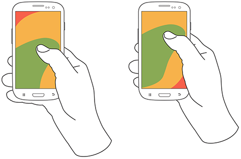
Note—The thumb joint is higher in the image on the right. Some users seemed to position their hand by considering the reach they would need. For example, they would hold the phone so they could easily reach the top of the screen rather than the bottom.
One-handed use—with the
- right thumb on the screen—67%
- left thumb on the screen—33%
I am not sure what to make of these handedness figures. The rate of left-handedness for one-handed use doesn’t seem to correlate with the rate of left-handedness in the general population—about 10%—especially in comparison to the very different left-handed rate for cradling—21%. Other needs such as using the dominant hand—or, more specifically, the right hand—for other tasks may drive handedness. [4]
One-handed use seems to be highly correlated with users’ simultaneously performing other tasks. Many of those using one hand to hold their phone were carrying out other tasks such as carrying bags, steadying themselves when in transit, climbing stairs, opening doors, holding babies, and so on.
Cradling in Two Hands
“Cradling is my term for using two hands to hold a mobile phone, but using only one hand to touch the screen or buttons.”
Cradling is my term for using two hands to hold a mobile phone, but using only one hand to touch the screen or buttons, as shown in Figure 3. The 36% of users who cradle their mobile phone use it in two different ways: with their thumb or finger. Cradling a phone in two hands gives more support than one-handed use and allows users to interact freely with their phone using either their thumb or finger.
Figure 3—The two methods of cradling a mobile phone
Cradling—with a
- thumb on the screen—72%
- finger on the screen—28%
With thumb usage, users merely added a hand to stabilize the phone for one-handed use. A smaller percentage of users employed a second type of cradling, in which they held the phone with one hand and used a finger to interact with the screen. This is similar to the way people use pens with their mobile devices. (We observed so few people using pens with their mobile devices—only about six—that I have not included them as a separate category in the data set.)
Cradling—in the
- left hand—79%
- right hand—21%
Anecdotally, people often switched between one-handed use and cradling. I believe this was sometimes for situational security—such as while stepping off a curb or when being jostled by passersby—but sometimes to gain extra reach for on-screen controls outside the normal reach.
Two-Handed Use
“We traditionally associate two-handed use with typing on the QWERTY thumbboards of devices like the classic Blackberry or on slide-out keyboards.”
We traditionally associate two-handed use with typing on the QWERTY thumbboards of devices like the classic Blackberry or on slide-out keyboards. Two-handed use is prevalent among 15% of mobile phone users. In two-handed use, as shown in Figure 4, users cradle their mobile phone in their fingers and use both thumbs to provide input—much as they would on a desktop keyboard.
Two-handed use—when holding a phone
- vertically, in portrait mode—90%
- horizontally, in landscape mode—10%
Figure 4—Two-handed use when holding a phone vertically or horizontally
People often switched between two-handed use and cradling, with users typing with both thumbs, then simply no longer using one hand for input and reverting to using just one of the thumbs consistently for interacting with the screen.
However, not all thumb use was for typing. Some users seemed to be adept at tapping the screen with both thumbs or just one thumb. For example, a user might scroll with the right thumb, then tap a link with the left thumb moments later.
Also notable is the overwhelming use of devices in their vertical orientation, or portrait mode—despite theories about the ease of typing with a larger keyboard area. However, a large percentage of slide-out keyboards force landscape use. [5] All ways of holding a phone typically orient the device vertically, but for two-handed use, use of landscape mode was unexpectedly low. Though several of my clients have received numerous customer complaints in app store reviews for not supporting landscape mode.
What Do These Findings Mean?
“Some designers may interpret charts of one-handed use to mean that they should place low-priority or dangerous functions in the hard to reach area in the upper-left corner of the screen. But I wouldn’t recommend that.”
I expect some to argue that one-handed use is the ideal—and that assuming one-handed use is a safe bet when designing for almost half of all users. But I see more complexity.
Some designers may interpret charts of one-handed use to mean that they should place low-priority or dangerous functions in the hard to reach area in the upper-left corner of the screen. [6] But I wouldn’t recommend that. What if a user sees buttons at the top, so switches to cradling his phone to more easily reach all functionality on the screen—or just prefers holding it that way all the time?
Even if we don’t understand why there are such large percentages for handedness, we cannot assume that people will hold their phone in their right or left hand. When targeting browsers or mobile-device operating systems, I am always uncomfortable ignoring anything with a market share over 5%. That’s a general baseline for me, though I adjust it for individual clients or products. But I would never, ever ignore 20 to 30% of my user base. While I am personally very right handed, now that I have these numbers, I am spending a lot more time paying attention to how interactions might work when using the left hand.
Another factor that I had not adequately considered until putting together these diagrams is how much of the screen a finger may obscure when holding a mobile phone in any of these ways. With the display occupying so much of the device’s surface, this may explain part of the reason for a user’s shifting of his or her grasp. As designers, we should always be aware of what content a person’s fingers might obscure anywhere across the whole screen. Just remembering that a tapping finger or thumb hides a button’s label is not enough.
Now, my inclination to test my user interface designs on devices is stronger than ever. Whether I’ve created a working prototype, screen images, or just a paper prototype that I’ve printed at scale, I put it on a mobile device or an object with similar dimensions and hold it in all of the ways that users would be likely to hold it to ensure that my fingers don’t obscure essential content and that buttons users would need to reach aren’t difficult to reach.
Next Steps
“With clear correlations between tasks and ways of holding a phone, we could surmise likely ways of holding devices for particular types of interactions rather than making possibly false assumptions….”
I don’t consider this the ultimate study on how users hold mobile devices, and I would like to see someone do more work on it, even if I’m not the one to carry it out. It would be very helpful to get some solid figures on how much people switch the ways they’re holding their mobile phone—from one-handed use to cradling to two-handed use. Having accurate percentages for how many users prefer each way of holding a phone would be useful. Do all users hold their phones in all three of these ways at different times? This is not entirely clear. It would also be helpful to determine which ways of holding a mobile phone are appropriate for specific tasks. With clear correlations between tasks and ways of holding a phone, we could surmise likely ways of holding devices for particular types of interactions rather than making possibly false assumptions based on our own behavior and preferences.
- See more at: http://uxmatters.com/mt/archives/2013/02/how-do-users-really-hold-mobile-devices.php#sthash.dqoD7V8L.dpuf
Premium vs Freemium vs Subscription
For mobile apps, there are three dominant pricing strategies: Premium, Subscription and Freemium.
According to a report by app-store analytics company, Distimo, freemium now accounts for 71% of Apple AppStore revenues in the US, up from somewhere around 50% last year, and rising. In Asia, freemium is 90% of App Store revenues.

Is freemium always the most optimal? What factors should you consider when choosing a pricing strategy?
Firstly, here is what these different pricing models mean, as applied to mobile apps:
Premium apps (or Paid apps) have an upfront price before they can even be downloaded. Similar to licensed software, except that the App Store makes all future upgrades to the premium app free once purchased.
Contrast this with freemium (a portmanteau of “free” and “premium”), where the app is free to download and use. However, some features inside the app are unavailable until you pay for them. App stores make it dead simple for developers to charge small amounts of money inside the app.
Subscriptions are a regular fixed fee the user is charged automatically via the App Store for using the app. Magazines in the iOS Newsstand are usually subscription-based. Subscriptions can actually overlap with either premium or freemium models. For example, Spotify requires you to have a subscription to even use the app (premium), while Pandora is closer to freemium where you can pay a subscription to get ad-free and unlimited hours of music.
How do you decide which to choose?
Premium has very limited use today
Perception is a large factor in how high a price is acceptable, and going premium helps create that perception. With premium, every user pays upfront, but the amount each user pays is fixed, regardless of how much utility each gets. Also, users have come to expect apps in the $2 – $5 range (a few niche apps can charge $10-$20) and there is no way to get higher ARPU.
In general, premium works in the following situations:
1. There is a strong demand for your app – niche areas are good candidates here.
2. You have a strong brand already and can establish trust with users where they are willing to pay before they download the app.
3. There is not a lot of competition that will almost certainly drive the price down.
4. You don’t care much about reach – which will be much smaller because of the “pay gate” into your app.
5. There are no ongoing feature or content costs that can drive up the average cost of of supporting a user to levels higher than what the user paid for the app.
Freemium helped create those million-dollars-per-day games
Freemium was popularized by casual games in Japan and Korea and has quickly become the winning model in mobile apps. It works really well in the following situations:
1. There is enough competition that users invariably have other cheaper or free options (low barrier to entry). This has been partly the reason for most mobile apps today moving to freemium.
2. When reach is important. You need large amount of users quickly to create network effects. For example, to drive virality or gather significant data.
3. When there are a small % of power users willing to pay significantly more than the other light users. The pay-as-you-go model facilitates this. Hard core users can drive as much as 100 – 1000 times more revenue than the other users. This is why some free-to-play games are reaching a $1MM per day revenue runrate.

More users in freemium, but a small percentage of them drive astronomical amounts of revenue.
The mobile app economy has progressed to a point today where all of the above usually hold true. Freemium does require some operational effort in managing your free and paying users, converting the former to the latter, and driving repeat purchases. However, this helps create a sustainable business rather than a one-time hit.
Subscriptions: the Holy Grail
A subscription provides a guarantee of repeat transactions and hence, businesses with subscription revenues tend to be valued far higher. The subscription price is usually smaller than the one-time price to incentivize the user into a longer term commitment. As the seller, you make up for the discount by being guaranteed future transactions.
A single issue of The New Yorker costs $6, but a year’s subscription of 52 issues is $70. That is a 77% discount and is still better, revenue-wise, than selling individual copies. Of course, they make a lot of money through advertising, so a guaranteed customer in the future is far more important to them. This may not be the case in all businesses. Amazon gives you a ~15% discount to “subscribe” to certain household items.
The subscription model does have a few drawbacks:
1. Like premium, there is a single price for all users, regardless of how much they use. There is a lot of money left on the table because hardcore users willing to pay a lot more cap out at the fixed price. There is some more money left on the table where the subscription price and commitment is too high for a large number of light users who will not sign up.
2. Tiered subscriptions does let you set different prices, but still creates ceilings on both price and consumption. Netflix has a 1 DVD plan for $8, 2 for $12, all the way up to 8 for $44. The lost opportunity? (a) A user can only do 8 DVDs. There may be a few subscribers who want much more. (b) A $44 price tag for DVD rental has a sticker shock. It is easier to charge $5.50 eight times than to charge $44 one time.
So when should you use subscriptions? Whenever you can. Subscriptions are considered the holy grail of revenue models. But it is important to make sure you are not leaving money on the table just to get a subscription commitment from a customer.
The ideal pricing strategy

Escalators are faster than stairs, even faster if you run up them.
At the risk of over-generalizing, a combination of freemium + subscription is the ideal for most apps.
Not everything being sold lends itself to subscriptions. Impulse purchases typically don’t. For example, a power-up that will help you cross this level in a game, or an Instagram filter that makes this photo of yours look exceptional. In such cases, it is best to start with a freemium model and then offer subscriptions to your regular customers to drive purchases further. Content (magazines, music streaming, movie streaming) has more commonly been a subscription business. For these, it is a good idea to start with the accepted subscription, but remove any ceiling on purchases and consumption by offering more content that can be purchased in-app in addition to the subscription.
The mobile app economy is already large and growing even bigger. Get all the value you can out of it.
Drop in a comment, or shoot us an email if you want to chat about this for your app. We’re happy to help!
- interactive
- interaction
- installation
- design
- led
- light
- art
- technology
- projectionmapping
- projectmapping
- robotics
- ui
- mobile
- projection
- interactivedesign
- lightdesign
- apple
- web
- 3d
- ux
- userinterface
- lightart
- robot
- artinstallation
- touchscreen
- application
- app
- webdesign
- touch
- motion
- responsive
- adobe
- multitouch
- future
- robots
- drone
- photoshop
- productdesign
- ledinstallation
- lightsculpture
- video
- user experience
- iphone
- creative
- interactivelight
- digitalart
- motiondesign
- ar
- 3dprinting
- responsivedesign
- augmentedreality
- drones
- kinetic
- data
- development
- kinect
- microsoft
- display
- immersive
- process
- painting
- timelapse
- dronerobotics
- 3dprojection
- ios
- vr
- virtualreality
- earth
- ai
- device
- user interface
- engineering
- laser
- lightpainting
- kineticsculpture
- lightinstallation
- touchinstallation
- animation
- programmableleds
- graffiti
- interactions
- neon
- performance
- leapmotion
- watch
- mobiledesign
- pixel
- environment
- exoskeleton
- interactiveenvironment
- sound
- lcd
- social
- leds
- lukew
- artlight
- patterns
- internet
- carui
- November 2011 128
- December 2011 65
- January 2012 25
- February 2012 27
- March 2012 33
- April 2012 31
- May 2012 16
- June 2012 32
- July 2012 20
- August 2012 37
- September 2012 24
- October 2012 34
- November 2012 31
- December 2012 6
- January 2013 21
- February 2013 11
- March 2013 10
- April 2013 35
- May 2013 45
- June 2013 10
- July 2013 49
- August 2013 33
- September 2013 40
- October 2013 57
- November 2013 31
- December 2013 28
- January 2014 86
- February 2014 49
- March 2014 24
- April 2014 40
- May 2014 6
- June 2014 9
- July 2014 1
- August 2014 34
- September 2014 30
- October 2014 45
- November 2014 21
- December 2014 6
- January 2015 5
- February 2015 17
- March 2015 18
- April 2015 14
- May 2015 1
- June 2015 10
- July 2015 4
- August 2015 1
- October 2015 11
- March 2016 4
- December 2016 18
- September 2017 6
- October 2017 13
- November 2017 5
- June 2018 8
- July 2018 2
- November 2018 7
- February 2019 8
- March 2019 6
- July 2019 1
- August 2019 1
- October 2019 1
- July 2020 5
- November 2020 9
- December 2020 1
- January 2021 1
- April 2021 1
- May 2021 9
- June 2021 3
- August 2022 3
- May 2023 2
- September 2023 1
- May 2025 6