From the Front Lines of Multi-Device Web Design

It’s hard enough to design a great mobile or Web site but what about experiences that span these devices and more? Join Luke for a set of lessons learned designing Web products that attempt to embrace simultaneous and sequential multi-device use. What worked and, more importantly, what didn’t?
Using Content To Define User Experience
In her presentation at Breaking Development in Nashville TN, Steph Hay talked about the importance of narrative in digital experiences. Here’s my notes from her talk on Using Content To Define User Experience.
- The Sesame Street TV show was based on actual research of how kids learned and continually measured to make sure it was reaching their educational goals. They approached content development by isolating chunks of programming, testing it, and continually refining.
- The big paradigm shift was learning first then writing second.
- Content and technology that guides people over time forms a narrative that allows people to act.
- Use cases in software design tend to be very flow-focused and high level. Requirements docs just focus on the what. Content is the missing piece in everything we’re doing.
- When content really works, we can get from point A to B more quickly and easily.
- Use content to explicitly set expectations then meet them regardless of device.
- Design is only part of the narrative, the other half is the real human people that experience what we are designing.
- The “you” orientation of content focuses on the user, not on the company. It positions the customer as the other half of the narrative.
- Features by themselves won’t protect your narrative, you also need relevance.
- There are two kinds of narratives online: setting expectations (through marketing), and functional requirements (through experience).
- Write content first. This is the paradigm shift.
- Many organizations are afraid to write content first because they are used to writing it last. But this results in missing pieces and incomplete experiences.
- State your goal: what are you trying to accomplish, what are your users trying to accomplish.
- You can use tools like Google Keyword builder and Google Analytics to find the language people are using to find you. What terms make sense for them? Use these terms to create a conversation.
- The content is the structure. This is why it makes sense to start there.
Relying Too Much on Screen Size
As people continue to go online using an ever increasing diversity of devices, responsive Web design has helped teams build amazing sites and apps that adapt their designs to smartphones, desktops, and everything in between. But many of these solutions are relying too much on a single factor to make important design decisions: screen size.
What’s Wrong With Screen Size?
It’s not that adapting an interface to different screen sizes is a bad thing. Quite the opposite. It’s so important that key metrics like conversion and engagement usuallyincrease substantially when Web sites adjust themselves to fit comfortably within available screen space. For proof, just look at how mobile conversion rates increase significantly more in responsive redesigns than PC conversions do.
So if adapting to different screen sizes can have that kind of positive impact for a business, what’s the risk? As the kinds of devices people use to get online continue to diversify, relying on screen size alone paints an increasingly incomplete picture of how a Web experience could/should adapt to meet people’s needs. Screen size can also lead to bad decision-making when used as a proxy for determining:
- If a browser is running on a mobile device or not
- If Network connections are good (fast) or bad (slow)
- If a device supports touch, call-making, or other capabilities
There’s still no relationship between screen size and bandwidth. Instead, we should ensure our work’s as light as possible *for everyone*.
— Responsive Design (@RWD)
None of these can actually be accurately inferred from screen size alone but they are comfortable assumptions that make managing device diversity substantially easier. The harsh truth however, is that output (screen size and resolution) is only one third of the equation -at best. Equally important to determining how to adapt an interface are input capabilities and user posture, which sadly screen size doesn’t tell us anything about.
Let me illustrate with a few specific examples.
Screen Size Limits
On tablets, PCS, and TVs, Microsoft’s Windows 8 platform allows any app, including the Web browser, to be “snapped” to the side of a screen thereby letting people interact with it while using another application in the primary view. As an example, the Windows 8 calendar application can be snapped alongside the weather app when making your daily plans.

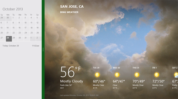
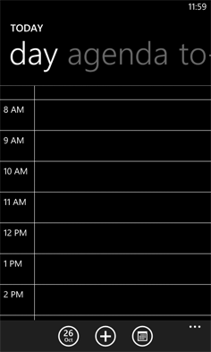
Notice though, that the default view of the calendar application on Windows Phone 8 is quite different than the snapped view of the same app on a tablet, PC, or TV. They are both using the same amount of screen width (in relative pixels), but the mobile interface starts with a daily agenda instead of a small month view by default. The controls are also adjusted to the mobile form factor as you can see in the image below.

We can debate about why these differences exist and if they should or not but the bottom line is there’s more than screen size being taken into account in these application designs.
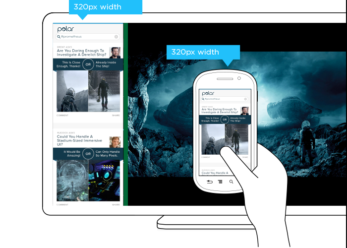
This simple example illustrates the challenge for Web designers. On Windows Phone devices, Internet Explorer uses 320 pixels for its device-width (the width it renders content at). On Windows 8 tablets, PCs, and TVs, snap mode uses the same 320 pixel device-width to lay out Web pages docked alongside other apps.
So with a responsive Web design, people get the same interface on a smartphone that they get in snap mode on a TV screen due to the same device-width (320 pixels). You can see this illustrated in the image below.

But should the interface be the same? A TV is usually viewed from about 10 feet away, while the average smartphone viewing distance is about 12 inches. This has an obvious impact on legibility for things like font and image sizes but it also affects other design elements like contrast. So a user’s posture (in this case viewing distance) should be taken into account when designing for different devices.
The input capabilities of a TV (D-pad) can differ wildly from a those of a mobile device (touch) or in some cases be the same (voice). Designing a simple list interface for d-pads requires a different approach than a creating a similar listing for use with touch gestures. So available input types should also be considered in a multi-device design.
When you take user posture and input capabilities into account when designing, an interface can change in big or small ways. For instance, contrast the design below for Windows 8 snap mode on a TV compared to a mobile version of the same feature.
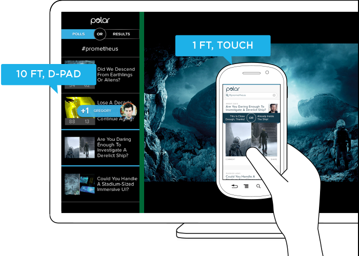
While the screen size (320 pixel device-width) has stayed consistent, the interface has not. Larger fonts, a simplified list view, inverted colors, and a lot more have changed in order to support a different user posture (10 ft away vs. 12 inches), and different input types (d-pad vs. touch). As you can see, screen size doesn’t give us a complete picture of what we need to know to design an appropriate interface.
Before you dismiss this as an isolated use case on Windows 8 devices, note that Android smartphones and tablets also offer the ability to interact with multiple applications side by side and Android-powered TVs won’t be far behind. In fact, we’ve already got Android eyepieces like Google Glass that pose similar challenges.
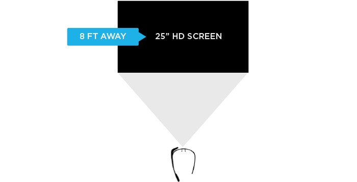
Google Glass allows you to view applications and Web pages using a display that projects information just above your line of sight. The official specs describe the Glass display as a “25 inch HD screen viewed from 8 feet away.” So right up front, viewing distance matters.

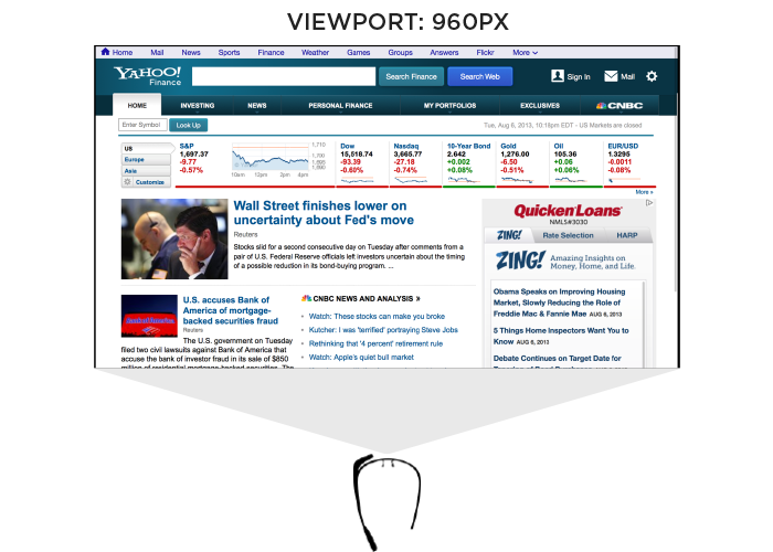
Like most mobile Web browsers, Glass uses a dynamic viewport to resize Web pages for its screen. On Glass the default viewport size is set to 960 pixels and pages are scaled down accordingly. So if someone is viewing the Yahoo! Finance site, it displays like this in the Glass browser (below). Essentially, it is shrunk down to fit.

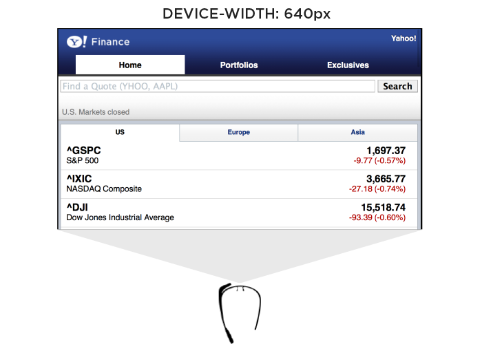
The Web browser on Glass also allows pages built responsively to adapt to a more suitable device-width. In this case, 640 pixels. So a Web page designed to work across a wide range of screen sizes would render differently on Glass. Given that 600 pixels is a common device-width for 7 inch tablets, the page you’d see on Glass would look more like the following -adapted for a smaller viewport size.

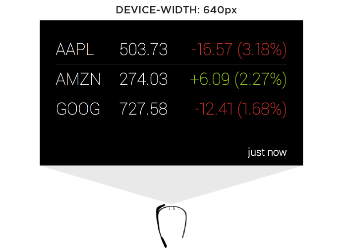
In addition to the Web browser, Google Glass also includes a number of “glassware” applications built with the same Web technologies used to create Web pages. One of these apps provides access to stock price changes -very similar to what you see displayed prominently on the Yahoo! Finance site. However, the presentation of this information is very different. As you can see in the image below it’s been designed as if you are viewing a 25” screen from 8 feet away. This design is much more suited to a wall-sized display than a small tablet screen.

This Glassware interface is also designed to make scrolling through information using the touchpad on the side of Google Glass (which comfortably supports sweeping left/right and up/down gestures) fast and easy.
So again user posture and input capabilities inform how to design for a specific device. Screen size alone doesn’t tell us enough.
Supporting Everything
In order for an interface to adapt appropriately to different output, input, and user posture, we need to know what combination of the three we’re are dealing with at any given time. On the Web that’s been notoriously difficult. We can’t tell TVs from smartphones or what devices support touch without relying on some level of user agent detection, which is often looked at dubiously.
Because of this, Web developers and designers have smartly decided to simply embrace all forms of input: touch, mouse, and keyboard for starters. While this approach certainly acknowledges the uncertainty of the Web, I wonder how sustainable it is when voice, 3D gestures, biometrics, device motion, and more are factored in. Can we really support all available input types in a single Web interface?
A similar approach to user posture is increasingly common. That is, an interface can simply ask people if they want a lean-back 10 foot experience, a data dense 2 foot experience, or something more suited for small portable screens. This makes user posture something that is declared by people rather than inferred by device. Once again, this kind of “support everything” thinking embraces the diversity of the Web whole-heartedly. However it puts the burden on each and every user to understand different modes, when they are appropriate, and change things accordingly. (Personally I feel we should be able to provide an optimal experience without requiring people to work for it.)
Ultimately trying to cover all input types and all user postures in a single interface is a daunting challenge. It’s hard enough to cover all the screen sizes and resolutions out there. Couple that with the fact that an interface that tries to be all things to all devices might ultimately not do a good job for any situation. So while I embrace supporting the diversity of the Web as much as possible, I worry there’s a limit to the practicality of this approach long-term as the amount of possible inputs, outputs, and user postures continues to grow.
Don’t Assume Too Much
These examples are intended to convey one important point: don’t assume screen adaptation is a complete answer for multi-device Web design. Responsive Web design has given us a powerful toolset for managing a critical part of the multi-device world. But assuming too much based on screen size can ultimately paint you into a corner.
It’s not that adapting to screen size doesn’t matter, as I pointed out numerous times, it really does. But if you put too much stock in screen size or don’t consider other factors, you may end up with incomplete or frankly inappropriate solutions. How people interact with the Web across screens continues to evolve rapidly and our multi-device design methods need to be robust enough to evolve alongside.

New Layouts for the Multi-Device Web. Most Web page layouts rely on design patterns created for laptop and desktop computers equipped with a mouse and keyboard. As the variety of devices being used to access the Web has grown, these patterns haven’t been keeping up. Designing for today’s Web means considering single-handed thumb use on smartphones, two handed touch interactions on tablets, mouse and keyboard input on traditional PCs, hybrid devices, and more. Web layouts have to evolve to support this new reality. Source
- interactive
- interaction
- installation
- design
- led
- light
- art
- technology
- projectionmapping
- projectmapping
- robotics
- ui
- mobile
- projection
- interactivedesign
- lightdesign
- apple
- web
- 3d
- ux
- userinterface
- lightart
- robot
- artinstallation
- touchscreen
- application
- app
- webdesign
- touch
- motion
- responsive
- adobe
- multitouch
- future
- robots
- drone
- photoshop
- productdesign
- ledinstallation
- lightsculpture
- video
- user experience
- iphone
- creative
- interactivelight
- digitalart
- motiondesign
- ar
- 3dprinting
- responsivedesign
- augmentedreality
- drones
- kinetic
- data
- development
- kinect
- microsoft
- display
- immersive
- process
- painting
- timelapse
- dronerobotics
- 3dprojection
- ios
- vr
- virtualreality
- earth
- ai
- device
- user interface
- engineering
- laser
- lightpainting
- kineticsculpture
- lightinstallation
- touchinstallation
- animation
- programmableleds
- graffiti
- interactions
- neon
- performance
- leapmotion
- watch
- mobiledesign
- pixel
- environment
- exoskeleton
- interactiveenvironment
- sound
- lcd
- social
- leds
- lukew
- artlight
- patterns
- internet
- carui
- November 2011 128
- December 2011 65
- January 2012 25
- February 2012 27
- March 2012 33
- April 2012 31
- May 2012 16
- June 2012 32
- July 2012 20
- August 2012 37
- September 2012 24
- October 2012 34
- November 2012 31
- December 2012 6
- January 2013 21
- February 2013 11
- March 2013 10
- April 2013 35
- May 2013 45
- June 2013 10
- July 2013 49
- August 2013 33
- September 2013 40
- October 2013 57
- November 2013 31
- December 2013 28
- January 2014 86
- February 2014 49
- March 2014 24
- April 2014 40
- May 2014 6
- June 2014 9
- July 2014 1
- August 2014 34
- September 2014 30
- October 2014 45
- November 2014 21
- December 2014 6
- January 2015 5
- February 2015 17
- March 2015 18
- April 2015 14
- May 2015 1
- June 2015 10
- July 2015 4
- August 2015 1
- October 2015 11
- March 2016 4
- December 2016 18
- September 2017 6
- October 2017 13
- November 2017 5
- June 2018 8
- July 2018 2
- November 2018 7
- February 2019 8
- March 2019 6
- July 2019 1
- August 2019 1
- October 2019 1
- July 2020 5
- November 2020 9
- December 2020 1
- January 2021 1
- April 2021 1
- May 2021 9
- June 2021 3
- August 2022 3
- May 2023 2
- September 2023 1
- May 2025 6