How to design for thumbs in the Era of Huge Screens

After years of resistance, Apple’s iPhone 6 announcement last week officially signaled the Dawn of the Era of Huge Screens.
And it’s going to crash into existence in a big way. Just this Monday,Apple announced that they’d sold over four million pre-orders for the phones the opening night of pre-orders. In only one night, they sold almost half of what they sold the entire opening weekend last year for iPhone 5s and 5c.
So it’s looking like the 3.5” and 4” screens of yore will start their inevitable decline very quickly. That means that those of us who’ve gotten comfortable building apps, responsive sites and mobile-optimized web views with the old ways in mind have some learning to do (myself included).
The decline is already in motion. Adobe’s 2014 Mobile Benchmark Report claims that mobile browsing among phones with 4” screens or smaller is down by 11%.
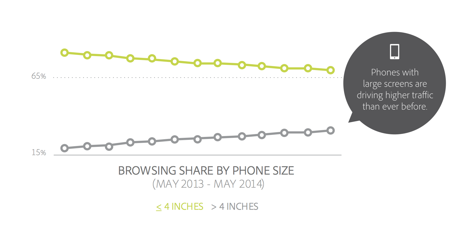
That means that learning how to design for thumbs is now more important than ever. Luckily, it helps that these phone display sizes are going to be practically universal. A cursory examination of the most popular Android screen sizes points to a range of 5.1” and 5.7”.
Apple’s changes will make our lives easier as smaller screen sizes die off. But only if we learn to adapt our designs.
If not, the future is going to be pretty painful for those thumbs.
This is especially important for those of us who’ve only been building iOS apps. All those design tradeoffs we thought we never had to worry about are suddenly right here in front of us — in an avalanche of pre-orders.
DESIGNING FOR THUMBS?
What does it mean to design for thumbs? It means building interfaces that are the most comfortable to use within our thumb’s natural, sweeping arc.
But this gets complicated. We unconsciously adjust the way we hold our phones to reach certain controls in various areas of the screen. During any given day, I’ll wager that you stretch your grip, choke up on the phone, or angle it in ways that make reaching difficult areas easier.
But we have to start somewhere. Research suggests that most of us hold our phones in the following way — with the bottom of the thumb anchored on the lower-right-hand corner:

This assumption comes from a study that mobile expert Steve Hoober conducted with 1,333 people early last year. He discovered that people held their phones in the following ways:
- one handed: 49%
- cradled: 36%
- two handed: 15%
Handedness figures were also instructive:
- right thumb on the screen: 67%
- left thumb on the screen: 33%
Hoober notes that left-handedness figures in the population are around 10%. So the observed higher rate of left-handed use could be correlated with people doing other things at the same time — smoking, riding a bike, drinking coffee, eating currywurst, etc.

THE THUMB ZONE
The Thumb Zone is a heat map of sorts. It’s a best guess for how easy it is for our thumbs to tap areas on a phone’s screen.
Let’s use Hoober’s research to create a Thumb Zone map representing what seems to be the most common use case:
- one-handed use
- right thumb on the screen
- thumb anchored in the lower-right-hand corner
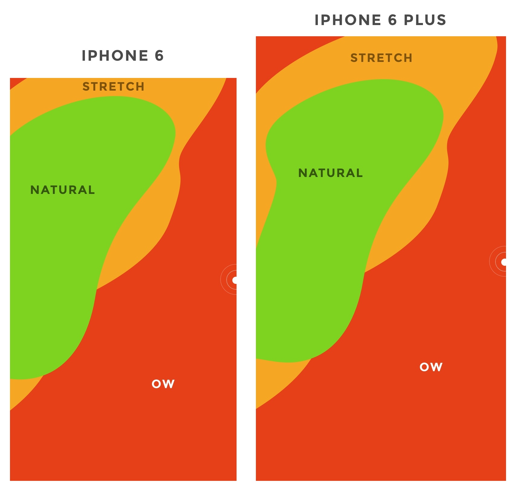
Here's the Thumb Zone heat map applied to every iPhone display size since 2007:

Here's a more direct comparison of the iPhone 6 and iPhone 6 Plus next to each other:

You’ll notice that the “safe” green zone stays roughly the same (more on why the iPhone 6 Plus is different in a second). That’s because our thumbs don’t magically scale with the screen size. And that’s also unfortunate, because I loved Dhalsim in Street Fighter as a kid.
But what changes is the sheer amount of “Ow” space, which becomes startlingly apparent with the iPhone 6 Plus.
Furthermore, you’ll notice how the shape of the “Natural” zone changes for the iPhone 6 Plus. That’s because it requires a different type of grip due to its size, using your pinkie finger as a stabilizer. It surprised me how different the experience was.
A note: my thumb doesn’t reach fully across the phone’s screen. Maybe you have bigger hands than I do. So terms and conditions certainly apply.
CHOKING UP
Let’s analyze how the Thumb Zones change when you shift your grip. Sometimes you might be in a situation where it’s easier to tap the phone with your thumb’s anchor at the vertical midpoint.
Here’s an illustration of this in action for iPhone 6 and iPhone 6 Plus:
REACHABILITY
Choking up might not be necessary, though, with iOS 8's "Reachability" feature. (That is if Apple takes the opportunity to teach people about its existence). By double-tapping the home button (not the same as "clicking" to display running apps), iOS will push the top of the screen down within one's grasp.
And here's how Reachability looks with the Thumb Zone overlaid on the iPhone 6 Plus. Notice anything?

Yes, Apple's demonstration images places the thumb in exactly the "Natural" zone.
Another observation on Reachability, as pointed out by John Gruber: "Reachability on the 6 Plus moves things further down the display, percentage-wise, than it does on the 6 — it’s all about moving the top of the display to a typical thumb’s length from the bottom of the device."
Here's that in action:

WHAT’S IT ALL MEAN?
Mobile screen sizes on the whole are becoming more similar, and that’s a good thing. But it also means that we can’t just treat screens in the 5.5” range simply as a scaled-up version of a smaller phone. Grips completely change, and with that, your interface might need to do so, as well.
I think prototyping will become even more important. So if you haven’t jumped on that train, now’s the time. (PS — I’m launchingXcode for Designers next week, which teaches designers how to build interactive prototypes in Xcode in less than a week. It’s chock-full of videos and has a really great pre-launch discount running right now. Get on the list if you’re at all interested.)
DOWNLOAD THE UPDATED THUMB ZONE TEMPLATES
Want a copy of the Thumb Zone diagram I drew for these screenshots? You’re in luck. You can download them as individual JPGs here.
Download my Thumb Zone templates now
Hopefully this helps with your current project. If you got any value out of it, I'd be grateful if you shared it. You can Tweet it now with one click.
Mobile Nav could be costing you half your user engagement
So, you have a mobile app where there are more pages or sections than can fit on a mobile screen at once. Your first thought might be to create a tabbed design, with a row of tabs along the top or buttons along the bottom.
But wait… that extra row of tabs or buttons wastes a lot of valuable real estate on a small mobile display, so let’s not do that. Instead, let’s move the options into a side menu, or side drawer, as our Android team keep reminding me it’s called.
If your mobile app has multiple views then I would be surprised if this subject has not been vigorously debated by your team:
- Persist all the navigation options on screen at all times so your users have clear visibility of all the main app views and single-click access to them.
- Or, free up screen real estate by moving the options into a side menu.
The side menu has become fashionable on Android but not yet taken off on iPhone… and so another factor that enters the discussion is the desire for your Android and iOS apps to have similar navigation and user journeys, or not.
I thought it worth sharing our experience.
Usability vs. clean design

When we first started zeebox, we began with a tabbed design with a row of buttons along the top. Our reasoning was simple: “Out of sight, out of mind” – i.e. if you don’t see the set of available options then you’re not going to know that they exist.
For example, in the above images, if you don’t see a GUIDE option then how would you know to go to the menu to look for it? And if you discovered it once, would you remember that each time you returned to zeebox? Even if you did, it would be two clicks to get to the guide rather than one.
On the other hand, the design looks so much cleaner without that ugly row of buttons along the top, moving the navigation into a side menu really lets the content breathe.
The idea of moving app navigation off-screen into a side menu – also known as a hamburger menu or navigation drawers – seems to have originated about 18 months ago.
Around Sep 2013 Facebook switched to a new side menu design – or at least my Facebook app did as part of its A/B test. Surely if Facebook was doing this, then it had to be good… right?
The friendly and wonderfully helpful Google Play team suggested thatnavigation drawers (which I’m referring to here as a side menu or side navigation) were the new way to go and would be the preferred design pattern for our Android app.
And so about six months ago, we decided to take the plunge and switch to a side navigation. To make sure people knew about all the available views and options we had the app start up by showing the navigation drawer open:

When we launched the new version the user reviews were great (“Love the new design, 5 stars”).
But when we looked at our analytics, it was a disaster! Engagement time was halved!
It looked like “out of sight, out of mind” really was the case.
The surprising truth
After realizing the gravity of the situation, we rushed out an update two weeks later that restored the top navigation as the default. We also provided a settings option that allowed users to turn on side navigation if they preferred so as to not upset those people who had loved the new side menu.
Anyway, cut to six months later.
The zeebox app has really come a long way in those months, we have a new My TV page that’s a constantly updated personal feed of news, TV shows starting for you, and posts for shows and from people you’re following. The My TV page is the place that our users want to see. But we wanted another go at letting the content breathe, so it was time to try that side navigation experiment again…
However, having learned our lesson, this time we’re going to do it the smart way: we’re going to A/B test it.
Our favorite A/B test tools and methodology
Lately we’ve become big fans of A/B testing, both with users coming into the office to test interactive Flinto prototypes and with A/B configuration built into our production app.
We start by creating mock-ups of various design concepts. We use Flinto to turn those into interactive prototypes that look just like the real thing, but which are built and iterated in minutes or hours.
You can see a couple of our Flinto prototypes here and here – click the links on an iPhone for best effect. Tap an hold anywhere on the page to see where all the interactive hotspots are, then tap on a hotspot as if you’re using the real app.
We advertise for users who love TV, anything from The Voice to Downton Abbey. Twice a week we have four to five people come by our office to our virtual lounge where they try out the various concepts and prototypes we’ve prepared.
Sometimes you’re able to get a clear design winner from that small user sample. But in other cases, like for side navigation, you really need to sample thousands of people using the real app. And for that you need A/B testing.
For mobile app A/B testing, we use Swrve – it’s the most sophisticated A/B testing product I’ve found. It provides not just useful features like Goal Seeking (the A/B test server can automatically switch all users to the best option once a clear winner has been determined) but Swrve also lets you serve customised experiences for every individual user.
For example, if you’re a Comcast subscriber and we notice that you haven’t yet discovered that zeebox can act as a remote control for your Xfinity box, then Swrve could instruct the zeebox app to pop a message telling you about that, with the timing of the message adjusted on a daily basis for optimal effect.
Anyway, we decided to go with a 15/85 test, where 15 percent of users were served the side navigation and 85 percent got the top navigation.
We launched the new version, waited 48 hours, checked the stats… would things be different this time…
The answer was a resounding No.

Weekly frequency was down. Daily frequency was down. Time spent in app was down. The side nav was as big a disaster as the first time round.
The good news is that, thanks to A/B testing, this time we could simply flip a switch on the server and set 100 percent of users to top navigation.
Given that the discussions about top or side nav are very likely a topic of debate in your company, I thought it worth sharing our experience.
Back when we did our above A/B test and concluded that the side nav was not for us, Facebook launched its new navigation on iPhone, with a persistent bottom navigation on every page. So, on iPhone, the app has a persistent lower navigation.
However, on Android it’s, well… variable. Looking at Facebook on my Android phone (below left) vs. on my colleague’s phone (below right), Facebook must be A/B testing this right now as some people are seeing top navigation and others side navigation. I’d love to know what Facebook are seeing in terms of engagement with each…

When does side navigation ever come into play?
My take-away from all of this is that if most of the user experience takes place in a single view, and it’s only things like user settings and options that need to be accessed in separate screens, then keeping the main UI nice and clean by burying those in a side menu is the way to go.
On the other hand, if your app has multiple views that users will engage with somewhat equally, then side navigation could be costing you a great deal of your potential user engagement, and interaction with those part of the app accessed via the side menu.
Hamburger vs Menu: The Final AB Test
In case you missed this post about an AB test on mobile menu icons, make sure you check out the comments. There are some very interesting insights about A/B testing and its shortcomings.
The post went a tiny bit viral, and suddenly it wasn’t just my mother reading this blog.
Three things I learned:
1. This icon has lots of names: hamburger, sandwich, and even hotdog ?! What it actually is, is a list icon. We’ve just co-opted it to mean a navigation menu.
2. When something gets noticed, some people get a little mean (source)
3. One commenter said I was the Dunning–Kruger effect in action. This phenomenon is when you try to sound clever but are actually a dumbass.
Thanks for the vote of no-confidence.
In this hyper-connected world full of rockstar developers and super-smart designers, I’m humbled on a minute-by-minute basis. I might need to start attaching positive affirmation stickers on my laptop.
The Final Hamburger A/B Test
I do enjoy A/B testing, but conclude what you want. I’m not an expert, nor am I advising anything, but sharing what happened on a single website.
Using a commercial A/B testing service can get very expensive very quickly, and well beyond the budgets of small-time web designers and developers. So, hopefully, these posts are helpful for some of you.
Variation 1
Bordered list icon (hamburger).

Variation 2
Bordered word menu.

Results
240,000 unique mobile visitors were served the A/B test.
VariationUnique VisitorsUnique ClicksHamburger1205431211Menu1211521455

The test was large enough to achieve statistical significance.
Where things get interesting is when we break down the data a little:
Unique VisitorsHamburger ClicksMenu ClicksiOS1480979060.61%11430.77%Android872452160.25%2370.27%
There is very little difference in the Android user preference, but their lack of engagement is disturbing.
Interpretations
Hamburger icons may appear to be ubiquitous, but they are not the only option.
There is an issue that is much more important:
Why?
Caveats
- These are the results from one website (see more about demographics here).
- The test was done using some in-house code, so I cannot guarantee the perfect execution of code across all devices. I do not have time or capacity to rigorously test code like the big commercial AB testing services like Optimizely. Bear in mind that to run this test with Optimizely would have cost $859 (I kid you not).
- I can’t measure intent with this test. I’m measuring clicks on a webpage. Maybe the user thought menu as a list of food to order. Maybe they wondered what the hamburger icon was and tapped it. Who knows. AB testing cannot tell you this.
Mobile Design Details: Avoid The Spinner
Conventional wisdom tells us that when things are going to take a while, we should let people know. In most mobile applications that translates to adding progress bars or spinners when something is happening or loading. While the intentions behind these progress indicators are good, the end result can actually turn out to be bad.
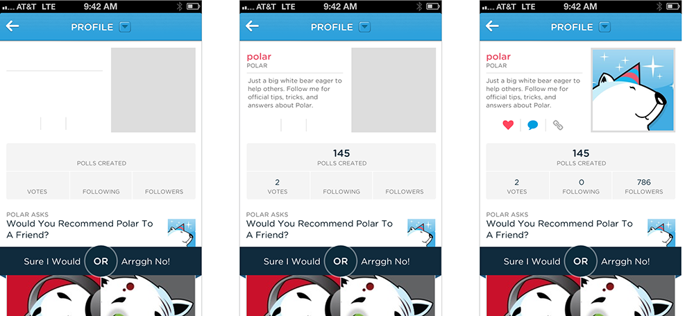
It can be bad because progress indicators by definition call attention to the fact that someone needs to wait. It’s like watching the clock tick down -when you do, time seems to go slower. We learned this lesson the hard way on Polar when we experimented with using Web Views to load parts of our native application’s interface. Web Views are like little embedded Web browsers that can fetch pages from a server and present them within an app but only after they are loaded.
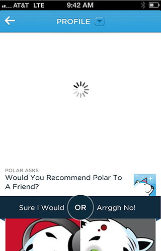
To let people know these elements were downloading, we added a spinner that showed up as each Web View was retrieved from our server. Since we used several Web Views, people could encounter these spinners in a few parts of the app and when they did we started to get feedback like this:
“There seems to be an excessive amount of waiting around for pages to refresh and load -it doesn’t seem as quick as the previous version.”
With the introduction of these progress indicators, we had made people watch the clock. As a result, time went slower and so did our app. We focused on the indicator and not the progress, that is making it clear you are advancing toward your goal not just waiting around.
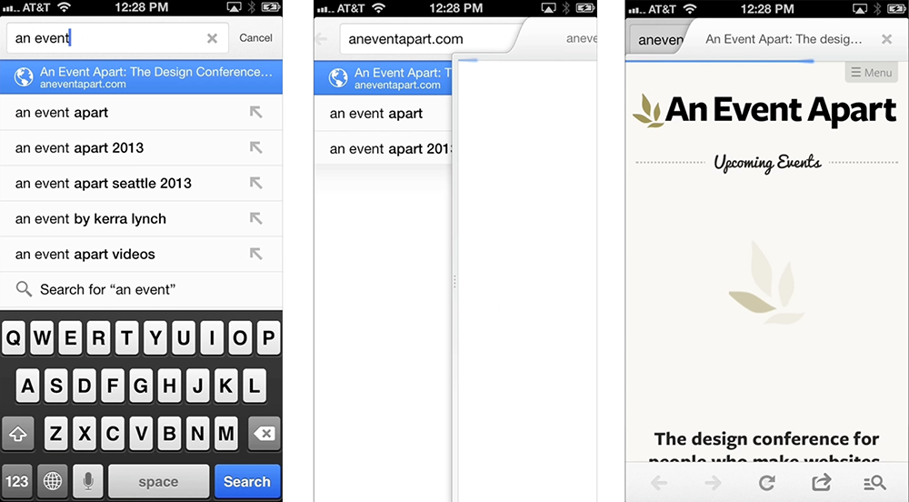
For example, in Google’s Search application the Web page you are loading slides in from the side, making it feel like content is loading immediately even when it isn’t. Google puts the focus on progress by making the loading indicator part of the transition that brings up the page you requested.
Skeleton screens are another way to focus on progress instead of wait times. We used this technique in several places on Polar to effectively eliminate our spinners. A skeleton screen is essentially a blank version of a page into which information is gradually loaded. This creates the sense that things are happening immediately as information is incrementally displayed on the screen.
With a skeleton screen, the focus is on content being loaded not the fact that its loading and that’s real progress.
Mobile first: Luke Wroblewski interview
The Mobile First philosophy has radically changed how professionals approach Web design and become the way companies as diverse as Facebook and IBM build their products.
The Mobile First approach is to start designing for mobile devices — which typically have less screen size and less capabilities than desktops — and progressively enhance the product; so that desktops get an enhanced site experience rather than mobiles getting a pared down one.
We grabbed the opportunity to interview Luke Wroblewski, who first defined the Mobile First concept back in 2009, about how he used the principle to create Polar at his latest startup, Input Factory Inc. where he is co-founder and CEO.
How did you get started building apps and what kept you fascinated?
The first mobile apps I worked on were during my time at Yahoo! I joined the Yahoo! Search team back in 2005 and a bit later was heading up a small “tiger team” focused on ideas for products that were 3 to 5 years out. At that time I was fascinated with where the web was going and in particular with mobile.
We started out building some experiences for newer Nokia devices, as Nokia was the big player back then. Soon after though, Apple announced the app store for iOS and we jumped into iOS applications as well. At the time we were experimenting with services that connected mobile apps to networked TVs and more traditional computers like laptops and desktops. It was a really great opportunity to explore what was coming and we came up with a bunch of concepts that I’m still passionate about today.
I think that’s what keeps me interested in this space. You can see the future: more connected devices of every shape and size; interactions between those devices; more real time access to useful information, services, and people –it’s all coming. But these things don’t just appear out of thin air. They take years of effort, trial and error to make real. So I keep at it because I keep seeing a more and more exciting future ahead.
When developing a product, how do you identify a gap in such a saturated market?
I don’t. If a market is saturated I think that’s a great sign it’s interesting on a number of levels. For me, its much more important to focus on problems I can understand and actually do something about. When you have deep experience in an area, you can often see a future other people can’t.
For instance, I’ve dug really deep into web form and mobile design. I even wrote two popular books on these topics. So I feel like I’ve increased my ability to see problems in these areas. And when I look across the Internet I see lots of people eager to share their opinions and get the opinions of others. But the solutions out there are just really bad.
You’ve got surveys that basically consist of multiple pages of form elements: checkboxes, radio buttons, text fields, and so on. Because they’re so painful to complete, companies are paying people to take these surveys and even then the participation rates are really low. I look at this and think: we can do better.
It doesn’t really matter if there are a lot of companies out there with apps for making surveys or soliciting feedback. If you see a problem and think you can do a better job solving it, that’s the on-ramp. That may sound overly confident but I think you need confidence to get out there and start doing your own thing. You have to believe in it or no one else will.
Why is the Mobile First approach a better way to do things?
Well the reasons have been stacking up over the years. But when I outlined the idea originally I pointed to three main reasons: growth, focus, and innovation.
Growth is pretty obvious these days. More than 2 million modern mobile devices enter the world each day. Compare that to the 371,000 children born per day and you can quickly see how these numbers add up. All these devices connected to networks is a huge opportunity and many companies are now feeling it in their stats as mobile begins to take over other kinds of devices in usage.
Focus comes from the natural constraints of mobile. These devices need to be portable, so their screens are small, they connect to networks anywhere and everywhere with varying success, and they get used in very diverse environments often full of distractions. These constraints push you toward more focused, simplified solutions. You can only fit so much on the screen, people often have to wait for it, and they’re unlikely to give you their full attention. So make it easy to understand and use and focus on the important things first. Mobile is a great forcing function for simplicity.
But mobile isn’t just about constraining yourself; quite the opposite. There are lots of things that make mobile experiences more powerful and engaging. Not least of which is the fact that mobile devices can be used all the time and just abut anywhere. That not only creates new uses but also means people can be connected throughout the entire day.
If that weren’t enough, due to the capabilities of mobile devices, we have new ways of creating experiences. Thanks to local detection technology, we know where people are down to 10 meters. Thanks to integrated cameras and microphones we can take in visual and audio input, process it, change it, and share it. Thanks to motion sensors we can tell where a device is in three-dimensional space, and the list goes on.
It’s easy to dismiss these capabilities as technology for technology’s sake. Instead think of them as new techniques or paints on your design palette. With them, you can paint a totally unique user experience that allows you to innovate and move beyond existing solutions that came about before these technologies were available to us.
How do you know your design is hitting the mark, especially when aiming for speed and simplicity?
Well, you can test for both. In fact, that’s exactly what we did for our app, Polar. We designed Polar for mobile first and foremost so speed and simplicity were, of course, top of my mind. Earlier I mentioned that we thought we could make collecting and sharing opinions fast, easy, and fun, almost the exact opposite of what most survey tools are like online today.
Polar is our first attempt to do that. The most important interactions in Polar are collecting and sharing opinions and, as a result, we spent a lot of time trying to get those interactions right. To make sure they were fast and easy, we used one-handed, timed tests. Our goal was to allow anyone to vote on 10 polls or create a new poll in under 60 seconds.
If you design for the extremes, the middle usually works itself out. To quote Dan Formosa at Smart Design: When they designed garden shears, they tested them with people who had arthritis. If this “extreme” case could use the garden shears, then anyone could. That’s the same approach we take with timed, one-thumb use. If you can make it work for that extreme it will work for everyone.
Is there anything you can do from a design perspective to make sure that people who download the app actually use it?
Sure. Let them actually use it. In all seriousness, so many apps start off the process by wanting to tell you all about themselves and having you tell them all about you. Fill in this form, give us your phone number, take this intro tour, and so on. All this instead of just letting you get in and start using the app you’re spending all your time memorizing which gestures the app has and connecting to Facebook.
No actually, you’re skipping past all that trying to actually use the app. So my approach is just get to the good stuff. Let me say, however, that I know this approach is controversial. There are a number of examples out there that show forcing registration up front increases your sign-up numbers. Which means you increased the number of people who filled out a form. But they’ve never used your service. They might not even know what it is, so how valuable are these users?
I’m biased toward people who’ve seen and used the app, then decided to sign-up as a result. That means they liked what they saw enough to take the next step. The total number of sign-ups may be lower but the number of qualified users may end up being higher. At least that’s our approach!
Have you heard horror stories of people screwing up their signup process in their products?
The best one I saw recently was published by Greg Nudleman. It was an app for finding nearby restrooms made by Charmin. The intro process was so labor intensive that Greg very appropriately titled his write up: Let Them Pee!
You’ve use the term “gradual engagement” a lot in the past when you talk about sign up process, can you elaborate on what that is?
Sure. Gradual engagement is an alternative to the sign-up form issue I just described. Through gradual engagement, we can communicate what apps do and why people should care by allowing them to actually interact with them in gradual ways.
For example, Polar is all about sharing and collecting opinions. So we allow anyone opening the app for the first time to vote on the polls they see. 88% of people who download the app do just that. We hold on to all their votes locally so if they ever take the next step on the “walkway” (when you want to leave a comment or create a poll of your own), all your votes carry over to your account. This is what I mean by gradually getting people to understand and use your service. It’s about creating a clear and welcome “pathway” vs. putting up walls.
There has been much debate recently over whether improved device capabilities will render mobile-first obsolete, where do you stand on this?
I certainly hope all our devices keep getting better and that we develop new ways of interacting with information and with each other. So I’m not building a moat around mobile or anything. That said, the idea of having a connected device with you anywhere and everything is really powerful.
For proof, just look at Flurry’s recent analysis of user sessions and activity across all phone and tablet sizes. The clear winner for both was the “medium” sized (3.5”-5”) phone. I think this is a testament to the value of a portable computer that you can turn to at any moment for answers, conversations, and frankly just about anything. That kind of mobility and its importance does not show any signs of letting up in the near future. So I’m still really bullish on mobile.
We’d like to thank Luke for taking the time to answer these questions.
Do you take a Mobile First approach? What stops you from using an app or mobile site? Let us know in the comments.
Featured image/thumbnail, mobile internet image via Shutterstock.
- interactive
- interaction
- installation
- design
- led
- light
- art
- technology
- projectionmapping
- projectmapping
- robotics
- ui
- mobile
- projection
- interactivedesign
- lightdesign
- apple
- web
- 3d
- ux
- userinterface
- lightart
- robot
- artinstallation
- touchscreen
- application
- app
- webdesign
- touch
- motion
- responsive
- adobe
- multitouch
- future
- robots
- drone
- photoshop
- productdesign
- ledinstallation
- lightsculpture
- video
- user experience
- iphone
- creative
- interactivelight
- digitalart
- motiondesign
- ar
- 3dprinting
- responsivedesign
- augmentedreality
- drones
- kinetic
- data
- development
- kinect
- microsoft
- display
- immersive
- process
- painting
- timelapse
- dronerobotics
- 3dprojection
- ios
- vr
- virtualreality
- earth
- ai
- device
- user interface
- engineering
- laser
- lightpainting
- kineticsculpture
- lightinstallation
- touchinstallation
- animation
- programmableleds
- graffiti
- interactions
- neon
- performance
- leapmotion
- watch
- mobiledesign
- pixel
- environment
- exoskeleton
- interactiveenvironment
- sound
- lcd
- social
- leds
- lukew
- artlight
- patterns
- internet
- carui
- November 2011 128
- December 2011 65
- January 2012 25
- February 2012 27
- March 2012 33
- April 2012 31
- May 2012 16
- June 2012 32
- July 2012 20
- August 2012 37
- September 2012 24
- October 2012 34
- November 2012 31
- December 2012 6
- January 2013 21
- February 2013 11
- March 2013 10
- April 2013 35
- May 2013 45
- June 2013 10
- July 2013 49
- August 2013 33
- September 2013 40
- October 2013 57
- November 2013 31
- December 2013 28
- January 2014 86
- February 2014 49
- March 2014 24
- April 2014 40
- May 2014 6
- June 2014 9
- July 2014 1
- August 2014 34
- September 2014 30
- October 2014 45
- November 2014 21
- December 2014 6
- January 2015 5
- February 2015 17
- March 2015 18
- April 2015 14
- May 2015 1
- June 2015 10
- July 2015 4
- August 2015 1
- October 2015 11
- March 2016 4
- December 2016 18
- September 2017 6
- October 2017 13
- November 2017 5
- June 2018 8
- July 2018 2
- November 2018 7
- February 2019 8
- March 2019 6
- July 2019 1
- August 2019 1
- October 2019 1
- July 2020 5
- November 2020 9
- December 2020 1
- January 2021 1
- April 2021 1
- May 2021 9
- June 2021 3
- August 2022 3
- May 2023 2
- September 2023 1
- May 2025 6