RESPONSIVE PHILOSOPHY

The next generation of the responsive web.
Responsive design, which allows designers and developers to build websites that adapt to every screen size, is one of the most empowering web tools to be adopted in the last decade.
How to decide between a responsive website or a native mobile app
Many business owners and entrepreneurs struggle with whether they shoulddesign a responsive website that works across devices or focus exclusively on building a native mobile app.
It’s a difficult choice to make since both options present advantages and disadvantages that must be taken into consideration when moving forward.
As of last year, apps from retail businesses took up to 27 percent of consumer’s time, which sheds lights on how critical a mobile app can be to reaching your customers where they are active online. At the same time, 67 percent of consumers say they are more likely to purchase from a mobile-friendly websitethan they are from a website not optimized for devices other than desktop.
It’s a tough call to make when deciding between responsive design or an app, but in the end, it depends on the goals of your business.
If your company can afford it, it’s highly recommended that you build both a responsive site and a native mobile app in order to help your business work towards capturing the attention of your entire mobile audience. The native mobile app will provide a mobile centric experience for your existing and most loyal customers, while your responsive website can help provide an optimized experience to new and old visitors browsing your website or discovering it for the very first time.
For example, popular ecommerce brand Nasty Gal has a responsive website and a mobile app to help provide the best experience for its shoppers however they wish to shop the brand’s products.
Most companies can’t afford to do both, which is why it’s important to understand the advantages of both options when addressing your company’s mobile priorities.
Responsive design isn’t a cure-all
Responsive Web design is certainly the most affordable option for your business as compared to the development of a mobile app. Take into consideration the initial costs of redesigning your website to be mobile friendly, then the cost of occasional upkeep and upgrades.
If visibility in the search engines is an increasingly important part of your strategy to grow your business, then a responsive website is critical in helping grow traffic to your website. A mobile app lives in a closed environment and cannot be indexed by the search engines, which requires driving traffic to this app through alternate methods.

Depending on your designer and the size of your website, a responsive Web design often takes far less time to create then does a mobile app since there’s no app store approval or extensive guidelines to follow as compared to what GooglePlay, the Apple app store and the Windows Phone app store require for launching an app.
If the goal of your destination online is to be universally accessible from any device, then responsive design is the solution. A mobile app is designed for a unique experience; exclusive to the operating system it lives on, which means it isn’t a one size fits all fix.
However, don’t think of responsive design as the easy way out when it comes to optimizing your website across mobile devices. Although a responsive website optimizes your experience, it doesn’t incorporate all the smart phone features like the camera or GPS that a native mobile app can.
A mobile app will provide users with unique functionality and speed that can’t be achieve with a responsive website, but can be experienced on the operating system you choose to design your app on.
It’s better than not having a mobile-friendly version of your website, but it’s not the finally solution for your customer’s experience with your business on mobile. Again, the choice between responsive and a mobile app depends on what your goals are for mobile.
Consult analytics to inform your native mobile app
A mobile app offers a compelling, unique and mobile specific experience for your customers, which is one of the main reasons why your company should consider designing an app over worrying about making your existing website mobile-friendly.
First and foremost, if you have existing data to analyze than it is important to use your analytics tools like Google Analytics or Omniture to see what mobile devices are used the most to visit your website in the past few months. This can help inform what operating system you decide to design your app on.

Whether you decide to go with iOS, Android, Windows Phone or another less popular operating system, it’s essential to match the features of the operating system with the type of app you’re looking to create whether it’s an ecommerce store, a content focused website etc.
Besides being able to utilize more of the features incorporated in a mobile device into the experience, a mobile app often has access to more data from a user and therefore, can provide a more personalized experience.
This personalization through data could play out in the types of push notifications an app sends you, product recommendations, suggested content to view or other specific user-driven actions. When a user makes a profile on an app, it makes gathering data about a person and their online habits much easier for a business and much quicker and smoother for the user continually using this app to shop, find events to attend, listen to music and perform other tasks.
As of now, a native mobile app offers the best user experience for a person on a mobile device since there are still limitations to how HTML 5 can be parsed on mobile.
As the complexity of the responsive website increases, the more likely the user experience will begin to suffer. A native mobile app offers the best user experience to your audience, taking advantage of the phone’s functions and the expectations of customers using these devices.
Lastly, in-app purchasing drives 76 percent of all app marketplace revenues to date since once it is setup, it’s particularly easy for users to make a purchase with pre-entered credit card information.
This is best suited if your app will offer micro-purchases, which our low price point products or services within the app, like buying virtual goods, membership to the premium version of the app or access to additional content.
When responsive design will make sense for your application
A few months ago, I found myself in a Twitter debate over whether or not responsive design can work for web apps.
While it was a fun debate, trying to answer the question of whether or not responsive design makes sense for your app is futile. Let me explain.
We don’t have a common understanding of what responsive means.
I wrote about my struggles with figuring out what is “responsive” recently. People think they know what others mean when they say something is responsive, but our definitions often differ.
The best responsive designs use much more than responsive design. When that is the case, it is easy to find faults with any given responsive implementation that can be used to say, “Well, that’s not really a responsive design.”
What happens when you use responsive web design, but add to it things that seem to be at odds responsive design? Is it possible to add something that make it no longer responsive? If so, where is the line?
What is a web app?
If responsiveness has a murky definition, “web app” is considerably worse. Jeremy Keith has long argued that “like obscenity and brunch, web apps can be described but not defined“.
Chris Coyier recently polled his readers about whether or not it was useful to distinguish between “web apps” and “web sites”.
While people agree that the distinction is important, there was little consensus on what the distinction was. Chris summarized his findings thusly:
I was kind of hoping we could get somewhere close to a solid distinction between these two classifications, but I don’t think it’s going to happen. There is very little agreement and heaps of opinion.
So any time we’re discussing web apps, we’re going to have trouble agreeing on what we’re talking about. Discussing responsive web apps is just asking for trouble.
A case study in different perspectives
Here is a timeline of articles and discussions that illustrates my point perfectly:
June 17, 2013 — Responsive design Web apps – good or bad?
On a content only site it [responsive design] probably is very wise to start small and scale up. But in a highly interactive functional UI the UX will be damaged by the time you scale up. Or vice versa. Take a demanding environment such as online betting or a tipping platform. The users needs are potentially very different between device environments.
July 4, 2013 — Why Responsive Web Design is a Must for Gambling Sites
I personally have no doubts that responsive web design will become an official standard for all good web pages and web content design to comply in the future, sonow is the right time for you to start using it on your gambling and sports betting sites.
June 13, 2013 — Case Study: Betting on a fully responsive web application
Kambiis one of the top sports betting providers and their services include popular sports from all over the world…At Kambiwe went all-in on this bet and decided to build a web application that scales across the board. The value was clear, unified development process and consistent user experience on all platforms…Fully responsive web applications is not just a pipe dream anymore*. With the right mindset, tools and processes it all becomes possible.
July 9, 2013 — I point to Kambi as an example of responsive design being used for a web app. Nick Finck replies:
To summarize:
- Gambling apps are too complex to use responsive design.
- All gambling apps should be responsive.
- A case study of how a popular gambling app was built to be responsive.
- The gambling app in the case study is too light-weight.
Therein lies the problem. Even when we have a specific niche app/site (e.g., gambling), we can’t agree on the definitions. We have a case study of how a gambling app was made responsive, but we derive different conclusions about how applicable the case study is.
And I’m fine with that. I don’t mind ambiguity. People don’t have to agree.
I just think it points out how futile it is to try to convince others that responsive design for web apps makes sense.
My thoughts on responsive design for apps
For my own part, I believe responsive design for apps is a no-brainer. We’re building apps for clients that use responsive design. I’ve seen large, complex apps for Fortune 500 companies that are in development. I’ve seen what other agencies are working on.
This stuff is coming. And perhaps when enough of these projects launch, we’ll move on from the debate about whether or not responsive design works for apps like we’ve moved on from similar questions about responsive design for ecommerce. (We have moved on, haven’t we?)
But even if I wasn’t fortunate enough to get a behind the scenes look at upcoming responsive app projects, I would still argue that responsive design for apps is inevitable:
Once you start accepting the reality that the lines inside form factors are as blurry as the lines between them, then responsiveness becomes a necessity.
I’m not saying there isn’t usefulness in device detection or looking for ways to enhance the experience for specific form factors and inputs. This isn’t a declaration that everything must be built to be with a single html document across all user agents.
What I am saying is that even in scenarios where you’re fine-tuning your app code and UI as much as possible for a form factor, that the differences in screen size and the various forms of input within a form factor alone will be enough to require you to design in a responsive fashion.
Sure you can build a complex web app without responsive design that only targets tablets, but that app would be limited. There is too much variation in the screen sizes of tablets for a design that isn’t responsive to work on more than a handful of devices.
I’m much more interested in skating to where the puck is going to be, no matter how difficult, than to fixate on what is easiest to do now.
We’re focused on helping our customers make their apps work across devices. And that means taking on many complex challenges. Making apps responsive is just one of them.
So how will you know when responsive design makes sense for your app?
When you decide it does and put in the hard work to make it so. The rest of the discussion is just noise.
Relying Too Much on Screen Size
As people continue to go online using an ever increasing diversity of devices, responsive Web design has helped teams build amazing sites and apps that adapt their designs to smartphones, desktops, and everything in between. But many of these solutions are relying too much on a single factor to make important design decisions: screen size.
What’s Wrong With Screen Size?
It’s not that adapting an interface to different screen sizes is a bad thing. Quite the opposite. It’s so important that key metrics like conversion and engagement usuallyincrease substantially when Web sites adjust themselves to fit comfortably within available screen space. For proof, just look at how mobile conversion rates increase significantly more in responsive redesigns than PC conversions do.
So if adapting to different screen sizes can have that kind of positive impact for a business, what’s the risk? As the kinds of devices people use to get online continue to diversify, relying on screen size alone paints an increasingly incomplete picture of how a Web experience could/should adapt to meet people’s needs. Screen size can also lead to bad decision-making when used as a proxy for determining:
- If a browser is running on a mobile device or not
- If Network connections are good (fast) or bad (slow)
- If a device supports touch, call-making, or other capabilities
There’s still no relationship between screen size and bandwidth. Instead, we should ensure our work’s as light as possible *for everyone*.
— Responsive Design (@RWD)
None of these can actually be accurately inferred from screen size alone but they are comfortable assumptions that make managing device diversity substantially easier. The harsh truth however, is that output (screen size and resolution) is only one third of the equation -at best. Equally important to determining how to adapt an interface are input capabilities and user posture, which sadly screen size doesn’t tell us anything about.
Let me illustrate with a few specific examples.
Screen Size Limits
On tablets, PCS, and TVs, Microsoft’s Windows 8 platform allows any app, including the Web browser, to be “snapped” to the side of a screen thereby letting people interact with it while using another application in the primary view. As an example, the Windows 8 calendar application can be snapped alongside the weather app when making your daily plans.


Notice though, that the default view of the calendar application on Windows Phone 8 is quite different than the snapped view of the same app on a tablet, PC, or TV. They are both using the same amount of screen width (in relative pixels), but the mobile interface starts with a daily agenda instead of a small month view by default. The controls are also adjusted to the mobile form factor as you can see in the image below.


We can debate about why these differences exist and if they should or not but the bottom line is there’s more than screen size being taken into account in these application designs.
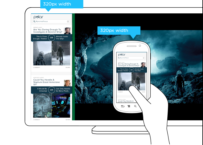
This simple example illustrates the challenge for Web designers. On Windows Phone devices, Internet Explorer uses 320 pixels for its device-width (the width it renders content at). On Windows 8 tablets, PCs, and TVs, snap mode uses the same 320 pixel device-width to lay out Web pages docked alongside other apps.
So with a responsive Web design, people get the same interface on a smartphone that they get in snap mode on a TV screen due to the same device-width (320 pixels). You can see this illustrated in the image below.

But should the interface be the same? A TV is usually viewed from about 10 feet away, while the average smartphone viewing distance is about 12 inches. This has an obvious impact on legibility for things like font and image sizes but it also affects other design elements like contrast. So a user’s posture (in this case viewing distance) should be taken into account when designing for different devices.
The input capabilities of a TV (D-pad) can differ wildly from a those of a mobile device (touch) or in some cases be the same (voice). Designing a simple list interface for d-pads requires a different approach than a creating a similar listing for use with touch gestures. So available input types should also be considered in a multi-device design.
When you take user posture and input capabilities into account when designing, an interface can change in big or small ways. For instance, contrast the design below for Windows 8 snap mode on a TV compared to a mobile version of the same feature.
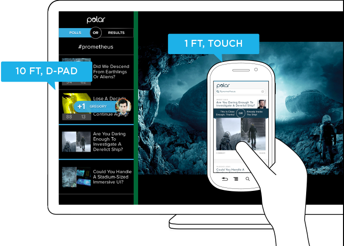
While the screen size (320 pixel device-width) has stayed consistent, the interface has not. Larger fonts, a simplified list view, inverted colors, and a lot more have changed in order to support a different user posture (10 ft away vs. 12 inches), and different input types (d-pad vs. touch). As you can see, screen size doesn’t give us a complete picture of what we need to know to design an appropriate interface.
Before you dismiss this as an isolated use case on Windows 8 devices, note that Android smartphones and tablets also offer the ability to interact with multiple applications side by side and Android-powered TVs won’t be far behind. In fact, we’ve already got Android eyepieces like Google Glass that pose similar challenges.
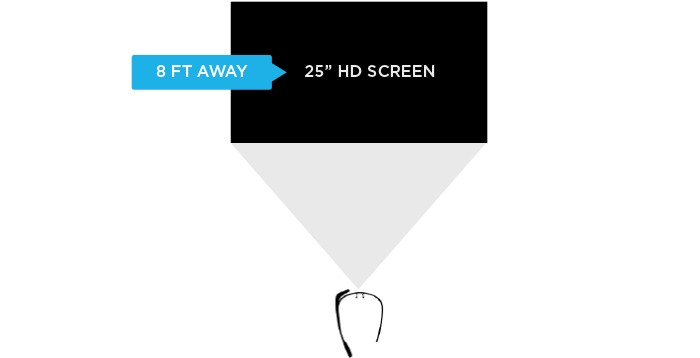
Google Glass allows you to view applications and Web pages using a display that projects information just above your line of sight. The official specs describe the Glass display as a “25 inch HD screen viewed from 8 feet away.” So right up front, viewing distance matters.

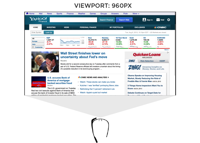
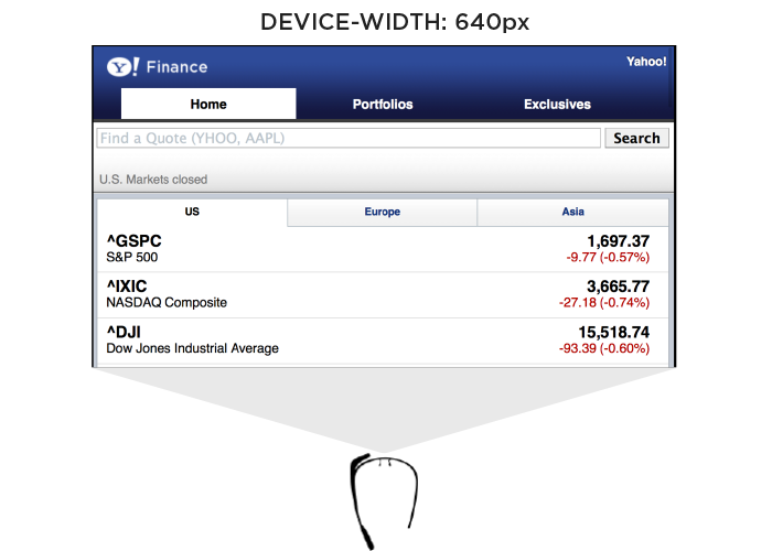
Like most mobile Web browsers, Glass uses a dynamic viewport to resize Web pages for its screen. On Glass the default viewport size is set to 960 pixels and pages are scaled down accordingly. So if someone is viewing the Yahoo! Finance site, it displays like this in the Glass browser (below). Essentially, it is shrunk down to fit.

The Web browser on Glass also allows pages built responsively to adapt to a more suitable device-width. In this case, 640 pixels. So a Web page designed to work across a wide range of screen sizes would render differently on Glass. Given that 600 pixels is a common device-width for 7 inch tablets, the page you’d see on Glass would look more like the following -adapted for a smaller viewport size.

In addition to the Web browser, Google Glass also includes a number of “glassware” applications built with the same Web technologies used to create Web pages. One of these apps provides access to stock price changes -very similar to what you see displayed prominently on the Yahoo! Finance site. However, the presentation of this information is very different. As you can see in the image below it’s been designed as if you are viewing a 25” screen from 8 feet away. This design is much more suited to a wall-sized display than a small tablet screen.

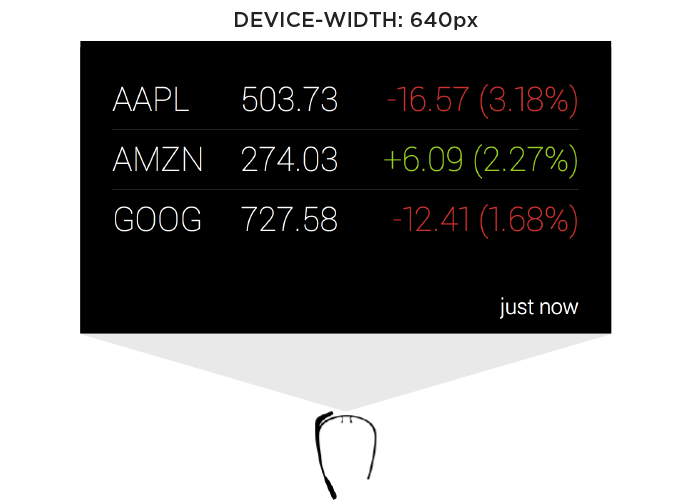
This Glassware interface is also designed to make scrolling through information using the touchpad on the side of Google Glass (which comfortably supports sweeping left/right and up/down gestures) fast and easy.
So again user posture and input capabilities inform how to design for a specific device. Screen size alone doesn’t tell us enough.
Supporting Everything
In order for an interface to adapt appropriately to different output, input, and user posture, we need to know what combination of the three we’re are dealing with at any given time. On the Web that’s been notoriously difficult. We can’t tell TVs from smartphones or what devices support touch without relying on some level of user agent detection, which is often looked at dubiously.
Because of this, Web developers and designers have smartly decided to simply embrace all forms of input: touch, mouse, and keyboard for starters. While this approach certainly acknowledges the uncertainty of the Web, I wonder how sustainable it is when voice, 3D gestures, biometrics, device motion, and more are factored in. Can we really support all available input types in a single Web interface?
A similar approach to user posture is increasingly common. That is, an interface can simply ask people if they want a lean-back 10 foot experience, a data dense 2 foot experience, or something more suited for small portable screens. This makes user posture something that is declared by people rather than inferred by device. Once again, this kind of “support everything” thinking embraces the diversity of the Web whole-heartedly. However it puts the burden on each and every user to understand different modes, when they are appropriate, and change things accordingly. (Personally I feel we should be able to provide an optimal experience without requiring people to work for it.)
Ultimately trying to cover all input types and all user postures in a single interface is a daunting challenge. It’s hard enough to cover all the screen sizes and resolutions out there. Couple that with the fact that an interface that tries to be all things to all devices might ultimately not do a good job for any situation. So while I embrace supporting the diversity of the Web as much as possible, I worry there’s a limit to the practicality of this approach long-term as the amount of possible inputs, outputs, and user postures continues to grow.
Don’t Assume Too Much
These examples are intended to convey one important point: don’t assume screen adaptation is a complete answer for multi-device Web design. Responsive Web design has given us a powerful toolset for managing a critical part of the multi-device world. But assuming too much based on screen size can ultimately paint you into a corner.
It’s not that adapting to screen size doesn’t matter, as I pointed out numerous times, it really does. But if you put too much stock in screen size or don’t consider other factors, you may end up with incomplete or frankly inappropriate solutions. How people interact with the Web across screens continues to evolve rapidly and our multi-device design methods need to be robust enough to evolve alongside.
Using Content To Define User Experience
In her presentation at Breaking Development in Nashville TN, Steph Hay talked about the importance of narrative in digital experiences. Here’s my notes from her talk on Using Content To Define User Experience.
- The Sesame Street TV show was based on actual research of how kids learned and continually measured to make sure it was reaching their educational goals. They approached content development by isolating chunks of programming, testing it, and continually refining.
- The big paradigm shift was learning first then writing second.
- Content and technology that guides people over time forms a narrative that allows people to act.
- Use cases in software design tend to be very flow-focused and high level. Requirements docs just focus on the what. Content is the missing piece in everything we’re doing.
- When content really works, we can get from point A to B more quickly and easily.
- Use content to explicitly set expectations then meet them regardless of device.
- Design is only part of the narrative, the other half is the real human people that experience what we are designing.
- The “you” orientation of content focuses on the user, not on the company. It positions the customer as the other half of the narrative.
- Features by themselves won’t protect your narrative, you also need relevance.
- There are two kinds of narratives online: setting expectations (through marketing), and functional requirements (through experience).
- Write content first. This is the paradigm shift.
- Many organizations are afraid to write content first because they are used to writing it last. But this results in missing pieces and incomplete experiences.
- State your goal: what are you trying to accomplish, what are your users trying to accomplish.
- You can use tools like Google Keyword builder and Google Analytics to find the language people are using to find you. What terms make sense for them? Use these terms to create a conversation.
- The content is the structure. This is why it makes sense to start there.
Web Performance 2.0
In March 2012, Guy Podjarny ran a test comparing the performance of hundreds of shiny new responsive websites across four different screen resolutions. The results were very dissapointing. (1)
Two years into the rise of Responsive Web Design, after every imaginable sort of designer and developer had jumped into the train, it took a test to almost rock the theory to its foundations.
Guy proved that almost every known responsive site was overweight.
We’ve made the internet in our image… ObeseJason Grigsby
But, most importantly, every mobile user was receiving the same kilobyte overload as a desktop user.
The community had different reactions to the fact. Some claimed Responsive design wasn’t the ultimate solution, perhaps not mature enough for the challenges web designers face today.
Thankfully, the Web community can always count on a number of people who will grab the bull by the horns and turn the situation around. Modern Web gurus likeBrad Frost, Luke Wroblewski or Christian Heilmann saw opportunity where others shouted crisis and managed to turn the problem to the community’s advantage.
If your website is 15MB, it’s not HTML5, it’s stupidChristian Heilmann
Web performance has traditionally been built around (no offence) developer-exclusive jargon.
Terms like GZIPing, uglifying, minifying, DNS Lookup, file-concatenation… This obscure words push designers out of the ecuation.
Smart people in the community, though, have since realized that the problem has a deeper root. It really doesn’t matter if you optimize or compress an ultra-high-res image, if your plan is to hide it from a mobile user and still make him download it.
Good performance is good designBrad Frost (2)
To achieve truly lightweight sites, performance shouldn’t only be a concern. It should be treated as a design feature.
To them, performance is like any other issue. Sites that overcome it are the ones who acknowledged it from the start. And the ones that overlook it are the ones that suffer it in the end.
Performance is about respect. Respect your users and they will come back.Brad Frost
The Why
It’s not only that you want users to have a good experience. If that was the case you could easily swap performance for a more important concern in your agenda.
Page Abandonment
Research shows 57% of users will leave your site if it takes more than 3 seconds to load. (3)
Google, page speed & SEO
Back from the spring of 2010, Google takes speed as a ranking factor. (4)
The impact is not major for average-speed sites, but if the page falls behind a certain threshold, it will be punished by the company’s search algorythm.
This proves speed not only is a concern when talking about User Experience. Be aware of loading speed if your site is to be ranked well among the competition.
Bandwidth considerations
Back in the day, people used to talk about the very abstract concept of ‘Mobile Context’. Google´s famous theory breaks mobile users down to three types (5):
Repetitive Now
People that use their phone to stay up to date with ongoing, repetitive changes (sports scores, Facebook feeds or stock market)
Bored Now
Users that put their phone out while waiting for something to happen.
Urgent Now
Pretty self explanatory
Sounds assumable, right?
Well, the truth is there is no truth about this. There is no 'mobile context'. People will use their phone not only when they are walking in the street, travelling by train or relaxing in their home. They do everything at the same time!
Phones follow people everywhere, so people use them anywhere.
Mobile context is important, but first we need to figure out what the heck it is.Tim Kadlec
Luke Wroblewski shows some really interesting stats: (6)
Where are people using mobile devices?
- 84% at home
- 80% during miscellaneous downtime throughout the day
- 76% waiting in lines of waiting for appointments
- 69% while shopping
- 64% at work
- 62% while watching TV (alt. study claims 84%)
- 47% during commute in to work
As new situations emerge, as new markets and different habits rise, mobile context will change. We can safely assume that the concept of mobile context will always be on the move, until people stop using mobile phones.
This leads us to keep an eye on bandwidth. There is only one scenario where you can serve users an obese website and get away with it: serve it to their macbook pros, while they are at home in UK or the USA with a full bandwidth.
But the rest of possible situations, which are a great many, have to be covered aswell. These include the seemingly endless stream of devices poured every day into the market, which people use to visit websites.
You don’t get to decide which devices access your site, your users doKaren McGrane
They include the countries which didn’t have that many smartphones a few years ago, but are ruthlessly getting ahead.
If your stuff, if your content, if your information, if your products, if your services are not available on mobile, they don’t exist for these peopleKaren McGrane
But more importantly, they include all the places people will be at when using your site. So you have to watch all bandwidths. It’s not only inhabitants of poor areas of the world clearly don’t have the same data-speed coming their way. People will try to access a site at work, with a 100mb/s connection; at home, with 2 to 30mb/s and also with 3G, and also with 4G, and also with a data plan, etc., etc.
To put it bluntly, Responsive design is not anymore about screen sizes but about different scenarios, so the solutions must be flexible, adaptable and thought out top to bottom.
And How?
Well, glad you asked.
We said before not to look at performance as a bunch of automated tasks run server side that help with an already doomed site. There are ways to undertake this concerns and turn them into a competitive advantage.
What to avoid
Guy Podjarny cites three main reasons for the number of bloated responsive websites we see out there: (1)
Download and Hide
Assets are still downloaded, but hidden.
Download and Shrink
High-res desktop-level images are downloaded, and shrinked to fit the users screen
Excess DOM
There is no way to avoid browsers parsing and processing all areas of the DOM, including the hidden ones
A preemptive approach
There’s a great deal of information out there about why websites keep failing to surpass expectations in performance. But what most people come to say is something like ‘Be responsible from the start’. All techniques I’m going to cover have been around for a while. To me the interesting part comes in how they mix and intertwine, covering each other’s flaws and combining their strenghts. It is now, deep in the mobile explosion that they show how powerful they are.
Progressive Enhancement…
…is all about providing a web experience reduced to the essential and take it from there.
A couple of years ago this theory was taken mostly from a browser point of view. With emerging technologies like HTML5, CSS3, jQuery and so on, the web makers had kind of forgotten about their users. Quite a big percentage of them were getting an incomplete form of their site, relying a bit too much on this shiny new tech.
Now that Webkit engines and Firefox and others have taken over much of the market share, the problem is the enormous quantity of devices with browsers that don’t have the capabilities of the brand new iPhone or Samsung. Again, Progressive Enhancement is the only approach which takes care of these forgotten players first and leave the shine for the ones that can take it.
Mobile First Development
Back in 2009, Luke Wroblewski proposed designing mobile first for three reasons: (7)
- Mobile is exploding
- Mobile forces you to focus (allowing you to get rid of the clutter that stems from having too much screen real estate)
- Mobile extends your capabilities (with technology like GPS, geolocation, multi-touch gestures, accelerometer, cameras…)
Since then, Web design has been rapidly shifting to this approach. Along the way not only designers, also many developers, have pointed out that building mobile first gives you an edge over desktop development, very related to Luke W’s second point. Progressive Enhancement and Mobile First Development have suffered a fusion of sorts. Devs start building for mobile and progressively enhance from there, taking larger screen space as an enhancement over a mobile core foundation.
Jordan Moore makes a good summary of the reasons(8). He argues that, since 'we can't safely bet on connection speed', 'The 'responsible Web designer' would build for the lowest point of entry - a mobile-first approach, assuming for the slowest connection speed and building up from there to larger breakpoints for faster connections'. In the future, we will be able to rely on solid bandwidth detection, but for now it is a good idea to take it as a concern and try not to take any steps in the wrong direction.
To sum up:
Code the site for the lowest resolution and possibilities that you care about. Make true use of Progressive Enhancement from the start. Build extra functionality, enhanced visuals and interaction when it can be used.
RESS: REsponsive Web design + Server Side components
To many people, Responsive design had kind of an essential short-coming. It relied mainly in screen width detection.
As more and more types of devices emerge, hybrid devices like touch screen laptops and so on, feature detection has become essential for Responsive design. Libraries that provide it, mainly Modernizr, have bloomed and are now used on most projects. They help devs valuate whether the client’s browser supports certain functionality and provide it accordingly. But many times it’s tricky to rely on browsers, because ‘they’ will say they support features when, really, ‘they’ do whatever they want. Support for new features is usually partial.
RESS was born to provide a solution. Like Mobile First, the term was coined by Luke Wroblewski in 2011 (9). It relies on detecting the user’s device type, evaluating it and providing an experience taylored for it. To do this, there are heavy tools out there, like WURFL, DeviceAtlas or lighter ones like Browser Gem, that read the user agent string and start from there.
Evaluating the device type has other advantages. It allows devs to serve different templates depending on the user’s device. Say you are building a ver large site, and you want your mobile navigation to be a simplified one, that doesn´t take half as much space as the desktop one. You could either play with content, showing and hiding stuff, moving divs around with JavaScript, or you could have different templates for mobile and desktop screens and have the server decide which one to serve.
This gives Responsive design an edge over Mdot sites. Mdot’s only advantage until RESS came along was providing an experience specific for mobile devices.
The BBC (very smart people, with millions of readers across the globe and a big responsibility toward their users) talk about how RESS and Progressive Enhancement could work as one and only. They call their approach Cut the Mustard! (10). It consists of creating a core experience that will work on every device you can imagine. After that, they evaluate the device on the server and they decide whether or not it ‘Cuts the mustard’. If it does, a progressively enhanced experience is handed out. But again, if it doesn’t, the user can still access the core content.
Conditional Loading
Mobile users want to see our menu hours and delivery number. Desktop users definitely want this 1mb png of someone smiling at saladMat ‘Wilto’ Marquis
Let’s take a couple of points of view into account:
- Mobile users want THE content, as much as desktop users.
If your content is accessible from a URL, it will be accessed by mobile devices.Brad Frost
- Mobile forces you to focus. There are some constraints designers have to embrace to serve the same content, like bandwidth and lesser screen size.
Also refered to as ‘Agressive Enhancement’, this development technique allows designers to focus on the core content and progressively enhance it for bigger screens. It provides basic access to certain content that can later be injected on the page when space becomes available.
It might be more accurate to think of conditional loading as a content-first approach. You don’t have the luxury of sidebars or multiple columns to fill up with content that’s just nice to have rather than essentialJeremy Keith
Use excellent tools like MatchMedia, that mimics CSS behaviour evaluating screen size in JavaScript.
Lazy Loading
Image and user heavy sites that need to be optimized for mobile, like Facebook, Twitter or Pinterest, make use of Lazy Loading to provide a better experience. When you first load the page, a number of posts is loaded. When you scroll down, the designer assumes it is because you want to browse through even more content, so it is injected in the page via Ajax. This makes the page load much faster by avoiding DOM excess.
Setting a performance budget
Tim Kadlec argues that setting a maximum page weight and being always aware of it is the ultimate way to keep page load down (11). ‘Set your goals and stick to them’. Steve Souders mentions three options to choose from, if you fall over your budget:
- Optimize an existing feature or asset
- Remove an existing feature or asset
- Don’t add a new feature of asset.
To me this sounds a bit radical, but it makes a point of closely following the overall performance of a site over time and with each new feature.
Let’s get Technical!
There are certain methods to achieve speed, that work in a more technical and less conceptual level.
Image Techniques
Images constitute around 60% of websites. If you are serving mobile users with unknown bandwidth connections desktop-sized images, you are basically dooming your site to poor performance
The trick to overcome this is to serve different versions of images, depending on screen size or type. You would serve a small image to a mobile phone and a high-res one to a desktop. You would serve a double-sized image to a Hi-DPI device.
Responsive Images
Designers and developers all over the world have been fighting to get responsive images into the HTML specification. Mat ‘Wilto’ Marquis is one of the most outspoken. The battle is not yet won, but there are a number of solutions that rely on JavaScript to achieve a desired result. Scott Jehl, also from the Filament Group, wrote a plugin that mimics the markup proposed by the community and works like a charm: PictureFill
Compressive Images
Daan Jobsis, a dutch designer, found a very strange phenomenon when compressing images with Photoshop (12). He proved the following: Take an image, double its size (200%), compress it to 25% or less its original quality, resize it back in the browser(100%). The image will not only be lighter in size but already optimized for HiDPI screens, since its pixel density is already doubled.
The only observed problem is that the browser might have a hard time painting a double-sized image back to its original size (if it has to do it a hundred times, like in image-heavy sites), so a little bit of testing is required to see if this is the optimal solution.
Vectors VS Bitmaps
SVG images are the way to go at the time. They are completely scalable, so they will perform better in any screen. Providing fallback is very easy through Modernizr.
Icon Fonts
Technically they are vector based images, only served as a font. As Chris Coyier puts it, ‘Icon Fonts are Awesome because’:
- You can easily resize
- You can easily change the color
- You can easily shadow their shape
- They will work in IE6, unlike transparent PNGs
- You can do everything you can do with images
- You can do anything you would do with typography
HiDPI images
Dave Bushell wrote recently a very interesting article with some thinking on HiDPI images (12). He argues that, even if today we have the possibility of serving iPhones, iPads and other modern devices with images that will fulfill their screen capabilities, it is still too soon to assume a site is not going to get crippled by doing it.
Does a fast connection and high pixel density mean users even want higher quality? Not likely on mobile data plans.Dave Bushell
The point is to do it but do it sensibly, considering the case before jumping into 4x images.
What’s next
Google recently developed a new image format, WebP. It provides lossless and lossy compression for Web images, resulting in files 3x smaller, compared with PNG.
There are simple, lightweight JavaScript libraries that convert to and from WebP available today. Considering the impact of Google’s latest tools, it’s probably a good idea to start experimenting today in order to handle an image-heavy site .
Asset Loading
Load assets carefully and in order. Controlling this aspect provides a big advantage, by allowing the page to render the basic content and enhance it afterwards.
CSS, Images
Controlled loading through media queries, conditional or lazy loading and responsive / compressive image techniques
JavaScript
Make use of HTML5 functionality, like async or defer. There are also loading helpers like RequireJS that can handle loading and dependencies.
Advertising, Social Widgets or any third party assets
Just inject after load.
Old-school Performance Techniques
They have been around for a while, but are still as relevant today.
Reduce the number of HTTP Requests
To achieve this devs have to think resource by resource, but here are a number of guidelines:
- Concatenate all CSS files or make use of CSS Preprocessors to compile them into one file.
- Unify all JS Plugins under the same file and always load them in the footer, unless they really need to block the rendering of the page (if you load Typekit fonts in the footer, you will get the famous FOUT or ‘Flash of Unstyled Text’).
- If you must use PNG images, use sprites. They unify all images in one and make use of CSS to cut the pieces. There are a number of online solutions to do this.
- Make use of the data URI scheme where possible, that allows you to include images as inline data, getting rid of some more HTTP requests.
Reduce the number of Bytes
Uglify, minify every Script or CSS file you call from the page. Set your server up to allow GZIP compression and expansion and GZIP every asset.
In Summary
The importance of Web performance has been slightly overlooked since the birth of Responsive design.
Designers and developers have been focusing on how to solve the Responsive puzzle and, along their way, a new multi-bandwidth, multi-device, multi-location Web is starting to come into focus.
To be prepared for tomorrow’s problems, we have to include performance as an essential consideration, as the Desktop-centered Web is disappearing before our eyes. The mobile user is hastier and readier and won’t jump through hoops to get the content, and since more and more sites spring every day, being fast will mean being ahead.
Reference
1. Performance Implications of Responsive DesignGuy Podjarny
2. Performance as DesignBrad Frost
3. Website abandonment happens after 3 seconds
4. How Page Load Speed Impacts SEO And User ExperienceSpencer Yao
5. Organizing MobileLuke Wroblewski
6. When & Where Are People Using Mobile Devices?Luke Wroblewski
7. Mobile FirstLuke Wroblewski
8. Responsible Considerations For Responsive Web DesignJordan Moore
9. RESS: Responsive Design + Server Side ComponentsLuke Wroblewski
10. Cutting the mustardBBC´s Responsive News
11. Setting a Performance BudgetTim Kadlec
12. Retina Revolutie Follow UpDaan Jobsis
13. The Raster Image ParadoxDave Bushell
Follow the discussion
- interactive
- interaction
- installation
- design
- led
- light
- art
- technology
- projectionmapping
- projectmapping
- robotics
- ui
- mobile
- projection
- interactivedesign
- lightdesign
- apple
- web
- 3d
- ux
- userinterface
- lightart
- robot
- artinstallation
- touchscreen
- application
- app
- webdesign
- touch
- motion
- responsive
- adobe
- multitouch
- future
- robots
- drone
- photoshop
- productdesign
- ledinstallation
- lightsculpture
- video
- user experience
- iphone
- creative
- interactivelight
- digitalart
- motiondesign
- ar
- 3dprinting
- responsivedesign
- augmentedreality
- drones
- kinetic
- data
- development
- kinect
- microsoft
- display
- immersive
- process
- painting
- timelapse
- dronerobotics
- 3dprojection
- ios
- vr
- virtualreality
- earth
- ai
- device
- user interface
- engineering
- laser
- lightpainting
- kineticsculpture
- lightinstallation
- touchinstallation
- animation
- programmableleds
- graffiti
- interactions
- neon
- performance
- leapmotion
- watch
- mobiledesign
- pixel
- environment
- exoskeleton
- interactiveenvironment
- sound
- lcd
- social
- leds
- lukew
- artlight
- patterns
- internet
- carui
- November 2011 128
- December 2011 65
- January 2012 25
- February 2012 27
- March 2012 33
- April 2012 31
- May 2012 16
- June 2012 32
- July 2012 20
- August 2012 37
- September 2012 24
- October 2012 34
- November 2012 31
- December 2012 6
- January 2013 21
- February 2013 11
- March 2013 10
- April 2013 35
- May 2013 45
- June 2013 10
- July 2013 49
- August 2013 33
- September 2013 40
- October 2013 57
- November 2013 31
- December 2013 28
- January 2014 86
- February 2014 49
- March 2014 24
- April 2014 40
- May 2014 6
- June 2014 9
- July 2014 1
- August 2014 34
- September 2014 30
- October 2014 45
- November 2014 21
- December 2014 6
- January 2015 5
- February 2015 17
- March 2015 18
- April 2015 14
- May 2015 1
- June 2015 10
- July 2015 4
- August 2015 1
- October 2015 11
- March 2016 4
- December 2016 18
- September 2017 6
- October 2017 13
- November 2017 5
- June 2018 8
- July 2018 2
- November 2018 7
- February 2019 8
- March 2019 6
- July 2019 1
- August 2019 1
- October 2019 1
- July 2020 5
- November 2020 9
- December 2020 1
- January 2021 1
- April 2021 1
- May 2021 9
- June 2021 3
- August 2022 3
- May 2023 2
- September 2023 1
- May 2025 6