User experience (UX) is an important facet of website development, though, it is often neglected. The reason is that most web developers focus on the technical features of the site. However, when one forgets to build a website that is easy to navigate, the user tends to shift his or her attention to other websites and would not ever come back.
On the contrary, when a website is well-thought of, a favorable and long-term impression is created, together with the preference of your website over that of the competitor’s. It is in this reason why it is pertinent to plan and prepare the experience a user will have when they browse through your website.
You need to consider if your site will provide the information a user needs as well as how your site is able to provide the information. Truly, you can never tell how this tiny and often ignored detail can gravely influence the views of your users.
To address this concern, let us look at the essential UX tools that can help us achieve an unforgettable and lasting user experience.
Maps and Charts
This is the foundation of everything, even in areas not concerning web design. You need to have a goal and a way to attain it.
Why maps are needed:
- A project will be left astray without having a sound and foolproof plan.
- Without a plan, you will be lost; you will tend to go in all directions like a hiker who opted to walk in the woods instead of the tracks.
Planning will give you the following benefits:
- Be able to determine the goal of the website
- Develop a flexible design that works on your target audience
- Maximize reusability of the web site through appropriate use and reuse of web pages
Planning tools like mind maps, flowcharts and sitemaps are great tools that you will need for guiding your goal.
- Mind maps and flowcharts are effective in organizing your mind and filing each plan in a way that you can ‘see for yourself’ how your plan would work.
- Sitemaps can utilized when defining the navigation structure of a website.

Concept Draw is a powerful tool for diagrams as it provides you with flowcharts and mindmaps both on Windows and Mac. It comes in three programs, namely:
- Concept Pro 9 - gives you diagrams and charts, vector illustrations and maps
- Concept Draw Mind Map 7 – allows you to do mind mapping, brainstorming and presenting
- Concept Draw Project 6 – has features like Gantt charts, project and resource planning
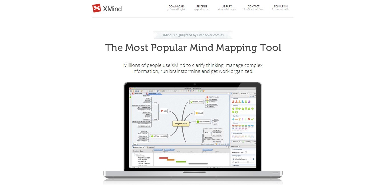
XMind is an open source project by Lifehacker.com. It is the most popular mind mapping tool that offers the following features:
Features:
- Local Network Sharing – helps you to communicate better with your teammates via LAN.
- Export to MS Excel/CSV – you can start the plan via XMind and export it to Excel for task management.
- Export to PDF/EVG as vectors – maps are always printable in any scale.
- Useful templates – there are loads of useful presets; you won’t worry how to start your plan.
- Beautiful markers – differentiate thoughts and ideas with style.
- Clip-art – another way to design your plan.
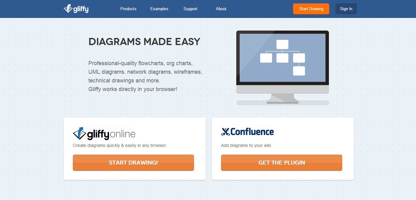
Want a professional-looking flowchart, diagram, floor plan or technical drawing? You can do that all in your browser using Gliffy!
Features:
- Drag and drop interface – combines the power of a desktop software with the lightweight and easy to learn browser based application.
- Compatible via Mac or Windows – you will never worry if the program works for your OS; as long as you have an Internet connection and a browser, Gliffy can run in your computer.
- You can also share your work with others

OminGraffle is a great iPad and Mac OS X tool for making eye-gasmic graphic documents. It provides you with great styling tools. It even organizes your diagrams in one click. You can now create flow chats, diagrams, UX and UI interaction and more!
Features:
- Document syncing – allows you to share your files with other users
- Comes in with GraphViz Layout Engine – you can do wireframes
- Has great graphic tools like lines, shapes, templates and custom stencils
- Can do multi-page, multi-layer and multi-canvas documents,which can all be stored in one Graffle document
- Has Presentation Mode – you can easily relay your proposals to clients and workmates.
Wireframes and Prototypes
Prototypes allow you to work on building elements, positions and design before moving further on the development. This will save you a lot of time as it will give you a clear goal of the design before the development phase.

UXPin offers a new way of prototyping websites and iPhone apps. It is a complete system for designing user experience with collaborative app for wire-framing and paper prototyping.
UXPin is used by the people from Google, Apple, Microsoft and IBM. It has earned reviews by Wall Street Journal and The Next Web.
Features:
- Uploads UX and project files such as Model Canvas and Project Canvas
- UI design
- Collaborative work in real time – no more emailing to team back and forth
- Visionary wireframing and protyping tool
- Easy UI design process

Did you know that you can make mock ups using MS PowerPoint? Oh yes, you can! Using Power MockUp, you can sketch your wonderful ideas without the hassle of learning a new software.
Features:
- Create designs using hundreds of stencils and icons
- Stencil library – provides you with a wide variety of templates for all the typical elements of a website design or application
- It works with PowerPoint 2007, 2010 and 2013, both 32 and 64-bit

Balsamiq offers fast and functional way of prototyping websites and apps. It is not inexpensive, yet it provides plenty of revenue to your business.
Features:
- Drawing is easy using the four major blocks (Application bar, UI library, mockup canvas, file browser)
- Team members can come up with a design and iterate over it in real-time in the form of a meeting.
Balsamiq price varies depending on the versions you need. You can check the pricing here.

Transform your designs into high-fi prototypes both for web and mobile interfaces with Invision. This powerful tool is integrated with Photoshop, Fireworks and Illustrator so you can use it whatever platform you might want to.
Features:
- Upload images and use hotspots to create interactions like a real app does
- Send the link of the project to your client so that you can get their own say about the app or site that you are developing

WireframeSketcher is an offline desktop wireframing tool that comes with fast and native UI on both Mac, Windows and Linux.
Features:
- Standalone application but also acts as plugin-in for any Eclipse IDE
- Cross platform and has a native fast UI on Windows, Mac and Linux
- Built-in refactoring lets you rename and move files without breaking links
- Flexible UI lets you work on multiple monitors
- Extensive library of UI controls
- Flexible wiki formatting (style any widgets that supports text)
- Large set of vector icons
- Storyboard use cases

If you’re into collaboration, Notism is a recommended tool for you. For one, it lets you obtain and share designs efficiently. You can also create interactive prototypes, and notes, discuss these prototypes and be notified about it in real-time.
Features:
- Upload and share design work with your team members easily
- Works with your favorite design tools like Photoshop, Fireworks and Illustrator
- Receive live feedback from team members
- Comment in realtime via Sketch
- Create working prototypes of your static design templates by setting up hotspots and linking screens
- Add to-dos lists

GoMockingbird is a web app that makes it simple for web and app developers to create, link together, preview and share mockups.
Features:
- Drag and drop UI elements to pages, rearrange and resize them
- Link users to multiple mockups screens, allowing them view each others work
- Share link to team members and clients in real-time
- Export mockups to PDF or PNG files
Creately is another useful wireframing UX tool. Aside from the wire-framing features and mock-ups, you can use it to draw flowcharts, mind maps and many more diagram types.
Features:
- Sharing diagrams with other users
- Great diagram customization
- Font and object can be altered in variety of ways
- Text can be turned into links

Indigo Studio is one of the fastest and newest prototyping and interaction design tool. The tool itself is interesting in that it has two modes of working: screen and storyboard.
Features:
- Designing prototypes for mobile devices
- Full support for any device that runs HTML5 including iOS devices
- Utilize supported touch gestures and documents designs through these new features

Lucid Chart is another great tool that provides collaborative online diagramming. It draws flowcharts, organizational charts, wireframes, UML, mind maps and more. It is a web-based, visual thinking application that has unlimited number of ways to create diagrams in real time.
Features:
- Enterprise-level security and admin controls
- Import and export Microsoft Visio documents
- Intuitive user interface and seamless collaboration

GUIToolKits is a prebuilt tool for everything from web to mobile devices. It is the next major UI template released by Amir Khella who also brought Keynotopia. GuiToolkits is apparently the largest collection of user interface in the planet.
Features:
- It’s loaded with UI components of various platforms such as Android, iPad, iPhone, MacOs, etc.
- You can create wireframes and turn them into high fidelity pixel perfect prototypes by switching the UI component style.

Pidoco is a web-based prototyping software for rapidly creating clickable wireframes and UI prototypes for web, and other applications. It’s easy to use with its smart sharing and collaboration features, a convenient specification generator, exports and much more.
Features:
- Design prototypes as simple as playing blocks
- Ready to use once you sign up
- Rapid application prototyping
- Share work together other team members in real-time
- Get feedback real-time

FlairBuilder has the tools you need to wireframe a website or iPhone apps. There are a lot of built-in widgets to get you started from having simple page-to-page links to more complex functional interactions tool.
Features:
- Simple and easy to use
- Wireframes are organized in pages
- Instant Site Map (Site Map View)
- Easy to add comments to your pages

SimpleDiagrams is a small and simple software program that enables anyone to quickly describe their thoughts or capture business processes visually. Consisting of an elegant design and simple feature set makes it a perfect tool for business.
Features:
- Drag, drop and size symbols from libraries
- Add photos and post-notes
- Various background styles (chalkboard, whiteboard, etc.)
- Create multi-diagram documents with tabs
- Save diagrams on your computer
- Export your diagram to PNG and PDF
- Create custom libraries

Handcraft is a great tool to build and share better prototypes with HTML, CSS, Javascript, Coffeescript, LESS and Markdown. HandCraft is now available in Chrome Web Store. This means that if you use the Google Chrome browser, you simply install it and it will appear on your tab screen.
Features:
- Design in the browser
- Include state changes, error messages and alternate designs directly in prototype
- Support for HTML, CSS, Javascript, LESS
- Secure and Private Prototypes

FileSquare offers web-based tools for creating prototypes by linking uploaded mock-up images together. With FileSquare, you can simplify the prototype process with click-through mockups and collect feedback on your designs.
Features:
- Drag and drop screens right into the editor window
- Link up sketches, wireframes etc. quickly
- Track progress drill down into details
User Testing and Feedback
Feedback and user testing are important too. Once you have done the project, you will get actual users to use it. In this manner, they will be able to identify the possible errors and bugs so you can improve or troubleshoot them.

Forrst, maintained by ZURB, is a great resource for designers and developers who want to share their work and get feedback from others in their field. Compared with Behance and Dribble, Forrst generally works better if you want complex feedback instead of just recognition.
Features:
- Get feedback on your visuals
- Interactive discussion about the design project
- Get help from other developers
- Share design or developer concepts with your peers

Intuition HQ allows you to share user feedback with clients in a visual and simple manner. You can get results to show the things that work in your website and the things that don’t. This way, clients are being given extra value by offering them new and improved services. It’s like involving the clients without over-involving them.
Features:
- Test designs quickly and easily
- Share user feedback with clients in an uncomplicated system
- Add value to clients by offering a new service
- Improve leads, sales & your reputation for the user-centered design

Silverback is a “guerilla” usability review application. This means you can review the feedback at at your own preferred time and place. It is a software that aims to empower people to develop applications. The best part of this is that it comes as ready-to-use, right out of the box.
Features:
- Capture screen activity
- Video the tester’s face
- Record the tester’s voice
- Add chapter markers on-the-fly
- Control recording with the remote
- Export to Quicktime

Verify gives you the opportunity to gain valuable input regarding your users’ expectations.
What does Verify do?
- It also provides reactions to your designs before writing a single code by uploading test screenshots.
- Your team will have an easier time in making design decisions.
- Fast in collecting and analyzing your feedback, it is also easy to use because you can set up your Verify account and start surveying in less than three minutes.
Features:
- Collect and analyze user feedback on screens or mockups via design surveys
- Collect data that informs your design decisions
- Create and share Actionable Reports
- Collect Demographics

Browserbite provides screenshots and report cross-browser results with differences. It comes with aprice but, on the other hand, it reduces testing time, making the whole process more efficient.
Features:
- Launch your site in many computer browsers
- Take snapshots and compare these using patent pending algorithm
- Report visual bugs to the language you understand

With Poll Daddy, you can easily create surveys and polls that suit your brand, budget and goals. It comes with an easy-to-use survey editor that lets you create surveys from 14-question types, ranging from multiple choices to free text.
Aside from that, you can view your results real-time as they are being delivered. You can even filter them to properly analyze your data and share them. Polldaddy also is customizable using CSS.
Features:
- Easy-to-use survey editor
- Powerful reporting and filtering
- Customized survey look

The name itself would ring curiosity but, honestly, Five Second Test is a very simple tool to get feedback. This is a service that gathers feedback by asking its users to recall the elements of the website after they have fast-seen it in five seconds.
Features:
- This is a great method in gauging the attention-fishing capability of your website.
- It can reveal the strong and weak points in the design.
- It could be a fun way to check if your design is really attention-catching.
I quote,
“Fivesecondtest could easily get addictive. With so much UI feedback available so cheaply, you could try a much riskier UI & iterate.”
- Kent Beck, Three Rivers Institute

Usersnap is a screenshot tool for web development. With this tool, you’ll get annotated screenshots of the current browser content directly delivered to your bug tracker or project management tool. This tool helps you deal easily about the issues and share feedback between developers and clients.
Features:
- Enables Google analytics on pages
- Supports CMS platforms like WordPress and Joomla
- Works on all browsers

BugHerd is a web-based online bug tracker for web projects. It’s comprehensive feature set ensures the bases are covered from development all the way through to delivery.
Features:
- Simple bug reporting interface
- See visual bug reports on your website
- Kanban board for easy management
- Automatically capture client-browser information

Visual Website Optimizer has a sleek user-interface and friendly navigation bar. Being a dedicated testing tool, it is also packed with options to provide more data- ideal for the marketer who doesn’t have advanced coding and technical skills.
Features:
- A/B testing
- Multivariate testing
- Behavioral targeting
- Heat maps
- Usability Testing
- Revenue Tracking
Conclusion
So there you have it guys, the essential UX tools you need. I hope you’ll pretty much get the idea of how user experience is important in our field. Let it be known that without these tools, we’ll be lost. What do you think? Which of the tools is intriguing to use? Which of these services are helping you already? Let’s talk about it.
Source
 A study of eyes in different paintings from my art class when I was 17.
 A mug wrapped in paper and string, inspired by the style of Christo and Jeanne-Claude.

 Rigging tools. Some native, some made just for this puppet.
 Hypergraph Editor
 A GUI for observing direct feedback (posing, watching playback)
 Graph Editor
 Regular timeline hybrid view (key ‘ticks’)
 Dope Sheet (more like classic cell animation timing). Dope as hell right?
 Particle simulation

 Melscript. On a windows machine. Weird.
 Adobe After Effects
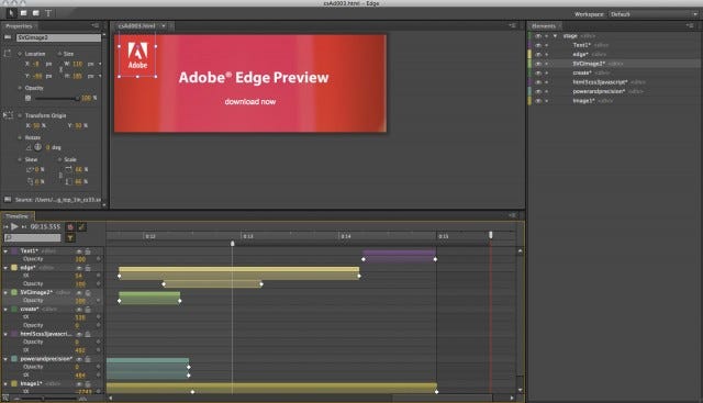 Adobe Edge Animate(it’s pretty terrible)
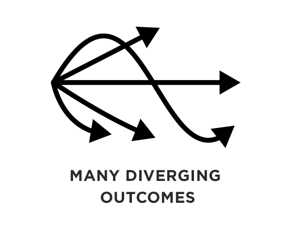 Signal Flow produces an almost infinite number of dynamic outcomes.
 Quartz Composer
 Moonbase — An animation tool I worked on, which attempted to reboot the node paradigm. R.I.P!
 Framer by Koen Bok
 A concept for a Better protyping tool by Colm Tuite
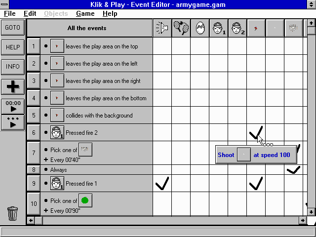 Klik & Play
 has lots of names: hamburger, sandwich, and even hotdog ?! What it actually is, is a list icon. We’ve just co-opted it to mean a navigation menu.