MOMU Explorer multitouch surface
These days museums have large parts of their collection locked away in huge archives. The Fashion Museum of Antwerp (MoMu) transforms this unfortunate situation into an asset by digitally showcasing the hidden treasures of their archives to the public. Providing a dynamic view into the collections of MoMu on this enormous 10 square meter multitouch surface is taken care of by a single computer, rendering 8xHD at a resolution of 7680x2160 at 60fps. All heavy image rendering and video processing is done by a node.js CMS in combination with phantom.js running on a Linux server. The whole setup supports 80 simultaneous touches.
Polar interactive augmented table
Polar interactive augmented table is the first iteration of an interactive content presenter designed for the young and tech savvy audience of Hellospace Brussels.
For the tabletop interaction it was clear we could not use traditional input methods and UI conventions, as the table is not a computerscreen. Likewise, the depth and amount of content would be different than for example on a kiosk touchscreen. In this environment the main use case instead would be brief explorations of basic content on the programme in the venue and the different product features of Hello Bank.
Dancer Bends Light in Projection-Mapped Performance
Inside a cube fashioned from translucent veils, a dancer takes a visual journey into a 3D space between dreams and reality. Hakanaï is a digital solo performance from Adrien M / Claire B that made its debut at BAM’s Fishman Theatre on March 17, 2015. The choreographed performance installation combines video projection mapping, CGI, and sensors to dynamically respond to the movements and proximity of its performer. Its visuals and sounds are generated and animated live, offering a uniquely different performance for each and every iteration.
How to design for thumbs in the Era of Huge Screens

After years of resistance, Apple’s iPhone 6 announcement last week officially signaled the Dawn of the Era of Huge Screens.
And it’s going to crash into existence in a big way. Just this Monday,Apple announced that they’d sold over four million pre-orders for the phones the opening night of pre-orders. In only one night, they sold almost half of what they sold the entire opening weekend last year for iPhone 5s and 5c.
So it’s looking like the 3.5” and 4” screens of yore will start their inevitable decline very quickly. That means that those of us who’ve gotten comfortable building apps, responsive sites and mobile-optimized web views with the old ways in mind have some learning to do (myself included).
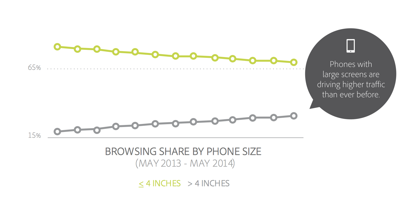
The decline is already in motion. Adobe’s 2014 Mobile Benchmark Report claims that mobile browsing among phones with 4” screens or smaller is down by 11%.
That means that learning how to design for thumbs is now more important than ever. Luckily, it helps that these phone display sizes are going to be practically universal. A cursory examination of the most popular Android screen sizes points to a range of 5.1” and 5.7”.
Apple’s changes will make our lives easier as smaller screen sizes die off. But only if we learn to adapt our designs.
If not, the future is going to be pretty painful for those thumbs.
This is especially important for those of us who’ve only been building iOS apps. All those design tradeoffs we thought we never had to worry about are suddenly right here in front of us — in an avalanche of pre-orders.
DESIGNING FOR THUMBS?
What does it mean to design for thumbs? It means building interfaces that are the most comfortable to use within our thumb’s natural, sweeping arc.
But this gets complicated. We unconsciously adjust the way we hold our phones to reach certain controls in various areas of the screen. During any given day, I’ll wager that you stretch your grip, choke up on the phone, or angle it in ways that make reaching difficult areas easier.
But we have to start somewhere. Research suggests that most of us hold our phones in the following way — with the bottom of the thumb anchored on the lower-right-hand corner:

This assumption comes from a study that mobile expert Steve Hoober conducted with 1,333 people early last year. He discovered that people held their phones in the following ways:
- one handed: 49%
- cradled: 36%
- two handed: 15%
Handedness figures were also instructive:
- right thumb on the screen: 67%
- left thumb on the screen: 33%
Hoober notes that left-handedness figures in the population are around 10%. So the observed higher rate of left-handed use could be correlated with people doing other things at the same time — smoking, riding a bike, drinking coffee, eating currywurst, etc.

THE THUMB ZONE
The Thumb Zone is a heat map of sorts. It’s a best guess for how easy it is for our thumbs to tap areas on a phone’s screen.
Let’s use Hoober’s research to create a Thumb Zone map representing what seems to be the most common use case:
- one-handed use
- right thumb on the screen
- thumb anchored in the lower-right-hand corner
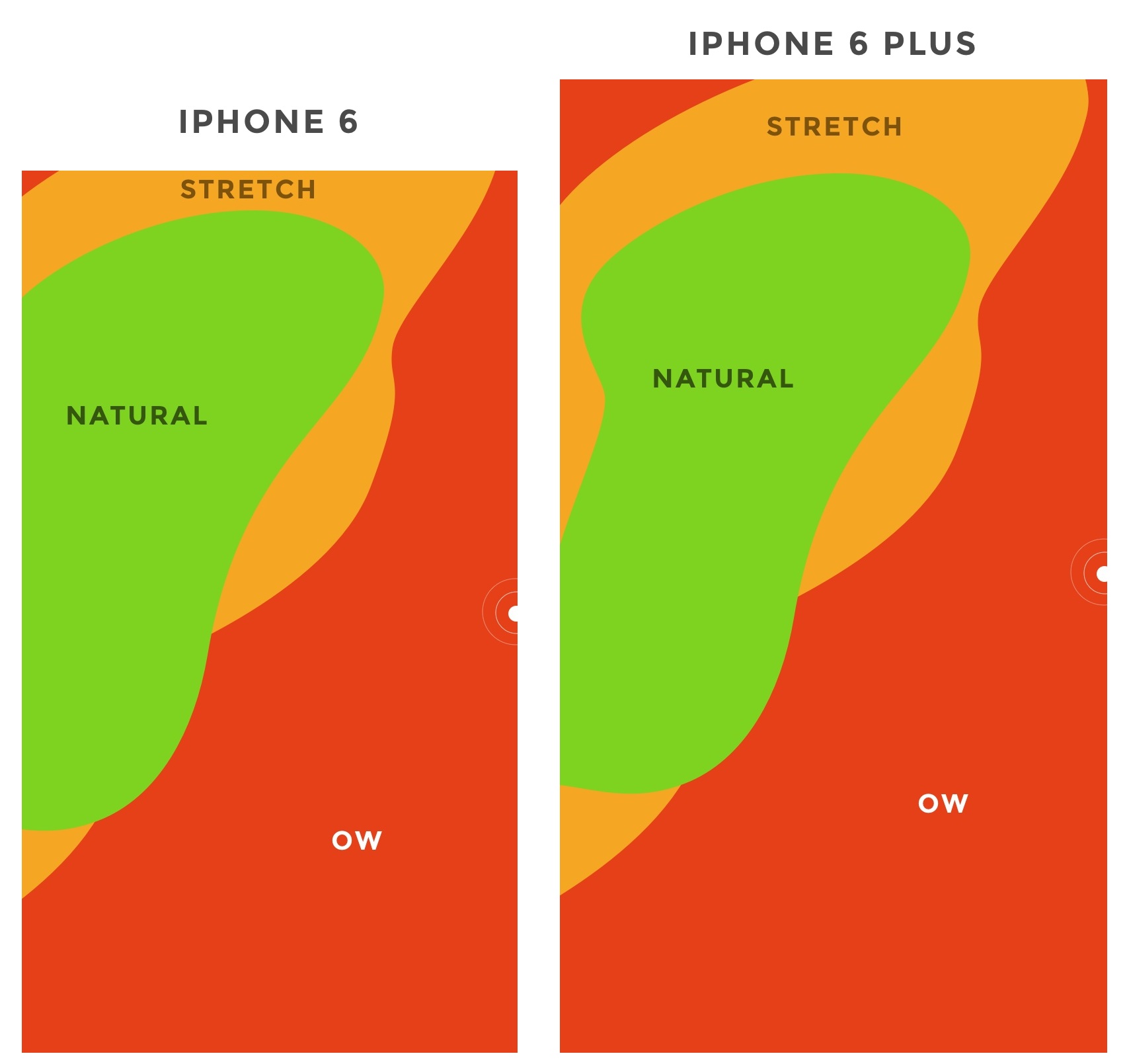
Here's the Thumb Zone heat map applied to every iPhone display size since 2007:

Here's a more direct comparison of the iPhone 6 and iPhone 6 Plus next to each other:

You’ll notice that the “safe” green zone stays roughly the same (more on why the iPhone 6 Plus is different in a second). That’s because our thumbs don’t magically scale with the screen size. And that’s also unfortunate, because I loved Dhalsim in Street Fighter as a kid.
But what changes is the sheer amount of “Ow” space, which becomes startlingly apparent with the iPhone 6 Plus.
Furthermore, you’ll notice how the shape of the “Natural” zone changes for the iPhone 6 Plus. That’s because it requires a different type of grip due to its size, using your pinkie finger as a stabilizer. It surprised me how different the experience was.
A note: my thumb doesn’t reach fully across the phone’s screen. Maybe you have bigger hands than I do. So terms and conditions certainly apply.
CHOKING UP
Let’s analyze how the Thumb Zones change when you shift your grip. Sometimes you might be in a situation where it’s easier to tap the phone with your thumb’s anchor at the vertical midpoint.
Here’s an illustration of this in action for iPhone 6 and iPhone 6 Plus:
REACHABILITY
Choking up might not be necessary, though, with iOS 8's "Reachability" feature. (That is if Apple takes the opportunity to teach people about its existence). By double-tapping the home button (not the same as "clicking" to display running apps), iOS will push the top of the screen down within one's grasp.
And here's how Reachability looks with the Thumb Zone overlaid on the iPhone 6 Plus. Notice anything?

Yes, Apple's demonstration images places the thumb in exactly the "Natural" zone.
Another observation on Reachability, as pointed out by John Gruber: "Reachability on the 6 Plus moves things further down the display, percentage-wise, than it does on the 6 — it’s all about moving the top of the display to a typical thumb’s length from the bottom of the device."
Here's that in action:

WHAT’S IT ALL MEAN?
Mobile screen sizes on the whole are becoming more similar, and that’s a good thing. But it also means that we can’t just treat screens in the 5.5” range simply as a scaled-up version of a smaller phone. Grips completely change, and with that, your interface might need to do so, as well.
I think prototyping will become even more important. So if you haven’t jumped on that train, now’s the time. (PS — I’m launchingXcode for Designers next week, which teaches designers how to build interactive prototypes in Xcode in less than a week. It’s chock-full of videos and has a really great pre-launch discount running right now. Get on the list if you’re at all interested.)
DOWNLOAD THE UPDATED THUMB ZONE TEMPLATES
Want a copy of the Thumb Zone diagram I drew for these screenshots? You’re in luck. You can download them as individual JPGs here.
Download my Thumb Zone templates now
Hopefully this helps with your current project. If you got any value out of it, I'd be grateful if you shared it. You can Tweet it now with one click.
4 Reasons Why Design Is Taking Over Silicon Valley
VC DESIGN PARTNER JOHN MAEDA SAYS THAT THE MOST SUCCESSFUL TECH COMPANIES OF THE FUTURE WILL REALLY BE DESIGN COMPANIES. HERE'S WHY.
Are the fortunes of design on the rise in Silicon Valley? A resounding yes, says John Maeda, design partner at the venture capital firm Kleiner Perkins Caufield Byers. During a presentation at South By Southwest 2015 on Sunday, Maeda argued that not only is Silicon Valley taking design more seriously; design is actually taking over. Here are four key reasons why the most successful tech companies of the future will really be design companies.
MOORE'S LAW NO LONGER CUTS IT
Starting with Flextronics' acquisition of the design consultancy Frog in 2004, the last 10 years have seen an increasing number of tech companies acquiring creative firms. For example, Google now ownsindustrial design firms, while Facebook owns software and digital design firms Sofa, Teehan+Lax, and Hot Studio. And this trend is starting to hit critical mass: 27 startups co-founded by designers have been acquired by big tech companies since 2010, while six venture capital firms have invited designers onto their teams for the first time in the past year.
DESIGNERS ARE NOW HIRED AT A RATE OF ONE TO FOUR COMPARED TO ENGINEERS AT TECH STARTUPS.
This trend is only going to continue, Maeda said during his presentation, because "Moore's Law no longer cuts it as the key path to a happier customer" in Silicon Valley. For years, the solution to every problem in tech was to build a faster chip. Now, design—not silicon —is seen as the answer. For example, look at the new MacBook: from a pure silicon perspective, it's slower than the old MacBook and MacBook Air, but its industrial designpushes the envelope in other ways, from the simplicity of its ports to its effortless portability.
START WITH DESIGN, DON'T END WITH IT
With design capturing more and more venture capital dollars, there's a shift occurring in tech. Before, tech companies saw design as something to spray on a product at the end—think of the generic beige case you might slap a desktop PC into, but increasingly, the companies that are making the biggest splash are integrating design into every product from the beginning, like the Nest smart thermostat.
The happy marriage of technology and design long predates Silicon Valley's rise. Consider, for example, Michael Thonet's No. 141 chair, also known as Vienna coffee house chair. Designed in 1859, the No. 141 was designed in such a way that exactly 36 chairs could be packed into a one-meter shipping container when disassembled. It's the original flat-pack furniture, and that design allowed Thonet chairs to be manufactured cheaply in Eastern Europe, then shipped to places as far away as New York while keeping the price low. Over 50 million No. 141 chairs have been sold since 1859, a feat that would be impossible if good design thinking hadn't informed every part of the manufacturing process.
"To achieve great design, you need great business thinking/doing—to effectively invest in design—and you need great engineering—to achieve unflagging performance," Maeda argues in his presentation. Letting design lead your business isn't something Apple came up with. It's something that the best businesses have always done. Tech is only really figuring out.
TECH IS NO LONGER FOR TECHIES
There was a time when tech companies didn't have to worry about design, because their audiences were techies, just like them. Not only is that no longer true, but the ubiquity of tech has made user interface and experience design more important than ever before. Back in the '80s and '90s, you might only interact with a bad user interface a couple of times a day—Maeda calls these "pain points"—but now that we check our smartphones hundreds of times a day, the number of possible "ouch points" that can alienate a user have increased tenfold. "User experience matters so much now, because we are experiencing so much," Maeda says in his presentation. "A pain point can become a 'pain plane' on mobile. That's a lot of ouch."
THE HAPPY MARRIAGE OF TECHNOLOGY AND DESIGN LONG PREDATES SILICON VALLEY'S RISE.
WHY DESIGNERS ARE IMPORTANT TO STARTUPS
Designers are key to startups and established tech companies alike, Maeda argues. In startups, early hires heavily influence corporate culture, so bringing in designers on the ground floor is hugely important. That's a fact startups are surely starting to wake up to: designers are now hired at a rate of one to four compared to engineers at tech startups. According to KPCB's talent partner Jackie Xu, this ratio used to be closer to 1:15 or even 1:30.
That's how designers can help build a company from the ground up. But Maeda also sees a new trend starting to happen. More and more designers are being hired in upper management positions in tech companies, advocating for design from the top down. Take Nike, which has a designer as CEO.
Read Maeda's Design in Tech report here.
LED and Projection Mapping Music Festival Installation
Amazing example of stage installation with LED and Projection Mapping combination. Bear stage for T.E.D (Thailand Electronic Dance)
Light Display as Seen by Drone Wizards in Winter
Entire neighborhood connected as one large light display seen by a drone from above.
Interactive Motorcycle Helmet Skully AR1
First motorcycle helmet to build in all the capabilities of Heads up display, Situational awareness, safety, connectivity and intelligent surround directly in. Some interesting features such as incoming calls and rear view camera. The question is do these features take away from the focus of driving a motorcycle while getting gps directions from the helmet.
- interactive
- interaction
- installation
- design
- led
- light
- art
- technology
- projectionmapping
- projectmapping
- robotics
- ui
- mobile
- projection
- interactivedesign
- lightdesign
- apple
- web
- 3d
- ux
- userinterface
- lightart
- robot
- artinstallation
- touchscreen
- application
- app
- webdesign
- touch
- motion
- responsive
- adobe
- multitouch
- future
- robots
- drone
- photoshop
- productdesign
- ledinstallation
- lightsculpture
- video
- user experience
- iphone
- creative
- interactivelight
- digitalart
- motiondesign
- ar
- 3dprinting
- responsivedesign
- augmentedreality
- drones
- kinetic
- data
- development
- kinect
- microsoft
- display
- immersive
- process
- painting
- timelapse
- dronerobotics
- 3dprojection
- ios
- vr
- virtualreality
- earth
- ai
- device
- user interface
- engineering
- laser
- lightpainting
- kineticsculpture
- lightinstallation
- touchinstallation
- animation
- programmableleds
- graffiti
- interactions
- neon
- performance
- leapmotion
- watch
- mobiledesign
- pixel
- environment
- exoskeleton
- interactiveenvironment
- sound
- lcd
- social
- leds
- lukew
- artlight
- patterns
- internet
- carui
- November 2011 128
- December 2011 65
- January 2012 25
- February 2012 27
- March 2012 33
- April 2012 31
- May 2012 16
- June 2012 32
- July 2012 20
- August 2012 37
- September 2012 24
- October 2012 34
- November 2012 31
- December 2012 6
- January 2013 21
- February 2013 11
- March 2013 10
- April 2013 35
- May 2013 45
- June 2013 10
- July 2013 49
- August 2013 33
- September 2013 40
- October 2013 57
- November 2013 31
- December 2013 28
- January 2014 86
- February 2014 49
- March 2014 24
- April 2014 40
- May 2014 6
- June 2014 9
- July 2014 1
- August 2014 34
- September 2014 30
- October 2014 45
- November 2014 21
- December 2014 6
- January 2015 5
- February 2015 17
- March 2015 18
- April 2015 14
- May 2015 1
- June 2015 10
- July 2015 4
- August 2015 1
- October 2015 11
- March 2016 4
- December 2016 18
- September 2017 6
- October 2017 13
- November 2017 5
- June 2018 8
- July 2018 2
- November 2018 7
- February 2019 8
- March 2019 6
- July 2019 1
- August 2019 1
- October 2019 1
- July 2020 5
- November 2020 9
- December 2020 1
- January 2021 1
- April 2021 1
- May 2021 9
- June 2021 3
- August 2022 3
- May 2023 2
- September 2023 1
- May 2025 6