From the Front Lines of Multi-Device Web Design

It’s hard enough to design a great mobile or Web site but what about experiences that span these devices and more? Join Luke for a set of lessons learned designing Web products that attempt to embrace simultaneous and sequential multi-device use. What worked and, more importantly, what didn’t?
Customizing Help & Tips By Input Type
On today’s multi-device Web, your audience might be using a mouse, keyboard, touchscreen, trackpad, or increasingly, more than one of these input types to interact with your service. Given all these possibilities, how do you let people know how they can get things done in your app?
A common way to provide relevant bits of guidance inside an application is throughinline help. Inline help is positioned where it’s most useful in an interface and made visible by default so people don’t have to do anything to reveal it. This makes it an effective way to tell people how to use an interface. But what happens when those instructions vary by input type?
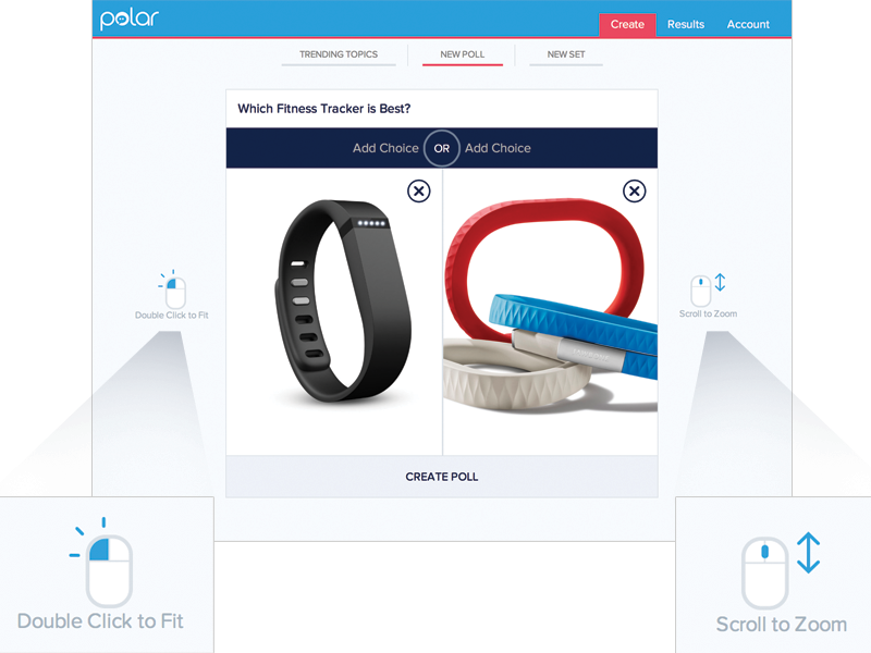
For instance, we recently built a fully responsive Web application that can be used on smartphones, tablets, desktops, and more. In this application, people can add and manipulate images by zooming, resizing, and moving these images around. Depending on the input type their device supports, however, they have different ways of accomplishing these tasks.
To position an image using touch, you simply drag it with your finger. Zooming-in and zooming-out is accomplished through pinch and spread gestures. Sizing an image to fit happens through a double-tap action.
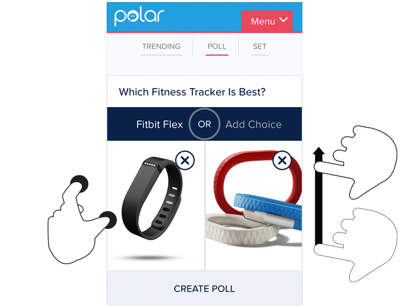
These same features are supported on mouse and keyboard devices as well. To move an image around, click and hold to drag it. Zooming in and out happens with the scroll wheel or a multi-touch gesture on the trackpad. Sizing an image to fit takes a double-click of the mouse.
As you can see, the touch and mouse actions are similar but not the same. We were also concerned that while touch users are quick to pinch and spread when trying to zoom an image, mouse users are less familiar with using scroll wheels and two-finger trackpad gestures to accomplish the same thing. So we wanted to let our mouse users know what’s possible with a few simple bits of inline help.
Easy, right? Just check if someone’s device has a mouse or trackpad attached and reveal the tip. Well, no.
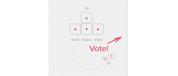
On an earlier project, we faced a similar situation. While our smartphone and tablet users could easily interact with our lists of polls by scrolling and voting with their thumbs, mouse and keyboard users had more work cut out for them. They couldn’t simply keep their fingers in one place and vote, scroll, vote.
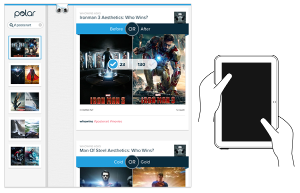
So we developed a keyboard interaction that allowed people to vote with left/right keys and move through polls with up/down keys. While this made keyboard users much faster and effective, we again were faced with a hidden interface: people didn’t know keyboard voting was possible unless we told them.
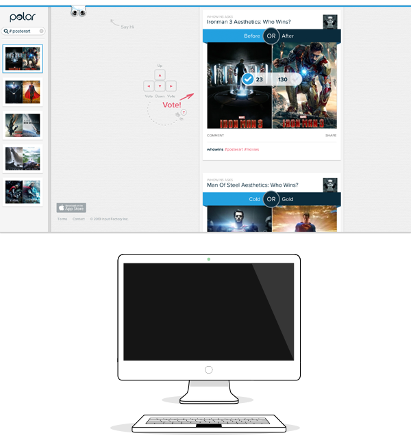
That meant we had to detect if a keyboard was present and surface a simple inline tip that explained the voting interface. After a few failed attempts at doing this, I reached out to friends on the Internet Explorer team at Microsoft. After all, if anyone would have a good handle on how to manage different input types on the Web, it would be the company with a Web browser that not only runs on phones, tablets, laptops, and desktops but hybrid devices and even game consoles as well.
Sadly, we learned there’s not a great way to do this in Web browsers today and browser makers are hesitant to reveal information like this in a navigator.hardware object because of concerns it could be used to fingerprint users. So instead, we opted to proxy the presence of a keyboard using screen width. That is, if the screen is wide we assume there’s a higher chance of a keyboard being present and show the keyboard interface tip by default.
This is the same solution we now have in our new publisher tool. When the screen crosses a certain width, we reveal two inline tips explaining how to zoom and fit an image using a mouse.
As I’ve written before, using screen width as a proxy for available input types is not ideal and increasingly unreliable in today’s constantly changing device landscape. But the alternative solutions don’t seem much better.
For instance, we could provide a help section that explains how to do things with every input type. But then we loose the immediacy and effectiveness of concise inline help. We could wait until someone interacts with the app to determine if they are a touch or mouse user, save that information and display device-appropriate tips from that point on. But even if we get this info up front it can change as people switch between touch screens and trackpads or their mouse.
While the need for input-appropriate help text in a Web application may seem like a small detail, it’s reflective of the broader challenge of creating interfaces that not only work across different screen sizes but across many different capabilities (like input type) as well. Inline help is just one of many components that need be rethought for today’s multi-device Web.
Multi-Device Web Design: An Evolution
As mobile devices have continued to evolve and spread, so has the process of designing and developing Web sites and services that work across a diverse range of devices. From responsive Web design to future friendly thinking, here’s how I’ve seen things evolve over the past year and a half.

If you haven’t been keeping up with all the detailed conversations about multi-device Web design, I hope this overview and set of resources can quickly bring you up to speed. I’m only covering the last 18 months because it has been a very exciting time with lots of new ideas and voices. Prior to these developments, most multi-device Web design problems were solved with device detection and many still are. But the introduction of Responsive Web Design really stirred things up.
Responsive Web Design
Responsive Web Design is a combination of fluid grids and images with media queries to change layout based on the size of a device viewport. It uses feature detection (mostly on the client) to determine available screen capabilities and adapt accordingly. RWD is most useful for layout but some have extended it to interactive elements as well (although this often requires Javascript).
Responsive Web Design allows you to use a single URL structure for a site, thereby removing the need for separate mobile, tablet, desktop, etc. sites.
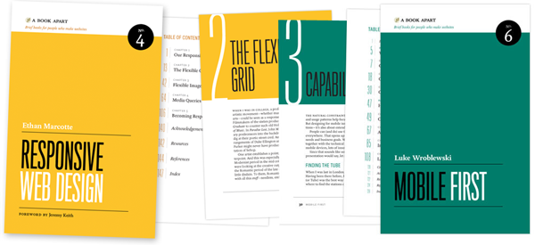
For a short overview read Ethan Marcotte’s original article. For the full story read Ethan Marcotte’s book. For a deeper dive into the philosophy behind RWD, read over Jeremy Keith’s supporting arguments. To see a lot of responsive layout examples, browse around the mediaqueri.es site.
Challenges
Responsive Web Design isn’t a silver bullet for mobile Web experiences. Not only does client-side adaptation require a careful approach, but it can also be difficult to optimize source order, media, third-party widgets, URL structure, and application design within a RWD solution.
Jason Grigsby has written up many of the reasons RWD doesn’t instantly provide a mobile solution especially for images. I’ve documented (with concrete) examples why we opted for separate mobile and desktop templates in my last startup -a technique that’s also employed by many Web companies like Facebook, Twitter, Google, etc. In short, separation tends to give greater ability to optimize specifically for mobile.
Mobile First Responsive Design
Mobile First Responsive Design takes Responsive Web Design and flips the process around to address some of the media query challenges outlined above. Instead of starting with a desktop site, you start with the mobile site and then progressively enhance to devices with larger screens.
The Yiibu team was one of the first to apply this approach and wrote about how they did it. Jason Grigsby has put together an overview and analysis of where Mobile First Responsive Design is being applied. Brad Frost has a more high-level write-up of the approach. For a more in-depth technical discussion, check out the thread about mobile-first media queries on the HMTL5 boilerplate project.
Techniques
Many folks are working through the challenges of designing Web sites for multiple devices. This includes detailed overviews of how to set up Mobile First Responsive Design markup, style sheet, and Javascript solutions.
Ethan Marcotte has shared what it takes for teams of developers and designers to collaborate on a responsive workflow based on lessons learned on the Boston Globe redesign. Scott Jehl outlined what Javascript is doing (PDF) behind the scenes of the Globe redesign (hint: a lot!).
Stephanie Rieger assembled a detailed overview (PDF) of a real-world mobile first responsive design solution for hundreds of devices. Stephan Hay put together a pragmatic overview of designing with media queries.
Media adaptation remains a big challenge for cross-device design. In particular, images, videos, data tables, fonts, and many other “widgets” need special care. Jason Grigsby has written up the situation with images and compiled many approaches for makingimages responsive. A number of solutions have also emerged for handling things likevideos and data tables.
Server Side Components
Combining Mobile First Responsive Design with server side component (not full page) optimization is a way to extend client-side only solutions. With this technique, a single set of page templates define an entire Web site for all devices but key components within that site have device-class specific implementations that are rendered server side. Done right, this technique can deliver the best of both worlds without the challenges that can hamper each.
I’ve put together an overview of how a Responsive Design + Server Side Componentsstructure can work with concrete examples. Bryan Rieger has outlined an extensive set of thoughts on server-side adaption techniques and Lyza Gardner has a complete overview of how all these techniques can work together. After analyzing many client-side solutions to dynamic images, Jason Grigsby outlined why using a server-side solution is probably the most future friendly.
Future Thinking
If all the considerations above seem like a lot to take in to create a Web site, they are. We are in a period of transition and still figuring things out. So expect to be learning and iterating a lot. That’s both exciting and daunting.
It also prepares you for what’s ahead. We’ve just begun to see the onset of cheap networked devices of every shape and size. The zombie apocalypse of devices is coming. And while we can’t know exactly what the future will bring, we can strive to design and develop in a future-friendly way so we are better prepared for what’s next.
Resources
I referenced lots of great multi-device Web design resources above. Here they are in one list. Read them in order and rock the future Web!
- Effective Design for Multiple Screen Sizesby Bryan Rieger
- Responsive Web Design (article) by Ethan Marcotte
- Responsive Web Design (book) by Ethan Marcotte
- There Is No Mobile Web by Jeremy Keith
- mediaqueri.es by various artisits
- CSS Media Query for Mobile is Fool’s Gold by Jason Grigsby
- Why Separate Mobile & Desktop Web Pages? by Luke Wroblewski
- About this site… by Yiibu
- Where are the Mobile First Responsive Web Designs? by Jason Grigsby
- Mobile-First Responsive Web Design by Brad Frost
- Mobile-first Media Queries by various artists
- The Responsive Designer’s Workflow by Ethan Marcotte
- Responsible & Responsive (PDF) by Scott Jehl
- Pragmatic Responsive Design (further details) by Stephanie Rieger
- A Closer Look at Media Queries by Stephen Hay
- Responsive IMGs — Part 1 by Jason Grigsby
- Responsive IMGs — Part 2 by Jason Grigsby
- Device detection as the future friendly img option by Jason Grigsby
- Responsive Video Embeds with FitVids by Dave Rupert
- Responsive Data Tables by Chris Coyier
- RESS: Responsive Design + Server Side Components by Luke Wroblewski
- Adaptation (PDF) by Bryan Rieger
- How I Learned to Stop Worrying and Set my Mobile Web Sites Free by Lyza Danger Gardner
- The Coming Zombie Apocalypse by Scott Jenson
- Future Friendly by various artists
- interactive
- interaction
- installation
- design
- led
- light
- art
- technology
- projectionmapping
- projectmapping
- robotics
- ui
- mobile
- projection
- interactivedesign
- lightdesign
- apple
- web
- 3d
- ux
- userinterface
- lightart
- robot
- artinstallation
- touchscreen
- application
- app
- webdesign
- touch
- motion
- responsive
- adobe
- multitouch
- future
- robots
- drone
- photoshop
- productdesign
- ledinstallation
- lightsculpture
- video
- user experience
- iphone
- creative
- interactivelight
- digitalart
- motiondesign
- ar
- 3dprinting
- responsivedesign
- augmentedreality
- drones
- kinetic
- data
- development
- kinect
- microsoft
- display
- immersive
- process
- painting
- timelapse
- dronerobotics
- 3dprojection
- ios
- vr
- virtualreality
- earth
- ai
- device
- user interface
- engineering
- laser
- lightpainting
- kineticsculpture
- lightinstallation
- touchinstallation
- animation
- programmableleds
- graffiti
- interactions
- neon
- performance
- leapmotion
- watch
- mobiledesign
- pixel
- environment
- exoskeleton
- interactiveenvironment
- sound
- lcd
- social
- leds
- lukew
- artlight
- patterns
- internet
- carui
- November 2011 128
- December 2011 65
- January 2012 25
- February 2012 27
- March 2012 33
- April 2012 31
- May 2012 16
- June 2012 32
- July 2012 20
- August 2012 37
- September 2012 24
- October 2012 34
- November 2012 31
- December 2012 6
- January 2013 21
- February 2013 11
- March 2013 10
- April 2013 35
- May 2013 45
- June 2013 10
- July 2013 49
- August 2013 33
- September 2013 40
- October 2013 57
- November 2013 31
- December 2013 28
- January 2014 86
- February 2014 49
- March 2014 24
- April 2014 40
- May 2014 6
- June 2014 9
- July 2014 1
- August 2014 34
- September 2014 30
- October 2014 45
- November 2014 21
- December 2014 6
- January 2015 5
- February 2015 17
- March 2015 18
- April 2015 14
- May 2015 1
- June 2015 10
- July 2015 4
- August 2015 1
- October 2015 11
- March 2016 4
- December 2016 18
- September 2017 6
- October 2017 13
- November 2017 5
- June 2018 8
- July 2018 2
- November 2018 7
- February 2019 8
- March 2019 6
- July 2019 1
- August 2019 1
- October 2019 1
- July 2020 5
- November 2020 9
- December 2020 1
- January 2021 1
- April 2021 1
- May 2021 9
- June 2021 3
- August 2022 3
- May 2023 2
- September 2023 1
- May 2025 6