10 Steps To An Engaging & Interactive UX
Article Source: Click Here
These days, building websites or applications that attract and retain customers has become somewhat of a science. For people who aren’t well versed in the digital space, I often compare the work that I do as a UX designer to an architect. Like the architect who builds your home, my UX team builds a comprehensive blueprint, which outlines every single detail of the site’s features and functionality.
But it’s not a one-shot deal. Getting to an intuitive and engaging user interaction requires many steps. Here’s my top 10 tips to help you deliver an amazing interactive experience for your users.
1. Design for the user, really
Back when online interaction was still in its infancy, and not much thought had been given to whom we were designing for, users were all too willing to spend their time learning the interaction required to complete tasks on websites. If users were confused, people often assumed they just weren’t tech savvy or well-informed on how to navigate the internet. As more and more websites, mobile devices and tablets started popping up; users weren’t as willing or patient to “learn” on their own. Nowadays, you’ll see more users becoming frustrated and even angry when they feel a product, application or website is substandard – and rightfully so.
It’s tempting to design with your own preferences and tastes in mind. But that won’t help users complete tasks on the site if they have a whole different set of preferences and needs. Think about what users want to do and help them complete those tasks in the easiest and most intuitive way possible. Are they browsing? Searching? Gaming? Watching video? Trying to complete a task? Looking for specific content? It’s the UX team’s job to look at the entire experience holistically and make sure that users’ needs are always met.
It’s this “design for the user” strategy that shaped every decision we made on Civil War 150. The biggest challenge with this project was the huge amount of Civil War related facts and statistics. To make it fun and relatable, we used colorful infographics to guide users through the top 150 Civil War related topics including Who They Were, Weapons of War, How They Died, 5 Deadliest Battles, Paying for the War and West Point Warriors. By giving users what they want, learning about the Civil War becomes richly engaging, informative and fun experience for hardcore Civil War fanatics and 7th grade history students alike.
2. Do your homework
Listen and absorb. The more conversations you have with clients, the better informed you’ll be. Dive deep into every piece of documentation, research their field, examine all content with a fine-tooth comb, understand the client’s goals, document thoroughly all of the client’s wishes (no matter how small) and talk to as many people across as many departments as possible. Only then will you have the most complete and accurate picture and be prepared to move to the next phase of the project.
Another crucial part of listening comes from doing a thorough analysis of what competitors are doing in the same space. Are there any innovators that you can learn from? Have they made any mistakes you want to avoid? Is there one universal component that ties all of them together? Were there any missed opportunities? Use the answers to these questions as inspiration in your own project.
The types of sites you may look at during this analysis phase can vary dramatically. You could even look at sites that sell cat food as points of reference when designing an application for audio equipment. It’s still relative and can be helpful because the user behaviour could very well be the same for cat food sites and audio equipment sites. Either way, you can learn valuable lessons from UX best practices across completely different industries and form factors.
3. Be an advocate for the user
We often think of the user as our client, though it’s not entirely true. In any project, there are sets of business objectives that need to be met and it’s the UX designer’s responsibility to meet those objectives, while at the same time informing the client about the user’s needs. That’s why the greatest digital projects are often those where there is a perfect equilibrium between the client’s objectives and the user’s needs. Sit on that fence, and balance well.
4. Forget about Nancy, think user types
Personas are vital when it comes to structuring the content. Look at all the content holistically and think about what people are trying to accomplish. Doing this helps prioritise the content and allows the site to be structured around the user’s goals. But traditional personas – “Nancy, who is 28-35 years old, drives an economy car, has a four-year-old PC she primarily uses for email, earns between $30K-$50K a year and wants to comparison shop for a cheap airfare to visit her mother in Florida” – won’t offer much insight into the user’s actual behaviour.
Instead, group basic User Types into categories according to what they want to do on the site such as “browsing,” “comparison shopping,” “killing time,” “looking for specific content.” These groupings will provide you with much more useful insights about why users come to sites or applications, the context of use (where and how), what content they’re seeking and how much time they have. In turn, you’ll be better equipped to design the website or application around their behaviour patterns, thus making their fictional names, ages, professions and income levels irrelevant.
5. Less really is more
You may think this is obvious and doesn’t need further explanation. But most sites and applications still manage to get it wrong. The key is to cut down tasks required by users to the bare minimum. I can’t stress this enough. Get rid of all that extra clutter that doesn’t add value, or worse, distracts and confuses the user. Know exactly how you want users to travel through your site or application and then guide the user as if you were holding their hand through the entire process. Again, users want things to be as simple, worry-free and fast as possible. If they can see what’s coming next before even clicking on something, they’ll be happy users.
To give you an example of using the “less is more” strategy, we worked together with Google on a project called 20 Things I Learned About the Web and Browsers. The challenge was to take the tactile experience of reading a book and reinvent it for online users. Using interactive features such as instant search, animated canvas page flips, enhanced canvas illustrations, offline mode, bookmarking and lights out mode, we made it simple, fun and informative for users to learn about the web and browsers. By focusing on what and how users wanted to travel through the website, learning about the web and browsers became enjoyable and informative for users.
6. Pretend you’re working for Fisher Price
Our CEO David Martin has this saying – and it’s really resonated for me. “All interaction should feel like Fisher Price.” In other words, when you make things bulky and oversized (like most children’s toys) and design digital experiences for “fat fingers,” it will automatically be easier to use. So how do we translate this to designing engaging and interactive user experiences?
Rather than using the standard input fields, radio buttons or checkboxes, try using big buttons, jumbo sliders and giant input fields. You’ll see user engagement increase and bounce rates drop. Isn’t that what all UX designers strive for?
Labeling is also extremely important. Whenever you ask users to provide information, try to use cheeky, simple, and to-the-point terminology so that it will feel less like a hassle. The result will be that users will feel more emotionally compelled to complete the process. And that could mean a boost in signups, web traffic, online sales and ROI.
When a 9.0 earthquake struck Japan earlier this year, earthquake relief efforts and support poured in from around the world. Working with Google, we created a platform for the global community to share their Messages for Japan. Taking a cue from Fisher Price, the site featured big buttons to group messages into categories of “Love” and “Hope”, as well as giant input fields asking users to “Write Your Message” and “Make a Donation.”
7. Take cues from tablets
Because you’re already limited by the amount of real estate on tablets, the need to simplify interactions is even greater. Ask yourself if your design would work on a tablet. If the answer is yes, you already have the two basic building blocks in place for a strong user experience: clear hierarchy and intuitive way finding.
These are the same questions we asked when we teamed up with CBSNews.com to create an elegant and visually rich online news experience for viewers of America’s #1 news program, 60 Minutes.
8. Design your UX
Adding placeholders for copy (lorem ipsum) next to some gray boxes underneath a row of navigation links does not constitute design. Visual hierarchy, content grouping, spacing, positioning and size are all things that should be solved in wireframes before a visual designer even sets eyes on it. If in your wireframes you’re working within the actual site or application width, and 12px text in your template is actually 12px in design, you’re on track.
9. Collaborate with all departments
User experience design alone is not enough to make great work and it will surely not provide all the answers. Listen, collaborate and become the liaison between the client, the user and the rest of your internal team. Only then can you create the best possible experience for the user while still meeting all business objectives.
Remember, you’re not alone. UX designers, visual designers and interactive developers all have a hand in making a project a success – it truly is a collaborative and multi-disciplinary effort. When it’s a shared passion and everybody pitches in with their level of expertise and voices their opinions, magic happens.
10. Don’t grade your own homework
The chance of you hitting the bulls eye with your first shot is very slim so be prepared to design iteratively as you gather more information about the performance of your site or application. One of the things that I am adamant about is that you should only do quantitative analysis on your own work. Tracking the performance and understanding where people are dropping off is extremely important and should be done in-house. But a third party should always conduct the qualitative user data analysis so you can truly have an objective testing environment. Doing this in-house is much like grading your own homework and won’t give you the depth of truth and insight that you’re looking for. If you want real objective answers, let someone else do the user testing and take those learnings into your next iteration.
An interactive display experience for Autism Awareness Month. Trying to make eye contact with the girl on the screen is harder then you think. Avoiding eye contact could be a sign of autism.
Realistic Paintings That Look Like Photos
Article Source: Click Here
Let’s take a look at the works of some of the world’s greatest photorealism masters – Roberto Bernardi, Steve Mills and Erich Christensen. Forget about Photoshop, Maya or 3Ds Max – these guys have gone the old school way.
Roberto Bernardi was born in Todi on the 18th of May 1974. He started to paint at a very young age and his first works in oils date back to the first half of the eighties. After an initial foray with landscapes and portraits, Bernardi turned towards a more intense and spectacular type of painting; photorealism. In this style Bernardi is most comfortable expressing his creativity while satisfying his perfectionist technical goals. He applies layers of oil paint and varnish in the traditional manner to a totally modern image, creating a wholly contemporary, unique kind of image.
Roberto Bernardi


Steve Mills
Born in in 1959 in Boston, MA, photorealist oil painter Steve Mills sold his first drawing at the age of 11 and has been selling ever since. Every child drew when young, though Mills requested a pencil over crayons to get better detail. This fascination with detail became his calling card. Influenced by the works of Andrew Wyeth, his early paintings consisted mostly of landscapes. After seeing the work of Richard Estes at a show in Boston, MA, Photorealism became his passion. Today his interests are somewhat varied though his main focus is on the “extraordinarily-ordinary”.


Erich Christensen
Christensen began to develop his interest in painting, as well as botany, classical music, and gourmet cooking as a child in Salt Lake City, Utah. Eric Christensen began painting professionally in 1992. Since that time he has enjoyed amazing success and a growing reputation as a celebrated Wine Country Artist. Self-taught, he invented a watercolor technique that allows him to create images of vibrant color that go beyond the look and depth of a high quality photograph. Christensen now finds himself unique in his field. In fact he is the only known artist capable of hyperrealism through the use of standard watercolor.


Interactive Ad for USA Network’s Show, White Collar, forges new ground to enhance the way users interact with rich media designed and developed by Glow Interactive.
How New Ideas Spread Like Seeds
Article Source: Click Here
The diffusion model is a detailed, academic way of looking at how a contagious idea or product or innovation moves through a population. One of the most famous diffusion studies is Bruce Ryan and Neal Gross’s analysis of the spread of hybrid seed corn in Greene Country, Iowa, in the 1930s. The new corn seed was introduced in Iowa in 1928, and it was superior in every respect to the seed that had been used by farmers for decades before. But it wasn’t adopted all at once. Of the 259 farmers studied by Ryan and Gross, only a handful had started planting the new seed by 1932 and 1933. In 1934, 16 took the plunge. In 1935, 21 followed, then 36, and the year after that a whopping 61 and then 46, 36, 14, and 3, until by 1941, all but two of the 259 farmers studied were using the new seeds.
In the language of diffusion research, the handful of farmers who started trying hybrid seed at the very beginning of the 1930s were the Innovators, the adventurous ones. The slightly larger group who were infected by them were the Early Adopters. They were the opinion leaders in the community, the respected, thoughtful people who watched and analyzed what those wild Innovators were doing and then followed suit. Then came the big bulge of farmers in 1936, 1937, and 1938, the Early Majority and the Later Majority, the deliberate and the skeptical mass, who would never try anything until the most respected of farmers had tried it first. They caught the seed virus and passed it on, finally, to the Laggards, the most traditional of all, who see no urgent reason to change. If you plot that progression on a graph, it forms a perfect epidemic curve—starting slowly, tipping just as the Early Adopters start using the seed, then rising sharply as the Majority catches on, and falling away at the end when the Laggards come straggling in.
The message here—new seeds—was highly contagious and powerfully sticky. A farmer, after all, could see with his own eyes, from spring planting to fall harvest, how much better the new seeds were than the old. It’s hard to imagine how that particular innovation couldn’thave tipped. But in many cases the contagious spread of a new idea is actually quite tricky.
The business consultant Geoffrey Moore, for example, uses the example of high technology to argue that there is a substantial difference between the people who originate trends and ideas and the people in the Majority who eventually take them up. These two groups may be next to each other on the word-of-mouth continuum. But they don’t communicate particularly well. The first two groups—the Innovators and Early Adopters—are visionaries. They want revolutionary change, something that sets them apart qualitatively from their competitors. They are the people who buy brand-new technology, before it’s been perfected or proved or before the price has come down. They have small companies. They are just starting out. They are willing to take enormous risks. The Early Majority, by contrast, are big companies. They have to worry about any change fitting into their complex arrangement of suppliers and distributors. “If the goal of visionaries is to make a percentage improvement—incremental, measurable, predictable progress,” Moore writes. “If they are installing a new product, they want to know how other people have fared with it. The word risk is a negative word in their vocabulary—it does not connote opportunity or excitement but rather the chance to waste money and time. They will undertake risks when required, but they first will put in place safety nets and manage the risks very closely.”
Moore’s argument is that the attitude of the Early Adopters and the attitude of the Early Majority are fundamentally incompatible. Innovations don’t just slide effortlessly from one group to the next. There is a chasm between them. All kinds of the high-tech products fail, never making it beyond the Early Adopters, because the companies that make them can’t find a way to transform an idea that makes perfect sense to an Early Adopter into one that makes perfect sense to a member of the Early Majority.
Moore’s book is entirely concerned with high technology. But there’s no question that his arguments apply to other kinds of social epidemics as well. In the case of Hush Puppies were identified with a dated, kitschy, fifties image. They were wearing them precisely because no one else would wear them. What they were looking for in fashion was a revolutionary statement. They were willing to take risks in order to set themselves apart. But most of us in the Early and Late Majority don’t want to make a revolutionary statement of take risks with fashion at all. How did Hush Puppies cross the chasm from one group to the next? Lambesis was given a shoe that had a very specific appeal to the southern California skateboarding subculture. Their task was to make it hip and attractive to teenagers all over the world—even teens who had never skateboarded in their life, who didn’t think skateboarding was particularly cool, and who had no functional need for wide outsoles that could easily grip the board and padded uppers to cushion the shocks of doing aerial stunts. That’s clearly not an easy task either. How did they do it? How is it that all the weird, idiosyncratic things that really cool kids do end up in the mainstream?
This is where, I think, Connectors, Mavens and Salesmen play their most important role. They are the ones who make it possible for innovations to overcome this problem of the chasm. They are translators: they take ideas and information from a highly specialized world and translate them into a language the rest of us can understand. Mark Alpert, the University of Texas professor whom I described as the Ur-Maven, is the kind of person who would come over to your house and show you how to install or fix or manipulates a very complicated piece of software. Tom Gau, the quintessential Salesman, takes the very arcane field of tax law and retirement planning and repackages it in terms that make emotional sense to his clients. Lois Weisberg, the Connector, belongs to many different worlds—politics, drama, environmentalism, music, law, medicine, and on and on—and one of the key things she does is to play the intermediary between different social worlds. One of the key figures at Lambesis was DeeDee Gordon, the firm’s former head of market research, and she says that the same process occurs in the case of the fashion trends that periodically sweep through youth culture.
The Innovators try something new. Then someone—the teen equivalent of a Maven or a Connector or a Salesman—sees it and adopts it. “Those kids make things more palatable for mainstream people. They see what the really wired kids are doing and they tweak it. They start doing it themselves, but they change it a bit. They make it more usable. Maybe there’s a kid who rolls up his jeans and puts duct tape around the bottom because he’s the one bike messenger in the school. Well, the translators like that look. But they won’t use tape. They’ll buy something with Velcro. Or then there was the whole baby-doll T-shirt thing. One girl starts wearing a shrunken-down T-shirt. She goes to Toys R Us and buys the Barbie T-shirt. And the others say, that’s so cool. But they might not get it so small, and they might not get it with Barbie on it. They look at it and say, it’s a little off. But there’s a way I can change it and make it okay. Then it takes off.”
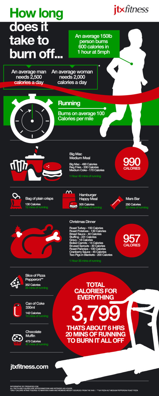
This infographic shows how many calories a single day of eating poor food can add up to and shows how much exercise would be required to burn it all off. via http://visual.ly/christmas-calorie-burning
- interactive
- interaction
- installation
- design
- led
- light
- art
- technology
- projectionmapping
- projectmapping
- robotics
- ui
- mobile
- projection
- interactivedesign
- lightdesign
- apple
- web
- 3d
- ux
- userinterface
- lightart
- robot
- artinstallation
- touchscreen
- application
- app
- webdesign
- touch
- motion
- responsive
- adobe
- multitouch
- future
- robots
- drone
- photoshop
- productdesign
- ledinstallation
- lightsculpture
- video
- user experience
- iphone
- creative
- interactivelight
- digitalart
- motiondesign
- ar
- 3dprinting
- responsivedesign
- augmentedreality
- drones
- kinetic
- data
- development
- kinect
- microsoft
- display
- immersive
- process
- painting
- timelapse
- dronerobotics
- 3dprojection
- ios
- vr
- virtualreality
- earth
- ai
- device
- user interface
- engineering
- laser
- lightpainting
- kineticsculpture
- lightinstallation
- touchinstallation
- animation
- programmableleds
- graffiti
- interactions
- neon
- performance
- leapmotion
- watch
- mobiledesign
- pixel
- environment
- exoskeleton
- interactiveenvironment
- sound
- lcd
- social
- leds
- lukew
- artlight
- patterns
- internet
- carui
- November 2011 128
- December 2011 65
- January 2012 25
- February 2012 27
- March 2012 33
- April 2012 31
- May 2012 16
- June 2012 32
- July 2012 20
- August 2012 37
- September 2012 24
- October 2012 34
- November 2012 31
- December 2012 6
- January 2013 21
- February 2013 11
- March 2013 10
- April 2013 35
- May 2013 45
- June 2013 10
- July 2013 49
- August 2013 33
- September 2013 40
- October 2013 57
- November 2013 31
- December 2013 28
- January 2014 86
- February 2014 49
- March 2014 24
- April 2014 40
- May 2014 6
- June 2014 9
- July 2014 1
- August 2014 34
- September 2014 30
- October 2014 45
- November 2014 21
- December 2014 6
- January 2015 5
- February 2015 17
- March 2015 18
- April 2015 14
- May 2015 1
- June 2015 10
- July 2015 4
- August 2015 1
- October 2015 11
- March 2016 4
- December 2016 18
- September 2017 6
- October 2017 13
- November 2017 5
- June 2018 8
- July 2018 2
- November 2018 7
- February 2019 8
- March 2019 6
- July 2019 1
- August 2019 1
- October 2019 1
- July 2020 5
- November 2020 9
- December 2020 1
- January 2021 1
- April 2021 1
- May 2021 9
- June 2021 3
- August 2022 3
- May 2023 2
- September 2023 1
- May 2025 6