Remarkable Portraits Made with a Single Sewing Thread Wrapped through Nails
Article: Source


Constellation is an ongoing series of portraits by New York artist Kumi Yamashita known most prominently for her innovative light and shadow sculptures. Each image is constructed from a single unbroken black thread wound through a dense array of galvanized nails mounted on a painted white board, meaning that the darker areas within the portrait are formed solely from the density of the string. Colossal is no stranger to artworks created withthread and nails, but these are certainly some of the most impressive and intricate works I’ve ever seen made using this method.
Use Preview in OS X Lion to digitally sign documents
Article: Source
The ability to digitally sign a document is sure to save you some time. Apple has rolled out a new feature in OS X Lion’s Preview app that allows you to create a digital signature using your FaceTime camera, and then sign a document with relative ease.
To get started you will need to open a PDF document in Preview, preferably a document you want to sign, but it doesn’t matter as we will be saving the digital signature for future use.

While viewing a document in Preview, click on the Marker icon to view the annotations toolbar.
Click on the icon that looks like this:
From here, you will be given the option to create a new signature using your Mac's built-in camera. Select this option.

The camera on your Mac will then turn on, and you will be presented with a screen and instructions similar to that pictured above. Make sure to create your example signature on a blank piece of paper, using dark ink for best results.
Once you are happy with your example signature, hold it up to your Mac’s camera, resting the bottom of your signature on the blue line. You see a preview of the signature show up after it has been digitized. If you wish to save your signature for future use, leave the box checked in the bottom-left-hand corner. Once you are happy with the outcome, click on Accept.

You will be returned to your document; click on the same signature icon that we clicked on previously. Now you will see your digital signature listed, ready to be placed into your document. Select the signature you would like to use in the document.

After selecting your signature, you will notice your mouse icon turn into crosshairs. You can now draw your signature on to the document. The size of the box that you draw represents the size of the signature that will be placed onto the document. Don’t worry if you get the size wrong the first try, you can click and drag any corner or side of the signature to resize it. If you need to move the digital signature, click and drag the middle of the signature.
This is a great new addition, albeit a small one, to OS X Lion. For professionals who are always on the go, or those of us who find ourselves without a scanner to scan signed documents, this is the perfect solution.
A Future-Friendly Web
Article: Source
I presented For a Future-Friendly Web, which covered how we as web creators can think and act in a more future-friendly way. Here are the slides, video and notes from my talk:
- The web is now a lot bigger than what we’ve been used to. There’s more web-enabled devices than ever: from smartphones, dumbphones, e-readers, tablets, netbooks, notebooks, desktops, smart TVs, game consoles and a whole lot more.
- All of these devices are just the beginning. There’s a whole host of connected devices right around the corner. Disruptions like Google’s Project Glass will continue to redefine our connected world.
- Because change is so rapid, it would be foolish to say that we can create anything that’s really “future proof”. But just because we can’t predict the future doesn’t mean that there aren’t things we can do to be better-prepared for whatever comes down the pipes.
- The power of the web is its ubiquity. No native platform or proprietary solution can claim the same level of reach as the web. This ubiquity is becoming increasingly important as more and more devices emerge. The web’s intrinsic inclusiveness is something that should be preserved and embraced.
- First and foremost we need to create relavent, purposeful content. There’s more stuff than ever demanding our attention, and we as humans only have the capacity to handle so much.
- People’s capacity for bullshit is rapidly diminishing. If you don’t focus your products and services, your users will do it for you. Tools like Instapaper, Readability, Safari Reader, Ad Block Plus, DVR, Bittorrent, and more allow users to get to the content without the crap that typically goes with it.
- As Josh Clark eloquently put it, we need to think of our content like water, and get our content ready to go anywhere because it’s going to go everywhere. It’s bigger than the web, native, Facebook, etc. We need to put our content and functionality in front of users wherever they may be.
- Rethink context. Historically we’ve created assumptions that users are comfortably seated in front of a desktop or laptop with a strong connection, large screen and fast processor. Mobile has shattered those assumptions and now context is a lot more fuzzy. We need to think about the quantitative (screen size, processing power, input methods, etc) and qualitative (user goals, environment, capabilities, etc) aspects of context when designing experiences
- Invest in content infrastructure. Too often redesigns are like slapping a new coat of paint on an otherwise-condemned building. Content is the foundation with which everything else stands. That means creating context-agnostic APIs and more robust, flexible content management systems that lend themselves to adaptation.
- Think more responsively. Responsive web design isn’t about creating squishy websites, it’s to create a more optimal experience across an increasing number of contexts. Unfortunately, many people, both proponents and opponents, miss the point.
- Users don’t care if your site is responsive, a separate mobile site, or even a plain old desktop site. They do care if they can’t accomplish their goals, if the experience takes 30 seconds to load, or if interactions are buggy and broken.
- Mobile is more than just a small screen. We should take mobile’s constraints and opportunities in mind when designing experiences.
- Progressive enhancement is becoming increasingly important. Lay a solid semantic foundation, writing mobile-first styles and using feature detection are good techniques to support more web-enabled devices while still optimizing for the best.
- Entirely separate experiences aren’t scalable in the long run, but building a separate mobile site might be reality. This can be a great opportunity to lay a future-friendly foundation. Don’t wait for the “perfect opportunity” to start taking steps in the right direction.
- This is going to be difficult, but it’s absolutely necessary. It will require all of us working together like never before, so let’s set aside petty differences and realize that we’re all on the same team trying to figure all this out. Let’s keep learning from each other.
I’m truly honored to have been part of such an amazing conference. I saw a lot of old friends and met a lot of new ones too. I’m already excited for next year’s Mobilism!
This blog is filled with creative technology and information so I don’t usually post items outside of those categories. So this was just a must share post…
My favorite all time YouTube video @ Wall Of Death
Responsive Navigation Patterns
Article: Source
Top and left navigations are typical on large screens, but lack of screen real estate on small screens makes for an interesting challenge. As responsive design becomes more popular, it’s worth looking at the various ways of handling navigation for small screen sizes. Mobile web navigation must strike a balance between quick access to a site’s information and unobtrusiveness.
Here’s some of the more popular techniques for handling navigation in responsive designs:
- Top Nav or “Do Nothing” Approach
- The Footer Anchor
- The Select Menu
- The Toggle
- The Left Nav Flyout
- The Footer Only
- The “Hide and Cry”
There are of course advantages and disadvantages of each method and definitely some things to look out for when choosing what method’s right for your project.
top nav or “do nothing” approach

One of the easiest-to-implement solutions for navigation is to simply keep it at the top. Because of its ease of implementation, it’s found on many (maybe even most) responsive sites right now.
pros
- Easy to implement- you can implement your large-screen site almost as-is.
- No Javascript dependencies – ensuring maximum compatibility
- No back-breaking CSS maneuvers required
- No tripping over your source order – no need to jump through hoops to shift nav lists around in the source. It flows au naturel.
cons
- Height issues- Height matters in mobile. As Luke’s book explains, content-first, nav-second is preferred for mobile web experiences. You want to get the users to the meat-and-potatoes content as quickly as possible. That means getting the navigation out of user’s way so they can focus on the core information on the page. It can also be confusing when all the core content is cut off:

The site doesn’t look different from page to page and doesn’t expose the core content soon enough
- Not scalable – What happens when you want to add a new section to your site? Where the nav fits neatly on one line now, what happens when your client says you need to add “products and services” to the nav? Or when you need to translate the menu to German?
- Fat Fingers – Cramming links too closely together can easily result in unwanted proximity clicks
- Cross-device issues – While text might look great on an iPhone, devices have different ways of rendering fonts. Sites can look great on an iPhone but break when viewed on other platforms:

Responsive navigation breaking to multiple lines on small screens


in the wild
resources
the footer anchor

This clever solution keeps the nav list at the footer of the site, while the header contains a simple anchor link pointing to the footer nav. This approach clears up a lot of room for the core content while still providing quick access to the navigation.
pros
- Easy to implement- Simple anchor on top. Nav list on the bottom. That’s pretty damn easy.
- No Javascript dependency- which means less testing and far better support.
- Little CSS work required to scale up – Thanks to absolute or fixed positioning, moving the footer nav up to the top for large screens is a piece of cake.
- Single button in header- A simple menu icon or link takes up very little room in the header, which frees up plenty of space for the core content
cons
- Anchor jump can be awkward/disorienting – Quickly jumping to the footer of the site can be a bit disorientating.
- Not elegant- this seems weird to say, but other methods like the toggle method have a bit of sexy to them. A jarring jump, while awesomely practical, isn’t the elegant interaction mobile users have gotten used to from interacting with those highly-polished native apps.
in the wild
- Grey Goose
- Contents Magazine
- Bagcheck (I know it’s not responsive, but it’s where the technique was popularized)
resources
the select menu

One way of taming nav links gone wild is to transform a list of links into a select menu for small screens. This avoids the problems the top nav approach presents and is a clever way to save real estate.
pros
- Frees up plenty of space- a select menu definitely takes up a lot less space than a horizontal or vertical list of links
- Keeps interactions in the header- instead of a footer nav, the select menu keeps the navigation functionality in the header, where users are used to seeing web navigation
- Easily Recognizable- a select menu with a clear label saying “navigation” or “menu” is definitely easy for users to figure out.
- Pulls up native controls- each mobile browser will handle select menus their own way. Touch devices will pull up the nav in a touch friendly list, while trackball/d-pad/pearl devices will pull up a select menu more conducive to that particular input method.
cons
- Lack of styling control- select menus are a pain in the ass to style. Each browser handles them in their own, usually clunky, way. Forget about cross-browser styling and coming out with anything that looks halfway consistent. As a result, the select menu can stick out like a sore thumb and really dirty up an otherwise good-lookin’ design.
- Potentially confusing – Users are used to select menus in the context of filling out a form, but I’m not sure they’d grasp a form element out of that context. This is simply a hunch, so it would be interesting to test.
- Handling subnav items- nested lists handled by select menus can look weird. Child categories are usually handled by indenting with dashes, and while it might get the point across I see it as potentially confusing and a little ugly.
- Javascript dependency- It doesn’t require too much JS to convert the list to a select menu, but it’s worth pointing out simply because mobile browsers do the dardest things. But again, the technique is pretty cut and dry so there shouldn’t be too many hang ups using this approach.
resources
- TinyNav by @viljamis
- Convert a Menu to a Dropdown for Small Screens
- Progressive and Responsive Navigation
- Responsive Menu
in the wild
the toggle

The toggle is similar to the footer anchor approach, but instead of jumping down to an anchor at the bottom of the page, the menu slides open right in the header. It’s a good-looking approach and is relatively easy to implement.
pros
- Keeps the user in place- Where the footer anchor jumps suddenly, the toggle menu simply appears in place, which doesn’t disorient the user.
- Elegant- This is definitely one of the more classy approaches. No awkward forms or page jumps, just a smooth animated flyout or basic show/hide.
- Easy to scale up- All you need to do is hide the mobile trigger and show the nav list when the appropriate breakpoint is reached and you have yourself a normal large screen nav. All this can be accomplished with CSS.
cons
- Animation performance- Your mileage will vary when doing any sort of animation on mobile devices. Android is notoriously bad with CSS animations and so things might not be as smooth as you’d like. Also, for what it’s worth I’ve recently been animating max-height which seems to work well.
- Javascript dependency- Again this approach relies on a bit of Javascript in order to trigger the toggle, but it’s minimal. I have one Blackberry test device that refuses to listen to any of this stuff, but most browsers, including proxy browsers like Opera Mini and Dolphin Mini, handle it just fine.
in the wild
resources
the left nav flyout

Facebook popularized a left navigation for mobile that’s quite unique. The nav is accessed by a menu icon, which reveals a tray that slides in from the left and moves the main content over to the right.
pros
- Lots of space- While other nav techniques don’t work very well if you have a lot of list items, this approach provides a lot of space to expand. I think that’s why Facebook took to it.
- Good looking- This menu is very sophisticated and advanced, so it definitely has a wow factor to it.
- Facebook conventions - Facebook mobile users will be used to this pattern already since the web and native Facebook mobile apps utilize this left tray system.
cons
- Advanced- While the other methods modify simple elements, this shelf method has a lot of moving parts. As Stephanie Rieger pointed out, the Obama site navigation broke on everything but the most sophisticated devices. If your project is meant for a broader audience, you want to be very careful if choosing this approach.
- Doesn’t scale well- this method is quite unique to mobile and doesn’t necessarily scale up to large screens easily. You can run a risk of essentially maintaining two separate navs for small and large screens.
- Potentially confusing- When I first saw Facebook’s new mobile nav, I actually thought it was broken. Keeping a hint of the content on the right seems a bit weird to me, but this is all personal preference.
in the wild
resources
the footer-only

The footer-only navigation is similar to the footer anchor approach, only without the anchor in the header. It follows the content-first, nav-second model, however it requires mobile users to scroll all the way to the bottom in order to navigate the site.
pros
- Frees up header space – It follows the content-first, nav-second model, but…
cons
- Difficult to Discover- Users (both on small and large screens) might not discover there’s a menu sitting in the footer.
- Difficult to Access- Mobile users have to scroll the entire way down a page (which might be very long) just to get around the site.
in the wild
the “hide n’ cry”

Follow this rule: Don’t penalize users for visiting your site on smaller devices. It’s a myth(PDF) that mobile users don’t want/need certain information. Mobile users will do anything and everything a desktop user will do, provided it’s presented in a usable way.
pros
- Clears up plenty of space- By removing the nav for small screens, you free up a lot of space! But that comes at a cost…
cons
- Removes content/functionality for mobile users- Hiding links and content is not OK. Responsive advocates say that responsive design removes many of the content disparities and experiential nightmares that can come from separate mobile sites, but if a responsive site is hiding content for mobile users it’s no better.
- Adds extra page weight- Adding
display: nonefor elements that are presumably unneeded for mobile doesn’t make it disappear. The code/images/whatever still gets download by mobile devices (which of course are more likely to be on slower connections). - Harder to maintain- Two separate navigations for small and large screens becomes a burden when maintaining the site.
in the wild
- Authentic Jobs
- rourkery.com
- A previous version of the Obama responsive site
resources
considerations
Ultimately, mobile navigation should be like a good friend: there when you need them, but cool enough to give you your space. A bad friend is someone who’s not there when you need someone to talk to (when navigation is absent or hard to find), or someone who’s obnoxious because they’re always around and taking up space (dude, get off my couch). Finding the balance between accessible navigation and mobile screen real estate is an art that we’re all trying to sort out. I’d love to hear your thoughts.
update
Right after this was written, it looks like there’s been some other great posts discussing responsive navigation. Check out:
- A Responsive Design Approach for Navigation, Part 1 by @filamentgroup Absolutely wonderful step by step guide to implementing the toggle approach.
- Pull Down for Navigation by @inspectelement, an clever approach that reveals the navigation as the user pulls down the top of the page. Quick pros and cons:
pros:
- Sexy as hell.
- Great use of screen real estate.
- Takes advantage of an existing smartphone convention of pulling down the top of the page to reveal more.
cons
- Potentially confusing- Mobile users are used to pulling down the top of the page to refresh a list of content items, not to reveal a navigation.
- Relatively Advanced- Right now the demo only is working in its entirety on iOS. I checked Chrome for Android, Android stock browser & Opera Mini and they all kind of worked, but not fully. I’m sure this solution could be progressively enhanced to accommodate more browsers.
- Explicit Instruction Required- you have to explicitly tell the user to pull down to reveal the nav, which is fine but could potentially be awkward in the site header.
All in all these are minor points, but I’d love to see it working across more browsers!
CREATING A MOBILE-FIRST RESPONSIVE WEB DESIGN
Article: Source
We’re going to walk through how to create an adaptive web experience that’s designed mobile-first. This article and demo will go over the following:
- Why we need to create mobile-first, responsive, adaptive experiences
- How to structure HTML for an adaptive site in order to optimize performance and prioritize flexibility
- How to write CSS that defines shared styles first, builds up styles for larger screens with media queries, and uses relative units
- How to write unobtrusive Javascript to conditionally load in content fragments, take advantage of touch events and geolocation
- What we could do to further enhance our adaptive experience
THE NEED FOR ADAPTIVITY
As the web landscape becomes increasingly complex, it’s becoming extremely important to deliver solid web experiences to a growing number of contexts. Thankfully, responsive web design gives web creators some tools for making layouts that respond to any screen size. We’ll use fluid grids, flexible images and media queries to get the layout looking great regardless of the size of the device’s screen dimensions.
However, mobile context is much more than just screen size. Our mobile devices are with us wherever we go, unlocking entire new use cases. Because we constantly have our mobile devices with us, connectivity can be all over the board, ranging from strong wi-fi signals on the couch to 3G or EDGE when out and about. In addition, touch screens open new opportunities to interact directly with content and mobile ergonomics lead to different considerations when designing layout and functionality.
In order to create a site that’s truly designed for mobile context and not just for small screens, we want to ensure that we tackle the many challenges of mobile development upfront. The constraints of the mobile context force us to focus on what content is essential and how to present that content as quickly as possible. Building fast-loading, optimized experiences mobile first has a trickle down (or up, depending on how you look at it) effect for tablet, desktop and other emerging contexts.
WHAT WE’RE MAKING: THE HUMBLE PRODUCT DETAIL PAGE
The demo we’re making is a simple e-commerce product detail page for a fictitious t-shirt company. Why choose this? E-commerce sites can have many use cases across contexts. For example, 70% of smartphone owners use their mobile phones to influence in-store purchases. So while we’ll make sure that purchasing the product is as easy as possible, we’ll also try to make the product reviews accessible and utilize the user’s location to enhance the mobile experience.
STRUCTURE
Authoring lean, semantic HTML5 markup keeps adaptive experiences manageable and accessible, and also provides opportunities for enhanced experiences (quick example: using proper HTML5 input typesbrings up the appropriate virtual keyboard on many touch devices). Semantic markup is extremely portable and can be accessed by many mobile devices, tablets, desktop browsers and future web-enabled devices, regardless of feature set or capability.
SETTING THE VIEWPORT
In order to accommodate for sites not optimized for mobile screens, many modern mobile browsers set a larger browser viewport, which allows for better viewing of non-mobile-optimized sites. Users can then pinch-to-zoom in on the content they want. That’s fine for non-mobile experiences, but because we’re optimizing our experience for mobile browsers, we’ll use the viewport meta tag to set the screen width to the device width:
<meta name="viewport" content="width=device-width, initial-scale=1" />
It’s important to note that we’re not disabling the user’s ability to zoom the page (which you could do by adding user-scalable=no to the content attribute), even though we’re optimizing the content for small screens. It’s recommended to keep user zooming enabled to keep things as accessible as possible. However, there are use cases to disable user-zooming, such as if you’re including fixed positioned elements.
CONTENT FRAGMENTS
In order to keep the experience as lightweight as possible and to improve the perceived loading time, we’re creating two additional HTML documents for our auxiliary content, reviews.html andrelated.html. Because this content isn’t required for the main use case (buying the product) and includes a number of images, we won’t load it by default to keep the initial page size down. By default the content is accessible via links on the page, but if a certain level of javascript support is present, we’ll conditionally load the content when the user requests it or when the resolution reaches a certain breakpoint.
HTML SPECIAL CHARACTERS
A simple technique to reduce the need for background images (thereby saving HTTP requests) is to use HTML special characters for simple shapes. In the case of our rating stars, we’re using ★ to create a solid star (★) and ☆ to create empty stars (☆) for our ratings. And because it’s HTML and not an image, it stays crisp even on high resolution screens.
THE TEL: URI SCHEME
Another simple yet effective technique we’re including in our footer is a clickable link to the customer service number. This is accomplished by using the tel URI scheme, which looks like this:
<a href="tel:+18005550199">1-800-555-0199</a>
We sometimes forget that mobile devices can make phone calls, and also that some desktop configurations can launch VoIP applications to initiate a phone call. We’re including an easy way for users to facilitate a phone call, which in some cases might make sense (i.e. a mobile user who might prefer finishing the transaction over the phone versus going through a checkout flow on their mobile device).
Now that we have a strong, semantic foundation in place, let’s move onto adding style enhancements.
STYLE
When crafting our CSS, we’ll do everything in our power to keep things lightweight and as fluid as possible. We understand that all these devices have many different screen sizes, and that tomorrow’s devices won’t have the same resolutions as today’s. Because screen size is an unknown, we’ll use the content itself to determine how the layout should adjust to its container.
SEPARATE STYLE SHEET FOR LARGER SCREENS
We’re creating two separate CSS files, style.css and enhanced.css in order to deliver basic styles for screens less than 40.5em and using media queries to serve up enhanced styles for screens larger than 40.5em.
<link rel="stylesheet" type="text/css" href="style.css" media="screen, handheld" />
<link rel="stylesheet" type="text/css" href="enhanced.css" media="screen  and (min-width: 40.5em)" />
<!--[if (lt IE 9)&(!IEMobile)]>
<link rel="stylesheet" type="text/css" href="enhanced.css" />
<![endif]-->
We’re using the conditional code <!—[if (lt IE 9)&(!IEMobile)]> in order to serve up enhanced.css to non-mobile versions of IE less than version 9, which unfortunately don’t support media queries. While this method does indeed add an HTTP request to the mix, it gives us greater flexibility over our styles. Alternately, we could use respond.js to deliver enhanced styles to IE.
We’re using the em unit instead of px to maintain consistency with the rest of our relative units and account for user settings like zoom level. Also, the content should determine the breakpoint (we’re using 40.5em as a breakpoint) because device dimensions are too varied and are always changing so are therefore unreliable.
MOBILE-FIRST STYLES
Starting with baseline shared styles and introducing more advanced layout rules when screen size permits keeps code simpler, smaller and more maintainable. Here’s just a quick example to demonstrate this point:
/*Large screen styles first - Avoid*/
.product-img {
  width: 50%;
  float: left;
}
@media screen and (max-width: 40.5em) {
  .product-img {
    width: auto;
    float: none;
  }
}
We want to avoid complexity as much as we can, so here’s what a mobile-first approach looks like:
@media screen and (min-width: 40.5em) {
  .product-img {
    width: 50%;
    float: left;
  }
}
Instead of declaring large screen rules first only to override them for smaller screens, we’ll simply define rules as more real estate becomes available. The web by default is a fluid thing so we’ll do our best to work with it instead of against it. It’s important to note that some mobile browsers (Symbian browsers, Blackberry <OS 6.0, Netfront, WP7 pre-Mango, etc) don’t support media queries, so serving base styles by default reaches more devices and browsers. As Bryan Rieger puts it, “the absence of support for @media queries is in fact the first @media query.”
APPLYING MEDIA QUERIES
We’re continuing our mobile-first style when we apply our media queries. Our related product list starts off two to a row, but increases to 3 in a row when the screen size is at least 28.75em wide (roughly the size of mobile phones in landscape mode) and then to 6 to a row when the screen size is at least 40.5em (roughly tablets in portrait mode or small desktop screens).
/*Default styles*/
.related-products li {
  float: left;
  width: 50%;
}

/*Display 3 per row for medium displays (like mobile phones in landscape or smaller tablets)*/
@media screen and (min-width: 28.75em) {
  .related-products li {
    width: 33.3333333%;
  }
}
/*Display 6 to a row for large displays (like medium tablets and up) */
@media screen and min-width: 40.5em) {
  .related-products li {
    width: 16.6666667%;
  }
}
Assuming small screen by default allows us to support more platforms and also makes it easy add more breakpoints without having to modify existing styles. Defining styles as they’re needed also keeps file size down, reduces complexity and keeps code more maintainable.
USING RELATIVE UNITS
We’re using percentages and em units in our design in order to keep things as flexible as possible. Relative units are far more compatible with the tremendous variance brought on by screen size, pixel density and zoom level.
While media queries are responsive web design’s secret sauce, we want our fluid grids to do most of the work. Maintaining a whole slew of set-width styles across many media queries can become unwieldy, so we’ll make sure the stylesheet’s foundation is entirely flexible. Ethan Marcotte provides a formula for converting dimensions and font sizes from pixel-based to relative units:
target ÷ context = result
USING CSS TO REDUCE REQUESTS
Too many HTTP requests can be a huge killer for performance, especially on mobile. We’re incorporating some CSS techniques to save HTTP requests which will improve the site’s performance. Using CSS gradients instead of background images reduces the amount of image requests and gives us more control over the design. We’re including the appropriate vendor prefixes to ensure maximum compatibility (there are tools for this) and hoping that one day that these rules will become standardized to save us some time.
/*Using CSS gradients instead of background images*/
header[role="banner"] {
  position: relative;
  background: #111;
  background: +linear-gradient (top, #111 0%, #222 100%);
}
We’re also using data URIs instead of background images for some of the smaller icons (for icons like search, social features and location). While data URIs might look a bit ugly and can increase up the stylesheet file size, the reduction of requests results in a faster perceived download time.
/*Using a Data URI for Background Image*/
.find-nearby {
  background: url(data:image/png;base64,iVBORw0KGgoAAAANSUhEUgAAAAwAAAAMCAYAAABWdVznAAADHmlDQ1BJQ0MgUHJvZmlsZQAAeAGFVN9r01AU/tplnbDhizpnEQk+aJFuZFN0Q5y2a1e6zVrqNrchSJumbVyaxiTtfrAH2YtvOsV38Qc++QcM2YNve5INxhRh+KyIIkz2IrOemzRNJ1MDufe73/nuOSfn5F6g+XFa0xQvDxRVU0/FwvzE5BTf8gFeHEMr/GhNi4YWSiZHQA/Tsnnvs/MOHsZsdO5v36v+Y9WalQwR8BwgvpQ1xCLhWaBpXNR0E+DWie+dMTXCzUxzWKcECR9nOG9jgeGMjSOWZjQ1QJoJwgfFQjpLuEA4mGng8w3YzoEU5CcmqZIuizyrRVIv5WRFsgz28B9zg/JfsKiU6Zut5xCNbZoZTtF8it4fOX1wjOYA1cE/Xxi9QbidcFg246M1fkLNJK4RJr3n7nRpmO1lmpdZKRIlHCS8YlSuM2xp5gsDiZrm0+30UJKwnzS/NDNZ8+PtUJUE6zHF9fZLRvS6vdfbkZMH4zU+pynWf0D+vff1corleZLw67QejdX0W5I6Vtvb5M2mI8PEd1E/A0hCgo4cZCjgkUIMYZpjxKr4TBYZIkqk0ml0VHmyONY7KJOW7RxHeMlfDrheFvVbsrj24Pue3SXXjrwVhcW3o9hR7bWB6bqyE5obf3VhpaNu4Te55ZsbbasLCFH+iuWxSF5lyk+CUdd1NuaQU5f8dQvPMpTuJXYSWAy6rPBe+CpsCk+FF8KXv9TIzt6tEcuAcSw+q55TzcbsJdJM0utkuL+K9ULGGPmQMUNanb4kTZyKOfLaUAsnBneC6+biXC/XB567zF3h+rkIrS5yI47CF/VFfCHwvjO+Pl+3b4hhp9u+02TrozFa67vTkbqisXqUj9sn9j2OqhMZsrG+sX5WCCu0omNqSrN0TwADJW1Ol/MFk+8RhAt8iK4tiY+rYleQTysKb5kMXpcMSa9I2S6wO4/tA7ZT1l3maV9zOfMqcOkb/cPrLjdVBl4ZwNFzLhegM3XkCbB8XizrFdsfPJ63gJE722OtPW1huos+VqvbdC5bHgG7D6vVn8+q1d3n5H8LeKP8BqkjCtbCoV8yAAAACXBIWXMAAAsTAAALEwEAmpwYAAABbmlUWHRYTUw6Y29tLmFkb2JlLnhtcAAAAAAAPHg6eG1wbWV0YSB4bWxuczp4PSJhZG9iZTpuczptZXRhLyIgeDp4bXB0az0iWE1QIENvcmUgNC40LjAiPgogICA8cmRmOlJERiB4bWxuczpyZGY9Imh0dHA6Ly93d3cudzMub3JnLzE5OTkvMDIvMjItcmRmLXN5bnRheC1ucyMiPgogICAgICA8cmRmOkRlc2NyaXB0aW9uIHJkZjphYm91dD0iIgogICAgICAgICAgICB4bWxuczpkYz0iaHR0cDovL3B1cmwub3JnL2RjL2VsZW1lbnRzLzEuMS8iPgogICAgICAgICA8ZGM6c3ViamVjdD4KICAgICAgICAgICAgPHJkZjpCYWcvPgogICAgICAgICA8L2RjOnN1YmplY3Q+CiAgICAgIDwvcmRmOkRlc2NyaXB0aW9uPgogICA8L3JkZjpSREY+CjwveDp4bXBtZXRhPgrlPw1BAAABGUlEQVQoFXWSvU4CQRRGdwydxWYLXkCp7ayIhMYIRPEJtDOGAG8AFY1vQOigZi202cQYY4XFJiRYWm2NsbE2LOfbnYlbwE0O3/2bO8PMemma+uAJ7AjuILHco8eurl6jwBhTonAOHfiFMzDwDgGM4YXePzf5gsQHXGsAFsKj9dv4C2gpLjFdx+jBA4knVLbKxdPAZ3o2xF30S9vqzDUKN65pl9I8Ix9rQWIbYvSThSMbZ0LjAOcETuFQf1aLZE7z6P9X+QNbNwp0dVUm36J7jZ2mFJda+QoBiSs0Mx0DhoW4iV+GyF1ri0BXd8lOiDeH0Pqq6cqzWvHhGiR1vB+og477Bpo8gYgB2cMVP40KBb3JGr6hDxXtZPG3KYiAhJlWaikAAAAASUVORK5CYII=) no-repeat 100% 43%;
}
BEHAVIOR
Now that we have our structure and style in place, we’ll add JavaScript enhancements to add functionality to the navigation, image gallery and auxiliary content.
NAVIGATION
Navigation can be especially tricky for adaptive experiences. Top navigation is common for desktop sites, but top navigation can crowd the screen and push down the primary content on small screens. We want to highlight the product and not the site navigation, so we’ll do our best to get the navigation out of the way. in our markup we’ve created a list called #nav-anchors, which will be used to toggle the visibility of the navigation and search bar for small screens.
<ul  id="nav-anchors" class="nav-anchors">
  <li><a href="#nav" id="menu-anchor">Menu</a></li>
  <li><a href="#search" id="search-anchor">Search</a></li>
</ul>
<form id="search" action="#" method="post" class="search reveal">
  <fieldset>
    <legend>Search the Site</legend>
    <input type="search" placeholder="Search Store" />
    <input type="submit" value="Search" />
  </fieldset>
</form>
<nav id="nav" class="nav reveal">
  <ul role="navigation">
    <li><a href="#">T-shirts</a></li>
    <li><a href="#">Hoodies</a></li>
    <li><a href="#">Pants</a></li>
  </ul>
</nav>
We’ll add a resize listener which will determine whether there’s enough room to show the navigation and search bar.
$(w).resize(function(){ //Update dimensions on resize
  sw = document.documentElement.clientWidth;
  sh = document.documentElement.clientHeight;
  checkMobile();
});

//Check if Mobile
function checkMobile() {
  mobile = (sw > breakpoint) ? false : true;

  if (!mobile) { //If Not Mobile
    $('[role="tabpanel"],#nav,#search').show(); //Show full navigation and search
  } else { //Hide
    if(!$('#nav-anchors a').hasClass('active')) {
      $('#nav,#search').hide(); //Hide full navigation and search
    }
  }
}
IMAGE GALLERY
By default the image gallery is simply a large image with thumbnail images that click through to their larger counterparts. This means that they’re accessible to browsers and devices with poor or no JavaScript support.
<div id="product-img" class="product-img">
  <figure class="img-container" id="img-container">
    <img src="images/product_img_1.jpg" alt="Super Ffly T-shirt" />
  </figure>
  <nav>
    <ul>
      <li><a href="images/product_img_1.jpg"><img src="images/product_img_1_thumb.jpg" alt="Super Ffly Men's Shirt" /></a></li>
      <li><a href="images/product_img_2.jpg"><img src="images/product_img_2_thumb.jpg" alt="Super Ffly Women's Shirt" /></a></li>
      <li><a href="images/product_img_3.png"><img src="images/product_img_3_thumb.jpg" alt="Ffly Logo" /></a></li>
    </ul>
  </nav>
</div>
We’ll build an image carousel from the available thumbnail images:
function buildGallery() {
  container.html('<div id="img-list"><ul /></div>');
  imgList = $('#img-list');
  nav.find('a:first').addClass('active');

  //For Each Navigation Link
  nav.find('a').each(function() {
    var $this = $(this);
    var href = $this.attr('href');

    //Prepare list item with image source in data attribute
    arr += '<li data-imgsrc="'+href+'"></li>';
  });

  //Append to #img-list
  imgList.find('ul').append(arr);

  //Nav Thumbnail Click
  nav.on('click', 'a', function(e) {
    var pos = $(this).parent().index();
    e.preventDefault();
    loadImg(pos);
    if(swipeEnabled) {
      mySwipe.slide(index, 300);
    }
    updateNav(pos);
  });
}
To enhance the experience further, we’re using Modernizr to detect for the presence of touch events and CSS transitions, and if they are supported, we’ll load in a library called SwipeJS to make a touch-friendly image carousel.
Modernizr.load({
  test: Modernizr.touch && Modernizr.csstransitions,
  yep: 'js/swipe.js',
  complete: function() {
    if (Modernizr.touch && Modernizr.csstransitions) {
      swipeEnabled = true;
      buildSwipe();
    }
  }
});

//Build Swipe Carousel
function buildSwipe() {
  //Initialize Swipe.js
  w.mySwipe = new Swipe(document.getElementById('img-list'), {
    callback: function(event, index, elem) {
      updateNav(index);
      loadImg(index + 1);
    }
  });
}
We now have an accessible image gallery with added enhancements for touch-enabled devices.
RELATED CONTENT
In order to keep Initial page size down, we’re not loading auxiliary content, namely the related t-shirts and product reviews, by default. Instead, they exist as their own HTML pages, which are accessed by links as a default behavior.
<section class="aux related-products" id="related-products">
<header id="tab-related">
<a href="related.html">
<h2>Similar T-shirts</h2>
</a>
</header>
</section>
<section class="aux reviews" id="reviews">
<header id="tab-reviews">
<a href="reviews.html">
<h2>8 Reviews</h2>
<ol class="star">
<li class="on">★</li>
<li class="on">★</li>
<li class="on">★</li>
<li class="on">★</li>
<li>☆</li>
</ol>
</a>
</header>
</section>
We’ll pull in the related content when one of two conditions are met: When a small-screen user clicks the related shirts or product reviews links When the screen has enough room to load in the auxiliary content.
//Check if Mobile
function checkMobile() {
  if(sw > breakpoint) {
    mobile = false; //Not Mobile
  } else {
    mobile = true; //Mobile
  }

  if (!mobile) { //If Not Mobile
    loadAux(); //Load auxiliary content
  }
}

//Set up Auxiliary content
function loadAux() {
  var $aux = $('.aux');
  $aux.each(function(index) {
    var $this = $(this);
    var auxLink = $this.find('a');
    var auxFragment = auxLink.attr('href');
    var auxContent = $this.find('[role=tabpanel]');
    if (auxContent.size()===0 && $this.hasClass('loaded')===false) {
      loadContent(auxFragment,$this);
    }
  });
}

function loadContent(src,container) { // Load Tab Content
  container.addClass('loaded');
  $('<div role="tabpanel" />').load(src +' #content > div',function() {
    $(this).appendTo(container);
  });
}
note: we’re using screen size to determine when to load in content, but this is in no way perfect. Keep an eye out for navigator.connection for a better way to determine whether it’s worth introducing extra content.
GEOLOCATION
Leveraging user location to deliver enhanced experiences is an important aspect of mobile development. Thankfully geolocation is one of the best supported Features across mobile browsers (as well as most desktop browsers). The fallback functionality could be a simple form where the user simply inputs their ZIP code to find store near them.
NEXT STEPS
ADAPTIVE IMAGES
Our demo isn’t incorporating many large images, but it’s best practice to load in mobile optimized images by default then conditionally load in larger images only when needed. There are lots of different techniques for responsive images, both client-side and server side. We’ve done a lot so far to be mindful of performance, and optimizing images is an easy way to optimize performance even further.
LESS JS
Keeping pages as lightweight as possible is important for performance, so we should look to optimize scripts as much as possible. We’re using the jQuery library for our demo, but we’re definitely not using all of it. We could look into using Closure Compiler to strip out unused bits of the library to keep things as lightweight as possible while still taking advantage of what jQuery offers. Alternately, we could look intomicro-frameworks like Zepto.js and others, but they typically don’t necessarily offer the best cross-browser support. Writing vanilla Javascript could avoid additional heft but can be more difficult to author and harder to maintain. Ultimately, each approach has its pros and cons, just be sure to consider the tradeoffs when making these decisions.
OFFLINE ACCESS
It’s increasingly important to make sure web experiences are accessible offline, especially when considering mobile users with variable connectivity. Thankfully, appcache and other offline techniques gives us a way to keep our resources accessible even when the user is offline.
WRAPPING UP
We’ve created an experience that is mindful to user context and adapts both layout and functionality based the browser and device’s features. We’ve also set up a foundation that can adapt to future devices and browsers. Here’s some key takeaways:
- Author semantic HTML5 markup as a foundation for adaptive experiences.
- Create mobile first CSS to keep things lightweight, simple and maintainable.
- Use relative units like ems and percentages to keep styles as fluid and flexible as possible.
- Let content determine the breakpoints for media queries.
- Exploit opportunities to reduce HTTP requests by conditionally-loading content and using HTML characters, CSS gradients, Data URIs and more
- Author unobtrusive javascript and use tools like Modernizr to detect features.
- Take advantage of mobile-centric features like touch events, telephone links and geolocation to deliver enhanced experiences to mobile users.
Creating adaptive experiences allows your content to go more places, which means more opportunities to reach potential customers wherever they may be. By adhering to the principles of progressive enhancement and addressing constraints first, we’re laying a future-friendly foundation that gives our site a better chance of working in future browsers and environments.
NON-RESPONSIVE APPROACH TO BUILDING CROSS-DEVICE WEBAPPS
Article: Source
Media queries are awesome, a godsend for website developers that want to make small tweaks to their stylesheets to give a better experience for users on devices of various sizes. Media queries essentially let you customize the CSS of your site depending on screen size. Before you dive into this article, learn more about responsive design and check out some fine examples of media queries usage here: mediaqueri.es.
As Brad Frost points out in an earlier article, changing the look is only one of many things to consider when building for the mobile web. If the only thing you do when you build your mobile website is customize your layout with media queries, then we have the following situation:
- All devices get the same JavaScript, CSS, and assets (images, videos), resulting in longer than necessary load times.
- All devices get the same initial DOM, potentially forcing developers to write overly complicated CSS.
- Little flexibility to specify custom interactions tailored to each device.
WEBAPPS NEED MORE THAN MEDIA QUERIES
Don’t get me wrong. I don’t hate responsive design via media queries, and definitely think it has a place in the world. Furthermore, some of the above mentioned issues can be resolved with approaches such asresponsive images, dynamic script loading, etc. However, at a certain point, you may find yourself doing too many incremental tweaks, and may be better off serving different versions.
As the UIs you build increase in complexity, and you gravitate toward single-page webapps, you’ll want to do more to customize UIs for each type of device. This article will teach you how to do these customizations with a minimal amount of effort. The general approach involves classifying your visitor’s device into the right device class, and serving the appropriate version to that device, while maximizing code reuse between versions.
WHAT DEVICE CLASSES ARE YOU TARGETING?
There are tons of internet-connected devices out there, and nearly all of them have browsers. The complication lies in their diversity: Mac laptops, Windows workstations, iPhones, iPads, Android phones with touch input, scroll wheels, keyboards, voice input, devices with pressure sensitivity, smart watches, toasters and refrigerators, and many more. Some of these devices are ubiquitous, while others are very rare.
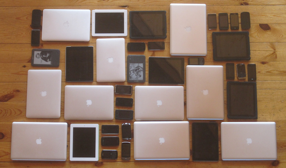
A variety of devices (source).
To create a good user experience, you need to know who your users are and what devices they are using. If you build a user interface for a desktop user with a mouse and a keyboard and give it to a smartphone user, your interface will be a frustration because it’s designed for another screen size, and another input modality.
There are two extreme ends to the spectrum of approaches:
-
Build one version that works on all devices. UX will suffer as a result, since different devices have different design considerations.
-
Build a version for each device you want to support. This will take forever, because you’ll be building too many versions of your application. Also, when the next new smartphone arrives (which happens roughly weekly), you will be forced to create yet another version.
There is a fundamental tradeoff here: the more device categories you have, the better a user experience you can deliver, but the more work it will take to design, implement and maintain.
Creating a separate version for each device class you decide on may be a good idea for performance reasons or if the versions you want to serve to different device classes vary hugely. Otherwise, responsive web design is a perfectly reasonable approach.
A POTENTIAL SOLUTION
Here’s a compromise: classify devices into categories, and design the best possible experience for each category. What categories you choose depend on your product and target user. Here’s a sample classification that nicely spans popular web-capable devices that exist today.
- small screens + touch (mostly phones)
- large screens + touch (mostly tablets)
- large screens + keyboard/mouse (mostly desktops/laptops)
This is only one of many possible breakdowns, but one that makes a lot of sense at the time of writing. Missing from the above list are mobile devices without touch screens (eg. feature phones, some dedicated ebook readers). However, most of these have keyboard navigation or screen reader software installed, which will work fine if you build your site with accessibility in mind.
EXAMPLES OF FORM FACTOR-SPECIFIC WEB APPS
There are many examples of web properties serving entirely different versions for different form factors. Google search does this, as does Facebook. Considerations for this include both performance (fetching assets, rendering pages) and more general user experience.
In the world of native apps, many developers choose to tailor their experience to a device class. For example, Flipboard for iPad has a very different UI compared to Flipboard on iPhone. The tablet version is optimized for two hand use and horizontal flipping while the phone version is intended for single hand interaction and a vertical flip. Many other iOS applications also provide significantly different phone and tablet versions, such as Things (todo list), and Showyou (social video), featured below:
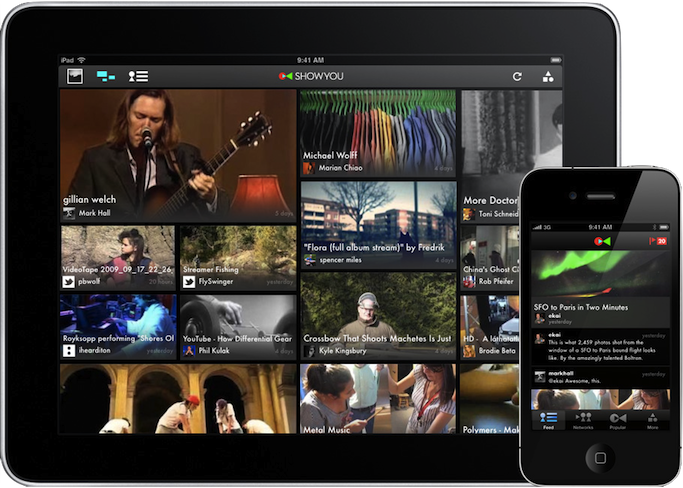
Significant UI customization for phone and tablet.
APPROACH #1: SERVER-SIDE DETECTION
On the server, we have a much more limited understanding of the device that we’re dealing with. Probably the most useful clue that’s available is the user agent string, which is supplied via the User-Agent header on every request. Because of this, the same UA sniffing approach will work here. In fact, the DeviceAtlas and WURFL projects do this already (and give a whole lot of additional information about the device).
Unfortunately each of these present their own challenges. WURFL is very large, containing 20MB of XML, potentially incurring significant server-side overhead for each request. There are projects that split the XML for performance reasons. DeviceAtlas is not open source, and requires a paid license to use.
There are simpler, free alternatives too, like the Detect Mobile Browsers project. The drawback, of course, is that device detection will inevitably be less comprehensive. Also, it only distinguishes between mobile and non-mobile devices, providing limited tablet support only through an ad-hoc set of tweaks.
APPROACH #2: CLIENT-SIDE DETECTION
We can learn a lot about the user’s browser and device by using feature detection. The main things we need to determine are if the device has touch capability, and if it’s a large or small screen.
We need to draw the line somewhere to distinguish small and big touch devices. What about edge cases like the 5” Galaxy Note? The following graphic shows a bunch of popular Android and iOS devices overlaid (with corresponding screen resolutions). The asterisk indicates that the device comes or can come in doubled density. Though the pixel density may be doubled, CSS still reports the same sizes.
A quick aside on pixels in CSS: CSS pixels on the mobile web aren’t the same as screen pixels. iOS retina devices introduced the practice of doubling pixel density (eg. iPhone 3GS vs 4, iPad 2 vs 3). The retina Mobile Safari UAs still report the same device-width to avoid breaking the web. As other devices (eg. Android) get higher resolution displays, they are doing the same device-width trick.
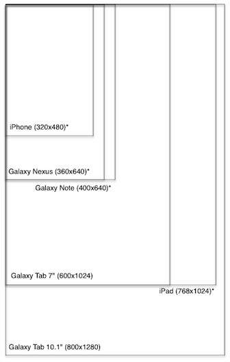
Device resolution (in pixels).
Complicating this decision, however, is the importance of considering both portrait and landscape modes. We don’t want to reload the page or load additional scripts every time we re-orient the device, though we may want to render the page differently.
In the following diagram, squares represent the max dimensions of each device, as a result of overlaying the portrait and landscape outlines (and completing the square):
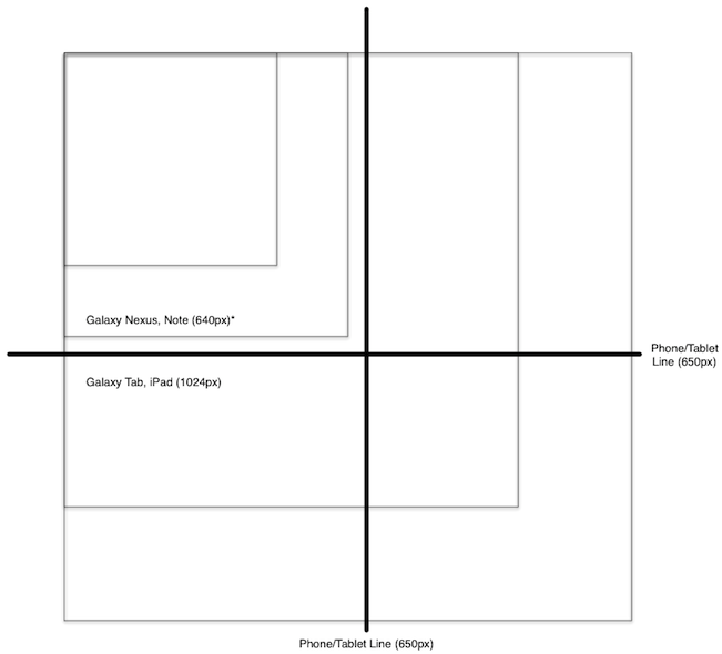
Portrait + landscape resolution (in pixels)
By setting the threshold to 650px, we classify iPhone, Galaxy Nexus as smalltouch, and iPad, Galaxy Tab as “tablet”. The androgynous Galaxy Note is in this case classified as “phone”, and will get the phone layout.
And so, a reasonable strategy might look like this:
if (hasTouch) { if (isSmall) { device = PHONE; } else { device = TABLET; } } else { device = DESKTOP; } See a minimal sample of the feature-detection approach in action.
The alternative approach here is to use UA sniffing to detect device type. Basically you create a set of heuristics and match them against your user’s navigator.userAgent. Pseudo code looks something like this:
var ua = navigator.userAgent; for (var re in RULES) { if (ua.match(re)) { device = RULES[re]; return; } } See a sample of the UA-detection approach in action.
A NOTE ON CLIENT-SIDE LOADING
If you’re doing UA detection on your server, you can decide what CSS, JavaScript and DOM to serve when you get a new request. However, if you’re doing client-side detection, the situation is more complex. You have several options:
- Redirect to a device-type-specific URL that contains the version for this device type.
- Dynamically load the device type-specific assets.
The first approach is straightforward, requiring a redirect such as window.location.href = '/tablet'. However, the location will now have this device type information appended to it, so you may want to use the History API to clean up your URL. Unfortunately this approach involves a redirect, which can be slow, especially on mobile devices.
The second approach is quite a bit more complex to implement. You need a mechanism to dynamically load CSS and JS, and (browser-depending), you may not be able to do things like customize <meta viewport>. Also, since there’s no redirect, you’re stuck with the original HTML that was served. Of course, you can manipulate it with JavaScript, but this may be slow and/or inelegant, depending on your application.
DECIDING CLIENT OR SERVER
These are the tradeoffs between the approaches:
Pro client:
- More future proof since based on screen sizes/capabilities rather than UA.
- No need to constantly update UA list.
Pro server:
- Full control of what version to serve to what devices.
- Better performance: no need for client redirects or dynamic loading.
My personal preference is to start with device.js and client-side detection. As your application evolves, if you find client-side redirect to be a significant performance drawback, you can easily remove the device.js script, and implement UA detection on the server.
INTRODUCING DEVICE.JS
Device.js is a starting point for doing semantic, media query-based device detection without needing special server-side configuration, saving the time and effort required to do user agent string parsing.
The idea is that you provide search-engine-friendly markup (link rel=alternate) at the top of your <head> indicating which versions of your site you want to provide.
<link rel="alternate" href="http://foo.com" id="desktop" media="only screen and (touch-enabled: 0)"> Next, you can either do server-side UA detection and handle version redirection on your own, or use the device.js script to do feature-based client-side redirection.
For more information, see the device.js project page, and also a fake application that uses device.js for client-side redirection.
RECOMMENDATION: MVC WITH FORM-FACTOR SPECIFIC VIEWS
By now you’re probably thinking that I’m telling you to build three completely separate apps, one for each device type. No! Code sharing is the key.
Hopefully you have been using an MVC-like framework, such as Backbone, Ember, etc. If you have been, you are familiar with the principle of separation of concerns, specifically that your UI (view layer) should be decoupled from your logic (model layer). If this is new to you, get started with some of these resources on MVC, and MVC in JavaScript.
The cross-device story fits neatly into your existing MVC framework. You can easily move your views into separate files, creating a custom view for each device type. Then you can serve the same code to all devices, except the view layer.
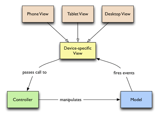 Cross-device MVC.
Your project might have the following structure (of course, you are free to choose the structure that makes the most sense depending on your application):
models/ (shared models) item.js item-collection.js controllers/ (shared controllers) item-controller.js versions/ (device-specific stuff) tablet/ desktop/ phone/ (phone-specific code) style.css index.html views/ item.js item-list.js This sort of structure enables you to fully control what assets each version loads, since you have custom HTML, CSS and JavaScript for each device. This is very powerful, and can lead to the leanest, most performant way of developing for the cross-device web, without relying on tricks such as adaptive images.
Once you run your favorite build tool, you’ll concatenate and minify all of your JavaScript and CSS into single files for faster loading, with your production HTML looking something like the following (for phone, using device.js):
<!doctype html> <head> <title>Mobile Web Rocks! (Phone Edition)</title> <!-- Every version of your webapp should include a list of all versions. --> <link rel="alternate" href="http://foo.com" id="desktop" media="only screen and (touch-enabled: 0)"> <link rel="alternate" href="http://m.foo.com" id="phone" media="only screen and (max-device-width: 650px)"> <link rel="alternate" href="http://tablet.foo.com" id="tablet" media="only screen and (min-device-width: 650px)"> <!-- Viewport is very important, since it affects results of media query matching. --> <meta name="viewport" content="width=device-width"> <!-- Include device.js in each version for redirection. --> <script src=”device.js”></script> <link rel=”style” href=”phone.min.css”> </head> <body> <script src=”phone.min.js”></script> </body> Note that the (touch-enabled: 0) media query is non-standard (only implemented in Firefox behind a moz vendor prefix), but is handled correctly (thanks to Modernizr.touch) by device.js.
VERSION OVERRIDE
Device detection can sometimes go wrong, and in some cases, a user may prefer to look at the tablet layout on their phone (perhaps they are using a Galaxy Note), so it’s important to give your users a choice of which version of your site to use if they want to manually override.
The usual approach is to provide a link to the desktop version from your mobile version. This is easy enough to implement, but device.js supports this functionality with the device GET parameter.
CONCLUDING
To summarize, when building cross-device single-page UIs, that don’t fit neatly into the world of responsive design, do this:
- Pick a set of device classes to support, and criteria by which to classify devices into classes.
- Build your MVC app with strong separation of concerns, splitting views from the rest of the codebase.
- Use device.js to do client side device class detection.
- When you’re ready, package your script and stylesheets into one of each per device class.
- If client-side redirection performance is an issue, abandon device.js and switch to serverside UA-detection
What’s New in Photoshop CS6 Extended
Product Manager Zorana Gee provides an overview of Photoshop CS6 Extended.
- interactive
- interaction
- installation
- design
- led
- light
- art
- technology
- projectionmapping
- projectmapping
- robotics
- ui
- mobile
- projection
- interactivedesign
- lightdesign
- apple
- web
- 3d
- ux
- userinterface
- lightart
- robot
- artinstallation
- touchscreen
- application
- app
- webdesign
- touch
- motion
- responsive
- adobe
- multitouch
- future
- robots
- drone
- photoshop
- productdesign
- ledinstallation
- lightsculpture
- video
- user experience
- iphone
- creative
- interactivelight
- digitalart
- motiondesign
- ar
- 3dprinting
- responsivedesign
- augmentedreality
- drones
- kinetic
- data
- development
- kinect
- microsoft
- display
- immersive
- process
- painting
- timelapse
- dronerobotics
- 3dprojection
- ios
- vr
- virtualreality
- earth
- ai
- device
- user interface
- engineering
- laser
- lightpainting
- kineticsculpture
- lightinstallation
- touchinstallation
- animation
- programmableleds
- graffiti
- interactions
- neon
- performance
- leapmotion
- watch
- mobiledesign
- pixel
- environment
- exoskeleton
- interactiveenvironment
- sound
- lcd
- social
- leds
- lukew
- artlight
- patterns
- internet
- carui
- November 2011 128
- December 2011 65
- January 2012 25
- February 2012 27
- March 2012 33
- April 2012 31
- May 2012 16
- June 2012 32
- July 2012 20
- August 2012 37
- September 2012 24
- October 2012 34
- November 2012 31
- December 2012 6
- January 2013 21
- February 2013 11
- March 2013 10
- April 2013 35
- May 2013 45
- June 2013 10
- July 2013 49
- August 2013 33
- September 2013 40
- October 2013 57
- November 2013 31
- December 2013 28
- January 2014 86
- February 2014 49
- March 2014 24
- April 2014 40
- May 2014 6
- June 2014 9
- July 2014 1
- August 2014 34
- September 2014 30
- October 2014 45
- November 2014 21
- December 2014 6
- January 2015 5
- February 2015 17
- March 2015 18
- April 2015 14
- May 2015 1
- June 2015 10
- July 2015 4
- August 2015 1
- October 2015 11
- March 2016 4
- December 2016 18
- September 2017 6
- October 2017 13
- November 2017 5
- June 2018 8
- July 2018 2
- November 2018 7
- February 2019 8
- March 2019 6
- July 2019 1
- August 2019 1
- October 2019 1
- July 2020 5
- November 2020 9
- December 2020 1
- January 2021 1
- April 2021 1
- May 2021 9
- June 2021 3
- August 2022 3
- May 2023 2
- September 2023 1
- May 2025 6