V Motion Project: Music Video powered by Kinect. They created this piece by hacking the Kinect motion tracking software and integrated it with audio production software, The V Motion Project created a tool that could transform the body’s movements into music. It’s great to see the Kinect technology being used in innovative and creative ways like this and it helps that the music track is pretty cool.
A first-of-its-kind web-based exhibition live from the Science Museum in London and open to the world online at chromeweblab.com. Worldwide visitors both online and in-museum are able to make music with people across the world; trace routes across the internet’s vast network and discover where images are stored; watch their portrait being processed and drawn by a robot; and travel instantly to far away places.
Designing for Context: The Multiscreen Ecosystem
Article: Source
To create applications and systems that are easy to use, it is crucial to understand the user and the context in which the app will be used. Understanding the context helps design systems that anticipate use cases at a relevant time of use. The more unobtrusive and transparent the experience is at the time of use, the better the design. This means the user does not have to think about the device he is using, changes in the environment, or changes in context, and can rely on great functionality and ease of use independent of his situation.
In traditional systems, the context of use did not change much. Whether the use was in the office or at a personal computer at home, the surroundings were similar and there was no need to adapt to different environments. In today’s world, smartphones, tablets, laptops, and smart TVs provide different services in different contexts. These services are consumed by a variety of users and require different interaction models, use cases, and planning. For this reason, UX professionals should first design for the context of use in order to provide better experiences and ultimately enhance the intended purpose of the product.
The Multiscreen App Ecosystem
Designing for context is especially important when designing for a multiscreen ecosystem, where multiple devices are all a part of one product.
Michal Levin, a UX designer at Google, describes multiscreen ecosystems in terms of three main categories. The first is consistent experience, where the application and the experience are similar across all screens. For example, the Google Search application provides the same search experience across all devices. The second category is the complementary experience, where devices work together and communicate with each other in order to create a unique experience. An example of this is Padracer, a racing game where the user’s iPhone serves as the steering wheel and the iPad screen as the racetrack.

Padracer - a complementary multi-screen experience
Another example of a complementary multiscreen experience is SlingPlayer for mobile devices. A Slingboxis a device that allows you users to stream live television from their living room to mobile devices. Using the SlingPlayer application, users can watch or record their favorite programs from a remote location. Each device complements the other and the experience could not exist with just a single device.

SlingPlayer for tablet
The Continuous Multiscreen Experience
The third category of app ecosystems the continuous multiscreen experience, which is possibly the most important category for a contextual multiscreen design. For a continuous experience across several devices, UX professionals must evaluate when and where a product will be used in order to assess the optimal experience for the user at the time of use. AllRecipes is an example of a continuous ecosystem where one can search for recipes online using a desktop computer and add ingredients to create a shopping list. While shopping, this list is accessible using a smartphone, the device most likely to be carried while shopping. The app also allows one to scan products using the camera and receive additional recipe ideas with greater ease. When it’s time to cook, an iPad can be brought into the kitchen for a cook-friendly interface with large fonts and big buttons so the user can touch the tablet with a knuckle in case of wet or messy fingers. Thetablet’s larger screen is a perfect size for the kitchen, much like a traditional cookbook resting on the counter.


Cook-friendly interface with large buttons for messy hands.
Eventbrite is another great example of a continuous multiscreen ecosystem. Users can register for an event through the Eventbrite website and receive an email ticket that they can print. Alternatively, users can download the mobile app for easy access to tickets and event information. The mobile app is ideal in this case because users will most likely take their smartphones to events to use a unique QR code as a ticket, which the app displays in high brightness and contrast for easy scanning in dark environments.
But the Eventbrite experience should not end there. The makers of Bizzabo, a new app designed to improve the social experience of conferences, believe in the importance of eye contact, handshakes, and face-to-face meetings. Their mobile app allows event organizers to import Eventbrite event information and engage directly with their attendees, while enabling professionals to network efficiently at conferences and meetups. This continuous experience is a natural evolution to the Eventbrite platform.

Eventbrite and Bizzabo, a continuous experience.
Additional Categories of Multiscreen Ecosystems
Precious, a studio based in Hamburg, Germany published a collection of additional multiscreen categories and scenarios to help understand and define strategies for the multiscreen world. It’s a handy reference for discussing solutions for digital products and services.

Understanding The Story
Sarah Doody writes, “A product is more than an idea, it’s more than a website, and it’s more than a transaction or list of functionalities. A product should provide an experience or service that adds value to someone’s life through fulfilling a need or satisfying a desire.” Understanding how people use a product and telling their stories helps designs create better critical paths and experiences for each platform when designing for a continuous multiscreen ecosystem. For example, a social network might decide that image sharing plays a significant role in developing the value of the product by enhancing user engagement. Although the website is the perfect platform for sharing and keeping in touch with friends, the critical path in the smartphone application can be directed towards the camera. Smartphones are carried everywhere, so a camera is always at arm’s reach. The images can then be synched with a tablet, which is an ideal platform for image sharing and manipulation because of its larger screen. Those images can be streamed directly from the tablet to a smart TV when friends come to visit, rounding out a great value for people who use the entire ecosystem.

Contextual Paths
When we understand how context affects usage for each device, we can create contextual paths to help guide the design for a multiscreen ecosystem. For example, a responsive website for a large city tells visitors what to do when in town, shows maps of public transportation, and provides directories of municipal services. To adapt to the context of a mobile platform, this same website should provide different paths according to the context to accommodate users on the go, typically by focusing on location-specific information such as bus routes. To determine these paths, designers can utilize web analytics to evaluate what users look for when using different platforms.

Device for Context
After doing some research I have accumulated some experience in understanding the basic context assumption for the various device types:
Smartphones
The idea that smartphone users are generally on-the-go outside the home, using the device as a substitute or a replacement for the personal computer is a misconception. Rather, smartphones are becoming a platform of their own and not a substitute for the computer, both at home and on-the-go.
However, it is safe to assume that the smartphone is always within reach throughout the day. With the rise of other convenient devices for media consumption (e.g., tablets), users mainly use smartphones for micro-tasks: looking for quick information, killing time, and social sharing.
Because the smartphone is always within reach, the context of use could be understood in terms of the application’s intended purpose. An example of this is Evernote, a multiscreen ecosystem that allows you to take notes, create to-do lists, clip articles, and save URLs. Evernote makes these notes completely searchable whether you are at home, at work, or on the go. In its mobile app, Evernote understands the mobile context and provides quick access for text notes, photo capture, and voice dictation. By utilizing the device capabilities and providing a quick way to save ideas, Eventbrite turns smartphones into a great note-taking platform.

Our Mobile Planet is a great resource for understanding the mobile consumer. The insights within this website are a result of an extensive technology research project commissioned by Google for understanding the smartphone adoption and usage around the world.
Tablets
Tablets are mostly used for media consumption, reading books, browsing news, and checking emails. People may use smartphones to look for a quick article to kill the three minutes waiting for a train; once on the train, they may take out the iPad for the hour it takes them to ride home (Usability of iPad Apps and Websites). Tablets are used in environments not conducive to a keyboard and mouse such as lying in bed,watching television, or standing. Because of its lighter weight in comparison to a laptop, the tablet is easily carried; however, its main usage is within the home. Most tablet owners use the device daily for an average of 90 minutes a day, mostly on weekdays.
Because the screen of a tablet is larger than that of a smartphone, the tablet is ideal for reading and viewing media such as images and movies, and the larger virtual keyboard is more convenient for writing emails and note-taking. However, the tablet is not currently considered a work tool for most people, nor is a replacement to the desktop computer; it is merely a more convenient way to consume media and surf the Web away from the office desk or the typical computer environment.
As technology advances, future tablets will have the power to replace the laptop PC. With the upcoming release of Windows 8, an operating system geared to touch devices and personal computers, there will most likely be a shift in the market, and perhaps one day the tablet (with an auxiliary keyboard) may replace the laptop altogether.
Tablets are a perfect platform for reading. Pocket (formally known as Read it Later) is a great example of an app that uses the tablet to enhance a consistent multiscreen experience. When the user finds something on the Web while using a desktop PC or laptop that he wants to view or read later, he simply puts it in Pocket. Pocket captures those reading items and displays them in a clean, easy-to-read layout on a tablet (or a smartphone), creating a personalized magazine for the individual user.
Personal computers (desktop or laptop)
People use personal computers for two completely different functions: for work and for leisure. Because personal computers are found in almost every home and office, it is essential to consider them when designing for a multi-screen ecosystem. Oftentimes, users will look for an application or find something they’re interested in while surfing the Web on a personal computer, and then continue the interaction onto other devices. Personal computers are also used to backup files and images, and users often revert back to the computer for the most important tasks in their daily routines.
Mouse and keyboard ergonomics and the advanced processing powers of personal computers provide an efficient working environment. When designing multiscreen ecosystems, UX professionals can utilize additional devices to serve as auxiliary screens. For example, with Adobe Nav and a network connection between an iPad and a computer, users can move the Photoshop toolbar onto the tablet and customize it to more easily access the toolbar without crowding the main interface, creating an even more efficient environment.
Smart TVs
Smart TV is a general term for a new generation television viewing experiences where the TV (or a specialized device connected to it, such as an Apple TV) has Internet connectivity and can run applications (e.g., Netflix) and video processing utilities.
Designing for television screens is also known as “designing for the 10-foot experience” because, from the distance of the living room couch, the apparent size of elements on the screen is noticeably smaller compared to a computer screen, where the user’s eyes are typically less than two feet (60 cm) from the display. When designing for the context of smart TVs, one can assume that users are in a very comfortable setting in their living rooms, often wanting to relax, to be entertained, and to interact with people who are in the room with them. The interaction with this device could last a few hours or longer.
The preferred television input device is a remote control. For the most part, people don’t want to use a mouse and keyboard when they’re watching television. This means the UI has to be simple and obvious, and users must be able to navigate with their thumbs without looking at the input device.

With devices like Google TV or Apple TV using AirPlay, smart TVs can integrate with other devices such as smartphones and tablets. For example, a tablet can be used as a program guide and as a way to read more about the program currently being watched. Or for a multiscreen experience, a user can begin watching a show on her laptop and then switch to her television for a more comfortable environment. The move between each device is synced and seamless to the user.
Following up his 2011 article Re-Thinking User Interface Design for the TV Platform, Jim Mischel noted in an interview: “A good way to satisfy the television user is by presenting a simple user interface on a tablet or phone. The tablet/phone presents the interface, and the user’s input on that device controls the television. Note that this is only important when dealing with short-format content. If the user is going to watch an hour-long television show or a two-hour movie, then Web interfaces like Hulu, or cumbersome cable TV-like interfaces are okay. The user is willing to put up with a little aggravation if the reward is an hour or two of uninterrupted entertainment. But if the user is watching YouTube videos or consuming other short format content, the user interface has to be simple. Really simple. The user can’t be bothered with having to go through a ton of menus every three minutes.”
The television could also serve as an extension to other devices, using the large display for streaming media or images from the tablet or using a high-quality sound system for better audio experiences. A good example of this is Sting 25, an app celebrating the life and work of the musician Sting. It allows a dual-screen AirPlay viewing of exclusive concert footage wirelessly on a smart TV while exploring additional content on an iPad.

A natural user interface (NUI) is an emerging concept in human–computer interaction, and refers to an interface that allows a user to control a tool or digital content using relatively natural means of communication. The goal of NUI is to make computing and technology simple to use, everywhere around us, accessible to people with minimal technical expertise, reliable and more intuitive. With a motion-sensing input device technology like Microsoft’s Kinect, the living room environment becomes a setting for an even greater TV experience. For example, face recognition software could detect a person and flip through his favorite channels as he taps two fingers together or waves his hand, and a voice command could initiate more complex actions.
Here is a demonstration of gesture controls by PrimeSense, an Israeli Company specializing in NUIs:
Conclusion
Designing for context is about aligning the purpose of a product with the user’s requirements at any given time or in any given situation. By evaluating each platform against the story of the users and how (or where) they use the product, designers can create better flows across and within the ecosystem. Creating these product ecosystems turns smart devices into smart displays. These smart displays follow users throughout their day and help drive the experience, allowing users to engage with the product more than ever before.
Overhauling a UI Without Upsetting Current Users
Article: Source
Companies with successful software products often know that their user interfaces could be improved but hesitate to take action because major changes might upset their existing users. “Not only would a redesign cost me a small fortune,” one executive told Macadamian “but look at the backlash againstGoogle and Facebook’s changes. I’m not willing to risk losing customers over design.”
Indeed, Google, Twitter, and Facebook caused quite a stir recently by making dramatic changes to their UIs. In less than 24 hours, hundreds of users formed a coalition against the new Gmail, with a mission to “urge Google to fix the horrid new Gmail interface and take us back to productivity.” And Facebook users began posting “If it Ain’t Broke, Don’t Fix It” banners to express their dissatisfaction.
But for every example of a redesign gone wrong, there is a success story of a company blasting ahead of its competitors by reinventing its product design. Salesforce.com’s dominance in the CRM market, for example, is largely attributable to its innovative design updates.
The risks associated with not updating a UI outweigh those associated with an update. But a successful redesign absolutely requires the right product management and UX techniques to evolve the product carefully and avoid a user revolt.
Consider Form and Function
Ninety percent of the value of an experience comes from how it works, not how it looks. Of course, it’s not that visual design is unimportant; it’s just not nearly enough.
This is the source of one of the major complaints about Gmail’s new interface. “Gmail’s new interface is form over function. Strange because the reason everyone went to Gmail was function” says one Twitter user. “Gmail’s new look is uncluttered, which is a good thing until you try to navigate and then, user beware.”
It is a myth among non-designers that the essence of a fantastic experience and a product’s success is its aesthetic value. Although UX pros recognize that visual appeal is just one part of the experience, even they sometimes spend disproportionate amounts of time on visual design, sacrificing other aspects of UX. The importance of good looks may be the initial draw to a product, and visual design can often be a very important factor in influencing purchasing decisions. However, for a product to be endorsed by the market, development needs to be focused on much more than just how the product looks. This is especially true in a world where information and opinions about products travel quickly and unpredictably via social media.
A redesigned UI that looks pretty but fails to deliver new value will not only disappoint new users but will also alienate existing, previously satisfied users, and the news of this failure will spread rapidly. Never make the mistake of thinking that a product’s aesthetic is the same as the product’s actual experience.
Redesign Based on Evidence
In order to make functional (not just aesthetic) improvements, product managers and design teams need to perform research with real-world users. Most people already agree with this in principle, but vary wildly in how well they execute on it.
One of the most common mistakes companies make is to implement UI changes based on what users saythey want. Unfortunately, experience shows that what people say they will or won’t like doesn’t always match reality. Moreover, a user’s suggestion on how to solve a UI problem may be unworkable, unreasonable, or both.
While it’s important to solicit and listen to user feedback, users aren’t designers or usability experts so their complaints and suggestions should not be taken at face value. Don’t confuse a design suggestion with a design solution. To identify the real UI problems and solutions, careful UX research must take into account facts, not just opinions.
Two fundamental techniques that should be used in any major UI update are focus groups and usability testing.
Focus groups
Focus groups are a powerful exploratory technique that can provide rich information on the opinions and attitudes of the target audience regarding a new or existing product or idea.
They are best used in the early discovery and assessment stages of a design update project in order to:
- get a feel for the range of opinions on different aspects of the interface
- understand the reasons for change requests, new interface ideas, and underlying preferences
- build a raw list of user requirements
This information can provide direction to a development team in the early stages of their work so they can prepare for, and even get an early start on, development in key areas in parallel with the design effort.
However, focus groups are not a good source of behavioral data. What people say they will do, compared to what they actually do, is notoriously unreliable for several reasons. First, what people say they will do (intent) and what they actually do (action or behavior) often vary because people can’t predict contextual factors that may alter their behavior in a given situation. This is why people like test drives and 30-day return policies.
Second, people are not fully aware of all of their behaviors. Some everyday actions are so commonplace that people sometimes forget they even do them. For instance, if you ask people something as simple as, “What features on a telephone do you use and approximately how often?” and compare the results to direct observation data on the same question, the results are usually staggeringly different.
That’s where observational techniques like usability testing come in.
Usability Testing
Usability testing is a technique to determine the effectiveness of a design by observing and assessing users as they walk through a predetermined series of tasks in the software. For example, if users consistently stumble during a particular part of the workflow, this is a strong indicator that the design is flawed.
Researchers usually follow-up each usability test session by interviewing the user and asking more qualitative questions about the experience. Usability metrics—such as the time it takes to complete a task, the number of errors, the number of clicks, the success rate, etc.—are collected along with ease of use ratings.
Usability testing is very different from beta testing. In beta testing, users will typically only report usability problems that make it very difficult for them to accomplish a task—in other words, things that are very clearly bugs. They typically won’t report that they found something challenging or unintuitive. People don’t always like to admit that they failed at something. Also, beta testers (or at least the ones who take time to report issues) are often fans of the product, and are therefore also power users. They may have already learned to work around or ignore usability issues.
Hopefully, by the time a product is in beta, most of the obvious usability issues will already have been solved because the most expensive time to fix a usability issue (or any bug for that matter) is after the product has been built.
Stop the Endless UI Debates
Despite access to quality user research, many projects still get mired in unproductive debate about design and implementation issues. To avoid this, take the development and design team back to the first principles of the product. When arguing over a particular feature or screen, stop to ensure the team is in agreement about the answers to the following questions:
- Why will a user want to use this feature?
- What will be their most common tasks?
- Under what conditions, or in what contexts, will this feature be used?
- Who are the primary users of this particular feature?
Taking just a bit of time to regroup and make sure everyone on the team knows the answers to these questions will forestall wasted debate and speed project completion. If you don’t, the same issues will inevitably come up again and again in the design and development process. Often when a team debates whether to include a certain feature, the true, underlying questions are, “Who are our primary users and what would they value?” If the team has considered these questions already, the answers to feature decisions will be clear, allowing the team to breeze through those discussions.
Integrating Redesign Feedback: Interpret and Prioritize
Even the best products won’t be perfect or universally loved; user complaints are a perennial and pervasive part of the design (and redesign) process. So when evaluating user complaints about the UI (there will always be some!) don’t react to them at face value or in a knee-jerk fashion that just closes the trouble ticket.
Experienced product managers and UX designers will take the time to gather qualitative and quantitative data from a variety of users to determine:
- how frequently each design issue is occurring
- the impact of an issue on a user
- the relative importance of one issue over another
This data and analysis allows teams to make sense of all the user reactions so that they can swiftly address issues that will most affect their product (and ultimately their business) success and put aside all the red herrings.
How pervasive is the complaint?
Some complaints may identify a common user problem, but they could also simply be gripes from a very small but vocal group of users.
This is where quantitative data becomes very useful. When Google changed the Gmail UI, it added a pop-up bar in the corner of the screen that asked users for feedback on the new design.

This is an effective mechanism for determining how widespread design problems are, and as a bonus allows users a sense of control as they vent their frustrations in direct communication to the software maker.
However, this method can be costly as it requires staff to sort through the wide variety of comments. The quality of the data provided is also; users will often offer solutions rather than explaining the reason behind their frustration.
For more cost-effective and equally powerful data gathering, consider conducting a random survey of your targeted audience through user interviews or an ethnographic study. This provides the quality and quantity of feedback necessary to ascertain whether a given complaint is common and should be immediately addressed, or is a minor issue that should be lower on the priority list.
Consider the Consequences of not Making a Change
Jumping into a design update can be costly both during the design process and, worse, if the updated product causes user backlash. It’s tempting to take the conservative approach and maintain things the way they are, hoping to avoid hurting customer goodwill with a bad UI decision. But with products such as theiPad and SalesForce.com setting a new bar for software UX, companies are being forced to update their products’ UIs in order to meet rising consumer expectations. The risk of falling behind exceeds the risk of alienating existing users.
Fortunately, you can have your cake and eat it too. Proper product management and UX techniques can reliably produce UI updates that keep a product ahead of the curve without losing loyal users. It’s a discipline based on the fundamentals of good UX design: collecting, interpreting, and prioritizing user research. These are core competencies that companies planning to stay market winners must cultivate within their organizations.
More about devicePixelRatio
Article: Source
It occurs to me that my recent post about devicePixelRatio was a bit cryptic and short. So I will givde some extra examples in this post. Also, I did some additional research that takes screen.width into account.
Remember the definition:
devicePixelRatio is the ratio between physical pixels and device-independent pixels (dips) on the device.devicePixelRatio = physical pixels / dips
Here is the test page. It shows the devicePixelRatio of your browser. Note that on most desktops and laptops it’s still 1. Retina laptops show 2 in Safari and Chrome 22, 1 in Chrome up to 21(?) and Opera, and undefined in IE and Firefox. (By the way, the 2 value is not always correct. See below.)
iOS
Similarly, non-retina iOS devices will show 1, while retina devices will show 2. That’s because the actual number of pixels has doubled, but the browser pretends it hasn’t so as not to upset the carefully crafted 320px-wide layouts people made especially for the iPhone. Sites with a meta viewport of device-width should not suddenly become 640px wide, after all. So the dips width remained at 320px, and 640/320 = 2.
On iOS the situation is relatively simple: there are only the values 1 and 2. On most other platforms the situation is also simple because the real physical pixel count is equal to the dips count, which gives a devicePixelRatio of 1.
Android
The main complications come from Android; or rather, from the many modern devices that sport a retina-like display that has significantly more pixels than just 320, most of which (in my collection) run Android.
In fact, Google’s Nexus One was the first device ever, as far as I know, to use dips; even before the iPhone. Meanwhile the Galaxy Nexus and the Galaxy Note both also sport retina-like displays. A closer look at these three devices is instructive.
The Nexus One has a physical resolution of 480x800, but the Android WebKit team decided that the optimal width for a web page viewed in portrait mode was still 320px. Thus the dips abstraction layer remained 320 pixels wide, anddevicePixelRatio became 480/320 = 1.5.
On the same phone, Opera Mobile reached the same conclusion. Its dips layer is also 320px wide, and its devicePixelRatio is also 1.5.
(Incidentally, the BlackBerry Torch 9810 with OS7 also has 480 physical pixels, and the BlackBerry WebKit team decided to stick to adevicePixelRatio of 1. In retrospect it might have been better if they’d moved to 1.5, too; 480px wide sites are somewhat hard to read on the Torch’s display.)
The Galaxy Nexus has a significantly upped pixel count of 720x1200. The Android team decided to up the width of the dips layer, too, to 360px. This makes devicePixelRatio 720/360 = 2. The Chrome team decided on the same, as did TenCent’s QQ browser.
Opera, however, disagreed, deciding to stick with a dips width of 320px. This yields a devicePixelRatio of 720/320 = 2.25. (When I saw this value I thought Opera had a bug here, but it does not. The value is perfectly consistent with the physical and dips widths.)
The Galaxy Note, finally, has a physical pixel count of 800x1200. Here all browsers decided on the same ratio as on the Galaxy Nexus: Android WebKit, Chrome, and QQ stick with 2 (which means a dips width of 400px), while Opera sticks to 2.25, arriving at the slightly odd dips width of 356px.
You still with me? The various browsers are essentially all playing their own game here. That’s perfectly fine as long as they report the correctdevicePixelRatio.
Relation with other properties
Anyway. devicePixelRatio works fairly consistently across browsers (see my earlier report for the exceptions); and the relation betweendevicePixelRatio, physical pixels, and dips is a purely mathematical one, meaning that if you know two of them you can calculate the third.
But how do we find either the dips width or the physical pixel width?
Dips are easy: give your page a <meta name="viewport" content="width=device-width">, read outdocument.documentElement.clientWidth, and most browsers will give you the width of the layout viewport, which now equals the dips width. (Here is the necessary compatibility table.)
If you can’t use this calculation, though, things get more hairy. We’re forced to use the values given by screen.width. But what do these values mean?
If you think their meaning depends on the browser, congratulations! You’re starting to understand the mobile world.
- On iOS Retina devices,
screen.widthgives the width in dips. So both a retina and a non-retina iPad report 768 in portrait mode. - On the three Android devices,
screen.widthgives the width in physical pixels; 480, 720, and 800, respectively. All browsers on the devices use the same values. (Imagine if some browsers on the same device used dips and others physical pixels!)
Vasilis has a nice theory: Apple added pixels because it wanted to make the display crisper and smoother, while the Android vendors added pixels to cram more stuff onto the screen. It’s one way of looking at these differences: it explains why Apple emphasises the continuity from non-retina to retina, while Android concentrates on the raw pixel count.
So what do other browsers on other OSs think? The problem here is that I can use only those browsers that have a different dips count than physical pixel count, and I don’t have too many of those. The single one I could get a clear reading from, IE9 on the Nokia Lumia Windows Phone, agrees with Android and gives the physical pixel count in screen.width. It does not supportdevicePixelRatio, though, so I can’t test it fully.
So my conclusions on the mobile side are:
devicePixelRatiois mostly trustworthy on most browsers.- On iOS devices, multiply
devicePixelRatiobyscreen.widthto get the physical pixel count. - On Android and Windows Phone devices, divide
screen.widthbydevicePixelRatioto get the dips count.
Here’s a nice browser compatibility conundrum. It’s even worse than normal because I’m not sure what the answer should be.
Retina MacBook
Finally, a word about the new retina MacBook. Its devicePixelRatio is (supposed to be) 2, but the situation is more complex than you’d think, because you can change the resolution. What you change is the size of something that’s kind of a dips layer (though not really). In any case, the point here is that devicePixelRatio doesn’t change.
The physical pixel count of a retina MacBook is 2800x1800, and the out-of-the-box resolution is 1400x900. Counting this resolution as kind-of a dips layer, a devicePixelRatio of 2 is correct.
Point is, when you change the resolution to 1920x1200 devicePixelRatioremains 2. Strictly speaking that’s wrong — it should become 1.5. However, you could also argue that a MacBook’s resolution is not the same as a dips layer, in which case devicePixelRatio has a different definition on desktop/laptop. (Which one? Dunno.)
In any case, what Apple has done here is standardise on only twodevicePixelRatio values: 1 and 2. If you see 2 you know that you can serve retina-optimised images, while a 1 says you should serve normal images.
I’m not a big fan of serving special retina images because it makes the web too heavy — especially over a mobile connection. Nonetheless people will do it.
If you use this sort of detection, please remember to build in a case for whendevicePixelRatio is neither 1 nor 2 but, for instance, 1.5 or 2.25.
Update: Turns out Opera’s value depends on the zoom level. And I wouldn’t be surprised if the same goes for other browsers. I did not test this. Maybe later.
HTML5 VS NATIVE: The Mobile App Debate
Article: Source
Mobile apps and HTML5 are two of the hottest technologies right now, and there’s plenty of overlap. Web apps run in mobile browsers and can also be re-packaged as native apps on the various mobile platforms. With the wide range of platforms to support, combined with the sheer power of mobile browsers, developers are turning to HTML5 as a “write one, run many” solution. But is it really viable? There are still compelling reasons to go native, and clearly, many developers are indeed going that route. This article is a debate on native versus the web.
FEATURE RICHNESS
POINT: NATIVE CAN DO MORE
We can divide mobile functionality into two dimensions: the experience of the app itself, and the way it hooks into the device’s ecosystem, e.g. for Android, this would be features like widgets and notifications. Native excels in both dimensions.
In terms of app experience, native apps can do more. They can easily get hold of swipe events, mutlitouch even, for those platforms which support it. They can typically act on hard keys being pressed, like Android’s search button and volume controls. They can access hardware too, like GPS and camera. And with the user’s permission, some platforms provide unfettered access to the operating system. Just try detecting how much battery remains with HTML5!
It’s more than the in-app experience though. An operating system like Android provides different ways for apps to interact with users, and indeed, with other apps. You have active widgets on the homepage. You have notifications, which show up in the device’s status bar. And you have intents, which allow your app to announce itself as providing a general service which other apps might require on occasion.
COUNTERPOINT: NATIVE FEATURES CAN BE AUGMENTED, AND THE WEB IS CATCHING UP ANYWAY
It’s true that many in-app features are simply beyond reach for an HTML5 app. No matter how hot your web-fu skills are, if your app is stuck in a sandbox with no camera API, it won’t be taking snaps anytime soon! Fortunately, you don’t have to be in that sandbox. If you really need your web app to take a photo, you can create a native app, one with an embedded web view which provides the bulk of the user interface. This is how the open-source PhoneGap framework operates: it fills the gap by exposing native features as web services, which the web view calls using a standard networking API. When you build a hybrid app like this, you’re also able to hook into those platform features like widgets, notifications, and intents.
Making a hybrid - native plus web - app is hardly an ideal solution. It adds complexity and applies only to web apps wrapped as native apps, rather than traditional websites accessed from a mobile browser. But it mightn’t be necessary for long. Web standards are evolving rapidly, and modern mobile browsers are keeping pace. Offline storage, geolocation, canvas graphics, and video/audio playback all enjoy widespread support among modern smarpthones, for example. Even camera is starting to be supported — as of Android 3.1, it’s possible to capture photos and videos using web standards. And the latest iOS browser supports WebSocket for 2-way streaming, as well as device orientation detection.
Overall, mobile is evolving. But the web is also evolving, and fast. Among desktop browsers alone, there are five major browser vendors evolving standards and adding features at lightning pace. While it’s not a trivial process to port these features to mobile, many of them have already made their way into the mobile browsers.
Native is a fast-moving target, but the web is closing the gap.
PERFORMANCE
POINT: NATIVE RUNS FASTER
Native apps don’t have the web runtime barrier to deal with. They run close to the metal and can take advantage of performance boosters like GPU acceleration and multithreading.
COUNTERPOINT: WEB RUNTIMES ARE MUCH FASTER TODAY, AND MOST APPS DON’T NEED THE SPEED ANYWAY
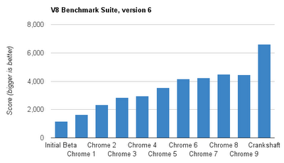
It would be an understatement to say the web has gotten faster in recent years. V8, the JavaScript engine that ships with Chrome, was a major development in web performance when it launched, and since then, it has only gotten faster:
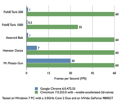
Graphic rendering engines has also sped up the web, and now hardware acceleration is starting to happen. Have a look at the speed bump provided by hardware accelerated-canvas:
In addition, the new Web Workers API makes multithreading a possibility, and modern web developers can also call on a range of performance-optimized libraries, and well-researched performance optimizion techniques. While most of those started life on the desktop web, they are still relevant to mobile, and there’s increased attention paid to mobile, e.g. performance guru Steve Souders has a page dedicated to mobile performance tools.
Not all desktop advances have made their way to every mobile platform yet, but the trends indicate they are on their way. It’s also important to note that the majority of mobile apps aren’t bleeding-edge 3D games, but fundamentally information-based: news, mail, timetables, social networks, etc. Visit a few sites from your mobile, e.g. GMail, Amazon, Twitter, and you can confirm mobile web performance is more than adequate. As for games, basic ones are already feasible with 2D canvas, and WebGL is starting to appear on mobiles - see Firefox 4. Until it’s widespread, there is a growing family of frameworks which compile WebGL apps to native apps that can take advantage of OpenGL, e.g. ImpactJS.
DEVELOPER EXPERIENCE
POINT: NATIVE IS EASIER TO DEVELOP
Native apps use robust programming languages (e.g. Java, Objective C, C++) which were designed for complex application development and have a proven track record. The APIs were designed ground-up to support the platform at hand. You can easily debug apps in desktop emulators which provide a close representation of the target device.
What makes web development particularly troublesome is the huge diversity of browsers and runtimes. When your app runs, it’s no guarantee feature X will be available. And even if it is, how will the browser implement it? Standards are open to interpretation.
COUNTERPOINT: WEB IS OFTEN EASIER TO DEVELOP, ESPECIALLY IF TARGETING MULTIPLE DEVICES
Let’s tackle core technology first. It’s true that web standards were originally conceived in an era when the web was fundamentally about documents, not apps, with JavaScript built and deployed in just 10 days! But they’ve turned out to be much more capable than imagined - web developers have learned to leverage the good parts and tame the bad parts, with patterns now understood for scaleable design. Furthermore, the standards are not standing still, and efforts like HTML5, CSS3, and EcmaScript Harmony are all improving the developer experience. Whether you prefer C++ or Java or JavaScript is a matter of religious debate, and also depends on your legacy code base. But we can certainly include JavaScript as a serious contender these days.
The flipside to browser/runtime fragmentation is the fact that all these environments exist in the first place. Develop an Android app in Java, and you’re faced with a full port to Objective C to support iOS. Develop a web app once and it will run in Android and iOS, not to mention WebOS, BlackBerry, Windows Mobile and … well, that’s the theory anyway. In practice, you’ll need to tweak things for each platform if you really want to get the experience right. But you’d have to do that in native too, for most mobile operating systems - there are different versions and different devices.
The good news is “fragmentation” has always been this way on the web, and there are well-known techniques to deal with it. Most importantly, the principle of progressive enhancement urges developers to target a basic device first, and add layers of platform-specific awesomeness where it’s available. The mantra of feature detection also helps and these days, we have library support from the likes of Modernizr to support responsive web design. With judicious use of these techniques, you can expand your reach to the vast majority of devices, even old-school “feature phones”, even form factors like watches and TVs, regardless of make and OS. Witness our multi-UI demonstration at Google IO 2011, where we targeted distinct form factors (feature phone, smartphone, tablet, desktop, TV) with a common code base of logic and markup.
LOOK-AND-FEEL
POINT: NATIVE FITS PLATFORM LOOK-AND-FEEL
One of the defining features of any platform is its look and feel. Users come to expect controls to be presented consistently and manipiulated in the same way. There are certain idioms which vary from platform to platform, e.g. what happens when the user performs a “long hold” (keep touching an element for several seconds)? Plaforms have standard idioms for such things, and you can’t satisfy them all with a single HTML5 app.
Furthermore, platform look-and-feel is orchestrated by the platform’s native software library, whose widgets encapsulate the kind of look and feel users expect. You get a lot of the expected look-and-feel “for free” just by using the native toolkit.
COUNTERPOINT: THE WEB HAS ITS OWN LOOK-AND-FEEL, AND YOU CAN ALSO CUSTOMIZE WEB INTERFACE FOR THOSE PLATFORMS YOU CARE ABOUT THE MOST
As explained in the previous section, the way of web development is to write a basic “one size fits all” version, and then progressively enhance it. While the enhancement is typically based on features, you can also enhance it by targeting those platforms you care the most about. This is a kind of “browser detection”, which is sometimes frowned upon by the web community, mostly because there are so many possible browsers out there. But if you do view two or three platforms with a very high priority, and you’re willing to make the extra effort in order to stack up against native alternatives, this may be the way to go.
As far as the baseline version, the web has its own look-and-feel, and we can even say each mobile platform has its own “web look-and-feel” established by the default browser and web runtime. “Web look-and-feel” may be fine for your users, and in fact, allows you to achieve a greater degree of consistency with the desktop browsing experience, as well as those on other devices the user might be working with. Furthermore, there are many successful apps which don’t much support native look and feel anyway. This is certainly true of games (does your favorite mobile game follow your mobile OS’s look and feel?), and even true of more conventional apps, e.g. check out the more popular native Twitter clients on your platform of choice, and you’ll see a wide range of user-interface mechanisms at work.
DISCOVERABILITY
POINT: NATIVE APPS ARE EASIER TO DISCOVER
App distribution mechanisms, like Android’s Market and Apple’s App Store, have been overwhelmingly popular in recent years and are a major driving force for the entire mobile industry. Any developer can submit their native app to the marketplace, where users can discover it through a combination of browsing, searching, and getting recommendations. Not only that, but if you’ve done your job right, the glowing ratings and comments will convince users to hit the all-important install button.
COUNTERPOINT: ACTUALLY, WEB APPS ARE EASIER TO DISCOVER
The web is arguably the most discoverable medium ever created. In the humble URL, we have (in theory, at least) a unique identifier for everything ever published on the web, which includes any apps published on standard websites. Search engines make it easy to discover that content and other websites can link to it, including catalogues of web apps similar to mobile marketplaces. Indeed, any individual can share web apps with their friends by just linking to it in emails and social network messages. Links can be sent in SMS too, where mobile users will be able to click on the link and launch the app in their device’s browser.
We don’t yet have the same marketplaces where users can rate and comment on apps, but that’s changing too. Read on …
MONETIZATION
POINT: NATIVE CAN BE MONETIZED
"6 year-old makes app during lunch hour, sells a zillion copies at $3 each". You see that headline a lot these days, so it’s no wonder developers big and small are looking to the mobile marketplaces for monetization. Mobile platforms offer several avenues for developers to directly charge for their apps. Simplest is the one-time payment, to unlock the app for all eternity. There are also in-app payment and subscription mechanisms on offer in some platforms, and they are tightly integrated in a consistent, secure, mechanism. These newer forms of payment allow developers to convert a smash-hit app into a long-term revenue stream.
In addition to app payments, you can monetize with traditional web models, such as advertising and sponsorship.
COUNTERPOINT: IT’S ALWAYS BEEN POSSIBLE TO MONETIZE ON THE WEB, AND THE OPPORTUNITIES ARE GROWING
The web would not be the engine of modern industry if there weren’t ample opportunities to cash in. Although direct “pay-per-use” mechanisms haven’t yet flourished, there are various niches where subscription-based “software as a service” solutions have indeed become viable. Examples include Google Apps, 37Signals’ range of products, and premium versions of various email services. Furthermore, direct payments aren’t the only way to profit from web apps. There’s online advertising, affiliate links, sponsorships, cross-promotion to other products and services.
Having said that, it’s perfectly reasonable for a web developer to read the headlines and experience a dash of payment envy. You can’t submit a web URL to the native marketplaces, so what’s a web developer to do? What you do is create a native “wrapper app” - for each platform you want to target, create an empty native app that simply contains a web view. The web view is where you embed the real app. Then you just submit these apps to the various marketplaces (and hopefully watch the money roll in!). There are probably hundreds, if not thousands, of web-powered apps in the main marketplaces today, some of them so cunningly assimilated that we don’t even know their web apps at all.
The downside is the onus of cross-compiling to each platform. Here’s where an existing framework like PhoneGap can help. Even better, there are web services like PhoneGap Build and Apparatio under development. Point these websites to your code repository, and out pops an Android app, an iOS app, and so on…ready for you to submit to the respective stores. No installing native SDKs on your machine; all you needed to build all these native apps was a a code editor and a web browser.
Will the marketplaces ever support web apps directly, without all the overhead of wrapping them natively? It’s not yet clear. We do know that Google introduced the Chrome Web Store last year, and although it applies only to the desktop, the store has triggered interest from other browser vendors, and is overall part of a trend towards web app catalogues, including some mobile-specific attempts. It’s early days for the concept of a web store, but the signs are promising.
CONCLUSIONS
It would be nice to declare a winner here, but right now, there is no clear winner. Some apps are best suited for native and some are best suited for the web. The web stack arguably has more momentum, but in terms of capabilities and execution qualities, native apps are moving fast too. And unless there comes a time when web technologies are a first-class citizen on the majority of mobile OSs, native will always be an important consideration.
One technique mentioned in this article is hybrid apps, and this may be the best compromise for some developers: web view where it’s possible and platform-specific native components where it’s not.
If you do choose the web path, be mindful of web standards and the principle of progressive enhancement. The web is a technology that knows how to target the multitudes of devices and operating systems around. Whether you choose to call it “fragmentation” or “diversity”, the web embraces it and you developers can benefit from all the prior art out there.
- interactive
- interaction
- installation
- design
- led
- light
- art
- technology
- projectionmapping
- projectmapping
- robotics
- ui
- mobile
- projection
- interactivedesign
- lightdesign
- apple
- web
- 3d
- ux
- userinterface
- lightart
- robot
- artinstallation
- touchscreen
- application
- app
- webdesign
- touch
- motion
- responsive
- adobe
- multitouch
- future
- robots
- drone
- photoshop
- productdesign
- ledinstallation
- lightsculpture
- video
- user experience
- iphone
- creative
- interactivelight
- digitalart
- motiondesign
- ar
- 3dprinting
- responsivedesign
- augmentedreality
- drones
- kinetic
- data
- development
- kinect
- microsoft
- display
- immersive
- process
- painting
- timelapse
- dronerobotics
- 3dprojection
- ios
- vr
- virtualreality
- earth
- ai
- device
- user interface
- engineering
- laser
- lightpainting
- kineticsculpture
- lightinstallation
- touchinstallation
- animation
- programmableleds
- graffiti
- interactions
- neon
- performance
- leapmotion
- watch
- mobiledesign
- pixel
- environment
- exoskeleton
- interactiveenvironment
- sound
- lcd
- social
- leds
- lukew
- artlight
- patterns
- internet
- carui
- November 2011 128
- December 2011 65
- January 2012 25
- February 2012 27
- March 2012 33
- April 2012 31
- May 2012 16
- June 2012 32
- July 2012 20
- August 2012 37
- September 2012 24
- October 2012 34
- November 2012 31
- December 2012 6
- January 2013 21
- February 2013 11
- March 2013 10
- April 2013 35
- May 2013 45
- June 2013 10
- July 2013 49
- August 2013 33
- September 2013 40
- October 2013 57
- November 2013 31
- December 2013 28
- January 2014 86
- February 2014 49
- March 2014 24
- April 2014 40
- May 2014 6
- June 2014 9
- July 2014 1
- August 2014 34
- September 2014 30
- October 2014 45
- November 2014 21
- December 2014 6
- January 2015 5
- February 2015 17
- March 2015 18
- April 2015 14
- May 2015 1
- June 2015 10
- July 2015 4
- August 2015 1
- October 2015 11
- March 2016 4
- December 2016 18
- September 2017 6
- October 2017 13
- November 2017 5
- June 2018 8
- July 2018 2
- November 2018 7
- February 2019 8
- March 2019 6
- July 2019 1
- August 2019 1
- October 2019 1
- July 2020 5
- November 2020 9
- December 2020 1
- January 2021 1
- April 2021 1
- May 2021 9
- June 2021 3
- August 2022 3
- May 2023 2
- September 2023 1
- May 2025 6