A Retna Web
Article: Source
With the recent announcement and release of the Retina Macbook Pro, Apple has brought double-density screens to all of the product categories in its current lineup, significantly paving the way for the next wave of display standards. While the fourth-generation iPhone gave us a taste of the “non-Retina” Web in 2010, we had to wait for the third-generation iPad to fully realize how fuzzy and outdated our Web graphics and content images are.
In the confines of Apple’s walled garden, popular native apps get updated with Retina graphics in a timely fashion, with the help of a solid SDK and a well-documented transition process. By contrast, the Web is a gargantuan mass whose very open nature makes the transition to higher-density displays slow and painful. In the absence of industry-wide standards to streamline the process, each Web designer and developer is left to ensure that their users are getting the best experience, regardless of the display they are using.
Before diving into the nitty gritty, let’s briefly cover some basic notions that are key to understanding the challenges and constraints of designing for multiple display densities.
Device Pixels
A device pixel (or physical pixel) is the tiniest physical unit in a display. Each and every pixel sets its own color and brightness as instructed by the operating system, while the imperceptible distance between these tiny dots takes care of tricking the eye into perceiving the full image.
Screen density refers to the number of device pixels on a physical surface. It is often measured in pixels per inch (PPI). Apple has coined the marketing term “Retina” for its double-density displays, claiming that the human eye can no longer distinguish individual pixels on the screen from a “natural” viewing distance.
CSS Pixels
A CSS pixel is an abstract unit used by browsers to precisely and consistently draw content on Web pages. Generically, CSS pixels are referred to as device-independent pixels (DIPs). On standard-density displays, 1 CSS pixel corresponds to 1 device pixel.
1<div height="200" width="300"></div>This would use 200 × 300 device pixels to be drawn on screen. On a Retina display, the same divwould use 400 × 600 device pixels in order to keep the same physical size, resulting in four times more pixels, as shown in the figure below.
On a Retina display, four times as many device pixels are on the same physical surface.
The ratio between device pixels and CSS pixels can be obtained using the following media query and its vendor-specific equivalents:
1 device-pixel-ratio,2 -o-device-pixel-ratio,3 -moz-device-pixel-ratio,4-Webkit-device-pixel-ratio {5…6}Or you can use their future-proof siblings:
1 device-pixel-ratio,2 -o-min-device-pixel-ratio,3 min--moz-device-pixel-ratio,4-Webkit-min-device-pixel-ratio {5…6}In Javascript, window.devicePixelRatio can be used to obtain the same ratio, although browser support is still relatively limited. Both of these techniques will be discussed in depth later in this article.
Bitmap Pixels
A bitmap pixel is the smallest unit of data in a raster image (PNG, JPG, GIF, etc). Each pixel contains information on how it is to be displayed, including its position in the image’s coordinate system and its color. Some image formats can store additional per-pixel data, such as opacity (which is the alpha channel).
Beside its raster resolution, an image on the Web has an abstract size, defined in CSS pixels. The browser squeezes or stretches the image based on its CSS height or width during the rendering process.
When a raster image is displayed at full size on a standard-density display, 1 bitmap pixel corresponds to 1 device pixel, resulting in a full-fidelity representation. Because a bitmap pixel can’t be further divided, it gets multiplied by four on Retina displays to preserve the same physical size of the image, losing detail along the way.
Each bitmap pixel gets multiplied by four to fill the same physical surface on a Retina display.
The Tool Chest
Even though we are still in the early stages of this major shift, several approaches to optimizing Web graphics for Retina displays have sprung up, and more are popping up as we speak. Each method makes some degree of compromise between performance, ease of implementation and cross-browser support. As such, choosing a tool should be done case by case, taking into account both quantitative and qualitative factors.
HTML And CSS Sizing
The most straightforward way to serve Retina-ready Web graphics is to halve the size of your raster assets using CSS or HTML, either manually or programatically. For instance, to serve a 200 × 300-pixel image (remember, those are CSS pixels), you would upload an image with a bitmap resolution of 400 × 600 pixels to your server, then shrink it by exactly 50% using CSS properties or HTML attributes. On a standard-resolution display, the result would be an image rendered with four times fewer pixels than its full bitmap size — a process commonly referred to as downsampling.

A CSS-sized image gets its dimensions halved during the rendering process.
Because the same image would use four times as many physical pixels on a Retina screen, every physical pixel ends up matching exactly 1 bitmap pixel, allowing the image to render at full fidelity once again.

CSS-sized images regain their full-detail glory on Retina displays.
There are several ways to achieve this:
USING HTML
The easiest way to apply CSS sizing would be by using the width and height attributes of the img tag:
1<img src="example@2x.png" width="200" height="300" />Please note that, even though specifying height is optional, it allows the browser to reserve the space required for the image before loading it. This prevents the page layout from changing as the image loads.
What to use it for? Single-page websites with few content images.
USING JAVASCRIPT
The same result can also be obtained using Javascript by targeting all Retina-ready content images in the document and halving their sizes. With the help of jQuery, this would look like this:
1$(window).load(function() {2 var images = $('img');3 images.each(function(i) {4 $(this).width($(this).width() / 2);5 });6});What to use it for? Websites with few content images.
USING CSS (SCSS)
If you want to keep all of the presentation code in your CSS files, then the most common technique involves setting the image as the background of another HTML element, usually a div, then specifying its background-size property. You could either set explicit width and height values for the background image or use the contain value if the dimensions of the HTML element are already specified. It is worth noting that the background-size property is not supported in IE 7 or 8.
1.image {2 background-image: url(example@2x.png);3 background-size: 200px 300px;4 /* Alternatively background-size: contain; */5 height: 300px;6 width: 200px;7}You could also target a :before or :after pseudo-element instead:
1.image-container:before {2 background-image: url(example@2x.png);3 background-size: 200px 300px;4 content:'';5 display: block;6 height: 300px;7 width: 200px;8}This technique works just as well with CSS sprites, as long as the background-position is specified relatively to the CSS size (200 × 300 pixels in this case):
01.icon {02 background-image: url(example@2x.png);03 background-size: 200px 300px;04 height: 25px;05 width: 25px;06 07 &.trash {08 background-position: 25px 0;09 }10 11 &.edit {12 background-position: 25px 25px;13 }14}When using image sprites, consider any OS-specific limitations.
What to use it for? Websites that make limited use of the background-image property, such as those that rely on a single-image sprite.
HTML AND CSS SIZING: PROS
- Easy to implement
- Cross-browser compatible
HTML AND CSS SIZING: CONS
- Non-Retina devices have to download larger assets.
- Downsampled images might lose some of their sharpness on standard-density screens, depending on the algorithm used.
- The
background-sizeproperty is not supported in IE 7 or 8.
Querying Pixel Density

Perhaps the most popular way to serve Retina-ready graphics on the Web is by querying the device for its pixel density and then serving assets accordingly. This can be done using either CSS or JavaScript.
USING CSS MEDIA QUERIES
As of this writing, almost every major browser vendor has implemented a prefixed variant of device-pixel-ratio and its two siblings, min-device-pixel-ratio and max-device-pixel-ratio. These media queries can be used in conjunction with the background-image property to serve Retina-ready assets to high-density devices:
01.icon {02 background-image: url(example.png);03 background-size: 200px 300px;04 height: 300px;05 width: 200px;06}07 08@media only screen and (-Webkit-min-device-pixel-ratio: 1.5),09only screen and (-moz-min-device-pixel-ratio: 1.5),10only screen and (-o-min-device-pixel-ratio: 3/2),11only screen and (min-device-pixel-ratio: 1.5) {12 .icon {13 background-image: url(example@2x.png);14 }15}By using a ratio of 1.5 instead of 2, you can target other non-Apple devices with the same query.
What to use it for? Any website or app that uses the background-image property for graphic assets. Not suitable for content images.
CSS QUERYING: PROS
- Devices download only those assets that target them.
- Cross-browser compatible
- Pixel-precise control
CSS QUERYING: CONS
- Tedious to implement, especially on large websites.
- Displaying content images as backgrounds of other HTML elements is semantically incorrect.
USING JAVASCRIPT
The pixel density of the screen can be queried in Javascript using window.devicePixelRatio, which reports the same value as its CSS counterpart. Once a higher-density screen is identified, you can replace every inline image with its Retina counterpart:
01$(document).ready(function(){02 if (window.devicePixelRatio > 1) {03 var lowresImages = $('img');04 05 images.each(function(i) {06 var lowres = $(this).attr('src');07 var highres = lowres.replace(".", "@2x.");08 $(this).attr('src', highres);09 });10 }11});Retina.js is a Javascript plugin that implements roughly the same technique as described above, with some additional features, such as skipping external images and skipping internal images with no @2xcounterparts.
Lastly, it is worth noting that devicePixelRatio is not entirely cross-browser compatible.
What to use it for? Any website with content images, such as landing pages and blogs.
JAVASCRIPT QUERYING: PROS
- Easy to implement
- Non-Retina devices do not download large assets.
- Pixel-precise control
JAVASCRIPT QUERYING: CONS
- Retina devices have to download both standard- and high-resolution images.
- The image-swapping effect is visible on Retina devices.
- Does not work on some popular browsers (such as IE and Firefox).
Scalable Vector Graphics

Regardless of the method used, raster images remain inherently constrained by their bitmap resolution; they were never meant to be infinitely scalable. This is where vector graphics have the advantage, being a future-proof way to “Retinize” your Web graphics.
As of this writing, the vector XML-based SVG format has cross-browser support of more than 70% and can be used in several ways on the Web. SVG images can be easily created in and exported from a number of vector-graphic editors, such as Adobe Illustrator and free alternatives such as Inkscape.
As far as Web design goes, the most straightforward way to use SVG assets is with the HTML img tag or with the CSS background-image and content:url() properties.
1<img src="example.svg" width="200" height="300" />In the example above, a single SVG image can be used as a universal asset, scaling infinitely up or down as required. This not only saves precious bandwidth (most SVG files tend to be smaller in size than standard-resolution PNGs), but also makes your graphic assets much easier to maintain. The same would apply if used in CSS:
01/* Using background-image */02 03.image {04 background-image: url(example.svg);05 background-size: 200px 300px;06 height: 200px;07 width: 300px;08}09 10/* Using content:url() */11 12.image-container:before {13 content: url(example.svg);14 /* width and height do not work with content:url() */15}If you have to support IE 7 or 8 or Android 2.x, then you will need a fallback solution that swaps SVG images with their PNG counterparts. This can be easily done with Modernizr:
01.image {02 background-image: url(example.png);03 background-size: 200px 300px;04}05 06.svg {07 .image {08 background-image: url(example.svg);09 }10}For best cross-browser results and to avoid some rasterization headaches in Firefox and Opera, make each SVG image at least the size of its parent HTML element.
In HTML, you can implement a similar fallback solution by adding a custom data attribute to your imgtag:
1<img src="example.svg" data-png-fallback="example.png" />Then, handle the rest with jQuery and Modernizr:
1$(document).ready(function(){2 if(!Modernizr.svg) {3 var images = $('img[data-png-fallback]');4 images.each(function(i) {5 $(this).attr('src', $(this).data('png-fallback'));6 });7 }8});This HTML and JavaScript route, however, would not prevent browsers with no SVG support from downloading the SVG assets.
What to use it for? Any website or app. Suitable for icons, logos and simple vector illustrations.
SVG: PROS
- One universal asset for all devices
- Easy to maintain
- Future-proof: infinitely scalable vector graphics
SVG: CONS
- No pixel precision due to anti-aliasing
- Unsuitable for complex graphics due to large file sizes
- No native support in IE 7 and 8 or early Android versions
Icon Fonts
Popularized by Twitter’s Bootstrap, the technique of using @font-face with icon-based fonts has garnered a following of its own as a resolution-independent alternative to bitmap icons. The technique consists of using a custom Web font that replaces the alphabet with monochrome glyphs, which can be styled using CSS, just like any other text on the website.
There is no shortage of comprehensive, good-quality icon fonts that would cover most of your needs. That being said, importing a large font in half a dozen formats only to use a small subset of the icons is a bad idea. Consider building your own custom font with free tools such as Fontello, Font Builder or even Inkscape.
The most common way to use icon fonts on websites is by assigning an .icon or .glyph class to a particular HTML element — most often a <span> or an <i> — and then using the letter corresponding to the desired icon as its content:
1<span class="icon">a</span>After having imported your custom font using @font-face, you would declare it:
1.icon {2 font-family: 'My Icon Font';3}Another technique consists of using the :before pseudo-element and the content property, with a unique class for each icon:
1<span class="glyph-heart"></span>1[class^="glyph-"]:before {2 font-family: 'My Icon Font';3}4 5.glyph-heart:before {6 content: 'h';7}What to use it for? Websites or apps with a high number of icons, and for rapid prototyping.
ICON FONTS: PROS
- Future-proof: infinitely scalable glyphs
- Cross-browser compatible
- More flexible than graphic assets: can be used in placeholder text and other form elements, etc.
ICON FONTS: CONS
- No pixel precision due to subpixel anti-aliasing
- Hard to maintain: changing a single icon requires regenerating the whole font.
- Relies on semantically incorrect markup (unless used with
:beforeor:afterpseudo-elements).
Favicons
Favicons are getting their fair share of attention, being increasingly used outside of browser chrome as an iconic representation of our websites and apps. To make your favicons Retina-ready, export an.ico file in both 16- and 32-pixel versions. If you are using a Mac, you can create your own .ico files with Apple’s Icon Composer (included in the Graphic Tools in Xcode) or with Icon Slate, a paid third-party application.
A Glimpse Of The Future
Besides the techniques covered above, several other efforts are being made independently by organizations and individuals alike, not the least of which is Apple’s own -Webkit-image-set,introduced last spring. This proposal allows for multiple variants of the same image to be provided in one CSS declaration:
1.image {2 background-image: -Webkit-image-set(url(example.png) 1x, url(example@2x.png) 2x);3 background-size: 200px 300px;4}This technique does not, however, cover images inside img tags, and it is Webkit-only as of this writing.
Another notable effort is Scott Jehl’s Picturefill, an HTML and Javascript solution that makes heavy use of data attributes and media queries to serve different images in different media contexts.
1<div data-picture>2 <div data-src="example.png"></div>3 <div data-src="example@2x.png" data-media="(min-device-pixel-ratio: 1.5)"></div>4 5 <!-- Fallback content for non-JS browsers -->6 <noscript>7 <img src="example.png" >8 </noscript>9</div>Even if the markup puts you off, it is a good cross-browser solution to consider if you are dealing with few content images.
Last but not least, the ambitious picture element proposal aims to bring responsive images to the Web using a markup-only approach for multiple image sources, coupled with media queries that route each device to the right asset.
CLOSING WORDS
Like other major shifts the Web is currently undergoing, attaining resolution independence will be a long journey. As Web designers and developers, either we can sit down and wait passively for a convention to be standardized, or we can immediately start offering a pleasurable viewing experience to our users. Let’s get to work.
Double is the simplest, most elegant way to be somewhere else in the world without flying there. The minimalist design and intuitive touchscreen controls allow you to freely move around without inconveniencing others. You can stay at eye level, whether sitting or standing, by adjusting your height remotely, which makes conversations fluid and real. Retractable kickstands will automatically deploy to conserve power when you are not moving around. Efficient motors and lightweight design give Double the ability to last all day without recharging the battery.
Story-centered design: hacking your brain to think like a user
Article: Source
When I first started designing interactive products, it was a struggle. Small projects were fine. But when the interactions got more complex, I noticed that tools, team communication, and even my own thinking started breaking down. I see many startups facing these same problems today. So I wanted to share some of the ways that I’ve changed my design process over the years to handle the complexity of large products.
I used to design screens
Back in college, we were mostly designing posters, book covers, homepages, and lots of other single-screens. We used Adobe Illustrator or Photoshop, which both worked great for designing a single screen of content. Peer critiques were incredibly helpful because the critique itself was so similar to actually using the product: a general audience walked up to something they hadn’t seen before and looked at it for a few minutes. Seeing a poster in a design studio is a lot like seeing the same poster on the street.
When I moved to San Francisco and started designing apps, I kept working the same way: I designed a screen, or maybe a set of screens, and showed that set to the team. I call this way of working screen-centered design.
Screen-centered design doesn’t work for apps
Once you’re dealing with an app that has a dozen screens and hundreds of states, you can’t hold the whole product in your head like a poster. I noticed that our team was emailing around individual screens, talking about individual screens, and naming all the screens just to keep track. But we weren’t paying any attention to how the screens and features fit together.
We were thinking of the product as a set of screens. But there’s a problem with working this way: it’s not at all how people experience the product in real life. People use products in little flows that last anywhere from 30 seconds to a few minutes.
A user might first notice your product in a search result, browse around the product for a minute, and then leave. They might come back, sign up, and then leave again. They might open an email from the product, come back, make a purchase, and leave. Each of these little stories is a way that people actually experience your product.
A product is not a set of screens — it’s the stories those screens enable.
If your team is not paying attention to these stories, if you’re thinking about each screen individually, then your minds will be in a completely different place than the people who are actually using your product.
Story-centered design
Once I realized that the stories were the things we were actually designing, everything got easier. But I still had trouble staying focused on the stories — I kept finding myself thinking about individual screens! Argh.
So I began hacking my design process in different ways. I changed tools, deliverables, and how I worked with my team. Here are four of the best ways I’ve found to keep my mind focused on stories.
Hack 1: Storyboard before you sketch
I start designing by thinking of a story that’s critical to the product’s success. There are probably a dozen or so stories that make up the core of any product, but I just pick one to start. Then I build a storyboard — a lot like a comic strip. If I already have wireframes in mind, each frame of the storyboard can be a screen in the interface. Sometimes I get more abstract and each frame is a tiny chunk of interaction: anything the user reads or clicks on.
Okay, it’s not rocket science. But this discipline helps in a bunch of ways:
- Storyboards help me focus equally on all the screens we need to design — some of which can even be search engine snippets or emails.
- Storyboards force me to think about user goals because they show how work gets done in the product.
- Once we agree which stories are most important to the company, they can help prioritize all the features on a given screen.
- And storyboards really help me focus on the transitions between screens. A button has to make sense in the context of the screen it’s on, but it also needs to set up the user for understanding what they’ll see in the next screen.
But the best part is that I can reuse the same story over and over again, so it speeds up the rest of my work dramatically. When I’m showing UI designs to the team, I’ll need to show them a story. When it’s time for a user study, we can use the same story as the set of screens we show to users. And if we’re creating a press demo, or producing a product intro video — you guessed it — we’ll need a story.
Hack 2: Render full stories with Fireworks
I know most designers use Photoshop or Illustrator. And for visual design, there’s nothing better. But if we’re truly designing stories, we should be looking at high-fidelity comps of each screen the user will see. Those stories can get to be 20-30 screens long, and building those in Photoshop is tough — so most designers don’t bother, and we’re back to designing individual screens again. Luckily, Fireworks has some neat features that make it possible to stay story-centered:
- Built-in pages: You can build an entire story in a single file. The page-up/down keys make it easy to flip through the story and see exactly what the user will see.
- Symbols: If a header or icon appears on many pages, you can make it a symbol. Then if you need to change an icon right before a user test, you don’t have to modify 20 files individually.
- Find-and-replace: Did the team change the name of a feature halfway through the design process? No problem.
- High-fidelity: You can move from rough wireframes to good-looking comps in the same tool. Once the story is solid, you can bounce to Photoshop for the fine details.
Hack 3: Review stories on paper
When it’s time to review designs with the team, I almost never show individual screens. Instead, I’ll print out all the screens in a story, and lay them out on a long conference table or tape them to a wall.

This works so well because the team can get up close and see a single screen in full detail. They can take one step back, see the adjacent screens, and think about the transitions between screens. And they can step back even more to see the entire story, which helps keep everyone in agreement about the user goals and tasks that the screens need to support.
When I show work to other designers, I’ll skip the paper and just flip through screens on a computer — they’ll get it. But I find that the printing approach is incredibly helpful for working with engineers and PMs who don’t spend all day nerding out about interaction design like I do. Oh, and with paper you can draw notes directly on the designs and take them back to your desk to work on the next iteration.
Hack 4: Don’t send mockups. Record a screencast.
This is both the strangest and most helpful design deliverable that I’ve learned to make. I used to try explaining detailed interactions over email. I would attach a set of screens, and then struggle to explain how they all fit together. It was painful to write, and even less fun to read.
So I started recording videos of stories with ScreenFlow. Since each screen was already built in Fireworks, I’d just pretend to click where the user would click, flip to the next screen, and describe to the camera what’s happening. The first video I recorded took me a long time, but with practice I got over my stage fright, and it soon became quicker to record a video than write an email.

I am constantly amazed at how real the product can feel in one of these videos. And because they’re such a good simulation of what it’ll be like to use the finished product, it makes them a great tool for gathering feedback — it’s almost like critiquing a simple poster again.
These are just some of the ways that I’ve changed the way I work to keep myself and my teams focused on stories. I’m curious if other people have noticed the difference between screen-centered and story-centered design? What ways have you learned to keep the design process focused on the stories?
Gold. Interactive Lobby Information Visualization. Together with our partners, we produced this interactive information visualization for a permanent exhibition taking place in their foyer. It shows data about gold production, trade and about the company itself in a series of interactive animated graphs. The user can toggle between various visualizations which are shown on a 3x3 monitor matrix using a touchscreen terminal.
The Problem with Dribbble. Or Not.
[ Dribbble - @dribbble ] is show and tell for designers, who share shots — small screenshots of the designs and applications they’re working on.
If you are a designer or in the creative industry then most likely you have heard of Dribbble. It’s a great concept and a website that I love to refer to from time to time when I am discussing project possibilities with customers.
The Problem with Dribbble lays sole on the invite process and talent level on the site. It needs to broaden. Dribbble’s site looks to push only the most talented designers into the public eye which is great for the industry but the problem is…It’s a POPULARITY CONTEST. Not actually the quality of work that gets you an invite to the site.
Don’t get me wrong the website has a large amount of extremely talented designers and ones that I look up to as great idealists and trend setters. BUT Dribbble also has allot of not-so-good-designers, pretending to have quality work while false advertising to the end customer who views the site to hire talent.
Why would I say…It’s a POPULARITY CONTEST?
Because you can only get onto the website by knowing other designers who can invite you to join Dribbble. A good idea but another method for creatives such as myself might benefit Dribbble. It also might attract the high end designers that are hesitant to signup.
I have been working as a high end designer for over 15+ years now and have allot of friends who have put in heavy time as well. But that being said non of the very high quality designers I know are actually on Dribbble. That brings up a problem for me and others. How. It’s not that they don’t want to be on the site it’s that they don’t feel like hunting for an invite or trying to play the popularity game. Sure at times I have some real creative clips I would like to post to Dribbble but the problem is I don’t have an account.
So. How the hell do I get an invite to Dribbble if I don’t know anyone with an invite? I have a cluster-fuck of new work that has been piling up over the past two years and instead of posting on my website I would like to begin trying out Dribbble. Recommendations welcome ;)
Travel Photos - Instagram Photos - Source Blog
https://twitter.com/#!/davidbanthony/creative-people
https://twitter.com/#!/davidbanthony/creative-businesses

An Open Perspective
I love all companies and all technologies. All I ask for is products, websites, etc that are developed with care and attention to deliver great experiences. Saw this today and had to repost:
Article: Source
Samsung is Apple’s Biggest Fan
I thought it would be fun to comprise a list of some of the things Samsung has copied form Apple recently. These are just the things I remember from the top of my head, but all of a sudden I had 20 items on the list — but that must be a coincidence, right? Because — as you probably know by now — Samsung gets inspired by bowls of water. Clearly not Apple.
The list (not in any particular order):
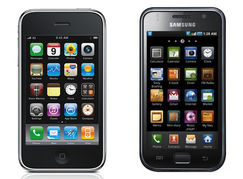
1. iPhone 3G/3GS design: (source)
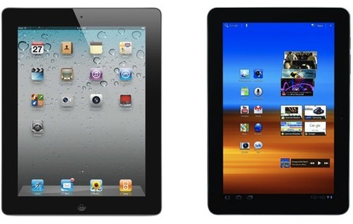
2. iPad 2 design: (source)
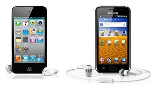
3. iPod touch design: (source)
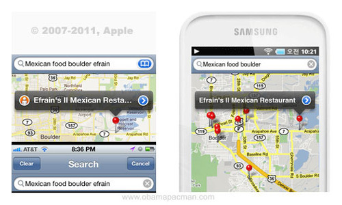
4. Maps app interface design (blatantly ripped-off): (source)
5. App Store icons: (source)
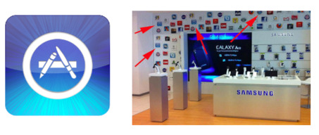
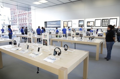
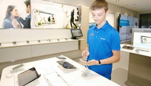
6. Apple Retail Store interior design: (source)
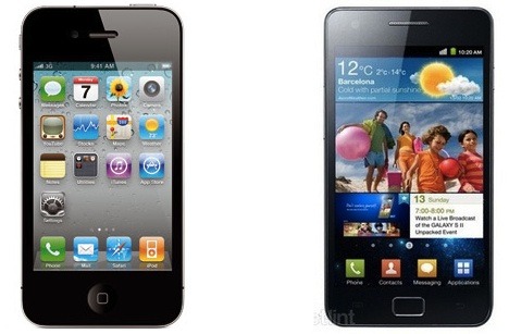
7. iPhone 4/4S design: (source)
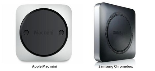
8. Mac mini: (source)
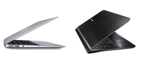
9. Macbook Air design: (source)
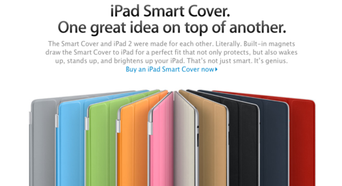
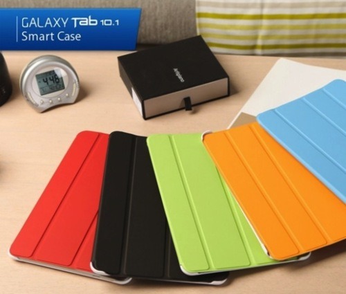
10. Smart Cover: (source)
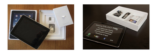
11: iPad box design: (source)
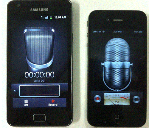
12: Microphone app design: (source)
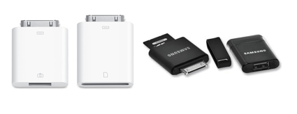
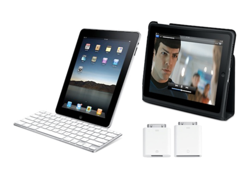
13: Camera connection kit: (source)
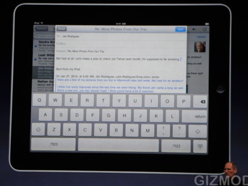
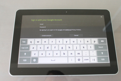
14. iPad software keyboard: (source)
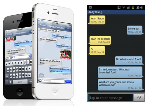
15. Apple’s stock SMS/Messaging app: (source)
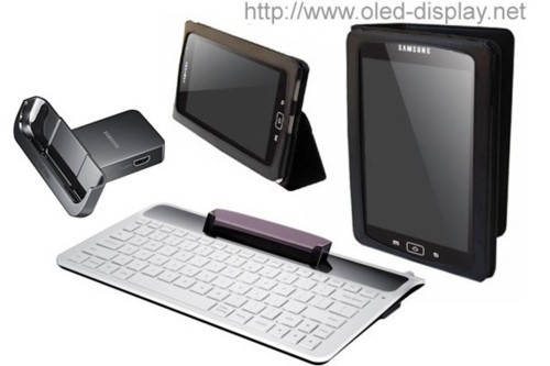
16. Misc. iPad accessories: (source)
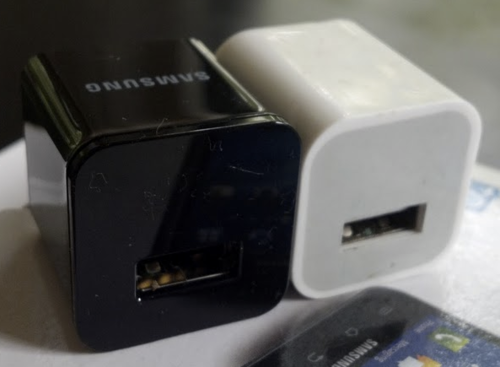
17. iPhone charger: (source)
18. Apple-style TV ads (they even used the same girl actress!) -here’s the link:

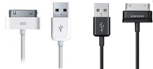
19. USB dock connector cable: (source)
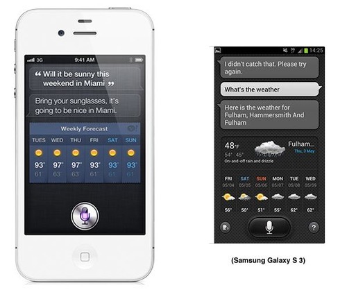
20. Siri (Samsung calls their copy “S Voice”): (source)
I’ll stop here, but trust me, the list goes on and on.
Apple Case Study: Range Rover Evoque iAd. An all-new vehicle deserved an all-new way to advertise. http://advertising.apple.com/brands/landrover.html
Volvo X-RAY application turns your iPad into an X-Ray scanner of the vehicle.Allows the user to see a full 360 degree view of the vehicle.
- interactive
- interaction
- installation
- design
- led
- light
- art
- technology
- projectionmapping
- projectmapping
- robotics
- ui
- mobile
- projection
- interactivedesign
- lightdesign
- apple
- web
- 3d
- ux
- userinterface
- lightart
- robot
- artinstallation
- touchscreen
- application
- app
- webdesign
- touch
- motion
- responsive
- adobe
- multitouch
- future
- robots
- drone
- photoshop
- productdesign
- ledinstallation
- lightsculpture
- video
- user experience
- iphone
- creative
- interactivelight
- digitalart
- motiondesign
- ar
- 3dprinting
- responsivedesign
- augmentedreality
- drones
- kinetic
- data
- development
- kinect
- microsoft
- display
- immersive
- process
- painting
- timelapse
- dronerobotics
- 3dprojection
- ios
- vr
- virtualreality
- earth
- ai
- device
- user interface
- engineering
- laser
- lightpainting
- kineticsculpture
- lightinstallation
- touchinstallation
- animation
- programmableleds
- graffiti
- interactions
- neon
- performance
- leapmotion
- watch
- mobiledesign
- pixel
- environment
- exoskeleton
- interactiveenvironment
- sound
- lcd
- social
- leds
- lukew
- artlight
- patterns
- internet
- carui
- November 2011 128
- December 2011 65
- January 2012 25
- February 2012 27
- March 2012 33
- April 2012 31
- May 2012 16
- June 2012 32
- July 2012 20
- August 2012 37
- September 2012 24
- October 2012 34
- November 2012 31
- December 2012 6
- January 2013 21
- February 2013 11
- March 2013 10
- April 2013 35
- May 2013 45
- June 2013 10
- July 2013 49
- August 2013 33
- September 2013 40
- October 2013 57
- November 2013 31
- December 2013 28
- January 2014 86
- February 2014 49
- March 2014 24
- April 2014 40
- May 2014 6
- June 2014 9
- July 2014 1
- August 2014 34
- September 2014 30
- October 2014 45
- November 2014 21
- December 2014 6
- January 2015 5
- February 2015 17
- March 2015 18
- April 2015 14
- May 2015 1
- June 2015 10
- July 2015 4
- August 2015 1
- October 2015 11
- March 2016 4
- December 2016 18
- September 2017 6
- October 2017 13
- November 2017 5
- June 2018 8
- July 2018 2
- November 2018 7
- February 2019 8
- March 2019 6
- July 2019 1
- August 2019 1
- October 2019 1
- July 2020 5
- November 2020 9
- December 2020 1
- January 2021 1
- April 2021 1
- May 2021 9
- June 2021 3
- August 2022 3
- May 2023 2
- September 2023 1
- May 2025 6