
Source. This is a very different kind of projection mapping installation, in that it starts out as a hypermatrix, thousands of individually controlled cubes that move in sequence to create objects and animation. This movement is then integrated into a projection mapping experience to bring to life the Hyundai Motor Group installation at the 2012 Yeosu Expo. Very cool. What do you guys think?
Source. This is perhaps the coolest (and scariest) piece of social innovation I’ve seen in a while now and easily the best thing since RFID tags were linked to Facebook. FaceDeals is a deal platform and hardware solution combined to deliver check-in deals based of facial recognition detection when customers walk through the doors, automatically checking them into the location, and texting them a deal to claim at the point of sale. How cool is that?!
Mobile Is Where The Growth Is
Article: Source
If you look at any of the top web properties on comScore, Quantcast, Alexa or any other third party reporting service you will see that they all have been fairly flat over the first half of the year. You might think that all these big web services are flatlining.
We have seen this in our portfolio too. From board meeting to board meeting, we are seeing a similar pattern. Web is flattish. But mobile is growing like a weed.
I alluded to this in a post last week where I wished for an aggregated audience measurement service across mobile and web.
There is a significant shift going on this year, much more significant than we saw last year, from web to mobile. It is most noticeable in games, social networking, music, and news, but it is happening across the board and it presents both great opportunity and great challenges.
Mobile native services like Foursquare & Instagram have the most to gain from this transition. Big feature rich web apps like Facebook and Google have the most to lose from this transition.
Mobile does not reward feature richness. It rewards small, application specific, feature light services. I have said this before but I will say it again. The phone is the equivalent of the web application and the mobile apps you have on your home screen(s) are the features.
That is why Facebook should (and it looks like will) break its big monolithic web app into a bunch of small mobile apps. Messenger, Instagram (not yet owned by Facebook), and Camera are the model for Facebook on mobile.
User experience is not the only big change/challenge for companies trying to navigate this transition. Monetization is different too.
Approaches like display advertising don’t work as well on mobile as they do on the web. And they don’t work that well on the web. ARPUs (avg revenue per user) on mobile are lower for display based revenue models on mobile across the board.
On the other hand, commerce works great on mobile if you have a well integrated (one click) purchase experience. The freemium model (whether it is virtual goods in games, in app upgrades, or something else) works very well on mobile.
If you are going to operate a media model on mobile, look at Twitter’s model for inspiration. The ads are the default content object (the tweet) and are delivered right in the primary user experience (the feed/timeline). It’s not surprising that more than half of Twitter’s ad revenue is coming from mobile.
All of this is good news for entrepreneurs since they are in the best position to take advantage of all of these changing dynamics. It is not as good news for those who find themselves operating a big Internet business started more than five years ago. You are going to need to make a hard right turn super fast without flipping over the car.
In the past fifteen years, we have seen Microsoft go from being an unstoppable force to being a non-factor in many important new markets, we have seen Google go from being an unstoppable force to being a non-factor in many important new markets, and I suspect we are going to see Facebook struggle with the same thing. RIM is dying quickly now. Yahoo! is a question mark.
In technology the more things change, the more the stay the same. You cannot ever rest. Because the big change that is going to upset your nice apple cart is right around the corner. Today that is mobile. Tomorrow, who knows? I am trying like hell to figure out what that will be and jump on it. Because that’s how you play this game.
CocaCola Vault of the Secret Formula. Source. As they step through the huge vault door at the World of Coca-Cola, visitors are transported into a tale about the most famous and mysterious trade secret in history—the secret formula of Coca-Cola. Second Story, along with partners Donna Lawrence Productions and Gallagher & Associates, crafted a compelling narrative experience to delight and surprise visitors and challenge their ideas about what is fiction and what is truth about the secret formula. Second Story conceived of media and design strategies flowing from the two aspects of the secret formula: the secrecy and mystery surrounding it, and the fun that comes from simply enjoying the product. This concept fueled the design and development of twelve media experiences that help deliver the visitor toward the exhibit’s cinematic climax.
Evolving E-commerce Checkout
Article: Source
Checkout is the lynchpin of e-commerce. It’s how customers buy and retailers get paid. Yet despite years of evolution, only a few changes have significantly impacted checkout conversion online. Knowing what worked, what didn’t, and what might can help improve checkout forms today and reveal what the future of digital shopping could be tomorrow.
Increasing E-commerce
Digital shopping shows no sign of letting up. Americans spent $142.5 billion online in 2010 and e-commerce in the United States has seen double digit growth every quarter since. While an increase in the number of online buyers is a big reason why, recent innovations in personal computing are poised to drive digital spending even higher.
The first wave of e-commerce was driven by the ability to purchase physical goods digitally. Growth of the desktop Internet and dropping costs of personal computers put the ability to buy online in many people’s hands and gave rise to online retail giants like Amazon and eBay.
Since then, an increasing amount of goods are being created, distributed, and consumed digitally. Apple’s iTunes is the number one music store in the world with over 16 billion songs downloaded. Less than four years after the introduction of the digital Kindle book format, Amazon customers are now purchasing more Kindle books than hardcover and paperback books combined.
New consumer devices are a critical part of digital media’s increased success. Amazon’s Kindle book format would be nowhere without the Kindle e-reader and Apple’s iTunes relies on over 300 million iPods and 365 million iOS devices for media playback. Networked mobile devices and digital content are not only creating more opportunities for e-commerce transactions, they’re changing what’s possible.
As an example, look no further than the growth in mobile commerce:
- $5B eBay’s 2011 mobile sales
- $10M daily PayPal mobile payments
- 15% of 2011 black Friday searches
These changes are leaving no part of e-commerce untouched. Especially not where the rubber hits the road in digital shopping… the checkout form.
The Checkout Form
While e-commerce has continued to grow, the experience of buying online has remained largely unchanged for the past seventeen years. To this day, the most common digital shopping experience consists of finding an item you want to buy, adding it to a cart, then checking yourself out.
Unsurprisingly this process just about always culminates in a form. After all, online retailers need to know who their customer is, where they want their item sent, and how they’ll pay for it. This has resulted in a fairly standard set of required input fields.
Personal
- First & Last Name
- Email Address (for verification & contact)
- Password (to create an account)
Shipping
- Street Address
- City
- State
- Postal Code
- Country
- Phone Number (sometimes optional)
- Shipping Options
- Gift Options
Payment
- Credit/Debit Card
- Card Number
- Type of Card
- Name on Card
- Security Code
- Name on Card
- Postal Code or Billing Address
Third Party Payment System Gift Card Number
While some e-commerce checkout forms vary from this list, most don’t. In fact, even the order of questions has become quite standard: personal information, shipping information, billing information, and a final verification step. This sequence actually builds on itself as shipping addresses determine final costs (shipping plus tax) and are often re-used for billing addresses. Details like this have been analyzed and optimized over the years to make sure that checkout throughput is everything it could be.
Yet despite many years of optimization, online shopping cart abandonment ratesreached 75% in the first six months of 2011. No wonder many companies are looking beyond standard form designs to improve their e-commerce conversions.
Evolving Checkout
Fundamentally, there are two ways to boost checkout conversion: increasing people’s desire to buy (persuasion) and reducing the effort required to make a purchase (efficiency) as the image below (originally crafted by Joshua Porter) illustrates. Marketing and sales teams have employed persuasive techniques to increase purchases long before digital shopping ever came along. But over the years, several of these techniques have also made their way into online checkout forms.

Product design and development teams, on the other hand, have mostly focused on reducing the effort required to checkout through usability and technical innovations. These approaches have done a lot to optimize the throughput of standard checkout forms and recently gotten a turbo-boost from massive increases in always connected mobile devices and digital content.
Due to all these efforts, checkout has evolved. Looking at the notable milestones in this evolution can not only help improve checkout forms today but also point the way to the future of e-commerce.
- Web Form Design
- Clarifying Requirements
- Real-Time Feedback
- Saved Accounts
- 1-Click
- Free Shipping
- Shipping Programs
- Psychological Motivators
- Mobile Input
- Digital Stores in Physical Locations
- Digital Shopping in Physical Stores
- Shopping Devices
So let’s dive into each.
Web Form Design
Because the information required at checkout is pretty much fixed, many retailers have turned to form organization and interaction design in an attempt to increase e-commerce conversions. In fact, it’s quite common to see large checkout redesign projects moving to single page forms, multi-page/step forms, or dynamic forms that manage multiple sections within a single interface.
Apple’s most recent checkout redesign is an example of this approach. The company went from a multiple page checkout flow to a single page that reveals different sections only when they are needed.
To evaluate the impact of this “accordion” design, usability testing firm, Etre and I ransome tests that compared a single page, multiple page, and accordion version of the same generic e-commerce checkout form (personal, shipping, and billing info). We measured standard usability and eye-tracking data for each.
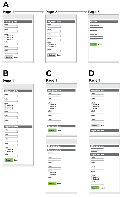
Each of the forms we tested had a 100% pass rate. While our study was small, it did seem to indicate that simply porting the same questions from one long web page to several web pages or to an accordion form isn’t likely to significantly increase conversion. Since then, I’ve seen seen this hold true in larger quantitative tests as well.
This doesn’t mean that Web form design can’t improve the digital shopping experience. It just takes more than moving form fields across Web pages.
Clarifying Requirements
Every question you ask someone within a checkout form forces them to decide what you are asking, come up with an answer, and then enter their answer into the affordance (form input) you have provided. Removing a question removes all of these considerations. And surprise… it can have a real impact.
For questions that can’t be removed potential customers need to understand what’s required of them. A lack of clarity in form labels, input fields, or actions can cause people to misinterpret requirements, thereby leading to errors or failed submissions. Addressing these issues is a common way to boost form conversion.
For example, a major online travel site had an optional question labeled “Company” in the payment step of their checkout form. Many customers mis-interpreted this question as a request for their bank information, which they entered in subsequent fields causing credit card verification to fail. The site removed the “Company” field and saw an overnight increase of $12 million a year in profit.
Looking closely at each of the questions being asked during checkout can reveal many similar opportunities to clarify requirements and thereby boost overall conversion.
Real-Time Feedback
Even when a form asks for the minimum amount of information necessary to complete checkout and does so clearly and concisely, mistakes can still happen. People don’t interact with checkout forms so they can fill them out accurately, they interact with them to buy something they want. In that moment of excitement, things can go wrong.
Most checkout experiences will wait until someone submits a form before letting them know if something is actually wrong. But it doesn’t have to be this way. Real-time feedback can help people move through checkout by confirming appropriate answers, suggesting valid answers, and providing regular updates to help people stay within necessary limits while they fill in a form.
In tests comparing forms with real-time feedback to those without, usability testing firm, Etre and I measured a:
- 22% increase in success rates
- 22% decrease in errors made
- 31% increase in satisfaction rating
- 42% decrease in completion times
In other large scale tests, I’ve seen real-time feedback reduce errors by over 80%. Because instant feedback turns data collection into a two-way conversation it enables people to get answers and fix mistakes as they complete forms instead of after the fact, which in turn helps improve conversion.
Saved Accounts
In order to sell you something, a retailer needs to know how you’ll pay for it. In order to ship what you bought, a retailer needs to know where to send it. This information is required every time you buy something online. Wouldn’t it be better if you only had to enter it once?
Saved accounts let you do just that. Simply authenticate into your account on an e-commerce site and all the information you entered before is there. No need to fill it in again.
Since they were introduced, saved accounts have became so popular that it’s next to impossible to find an online retailer without them. In fact, saved accounts are usually the first step in checkout: have an account or need one?
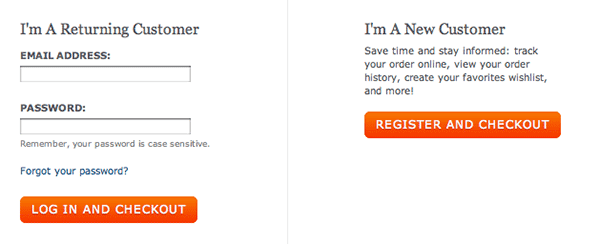
Yet most first time buyers don’t actually want an account –at least not yet. They’re there to purchase something not “enter into a relationship”. Repeat customers frequently don’t do better. 45% of all customers for a major Web retailer had multiple registrations and 75% of people who tried to login to an existing account by recovering their password never completed their purchase.
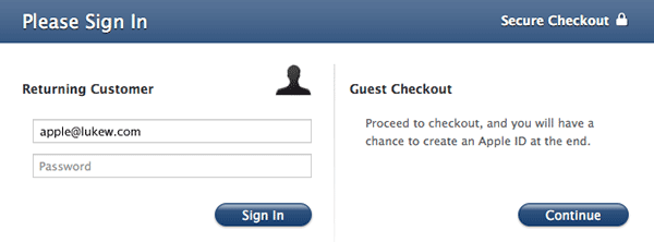
It turns out reducing effort applies to saved accounts as well. Not requiring every customer to create an account removes a barrier to entry for many people. An increasing number of retailers have figured this out and now provide guest checkout prominently alongside saved account options. For one retailer, this change alone increased yearly revenue by $300 million. Not bad for a one button change.
1-Click
For people who are repeat customers, reducing the friction of checkout can increase conversion by making it faster and easier to buy. And there’s no faster way to buy something online than with 1-Click. 1-Click essentially removes all effort from the checkout process. Simply, click or tap once and the checkout process is complete. That’s it –really.
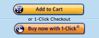
1-Click purchasing is important enough that Amazon patented it years ago and companies like Apple are paying Amazon to license the technology in their offerings. 1-Click is likely one of the big reasons Apple’s iTunes (the world’s largest media store) store can charge 3rd parties a 30% fee for selling digital content in their store. Instant and impulse purchases enabled by 1-Click drive purchasing volume up so retailers sell more.
Because 1-Click is patented by Amazon, other retailers aren’t free to use the same approach on their sites. They can, however, remove as much effort from checkout as possible through guest checkout, saved accounts, free shipping, and more.
Free Shipping
Of all the requirements in checkout, shipping may have the biggest potential for improvement. Shipping costs are often the leading cause of shopping cart abandonment online and can make or break checkout conversion especially when customers compare the cost of shipping fees to heading over to the local store for a purchase. Consider:
- High shipping costs are the number one reason why consumers were not satisfiedwith their online shopping experience.
- 93% of people surveyed indicate that free shipping would encourage them to purchase more online.
So it’s little wonder that free shipping offers have had a big impact on conversion for retailers. In 2004, 60% of all online retailers considered free shipping to be their most successful marketing tool. In 2011, a record 92.5% of online retailers were expected to offer free shipping promotions.

In the evolution of e-commerce checkout, free shipping is a significant milestone. Not only does it remove the need to calculate postage costs by entering a destination (usually Postal/ZIP code), but it also aligns perfectly with the core values of e-commerce: convenience and price. No need to worry about how much it will cost to ship –it’s free!

In cases where free shipping is not possible, fixed shipping costs can help clarify what people will need to pay up front. Complicated shipping policies and calculations that have to be done by the customer, on the other hand, are likely to make conversion rates suffer.
Shipping Programs
Shipping costs impact the decision to buy online so much that some retailers have developed loyalty programs based primarily around the promise of free shipping. The largest of these is Amazon’s Prime program which is estimated to include about five million members.

Amazon Prime members pay a yearly fee (moms & students can receive a year for free) to get complimentary two-day shipping on just about anything they buy from Amazon. The subsequent impact on their purchasing behavior is staggering. Amazon Prime members:
- Increase their purchases on Amazon from $400 a year to $900 a year after they join.
- Spend 130% more than regular Amazon customers.
- May be responsible for as much as 20% of Amazon’s overall sales in the U.S.
- Buy on Amazon even if the item is less expensive somewhere else.
With estimated increases like this, Amazon Prime maybe the most successful solution to the problem of e-commerce shipping costs yet. It may even be the most successful conversion increasing product Amazon has launched to date -1-Click included.
So it’s not surprising that other retailers have noticed and followed suit. Williams Sonoma’s Reserve program ships all its online products for free when a customer signs up for $30 a year. Sears’ ShipVantage program ships all products for free after a $79 a year fee is paid (the same price as Amazon Prime charges).
Psychological Motivators
When we want something bad enough, even complex forms and shipping costs won’t keep us away. That’s the idea behind increasing desire in e-commerce: encouraging people to complete checkout by making it exceptionally clear why they should. Lots can be done before a customer ever makes it to a checkout form -but once there, similar principles apply.
Perhaps the earliest examples of increasing motivation in checkout form design were visual verification “seals” from companies like Truste and VeriSign. In the initial phase of e-commerce, people were unsure about the security of their transactions. So verification systems sprung up to make people more comfortable with buying.

To understand why this approach worked, we can look at underlying (often subconscious) psychological motivators. In particular, people will follow instructions when they come from perceived authority figures like VeriSign and Truste. Trust can also be increased with prominent phone numbers, pictures of previous customers, their testimonials, ratings, and professional design.
Trust isn’t the only psychological motivator that can increase people’s desire to checkout. The Living Social checkout experience highlights the amount of people that have already purchased an item and the time left to buy it.

Seeing the number of purchases already made increases motivation because people tend to follow the lead of others (social proof). Time left infers value in something that has limited availability (scarcity). For a full list of psychological motivators that could be used to increase conversion, look into Stephen Anderson’s Mental Notes cards.
Mobile Input
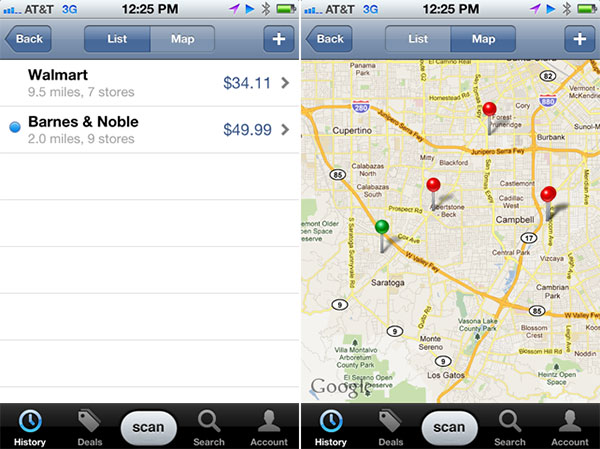
Mobile devices are turning the physical world into a digital shopping cart. Just point a mobile device’s camera at a product barcode to scan, identify, and buy it. Barcode scanning app, RedLaser has seen scans go up 50% over the past year as an increasing number of customers compare prices and make purchases using their mobile device’s camera in stores and homes.
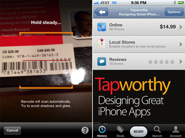
But you don’t have to rely on barcodes to purchase what’s around you. Image recognition apps like Google Search can identify books, movies, music, wine labels, and more. Just take a picture of the product you want to buy and checkout right on your mobile device or use its location detection capability to find the closest physical store selling what you want -no shipping costs necessary.
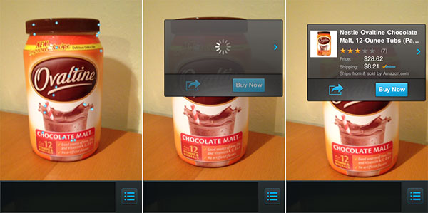
Amazon’s Flow is perhaps the most impressive example of reducing the gap between products in the physical world and digital shopping. Through a continuous image recognition system, Flow allows you to point a mobile device at barcodes or products. Once identified, it only takes a single tap to order the product from Amazon using 1-Click checkout. When coupled with Amazon Prime, the product is shipped free and arrives within two days. If that’s not the bleeding edge of digital shopping I don’t know what is.
Digital Stores in Physical Locations
Online retailers aren’t the only ones that benefit from turning the physical world into a digital shopping cart. Mobile devices can expand the presence of physical retailers too. Consider the Korean grocery company, Tesco.
Tesco created a series of virtual storefronts in high-traffic locations like subways by putting up large poster-sized images of the aisles you’d normally see in a grocery store. Each product shown in the posters has an associated QR code that can be scanned using a mobile device’s camera.
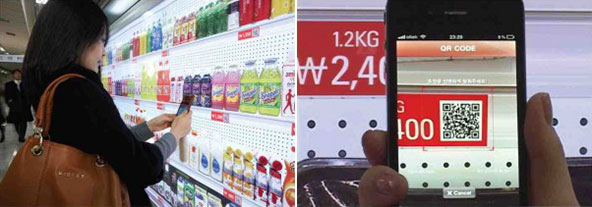
Once a customer has scanned all the products they’d like to buy, they can check out on their mobile device and their order is delivered to their home usually the same evening. This early example of digital interactions with physical representations of products have turned out to be quite successful for Tesco. So it’s likely we can expect to see similar ideas around the globe soon.
Digital Shopping in Physical Stores
The physical world is more than just a catalog for digital shopping applications. It can also work in concert with mobile devices to bring the best of physical and digital shopping together. Two early examples from Apple do a great job of illustrating the potential of this hybrid approach.
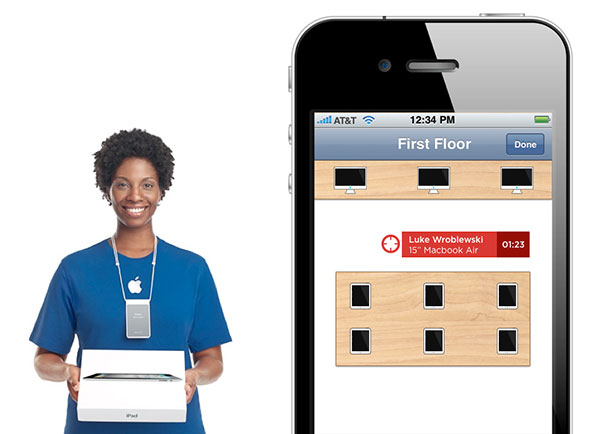
Available in the Apple Store app, Personal Pickup is a feature that allows customers to buy products on their mobile device and pick them up in an Apple retail store later. Thanks to location detection technology, Apple retail employees are notified when a customer arrives to pick up their purchase. The Apple employee can see the location of the customer in the store and promptly hand them their purchase. Checkout complete.
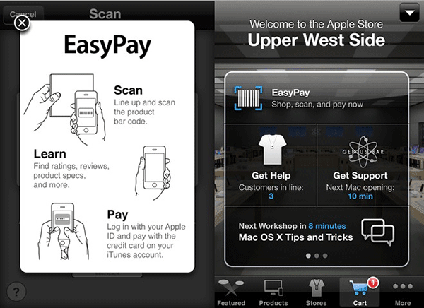
EasyPay, also in the Apple Store app, allows customers to scan the barcodes of “select accessories” within an Apple retail store and pay for them within the app using 1-Click or their saved accounts. The app uses a customer’s current location to apply the proper amount of sales tax to their total bill. Self-checkout complete.
Shopping Devices
Mobile shopping apps that take advantage of capabilities like camera access and location detection can minimize the gap between the physical world and digital shopping. But they’re still standalone applications. Shopping devices, on the other hand, turn an entire tablet, media reader, or mobile device into an end-to-end complete digital shopping experience.
Product discovery, purchase, and consumption on these devices is never more than a tap apart. Find a digital book, song, movie or TV show in an integrated storefront or promotion, tap to buy, then enjoy it seconds later. This integration removes practically all the friction in e-commerce: no shipping required, 1-Click purchasing, and instant delivery.
Without friction, conversion goes up. When it’s so easy to buy and immediately enjoy content, people do it more often. As proof, Amazon customers are now purchasing more digital Kindle books than print books –due in no small part to Kindle device integration.
Though Amazon hasn’t revealed how many books the average Kindle user buys (estimates range between 11 and 27), their aggressive pricing of Kindle devices suggests that their profits actually lie in subsequent purchases of books not in the device itself.
If shopping devices continue to drive increases in purchases and conversion, it’s likely companies will be even more aggressive with pricing. At $79 dollars, Amazon’s Kindle is already looking like a disposable digital shopping cart for books. Close behind at $199, the Kindle Fire tablet was poised to do the same for music, movies, games, and more. But recent estimates show it may not be living up to expectations.
What’s Next
Over the past seventeen years a few notable checkout improvements like 1-Click and free shipping have boosted e-commerce conversion. But overall, progress has been slow -until now.
Digital content and mobile devices are growing at a breakneck pace creating many new opportunities for e-commerce. From friction-less checkout on dedicated devices to services that combine the best of physical and digital shopping, we’re just seeing the start of what’s possible. There’s never been a better time to “checkout” what’s next.
How To Run Your Meetings Like Apple and Google
Article: Source
- All meetings must have a stated purpose or agenda. Without an agenda, meetings can easily turn into aimless social gatherings rather than productive working sessions.
- Attendees should walk away with concrete next steps or Action Items. We love Action Items here, but we’re not the only ones. From Apple to the Toastmasters, the world’s most successful organizations demand that attendees leave meetings with actionable tasks.
- The meeting should have an end time. Constraints breed creativity. By not placing an endtime, we encourage rambling, off-topic and useless conversation.
Of course, there’s no need to stop there. Truly productive companies always continue tweaking to suit their specific culture. Here are a few highlights:
Apple
- Every project component or task has a “DRI.” According to Fortune’s Adam Lashinsky, Apple breeds accountability at meetings by having a Directly Responsible Individual whose name appears next to all of the agenda items they are responsible for. With every task tagged, there’s rarely any confusion about who should be getting what done.
- Be prepared to challenge and be challenged. There are dozens of tales about Jobs’ ability to aggresively question his employees, sometimes moving them to tears. While you probably don’t need the waterworks at your office, everyone should be willing to defend their ideas and work from honest criticism. If a person has no ideas to defend, they shouldn’t be at the meeting.
Catalyst
- The answer is always “yes, and…” and never “no, but…” Keep things positive and ideas flowing by not shouting down initial proposals.
- Take a break every 30 minutes. If your meeting must last longer than a half hour, make sure attendees can get up, walk out of the room and put their brain on pause.
- Think and dream with out limitations. Those come later.
- All meetings should have a clear decision maker. Gil credits this approach to helping the Google+ team ship over 100 new features in the 90 days after launch.
- No more than ten people at a meeting. “Attending meetings isn’t a badge of honor,” she writes.
- Decisions should never wait for a meeting. Otherwise, the velocity of the company is slowed to its meeting schedule. If a meeting needs to happen for something to get done, hold the meeting as soon as possible.
- Kill ideas, and meetings. After Larry Page replaced Eric Schmidt as Google CEO, the company quickly killed its Buzz, Code Search, and Desktop products so it could focus more resources on less efforts. Focus has to permeate every aspect of a company, including meetings.
37Signals
- Keep it short. No, shorter than that. And use a timer to enforce the time limit.
- Have an agenda.
- Invite as few people as possible.
Reily
- Schedule the meetings for the same time. Keeping employees in a rhythm allows them to not have their work unexpectedly disrupted.
- The stand up is to communicate, not solve. If your team has a regularly planned stand up meeting, “lack of communication” is no longer an excuse for problems. Just be sure to protect the stand up meeting time by deferring larger discussions to private meetings.
Technically Media
- There is no judging in brainstorming. Focus on capturing ideas before filtering and critiquing them.
- Bring solutions, not problems. Solutioning in the middle of a meeting wastes precious communication time. If you can’t bring proposed solutions to the table, save it for next time or bring it up in private conversations.
- Review “homework” from the last meeting. Not only does it remind participants what happened last week, it holds attendees accountable.
- interactive
- interaction
- installation
- design
- led
- light
- art
- technology
- projectionmapping
- projectmapping
- robotics
- ui
- mobile
- projection
- interactivedesign
- lightdesign
- apple
- web
- 3d
- ux
- userinterface
- lightart
- robot
- artinstallation
- touchscreen
- application
- app
- webdesign
- touch
- motion
- responsive
- adobe
- multitouch
- future
- robots
- drone
- photoshop
- productdesign
- ledinstallation
- lightsculpture
- video
- user experience
- iphone
- creative
- interactivelight
- digitalart
- motiondesign
- ar
- 3dprinting
- responsivedesign
- augmentedreality
- drones
- kinetic
- data
- development
- kinect
- microsoft
- display
- immersive
- process
- painting
- timelapse
- dronerobotics
- 3dprojection
- ios
- vr
- virtualreality
- earth
- ai
- device
- user interface
- engineering
- laser
- lightpainting
- kineticsculpture
- lightinstallation
- touchinstallation
- animation
- programmableleds
- graffiti
- interactions
- neon
- performance
- leapmotion
- watch
- mobiledesign
- pixel
- environment
- exoskeleton
- interactiveenvironment
- sound
- lcd
- social
- leds
- lukew
- artlight
- patterns
- internet
- carui
- November 2011 128
- December 2011 65
- January 2012 25
- February 2012 27
- March 2012 33
- April 2012 31
- May 2012 16
- June 2012 32
- July 2012 20
- August 2012 37
- September 2012 24
- October 2012 34
- November 2012 31
- December 2012 6
- January 2013 21
- February 2013 11
- March 2013 10
- April 2013 35
- May 2013 45
- June 2013 10
- July 2013 49
- August 2013 33
- September 2013 40
- October 2013 57
- November 2013 31
- December 2013 28
- January 2014 86
- February 2014 49
- March 2014 24
- April 2014 40
- May 2014 6
- June 2014 9
- July 2014 1
- August 2014 34
- September 2014 30
- October 2014 45
- November 2014 21
- December 2014 6
- January 2015 5
- February 2015 17
- March 2015 18
- April 2015 14
- May 2015 1
- June 2015 10
- July 2015 4
- August 2015 1
- October 2015 11
- March 2016 4
- December 2016 18
- September 2017 6
- October 2017 13
- November 2017 5
- June 2018 8
- July 2018 2
- November 2018 7
- February 2019 8
- March 2019 6
- July 2019 1
- August 2019 1
- October 2019 1
- July 2020 5
- November 2020 9
- December 2020 1
- January 2021 1
- April 2021 1
- May 2021 9
- June 2021 3
- August 2022 3
- May 2023 2
- September 2023 1
- May 2025 6