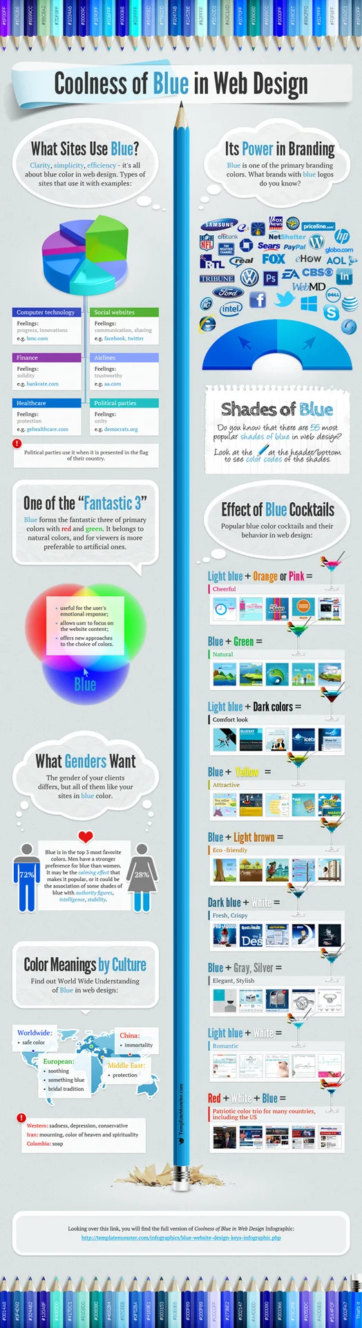
Facebook and Twitter use the color blue, most healthcare companies use the color blue. According to an infographic by TemplateMonster, blue is one of the most popular colors for logos, and it is the dominating the web—but why? ‘Coolness of Blue In Web Design’ explains that the color gives off positive feelings of progress, innovation, communication, sharing, solidity, trustworthiness, security and unity. Source


Things to worry about:
Article Source: Click Here
Things to worry about:
Worry about courage
Worry about Cleanliness
Worry about efficiency
Worry about horsemanship
Worry about…
Things not to worry about:
Don’t worry about popular opinion
Don’t worry about dolls
Don’t worry about the past
Don’t worry about the future
Don’t worry about growing up
Don’t worry about anybody getting ahead of you
Don’t worry about triumph
Don’t worry about failure unless it comes through your own fault
Don’t worry about mosquitoes
Don’t worry about flies
Don’t worry about insects in general
Don’t worry about parents
Don’t worry about boys
Don’t worry about disappointments
Don’t worry about pleasures
Don’t worry about satisfactions
Things to think about:
What am I really aiming at?
How good am I really in comparison to my contemporaries in regard to:
(a) Scholarship
(b) Do I really understand about people and am I able to get along with them?
(c) Am I trying to make my body a useful instrument or am I neglecting it?
In a 1933 letter to his 11-year-old daughter Scottie, F. Scott Fitzgerald produced this poignant and wise list of things to worry, not worry, and think about – the best father’s advice since John Steinbeck’s letter to his son on falling in love and this beautiful letter to 16-year-old Jackson Pollock by his dad.
Subtle UI changes in iOS 6 and the case for the blue status bar
Article: Source
I recently bought an iPhone 5, so now I have a 4S which isn’t receiving much use. I decided to give it newfound purpose by comparing certain parts of iOS 5 with their counterparts in iOS 6. There have been a great amount of UI changes, some very subtle, in this update.
As we all know, iOS 6 has gone in a few bold directions with a changed Maps app, enhancements to Siri and support for the taller iPhone 5 display. Some of my favourite features, though, are UI enhancements and are therefore not headline-grabbing — that is, of course, unless you’re writing for The Industry.
For the following comparisons, unless stated otherwise, the left image is iOS 5 and the right image is iOS 6. At the time of writing, I was using the latest available versions of iOS 5 and 6 respectively.
Keyboard, status bar and menu bar


The subtle changes here — when composing a new email in Mail — are as follows: the status bar at the top of the screen is blue, matching the menu bar of the app, the transition between the menu bar and the main content of the screen (in this case the message) is more muted, with a nice simple shadow rather than the abrupt change in iOS 5. The same is true for the top of the keyboard. Notice the shadow which isn’t present in iOS 5.
The menu bar itself at the top of the screen is a gradient on iOS 6, whereas in iOS 5 there’s more of a reflection, giving the impression of a glossy plastic. With the update, especially when combined with the blue status bar, iOS 6 oozes a less reflective, almost textured feel to the menu bars, with (in my opinion) a less harsh and improved transition between menu bars and status bars.
Great changes.
Notification Center


Now, we move on to Notification Centre. As you can see, iOS 6 is using the limited screen space more efficiently to display the first notification higher up than iOS 5 does. Not only is the use of screen space more efficient, but for Calendar notifications, the specific day is mentioned in the notification separator and the times and dates aren’t in italics.
The difference isn’t huge, but this post isn’t about big differences. It’s about the small details.
Settings and status bar colours


This is what Settings looks like when scrolled to the top in the two iOS versions. I love the re-thought out menu with easier access to Bluetooth, Notifications and Do Not Disturb. The latter two have their own section in iOS 6 and are easier to quickly navigate to. Again, the menu bar and status bar match up — I know I’m in the minority here, but I personally enjoy this UI change.
I feel the coloured status bar doesn’t distract my eyes in the same way it used to, as it matches the menu bar. The menu bar tends to blend in with the status bar in iOS 6, looking more like a single cohesive element, rather than two separate entities jostling for attention.
Simpler, neater, more cohesive. I like it.
Reminders


The first thing I noticed when I launched the new Reminders app was how much more room there was to view stuff on the screen — let alone what it looks like on my iPhone 5 with all those extra pixels.
Switching lists is now done from a more standardised button in the top left of the UI, rather than swiping left and right between lists. I don’t really use Reminders much, but I find this change to be an improvement. I welcome the removal of the switcher at the top of the app, too. I always thought that was quite a confusing addition to an otherwise fairly simple app.
Thumbs up.
Phone


It’s easy to forget that the iPhone is, after all is said and done, a mobile telephone. I never loved the buttons in the Keypad section of the Phone app, and whilst I don’t think the new ones are gorgeous, I certainly find them to be an improvement.
My favourite change in the Keypad is the screen at the top. It acts just like a large menu bar, with the status bar taking its colour. Just like I’ve mentioned earlier, I enjoy the way this colour transition “fades” in. It’s much less abrasive than the harsh contrast between the status bar and dialer on iOS 5. More on that later.


Note: both the above screenshots are taken on iOS 6: this is not a comparison.
How could I write this post without mentioning the enhancements to the Phone app when receiving a call? Whilst this has been talked about a great deal, it really is hard to dismiss just how valuable it is being able to dismiss a call without tapping the sleep/wake button.
Accessed by sliding the phone icon upwards (just like accessing the camera from the lock screen), the “Reply with Message” and “Remind Me Later” options do just what they suggest and are welcome additions.
It’d be great if it was possible to reply with a message and remind me later, though. Furthermore, it isn’t obvious that tapping one of these two buttons will immediately dismiss the call, but I can confirm that’s what happens.
Clock and alarms


The stripes at the back of the Alarm section of the Clock app have changed colour! This is one of the more subtle changes in iOS 6, but I decided to include it because it’s another great example of where I believe the coloured status bar really improves the look of the device.
The blue status bar matches the menu bar and almost “flows” with it. That “flow” is missing on iOS 5. It matches the background, muted pinstripe colour, too.
These screenshots are some more examples of the improved gradients and shadows between UI elements in iOS 6. Just look at that tasty shadow at the bottom and the much more refined transition between menu bar and content at the top.
I’m a fan of these changes.
Sharing


Sharing has been completely overhauled in iOS 6 and I welcome it. It was overdue. Being able to tweet and post to Facebook from almost anywhere on my iPhone is such a great improvement and I’m using it a lot.
Having said that, it’s quite overwhelming seeing a grid of 9 icons throughout the OS. I quite often take longer to choose an option than I did with a list of options, but that may just be a side effect of me getting used to this layout. Even if I were to incorrectly tap a sharing option, I’d be able to hit cancel before all my friends could see the mistake I’d made.
Check out the difference between the two cancel buttons in the screenshots, too. Also notice that Safari’s status bar is black, where it used to be white. I’m quite surprised that Safari didn’t have a blue status bar, as it’s menu bar is that colour. Perhaps the UI designers felt it’d detract from the content displayed on the webpage too much.
I’m even more surprised that there are still separate URL and Search fields in Safari on iOS, where screen space is most valuable. On OS X, there’s just one. It certainly seems like it’d be an obvious upgrade to make.
Buttons


One of my favourite little details in iOS 6 is the gradients and lighting changes on the buttons in pull-up menus. They’re beautiful now — and they were hardly ugly before.
The reflection has gone, having been replaced by slight gradients and hints of a raised, rounded button. These match the new menu bar style perfectly. As you can see from the screenshots, even the pull-up menu itself has lost its lines of reflection, even though it remained translucent.
Last words
The change which most design-savvy users are complaining about in iOS 6 is the status bar. I’ve explained why I think it’s an improvement, but as I noticed more of the little improvements throughout the OS I realised that the status bar is just one step on a path iOS is going down.
The criticism of the blue status bar tends to just be, “it’s ugly.”
My argument for it is more nuanced: I feel the blue status bar with light text, positioned above a lighter blue menu bar also with light text and some darker controls gives the top of the screen a certain unimportance. A flow. This move is saying that the status bar is so unimportant that its colour can change to match the app which is currently open. This should be the case — apps take up the majority of the iOS device’s screen and I wouldn’t want the top of my device to look out-of-place.
I’m certainly not saying that a silver status bar next to a blue menu bar was distracting, but a blue status bar next to a blue menu bar is less so, after the initial “whoa, that’s different” feeling wears off.
And I like it. If you disagree with me, please, let me know. If there are any details in iOS 6 you feel I missed, or anything else you’d like me to delve into and explore, please, let me know, either by mentioning me on twitter, lettingThe Industry’s twitter account know, or by leaving a comment below.
The final subtle change in iOS 6 in this post is a challenge for you to find out yourself. Notice anything different in the featured image?
What Brand Loyalty
I have owned an iPhone since the day it was released on June 29, 2007. Friday [ October 5th 2012 ] marked the first day that I no longer owned an iPhone. I thought long and hard about the change but due to an iOS 6 bug I was forced to look for an alternative device since my phone had become useless.
iOS6 for AT&T currently has a bug where the WiFi Network option greys out causing an assortment of other problems. When this happens the 4G connectivity stops working, all calls drop, facetime doesn’t work and text messages come in already read. After Apple supplied 4 iPhones trying to fix this I had to make a change till a patch is released > [ Forum Link Click Here ]
—————————————————————————————————————
The Phone Choices:
—————————————————————————————————————
After spending an hour in the store fumbling around with the Windows Phones I just couldn’t get comfortable with lack of emotion the UI presented to me. With the Windows phone I felt like the ux was clear enough to use but wasn’t created with any love. I found myself feeling like a robot created it and I would get bored of it quickly. The two Android phones presented a better option for what I was looking for and seemed closest to the iOS platform I was happy with. So I decided to try out Apples main competitor the Samsung GS3. Considering all the press and court cases I felt is was the right way to go.
Keep in mind I have a 30 day return policy so the fate of my mobile device choice is in Apple’s hands and how quickly they can patch the iOS6 bug that I am experiencing.
It’s funny how people judge you based on your phone these days. The four days I have owned the phone people have been asking me:
- How I like it compared to the iPhone?
- Is it better then the iPhone?
- What are the differences from the iPhone?
Just a note for any readers I am a user experience and user interface designer so my attention to detail on items such as this tends to be very detail oriented. So here are some quick thoughts on the iPhone Product vs Samsung Product as well as iOS vs Android. I wanted to keep this quick.
—————————————————————————————————————
Product quality and design:
—————————————————————————————————————
Looking at the two options as products in your hand I honestly don’t believe you can compare the two. The iPhone is a product which has an amazing amount of thought and detail behind the design, the glass, the etched corners, etc. The Samsung is an odd egg shape made with what feels to me a cheap plastic. So the easiest way to compare the two products quality and design is relating them to vehicles.
Both vehicles are great options but in the end it’s what your willing to spend. I always believe you get what you pay for. In this case the iPhone to me relates to BMW and what is considered a brand that pays a great amount of attention to detail. Yes you pay a premium for a BMW but it’s in a class of it’s own delivering a great ride, design and evokes emotion. The Samsung in this case I compare to a Honda which is not focused on making the best but simply selling the most. It’s a reliable machine, not focused on design or fine details but on how many they can sell with cost effective parts.
—————————————————————————————————————
Operating system and user experience:
—————————————————————————————————————
The most important aspect of any mobile device is the operating system, user experience and how it relates to the user. The iPhone is an excellent example of great user experience when you think about how easy it is to navigate and find things. I have listed a couple bullet points below that I “Liked” or “Disliked”.
—————————————————————————————————————
1. Customization [ Android - Like ]
—————————————————————————————————————
The iPhone has strict guidelines for app development as well as any customization that happens throughout the device. The Android however is completely customizable in every way. I personally think that allowing user full customization tends to ruin the feel and experience of a device. But in this case I found that I am able to discover content faster with the customization of screens that the Android device offeres. So this ones a plus for me.
 —————————————————————————————————————
2. Discovery & UX [ Android - Dislike ]
—————————————————————————————————————
The iPhone delivers very intuitive navigation for users to find what they need at all times. The Android I consistently find myself wondering how to navigate or change a setting depending on what I am doing. The user should never have to think about how to do something so I really dislike this.
 —————————————————————————————————————
3. Camera [ Android - Dislike ]
—————————————————————————————————————
The camera I believe is the star of the iPhone. The iPhone delivers a very responsive, fast, easy to use start to finish process for any type of photographer or videographer. The Android I found left puzzled by a couple things. 1. How to open the camera app quickly. I loved the ability to photograph quickly with my iPhone which the Android doesn’t seem to deliver. 2. Photo quality and Apps for the iPhone are untouchable. The Android just doesn’t have any photo apps that are any good and the quality of photos is just not the same.
—————————————————————————————————————
—————————————————————————————————————
5. Syncing [ Android - Like ]
—————————————————————————————————————
The iPhone syncs with iCloud to allow users connections to email, notes, tasks and contacts at all times. The Android syncs with Google Accounts and offers the same list of items that the iPhone does. I believe the Android syncing is far superior and actually delivers a better experience. I found that with three clicks my entire phone and apps were fully synched delivering exactly what I wanted from mail to Google Reader and more. If Apple would step up it’s development process then I would side with them but in this case they are just moving to slow.
—————————————————————————————————————
6. Screen Size [ Samsung GS3 - Like ]
—————————————————————————————————————
The deciding factor for me. The Samsung GS3 screen size is what the iPhone 5 size should have been. I am not buying the Apple commercials [ http://youtu.be/EY4c2mh15Yk ] emphasizing the thumb length and reachability. I think it’s false advertising for a mistake they know they made. With that said lets hope the next iPhone 6 screen size is the same as the GS3 because it’s perfect and my fingers reach just fine.

—————————————————————————————————————
Final Thought:
—————————————————————————————————————
The iPhone 5 was a big launch for Apple. I believe it was one that would make or break some users such as me and my decisions on a phone for the next few years. Not to mention the major bug with iOS6 that I have experienced was the real deciding factor.
The iPhone all around is the best device in the world. It doesn’t matter what anyone says -start to finish- no other platform can deliver what Apple has done. Overall it depends on what functions you use most on your mobile device. For my needs messaging and the camera are the most important and the Android just falls short. In final I do prefer the Apple iOS and will be back on it but for now I am completely happy dealing with a lack luster OS such as Android’s because one thing makes me happy every time I use it. The GS3 4.8” inch display is the perfect size and the days of “Brand Loyalty” are gone.
The ball is Apple’s court. Will they fix the bug before my return policy on the GS3 expires…
—————————————————————————————————————
Update 1 - October 22 2012:
Apple still has not released a patch for this. I still have the Samsung GS3 with 5 days remaining to return the phone. I truly miss the Apple ecosystem. All of my content [Videos, Music, Etc] are trapped inside of iTunes which I can’t access on the Android. Also the Camera experience and photo editing on the device are absolutely terrible with the Android system which is what I use most on phones. However the screen size of the Samsung GS3 continues to grow on me. I will post another update in the coming weeks.
—————————————————————————————————————
NuFormer introduces something new: MOCAP MAPPING. NuFormer presents Mocap Mapping, a first of its kind combination of 3D video mapping projection and live motion capture technology. This brand-new mix allows for engaging interaction between the audience and a 3D character projected onto a building. This teaser provides you with a first glimpse of this versatile technology. Source
- interactive
- interaction
- installation
- design
- led
- light
- art
- technology
- projectionmapping
- projectmapping
- robotics
- ui
- mobile
- projection
- interactivedesign
- lightdesign
- apple
- web
- 3d
- ux
- userinterface
- lightart
- robot
- artinstallation
- touchscreen
- application
- app
- webdesign
- touch
- motion
- responsive
- adobe
- multitouch
- future
- robots
- drone
- photoshop
- productdesign
- ledinstallation
- lightsculpture
- video
- user experience
- iphone
- creative
- interactivelight
- digitalart
- motiondesign
- ar
- 3dprinting
- responsivedesign
- augmentedreality
- drones
- kinetic
- data
- development
- kinect
- microsoft
- display
- immersive
- process
- painting
- timelapse
- dronerobotics
- 3dprojection
- ios
- vr
- virtualreality
- earth
- ai
- device
- user interface
- engineering
- laser
- lightpainting
- kineticsculpture
- lightinstallation
- touchinstallation
- animation
- programmableleds
- graffiti
- interactions
- neon
- performance
- leapmotion
- watch
- mobiledesign
- pixel
- environment
- exoskeleton
- interactiveenvironment
- sound
- lcd
- social
- leds
- lukew
- artlight
- patterns
- internet
- carui
- November 2011 128
- December 2011 65
- January 2012 25
- February 2012 27
- March 2012 33
- April 2012 31
- May 2012 16
- June 2012 32
- July 2012 20
- August 2012 37
- September 2012 24
- October 2012 34
- November 2012 31
- December 2012 6
- January 2013 21
- February 2013 11
- March 2013 10
- April 2013 35
- May 2013 45
- June 2013 10
- July 2013 49
- August 2013 33
- September 2013 40
- October 2013 57
- November 2013 31
- December 2013 28
- January 2014 86
- February 2014 49
- March 2014 24
- April 2014 40
- May 2014 6
- June 2014 9
- July 2014 1
- August 2014 34
- September 2014 30
- October 2014 45
- November 2014 21
- December 2014 6
- January 2015 5
- February 2015 17
- March 2015 18
- April 2015 14
- May 2015 1
- June 2015 10
- July 2015 4
- August 2015 1
- October 2015 11
- March 2016 4
- December 2016 18
- September 2017 6
- October 2017 13
- November 2017 5
- June 2018 8
- July 2018 2
- November 2018 7
- February 2019 8
- March 2019 6
- July 2019 1
- August 2019 1
- October 2019 1
- July 2020 5
- November 2020 9
- December 2020 1
- January 2021 1
- April 2021 1
- May 2021 9
- June 2021 3
- August 2022 3
- May 2023 2
- September 2023 1
- May 2025 6