

The pastry box project baked by Wilson Miner
When I was 16, I worked for a designer who gave me this advice: “If you don’t A-S-K, you won’t G-E-T.” Yeah, it’s goofy how he spelled it out like that, but it stuck with me.
He was talking about asking for money, getting paid for my work. The idea that I was doing work that had any value to anybody even though I was 16 years old and had almost no experience was hard to get my head around. But it was 1996, and I was building web pages for some of his local clients. I had as much experience as anybody else they could hire to do it.
Later on in my career I started to think about that advice in a different way. Sure, it’s about taking responsibility for valuing your own work, but it’s also about taking responsibility for the kind of work you want to be valued for.
One piece of advice I’ve given designers starting out is don’t put work in your portfolio that you don’t want to do again. It’s easy to feel pressure to “round out” your book, and make your skills look as broad as possible. But it’s a self-fulfilling prophecy — the work you show is the kind of work people will ask you for. Typecasting is just human nature.
Recognizing that actually gives you a kind of power. By shaping the image you put out there, you can shape the work you do in the future. Tired of people coming to you as the “illustration guy”? Take the illustrations out of your book. Want to do more UI work? Put some spec UI work in. Pull out all the stops, write a case study, build your own app, push the details, make it thoughtful. If the work leaves an impression, it doesn’t matter who the client was, or if there even was one. As a designer, you always have the power to (re)invent yourself.
“If you don’t A-S-K, you won’t G-E-T.”
Go Big by Going Home
Launch Day: the culmination of thousands of hours of focused, dedicated work; hundreds of scrapped ideas that will never see the light of day; dozens of sleepless nights; a single burning desire that united a team to build something for the world with their hands and with their minds.
It is also, as we like to say at Facebook, a marker in a journey that is 1% finished.
Less than a week ago, we announced Facebook Home to the world, a people-centric family of apps for Android that elevates the way you share and connect with the people you care about. It will be downloadable for free via Google Play and bundled with the new HTC First phone available this Friday. Already, the team is looking ahead to the next iteration, to the improvements that will make Facebook Home that much smoother or more intuitive, to the seedlings of ideas that will blossom into the next big evolution of the product. There is no time for rest; Launch Day is but one of many milestones on the march towards making the world more open and connected.
At the same time, milestones are a useful time to reflect, to pop up a level from the dizzying pace on the ground and see if there are any lessons, any kernels of truths, to file away for the future. As design manager for Facebook Home, these are the three things that I am taking away from the experience of building our first version of the product.
A big project must have a big vision.
Facebook Home isn’t the kind of thing you approach by looking at what you’ve already built and saying, “Hmm, how can we make some improvements?” On the contrary, this was a project with a strong vision put forth by Mark to “make the content that people want to see—new messages and notifications and updates about the people around you—as accessible as possible.” Eventually, this came to mean “a news feed-like experience on the lock screen” and “the lock screen and the home screen are one and the same.”
I can with a very straight face say that these last two statements seemed crazy at first. Like, really, really ridiculously crazy. There’s not a single other example of a lock screen and a home screen being the same thing. That’s because the two serve different functions. A lock screen has to prevent accidental taps, show you the time, make sure you know which phone is yours, give you quick access to your last app, support a notifications system, etc. A home screen has to be extremely efficient at launching apps. We worried about what it would mean to muddle and combine the two. For instance, app-launching would have to be behind a swipe gesture in our model, which meant it wouldn’t be instantly accessible from tapping the home button. Would that be a problem? Not to mention, if News Feed was your lock screen, how on earth could we also cram notifications on there? And make the News Feed ambient enough to not distract you from getting to your apps? AND support all the functionality of stories such as liking, commenting, ‘continue reading…’, displaying photos and status updates and check-ins, advancing to the next story, tapping on links, etc? AND ensure that your phone wasn’t vulnerable to a slew of butt-typed ‘ghgggehgghg’-esque comments?
It’s likely, as a v1 product, that we didn’t get all of those things right. At the same time, ten months later, looking at Home and where we ended up, the solutions to some of the problems listed above seem obvious. I take that as a good sign. (My first boss once told me, “The sign of a successful design is that it seems obvious in retrospect. But those are usually the hardest solutions to come up with.”) For that I give Joey, Francis, Justin and Mac—the four phenomenal product designers on Facebook Home—every iota of credit. But it was Mark’s vision that laid the groundwork, that pushed the team to achieve what at first seemed an unlikely and somewhat audacious task. I would be lying if I said that no skepticism ever presented itself. It did, and quite strongly. There were periods when the vision seemed to demand too much, seemed to place too many constraints on the design.
But then again, that’s also the sign of a powerful vision.
Give designers the room to dream.
I’ll let you in on a little secret. The Chat Heads feature was actually conceived of originally by Joey and Brandon prior to Facebook Home, in the context of something else they were working on at the time. Nobody asked them to design Chat Heads. Nobody went up to them and said, “Hey, please put together some design ideas for how we might build a lightweight, simple chatting interface on mobile.” Nobody handed them a spec or rattled off some guidelines for what they should do. No, the idea for Chat Heads came about because those designers saw a problem—chatting on mobile devices is hard—and they had the space and freedom to do something about it. Being in the early phases of their respective projects helped—theirs was an environment of exploration, when things were still ambiguous and crazy blue-sky ideas were encouraged. Having periods like that when designers can have the freedom to explore and dream up kind-of-out-there solutions is essential for good design ideas to flourish. If you are always executing on a week-by-week roadmap and running the product development process like a bootcamp, it’s likely you will get some optimization wins, but full-blown new concepts are not usually born from those environments. There needs to be time for both an execute-and-optimize strategy in design, as well as room and space for more creative, bigger-picture solutions.
You don’t design something like Facebook Home using Photoshop.
I touched on this point earlier in How to Survive in Design (and in a Zombie Apocalypse), but something like Facebook Home is completely beyond the abilities of Photoshop as a design tool. How can we talk about physics-based UIs and panels and bubbles that can be flung across the screen if we’re sitting around looking at static mocks? (Hint: we can’t.) It’s no secret that many of us on the Facebook Design team are avid users of QuartzComposer, a visual prototyping tool that lets you create hi-fidelity demos that look and feel like exactly what you want the end product to be. We’ve given a few talks on QC in the past, and its presence at Facebook (introduced by Mike Matas a few years back) has changed the way we design. Not only does QC make working with engineers much easier, it’s also incredibly effective at telling the story of a design. When you see a live, polished, interactable demo, you can instantly understand how something is meant to work and feel, in a way that words or long descriptions or wireframes will never be able to achieve. And that leads to better feedback, and better iterations, and ultimately a better end product. When you are working on something for which the interactions matter so greatly—in this case, a gesture-rich, heavily physics-based ui—anything less simply will not do.
I want to end by shining the spotlight on the designers that made Facebook Home what it is. Now, of course, Facebook Home is far more than just design—it is top-notch engineering and strong leadership and talented content and research and partnerships and marketing. But as this is a post about design, this too, is a highlight about design.
So often at big companies, the work of individuals are blended into one big, faceless corporation. And yet, at the heart of any product are the people who made it their life’s work. So let me just say this: I could not be prouder to work with a design team so talented, so dedicated, and so unwavering in their desire for quality. Joey Flynn—thank you for bauble, for cover feed, and for setting the bar so high in everything you see and touch. Francis Luu—your positivity is a ray of light, and so is your work on notifications, blues clues, and the end-to-end install flow.Justin Stahl—you started at Facebook and six months later you emerged with a launcher, an app, a preso, and more. Mac Tyler—your energy is an inexplicable well of awesomeness, thank you pouring yourself into saving the day again and again. Skyler Vander Molen—the experience site for Facebook Home is one of the best we’ve ever built. Thank you. Thank you. It’s been an honor and a pleasure working with you. Now onwards, onto v2, v3, and the many other milestones on a journey that’s just begun.
A Good User Interface
A Good User Interface has high conversion rates and is easy to use. In other words, it’s nice to both the business side as well as the people using it. Here is a running list of practical ideas to try out.
-
Try A One Column Layout instead of multicolumns.

 A one column layout will give you more control over your narrative. It should be able to guide your readers in a more predictable way from top to bottom. Whereas a multi column approach runs some additional risk of being distracting to the core purpose of a page. Guide people with a story and a prominent call to action at the end.
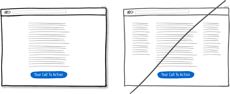
-
Try Giving a Gift instead of closing a sale right away.
A friendly gesture such as providing a customer with a gift can be just that. Deeper underneath however, gifting is also an effective persuasion tactic that is based on the rule of reciprocity. As obvious as it sounds, being nice to someone by offering a small token of appreciation can come back in your favour down the road.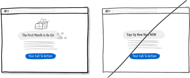
-
Try Merging Similar Functions instead of fragmenting the UI.
Over the course of time, it’s easy to unintentionally create multiple sections, elements and features which all perform the same function. It’s basic entropy - things start falling apart over time. Keep an eye out for duplicate functionality, as it puts a strain on your customers. Often, the more UI fragmentation there is, the higher the learning curve which your customers will have to deal with. Consider refactoring your UI once in a while by merging similar functions together.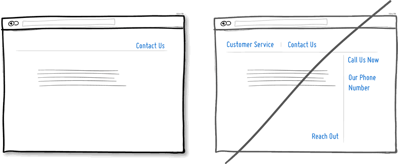
-
Try Social Proof instead of talking about yourself.
Social proof is another great persuasion tactic directly applicable to increasing conversion rates. Seeing that others are endorsing you and talking about your offering, can be a great way to reinforce a call to action. Try a testimonial or showing data which proves that others are present.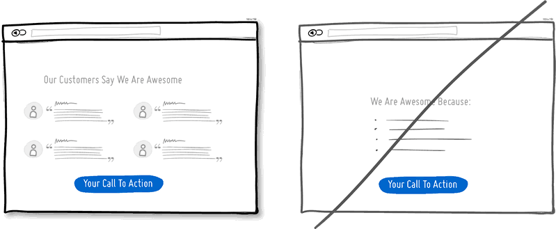
-
More On The Way. Sign Up Below For Updates.
Responsive Deliverables
In a world of growing front-end complexity, what are we handing off to clients?
During the era of Print Design, companies would approach agencies for a brand identity system. Don Draper would then hire one of two people: either Paul Rand or Saul Bass. Paul Rand’s work with Westinghouse makes a great case study for building a design system.
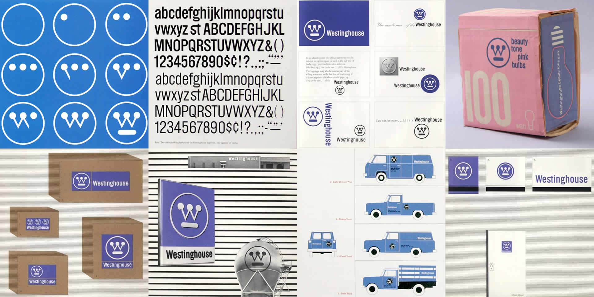
The identity work started with a simple logo and color scheme and then scaled to business cards, product packaging, vehicles and more. The sum of these components made up the physical brand.
Building webpages is not so different. The old PSD-to-HTML workflow served us well for many years, but isn’t able to stand in the face of all the complexity that responsive web design and the multi-device web have introduced. Internal processes have already begun to change. Likewise, how we craft webpages and what we deliver to our clients must mature.
Modules, not pages
The traditional way to handle complexity in programming is to break large complex things into smaller well-formed “modules”. Focusing on creating healthy front-end modules1 instead of complete pages can help break complex page layouts into reusable solutions. This proved to be true working on the Microsoft.com homepage.
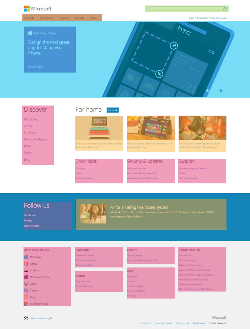 Legend: Search, Navigation, Hero, List of links, Highlight
From the exterior, it may appear to be a single page but the homepage is actually comprised of Lego®-like building blocks designed to be combined together. The look and feel of new components like form controls, navigation, and carousels are informed by the colors and typethat define the brand.
Good components make code reusable. Tyson Matanich, developer at Microsoft, was the main driver and lead enforcer to ensure that all components were reusable at their core, running each component though stress test scenarios. He coached us in how their components might be reused and continually pushed us to “componetize” even further.
The highlight component, for example, can be re-purposed and “themed” in the news section using a simple CSS class. While they are different visually, they possess the same underlying code structure. All these components are then strung together to create complete page layouts.
Working on isolated components made the iteration process faster as well. Faster and more reusable means that the work our agency performed resulted greater value for their company.
Modern day deliverables
What does a modern day Paul Rand need to do in order to bring a brand identity system to the web? Instead of delivering one PSD per page or worse, one PSD per responsive view, we should be thinking about deliverables as modular pieces of the larger system. Whether they’re based on strategy, components, or layout, they should all be built with extendibility in mind.
- Components
- Flexible grid
- Typography
- Navigation
- Accessible form controls
- Carousels
- Tabbed navigation
- Responsive tables
- Accordions
- Media lists
- Dropdowns
- Pagination
- Data tables
- Buttons
- Icon fonts
- Strategy
- Responsive images
- Responsive typography
- Accessibility architecture
- Legacy browser support
- i18n/l10n tolerance
- Performance budget
- Interaction/Animations
- Responsive advertising
- Layouts
- Homepage layout
- Subpage layout
- Article index layout
- Article layout
- Product index layout
- Product detail layout
- Sign up flow
- Checkout flow
All billable items should be accompanied with demo-able code. If some of these deliverables seem familiar, they should…
Tiny Bootstraps, for Every Client
Responsive deliverables should look a lot like fully-functioning Twitter Bootstrap-style systems custom tailored for your clients’ needs. These living code samples are self-documenting style guides that extend to accommodate a client’s needs as well as the needs of the ever-evolving multi-device web.
- interactive
- interaction
- installation
- design
- led
- light
- art
- technology
- projectionmapping
- projectmapping
- robotics
- ui
- mobile
- projection
- interactivedesign
- lightdesign
- apple
- web
- 3d
- ux
- userinterface
- lightart
- robot
- artinstallation
- touchscreen
- application
- app
- webdesign
- touch
- motion
- responsive
- adobe
- multitouch
- future
- robots
- drone
- photoshop
- productdesign
- ledinstallation
- lightsculpture
- video
- user experience
- iphone
- creative
- interactivelight
- digitalart
- motiondesign
- ar
- 3dprinting
- responsivedesign
- augmentedreality
- drones
- kinetic
- data
- development
- kinect
- microsoft
- display
- immersive
- process
- painting
- timelapse
- dronerobotics
- 3dprojection
- ios
- vr
- virtualreality
- earth
- ai
- device
- user interface
- engineering
- laser
- lightpainting
- kineticsculpture
- lightinstallation
- touchinstallation
- animation
- programmableleds
- graffiti
- interactions
- neon
- performance
- leapmotion
- watch
- mobiledesign
- pixel
- environment
- exoskeleton
- interactiveenvironment
- sound
- lcd
- social
- leds
- lukew
- artlight
- patterns
- internet
- carui
- November 2011 128
- December 2011 65
- January 2012 25
- February 2012 27
- March 2012 33
- April 2012 31
- May 2012 16
- June 2012 32
- July 2012 20
- August 2012 37
- September 2012 24
- October 2012 34
- November 2012 31
- December 2012 6
- January 2013 21
- February 2013 11
- March 2013 10
- April 2013 35
- May 2013 45
- June 2013 10
- July 2013 49
- August 2013 33
- September 2013 40
- October 2013 57
- November 2013 31
- December 2013 28
- January 2014 86
- February 2014 49
- March 2014 24
- April 2014 40
- May 2014 6
- June 2014 9
- July 2014 1
- August 2014 34
- September 2014 30
- October 2014 45
- November 2014 21
- December 2014 6
- January 2015 5
- February 2015 17
- March 2015 18
- April 2015 14
- May 2015 1
- June 2015 10
- July 2015 4
- August 2015 1
- October 2015 11
- March 2016 4
- December 2016 18
- September 2017 6
- October 2017 13
- November 2017 5
- June 2018 8
- July 2018 2
- November 2018 7
- February 2019 8
- March 2019 6
- July 2019 1
- August 2019 1
- October 2019 1
- July 2020 5
- November 2020 9
- December 2020 1
- January 2021 1
- April 2021 1
- May 2021 9
- June 2021 3
- August 2022 3
- May 2023 2
- September 2023 1
- May 2025 6