COLOR WARRIORS. I created 2 Interactive Installations + 2 Projection Mappings for our event COLOR WARRIORS. I collaborated with 8-year-old London on the projection mappings. On one of them, I redrew one of this drawings on the wall and mapped it. For the other, I used colors from one of his paintings, and blasted them on the Tetrahedron Structure I built. This event was created to raise awareness on Autism. Source
Death To The Waterfall [Webdesign]
 Most developers/designers adapt to the waterfall process, because it’s an industry standard. It’s in every job post, “Must be able to handle 1000’s of projects at once.” Hmm, no thanks.
This process can have adverse effects on the whole organization. Delayed projects effect other projects by tying up valuable resources. Making it very hard to allocate team members because everyone is multi-tasking.
This process does not create teams it creates assembly lines. It divides teams into silos that don’t communicate until it’s time to hand off deliverables. This causes confusion because most of the communication is misinterpreted, or lost between team members.
 This process is both duplicative and inefficient.
I’ve always had a problem with the standard agency waterfall process. It sucks. And to tell you the truth, its not even worth fixing. The problem lies within the structure itself, so patching it won’t help.
We need a new process.
In order to change our process we must change the way we think. Every team member must contribute to a project’s strategy from day one. Instead of one team that handles multiple projects lets create smaller teams with 100% committed resources to one project. Let’s explore further.
“Process is often shaped by how teams are organized. Small tactical teams can accomplish more are capable of executing multiple rounds of planning, design, and code quickly.” - Trent Walton
Smaller teams inspire communication and collaboration among its members. They also invoke skill overlap & peer learning as they are expected to perform their jobs as well as any others if needed. When a team member finishes their tasks, they shift to support the other members in any way possible.

A small team should include a project manager, a designer and a developer at the least. The members should dedicate all of their time to one project and set a goal for a specific iteration. An iteration can be 1 to 6 weeks depending on the scope of the project. The point is that all members take part of strategy, planning & execution.
“Everyone is just as important on a project. Some play larger roles, some only share a single idea, but all voices need to be heard and understood.” - Daniel Mall
We need a new process based on smaller teams that are fluid and always changing, just like the technology we build with.
We need a responsive process.
PLAN
- Identify team members and establish project roles.
- Conduct a kickoff meeting with the client, gather requirements & project goals.
- Gather and audit content.
- Define the project strategy and scope.
- Compile communications brief and send to the client.
- Create a site diagram from content and communications brief.
- Send site diagram to client for feedback.
- Revise site diagram based on client feedback.
DESIGN / DEVELOP
- Sketch UX layouts from site diagram and content.
- Code a responsive HTML Prototype from sketches, site diagram and content.
- Send the HTML Prototype to the client for feedback.
- Revise HTML Prototype based on client feedback. Create style guide in Photoshop during feedback phase.
- Send the style guide to the client for feedback.
- Revise style guide based on client feedback. Create mock-up in photoshop during feedback phase.
- Send mock-ups to the client for feedback.
- Revise mock-ups based on client feedback. Code beta website from html prototype & mock-up during feedback phase.
- Send the beta website to the client for feedback.
LAUNCH
- Test responsive site across browsers and multiple devices.
- Establish a maintenance plan & schedule training.
- Launch website!
- Conduct a follow up meeting with team members and client to address overall process and ways to improve.
- Learn from team mistakes and refine process.
BENEFITS
- Testing starts in the prototype phase which allows more time to identify & fix bugs.
- Design mock-ups based on a live responsive prototype as apposed to a static wire-frame.
- Prototype code becomes the framework for the final site.
- Save time by designing in the browser instead of designing static wire-frames.
- Client gets to preview and make changes in their native browser. Priceless!
Special thanks to Trent Walton, Ben Callahan, Daniel Mall and Steve Fisher for inspiring me to write this article.
Now lets get out there and build the web!
ADDITIONAL READING
http://trentwalton.com/2013/04/10/reorganization/
http://www.republicofquality.com/working-together
http://danielmall.com/articles/the-post-psd-era/
Transitional Interfaces
Designers love to sweat the details. Much time is spent pixel-fucking buttons, form styles, setting type, & getting those icons as sharp as a tack. A+, great job, don’t stop you guys.
…but there’s little consideration about how it all fits together outside of a static comp. You tap a button and the form just …appears? You swipe to delete an item and it just vanishes? That’s super weird and un-natural. Nearly nothing in the real world does anything as jarringly as just swapping states. It would feel like a glitch.
Oh, ok sweet. You made some notes — it just “slides in.”
How? Quickly? Does it bounce back? Cushion in? Static design doesn’t provide context between states.
Folks keep throwing around the word “delight” when referring to animation and cute interactions. Cool and great for those guys. Guess what though? Animation can be used functionally too. It’s not just an embellished detail.
Animation leverages an overlooked dimension — time! An invisible fabric which stitches space together. You don’t have to be a math dork to understand this.
Let’s take a look at some simple ideas:
Easing/cushioning
In traditional animation, a breakdown determines how a mass moves from Point A to Point B. It adds bias to motion, and determines how the rest of the frames fall into place. Take these 25 frame interpolations, where frame 13 (the middle-ish point) varies in position:


Look at that! You just learned about cushioning/easing. Computers are jerks and love to fill in the gaps linearly because they are lazy sacks of wires. A great animator/motion designer spends most of their days fighting computers to make sure they don’t mess this up.
Animation is all about timing. You can play with all sorts of different spacing to get different results. But enough about that. This isn’t an animation tutorial, the point was to get you thinking about the language of timing and spacing.
Some ideas about Animation in the context of Interfaces
Like I said earlier, animation can help to provide context. It helps brains understand how the information flows.
Inserting an item into a list
Let’s say you’re looking at a live list of things and you’d love it to be populating with live data. If you leave it to a computer, it’d look something like this:

Yikes, that’s rough…
Smoothing it out only requires a few frames of animation. How about giving your brain a clue about what’s happening to the list?:


For a new item to be added, the list needs to make room for the item, and then the new item (which came from somewhere) fills in the space.Much less jarring. There’s easing in & out of states to soften the change. It feels more natural, because we have the contextual hook of space — mirroring the way you’d add something to a stack of things in real life!
A few more:
Drilling down into list items
There’s the typical, default pattern of sliding over into an item. A regularly used pattern, but doesn’t make a whole lot of sense spatially:

The direction of sliding doesn’t really give you any useful clues outside of a linear chain of views.
How about considering the item to be a container you prod for more detail, inline?

If the goal is to drill in and have the list item hold full focus, we could even make everything else hide within the same view:

Breadcrumbing>all>the>way>into>a>view is an easy way to get lost.
An advantage of remaining inline is that you can remove the need to explain how deep a user is embedded into sub-views. You can scrap the display of a hierarchical navigation, because the user saw how they got there.
Of course, the above ideas don’t work with every case — but this perspective can lead to much more elegant solutions to connect a flow.
An implemented example - Thinglist

Thinglist, an Elepath product I’m working on with Mister Kyle Braggerhas some pretty fun transitional interface work woven into it. The above example demonstrates how we reveal the new filtering feature.
Examples of Transitional interfaces you should check out:
You know, I can’t really name many… On one end of the scale, there are a lot of beautiful, but dreadfully static interfaces. On the other end — ones that are over embellished with gimmicky animation.
Three stand out to me right now.
Clear: Very tight gesture driven animation.
Willcall: Has a consistent, kinetic rhythm. There’s no hard pops between states. A lovely playfulness.
Facebook.app: Not very consistent, but there’s some nice solutions todrawing focus. Specifically… drilling down into lightbox-like views for fullscreen photos, and popping comment inputs into list views.
It seems crazy to me that more people don’t think about interfaces with respect to the dimension of time. Motion can provide so much information! Maybe the tools to create prototypes are too complicated for most designers?
I originally wrote this as an internal document for Elepath employees, to begin to explain my obsession with motion. I am an Animator after all.
We figured it would be cool to share this for discussion. I’d love to hear thoughts from other people building interfaces, with a real consideration for how & why they move.
Do leave your comments here, or pipe up & chat to me on twitter: @pasql
…or join the discussion on branch: http://branch.com/b/transitional-interfaces-design-ux
Bonus - Recommended reading/watching material (you should really, definitely look at these)*:
- The Animator’s Survival Kit by Richard Williams
- Timing & Spacing Primer
- Prologue - Designing Fictional Interfaces for Iron Man 2
- A demonstration of me using Moonbase, an Elepath animation experiment
*I take no responsibility for you plunging down the rabbit hole and getting hooked on animation.
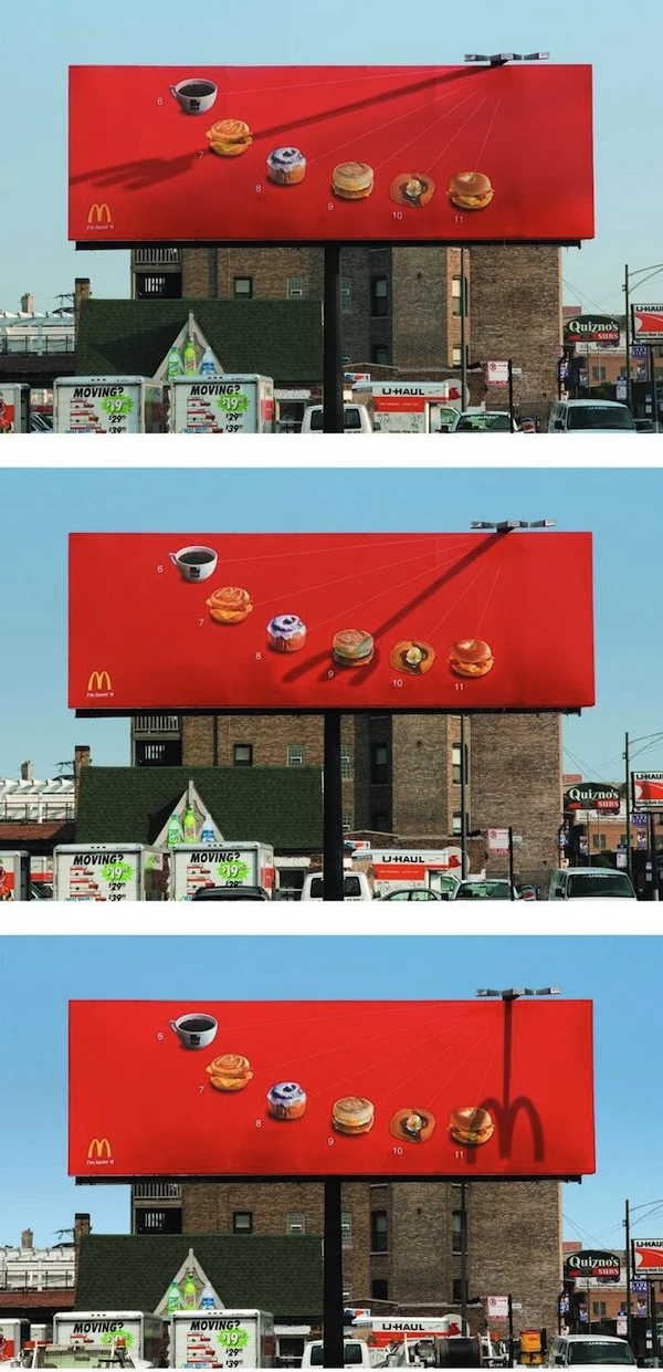
Clever McDonald’s Billboard Uses A Shadow Fork To Tell You What To Eat
In Chicago, McDonald’s has put up a clever new billboard that uses an ingenious shadow fork to tell you when to eat at each hour of the morning.
Featuring various breakfast items from the fast food chain’s menu, the billboard is attached with a fork-shaped structure, whose shadow changes and shifts throughout the morning.
At every hour between 6-11AM, this shadow fork would stick through a different dish, reminding anyone who is looking at the billboard that it is time for a snack.
At noon, when the sun is directly overhead, the fork casts its last shadow of the day—one that looks exactly like McDonald’s famous golden arches logo.
[via Reddit]
Pantone 50 Years of Color
The company best know for it’s color matching system is celebrating 50 years of existence this year and they have marked the occasion by taking a look at how color has changed over the years.

This vibrant infographic takes a look at different points in time such as the psychedelic 60s and nuanced 90s to name just a few. It also looks at other aspects of color such as the color of the year over the past 13 years, top color in social media and an overview of various colors used by top name brands.

So if you want to add a bit of color to your day and see how they have changed over the past few decades, take a look at this great showcase from Pantone.

- interactive
- interaction
- installation
- design
- led
- light
- art
- technology
- projectionmapping
- projectmapping
- robotics
- ui
- mobile
- projection
- interactivedesign
- lightdesign
- apple
- web
- 3d
- ux
- userinterface
- lightart
- robot
- artinstallation
- touchscreen
- application
- app
- webdesign
- touch
- motion
- responsive
- adobe
- multitouch
- future
- robots
- drone
- photoshop
- productdesign
- ledinstallation
- lightsculpture
- video
- user experience
- iphone
- creative
- interactivelight
- digitalart
- motiondesign
- ar
- 3dprinting
- responsivedesign
- augmentedreality
- drones
- kinetic
- data
- development
- kinect
- microsoft
- display
- immersive
- process
- painting
- timelapse
- dronerobotics
- 3dprojection
- ios
- vr
- virtualreality
- earth
- ai
- device
- user interface
- engineering
- laser
- lightpainting
- kineticsculpture
- lightinstallation
- touchinstallation
- animation
- programmableleds
- graffiti
- interactions
- neon
- performance
- leapmotion
- watch
- mobiledesign
- pixel
- environment
- exoskeleton
- interactiveenvironment
- sound
- lcd
- social
- leds
- lukew
- artlight
- patterns
- internet
- carui
- November 2011 128
- December 2011 65
- January 2012 25
- February 2012 27
- March 2012 33
- April 2012 31
- May 2012 16
- June 2012 32
- July 2012 20
- August 2012 37
- September 2012 24
- October 2012 34
- November 2012 31
- December 2012 6
- January 2013 21
- February 2013 11
- March 2013 10
- April 2013 35
- May 2013 45
- June 2013 10
- July 2013 49
- August 2013 33
- September 2013 40
- October 2013 57
- November 2013 31
- December 2013 28
- January 2014 86
- February 2014 49
- March 2014 24
- April 2014 40
- May 2014 6
- June 2014 9
- July 2014 1
- August 2014 34
- September 2014 30
- October 2014 45
- November 2014 21
- December 2014 6
- January 2015 5
- February 2015 17
- March 2015 18
- April 2015 14
- May 2015 1
- June 2015 10
- July 2015 4
- August 2015 1
- October 2015 11
- March 2016 4
- December 2016 18
- September 2017 6
- October 2017 13
- November 2017 5
- June 2018 8
- July 2018 2
- November 2018 7
- February 2019 8
- March 2019 6
- July 2019 1
- August 2019 1
- October 2019 1
- July 2020 5
- November 2020 9
- December 2020 1
- January 2021 1
- April 2021 1
- May 2021 9
- June 2021 3
- August 2022 3
- May 2023 2
- September 2023 1
- May 2025 6