Rafmögnuð Náttúra is a temporary and site-specific light installation that animates the facade of Iceland’s Hallgrímskirkja Church with a large 3d video-mapping projection. Inspired by the natural elements of Iceland and working with the unique architectural features of the church, UNSTABLE transforms the static condition of this iconic landmark into a dynamic, engaging and interactive visual experience. The intention is to intervene in the city by socially activating an inactive urban public space. Source
Macworld Cover Creation. [Rob Schultz] After working on the latest cover for Macworld Magazine I wanted to show what is involved in making a cover. I focused on the three main areas: the photography, photoshop and design. I chose a time lapse format to convey lots of information in a small amount of time. The only drawback of time lapse is that since half a day goes by in 30 seconds, the whole process seam so easy! Lots of details were left out of the design process (like the cover meetings and rounds of layout options). I began to photograph the design process after the layouts had already been narrowed down to just three cover designs. Source
Touch interaction design (Windows Store apps)
This topic describes the touch interactions for Windows 8 and provides guidelines for designing good touch interactions. For a handy downloadable version of this topic, go here.
Touch guidance
- Use the Windows 8 touch language.

Windows 8 provides a concise set of touch interactions used consistently throughout the system. Applying this language consistently makes your app feel familiar to what users already know. This increases user confidence by making your app easier to learn and use.
- Use fingers for what they’re good at.

A mouse and pen are precise, while fingers aren’t, and small targets require precision. Use large targets that support direct manipulation and provide rich touch interaction data. Swiping down on a large item is quick and easy because the entire item is a target for selection.
- Browse content with touch.

Semantic Zoom and panning make navigation fast and fluid. Instead of putting content in multiple tabs or pages, use large canvases that support panning and Semantic Zoom.
- Provide feedback.
Increase user confidence by providing immediate visual feedback whenever the screen is touched. Interactive elements should react by changing color, changing size, or by moving. Items that are not interactive should show system touch visuals only when the screen is touched.
- Content follows finger.
Elements that can be moved or dragged by a user, such as a canvas or a slider, should follow the user’s finger when moving. Buttons and other elements that do not move should return to their default state when the user slides or lifts their finger off the element.
- Keep interactions reversible.
If you pick up a book, you can put it back down where you found it. Touch interactions should behave in a similar way—they should be reversible. Provide visual feedback to indicate what will happen when the user lifts their finger. This will make your app safe to explore using touch.
- Allow any number of fingers.
People often touch with more than one finger and don’t even realize it. That’s why touch interactions shouldn’t change radically based on the number of fingers touching the screen. Just like the real world, sliding something with one or three fingers shouldn’t make a difference.
- Keep interactions untimed.

Interactions that require compound gestures such as double tap or press and hold need to be performed within a certain amount of time. Avoid timed interactions like these because they are often triggered accidentally and are difficult to time correctly.
Windows 8 touch language
This list describes the standard touch-related terms used in Windows 8.
Important To avoid confusing users, please do not create custom interactions that duplicate or redefine existing, standard interactions.
- Press and hold to learn.
This touch interaction causes detailed information or teaching visuals (for example, a tooltip or context menu) to be displayed without a commitment to an action. Anything displayed this way should not prevent users from panning if they begin sliding their finger.
- Tap for primary action.
Tapping on an element invokes its primary action, for instance launching an app or executing a command.
- Slide to pan.

Slide is used primarily for panning interactions but can also be used for moving, drawing, or writing. Slide can also be used to target small, densely packed elements by scrubbing (sliding the finger over related objects such as radio buttons).
- Swipe to select, command, and move.
Sliding the finger a short distance, perpendicular to the panning direction, selects objects in a list or grid (ListView and GridLayout controls). Display the app bar with relevant commands when objects are selected.
- Pinch and stretch to zoom.
While the pinch and stretch gestures are commonly used for resizing, they also enable jumping to the beginning, end, or anywhere within the content with Semantic Zoom. A SemanticZoom control provides a zoomed out view for showing groups of items and quick ways to dive back into them.
- Turn to rotate.
Rotating with two or more fingers causes an object to rotate. Rotate the device itself to rotate the entire screen.
- Swipe from edge for app commands.
App commands are revealed by swiping from the bottom or top edge of the screen. Use the app bar to display app commands.
- Swipe from edge for system commands.
Swiping from the right edge of the screen reveals the charms that expose system commands.
Swiping from the left edge cycles through currently running apps.
Sliding from the top edge toward the bottom edge of the screen closes the current app.
Sliding from the top edge down and to the left or right edge snaps the current app to that side of the screen.
Note Users can perform direct manipulations like the slide-to-pan, pinch-to-zoom, and turn-to-rotate interactions simultaneously and with any number of touch points.
Windows 8 touch posture
Designing for touch is more than designing what’s displayed on the screen. It requires designing for how the device will be held (grip).
Typically, different people have a few favorite grips when holding a tablet.
The current task and how it’s presented usually determines which grip is used. However, the immediate environment and physical comfort also affect how long a grip is used and how often it’s changed.
Try optimizing your app for different kinds of grips. But if an interaction naturally lends itself to a specific grip, optimize for that.
Interaction areas: Because slates are most often held along the side, the bottom corners and sides are ideal locations for interactive elements.

Reading areas: Content in the top half of the screen is easier to see than content in the bottom half, which is often blocked by the hands or ignored.

Four most common grips: While there are many ways to hold a tablet, these four grips are most commonly used.
GripGrip and interactionDesign considerations One hand holding, one hand interacting with light to medium interaction
- Right or bottom edges offer quick interaction.
- Lower right corner might be occluded by hand and wrist.
- Limited reaching makes touching more accurate.
- Reading, browsing, email, and light typing.
 Two hands holding, thumbs interacting with light to medium interaction
- Lower left and right corners offer quick interaction.
- Anchored thumbs increase touching accuracy.
- Anything in the middle of the screen is difficult to reach.
- Touching middle of screen requires changing posture.
- Reading, browsing, light typing, gaming.
 Device rests on table or legs, two hands interacting with light to heavy interaction
- Bottom of the screen offers quick interaction.
- Lower corners might be occluded by hands and wrists.
- Reduced need for reaching makes touching more accurate.
- Reading, browsing, email, heavy typing.
 Device rests on table or stand, with or without interaction
- Bottom of screen offers quick interaction.
- Touching top of the screen occludes content.
- Touching top of screen might knock a docked device off balance.
- Interaction at a distance reduces readability and accuracy.
- Increase target size to improve readability and precision.
- Watching a movie, listening to music.
Windows 8 touch targets
Size vs. efficiency: Target size influences error rate
There’s no perfect size for touch targets. Different sizes work for different situations. Actions with severe consequences (such as delete and close) or frequently used actions should use large touch targets. Infrequently used actions with minor consequences can use small targets.

Fat fingers?

People often blame themselves for having “fat fingers.” But even baby fingers are wider than most touch targets.
The image on the left shows the width of the average adult finger is about 11 millimeters (mm) wide, while a baby’s is 8 mm, and some basketball players have fingers wider than 19 mm!
Target size guidelines: Here are some guidelines for deciding how large or small to make your touch targets.

7x7 mm: Recommended minimum size
7x7 mm is a good minimum size if touching the wrong target can be corrected in one or two gestures or within five seconds. Padding between targets is just as important as target size.

When accuracy matters
Close, delete, and other actions with severe consequences can’t afford accidental taps. Use 9x9 mm targets if touching the wrong target requires more than two gestures, five seconds, or a major context change to correct.

When it just won’t fit
If you find yourself cramming things to fit, it’s okay to use 5x5 mm targets as long as touching the wrong target can be corrected with one gesture. Using 2 mm of padding between targets is extremely important in this case.
Most people are right handed
Most people hold a slate with their left hand and touch it with their right. In general, elements placed on the right side are easier to touch, and putting them on the right prevents occlusion of the main area of the screen.

Touch interactions and accessibility
As you plan the UI and the interactions supported by your app, always keep in mind the wide range of abilities, disabilities, and preferences of your users. Following accessible design principles from the beginning helps make your app accessible to the widest possible audience. For more info on planning for accessibility, see Design for accessibility.
Related topics
Navigation design for Windows Store apps
Learn how to organize the content in your Windows Store app so your users can navigate easily and intuitively. Using the right navigation patterns helps you limit the controls that are persistently on screen, such as tabs. This lets people focus on the current content.

Hierarchical system

Most Windows Store apps in Windows 8 will use a hierarchical system of navigation. This pattern is common and will be familiar to people, but is made even better by the Hub navigation pattern. This pattern makes Windows Store apps fast and fluid while still being easy to use.
This pattern is best for apps with large content collections or many distinct sections of content for a user to explore.
Layers in the hierarchy
The essence of Hub design is the separation of content into different sections and different levels of detail.
Hub pages
Hub pages are the user’s entry point to the app. Here content is displayed in a rich horizontally panning view allowing users to get a glimpse of what’s new and available.
The Hub consists of different categories of content, each of which maps to the app’s Section pages. Each Section should bubble up content or functionality. The Hub should offer a lot of visual variety, engage users, and draw them in to different parts of the app.
Section pages
Section pages are the second level of an app. Here content can be displayed in any form that best represents the scenario and content the Section contains.
The Section page consists of individual items, each of which has its own Detail page. Section pages may also take advantage of grouping and a panorama style layout.
Detail pages
Detail pages are the third level of an app. Here the details of individual items are displayed, the format of which may vary tremendously depending upon the particular type of content.
The Detail page consists of item details or functionality. Detail pages may contain a lot of information or may contain a single object, such as a picture or video.

Flat system

Many Windows Store apps in Windows 8 use a flat system of navigation. This pattern is often seen in games, browsers, or document creation apps, where the user moves between pages, tabs, or modes that all reside at the same hierarchical level.
This pattern is best when the core scenario involves fast switching between a small number of pages or tabs.
Content pages
The essence of the Flat system is the separation of content into different pages.
Top app bar
The top app bar is great for switching between multiple contexts. Examples include tabs, documents, and messaging or game sessions.
This bar is a transient element that resides at the top of the screen, and is made visible when users swipe from the top or bottom edge. While formatting of items in the bar can vary, a typical treatment is the use of a simple thumbnail.
Switching
Unlike the hierarchical system, there is typically no persistent back button or navigation stack in the flat system, so moving between pages is usually done through direct links within the content or the top app bar.
You can choose to include other functionality within the top app bar, such as adding a ‘+’ button to create a new tab, page, or session.

Navigation anatomy
The following show the anatomy navigating between sections in an app, between different levels in the hierarchy, and within a single app page.
-
Header and Back button
The header labels the current page and is useful for wayfinding. The Back button makes it fast to get back to where you were.
-
Hub page
The Hub page pulls information from different areas of the application onto one screen. It gives the user a bird’s-eye view of everything available in the app.
-
Content sections, or categories
Content sections can be formatted to best display the functionality or items they promote.

-
Semantic zoom: navigating between levels in a hierarchy
Semantic zoom makes scanning and moving around a view fast and fluid, especially when the view is a long panning list.

-
Top app bar
The top app bar contains transient access to navigation controls or to other areas of the app.
-
Header menu
The header menu is available from anywhere in the app, and allows users to quickly jump from one section of the app to another
-
Home link
The home link, located at the bottom of the header menu, is a quick way to get back to the root of the app.
-
Bottom app bar
The bottom app bar contains transient access to commands relevant to a particular view.
-
View/Sort/Filter
These commands change the way in which content is displayed within a specific view. The best place for them to reside is in the app bar.
-
Edge
Swiping from the edge of the screen is what makes the app bars and charms appear.

Navigating with the edge swipe

Users can navigate within apps and throughout the system by swiping a finger or thumb from an edge. In order to use Windows Store apps efficiently, users learn what each of the following edge swipes does:
- Swiping from the bottom or top edge of the screen reveals the navigation and command app bars.
- Swiping from the right edge of the screen reveals the charms that expose system commands.
- Swiping from the left edge cycles through currently running apps.
- Sliding from the top edge toward the bottom edge of the screen closes the current app.
- Sliding from the top edge down and to the left or right edge snaps the current app to that side of the screen.
Navigating with header menus and section labels
We will use a sample app called Food with Friends to illustrate a pattern for using the back button, header menu, and content sections to navigate a Windows Store app.

The header menu contains a link to each section page (level 2) as well as a link back to the hub (level 1), enabling users to move around the app quickly. The menu appears at each level and on every page of the app, making it an efficient and reliable way for users to get where they want to go.
Users can tap on the section label to drill in to the corresponding page for that section. Provide a visual cue, likeView all (x), to indicate to users that there are more items in this section that what is shown in the hub. Using this pattern avoids the need to use a tile space or place a link within the content.
Using this pattern, this is what the navigation diagram would look like for the Food with Friends example. This is a simplified diagram showing only canonical examples of navigation elements, used as representatives of everything that’s interactive.
Navigating with filters, pivots, sorts, and views
Another part of app navigation is determining when, where, and how to give users more control over the way they experience content. Filters, pivots, sorts and view switchers are all things to consider in your app design.
TermDefinitionExampleFilterRemoving or hiding content within a data set, based on some criteria.When looking for a game to play, you might choose to view only those games categorized as “adventure.”PivotReorganizing content within a data set, based on some criteria.When looking at a music collection, you might choose to organize songs by artist, album, or genre.SortChanging the order in which content is displayed within a data set.When browsing for an article to read in a news app, you might choose to see the most recent articles listed first.ViewChanging the style or method in which content is displayed.When browsing for a place to eat in a restaurant-finding app, you might choose to view restaurants on a map instead of in a list.
On-canvas
Use on-canvas controls for filtering, pivoting, or sorting when finding an item is a primary task, like in a collection or search result page.
Controls should go into the app bar, if the focus of the app is on browsing for content, like a magazine or shopping app.
Page filters and sorts
For filtering and sorting content within a collection view, filter and sort commands can be placed in a row between the header and content. In the following example, the view is filtered to show only TV episodes, sorted and grouped by series.

In this example for a marketplace app, drop-down selection controls filter the content for the current view. As the menus show, the currently active filter appears selected in the drop-down list.


The top app bar
The top app bar is used primarily for navigating sections or pages of an app that use the Flat navigation pattern. Sometimes called a navigation app bar, it can also be used along with the Hierarchical pattern, in lieu of the header menu, to provide global navigation controls. The top app bar should show up on every page and at all levels of the app to provide users with a convenient, consistent way to get around.
In this finance app example, the hub (L1) promotes sections of the app (Headlines, Watchlist) to the hub, and the section headers link in to them. At the section level (L2), when the top app bar is invoked by swiping the top or bottom edge, the user has access to the root and all other sections of the app.

App bar view switching
The app bar is used primarily as a commanding surface, but it can also be used to alter the way in which content is being viewed. Switching views, pivoting, filtering and sorting can all be done by using the app bar. Don’t use the app bar for navigating from one place in the app to another. All app bar items should act on the content currently in view.
In this calendar app example, the view defaults to a month view, which this app has optimized for. Commands to choose other calendar views are in the app bar, accessed by swiping from the top or bottom edge. Other commands, such as making a new appointment, may appear in the bar as well.

In the All Restaurants page of the Food with Friends example, options for viewing items as a list or map are available, as are filtering and sorting the view based on certain criteria such as cost, location, and rating. Here, filtering options are exposed as controls in a menu Flyout.

Small Design And Usability Details Matter A Lot More Than You Think
The difference between a regular web designer and a really good one is the attention to details, taking time and being careful when making each and every aspect of the design process. What I’m talking about here is not impressive graphical elements that would steal a visitor’s attention, instead I’m talking about those delicate details of a design element that could enhance the user’s experience.
I know time is important to everyone and it may seem like a waste of it to focus on these little things, but you have to take care of these subtle details especially when creating a project for designers or people with a trained eye. The satisfaction that a visitor receives when he sees one of these details is incredible and your image in his eyes increases tenfold.
For example, look at the globe icon on Facebook. The icon shows a different side of the globe depending on your location.

You might say that Facebook is big company and it affords to do these specific things. If you would say this, it wouldn’t be the smartest thing you have said. One of the reasons it became a big company is that it cares about its visitors and tries to deliver the best experience to its visitors.
Perfection is achieved not when there is nothing more to add, but when there is nothing left to take away
You have to be patient with your work and put every element of your design layout in their place with a specific purpose. Otherwise, if the element has no importance in your design, then you should remove it. Cluttering your design won’t do you any good. On the contrary, it may do more harm so try keeping it simple.
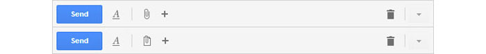
Even if you want to believe it or not, small design elements are noticed subconsciously by the visitor and they influence him in making decisions on the site. A good example of small design element is the attachment icon on Gmail which changes after the first attachment was uploaded.
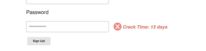
There are also other details which don’t necessarily focus on design, but on functionality and improving the user experience, like security issues or guidance for the visitor to do the safest decisions on a website, like the registration form on Geeklist which tells you in a more interesting way that you have a weak password.
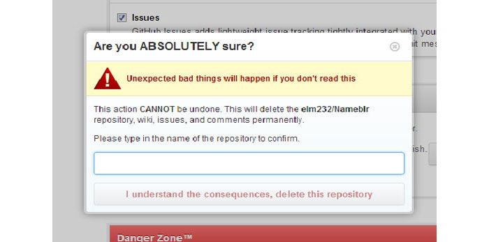
Another similar example is from GitHub where you are asked to type the full repository name to delete it. There are various sites where users tend to have a certain fear for “delete my profile” type of buttons which are stupidly thrown on the layout of the page and you might click it by mistake.
Be a perfectionist
This sounds a little bit elitist, but you have to do your best at every part of the design that you are working on. You will have to recheck the design and position of every element and modify it in such a way that it will improve the user’s experience.
You probably noticed that the words usability and user experience appear a lot when we’re talking about design and it should be no surprise. Website and app designs are all about UX and usability.

We’re not in the year 2000 when visitors responded positively to flashy content. The industry has grown up and the users are tired of the design over functionality issue. What they want are products that are useful and that can deliver what they are looking for.
Another thing that the visitors enjoy is being informed about what’s happening on the screen and about the result of their interactions. For example, when uploading a photo for example, they would like to know in real time how much of it was uploaded.
A plus on credibility
Gaining credibility for your product with these details is a big win and that is important because you design for you visitors and customers, not just for the sake of designing something. Visitors judge your site by evaluating design, copywriting and interactions. While copywriting shouldn’t be your concern, design and interactions are your responsibilities and you must deliver a well thought product if you want to gain more customers or visitors.
Go big or go home
You can build average websites, apps for web and mobile, but what you want for you and for your clients is to build excellent apps that are memorable. This can be done with a lot of work and time invested.
Also, you have to ignore templates. I know using templates is easy and switching the colors and a few fonts from one client to another may work for some designers, but that won’t help you get far, especially because one design doesn’t have the same effect for every client. They most likely target different audiences and different audiences respond differently to various design styles.
Use unique graphics in your designs. Trying to use icons made by other designers on your layouts doesn’t always have the desired effect. There are icon packs built with a lot of attention and which have really neat icons, but most of the times you will find yourself trying various icon packs on your design and you’ll notice that they simply don’t fit well. Creating your own icons in the same style as the overall design of the site is the best solution.
After you think you finished your project inspect every element and make sure everything is in place. If you are uncertain about some elements, don’t be afraid to ask for feedback your colleagues or friends. Don’t be afraid of what they might say. Also, don’t do everything that they comment about your design. If you know you know for sure that you’ve done the right thing by placing an element in a certain zone or if you designed it properly, stick to your design.
In the final part of the article, I left you a few other examples of details that look good and make the user experience better, courtesy of littlebigdetails.com.
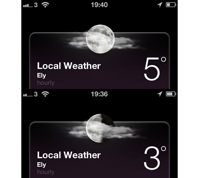
iOS 6 – the night time weather summary shows the correct phase of the moon.
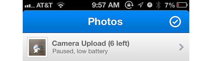
Dropbox – iOS app automatically pauses Camera Upload when the battery is running low.

YouTube – If you navigate away from a video, then immediately return, the player continues where it was left off.

YouTube – Clicking on the “Report” icon on YouTube stops the video if it’s currently playing.
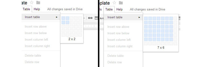
Google Drive – An expanding hover interface allows you to choose the desired amount of rows and columns in a new table.
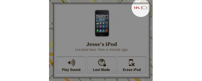
Find My iPhone – When your iOS device has been located, it shows the remaining battery level, so you know if you’re going to lose track of it soon.
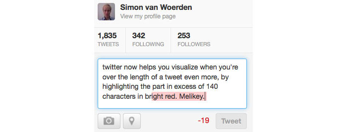
Twitter – Characters exceeding the 140 limit are highlighted in red.

Gmail – Incompatible versions of Internet Explorer show a damaged envelope as the favicon.
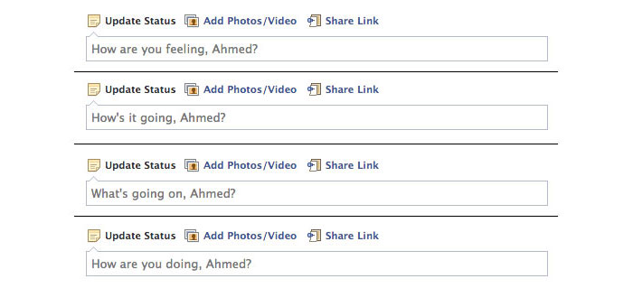
Facebook – The prompt text in the “Update Status” field constantly changes on refresh.

Opera – Tabs that haven’t been viewed yet are indicated by a folded corner.
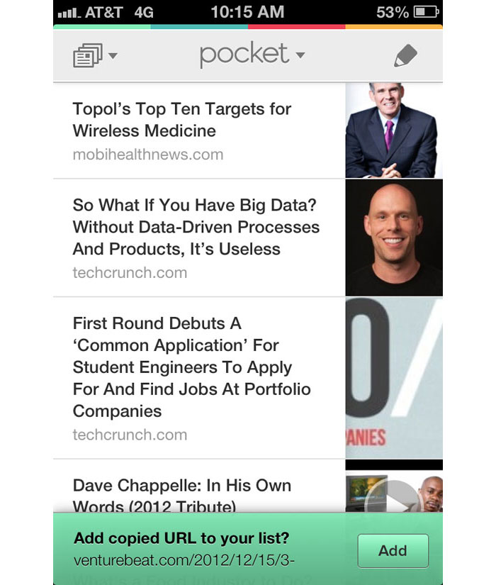
Pocket (iOS) – After copying a URL, opening the Pocket app will automatically prompt you to save the content.
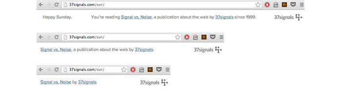
37 Signals – Blog post header text changes with size by dropping non-essential words as the browser viewport gets smaller.
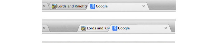
Google Chrome – When dragging the active tab it is always on top of the others, when dragging an inactive tab it moves behind the active one.
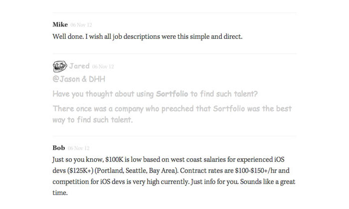
Signal vs. Noise – When a comment is marked as trolling, the comment appears in Comic Sans, lighter color and has a troll face next to the comment author.
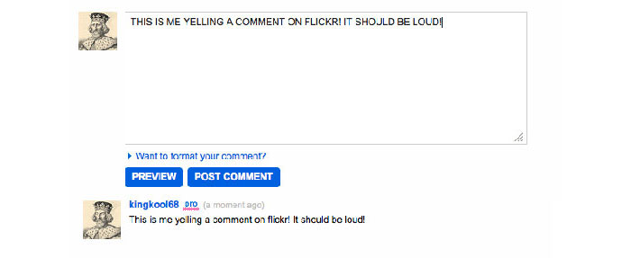
Flickr – When you enter a comment on in all caps, the comment is posted with proper capitalization.

Mailchimp – The logout URL says “see ya later” to the user.
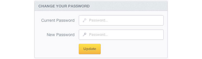
Mixpanel – When changing your password, the field for the current password has an old style key, and the new password has a modern key.
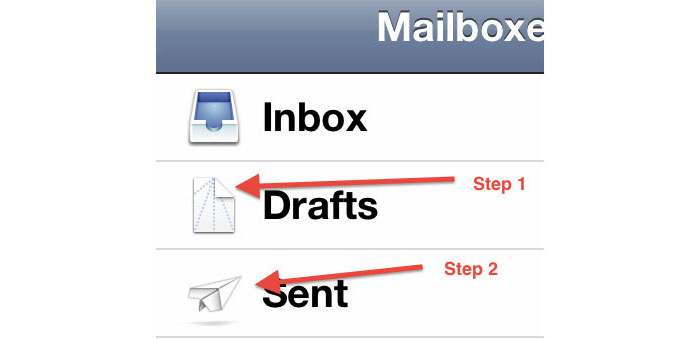
iOS Mail – The icons represent instructions on how to fold a paper airplane.
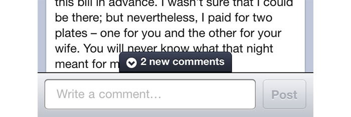
Facebook – On the mobile app, a notification tells you about new comments while you’re writing a comment.
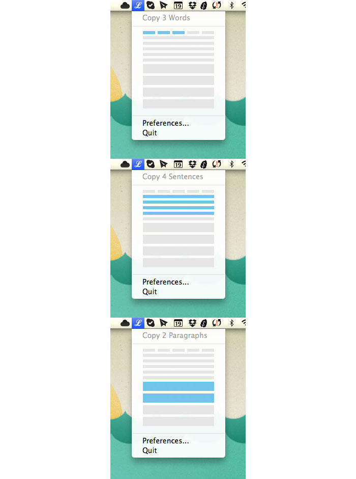
LittleIpsum – Graphical representation for selecting words, sentences, or paragraphs of Lorem Ipsum.
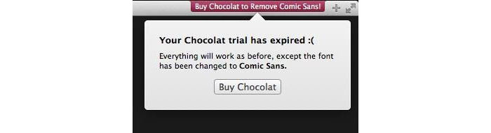
Chocolat – Turns all text into Comic Sans after your trial has expired.
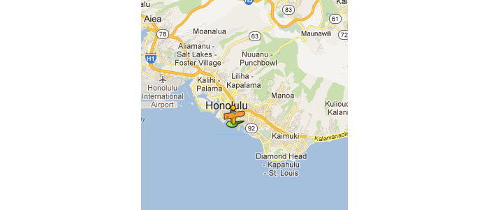
Google Maps – The street view icon on Google Maps has a surfboard and tropical shirt when in Hawaii.
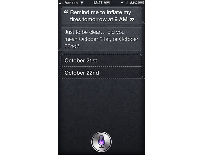
Siri – Confirms what “tomorrow” means, when it is mentioned close to midnight
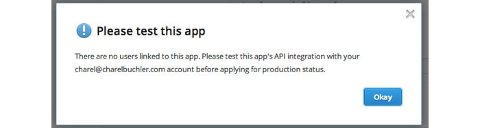
Dropbox – The dropbox forces developers to test their app before they can release the app in “production” status.

Youtube – The settings icon spins when you change quality of the video until it stabilizes.

theyouway.com – When opening a new tab the page title changes to “♥ Come back luv!”.
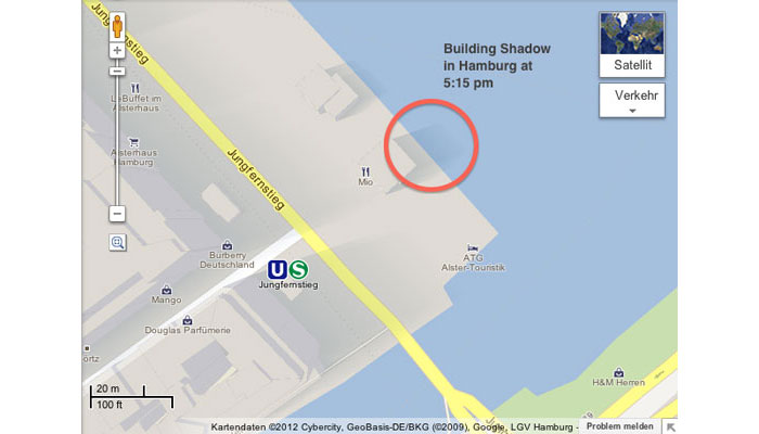
Google MapsGL – The shadows cast by the buildings are relative to the current position of the sun.
- interactive
- interaction
- installation
- design
- led
- light
- art
- technology
- projectionmapping
- projectmapping
- robotics
- ui
- mobile
- projection
- interactivedesign
- lightdesign
- apple
- web
- 3d
- ux
- userinterface
- lightart
- robot
- artinstallation
- touchscreen
- application
- app
- webdesign
- touch
- motion
- responsive
- adobe
- multitouch
- future
- robots
- drone
- photoshop
- productdesign
- ledinstallation
- lightsculpture
- video
- user experience
- iphone
- creative
- interactivelight
- digitalart
- motiondesign
- ar
- 3dprinting
- responsivedesign
- augmentedreality
- drones
- kinetic
- data
- development
- kinect
- microsoft
- display
- immersive
- process
- painting
- timelapse
- dronerobotics
- 3dprojection
- ios
- vr
- virtualreality
- earth
- ai
- device
- user interface
- engineering
- laser
- lightpainting
- kineticsculpture
- lightinstallation
- touchinstallation
- animation
- programmableleds
- graffiti
- interactions
- neon
- performance
- leapmotion
- watch
- mobiledesign
- pixel
- environment
- exoskeleton
- interactiveenvironment
- sound
- lcd
- social
- leds
- lukew
- artlight
- patterns
- internet
- carui
- November 2011 128
- December 2011 65
- January 2012 25
- February 2012 27
- March 2012 33
- April 2012 31
- May 2012 16
- June 2012 32
- July 2012 20
- August 2012 37
- September 2012 24
- October 2012 34
- November 2012 31
- December 2012 6
- January 2013 21
- February 2013 11
- March 2013 10
- April 2013 35
- May 2013 45
- June 2013 10
- July 2013 49
- August 2013 33
- September 2013 40
- October 2013 57
- November 2013 31
- December 2013 28
- January 2014 86
- February 2014 49
- March 2014 24
- April 2014 40
- May 2014 6
- June 2014 9
- July 2014 1
- August 2014 34
- September 2014 30
- October 2014 45
- November 2014 21
- December 2014 6
- January 2015 5
- February 2015 17
- March 2015 18
- April 2015 14
- May 2015 1
- June 2015 10
- July 2015 4
- August 2015 1
- October 2015 11
- March 2016 4
- December 2016 18
- September 2017 6
- October 2017 13
- November 2017 5
- June 2018 8
- July 2018 2
- November 2018 7
- February 2019 8
- March 2019 6
- July 2019 1
- August 2019 1
- October 2019 1
- July 2020 5
- November 2020 9
- December 2020 1
- January 2021 1
- April 2021 1
- May 2021 9
- June 2021 3
- August 2022 3
- May 2023 2
- September 2023 1
- May 2025 6