Information Software and the Graphical Interface
This article is best experienced directly on the Authors website here.
Abstract
#The ubiquity of frustrating, unhelpful software interfaces has motivated decades of research into “Human-Computer Interaction.” In this paper, I suggest that the long-standing focus on “interaction” may be misguided. For a majority subset of software, called “information software,” I argue that interactivity is actually a curse for users and a crutch for designers, and users’ goals can be better satisfied through other means.
#Information software design can be seen as the design of context-sensitive information graphics. I demonstrate the crucial role of information graphic design, and present three approaches to context-sensitivity, of which interactivity is the last resort. After discussing the cultural changes necessary for these design ideas to take root, I address their implementation. I outline a tool which may allow designers to create data-dependent graphics with no engineering assistance, and also outline a platform which may allow an unprecedented level of implicit context-sharing between independent programs. I conclude by asserting that the principles of information software design will become critical as technology improves.
#Although this paper presents a number of concrete design and engineering ideas, the larger intent is to introduce a “unified theory” of information software design, and provide inspiration and direction for progressive designers who suspect that the world of software isn’t as flat as they’ve been told.
Scope and terminology
#“Software,” as used here, refers to user-facing personal desktop software, whether on a native or web platform. “Software design” describes all appearance and behaviors visible to a user; it approaches software as a product. “Software engineering” implements the design on a computer; it approaches software as a technology. These are contentious definitions; hopefully, this paper itself will prove far more contentious.
Contents
What is software?
- Of software and sorcery. Is “interaction design” the cure for frustrating software, or the disease itself?
- What is software design? Software is not a new and mysterious medium, but a fusion of two old ones.
- What is software for? People turn to software to learn, to create, and to communicate.
- Manipulation software design is hard. Creating software for creating is tricky business.
- Most software is information software. People spend more time learning than creating.
Graphic design
- Information software design is graphic design. People learn by looking. Looks are all that matters.
- Demonstration: Showing the data. Redesigning Amazon as an information graphic.
- Demonstration: Arranging the data. Redesigning Yahoo! Movies as an information graphic.
Context-sensitivity
- Context-sensitive information graphics. Software trumps print by showing only what’s relevant.
- Inferring context from the environment. The outside world can suggest what’s relevant.
- Inferring context from history. Memories of the past can suggest what’s relevant.
Interactivity
- Interactivity considered harmful. The user can suggest what’s relevant, but only as a last resort.
- Reducing interaction. Approaches to easing the pain.
- How did we get here? The popular focus on interactivity is a vestige of another era.
Intermission
- Case study: Train schedules. Designing a trip planner as an information graphic.
- Demonstration: Trip planning redux. Redesigning Southwest Airlines as an information graphic.
Changing the world
- Designing the information software revolution. Five steps from artifice to art form.
- Designing a design tool. Dynamic graphics without the programming.
- Engineering inference from history. How software can learn from the past.
- Engineering inference from the environment. A platform for implicit communication between software.
- Information and the world of tomorrow. Why all this matters.
![]()
Of software and sorcery
#A computational process is indeed much like a sorcerer’s idea of a spirit. It cannot be seen or touched. It is not composed of matter at all. However, it is very real. It can perform intellectual work. It can answer questions. It can affect the world by disbursing money at a bank or by controlling a robot arm in a factory. The programs we use to conjure processes are like a sorcerer’s spells.
—Abelson and Sussman, Structure and Interpretation of Computer Programs (1984)
#Merlin had it easy—raising Stonehenge was a mere engineering challenge. He slung some weighty stones, to be sure, but their placement had only to please a subterranean audience whose interest in the matter was rapidly decomposing. The dead are notoriously unpicky.
#Today’s software magicians carry a burden heavier than 13-foot monoliths—communication with the living. They often approach this challenge like Geppetto’s fairy—attempting to instill the spark of life into a mechanical contraption, to create a Real Boy. Instead, their vivified creations often resemble those of Frankenstein—helpless, unhelpful, maddeningly stupid, and prone to accidental destruction.
#This is a software crisis, and it isn’t news. For decades, the usability pundits have devoted vim and vitriol to a crusade against frustrating interfaces. Reasoning that the cure for unfriendly software is to make software friendlier, they have rallied under the banner of “interaction design,” spreading the gospel of friendly, usable interactivity to all who would listen.
#Yet, software has remained frustrating, and as the importance of software to society has grown, so too has the crisis. The crusade marches on, with believers rarely questioning the sacred premise—that software must be interactive in the first place. That software is meant to be “used.”
#I suggest that the root of the software crisis is an identity crisis—an unclear understanding of what the medium actually is, and what it’s for. Perhaps the spark of life is misdirected magic.A good introduction to the crisis is Alan Cooper’s The Inmates Are Running The Asylum (1999). Essential concepts of interactive design are presented in Don Norman’s Design Of Everyday Things(2002), Jef Raskin’s The Humane Interface (2000), and Cooper’s About Face (2003).
What is software design?
#A person experiences modern software almost exclusively through two channels:
- She reads and interprets pictures on a screen.
- She points and pushes at things represented on the screen, using a mouse as a proxy finger.
#Thus, software design involves the design of two types of artifact:
- Pictures.
- Things to push.
#These are not brave new realms of human endeavor. We share the blood of cavemen who pushed spears into mammoths and drew pictures of them in the living room. By now, these two activities have evolved into well-established design disciplines: graphic design and industrial design.
#Graphic design is the art of conveying a message on a two-dimensional surface. This is a broad field, because people have such a variety of messages to convey—identity, social status, emotion, persuasion, and so on. Most relevant to software is a branch that Edward Tufte calls information design—the use of pictures to express knowledge of interest to the reader.** Edward Tufte, The Visual Display of Quantitative Information (2001). Some products of conventional information graphic design include bus schedules, telephone books, newspapers, maps, and shopping catalogs. A good graphic designer understands how to arrange information on the page so the reader can ask and answer questions, make comparisons, and draw conclusions.
#When the software designer defines the visual representation of her program, when she describes the pictures that the user will interpret, she is doing graphic design, whether she realizes this or not.
#Industrial design is the art of arranging and shaping a physical product so it can be manipulated by a person. This too is a broad field, because people work with such a variety of objects—cutlery to chairs, cell phones to cars. A good industrial designer understands the capabilities and limitations of the human body in manipulating physical objects, and of the human mind in comprehending mechanical models. A camera designer, for example, shapes her product to fit the human hand. She places buttons such that they can be manipulated with index fingers while the camera rests on the thumbs, and weights the buttons so they can be easily pressed in this position, but won’t trigger on accident. Just as importantly, she designs an understandable mapping from physical features to functions—pressing a button snaps a picture, pulling a lever advances the film, opening a door reveals the film, opening another door reveals the battery.
#Although software is the archetypical non-physical product, modern software interfaces have evolved overtly mechanical metaphors. Buttons are pushed, sliders are slid, windows are dragged, icons are dropped, panels extend and retract. People are encouraged to consider software a machine—when a button is pressed, invisible gears grind and whir, and some internal or external state is changed. Manipulation of machines is the domain of industrial design.
#When the software designer defines the interactive aspects of her program, when she places these pseudo-mechanical affordances and describes their behavior, she is doing a virtual form of industrial design. Whether she realizes it or not.
#The software designer can thus approach her art as a fusion of graphic design and industrial design. Now, let’s consider how a user approaches software, and more importantly, why.
What is software for?
#Software is for people. To derive what software should do, we have to start with what people do. Consider the following taxonomy of human activity:** There are any number of ways of breaking down the spectrum of human activity. I don’t claim that the subdivision given here is definitive, but that it’s useful. Consider it a set of basis vectors into the space of human activity. Different basis sets are helpful for reasoning about different problems, but they all describe the same space.

#At the present, software can’t do much for physical needs—if your avatar eats a sandwich, you remain hungry. But people are increasingly shifting their intellectual activities to the virtual world of the computer. This suggests three general reasons why a person will turn to software:
- To learn.
- To create.
- To communicate.
#I propose that software can be classified according to which of these needs it serves. I will call these categories information software, manipulation software, and communication software.
#Information software serves the human urge to learn.  A person uses information software toconstruct and manipulate a model that is internal to the mind—a mental representation of information. Good information software encourages the user to ask and answer questions, make comparisons, and draw conclusions. A person would use recipe software, for example, to decide what to cook for dinner. She would learn about various dishes (where “learning” could be as informal as a quick skim for something tasty that contains ingredients on hand), compare her options, and make her decision. In effect, she is constructing an internal understanding of culinary possibilities, and mentally prodding this model to reveal the optimal choice. It’s the same effect she would hope to achieve by consulting a recipe book.
#Manipulation software serves the human urge to create.  A person uses manipulation software toconstruct and manipulate a model external to herself—a virtual object represented within the computer, or a remote physical object. Some examples include software for drawing, writing, music composition, architectural design, engineering design, and robot control. Manipulation software can be considered a virtual tool—like a paintbrush or typewriter or bandsaw, it is used as an interface between creator and artifact.
#Communication software serves the human urge to communicate.  A person uses communication software to construct and manipulate an internal model that is shared with others—an understanding synchronized across multiple minds. Examples include software for email, group discussions (whether voice, video, or text), and collaborative working. In terms of raw mechanics, communication can be thought of as creating a response to information learned—that is, the external model manipulated by the speaker is the internal model learned by the listener. Thus, this paper will simply treat communication software as manipulation software and information software glued together, and mention it no further.** This dismissal is rather disingenuous—communication software is fundamentally unlike the other two because its user is a group, and a group as a whole can have different goals than any of its constituents individually. The considerations of social software design are well beyond the scope of this paper, but see Clay Shirky’s essays, particularly Social Software and the Politics of Groups(2003). This design approach is widespread—email software typically has separate reading and writing modes; messageboards similarly segregate browsing and posting.
Manipulation software design is hard
#Manipulation software generally displays a representation of an object—the model—which the user directly manipulates with pseudo-mechanical affordances. Because manipulation is the domain of industrial design, manipulation software emphasizes industrial design aspects.
#Consider a tool for laying out a small newspaper. The user will spend most of her time performing a number of pseudo-physical operations—writing, drawing, cutting, moving, rotating, stretching, cropping, layering—within a virtual space. The primary design challenge, just as with any industrial design, is to provide affordances that make these mechanical operations available, understandable, and comfortable. However, in a physical space, each operation would use a specialized tool. Designing a “mega-tool” that cleanly incorporates all operations (and flattens them into two dimensions, and uses only the gestures “click” and “drag”) is a significant challenge indeed.
#Although manipulation is the focus, good manipulation software must provide superb visualization as well. This establishes the feedback loop that is critical for all creative activity—the manipulator must see the effects of her manipulation. Thus, manipulation software design is also a significant graphic design challenge.
#For example, the newspaper editor needs to see what a page looks like—close-up, from a distance, and in relation to other pages—and how it would look in a variety of other configurations. She wants to see misspelled words, lines that are poorly justified or hyphenated, and widows and orphans. She wants to see columns that are short or overlong, and how they can be corrected by changing column width or leading. She wants to know what stories and ads are still on the table, their sizes, and how they can be fit in. She wants to know how recently and how often stories about a given topic have run, and how readers have responded. She wants to know past response to a given ad, as a function of the topics or authors of the stories it was coupled with. Finally, the presentation of all this information must not distract the editor from the primary task of manipulating the layout.
#Furthermore, the industrial and graphic designs in manipulation software must be in intimate synergy, since it is the graphic design which describes how the object can be manipulated—the mechanical affordances are graphical constructs. Even more graphically challenging is manipulation of abstract objects, such as music or financial data, where the graphical representation must show not only what can be done with it, but what it is in the first place.** As opposed to painting software, for instance, where the graphical representation can be the artifact itself. This is not a pipe, but it’s close enough.
#Because of these intertwined design challenges, the design of excellent manipulation software isunbelievably difficult, and mustn’t be underestimated. Fortunately, for an enormous class of software, manipulation is not only largely unnecessary, but best avoided.
Most software is information software
#J.C.R. Licklider once examined how he spent his research time:
#In the spring and summer of 1957… I tried to keep track of what one moderately technical person [myself] actually did during the hours he regarded as devoted to work… About 85 per cent of my “thinking” time was spent getting into a position to think, to make a decision, to learn something I needed to know. Much more time went into finding or obtaining information than into digesting it. Hours went into the plotting of graphs, and other hours into instructing an assistant how to plot. When the graphs were finished, the relations were obvious at once, but the plotting had to be done in order to make them so… Throughout the period I examined, in short, my “thinking” time was devoted mainly to activities that were essentially clerical or mechanical: searching, calculating, plotting, transforming, determining the logical or dynamic consequences of a set of assumptions or hypotheses, preparing the way for a decision or an insight.** J.C.R. Licklider, “Man-Computer Symbiosis” (1960).
#For Licklider and other early visionaries such as Vanevar Bush and Doug Engelbart,** See Bush’s paper “As We May Think” (1945) and Engelbart’s paper “Augmenting Human Intellect” (1962). the ideal of the then-hypothetical personal computer was a brain supplement, enhancing human memory and amplifying human reasoning through data visualization and automated analysis. Their primary concern was how a machine could help a person find and understand relevant knowledge. Although they were generally discussing scientific and professional work, their prescience fully applies in the modern home.
#Most of the time, a person sits down at her personal computer not to create, but to read, observe, study, explore, make cognitive connections, and ultimately come to an understanding. This person is not seeking to make her mark upon the world, but to rearrange her own neurons. The computer becomes a medium for asking questions, making comparisons, and drawing conclusions—that is, forlearning.
#People turn to software to learn the meaning of words, learn which countries were bombed today, and learn to cook a paella. They decide which music to play, which photos to print, and what to do tonight, tomorrow, and Tuesday at 2:00. They keep track of a dozen simultaneous conversations in private correspondence, and maybe hundreds in public arenas. They browse for a book for Mom, a coat for Dad, and a car for Junior. They look for an apartment to live in, and a bed for that apartment, and perhaps a companion for the bed. They ask when the movie is playing, and how to drive to the theater, and where to eat before the movie, and where to get cash before they eat. They ask for numbers, from simple sums to financial projections. They ask about money, from stock quote histories to bank account balances. They ask why their car isn’t working and how to fix it, why their child is sick and how to fix her. They no longer sit on the porch speculating about the weather—they ask software.
#Much current software fulfilling these needs presents mechanical metaphors and objects to manipulate, but this is deceiving. People using this software do not care about these artificial objects; they care about seeing information and understanding choices—manipulating a model in their heads.
#For example, consider calendar or datebook software. Many current designs center around manipulating a database of “appointments,” but is this really what a calendar is for? To me, it is about combining, correlating, and visualizing a vast collection of information. I want to understand what I have planned for tonight, what my friends have planned, what’s going on downtown, what’s showing when at the movie theater, how late the pizza place is open, and which days they are closed. I want to see my pattern of working late before milestones, and how that extrapolates to future milestones. I want to see how all of this information interrelates, make connections, and ultimately make a decision about what to do when. Entering a dentist appointment is just a tedious minor detail, and would even be unnecessary if the software could figure it out from my dentist’s confirmation email. My goal in using calendar software to ask and answer questions about what to do when, compare my options, and come to a decision.
#Consider personal finance software. Entering and classifying my expenses is, again, tedious and unnecessary manipulation—my credit card already tracks these details. I use the software tounderstand my financial situation and my spending habits. How much of my paycheck goes to rent? How much to Burrito Shack? If I give up extra guacamole on my daily burrito, will I be able to buy a new laptop? What is my pattern of Christmas spending, and will I have to cut back if I don’t take any jobs for a month? If I buy a hybrid car, how much will I save on gas? I want to ask and answer questions, compare my options, and let it guide my spending decisions.
#Consider an online retailer, such as Amazon or Netflix. The entire purpose of the website—the pictures, ratings, reviews, and suggestions—is to let me find, understand, and compare their offerings. The experience is about building a decision inside my head. In the end, I manipulate a shopping cart, but that is merely to put my mental process to effect, to reify the decision. At the best retailers, this manipulation is made as brief as possible.
#Even consider reading email. Most current designs revolve around the manipulation of individual messages—reading them one-by-one, searching them, sorting them, filing them, deleting them. But the purpose of reading email has nothing to do with the messages themselves. I read email to keep a complex set of mental understandings up-to-date—the statuses of personal conversations, of projects at work, of invitations and appointments and business transactions and packages in the mail. That this information happens to be parceled out in timestamped chunks of text is an implementation detail of the communication process. It is not necessarily a good way to present the information to a learner.
#Similar arguments can be made for most software. Ignore the structure of current designs, and ask only, “Why is a person using this?” Abstracted, the answer almost always is, “To learn.”
#So far, this categorization has just been an exercise in philosophy. But this philosophy suggests a very practical approach to software design.
![]()
Information software design is graphic design
#It might seem like I’m demanding a lot from my software. But it’s not deep magic—no simulations of complex phenomena, no effects on the external world, certainly no sentience or spark of life. I’m asking for software to display a complex set of data in a way that I can understand it and reason about it. This is a well-established problem; it’s the raison d’etre of information graphic design. My demands are perfect examples of graphic design challenges.
#A well-designed information graphic can almost compel the viewer to ask and answer questions, make comparisons, and draw conclusions. It does so by exploiting the capabilities of the human eye: instantaneous and effortless movement, high bandwidth and capacity for parallel processing, intrinsic pattern recognition and correlation, a macro/micro duality that can skim a whole page or focus on the tiniest detail. Meanwhile, a graphic sidesteps human shortcomings: the one-dimensional, uncontrollable auditory system, the relatively sluggish motor system, the mind’s limited capacity to comprehend hidden mechanisms. A graphic presents no mechanisms to comprehend or manipulate—it plugs directly into the mind’s spatial reasoning centers.
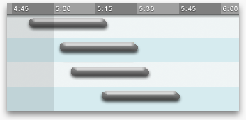
#For example, consider this train timetable:
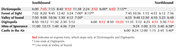
#This design may be adequate for commuters, whose questions mostly concern when trains arrive at stations. But train system operators have a different set of questions: Where exactly are the trains at any given time? How fast are they moving? Where do two trains cross? (They better not be on the same track at that point!) Where are the trains at the start of the day, and where do they end up at night? If a train is delayed, how do all these answers change? Like some of the software questions above, these questions seem very difficult to answer. But consider this revised timetable design:
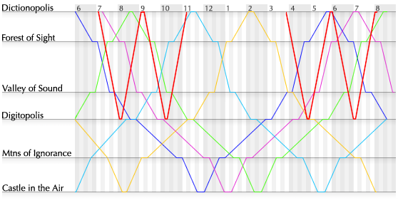
#Each train is represented by a distinctly-colored line, with distance along the track plotted vertically and time horizontally. The slope of the line represents the train’s direction and speed; horizontal sections are stops. This graphic incorporates no more data than the previous one, yet all of the operators’ questions are answered at a glance. Important features such as crossings are emphasizedsimply because the eye is naturally drawn toward line intersections. Footnotes are unnecessary; the exceptions are no longer exceptional when seen in context. Should a train be delayed, all revised stops and crossings can be “calculated” simply by drawing a new line.** Graphical train timetables date from the late 1800s. For the origin of this and other classic graphical forms, see Howard Wainer’s book Graphic Discovery (2005).
#Compared to excellent ink-and-paper designs, most current software communicates deplorably. This is a problem of surface, but not a superficial problem. The main cause, I believe, is that many software designers feel they are designing a machine. Their foremost concern is behavior—what the software does. They start by asking: What functions must the software perform? What commands must it accept? What parameters can be adjusted? (In the case of websites: What pages must there be? How are they linked together? What are the dynamic features?) These designers start by specifying functionality, but the essence of information software is the presentation.
#It must be mentioned that there is a radically alternative approach for information software—games. Playing is essentially learning throughstructured manipulation—exploration and practice instead of pedagogic presentation. Despite the enormous potential for mainstream software, accidents of history and fashion have relegated games to the entertainment bin, and the stigma of immaturity is tough to overcome. (The situation is similar for graphic novels.) Raph Koster’s Theory of Fun for Game Design (2004) and James Paul Gee’sWhat Video Games Have To Teach Us About Learning and Literacy (2003) deal directly with games as learning tools. Salen and Zimmerman’s Rules of Play (2003) and Chris Crawford’s Art of Interactive Design (2003) and Chris Crawford on Game Design (2003) discuss learning through play in a broader context.I suggest that the design of information software should be approached initially and primarily as a graphic design project. The foremost concern should be appearance—what and how information is presented. The designer should ask: What is relevant information? What questions will the viewer ask? What situations will she want to compare? What decision is she trying to make? How can the data be presented most effectively? How can the visual vocabulary and techniques of graphic design be employed to direct the user’s eyes to the solution? The designer must start by considering what the software looks like, because the user is using it to learn, and she learns by looking at it.
#Instead of dismissing ink-and-paper design as a relic of a previous century, the software designer should consider it a baseline. If information software can’t present its data at least as well as a piece of paper, how have we progressed?
Demonstration: Showing the data
#Edward Tufte’s first rule of statistical graphic design is, “Show the data.” All information graphics, statistical or not, must present the viewer with enough information to answer her questions. It seems that many software designers, in their focus on functionality, forget to actually present the data.
#Consider the information presented when searching a popular online bookstore.** Based on amazon.com as of January 2006.
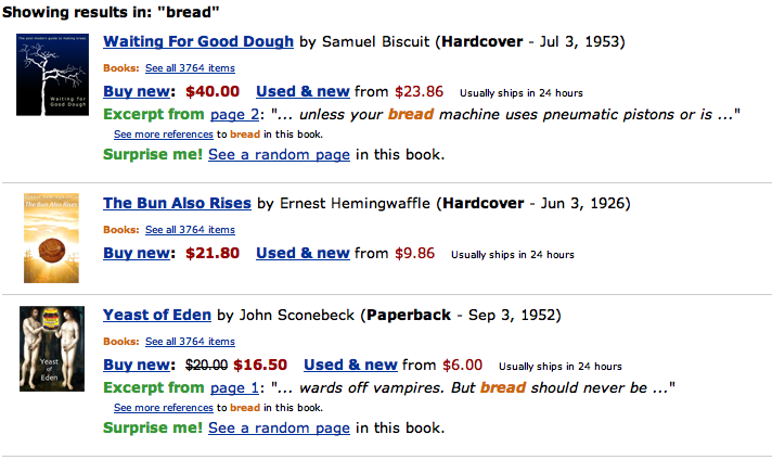
#There are a number of graphic design criticisms one could make—the uniform text size and weight results in a solid, oppressive mass; the abundance of saturated primary colors gives a distracting, carnival-like appearance; the text is spread all over the page, giving the eye no well-defined path to follow. However, the most egregious problem is simply that there is not enough information to make any sort of decision.
#The user’s goal is to find the best book about some particular topic. Given that the books shown are presumably related to this topic, what questions does the user have?
- Is the book appropriate? That is, what is it about, and do I care?
- Is the book good? That is, what did other people think of it, and do I trust them?
#The answers will be used to compare the available books, and decide upon one to follow up on and possibly buy.
#Unfortunately, these questions are completely unaddressed by the information provided. To see relevant information, the user must click on each listing individually. That is, she must navigate byhand instead of by eye, and must use her memory to compare information across time instead ofspace.
#The problem is that this graphic was designed as an index into a set of webpages, but is used as acatalog for comparing a set of books. The purpose of this graphic should not be to return a list of query matches, but to help the user learn about books related to her topic of interest.
#Consider this redesign:
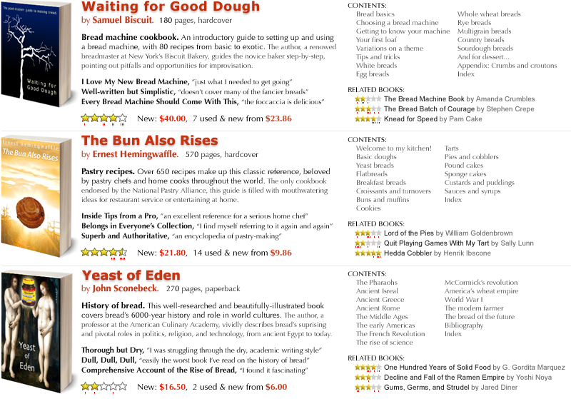
#Is a book appropriate? A synopsis and table of contents give an overview of the book’s contents. Is a book good? A rating and reviews indicate popular opinion. Because all of this information is on a single page, it can be compared by eye, with no need for memory.
#The standard 5-star rating system is information-weak—it gives only an average. It can be enhanced with whiskers underneath that indicate the distribution of ratings. This allows the viewer to differentiate between a book that was unanimously judged middling  and one that was loved and hated
  —these are both 3-star ratings, but have very different meanings. The viewer can also see whether a highly-rated book got any bad reviews; in a sea of praise, criticism often makes enlightening reading. As a whole, the whiskers give a visual indication of the number of ratings, which reflects the trustworthiness of the average. The whiskers are unobtrusive, and can easily be ignored by viewers who don’t care about distribution.
# Text weight and color is used to emphasize important information and call it out when skimming. Text in grey can be read when focused upon, but disappears as background texture when skimming. All critical information is contained in a column with the width of an eyespan, with a picture to the left and supplementary information to the right. The viewer can thus run her eye vertically down this column; when she spots something interesting, she will slow down and explore horizontally.
#The user wants to see books related to a topic in her head. But ideas in the head are nebulous things, and may not translate perfectly to a concrete search term. For this reason, a mini-list of related books is provided for each book.  This is similar to a “related words” section in a thesaurus listing—it allows the user to correct a near miss, or veer off in a tangential but intriguing direction.
#Conventional software designers will worry about functionality—how does the user interact with this graphic? Clearly, other than the “related books” listing, a click anywhere in a book’s section should reveal details and purchasing options. What else could the user mean by clicking? It’s analogous to pulling the book off a physical shelf.
#This is a significant redesign over the original; yet, I consider it a conservative one. A more ambitious design could surely show even more data, perhaps allowing the user to browse within the book or fully explore the space of related books. A world of possibilities opens up with a simple change of mindset. This is not a list of search results—it is an information graphic. It is for learning.
Demonstration: Arranging the data
#Just as important as what data is shown is where it is shown. Unlike the words in a paragraph, the elements in a graphic can be deliberately placed to encourage spatial reasoning. Unfortunately, most software graphics are arranged to maximize aesthetics, not to bring out useful relationships in the data. (That is, when any skilled thought is given to appearance at all.)
#Consider this excerpt of a graphic for browsing nearby movie showings:** Based on movies.yahoo.com as of January 2006.
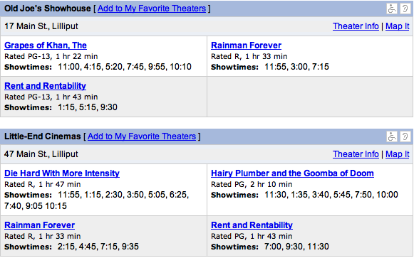
#If a person is in the mood for a movie, what questions might she have?
- What movies are showing today, at which times?
- What movies are showing around a particular time?
- Where are they showing?
- What are they about?
- Are they good?
#The user will use the answers to compare the available movie showings and decide upon one to go see.
#Although the above graphic clearly has an information deficiency (What are these movies about? Are they good?), the worst problem is that the data is not arranged in any useful manner. Understanding which movies are playing when involves scanning a pageful of theaters, extracting movies of interest and mentally merging their showtimes. A viewer’s eye might leap erratically around the screen as she compares showtimes of a given movie at six theaters, trying to find the one that best fits her dinner plans.
#The primary question is, “What movies are showing today, at which times?” Given the two spatial dimensions available to us, this should suggest a graphic with movies along one axis and times along the other.
#Consider this redesign:
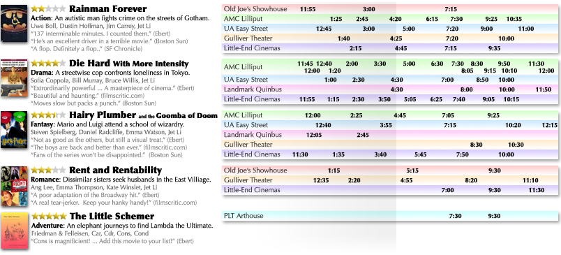
#As with the bookstore redesign, enough information is given about each movie to determine its content and quality, although films have enough external marketing that the intent is more to remindthan introduce. Text weight is again employed to make critical information stand out and supplementary information disappear until focused upon.
#More interesting is the chart on the right, which plots movie showings by time. To find all movie showings around a particular time, the viewer simply scans her eye vertically down the page. If she is only interested in a particular movie, she looks only within that movie’s range. The current time is indicated by shading the past, providing a springboard for the viewer’s eye; in this example, it is about 4:45.
#The original design grouped movies by theater; this redesign groups theaters by movie.** I assume that Yahoo! simply mimicked the newspapers, and newspapers arrange by theater for business reasons. The assumption is that the viewer would rather see a particular movie at any theater than any movie at a particular theater. However, to ease correlation of the various movies offered at a given theater, each theater is color-coded. If the viewer prefers to avoid the Gulliver Theater because of sticky floors, the consistent yellow background may help her filter out its showtimes.
#No theater addresses are shown. The viewer is likely to be familiar with the theaters in her area, and if she isn’t, a simple address would be useless without a map or directions. Presumably, a mouse click or hover over a theater’s name would reveal this information, or perhaps it could be displayed elsewhere on the page.
#This demonstration and the previous one have attempted to illustrate the power of approaching information software as graphic design, instead of as styling the regurgitation of a database. To design excellent software, however, this mindset is necessary but insufficient. Something major is missing.
#Very little in the above designs is software-specific. For the most part, the designs would work almost as well on paper. Modern magic shouldn’t merely match our ancient technology—it should surpass it. We’ve seen how graphic design can improve software, but how can software improve graphic design?
#The answer lies with context.
![]()
Context-sensitive information graphics
#Print has one supreme flaw: ink is indelible. An ink-and-paper design is static—it must display all its data, all the time. However, a reader typically only cares about a subset relevant to her current situation. The designer is faced with the challenge of organizing the data so that hopefully mutually-relevant subsets are grouped together, and the reader has the challenge of visually or physically navigating through the entire data space to find the group of interest.
#For example, a rider consulting a bus schedule must comb through a matrix of times and stations to find the single relevant data point—the time of the next bus.** And then, she must consult her watch and do some arithmetic to calculate the information she actually cares about—how long she will be waiting. Any driver who’s been lost in an unfamiliar city knows the frustration of locating the immediate vicinity on a roadmap. And a reader consulting an encyclopedia must not only find the right entry on the page and the right page in the book, but even the right book on the shelf! These are consequences of static graphics. Because ink is permanent, the reader must navigate through lots of paper.
#The modern computer system provides the first visual medium in history to overcome this restriction. Software can:
- infer the context in which its data is needed,
- winnow the data to exclude the irrelevant, and
- generate a graphic which directly addresses the present needs.
#Liberating us from the permanence of publication is the undersung crux of the computer—the dynamic display screen. Its pixels are magic ink—capable of absorbing their context and reflecting a unique story for every reader. And the components surrounding the display—CPU, storage, network, input devices—are its peripherals for inferring context.
#Information software design, then, is the design of context-sensitive information graphics. Unlike conventional graphics, which must be suitable for any reader in any situation, a context-sensitive graphic incorporates who the user is and what exactly the user wants to learn at the moment. Context allows software to winnow its data space to the subset of information that the user cares about, and present the data in such a way that the user’s current questions can best be answered.
#All information software consists of context-sensitive graphics, whether the designer realizes it or not. For example, the list of query results from an internet search engine is a context-sensitive information graphic. The software’s data space consists of all the websites in the world. This is winnowed down to a dozen, using context that is inferred entirely from the search term contributed by the user.** Clicking a “next” button contributes further context—dissatisfaction with the first set of results. Despite its enormous data space, this software restricts itself to a meager scrap of context, impersonal and imprecise.
#There are, in fact, three sources from which software can infer context:
- Environment involves sensing the current state of the world.
- History involves remembering the past.
- Interaction involves soliciting input from the user.
Inferring context from the environment
#A person determines her surroundings through the five human senses. Software doesn’t operate in a vacuum, either; through connections to hardware and other software, it can sense much about the user’s situation. Some examples of context clues in the software’s environment include:
-
#Date and time. Time is one of the fundamental dimensions along which we organize our lives, and in any data space with a temporal dimension, “now” is almost always the prime landmark. Because users often seek information on demand, information related to “now” or “soon” is often the most relevant. Fortunately, every general-purpose computer knows when “now” is. A person using a software bus schedule, for example, should never have to hunt for the next bus.
-
#Geographical location. Similarly, the most interesting spatial landmark is usually “here.” Unfortunately, this currently can be harder to determine automatically, but the payoff is enormous.** I believe that location is such vital context, Powerbooks should come withGPS receivers pre-installed, with an easy software API. Developers would then write software to take advantage of it, and other computer makers would follow suit. Someday, a computer without GPS might seem as silly as a computer without a clock. Obviously, a software roadmap needs to know the user’s location, but so does the bus schedule, as well as business listings, transportation planners, travel guides, and much other information software.
-
#Physical environment. Given a time and location, many details of the physical environment, such as the weather, are just a network connection away. Consider a travel guide that suggests parks when sunny and museums when rainy.
-
#Other information software, such as open websites. By reading some information, the user is indicating a topic of interest. All other information software should take heed. Consider a person reading the website of an upcoming stage play. When she opens her calendar, the available showings should be marked. When she opens a map, she should see directions to the playhouse. When she opens a restaurant guide, she should see listings nearby, and unless the play offers matinees, they shouldn’t be lunch joints.
-
#Documents created with manipulation software. Creating some information indicates an even stronger topic of interest. Consider a person who requests information about “cats” while writing a paper. If the paper’s title is “Types and Treatment of Animal Cancer,” the information should skew toward feline medical data. The title “History of Egypt” indicates interest in ancient feline worship instead. And if the paper contains terms related to building construction, “cats” probably refers to the decidedly non-feline Caterpillar heavy machinery.** This example is from Budzik and Hammond’s paper User Interactions with Everyday Applications as Context for Just-in-time Information Access(2000).
-
#Email. Names, addresses, and phone numbers in recent email clearly constitute valuable hints. A recipient who opens a calendar should find the sender’s schedule juxtaposed with her own. When she opens a map, addresses in the email should be marked. But beyond that, recent correspondence can indicate current activities, and an email archive as a whole can describe the user’s characteristics and interests. Consider a person who requests information about “racing.” The fields of running, bicycles, and cars have distinct sets of terminology; if one set regularly shows up in the person’s conversations, “racing” isn’t so ambiguous.
#All software lives within an environment, rich with evidence of context. Using software that doesn’t look outside itself is like conversing with a blind person—constantly describing what is plainly visible.** Some of the suggestions given here may seem daunting (or infeasible) to an engineer. Implementation will be discussed later in the paper.
#On the other hand, the power of the environment is multiplied when it is correlated with the past—that is, when the software makes use of history.
Inferring context from history
#A human doesn’t just use her senses to recognize her situation; she also uses memories of past situations. Software, too, can use its memory to understand the present. The current context, or a good approximation, can often be predicted from a history of past environments and interactions.
#Last-value predictors represent the simplest form of prediction. They simply predict the current context to be the same as the previous one. This is reasonable in many situations where the user’s context is fairly static, changing slowly over the short term. For example, if yesterday, the user looked for one-bedroom apartments in North Berkeley, she is is probably still interested in one-bedroom apartments in North Berkeley today. If nothing else, the software should present this information immediately, without asking for details.
#Last-value prediction is frequently thought of and implemented as manipulation of explicit state—that is, the context is a persistent object that remains as is unless changed by the user, so the software always appears as the user left it.** The engineering challenge then becomes merely persisting across invocations of the program. Often, not even this is bothered with. This stateful conceptual model mimics physical reality, and can be comfortable if the user cares enough about the software’s state to keep her own mental state in sync. However, this is often not the case with information software, especially software that is consulted intermittently. (If you put down a newspaper for a few hours, you won’t be distressed to find it on a different page when you return. You probably won’t even notice. On the other hand, you would be delighted if you often came back to find it on exactly the page you wanted to read.) By thinking of this as context prediction instead of state maintenance, the door is opened to more sophisticated predictors.
#Learning predictors attempt a deeper understanding of the user. They construct a model to explain past contexts, and use the inferred relationships to predict the current context.
#One simple approach to learning is to discover a common attribute of recent contexts, and narrow the current context along that attribute’s dimension. For example, in a music library, as the user chooses several bluegrass songs in a row, the software can graphically emphasize other songs in this genre. With further confidence, it might consider de-emphasizing or omitting songs outside of the genre. As another example, consider a user who requests information about “Lightwave,” then about “Bryce,” then “Blender.” These terms have many meanings individually, but as a group they are clearly names of 3D rendering software packages. A subsequent search for “Maya,” another 3D package, should not display information about the ancient civilization. In fact, information about Maya could be presented automatically.
#Another simple approach is to establish the user’s velocity through the data space. If a person asks a travel guide about the Grand Canyon on one day, and Las Vegas the next day, the following day the software might suggest attractions around Los Angeles.** A better travel guide would suggest skipping Los Angeles.
#In general, the problem is one of inferring a pattern that explains the user’s interests as a function of the environment, and extrapolating along the pattern to classify the current environment. As an example of general pattern modeling, consider a person who, as a byproduct of traveling to work, always checks the train schedule from Berkeley to San Francisco in the morning, and San Francisco to Berkeley in the evening. If the software can discover and model this pattern, it can present the appropriate information at each time without the user having to request it. When she looks in the morning, she sees by default the San Francisco-bound schedule; in the evening, the Berkeley-bound schedule.** Again, this may sound daunting to an engineer. Implementation will be discussed later in the paper.
#Large histories can enable some very sophisticated predictors, especially if it is possible to reach into the environment and correlate with other users’ histories. For example, by asking their users to rate each movie they return, Netflix is able to infer some enormously valuable context—each user’s taste. This allows them to winnow an enormous dataset (their catalog of movies) down to a dozen data points (movies the user hasn’t seen, which were enjoyed by people with similar taste), which can be presented in a single, navigation-free graphic. The winnowing is impressively on-target—two-thirds of users’ selections come from recommendations.** Laurie J. Flynn, Like This? You’ll Hate That. New York Times, Jan. 23, 2006. TiVo similarly uses a collaborative predictor to infer which television programs the user would be interested in. These are presented on a “suggestions” page, and recorded automatically when possible.** For technical details, see Ali and van Stam’s paper TiVo: Making Show Recommendations Using a Distributed Collaborative Filtering Architecture(2004).
#Amazon, iTunes, and an increasing number of other online retailers are currently incorporating similar schemes. However, with the exception of the lowly junk-mail filter, non-retail information software that learns from history is still rare. Typically, users can only hope for last-value prediction, if that. Most software wakes up each day with a fresh case of amnesia.
#Unfortunately, software that doesn’t learn from history dooms users to repeat it. And repeat it they will—tediously explaining their context, mouse click by mouse click, keystroke by keystroke, wasted hour by wasted hour. This is called interactivity.
![]()
Interactivity considered harmful
#Chris Crawford defines interaction as a three-phase reciprocal process, isomorphic to a conversation: an interactant listens to her partner, thinks about what was said, and speaks a response. Her partner then does the same.** See Crawford’s book The Art of Interactive Design (2003), or his essayFundamentals of Interactivity (1993). For manipulation software, interaction is perfectly suitable: the user views a visual representation of the model, considers what to manipulate next, and performs a manipulation. The software, in turn, inputs the user’s manipulation request, updates the model, and displays the updated representation. With good feedback and an effective means of “speaking” to the software, this process can cycle smoothly and rapidly. It mimics the experience of working with a physical tool.
#Information software, by contrast, mimics the experience of reading, not working. It is used for achieving an understanding—constructing a model within the mind. Thus, the user must listen to the software and think about what it says… but any manipulation happens mentally.** Except possibly for signaling a decision, such as clicking a “buy” button, but that concludes, notconstitutes, a session. The only reason to complete the full interaction cycle and speak is to explicitly provide some context that the software can’t otherwise infer—that is, to indicate a relevant subset of information. For information software, all interaction is essentially navigation around a data space.
#For example, Amazon’s data space consists of their catalog of items. For a yellow pages directory, the data space contains all business listings; for a movie guide, all showtimes and movie information; for a flight planner, trips to and from all airports. In all of these cases, every interaction, every click and keystroke, search term and menu selection, simply serves to adjust the user’s view into the data space. This is simply navigation.
#Alan Cooper defines excise in this context as a cognitive or physical penalty for using a tool—effort demanded by the tool that is not directly in pursuit of a goal. For example, filling a gas tank is done to support the car, not the goal of arriving at a destination. Cooper goes on to assert that software navigation is nothing but excise:
#…the most important thing to realize about navigation is that, in almost all cases, it represents pure excise, or something close to it. Except in games where the goal is to navigate successfully through a maze of obstacles, navigation through software does not meet user goals, needs, or desires. Unnecessary or difficult navigation thus becomes a major frustration to users. In fact, it is the authors’ opinion that poorly designed navigation presents the number-one problem in the design of any software application or system…** Alan Cooper and Robert Reimann,About Face (2003), p143.
#If all interaction is navigation, and navigation is the number-one software problem, interactivity is looking pretty bad already. However, when compared with the other two sources of context, interactivity has even worse problems than simply being a frustrating waste of time:
-
#The user has to already know what she wants in order to ask for it. Software that infers from history and the environment can proactively offer potentially relevant information that the user wouldn’t otherwise know to ask for. Purely interactive software forces the user to make the first move.
-
#The user has to know how to ask. That is, she must learn to manipulate a machine. Donald Norman’s concept of determining a user’s “mental model” has become widespread in the software usability community, and is now considered a core design challenge.** See Donald Norman’s book The Design of Everyday Things (2002), p9. However, Norman described this concept in the context of mechanical devices. It only applies to software if the software actually contains hidden mechanisms that the user must model. A low-interaction, non-mechanical information graphic relieves both user and designer from struggling with mental models.
-
#Navigation implies state. Software that can be navigated is software in which the user can get lost. The more navigation, the more corners to get stuck in. The more manipulable state, the more ways to wander into a “bad mode.” State is the primary reason people fear computers—stateful things can be broken.** The only state kept by a book is which page it is open to, which is why “getting lost in a book” describes apleasurable experience!
#Beyond these cognitive problems are physical disadvantages of interaction. The hand is much slower than the eye. Licklider described spending hours plotting graphs and seconds understanding them. A user who must manually request information is in a similar situation—given the mismatch between mousing and reading speeds, most of her time may be spent navigating, not learning. Further, the user might prefer to learn information while using her hands for other purposes, such as writing or eating or stroking a cat. Each time software demands the user’s hands, this activity must be interrupted. Finally, the growing prevalence of computer-related repetitive stress injuries suggests that indiscriminate interactivity may be considerably harmful in a literal, physical sense.
#Unless it is enjoyable or educational in and of itself, interaction is an essentially negative aspect of information software. There is a net positive benefit if it significantly expands the range of questions the user can ask, or improves the ease of locating answers, but there may be other roads to that benefit. As suggested by the above redesigns of the train timetable, bookstore, and movie listings, many questions can be answered simply through clever, information-rich graphic design. Interaction should be used judiciously and sparingly, only when the environment and history provide insufficient context to construct an acceptable graphic.
#It is unfortunate that the communities concerned with human factors of electronic artifacts have latched onto the term “interaction.”** Most professional communities and academic programs use the term Human-Computer Interaction, or HCI; the ACM special-interest group is CHI, the converse. Many practitioners, following Cooper and Bill Moggridge, refer to their profession as “interaction design.” For information software, the real issue is context-sensitivity.Interaction is merely one means of achieving that. And as long as “speaking” is constrained to awkwardly pushing metaphors with a mouse, interaction should be the last resort.
#The working designer might protest that interaction is unavoidable in practice, and may even consider my ideal of interaction-free software to be a scoff-worthy fantasy. This is only because the alternatives have been unrecognized and underdeveloped. I believe that with the invention of new context-sensitive graphical forms and research into obtaining and using environment and history, the clicking and dragging that characterizes modern information retrieval will be made to seem laughably archaic. But every condonation of “interactivity,” from the annals of academia to the corporate buzzvocabulary, postpones this future.
Reducing interaction
#When the user is forced to interact, the software assumes the form of manipulation software. The external model, manipulated through navigation, is the software’s model of the context. 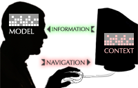 However, unlike genuine manipulation software, the user does not care about this model—it is merely a means to the end of seeing relevant information.
#The designer’s goal is to let the user adequately shape the context model with as little manipulation as possible. Assuming that graphic design, history, and the environment have been taken as far as they will go, there are a few techniques that can lessen the impact of the remaining interaction:
- Graphical manipulation domains present the context model in an appropriate, informative setting.
- Relative navigation lets the user correct the model, not construct it.
- Tight feedback loops let the user stop manipulating when she’s close enough.
#Graphical manipulation. Command-line systems are criticized for forcing the user to learn the computer’s language. Modern GUIs may be easier to use, but they are not much different in that respect. The GUI language consists of a grammar of menus, buttons, and checkboxes, each labeled with a vocabulary of generally decontextualized short phrases. The user “speaks” by selecting from a tiny, discrete vocabulary within an entirely fixed grammatical structure—a bizarre pidgin unlike any human language, unexpressive and unnatural.** One might wonder what Sapir and Whorf would conclude.
#As an alternative, consider a child describing his toy at “Show and Tell”:** From Scott McCloud’s bookUnderstanding Comics (1994), p138.
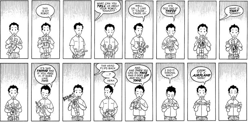
#Because the child’s “telling” skills are underdeveloped, he communicates complex concepts throughshowing. Similarly, a GUI’s stunted grammar makes telling tedious, but software’s dynamic display is ideal for showing. A user can specify context by pointing somewhere on an information graphic and saying, “There!”
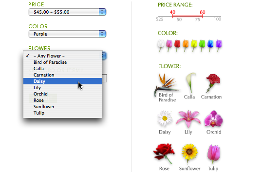
#Two of the most fundamental context dimensions are where and when. For millennia, people have described these concepts with specialized information graphics. But much modern software abandons this tradition, as seen on the website of a popular moving company:** Based on uhaul.com as of January 2006.
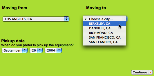
#These drop-down menus are awkward and uninformative. Geographical locations belong on maps, and dates belong on calendars. Consider this redesign:
#Even this is not ideal. Locations and dates should be chosen from the user’sown map and calendar. But until platforms that enable such a thing are widespread, software can at least provide temporary ones.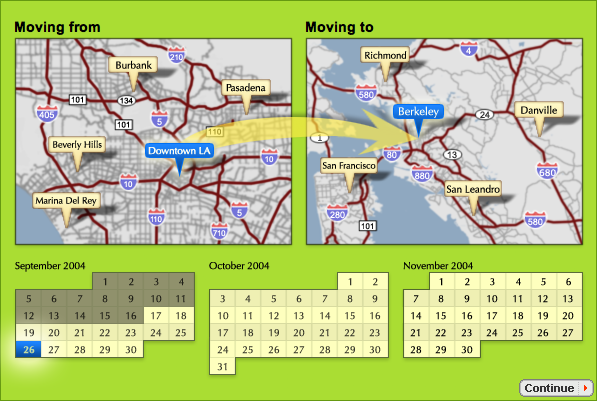
#As an example of more application-specific context, a prominent online flower shop lets the user narrow the view via a set of drop-down menus.** Based on teleflora.com as of January 2006. Compare it with a simple visually-oriented redesign:
#Many types of context can be naturally expressed in some informative graphical domain, relieving the user from manipulating information-free general-purpose controls. Several more examples will be given in the case study below.
#Relative navigation. If the software properly infers as much as possible from history and the environment, it should be able to produce at least a reasonable starting point for the context model. Most of the user’s interaction will then consist of correcting (or confirming) the software’s predictions. This is generally less stressful than constructing the entire context from scratch.
#For example, Google Maps offers both absolute navigation (typing in an address) and relative navigation (panning and zooming the current map). However, it initially displays by default the entire continent; this effectively demands that the user type in an absolute location to get started.** The user can manually specify an initial location, but she will presumably set this to her home. Ironically, her own neighborhood is the least likely place she’ll need mapped. A better design might start at the last place the user looked (last-value prediction), with a nearby list of locations predicted by history (recently visited or manually bookmarked) and the environment (addresses extracted from email, open websites, and calendar software). A reasonable starting point would almost always be a click away, and from there, the user could use relative navigation (dragging and zooming) or simply “navigate” by eye if the graphic is detailed enough.Conceptually, a prediction list might itself be considered relative navigation, as a set of “shortcuts” through the data space.
#An even better design would recognize the prediction list as information software in its own right, and would take steps to show the data (such as annotating the predictions with driving times to and from common locations, taking current traffic conditions into account) and arrange the data (perhaps spatially arranging the predictions on their own map). This might answer most of the user’s questions without any interaction at all.
#Tight feedback loops. Salen and Zimmerman offer a game design perspective on a principle that is crucial for all interactive software:
#If you shoot an asteroid while playing a computer game and the asteroid does not change in any way, you are not going to know if you actually hit it or not. If you do not receive feedback that indicates you are on the right track, the action you took will have very little meaning. On the other hand, if you shoot an asteroid and you hear the sound of impact, or the asteroid shudders violently, or it explodes (or all three!) then the game has effectively communicated the outcome of your action.** Katie Salen and Eric Zimmerman,Rules of Play (2003), p35.
#This principle is universal. If the user clicks a checkbox and nothing happens, her action is rendered ambiguous or even meaningless. She cannot evaluate a response and let it guide her next action. In terms of Crawford’s conversation metaphor, the software is failing to speak back—she is shouting into the wind.
#For information software in particular, all interaction specifies context. Thus, each interaction can and should result in a discernible change to a context-sensitive information graphic. Providing immediate feedback reduces the amount of manipulation the user must do before either reaching an adequate view or recognizing a wrong turn and backtracking.
#Any web form with a “submit” button or dialog box with an “accept” button fails this point. Google Maps offers reasonable feedback during relative navigation, but none during absolute navigation, such as typing in an address. Even a simple predictive auto-complete would be helpful, but consider the possibilities suggested by Ben Fry’s zipdecode applet. (First click “zoom” in the lower-right, then type in numbers.) Imagine honing in on familiar areas simply by typing the first few digits of a zip code—type “9” to immediately zoom into the US west coast, followed by “4” to zoom into the SF bay area and then “5” for the east bay. Because of the immediate feedback, the user can stop typing when she gets close enough, and use relative navigation from there.
How did we get here?
#Much current software is interaction-heavy and information-weak. I can think of a few reasons for this.
#First, our current UI paradigm was invented in a different technological era. The initial Macintosh, for example, had no network, no mass storage, and little inter-program communication. Thus, it knew little of its environment beyond the date and time, and memory was too precious to record significanthistory. Interaction was all it had, so that’s what its designers used. And because the computer didn’t have much to inform anyone of, most of the software at the time was manipulation software—magic versions of the typewriter, easel, and ledger-book. Twenty years and an internet explosion later, software has much more to say, but an inadequate language with which to say it.** Make no mistake, I revere GUIpioneers such as Alan Kay and Bill Atkinson, but they were inventing rules for a different game. Today, their windows and menus are like buggy whips on a car. (Although Alan Kay clearly foresaw today’s technological environment, even in the mid-’70s. See “A Simple Vision of the Future” in his fascinating Early History of Smalltalk (1993).)
#A second reason why modern software is dominated by mechanical metaphors is that, for the people who create software, the computer is a machine. The programmer lives in manipulation mode; she drives her computer as if it were a car. Thus, she inadvertently produces software that must be operated like a machine, even if it is used as a newspaper or book. Worse, the people who design platforms and GUI toolkits are even more prone to this perspective, since they work at a lower level. The application software designer is then almost forced into a mechanical model by the design environment.** Apple’s Interface Builder, for example, makes it simple to place buttons, sliders, and blocks of text. Dynamic graphics, the cornerstone of information software, must be tediously programmed with low-level constructs.
#Even software that starts out information-rich and interaction-simple tends to accumulate wasteful manipulation as features are added over successive versions. It’s easier on both the designer and the programmer to plug in another menu item and dialog box than to redesign a dynamic graphic, and sometimes it’s justified as a less jarring change for the user. After ten versions, the software can grow into a monstrosity, with the user spending more time pulling down menus than studying and learning information.
#Software doesn’t have to be this way, but the solution will require a significant re-thinking of both the design process and the engineering platforms. After a detailed case study of one recent design, I will discuss what’s needed to usher in the information software revolution.
![]()
Case study: Train schedules
#I recently created a program for planning trips on BART, the San Francisco bay area subway system, in the form of a “Dashboard widget” (mini-application) for the Apple Macintosh.
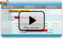
#The design has clearly been successful. Even though the target audience is fairly small (SF bay area public transportation riders with the latest Mac OS and knowledge of how to customize it), user feedback has been wildly enthusiastic, and the widget received the 2007 Apple Design Award, as well as Macworld magazine’s rare perfect  rating. If you are unfamiliar with the widget, you can watch a one-minute demo movie:
#As information software, the widget was approached primarily as a graphic design project. I will discuss how its design exemplifies the viewpoints in this paper, and also point out where it falls short and could be improved.** The widget originally inspired this paper, not vice-versa. Thus, the widget does not reflect new ideas conceived while writing this. (Yet!) I will also compare it to the trip planner on the official BART website, which follows the typical mechanical paradigm of drop-down menus, “submit” button, and table of results.
#The BART widget was designed around three classical forms of graphical communication: the timeline, the map, and the sentence.
Showing the data
#Information software allows the user to ask and answer questions, make comparisons, and draw conclusions. In the case of trip planning, some questions are:
- When is the next train leaving? How long is that from now?
- When is that train arriving? How long is that from now?
- Which line is that train on?
- Does that trip have a transfer? If so, when, where, and for how long?
- What about the train after that? And after that?
- How frequently do the trains come?
- What about trains around 7:00 am on Tuesday?
#Users use the answers to compare the available trips, and draw a conclusion about which to take. Naturally, it must be possible for that conclusion to take the form of a plan: “Which train will I take? I will take the 7:32 train.” However, the plan then becomes a mental burden on the user. A good design would also allow for a series of quick boolean conclusions over time: “Should I start walking to the station now? No… no… no… okay, let’s go.”
#The choice of graphical representation depends on what sort of data space is left after context-based winnowing. What context can be inferred?
#The user is expecting to leave around a particular time; thus, the graphic can exclude trips outside of some narrow time window. Furthermore, the most common time is “soon”; thus, the software can initially assume that the time window is “the near future.” Also, notice that all of the questions implicitly refer to a single route—a particular origin and destination pair. That is, the user wants to compare trips along the time dimension, but not the space dimensions. Thus, the graphic need only concern itself with a single route, which we last-value predict to be “the same as last time.”** A learning predictor for the route is presented later in the paper.
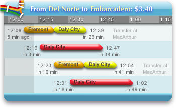
#After winnowing the data, we are left with a handful of trips—ordered, overlapping spans of time. We need a graphical construct that allows the viewer to compare the start, end, and length of each span. A natural choice is a time bar graph, which allows for important qualitative comparisons at a glance: When does each span start and end? How long is each span? How close together are they?The time bar graph may have been invented by proto-chemist Joseph Priestly in 1765 to compare thelifespans of various historical figures. Priestly’s chart inspired William Playfair to invent the modern statistical bar graph. Howard Wainer claims to have uncovered a bar graph from 3000 years earlier, plotting population changes in the tribes of Isreal after the exodus. See Graphic Discovery (2005), p18.
#The most important context, the current time, can be emphasized by shading the past. The most important data point, the next train, can be emphasized by keeping it in a constant location, the second row. This answers the most important qualitative questions: Is the next train coming soon? Did I just miss a train? For an experienced viewer, the conclusive question, “Should I start walking to the station now?”, can be answered literally at a glance.
#The graphic can then be unobtrusively annotated with quantitative information, so closer inspection answers all of the questions precisely:
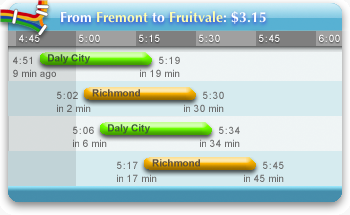
#Transfers can be regarded as segmentation of the overall trip. The question that must be answered exactly is where to transfer. The questions of when and how long should be answered qualitatively; the exact times would be irrelevant clutter.** A better design would probably place the transfer station name closer to the graphical representation of the transfer, instead of over to the side.
#And that’s about it. Although there clearly is more to the widget than this, most of the “user experience” is represented by the picture above. That is, this software is normally “used” by simplylooking at it, with no interaction whatsoever. In contradiction to the premise of interaction design, this software is at its best when acting non-interactively.
#Accordingly, all interactive mechanisms—the buttons and bookmarks list—are hidden when the mouse pointer is outside the widget. Unless the user deliberately wants to interact with it, the widget appears as a pure information graphic with no manipulative clutter.** Tufte uses the term “administrative debris.”
#Of course, if the predicted context is wrong, the user must interact to correct it. This involves navigation in the usual two dimensions, time and space.
Navigating through time
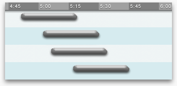
#The widget initially assumes a time window of “the near future.”** This window changes over time, of course. The widget naturally stays in sync, always displaying relevant information. A button to manually “refresh” the display would be almost obscenely mechanical. There are two cases in which this context is incorrect:
- The user wants to see even later trips.
- The user wants to plan for some other time entirely.
#Relative navigation. To see earlier or later trips, the user can simply drag the graphic around. A cursor change suggests this, as well as a brief message when the widget is first started.** 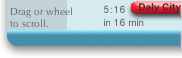 The mouse scrollwheel and keyboard arrow keys also serve to navigate through time. The “underlying” graphic is infinite—the user can scroll forever. Thus, a GUI scrollbar would be inappropriate.
#Absolute navigation. To plan around an arbitrary time, the user clicks a button to reveal the hours of the day, from morning to night, laid out linearly. The user can then click anywhere on the mechanism to jump to that time.
![]()
#The mechanism’s labeling is intentionally vague, so the user will click approximately in the right area, and then continue to drag left or right until the correct information is displayed on the chart of train schedules. This forces the user to keep her eyes on the information graphic, instead of wasting effort precisely manipulating the navigation mechanism.** This is the same concept suggested by the Google Maps prediction list above. Instead of precise, tedious absolute navigation, offer quick ballpark navigation, followed by relative navigation in a tight feedback loop. Unlike the time of day, the predicted date (today) is probably close—few people plan subway trips weeks in advance. Thus, the date control is relative.
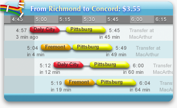
Navigating through space
#The assumed context includes where the user is coming from and where she is going. The assumption is “the same as last time”; that is, this appears as explicit state. There are three cases for which the context is incorrect.
#The most common case is that the user is making a round trip, and wants to come home. The “reverse route” button serves this case.** A better design could probably eliminate this interaction with a predictor as described above (and implemented below), or a graphic that somehow incorporates both directions at once.
![]()
#The second case is that the user is making a common trip, and knows exactly where she wants to go. The bookmarks feature serves this case. When the user clicks the heart button  , the trip is added to a bookmarks list. From then on, that trip and its reverse can be selected with a click. No manipulation is needed to bring up the bookmarks list—it slides out when the mouse is over the widget.** A better design might further reduce interaction by annotating each bookmarked trip with its next depart time. In many cases, that would eliminate the need to even click on the bookmark. Another improvement would be to automatically infer “bookmarks” from recent trips or environmental clues.
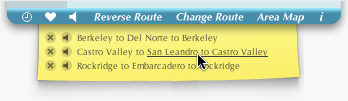
#The most interesting case is the least common, but the most stressful for the user—selection of an unfamiliar station. The user needs information to decide which station to travel to; thus, this can be approached as an information software problem in itself. Some questions the user might have:
- Where are the stations?
- What are the lines?
- What order are the stations on a particular line?
- Which stations are near a particular area?
#These questions involve orientation and navigation in a physical two-dimensional space. The standard graphical device for this situation is the map. The map allows the user to ask and answer the above questions, make comparisons among the available stations, and decide which station she’s looking for.This map courtesy of newmediasoup.
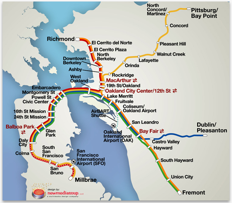
#Once the user has decided, she must indicate her selection to the software. This manipulation can be done in the same graphical domain as the information. “From” and “To” markers appear directly on the map; these are dragged to the desired station. Instead of having to name the station, the user effectively points at the map and says, “There!” Although it is less important in this case, the feedback loop remains tight; the train chart updates as the markers are moved.** Widgets are expected to have a small screen footprint, which is why the map can be hidden. Ideally, the map would always be visible. A better design might then overlay dynamic information on the map, such as the positions of the trains and arrival times at stations.
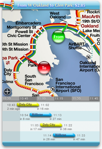
Configuring notifications
#Instead of the user continually asking “Should I start walking to the station now?”, she might prefer the software to notify her directly: “Start walking to the station now!” Audio works well for infrequent, asynchronous notifications. The widget can speak announcements of upcoming trains. (Hear asample.)Vocal announcements were originally a semi-hidden Easter Egg, but they got enough of a user response that they were moved up to first-class feature.
#The design challenge is allowing the user to express if and when she wants announcements. For example, if the user is about ready to go home and it’s a twelve-minute walk to the BART station, she would want the software to announce trains departing in twelve minutes. But if she’s meeting a friend at the station, she would want to hear about trains arriving in twelve minutes. Normally, of course, she doesn’t want to hear anything at all.
#A typical design would use a preference dialog or form that the user would manipulate to tell the software what to do. However, an information design approach starts with the converse—thesoftware must explain to the user what it will do. It must graphically express the current configuration.
#For presenting abstract, non-comparative information such as this, an excellent graphical element is simply a concise sentence.** Chris Crawford discusses the relative merits of pictorial and textual representation in his essayRepresentation Versus Depiction(1994).

#As with the map, once the information graphic is established, manipulation can be incorporated. In this case, some words are colored red, and the user can click on these words to change them.** Numerical and time parameters transform into edit controls when clicked—the idea for this was inspired by Jeremy Ruston’s wonderfulTiddlyWiki.
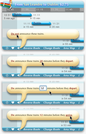
#The user always sees the software presenting information, instead of herself instructing the software. If the information presented is wrong, the user corrects it in place. There is no “OK” or confirmation button—the sentence always represents the current configuration. The graphic fades out when the mouse is clicked outside of it or the mouse leaves the widget.
#This approach scales well to more complex configuration. The widget allows spoken announcements to be associated with a bookmark and a particular time. This is useful for daily trips, such as to and from work. The user thinks, “It takes me 15 minutes to drive to BART, it takes ten minutes to walk from the station to work, and I have to be at work by 8.” This graphic represents her thought precisely, as well the trip home:
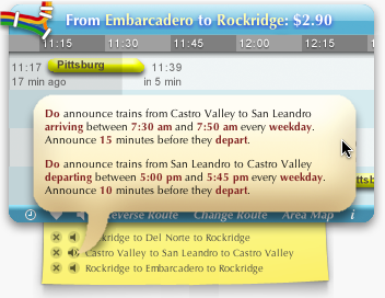
#Sentence-based configuration scales so well because parameters are given meaning by the surrounding textual context, which can itself consist of other parameters. A typical configuration dialog box attempts to express each parameter in isolation, resulting in intimidating (or bewildering) verbosity:** Some people claim that no interface can be fundamentally more “intuitive” than another, because intuition is simply a result of familiarity. But surely these people were parsing and producing complete sentences long before they could manage a dialog box. The human brain actually does have some hard-wiring.
#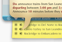 Some additional graphical touches help bring the design together. The sentence is contained within a cartoon speech bubble which, beyond simply looking cute, implies that the activity pertains to speech, and points via the tail to the button which spawned it and the trip to which it refers. More importantly, if a voice announcement is activated, the button’s icon changes to an active speaker.
  This avoids a “hidden mode” problem by providing a clear visual indication of where the voice is coming from and how to turn it off.
Comparison
#The trip planner on the official BART website refuses to divulge any information whatsoever without a sequence of menu selections and a button-push.** Based on bart.gov as of January 2006.
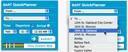
#Because the BART system is two-dimensional, no linear arrangement of the stations can convey useful information. Instead, the stations are listed alphabetically, but because many stations go by several names (“Berkeley” or “Downtown Berkeley”? “Oakland City Center / 12th St.,” “City Center / 12 St.,” or “12th St”?) the selection is difficult even for those familiar with the system. The user can click a link to see a map, but the map graphic is static; the selection must be made through drop-down menus. Information and navigation are completely segregated, and the feedback loop is enormous.
#The results screen shows no useful information at a glance:
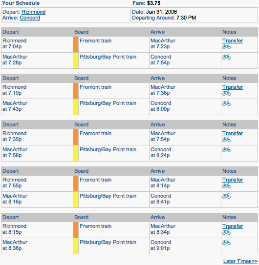
#The starting and ending stations, always the same, clutter the results. Transfers are treated as two separate trips, and the relevant times (the start and end of the entire trip) are in opposite corners, with distracting clutter in between. Not only does the information not stay in sync with the current time, there is no relative time information at all. Other than a “later times” link (which leads to a page with only an “earlier times” link!) navigation through time or space requires hitting the back button and working a drop-down menu.
#For all its interactivity, the information here is sparse, poorly presented, and hard to get to. Yet, this sort of design is so typical of software on all platforms, it has almost become an accepted norm. For many people, this is “how computers work.”
Conclusion
#Ironically, the BART widget appears so fresh because its underlying ideas are so old. The time bar graph was invented about 250 years ago. The map and the written sentence are both about 5000 years old. They are beautiful, venerable forms of visual communication. The bugs have been worked out. They are universally, intuitively understood.
#The pulldown menu, the checkbox, and the bureaucracy-inspired text entry form were invented 25 years ago, desperation devices to counter inadequate technology. They were created for a world that no longer exists.
#Twenty-five years from now, no one will be clicking on drop-down menus, but everyone will still be pointing at maps and correcting each others’ sentences. It’s fundamental. Good information software reflects how humans, not computers, deal with information.
Demonstration: Trip planning redux
#BART’s official planner is somewhat of a straw man, since BART has little competitive pressure to provide a quality website. The airline industry, on the other hand, has every incentive to give customers a smooth decision-making experience. However, planning a trip through the sky is almost identical to planning one underground.** This example is based onsouthwest.com as of January 2006, but I checked ten other airline websites and found them (almost eerily) similar.
#First, a mechanical, information-free configuration screen:
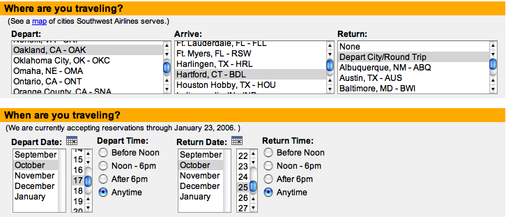
#Followed by a table of textual results:
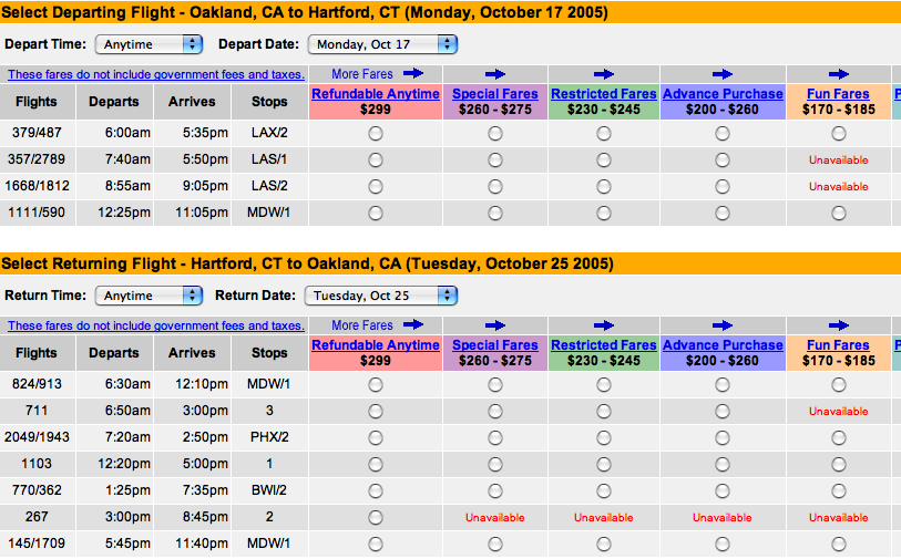
#The actual information is squeezed into a few columns on the left, with most of the screen a monument to Southwest’s intricately stratified pricing structure. (Additional columns to the right are not shown.)
#What questions might a user have?
- What cities does this airline fly out of? Where are they?
- What flights are available on the days I want to travel?
- When do they depart and arrive?
- How long are they? (This can get confusing across time zones.)
- How many stops are there? How many transfers?
#Consider this redesign:
#The times and lengths of the flights, and the count, times, and lengths of stops and transfers, can be compared visually. Trips without transfers stand out because they are entirely blue; non-stop flights would appear unbroken. Anomalies, such as the 6:50 from Hartford which arrives later than the 7:20, stand out literally. Times can be converted into either time zone simply by referencing the appropriate header bar.
#There is some attempt to use color symbolically. On the map, the calendar, and the flight chart, green represents “home,” and yellow the destination. However, it is not critical that the user notice this.
#Interaction is simplified to the point where a short, instructive sentence can describe each and every click. At the most, the user will click twice on the map, drag across the calendar, and click twice on the ticket prices, possibly with some page scrolling. Last-value prediction (automatically selecting the last route purchased, and displaying a list of recent trips) may eliminate or reduce the map clicks for many travelers. A learning predictor, capable of inferring that the user always spends the first Monday through Friday of the month in Baltimore and selecting that range on the calendar automatically, could eliminate all context-establishing interaction, leaving only the decision-conveying interaction of clicking ticket prices. Of course, since everything is on the same page and feedback loops are tight, the user can explore different dates and cities, and see the available flights immediately.
#With air travel in a slump for the past few years, airlines have been desperate for any passengers they can get. Unsuccessful ones have even faced bankruptcy. With so much at stake, why hasn’t any airline attempted to improve the ticket-buying experience through better software design?
#The problem is primarily cultural. Asking “Why doesn’t Southwest design better software?” is challenging the symptom, not the disease. The real question is, “Does software design exist yet?” Before we can expect better airline websites, we may need to change a worldview.
![]()
Designing the information software revolution
#Mass production of machines emerged at the start of the 20th century. Henry Ford’s assembly line methods spread throughout the manufacturing world, dramatically lowering production costs and making a variety of machines affordable for the average person. But many of these products were unpleasant to interact with. Between the businessman’s specifications and the engineer’s implementation, there was no design. Within a few decades, a new profession arose to fill the gap—industrial design.
#The next revolution in the mass production of machines was software. The late 1970s saw the rise of the personal computer, a device capable of behaving as any machine—typewriter, adding machine, filing cabinet, arcade game—when given the right instructions. Manufacturing a “machine” was now just a matter of printing its instructions onto a disk, and production costs plummeted. But much of this software was unpleasant to interact with. Between the businessman’s specifications and the engineer’s implementation, there was no design. Within a couple decades, a new profession arose to fill the gap—interaction design.
#The mass production of information has a very different history than the mass production of machines. Industrial design brought art to existing mass-produced technology, but printing brought mass-producing technology to an existing art.
#Before the 15th century, books were precious and extremely rare, for each had to be copied by hand. A single book might cost as much as a farm. Books were also exquisite works of art, carefully lettered in calligraphy, lavishly illustrated and decorated. In the 1440s, Johann Gutenberg’s movable type press boosted book production over a thousand-fold, making books affordable (and literacy worthwhile, and political awareness possible) for the average person for the first time. Fortunately, Gutenberg and contemporary printers were exceptionally devoted to the art form, and took great pains to preserve the quality of the hand-lettered page.** Gutenberg’s emulation of calligraphy was so accurate, his bibles were sold as handmade manuscripts in Paris. When people noticed the quantity and similarity of the books, they did not suspect printing, but witchcraft! See Philip Meggs’s superb History of Graphic Design (2005). The explosion of new books of all kinds, as well as the rise of the broadside (precursor to the poster and the newspaper), created a great demand for artists in the new medium, many of whom transitioned from the old medium. The art of laying out a page eventually became known as graphic design.
#The next revolution in the mass production of information was the web. Unlike early printers, unfortunately, early web technologists cared little for the artistic qualities of their predecessor, but the capabilities eventually evolved to approximate the printed page on the computer screen. Publishing was now just a matter of sending bits through a wire. The explosion of websites created a great demand for artists in the new medium, many of whom transitioned from the old medium. The art of laying out a webpage became known as web design.For related historical allegories, see Peter Drucker’s fascinating essay The Next Information Revolution (1998).
#These parallel evolutions have produced designers for interactive machines (conventional software) and designers for static page layouts (conventional websites). From this viewpoint, the chimeric effects of convergence are almost to be expected. The emerging “interactive web” embraces a ludicrously mixed metaphor of machines on pages, a monstrous hybrid of virtual mechanical affordances printed on virtual paper. Information is trapped behind interactive mechanisms andpresented in static layouts—it is the worst of both worlds.
#Good context-sensitive information graphics are neither interactive nor static, neither machines nor page layouts. Design has not evolved to produce them. The culture is blind to the possibilities.
#Who will draw information software? And how?
#The first step toward the information software revolution is widespread recognition of the need for design. It must be universally understood that information software is not a machine, but a medium for visual communication, and both publishers and public must hold it to the same standards that they hold print. People constantly settle for ugly, clunky software, but demand informative, professionally-designed books, newspapers, magazines, and—ironically—brochures, ads, and manuals for that very software.** As brochures have become websites, this duality has veered into absurdity: “Let’s design beautiful software to sell our ugly software!” The wrapper tastes better than the candy. Though once justified by technological limitations, this double standard is now dangerously obsolete. It is the first and largest obstacle to revolution. Without consumer demand, design appears to give no return on investment.
#Prominent usability pundits have claimed that the public is becoming more discriminating, but since this claim underlies their consultancies’ sales pitch, it is far from an unbiased observation. I see the opposite—as technology races ahead, people are tolerating increasingly worse design just to use it. The most beautifully-designed DVD player will go unsold if the competition costs the same and has S-Video output, or plays MP3s from memory sticks. Good design makes people happy, but feature count makes people pay.
#I don’t know the solution to cultivating a culture of good taste, but I believe lessons can be learned from the emergence of industrial design, about seventy years ago.** See the chapter “Through the Back Door” in Henry Dreyfuss’s recently rereleased autobiography Designing for People (1955). At a time when many products competed on ornamentation, the simplified, functional creations of industrial designers were too untraditional to sell on looks alone. The salesman made inroads by directly touting the tangible benefits of good design, such as comfort and safety. He would demonstrate to a homemaker how his vacuum cleaner or iron was designed to reduce fatigue and cramping. He would demonstrate to a farmer how his machinery was designed to eliminate the finger-severing accidents that were, to that point, distressingly common. Explicitly informed of the benefits, people gradually came to demand, then expect, such conscientious design in their everyday products.
#Other factors that boosted industrial design were fashion (top designers were promoted as celebrities) and price (good design often loweredmanufacturing and materials costs). See Raymond Loewy’s autobiographyIndustrial Design (1979). Both factors can be applied to software.Today, software consumers demand technological features because software marketing presentsfeatures. Consumers ignore design because marketing ignores design. The cycle is vicious, but perhaps vulnerable too—some brilliant new software with engineering, design, and marketing all in sync may raise the bar for everyone.
#The second step toward the information software revolution is finding people with talent for visual communication. Currently, almost all software is designed by people who are very comfortable with computers; their interest in technology motivated them to enter the field. This suggests an enormous exclusion of potential talent—imagine if all graphic designers had to be comfortable running a print shop!** One might argue that the entire next generation will be comfortable with computers. But comfort with today’s “computers” may prove irrelevant—who can say what a “computer” will be in twenty years? It is better to look for interest and talent in communicating with people, not with technology, since people don’t change nearly as fast. I believe that ideal candidates for software design are those who have achieved mastery of information graphics in other mediums. There may be multitudes of artists, currently drawing business graphics or maps or comics, who could excel at information software design if they had any idea that it was a legitimate artistic field. Recent years have brought a wealth of beautiful amateur websites, created by visually-oriented people dabbling in the only sort of software design accessible to them. But because full-fledged software is seen as an artifact of arcane technology, a product of “programmers,” these people lack the confidence to consider life beyond HTML.
#The third step is complementing the designer’s talent with skill. Skill is achieved through educationand practice, but dearth of the former has given aspiring designers no entry point—they are expected to learn the art through osmosis and guesswork. Effective education can entail any, but ideally all, of: classes, books, and examples.
-
#Classes. The renowned Art Center College of Design in Pasadena offers forty courses in industrial design. Students learn art theory, draftsmanship, and visual communication theory. They learn about form, and the visual and tactile properties and constraints of materials. They learn about cognitive and behavioral psychology, and explore how users experience products. They follow the entire production process: researching the needs of the target markets; sketching ideas and proposals; drawing detailed renderings; designing virtual 3D models; constructing physical models out of clay, plastic, and fiberglass; constructing a functional mechanical solution; designing logos and retail packaging. They learn to devise artistic solutions to problems, to think creatively and think critically, to invent concepts and critique those of others. They interact with industry representatives and do team projects under corporate sponsorship.
#Art Center offers only five courses that could be somewhat related to information software.** All five use “interactive” as a synonym for “software”: Interactive Structures, Information and Interactivity, Branding and Interactivity, Interactive Design 1, andInteractive Design 2. The intent of this example is not to malign Art Center’s curriculum, but to demonstrate the lack of resources for the aspiring software designer.For the most part, students learn to make websites. There is nowhere near the breadth or depth offered to designers of physical products. Art Center clearly knows how to put together an applied arts curriculum. What’s missing is the understanding of software as an applied art.
#There are other schools that offer specializations in “information architecture,” “usability,” and other recently-coined areas, but these subjects approach software design from a scientific perspective, neglecting the essentially artistic aspect of visual communication and the creative and critical techniques used by art schools for centuries. Experimental analysis can be valuable, but only if an artist has created a design worth analyzing.
-
#Books. Information software design will need a body of pedagogical literature, once enough theory is developed to make pedagogy possible. Until that point, the student has little recourse—the closest established areas, information graphic design and “user interface design,” are both severely underserved.
#The paucity of literature on information graphic design is bewildering. Edward Tufte’s books are highly acclaimed, and deservedly so, but they almost win their titles by default. In a typical bookstore, they are lost amidst a sea of fashion rags masquerading as graphic design guides, or perhaps submerged in a “computer” section overflowing with the latest engineering fads. They have too little company to define a category.** Their best company is probably William Cleveland’s The Elements of Graphing Data and Visualizing Data. I doubt you will find either in a bookstore.
#The shortage of good books on user interface design is more understandable, since pedagogy requires a working paradigm—the status quo must be at least acceptable. Accordingly, I haven’t yet found a textbook that is at all helpful for software design; the only books I’ve found worthwhile are the few that challenge the status quo and present fresh, progressive ideas. For the field to progress, we need less recycled platitudes and more cutting-edge research.The industrial design literature, incidentally, seems to consist primarily of photographs of chairs. I don’t know what this means.
-
#Examples. In all artistic fields, from painting to writing to music to architecture, students study the works of the masters. (In fact, artists who claim to be “self-taught” usually mean that they learned purely from examples.) Much has been written about the failure of software engineering schools to provide examples of great works, expecting students to somehow derive style from first principles.** This is true in most other engineering disciplines as well, though less discussed. I can think of only one exception from my own schooling in electrical engineering—David Rutledge’s innovative introduction to analog electronics, taught through gradual construction and analysis of a commercial radio transceiver. Engineering study typically focuses on how something should be done, not how it has been done, to the detriment of the culture. Since software design isn’t yet recognized as an artistic field in the first place, its situation is even worse—the very concept of a gallery of software designs will seem absurd to most people. But a corpus is crucial for the development of any artistic field. Outstanding designs must be recognized, collected, and explicated. Furthermore, outstandingdesigners should be recognized and encouraged to teach, instead of hidden behind a corporate label.
#The fourth step is supplementing the designer’s talent and skill with tools and platforms. These two terms are vague in common usage. I will define a tool as a communication device that a designer has control over, and a platform as a communication device that a recipient is expected to provide. This is best demonstrated with Claude Shannon’s communication model:
* Adapted from Claude Shannon, A Mathematical Theory of Communication (1948), p2.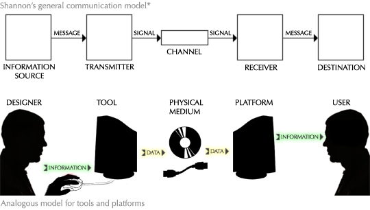
#A tool encodes mental information into physical data, which can travel in a physical medium. A platform decodes the physical data into the mind of the recipient. Because all information transfer short of telepathy requires some medium, this model is universal. If I write you a letter, my tools are pen and paper, and your platform is knowledge of my written language. If I broadcast a radio signal, my tools are a microphone and transmitter, and your platform is a radio receiver. In general, my tools are whatever I use to make the thing I hand off to you. Your platform is whatever I’m counting on you to already have.
#To deliver her message most effectively, the visual designer needs as much control as possible over what the viewer sees. But, by definition, the designer only has direct control over the tool. She is at the mercy of whatever platform implementation the recipient happens to supply. This implies that a good platform must be as simple and as general as possible.
-
#Simplicity. “I conclude that there are two ways of constructing a software design: One way is to make it so simple that there are obviously no deficiencies, and the other way is make it so complicated that there are no obvious deficiencies.” C.A.R. Hoare, The Emperor’s Old Clothes Turing Award lecture (1980), p81.From a practical (and historical) standpoint, we can assume that no complex specification will be implemented exactly. This, in itself, is not a problem. However, multiple, decentralized implementations of a complex specification will be incorrect in different ways. A platform consisting of the union of all possible implementations is thus arbitrarilyunreliable—the designer can have no assurance of what a recipient actually receives. For a platform to be reliable, it must either have a single implementation, or be so utterly simple that it can be implemented uniformly. If we assume a practical need for open, freely implementable standards, the only option is simplicity.** POSIX, Java, and newer web standards (DOM, CSS) are some attempts at universal platforms (for various domains) that have proven too complex to implement uniformly. In each case, the power of the platform is effectively constricted to some simple, reliable subset, and enormous time is wasted designing around incompatibilities. By contrast, JPEG, MP3, and modern CPU instruction sets are universally dependable, because much of the complexity is placed at the encoding tool, not the decoding platform. (Almost a century ago, a similar justification was used to reject single-sideband public radio.) The complex Perl and Flash platforms are dependable only because they have centralized implementations.
-
#Generality. If we think of a computer as a machine that runs software, then in some sense, all data handled by a computer platform must be “software.” The data making up a JPEG image, for example, can be thought of as the encoding of a program that describes a picture. (This is sometimes called the “data is code” equivalence.) But the limitations of the JPEG platform result in severely lobotomized “programs”—they cannot animate, respond to context, incorporate new compression techniques, or otherwise take any advantage of the computerbeyond what JPEG explicitly allows. A crippled platform cripples a designer’s means of expression.
#In order for a designer to take full advantage of the medium, a good platform must provide safe access to everything that is technologically possible. A platform for information software must offer: inputs from the environment (that is, communication with other software and physical sensors), from history (that is, storage), and from the user (that is, interaction); computational resources with which to respond to inputs; and unrestricted graphical output. Anything less robs information software of its full potential. The proper way to prevent destructive behavior is a well-designed security model, not arbitrarily amputating the computer’s capabilities.
#Alarmingly, the latest platforms forgo both of these virtues. CSS, a language for specifying visual appearance on the web, is a particularly egregious example. It is so complex that it has never been implemented correctly; yet, successive versions specify even more complexity. At the same time, it is so underpowered that many elementary graphic designs are impossible or prohibitively difficult, and context-sensitivity (or anything computational) must be addressed externally. Most CSS lore is dedicated to describing the tangles of brittle hacks needed to circumvent incompatibilities or approximate a desired appearance.
#One cause of the CSS mess is the eschewing of elegant, flexible abstractions for “1000 special cases,” a detrimental approach which precludes simplicity and generality in any domain. However, the larger and more germane fault is the language’s attempt to serve as both tool and platform, thereby succeeding as neither.
#For universal reliability, the ideal platform must be optimized for ease of implementation. For artistic expressiveness and exploration, a tool must be optimized for the designer’s manipulation. Thus, the tool and platform cannot be the same—we must expect a layer of translation between what the designer works with and what the platform interprets.** There is a direct analog with RISC computer processors, whose simplified instruction sets are targeted at compilers, not programmers. This considerably eases implementation of the processor, although the motive in this case is more performance than reliability.
#A simple and general platform shifts complexity to this translation layer—the tool’s “back end”—where the designer has control over it. If a particular tool is implemented incorrectly, the designer can work around its particular idiosyncrasies, or switch to a different tool. (It is much easier for a designer to switch or upgrade tools than for a sea of users to switch or upgrade platforms.) Meanwhile, the tool’s “front end”—that which the designer interacts with—can be simple or complex, general or domain-specific, according to the designer’s needs and skill level.
#The platform must make it possible to create information software. The tool must make it easy. A specific look at some tools and platforms for information software will be offered in the next few sections.
#The fifth and final step into the information software revolution is an environment where experimentation, evolution, and interplay of ideas can thrive. Much like our geological environment, a creative environment can become fatally polluted by short-sighted business interests.
#Before 1786, authors invariably presented quantitative data as tables of numbers. In this year, an economist named William Playfair published a book called The Commercial and Political Atlas.** Remarkable recent efforts have brought this classic back into print, asPlayfair’s Commercial and Political Atlas and Statistical Breviary (2005). In order to illustrate his economic arguments, Playfair single-handedly invented the line graph, the bar graph, and the pie chart, and thereby the entire field of statistical graphics. Within years, his inventions had spread across Europe, transforming the landscape of visual communications and heralding an age of discoveries in data made visible. Today, children take these graphical forms for granted; they seem as obvious and fundamental as written language.
#Imagine if Playfair had patented his invention and prosecuted his imitators, suppressing the crucial period of initial excitement and growth. Would we today be staring at tables of numbers, unable to apply our visual cortex to unlocking their patterns?
#This path is inevitable, for it is the path of all artistic media. Books, newspapers, and the static visual arts have already completed it, or almost so. Movies, television, and published music are struggling at step five, but completion is only a matter of time. For information software as well, it is only a matter of time. But a decade or a century?
#Of course, design is nothing without implementation. If information software is to consist of dynamic graphics that infer from history and the environment, it must be possible and easy to create such things. The following sections will discuss a design tool for dynamic graphics, and engineering approaches to inferring from history and the environment.
Designing a design tool
#Software tools for drawing static graphics or composing static animations have long been commonplace. But the designer who wants to create dynamic graphics—graphics whose properties are data-dependent—currently has two undesirable options:
-
#She can learn some sort of programming language. Many designers are intimidated by engineering and may lack the talent or desire to program. They are completely justified—drawing is a visual activity, and working with textual abstractions is entirely inappropriate. Painters, illustrators, and sculptors manipulate the artifact directly—there is no abstraction, and visual feedback is immediate. Would we have any of our great works of art if the creators had to work with “rectangle.width = 17” instead of visible brushstrokes?** Early music composers typically worked in silence, with pen and paper, and did not actually hear their compositions until they were presented to musicians. Composers who couldn’t handle this abstraction were belittled. With the growing popularity of the clavier and harpsichord, and then the piano, it became acceptable for composers to hear their creations as they composed. Most of our classical masterpieces were composed in this way. Today, not only is every composer expected to work at an instrument, illiteracy is even becoming acceptable!
-
#Alternately, a designer can draw a series of mockups, snapshots of how the graphic should look for various data sets, and present these to an engineer along with a verbal description of what they mean. The engineer, who is skilled in manipulating textual abstractions, then implements the behavior with a programming language. This results in ridiculously large feedback loops—seeing the effect of a change might take a day instead of a second. It involves coordination and communication between at least two people, and requires that the designerjustify herself—she must convince the engineer and possibly layers of management that each change is worth the engineer’s time. This is no environment for creative exploration.
#There is nothing wrong with the concept of drawing mockups. It is a natural, visual way to work, and is ubiquitous across many artistic disciplines, from architecture to industrial design. The problem lies with engineering the behavior the mockups describe. But, consider what exactly the engineer does. From a set of mockups, the engineer infers the pattern they conform to—how the graphic changes as a function of the data—and codifies this inferred pattern in a computer program.
#Is a human really necessary? Couldn’t this pattern be inferred by a software tool instead?
#Going down this path leads to a computer science discipline known as “programming by demonstration” (PBD) or “programming by example.”** See Allen Cypher (ed.), Watch What I Do (1993, available online) and Henry Lieberman (ed.), Your Wish Is My Command (2001). Both are compendia of research projects, not textbooks. This field is concerned with teaching behavior to a computer implicitly, through a series of examples, rather than with explicit instructions. Researchers have created systems (with varying degrees of success) for constructing interactive GUIwidgets, defining parameterized graphical shapes, moving and renaming files, performing regular expression-like text transformation, and other domain-specific tasks. With these systems, the user typically performs a few iterations of a repetitive task manually, and the system then performs the rest according to an inferred generalization, perhaps asking for clarification or confirmation.
#This section outlines a hypothetical but plausible tool to allow designers to create dynamic data-dependent graphics with no conventional programming. These dynamic graphics would serve as the user-facing visible representation of information software. In a sense, this is a tool for “drawing information software.”
#The tool can be considered an extension of a conventional vector-oriented drawing program.** Popular examples of drawing tools are Adobe Illustrator and Macromedia Flash. The necessary feature is the representation of graphical elements as objects with variable properties, rather than as arrays of pixels. Using the same drawing process as with a conventional tool, the designer draws a mockup of the graphic—how the graphic should look for some particular set of data. She then takes a snapshot of this graphic, and indicates the data set that it corresponds to. She then modifies the graphic to correspond to a slightly different data set, takes another snapshot, and so on. Each snapshot serves as an example. With well-chosen examples, the tool will infer how to generate a graphic for arbitrary data.The concept of snapshots may have been introduced by David Kurlander’sChimera (1991), which used common features in a set of snapshots to infer constraints while drawing a static graphic.
#This tool is significantly less ambitious than many in the literature, for several reasons:
- Many systems use “programming by demonstration” as a means toward end-user programming, typically to allow novices to automate repetitive tasks. This tool is intended for professional designers with specialized skills and training, and thus can assume a higher level of user sophistication.
- Many systems attempt to infer a full computational procedure, and have the most difficulty with computational concepts such as conditionals and iteration. As we will see, this tool mostly has to infer mappings from some set or numerical range to another—functions in themathematical sense rather than the (imperative) computational sense. This may be significantly easier.
- Similarly, many systems attempt to infer stateful programs. This introduces enormous complexity, because the user must teach an output that depends on both the input and a potentially large hidden state. A graphic is stateless; its appearance is only a function of the input data. Examples require no context.
#Demonstration. I will demonstrate how we might use this tool to design the BART widget described above.
#Train component. We start by modeling a single train bar.  This graphic has a number of dynamic aspects: position, length, color, and label. For now, we will just handle the color and label. We draw a picture, take a snapshot, and indicate the data properties that it corresponds to:
![]()
#This is what a Train should look like if the “Line” property is “Orange” and the “Destination” property is “Fremont.” With only a single example, of course, the tool cannot infer anything dynamic. Let’s teach it how to change the label.
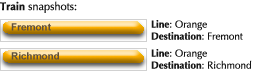
#Compare these two snapshots. The graphics are exactly the same, except a label has changed from “Fremont” to “Richmond.” The data is exactly the same, except the “Destination” property has changed from “Fremont” to “Richmond.” The simplest inference is that the “Destination” property should be used as the label text. The tool will learn and use this rule, provided no other example contradicts it.
#We now teach the tool how to respond to the “Line” property.
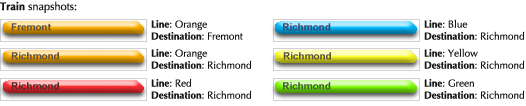
#The graphics in the new snapshots are exactly the same as the orange-line Richmond-bound example, except for hue adjustments. The data is exactly the same, except for the “Line” property. Thus, the tool infers that each given value of the “Line” property corresponds to a particular hue adjustment.
#At this point, the tool should understand how to draw a Train for any arbitrary data set, as long as “Line” is within the provided domain. (How we know that it has learned correctly will be discussed below.)
#If we want to clarify the model for posterity, we can add visual comments simply by drawing outside the snapshots:
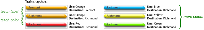
#When component. Now, we’ll model the time-related text that appears to the left and right of aTrain. ![]() We will use two data properties. “Now” refers to the current time, and “Time” refers to the start or end of the trip. Here are our first two snapshots:
We will use two data properties. “Now” refers to the current time, and “Time” refers to the start or end of the trip. Here are our first two snapshots:
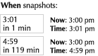
#In these examples, “Now” stays constant while “Time” varies. The tool will easily infer that the first row corresponds to “Time” (again, as long it doesn’t contradict further examples). The second row is more problematic. The tool infers linear relations when given two points, so our examples indicate this relation:
#The correct relation actually depends on “Now,” but we haven’t yet demonstrated variance with respect to “Now.” Our third snapshot does so:
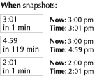
#The simplest non-trivial relation now depends on the difference between “Now” and “Time”, which is correct:** To understand how the tool might figure this out, let us take f(x,y) to be the number in the text label, and x and y to be our two data properties (here expressed as minutes since 3:00, although any units and origin will work). The three snapshots give us these constraints:
f(0,1) = 1
f(0,119) = 119
f(-60,-59) = 1
One of the simplest and most naturally-occurring functions of two variables is linear combination:
f(x,y) = ax + by + c
Solving for the coefficients gives us
a = -1, b = 1, c = 0
Because linear combination results in such simple coefficients, the tool will have high confidence in this inference, and will use it unless contradicted by some other example.
#Now, let’s teach the tool how to present larger time differences:
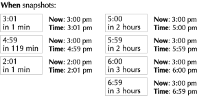
#This gives us the following relation, with interpolation in black and two possible extrapolations in red and blue.
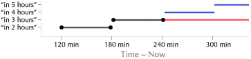
#The blue extrapolation is desired. The tool can probably infer it, since it results in an arguably simpler relation. (The red interpretation makes “in 2 hours” a special case, whereas the blue interpretation understands it as part of a general rule.) But if the tool infers incorrectly, the designer can easily correct it. (How so will be discussed below.)
#We now provide snapshots to cover earlier times.
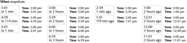
#Timeline component. Time extends infinitely; thus, the timeline is conceptually an infinitely-wide bar. Of course, only a portion of this bar is actually visible at any given instant. Dealing directly with infinite graphics will be discussed below. Here, I will demonstrate how this can be easily simulated with a normal graphic.
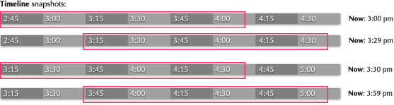
#The red box indicates the clipping region of the graphic. The section within the box is the portion that will actually be visible. These snapshots differ from each other in only two aspects: the position of the clipping region and the text labels. The inferred position of the clipping region is shown below as a function of “Now,” with the interpolation in black and extrapolation in blue:
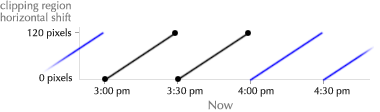
#Because the graph above is somewhat abstract, it may easier to view images of the Timeline itself (rotated sideways) as a function of “Now”:
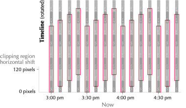
#We can see that the clipping region slides rightward with time, snapping back to the left on the half hour. The cyclic extrapolation can either be inferred by the tool or specified by the designer, as will be explained below.
#The first text label’s value as a function of “Now”:
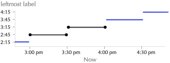
#That is, the text label is “rounded down” to a multiple of fifteen minutes. The rest of the labels will be inferred similarly. With a little thought, it is clear that this graphic, when cropped to the red rectangle, appears to scroll boundlessly with respect to “Now.”
#Row component. Next, we combine some of the components created above to form a compound component:
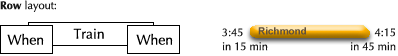
#Adjacent pairs of snapshots describe how to adjust, respectively, the end point of the Train, the start point of the Train, and the clipping region:
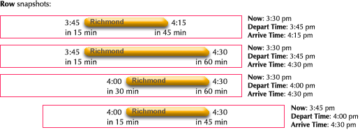
#Notice that adjustments were made within individual components. The length of the Train was changed, and the second When was right-justified.** Thus, modeled components are not black boxes, only adjustable through data properties, but can be modified at any level in the hierarchy. The tool allowed “Depart Time” to be explicitly linked to the first When’s “Time” property, and “Arrive Time” to the second, so these relationships did not need to be inferred. (These links are not shown here.)
#Title component. We are almost done. We have to put the title together:

#No inference is used here; we explicitly link the properties to the appropriate labels. (Again, not shown.)
#Trip Planner component. Finally, we are ready to lay out the top-level component. We draw the background picture and place the components created above.
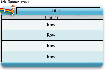
#Our final graphic and its data properties look like so:
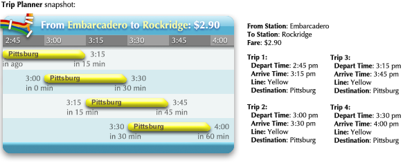
#No inference is used here. We explicitly link the top-level properties to the appropriate component properties.
#Our dynamic graphic is complete. The final program would consist of this graphic and a data source that fills in the properties. Of course, this small example does not entirely emulate the actual BARTwidget, but it is easy to see how additional features can added, simply with models and snapshots.** Except for animation, interaction, and state. It is also easy to see how a completely different design, such as the tables on the official BART website, could be composed on top of the exact same data source.
#Editing snapshots. The essence of this process is elimination of abstraction. The designer works with concrete, visible examples.
#However, this raises a concern about editing. An advantage of abstraction is that it localizes common properties, so widespread changes can be made with a single edit. What if the designer decides that aTrain should have square corners instead of rounded? Having to individually edit each of the snapshots is unacceptable—such a burden would squelch experimentation.
#Instead, the designer simply selects the snapshots she wants changed, and proceeds to edit one of them. The changes propagate to all selected snapshots. This is possible because the tool treats the snapshots as variations on a single graphic, rather than independent graphics.
#Editing curves. A more quantitatively-oriented designer may prefer to manipulate inferred relations directly. Mapping curves can be shown graphically, and the designer can move anchor points around, add new anchor points, and introduce curvature by stretching the interpolation curves. This allows for non-linear or nuanced behavior that would be difficult to specify purely with examples.
#The curves are an abstraction, but because it is purely visual, designers may find it comfortable. To lessen the abstraction, abundant concrete examples from along the curve are shown, and a designer can point anywhere in the plane to see an example that corresponds to that point.
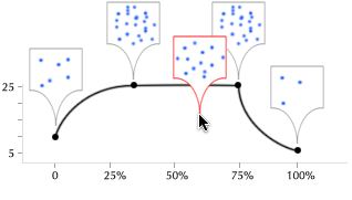
#Curve editing may also allow for better control over extrapolation:
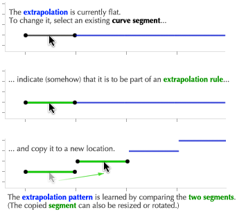
#In the above, we are essentially using “drawing by example” to specify the extrapolation curve.
#Feedback through examples. Conventional software engineers will be worried by the rampant ambiguity in this design process. In the demonstration above, the snapshots are visible but the inferred relations tying them together are not. How does a designer know if the tool’s understanding matches her own?
#Unlike a programmer typing into a text editor, the designer does not create these snapshots in isolation. The tool provides a design environment that actively communicates the dynamics of the graphic.
#One approach is for the tool to directly ask the designer about ambiguous cases. The tool can present the designer with a data set that would disambiguate an unclear relation, and the designer would then draw a snapshot for that particular data set. We might imagine the design process becoming inverted, driven by the tool—the designer would create a few representative examples, and then let the tool explicitly ask for all of the examples necessary to fill out the model.** There are a number of Programming By Demonstration research systems that take a similar interactive approach to disambiguation.
#However, visual art has traditionally been composed actively, not reactively, and this approach may feel unnatural and stifling. A more natural and information-oriented approach uses continuous peripheral feedback. The tool adorns the screen with an array of its own examples that represent the inference it currently understands. As the designer works, she can visually verify that the inferred relations are correct:
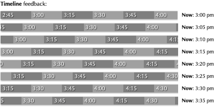
#The tool can graphically emphasize feedback examples according to how little confidence it has in them. If one is incorrect, the designer creates a new snapshot simply by clicking on it and correcting it.
#Feedback through curves. 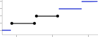 In addition to feedback through examples, the mapping curves described above also provide feedback. As the designer creates snapshots, she can see the inferred curves. If an inference is incorrect, she can either create more snapshots, or directly edit the curve (as long as the tool has correctly inferred which variables are involved in the mapping).
#If the tool feels an extrapolation is ambiguous, it can display all of the candidate extrapolations on the curve, and the designer can select one with a click:
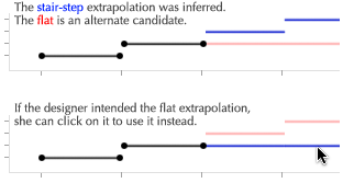
#Hints. If necessary, the designer can add hints to encourage the tool to prefer certain inferences. There are two types of hints: dependencies and constraints.
#A dependency hint suggests that a particular graphical aspect is related to a particular data property. The specific mapping between the two must be specified through examples or curves, but this hint tells the tool which variables are involved.
![]()
#A constraint hint suggests that a particular graphical aspect is related to some other graphical aspect.** Drawing with constraints is as old as drawing on computers—both originated with Ivan Sutherland’s seminalSketchpad (1963). Constrained drawing was further explored in a number of research projects (of note are David Kurlander’s Chimera (1991) and Michael Gleicher’s Briar (1993)) but has rarely appeared in general-purpose commercial tools.A “hard” constraint specifies an invariant relationship, such as two components that must always be aligned or parallel. In the example below, we ensure that the train cannot shrink smaller than the text label, by constraining the right edge of the train to lie to the right of the label:
![]()
#A “soft” constraint specifies a goal that should be fulfilled as well as possible, given the other constraints. The example below models a character whose eyes will watch the train, wherever it goes. The eyeball is hard-constrained to lie within the eye, and soft-constrained to move as close as possible to the train.
#Hints may allow a designer to specify complex relationships that would be difficult to describe purely through snapshots.
#Recursion. In the demonstration above, an infinitely-wide timeline bar was modeled by cyclicly panning over a finite graphic whose labels change on each cycle. This corresponds to the computational concept of iteration. An alternative for modeling infinite graphics is recursion. Consider this layout:** The approach shown here is precisely how infinite data structures are represented in lazy programming languages such as Haskell.
In fact, if we think of a component model as a function definition, and the placement of a component as a function call, this tool can be seen as an editor for an underlying functional “language.” Intriguing features include purity (evaluating a component has no side effects), laziness (components placed outside a clipping region need not be evaluated), and a combination of applicative evaluation (via mapping curves, whether explicit or inferred by the tool) and constraint-solving (via constraint hints). If we allow a component’s parameters (the function’s “arguments”) to themselves be dynamic graphics instead of merely text, and provide a means of graphically extracting part of a parameter and recursing on the rest, this language should be as expressive and powerful as any textual functional language.
![]()
#This Timeline component contains a Timeline component, shifted right by 100 pixels. The graphic now must be infinitely wide, because it is 100 pixels wider than itself. The tool draws this graphic by continuously “copying” the entire Timeline graphic, and “pasting” it into the yellow box:
#With each paste, the yellow box shifts over by 100 pixels, and the pasting could go on forever. Now, we edit the text labels in the first paste (indicated by red arrows):
![]()
#As we do so, the tool infers a linear relation between the top-level label (12:00) and the pasted one (12:30), and that relation is used to generate the labels in subsequent pastes (1:00, 1:30, etc.). That is, the tool learns to add a half hour each time it pastes. The result is a timeline whose labels increment forever.
#For the final component, we need just two snapshots, to show how “Now” should pan across the graphic:
#Some may claim that recursion is inappropriate for graphic designers. I would argue that recursion’s reputation for abstruseness is due to the textual abstractions used in mathematics and programming, and especially because expansion is rarely shown explicitly. I believe that, with training, any designer who appreciates MC Escher can learn to make powerful use of visual recursion.
#Insulation from engineering. One of the primary benefits of this tool is the freedom it gives designers in composing the appearance of information software. The engineer’s job is to create a data source, and possibly spot-optimize the tool’s inferences if any are prohibitively inefficient. Unless complex behavior is necessary, the engineer is completely uninvolved with graphical presentation, to the relief of both designer and engineer.
#For example, in the actual BART widget, the ending times become left-justified if the trip is too short:
![]()
#Excellent software is characterized by this sort of attention to detail. However, if a designer were torequest that this minor feature be implemented, she would probably be rebuffed by both engineer and management. This tool allows a perfectionist designer to add this feature on her own, just by taking a couple additional snapshots.** Implementation of the inferencing described here may involve algorithms that are unfamiliar to many engineers. Interested (or skeptical) engineers are encouraged to read the two machine learning books cited immediately below, as well as the two Programming By Demonstration books cited above.
Engineering inference from history
#The section “Inferring context from history” presented the need for software to learn from the past. Good information software will attempt to predict current context by discovering patterns in past contexts. Although such application software is rare, there is nothing novel or exotic about the algorithms required. The computer science discipline devoted to this subject is called “machine learning” or “learning systems,” and several decades of research have produced a variety of algorithms for modeling and predicting behavior.** Tom Mitchell’s book Machine Learning (1997) gives a good introductory overview to the basic algorithms. Russell and Norvig’s bookArtificial Intelligence: A Modern Approach (2003) covers learning within a much broader context, but is less focused and concise.
#Consider the example presented earlier of a train trip planner that predicts the route that the user wants to see. There are typically daily or weekly patterns to a person’s local travel schedule. A planner that models these patterns could automatically present the user with appropriate information, eliminating most interaction.
#As a demonstration, I implemented this behavior with the very simple probabilistic algorithm described below:** You can see the Lua source code for the algorithm and test simulator.
#History collection. Each time the user indicates interest in a particular route, it is recorded in a history with the date and time. 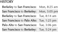 The user indicates interest either by explicitly switching the planner to display a route, or by looking at the planner and then looking away, indicating that the shown route is still interesting.
#Prediction. When the user looks at the planner, each history entry “votes” for its route with a certain weight, and the route with the largest total weight is displayed. Each entry’s weight is a product of three factors, which depend on the time, the day of the week, and the age of the history entry.
-
#
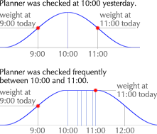 Time. If the time is 9:00, the user’s route at 9:10 yesterday is very relevant. What the user did at 10:00 is not quite so relevant, and her 12:00 activity is probably unrelated. Thus, each vote is weighted by a window around the time of the history entry.
#Typically, if the user is preparing to catch a train, she won’t just look once at the planner and memorize the time. She will glance at the planner frequently over a span of time. Each of these looks should not count as an individual vote. Instead, the entire span of checking is coalesced into a single history entry, with a widened time window. (Also, throughout these frequent check-ups, the user sees only last-value prediction. Learning prediction is only used if some time has passed since the previous look.)
-
#
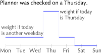 Day of the week. A user will typically exhibit a superposition of daily patterns, such as going to and from work, and weekly patterns, such as cello practice every Tuesday. To allow for both, history entries from a different weekday are allowed to vote, but have a smaller weight. The bleed across days allows the algorithm to learn daily patterns faster, but because other days are penalized, weekly patterns can be learned as well. Saturday and Sunday are independent from weekdays and from each other.
 -
#
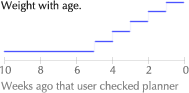 Age. Older history entries are given less weight, and eventually are forgotten. This makes the algorithm adaptive. If the user adopts a new pattern, such as switching jobs or joining the Thursday-night knitting circle, the algorithm is able to keep up, instead of having to be manually reset.
#Finally, the most recent route is given a bonus vote. This causes the algorithm to default to last-value prediction if there is no compelling reason to do otherwise.
#Results. I tested this algorithm with user models that simulate a variety of schedules. Various trade-offs are possible through choices of weights and window widths; the results below are intended to convey a qualitative idea of the algorithm’s performance.
#For a user who simply uses the planner to go to and from work, the algorithm learns the pattern flawlessly within a week. When the user switches schedules, the algorithm adapts within a couple weeks.** Of course, humans won’t check the planner at exactly the scheduled time, and neither does the model. The simulated times are normally distributed around the base time shown in the schedule, with a standard deviation of half an hour.
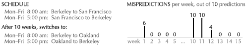
#More complicated schedules are also learned quickly and almost flawlessly.
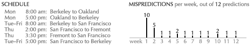
#Up to a certain level, random (unscheduled) behavior can be added without the algorithm losing the pattern.** This graph plots mispredictedscheduled views. Obviously, the random views are always mispredicted.
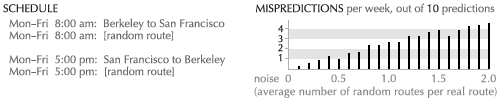
#In conclusion, it appears that this algorithm would successfully be able to infer the context of a regular user, allowing relevant information to be presented with little or no interaction.
#So what? As an ad-hoc solution to a particular problem, this algorithm seems to work quite well. As a general solution, it is no solution at all.
#This simple, understandable example was intended to demonstrate that learning prediction is not science fiction—it is a viable and powerful approach to context inference, one that every software designer must keep on her palette. However, the best learning algorithms are considerably more complex than this one. Currently, machine learning is considered an experts-only area, where the fruits of research are restricted to specialists. Implementing learning behavior typically involves calling in an expert, not assigning it to the application programmer.
#Unfortunately, an algorithm that can only be wielded by a master is almost worthless. There are far more applications than experts; if application programmers cannot make use of learning, learning applications will remain rare and exotic.
#This predicament has been overcome many times before. All software today performs an intricate dance of feeding a processor primitive machine-level instructions, repolarizing tiny magnets in hard drives, transmitting bits reliably across wires, and lighting up specific pixels on a screen. The algorithms behind these operations are unimaginably complex, requiring years of study. Yet, even novice programmers have no trouble with these operations. The complexity has been hidden behindabstractions.
#Programmers write to “files,” read from “sockets,” draw with “fonts” and “images,” and think in “programming languages.” Behind each abstraction are experts who devote their entire careers to their particular niche, following cutting-edge research and participating in the community. In front of the abstractions are armies of application programmers, blessedly able to take all this for granted.Without these abstractions, our modern software landscape simply wouldn’t exist.
#As I see it, the primary challenge for the machine learning community is not the generation and tuning of yet more algorithms, but the design of simple abstractions. Learning magic must bepackaged. Like a “file,” the abstraction must be usable by any engineer working in any domain. It must be so simple that it can be taken for granted.
#Today, a Perl programmer needs just four letters to invoke decades of research into filesystems and physical media: “open.” A finely-tuned mergesort is available with the word “sort,” and even more finely-tuned hashing algorithms require just a pair of brackets. Until machine learning is as accessible and effortless as typing the word “learn,” it will never become widespread.
#One small step for trip planners gets mankind nowhere.
Engineering inference from the environment
#Other information software, such as open websites. By reading some information, the user is indicating a topic of interest. All other information software should take heed. Consider a person reading the website of an upcoming stage play. When she opens her calendar, the available showings should be marked. When she opens a map, she should see directions to the playhouse. When she opens a restaurant guide, she should see listings nearby, and unless the play offers matinees, they shouldn’t be lunch joints.
Documents created with manipulation software. Creatingsome information indicates an even stronger topic of interest. Consider a person who requests information about “cats” while writing a paper. If the paper’s title is “Types and Treatment of Animal Cancer,” the information should skew toward feline medical data. The title “History of Egypt” indicates interest in ancient feline worship instead. And if the paper contains terms related to building construction, “cats” probably refers to the decidedly non-feline Caterpillar heavy machinery.The section “Inferring context from the environment” presented a number of environmental sources from which information software could infer context. The hardware-related sources, such as clocks and location sensors, might have seemed obvious. The software-related sources, such as other information software and documents created with manipulation software, might have seemed so far-fetched as to be implausible. This section will present the information ecosystem, a software architecture which might allow for such behavior.
#Consider this scenario:
-
#I receive an email from a friend.
-
#After reading the email, I open my map software to find that nearby pizza restaurants are prominently marked.
#How might such behavior be implemented?
#One approach is to build a system that directly performs the desired behavior. In this case, perhaps one would design an email program with a built-in map. If the current email contains the word “pizza,” the program would perform an internet search for pizza places and display them on its map.
#There are several reasons why the system-based approach is unappealing:
-
#Monolithic systems don’t scale. The system described is a trivial solution to a general problem. What about information from a website showing up on my calendar? What about seeing encyclopedia entries related to the paper I’m writing? The possibilities grow combinatorially—it is impossible to deliberately handle them all.
-
#Monolithic systems are bad for users. Email and maps are distinct concepts. There is no reason why a user should turn to the same software package for two unrelated purposes.** For that matter, email and calendars are distinct concepts as well. Also, the components of integrated systems tend to be of lower quality than their dedicated counterparts. You could chop your vegetables and assemble your furniture with a Swiss Army knife, but you probably don’t.
-
#Monolithic systems are bad for software providers. In a healthy marketplace, whether of groceries or auto parts, individual providers offer components which combine with others for a complete solution. A small software provider could provide an excellent email program, or an excellent map. But only a large corporation has the resources to develop an integrated package. Once small companies can’t compete, progress stagnates.
#What we need, then, is not a system that implements this behavior, but a platform that enables such a system to grow organically, via small contributions from diverse providers.
#In forsaking integration, however, we forsake designed coordination between components. The email program and the map will be designed by two different software providers, oblivious to one another. The programs must somehow exchange information without knowing anything about each other—without even knowing the other exists.
#As it happens, such a mechanism has long existed for manipulation software—copy-and-paste. This mechanism uses the platform as an intermediary. When the user “copies” a picture in a drawing program, the program hands data off to the platform. When the user then “pastes” the picture into a word processing document, the program requests data from the platform, and handles it according to its type. The drawing and word processing programs know nothing of each other—they know only of the platform and standard data exchange formats.
#Extending this concept to information software involves two additional concerns:
-
#Autonomy. As befitting manipulation software, copy-and-paste requires explicit manipulation by the user. Information software must be able to share information implicitly and autonomously, with no user interaction.
-
#Translation. An email is not a map location. Nor is a website a calendar event, nor a word processing document an encyclopedia entry. The information must be translated from one form to another.
#Given that this platform exists to promote inference from the environment, let us take some inspiration from a biological environment. The very essence of a biological environment is autonomous translation. Plants translate sunlight into fruit, large animals translate fruit into dung, small animals translate dung into soil, plants translate soil into fruit. An ecosystem is a network of individual components which consume nutrients and translate them to an enriched form consumed by others, autonomously and with no knowledge of the system as a whole.
#If we adopt this process in software, considering our “nutrients” to be information, we have aninformation ecosystem. Consider this system:
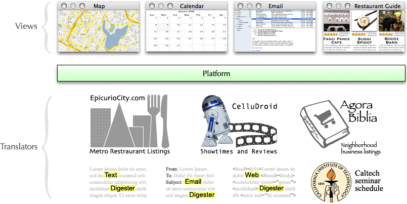
#The components above the platform are views. This is the software that the user sees and interacts with. Views interact with the platform in two ways:
-
#Views nominate a topic of interest. For example, if the user is reading an email, she is probably interested in information related to the contents of the email. The email program would give the email to the platform as a topic. This is analogous to “copying,” but happens implicitly.
-
#Views request topics of interest, of some particular type. The map, for example, would request topics that have a geographical location associated with them. If a restaurant were a topic, the platform would give it to the map, and the map would display it. This is analogous to “pasting,” but again is implicit.
#The components below the platform are translators. The platform gives them information objects, which they convert from one type to another and return to the platform. Sometimes this involves decomposing an object into constituent parts (“digesting” it); other times, it involves enriching the object with additional information.
#The platform itself acts as an intermediary between components, attempting to fulfill requests by constructing a chain of translators to convert topics into the requested types.
#This is how the behavior in the original example might come about:
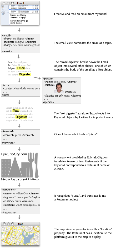
#Although it is clearer to visualize the process as described, an actual implementation would have to belazy, driven by demand. That is, the process would start at the end with the map’s request, and the platform would then construct the chain back toward the email program, according to the types and properties of the objects each component claims to consume and produce. This is necessary for efficiency reasons, but also explains how EpicurioCity knows the area to look for restaurants—the map actually requests objects with locations around a particular area, and EpicurioCity then attempts to produce objects that match this type. It also explains how EpicurioCity knows how many objects to produce from its almost infinite collection—it produces objects as long as the map consumes them.
#Assuming the proper components are in place, we now have a system that maps pizza places in response to Joe’s email. Now, consider what would happen if, instead of receiving an email, I were to type the word “pizza” into a document. Surely the last word typed would be nominated as a topic. It would then get picked up by EpicurioCity and translated into restaurants, and these would show up on the map. Thus, we have the remarkable emergent behavior of being able to look up pizza places simply by typing the word “pizza” anywhere on the computer.
#This sort of emergent, non-designed behavior is the overall goal of the platform. Through topic nomination, the system models the user’s immediate interests, and through translation, every view can attempt to serve these interests in any way possible.
#Confidence. At this point, the biggest problem concerns the question, “Just what should be a topic?” If every component nominated everything that could possibly be relevant, the map would become so cluttered as to be useless. The problem is addressed by recasting the question more fuzzily: “Howmuch is something a topic?”
-
#Every topic is nominated with a level of confidence.** I will consider confidence levels to lie between 0 and 1, so that multiplication makes sense. An email that I’m reading right nowwould be nominated with high confidence. When I finish reading it and move on to something else, its confidence diminishes. The title of a paper I’m currently typing in would have high confidence; the title of a paper I haven’t touched for a few minutes is lower. The paragraph that I’m working on has higher confidence than surrounding paragraphs.
-
#Translators produce dilution of confidence. As they translate, they multiply the object’s confidence level by their own confidence in the translation. The text digester will have more confidence in unusual, prominent words, and words that seem related to other topics or the context in which topics were found. Partial or tenuous matches can be translated with low confidence instead of omitted. For example, a movie translator from CelluDroid.com might translate “pizza” into the film “Pizza Cato: The String Cheese Connection,” but because the name is only partially matched and the context of the consumed object contains no references to movies, the confidence would be low.
-
#Views, such as the map, use confidence to determine the graphical emphasis of displayed objects. This is a critical part of the graphic design. Beyond simply adjusting size, emphasis can involve all sorts of standard graphical techniques—contrast, color saturation, shading, shadowing, grouping, or placement on a different graphic entirely. Objects with confidence below some threshold will probably be discarded.
#As events cause confidence levels to change, the changes propagate through the chain of translators, adjusting the emphasis of displayed objects.
#Feedback. The next problem with this system is inappropriate translations. Consider again my friend’s email. The text digester might pick out the word “dude,” which would go through the business listings at AgoraBiblia.com, resulting in the neighborhood dude ranch showing up on my map. This would be a nuisance if it occurred every time I received an email from my friend.
#The problem is addressed through backpropagation of feedback. Feedback can be either explicit or implicit. Explicitly, I can indicate to the map that I am uninterested in dude ranching. This negative feedback is returned to the AgoraBiblia.com translator, resulting in low confidence in future dude ranch matches. The feedback may even propagate back to the text digester, slightly lowering the confidence that the word “dude” indicates a topic of interest. Implicitly, simply looking at the map without indicating interest in the dude ranch will cause a slight negative feedback, resulting in its de-emphasis over time. On the other hand, if I frequently click on pizza places, positive feedback will backpropagate through the chain of translators, increasing confidence in all things pizza-related and resulting in their emphasis on the map.
#In effect, the entire environment becomes a learning system, tailoring itself to the individual user. While topics model the user’s immediate interests, the history acquired through feedback allows the system to model the user’s long-term characteristics.
#Protocol. The last problem I will consider here is the political issue of protocol creation. Just what is a Restaurant object, and who decides that? Standards, especially premature ones, stifle invention and progress, but anarchy results in incompatibility. It may be possible to address this problem through namespacing and published proprietary protocols.
#To answer the above question, there is no Restaurant object. Instead, EpicurioCity produces acom.EpicurioCity.Restaurant object,** Or however namespacing is spelled in the implementation language. whose protocol is defined and managed by EpicurioCity.com. This proprietary object can be composed of other proprietary objects, as well as some standard objects defined by the platform, such as Text, Keyword, and Location. Note that this proprietary Restaurant is not hindered from showing up on the map, since the map will accept anything with a Location (and presumably some other standard properties such as a name and description).** In object-oriented terminology,com.EpicurioCity.Restaurant conforms to the Mappable interface, and the map requests Mappable objects. However, this “interface” can be very informal, and even unknown to the Restaurant. If the Restaurant happens to define enough standard properties, it can be mapped. A restaurant guide view, on the other hand, would be written to take advantage of the extra information thatcom.EpicurioCity.Restaurant offers—ratings, reviews, and such.
#When another provider, CuisineCousins.com, develops a competing restaurant translator, it can follow EpicurioCity’s published protocol and produce com.EpicurioCity.Restaurant objects. This makes their new translator immediately compatible with existing views. Meanwhile, the translator cansimultaneously offer their own objects, such as a com.CuisineCousins.Eatery, with whatever advantages over EpicurioCity’s protocol. View providers can then update their software to also accept CuisineCousins’s protocol, if CuisineCousins offers a compelling enough advantage.
#If a de facto standard emerges and stabilizes, it might eventually get canonized as the officialRestaurant object. Even then, though, providers will be able to add proprietary namespaced extensions to it.
#Modularity. An obvious benefit to this platform is that it enforces modularity between data and views. Unlike current systems, in which almost all data and functionality is locked up behind a user interface, every service on this system is available to every view. More subtly but just as importantly, the fact that translators have no end-user interface means they can be created by engineers. Only the views must be designed for users. Meanwhile, a designer who is dissatisfied with a view can simply create and release a replacement, with no engineering worries about data acquisition. Because the system can be easily improved without cross-disciplinary concerns, creativity and invention should flourish.
Information and the world of tomorrow
#Today’s ubiquitous GUI has its roots in Doug Engelbart’s groundshattering research in the mid-’60s. The concepts he invented were further developed at Xerox PARC in the ’70s, and successfully commercialized in the Apple Macintosh in the early ’80s, whereupon they essentially froze. Twenty years later, despite thousand-fold improvements along every technological dimension, the concepts behind today’s interfaces are almost identical to those in the initial Mac. Similar stories abound. For example, a telephone that could be “dialed” with a string of digits was the hot new thing ninety years ago. Today, the “phone number” is ubiquitous and entrenched, despite countless revolutions in underlying technology. Culture changes much more slowly than technological capability.** Other obsolete but entrenched designs: the QWERTY key layout (intentionally sub-optimal to reduce typewriter jams), the von Neumann architecture (see John Backus, Can Programming Be Liberated from the von Neumann Style?, 1978); C and UNIX (see Richard Gabriel, The Rise of “Worse is Better”, 1991).
#The lesson is that, even today, we are designing for tomorrow’s technology. Cultural inertia will carry today’s design choices to whatever technology comes next. In a world where science can outpace science fiction, predicting future technology can be a Nostradamean challenge, but the responsible designer has no choice. A successful design will outlive the world it was designed for.
#With what artifact will the people of tomorrow learn information? I believe that in order for a personal information device to be viable in the long term, it must satisfy two conflicting criteria: portability and readability.
-
#Portability. Consider today’s ubiquitous information device—the book. We have the technology to manufacture 5000-page desk-sized tomes, but despite the high information content, such books are rare. The reason is simply that they can’t be carried around. As people increasingly expect information on demand, portability will become ever more critical. Today, people can talk to anyone on the planet by reaching into a pocket; tomorrow’s information device must be just as accessible. Like a wallet and keys, the computer will be dropped into the pocket or purse before leaving the house.** Ideally, it will even supplant both wallet and keys. This implies light weight and small volume.
-
#Readability. Consider again the book. We have the technology to produce books smaller than a business card, but despite the improved portability, such books are also rare. The supremely-portable postage-stamp-sized book is non-existent. The catch: Although technology miniaturizes, the human eyespan remains a fundamental constant. In order to compete with the book, tomorrow’s information device must provide a book-sized surface area. Anything less cannot be read and skimmed comfortably, and cannot support spatially-distributed information graphics.
#To resolve these contrasting size constraints, I predict a computer the size and thickness of a sheet of paper. Like paper, its entire surface is a graphical display. When in use, it is rigid; when not in use, it collapses and can be folded or rolled up (or crumpled!) and tucked into a pocket or purse.
#Regardless of whether I’ve guessed its form accurately, we can predict the device’s expected characteristics by extrapolating technological trends. Consider the capabilities relevant to context-sensitive information graphics: graphical output, history, environment, and user interaction.
-
#Graphical output. To serve as a book, the device must have a sufficiently large reading area and high pixel resolution. To serve as a computer, the device must produce dynamic color graphics. In matching each of today’s devices, tomorrow’s device will overcome the shortcomings of the other. Dynamic graphics with print resolution will open up a world of possibilities for detailed information graphics which are impossible today in either medium.
-
#Environment. Because the user will carry this device everywhere, the device’s environment will literally be the user’s own. Assuming a sufficient networking model, the device will be able to sense an enormous amount of information from the environment—geographical location, physical surroundings (streets, stores, transportation options, entertainment options), social surroundings (friends, strangers with interests in common, strangers who can serve a need), and more. The device will have a far better sense of the user’s environment than the user herself.
-
#History. Since its inception, electronic storage has exponentially increased in density and decreased in cost. We can fully expect tomorrow’s device to have onboard capacities that stagger modern sensibilities. But, perhaps more importantly, ubiquitous network access will make memory effectively unlimited. The device will have the means to remember everything the user has ever done and every environment in which she did it. With such a tremendous history and sense of the environment, software will have an unprecedented potential to predict the user’s current context.
-
#Interaction. Touch or motion-based manipulation is somewhat more efficient than the mouse. Eye-tracking and speech may be better still, although even these are unlikely to match the order-of-magnitude improvements predicted for the capabilities above. But none of these mechanisms will ever approach the sheer amount of information that can be absorbed by the eye. No matter what new interactive technology comes along, the bandwidth between the device and the user will remain not merely asymmetric, but utterly lopsided.
#Interaction is already a bottleneck. It will get much worse as graphics, environment, and history experience their expected breakthroughs. To me, the implication is clear—the principles of information software and context-sensitive information graphics will become critical as technology improves.
#The future will be context-sensitive. The future will not be interactive.
#Are we preparing for this future? I look around, and see a generation of bright, inventive designers wasting their lives shoehorning obsolete interaction models onto crippled, impotent platforms. I see a generation of engineers wasting their lives mastering the carelessly-designed nuances of these dead-end platforms, and carelessly adding more. I see a generation of users wasting their lives pointing, clicking, dragging, typing, as gigahertz processors spin idly and gigabyte memories remember nothing. I see machines, machines, machines.
#I expect that designers who cling to these models will appear to the next generation like classical physicists as the world turned quantum, like epicycle-plotters as Kepler drew ellipses, like Aristotelians as Galileo stood atop the tower at Pisa. No matter how hard they work or how much they invent, these designers will not be revered as pioneers. They are blazing trails through a parking lot.
#Our pioneers are those who transcend interaction—designers whose creations anticipate, not obey. The hero of tomorrow is not the next Steve Wozniak, but the next William Playfair. An artist who redefines how people learn. An artist who paints with magic ink.
![]()
Summary
#Software design consists of graphic design (drawing pictures) and industrial design (allowing for mechanical manipulation).
#Information software is for learning an internal model. Manipulation software is for creating an external model. Communication software is for communicating a shared model.
#Manipulation software design is hard, but most software is information software.
#Information software design is the design of context-sensitive information graphics. Information software is not a machine, but a medium for visual communication.
#Context can be inferred from the environment, which can include physical sensors, other information software, documents created with manipulation software, and data such as email which acts as a user profile.
#Context can be inferred from a history of past environments and interactions. Last-value predictors provide a rudimentary approach. Learning predictors can infer patterns and make dynamic predictions.
#Context can be inferred from user interaction, but only as a last resort. The best way to reduce or eliminate interaction is through information-rich graphic design that uses the environment and history. Remaining interaction can be reduced with graphical manipulation, relative navigation, and tight feedback loops.
#The information software revolution will require public recognition that information software is a medium of visual communication, designers with talent, skill, and tools, simple and general platforms, and an environment that encourages creativity and sharing.
#A design tool for dynamic graphics that infers behavior from mockups may allow for natural-feeling creative design with no engineering-related distractions.
#Learning predictors exist and are effective. For them to become widespread, simple abstractions must be invented.
#An information ecosystem of views and translators may be able to offer relevant information of all forms with minimal interaction. Key aspects include topic nomination and translation, confidence levels, learning through feedback, and a fine-grained modular structure wherein small software providers can thrive.
#As technology related to graphics, the environment, and history undergoes revolutionary improvements, interaction will become even more of a critical bottleneck. The best approach is to work towards eliminating it.
#Two centuries ago, Playfair invented statistical graphics and changed the world. The time is ripe for another designer to invent the fundamental context-sensitive graphical forms, and change the world again.
Recommended reading
#Most of the works cited in this paper are recommended—just skim up the sidenotes. The following landmark books deserve special mention:
#Edward Tufte. The Visual Display of Quantitative Information (2001), Envisioning Information(1990), Visual Explanations (1997). The three testaments of the information design bible. (A fourth is on the way.) If you’ve already read them, read them again.
#Scott McCloud. Understanding Comics (1994). Like information graphics, comics convey information through arrangements of words and pictures—they are Tufte’s “small multiples” applied to storytelling. McCloud’s analysis of how people read and understand the visual language of comics is essential reading for all information graphic designers.
#Thomas Kuhn. The Structure of Scientific Revolutions (1962). The only purpose of incremental improvement to a status quo is to reveal its flaws. Progress occurs when the status quo is replaced.
Acknowledgments
#I am grateful for the detailed and helpful feedback I received on earlier drafts from Andy Likuski, Jonathan Harel, Justin McCarthy, Jon Nakasone, and Daniel Cook.
#I also appreciate everyone who sent in feedback on the BART widget, and particularly Joel Dreisbach-Penner, Walter Jew, and Omid Tavallai for their contributions. This paper sprung from that little widget.
#This paper was formatted with a modified version of John Gruber’s Markdown utility. If you like, you can see the modified Markdown and the paper’s source code.
#Half of this paper was written in the San Leandro and Dublin public libraries.** Have you been to your public library? It’s like Starbucks, but free of charge, noise, and corporate branding. The other half was written in Cordonices Park and Live Oak Park in Berkeley.
Inventing Interactive: Interview: Jorge Almeida (Star Trek Into Darkness)

I’m a massive Star Trek fan. So I’m super-excited that Jorge Almeida took some time to discuss his work on Star Trek Into Darkness — for which he was the lead designer of the UI elements. (If you’re paying attention you’ll remember this previous post with Jorge on his work for MI:4 and The Dark Knight Rises).
Q: How did you get involved with Star Trek Into Darkness?
OOOii (pronounced “ooh-wee”) created all of the user interfaces for the first film, so we were brought on to continue our work on the second. I had done some UI work on “Star Trek”, and was asked to take the lead on “Star Trek Into Darkness.” I got a chance to see the movie on Sunday. Just a great ride. I am really proud to have been a part of this film. Hopefully fans will like what we did.
Q: What was your role? Were there a lot of others involved in the design and production? What software did you use?
I was lead designer for OOOii. I oversaw the look and animation style for all of the UI in the film. We had a great team, with major contributions from Blaise Hossain, David Schoneveld, Paul Luna, and Andrew Tomandl. I also need to single out Rudy Vessup, who was my right hand man on this job. Just a fantastic motion graphics artist and a real pro.
Everything we created was done using some combination of Adobe Illustrator, Photoshop, and After Effects. Additional 3d elements were created using Maya.
Q: Was there a general design brief or design direction that you were given? What were your design influences?
For the Enterprise, production already had the full set of interface animations we created from the first film, so we were only responsible for additional UI specific to the story. It was therefore important that I maintain the style and the spirit of what was done in the first film.
Scott Chambliss was the production designer, and I loved what he did with “Star Trek.” The look of that film reminded me of some of Frank Frazetta’s classic Buck Roger’s illustrations. I would always keep that style in mind when designing. I’m also a fan of the classic LCARS interface from “The Next Generation.” While production wasn’t looking for a revision of LCARS, the curved corners and elegance of those interfaces definitely had an influence on my work.
We also had the advantage of having seen the first film and how it was cut. The action often moves quickly, so the UI had to communicate story points clearly and efficiently. When you’re spending days or weeks on a shot, it’s easy to forget that it may only be onscreen for less than two seconds.
Q: Can you describe the work that went into the UI development for the starship Vengeance?
Early on, there was a focus placed on the starship “Vengeance.” They were shooting the Vengeance towards the end of the schedule, but Scott wanted to get a clear direction before production started and other priorities took over. He provided us with some imagery to use as inspiration- most of it pretty abstract, but the shapes definitely felt interstellar. There were many overlapping circles, and cloud-like clusters. They reminded me of some of the space station research I had done. I presented him with ideas and he started to narrow it down from there.


The “Vengeance,” like the “Enterprise,” featured 4 sets of monitors that wrap around the top half of the bridge walls and act as a 360º radar monitor. Some of the images Scott had provided us felt like nautical maps, so I kept that in mind when coming up with ideas. Thinking of the monitors as windows of a submarine, I tried to make what was happening outside feel slightly ominous and alive.


Once we started testing the animations on set, Scott asked us to desaturate them quite a bit so that they would blend in better with the black interior. I really liked the effect. Here are some of the finals (the viewscreen was done in post):

Q: There’s some really interesting heads-up display work. What was involved in their design?
All of the heads-up display shots were obviously done during post-production, so we worked under the direction of Visual Effects Supervisor Roger Guyett. We presented our work regularly to Roger and VFX Producer Ron Ames for comments, and eventually they would present our work to JJ.
The entire space jump sequence was definitely a highlight for me. It was obvious from the first edit I saw that this scene was going to be a lot of fun. We were asked to create the UI for the viewscreen, the glass panel display, and for the helmet heads-up display.
My goal with the HUD was to minimize the interface as much as possible. I wanted to frame it around the actors face in a way that didn’t feel too tech. I was trying to make it feel soothing, with a steady pulse- that way the animation had somewhere to go when things get dangerous.


The projected flightpath was something they had as a rough concept in their original edit, so I just took it from there. I had seen some POV video of an olympic luger, and thought it had the right rhythm and movement to use as a starting point for the animation. I showed our 3d artist the videos, as well as some sketches I had done, and he started building elements in Maya. He rendered a variety of frames and I started combining them in photoshop until we came up with a style that production liked.


From there, it was a matter of animating the individual shots. I animated all of the shots using After Effects. I would create the animation, then put together rough comps so Roger and JJ could see the graphics in context. Once approved, I provided the flat HUD graphics as separate passes for ILM so that they could have flexibility when doing final compositing. The whole process went pretty smoothly.
Q: How did you approach the Enterprise viewscreens?
One of the major challenges in post was designing the Enterprise viewscreen interface. There were only one or two viewscreen interfaces in the first film, but in “Star Trek Into Darkness” there were several. The obvious challenge was keeping the look consistent with the rest of the bridge. Like Scott, Roger also wanted to avoid any design that felt too grid-like or text-heavy.
I don’t really have a set process for how I work. Sometimes I draw thumbnails, sometimes I just start throwing elements onto a photoshop or ae file and start mixing and matching. Generally my philosophy is to keep fixing it until it breaks, then take it back a step. I heard Iain McCaig say that in a video once. Made sense to me.
In practical UI, you are trying to give the user an elegant way to make choices. With film UI, I am trying to give the viewer the illusion of choice. I am trying to deliberately direct the viewers eye to whatever story point the director wants revealed at the time he wants it revealed. The job becomes more about illustration, especially in post where we can see how the interface is framed within the shot. We paint a small part of a much bigger picture, and our work needs to visually support what’s on screen so that we don’t disrupt the rhythm of the viewing experience.
One technique that I often use is to design in greyscale (using an adjustment layer). It reduces the composition to it’s basic values so that I can design without being distracted by color. We also often use Adobe bridge to review various concepts and composites at thumbnail size. It’s an easy way to see which designs are the most effective.
The viewscreen for the volcano sequence was one of the first priorities we had, so the developmental process took place with that interface. I began with thumbnail sketches and tried to work out compositions both on paper and in photoshop.


The volcano viewscreen quickly exposed an issue with trying to make the design too nonlinear — that we might lose the distinction between what was being projected on the glass and what was floating behind it. The view screen needed some type of framing to visually attach it to the ship and easily distinguish it from the environment. We had used translucent glass panels as border elements in the first film, so I started enlarging and reconfiguring them to break up the shape of the viewscreen. I then added and rearranged graphic elements within that framework until the interface had a balance between design and functionality that everyone was happy with.


Once the first couple of viewscreens were approved, the look took off from there. We provided the elements to ILM in separate passes so they could make adjustments and dial in the final composites with Roger and JJ. ILM, as always, did a fantastic job. I couldn’t be happier with how our graphics looked onscreen.


Q: Any final thoughts?
“Star Trek Into Darkness” did a lot of shooting in Los Angeles, so I was much closer to this production than I have been on any film in a while. We were on set a lot, so I was reminded first-hand of just what an enormous operation film production is. Multiple sets being built simultaneously. Trees being painted red on one stage, and a giant Starfleet shuttle on the next. I was humbled by the tireless efforts of our producer, Jennifer Simms, as well the playback producer Cindy Jones. They took on many of the headaches of the job and helped facilitate the constant flow of information between our team and production. This is not easy when you’re talking about creative notes one second, detailed technical issues the next, and budget issues in between- all while this giant train is in motion.
I was also reminded of just how much we depend on the playback crew on set to make our animations work within a scene. We’ve worked with Monte and the guys at Cygnet Video for years. Aside from technical issues, they are also responsible for cueing our animations in sync with the actor’s movements. Ultimately, what you see on screen is an elaborate dance between a large number of people both onscreen and off. It’s pretty amazing to watch it all come together so effectively.
Thank you.
Thanks for the interest in our work. Hopefully people enjoy the movie as much as I did.
You can see more of OOOii’s work on their website oooii.com. And Jorge has posted more of his developmental stuff on his website: jorgeonline.me.

Mobile first: Luke Wroblewski interview
The Mobile First philosophy has radically changed how professionals approach Web design and become the way companies as diverse as Facebook and IBM build their products.
The Mobile First approach is to start designing for mobile devices — which typically have less screen size and less capabilities than desktops — and progressively enhance the product; so that desktops get an enhanced site experience rather than mobiles getting a pared down one.
We grabbed the opportunity to interview Luke Wroblewski, who first defined the Mobile First concept back in 2009, about how he used the principle to create Polar at his latest startup, Input Factory Inc. where he is co-founder and CEO.
How did you get started building apps and what kept you fascinated?
The first mobile apps I worked on were during my time at Yahoo! I joined the Yahoo! Search team back in 2005 and a bit later was heading up a small “tiger team” focused on ideas for products that were 3 to 5 years out. At that time I was fascinated with where the web was going and in particular with mobile.
We started out building some experiences for newer Nokia devices, as Nokia was the big player back then. Soon after though, Apple announced the app store for iOS and we jumped into iOS applications as well. At the time we were experimenting with services that connected mobile apps to networked TVs and more traditional computers like laptops and desktops. It was a really great opportunity to explore what was coming and we came up with a bunch of concepts that I’m still passionate about today.
I think that’s what keeps me interested in this space. You can see the future: more connected devices of every shape and size; interactions between those devices; more real time access to useful information, services, and people –it’s all coming. But these things don’t just appear out of thin air. They take years of effort, trial and error to make real. So I keep at it because I keep seeing a more and more exciting future ahead.
When developing a product, how do you identify a gap in such a saturated market?
I don’t. If a market is saturated I think that’s a great sign it’s interesting on a number of levels. For me, its much more important to focus on problems I can understand and actually do something about. When you have deep experience in an area, you can often see a future other people can’t.
For instance, I’ve dug really deep into web form and mobile design. I even wrote two popular books on these topics. So I feel like I’ve increased my ability to see problems in these areas. And when I look across the Internet I see lots of people eager to share their opinions and get the opinions of others. But the solutions out there are just really bad.
You’ve got surveys that basically consist of multiple pages of form elements: checkboxes, radio buttons, text fields, and so on. Because they’re so painful to complete, companies are paying people to take these surveys and even then the participation rates are really low. I look at this and think: we can do better.
It doesn’t really matter if there are a lot of companies out there with apps for making surveys or soliciting feedback. If you see a problem and think you can do a better job solving it, that’s the on-ramp. That may sound overly confident but I think you need confidence to get out there and start doing your own thing. You have to believe in it or no one else will.
Why is the Mobile First approach a better way to do things?
Well the reasons have been stacking up over the years. But when I outlined the idea originally I pointed to three main reasons: growth, focus, and innovation.
Growth is pretty obvious these days. More than 2 million modern mobile devices enter the world each day. Compare that to the 371,000 children born per day and you can quickly see how these numbers add up. All these devices connected to networks is a huge opportunity and many companies are now feeling it in their stats as mobile begins to take over other kinds of devices in usage.
Focus comes from the natural constraints of mobile. These devices need to be portable, so their screens are small, they connect to networks anywhere and everywhere with varying success, and they get used in very diverse environments often full of distractions. These constraints push you toward more focused, simplified solutions. You can only fit so much on the screen, people often have to wait for it, and they’re unlikely to give you their full attention. So make it easy to understand and use and focus on the important things first. Mobile is a great forcing function for simplicity.
But mobile isn’t just about constraining yourself; quite the opposite. There are lots of things that make mobile experiences more powerful and engaging. Not least of which is the fact that mobile devices can be used all the time and just abut anywhere. That not only creates new uses but also means people can be connected throughout the entire day.
If that weren’t enough, due to the capabilities of mobile devices, we have new ways of creating experiences. Thanks to local detection technology, we know where people are down to 10 meters. Thanks to integrated cameras and microphones we can take in visual and audio input, process it, change it, and share it. Thanks to motion sensors we can tell where a device is in three-dimensional space, and the list goes on.
It’s easy to dismiss these capabilities as technology for technology’s sake. Instead think of them as new techniques or paints on your design palette. With them, you can paint a totally unique user experience that allows you to innovate and move beyond existing solutions that came about before these technologies were available to us.
How do you know your design is hitting the mark, especially when aiming for speed and simplicity?
Well, you can test for both. In fact, that’s exactly what we did for our app, Polar. We designed Polar for mobile first and foremost so speed and simplicity were, of course, top of my mind. Earlier I mentioned that we thought we could make collecting and sharing opinions fast, easy, and fun, almost the exact opposite of what most survey tools are like online today.
Polar is our first attempt to do that. The most important interactions in Polar are collecting and sharing opinions and, as a result, we spent a lot of time trying to get those interactions right. To make sure they were fast and easy, we used one-handed, timed tests. Our goal was to allow anyone to vote on 10 polls or create a new poll in under 60 seconds.
If you design for the extremes, the middle usually works itself out. To quote Dan Formosa at Smart Design: When they designed garden shears, they tested them with people who had arthritis. If this “extreme” case could use the garden shears, then anyone could. That’s the same approach we take with timed, one-thumb use. If you can make it work for that extreme it will work for everyone.
Is there anything you can do from a design perspective to make sure that people who download the app actually use it?
Sure. Let them actually use it. In all seriousness, so many apps start off the process by wanting to tell you all about themselves and having you tell them all about you. Fill in this form, give us your phone number, take this intro tour, and so on. All this instead of just letting you get in and start using the app you’re spending all your time memorizing which gestures the app has and connecting to Facebook.
No actually, you’re skipping past all that trying to actually use the app. So my approach is just get to the good stuff. Let me say, however, that I know this approach is controversial. There are a number of examples out there that show forcing registration up front increases your sign-up numbers. Which means you increased the number of people who filled out a form. But they’ve never used your service. They might not even know what it is, so how valuable are these users?
I’m biased toward people who’ve seen and used the app, then decided to sign-up as a result. That means they liked what they saw enough to take the next step. The total number of sign-ups may be lower but the number of qualified users may end up being higher. At least that’s our approach!
Have you heard horror stories of people screwing up their signup process in their products?
The best one I saw recently was published by Greg Nudleman. It was an app for finding nearby restrooms made by Charmin. The intro process was so labor intensive that Greg very appropriately titled his write up: Let Them Pee!
You’ve use the term “gradual engagement” a lot in the past when you talk about sign up process, can you elaborate on what that is?
Sure. Gradual engagement is an alternative to the sign-up form issue I just described. Through gradual engagement, we can communicate what apps do and why people should care by allowing them to actually interact with them in gradual ways.
For example, Polar is all about sharing and collecting opinions. So we allow anyone opening the app for the first time to vote on the polls they see. 88% of people who download the app do just that. We hold on to all their votes locally so if they ever take the next step on the “walkway” (when you want to leave a comment or create a poll of your own), all your votes carry over to your account. This is what I mean by gradually getting people to understand and use your service. It’s about creating a clear and welcome “pathway” vs. putting up walls.
There has been much debate recently over whether improved device capabilities will render mobile-first obsolete, where do you stand on this?
I certainly hope all our devices keep getting better and that we develop new ways of interacting with information and with each other. So I’m not building a moat around mobile or anything. That said, the idea of having a connected device with you anywhere and everything is really powerful.
For proof, just look at Flurry’s recent analysis of user sessions and activity across all phone and tablet sizes. The clear winner for both was the “medium” sized (3.5”-5”) phone. I think this is a testament to the value of a portable computer that you can turn to at any moment for answers, conversations, and frankly just about anything. That kind of mobility and its importance does not show any signs of letting up in the near future. So I’m still really bullish on mobile.
We’d like to thank Luke for taking the time to answer these questions.
Do you take a Mobile First approach? What stops you from using an app or mobile site? Let us know in the comments.
Featured image/thumbnail, mobile internet image via Shutterstock.
Mobile: Never Use Native Drop-Downs for Navigation
Many responsive mobile sites are using native drop-downs (as in: a select tag) for main navigation and many plugins have beendeveloped for this specific purpose, yet our usability research shows that this is a poor strategy. On the tested m-commerce sites that used native drop-downs for navigation, the test subjects showed decreased control and overview of the menu items.
During testing, nearly all subjects scrolled up and down category lists before selecting an option, many explicitly stating that they wanted to see all the categories before selecting one – even if they felt they had spotted a good match early in the list, the subjects still scrolled the remaining items just to make sure they knew what their other options were (before then scrolling back and selecting the good match). The subjects exhibited the same behavior on homepages where they often scrolled up and down to get an idea of what their options were, even if they saw what they were looking for right away.
This strong tendency towards scanning all options before selecting one is at the core of why native drop-downs are a poor choice for navigation. When open, a native drop-down only utilize ~50% of the screen, which made it needlessly difficult for the subjects to get an overview of their options.

With only half of the screen used to display the available options, users will have a difficult time scanning and comparing the available options. To make matters worse, the drop-down often starts out at the top with only 3 options visible to the user (left image), and even when scrolled to align optimally, no more than 5 options can be seen at once (right image).
Another issue with the navigation options only taking up 50% of the screen is that the scroll area for those options is similarly small. The smaller scroll area resulted in less accurate scrolling as there was so little room to “drag” the content that many subjects flicked to scroll instead (which of course is a much more inaccurate way of scrolling).
Finally, we also observed a few instances where subjectsmistook the navigation for filtering options. This was especially true of category and search result pages where subjects were on the lookout for filtering options and then simply jumped to the conclusion that the drop-down was such a feature.
Solution: Custom UI Drop-Downs
It’s very important to underscore that drop-down navigation isn’t bad at all, it’s native drop-downs (as in: a select tag) which are unsuitable for navigation due to the way they have been implemented in the major smartphone operating systems (such as iOS and Android).

While the navigation at The Boston Globe is very similar to how the native drop-down works in terms of interaction (you first click “Sections” and then a set of simple items are revealed) it is significantly better because the options aren’t limited to a dialog but can take up the entire screen if necessary. In the above all 10 items are shown at once; quite the improvement in terms of overview, scannability and “scroll control” when compared to the meager 5 items that can be shown in a native drop-down dialog. (The navigation items on Boston Globe are, however, on the short end, being only ~5,3mm tall.)

Another benefit of implementing custom drop-down UIs for navigation is that you have complete control over the design of the options. This means you can optimize the design and layout of the shown options (which you can’t with a native drop-down).CSS-Tricks, shown above, is a great example of this where, when expanded, the menu items are displayed in two columns and each has a descriptive icon next to it. It can also be more subtle, like the earlier Boston Globe example where arrows have been added to indicate virtual space.
During testing the subjects had no issues using these types of custom UI navigation as long as they followed basic design conventions, had adequate hitarea sizes (device manufacturers recommend a minimum of ~7×7mm), and the trigger elementwas designed as a link / button (so that the subjects knew it was clickable).
It should be noted that native drop-downs are not poor for all purposes – they can work well in forms where keeping page context can be as important as the options themselves. However, native drop-downs should not be used for main navigation as they simply afford too little overview of the available options and are needlessly difficult for users to scroll accurately.
Responsive Web Design Summit talk, 'Measuring Web Performance'
On Tuesday, April 16, 2013, I was lucky enough to give the opening talk on the web performance day of RWD Summit presented by Environments for Humans. This is the short description for the talk:
Today, a web page can be delivered to desktop computers, televisions, or handheld devices like tablets or phones. While a technique like responsive design helps ensure that our web sites look good across that spectrum of devices we may forget that we need to make sure that our web sites also perform well across that same spectrum. More and more of our users are shifting their Internet usage to these more varied platforms and connection speeds with some moving entirely to mobile Internet.
In this session we’ll look at the tools that can help you understand, measure and improve the web performance of your web sites and applications. The talk will also discuss how new server-side techniques might help us optimize our front-end performance. Finally, since the best way to test is to have devices in your hand, we’ll discuss some tips for getting your hands on them cheaply.
This presentation builds upon Dave’s “Optimization for Mobile” chapter in Smashing Magazine’s ”The Mobile Book.”
Article: Source
Designing a responsive, Retina-friendly site
It’s hard to believe I have been blogging for more than 7 years. Michael Wozniak, my hallmate during my freshman year at Georgia Tech, had gotten me into Gentoo Linux the year prior and told me he was playing with WordPress 1.2. Compared to the MediaWiki site I was running at the time that piqued my curiosity and I began blogging on WordPress on my G4 Mac Mini that summer. I immediately fell in love with it and began learning CSS and PHP to tweak the theme1.
Eventually I found my thing – writing technical guides, product reviews and tech editorials. I still remember the feeling when I noticed one of my articles got picked up by Lifehacker. Then digg. Then 5 other sites. 20,000 uniques in 4 hours. I wrote a follow up to that article. Same thing. And another follow up. I received enough traffic that month in 2005 to kill the hard drive in my dorm-hosted Mac.
Unfortunately, I haven’t blogged as much in recent past; my waking hours spent worrying about startup issues than crafting new content. Things I would have blogged about in the past are now published as tweets.
When the time arises, I thoroughly enjoy writing long-form articles and with that in mind I wanted to design a better experience for consuming them.
Note: This article got rather long (15,000 words), so I split it up into a few posts. This one is about design. Developing a responsive, Retina-friendly site (Part 1) covers responsive development while the third part will cover responsive images.
Mobile
My last redesign in 2010 was not built with mobile in mind. It was more of a lets-get-this-new-Jekyll-thing-working project than a planned website overhaul. Visiting on an iPhone meant the typical double-tap-to-zoom fiasco.
Having seen my traffic breakdown go from 3% iPhone and 2% iPad in 2011 to7% iPhone and 4% iPad in 2012 I knew it was time to focus on the mobile experience throw mobile visitors a proverbial bone. iPad visitors in particular spent more time on site than desktop or iPhone visitors. Approximately 132,000 people read this site on a mobile device in 2012. Damn.
 The new responsive & retina-friendly PaulStamatiou.com.
These numbers are only going to grow. It helps that proliferation of LTE networks and devices means the fastest Internet connection people have will likely be on their smartphone, not their home connection. That’s crazy.
Picture Perfect
Many of my posts and reviews are filled with my own photos. My blog actually got me into photography. I first purchased a DSLR to take better pictures for articles and product reviews. In the last 3 years I have fallen in love photography. But most of my shots were getting published on Instagram. It made me feel a bit bad that I don’t often share many of my photos on my blog.

Some of my Instagrams
I was in that exact mindset when I was flying back from New York after hanging out with the Rap Genius guys. They don’t have an office, instead they have a few baller (to use their vernacular) penthouses in Brooklyn. I took this panorama on their deck with my iPhone which I then post-processed with Snapseed.

Click see my new photo page
I liked this photo so much that I was vexed I couldn’t share it with my Instagram followers. I began pondering about a clean way of sharing it on my blog.
The Retina Revolution
If I was going to touch my site, it would need to be Retina friendly. I’ll be referring to Retina as the device agnostic term HiDPI from here on out. What does that mean? Every icon, background or image used should look crisp on HiDPI displays. The most pressing area for that is on mobile devices as there aren’t yet that many HiDPI desktops and laptops out. As much as people love the Retina MacBook Pros, that’s not even a single percentage of anyone’s web traffic yet.
Don’t expect to have a HiDPI 27-inch display just yet. The first 4K (3,840 x 2,160) big displays are shipping and they are expensive.. around $5,500. But in 2-3 years? That’ll be another story entirely; HiDPI displays will be standard on most high-end desktops2.
If responsive web design was the fad of the web design/development community for the last few years, the next one is going to be HiDPI support. With HTTP 2.0 (with SPDY forming the starting point) slated to drop in 20143it will be perfect timing to combat the larger filesizes needed for HiDPI image assets. As I’ll discuss in the second part of this post, there are some development challenges associated with this.
Design

Late night Photoshopping & trance. Very similar to The Coding Zone.
I wanted to completely rethink my site, not just a add new coat of candy paint. I planned to rewrite copy on all static pages, reorganize content as necessary and generally simplify things. This would also give me a good excuse to start using more semantic HTML5 tags.
My design process was a little different from how I mentioned it in my ridiculously popular Crash Course: Design for Startups. I usually start with some inspiration-wrangling, a few ideas about direction and lots of sketching before any Photoshop or code. I couldn’t exactly whip out a big sketch pad in lovely last-minute seat 37b so I worked in Photoshop for most of my 6 hour flight back to SF (until they started playing How I Met Your Mother).
If you need to use something like Readability or Safari Reader to read my articles, I’ve failed as a designer.
I began thinking single column. The content should be the star of the show. No sidebars or extraneous post metadata that gets in the way of reading. If you need to use something like Readability or Safari Reader to read my articles, I’ve failed as a designer. And lets not forget the impetus behind this rethinking; I wanted to be able topublish large photos – within posts that extend beyond the narrow copy and also on individual photo pages.Bandwidth and latency be damned, I want to show dozens of 1000px+ wide photos at a time.
Planning Mobile First RWD
The premise behind Mobile First Responsive Web Design4 is that you should trim your site to only the essentials, establish the priority or question the necessity of all elements and focus on mobile before adding complexity for larger/desktop versions of the site. This is going to sound ridicu-cheesy, but this is a way of thinking and it applies to every aspect of your site planning. Even down to writing mobile first CSS to keep things lightweight and simple and conditionally load extra stylesheets and content for larger devices (that are also likely to have faster connections) as necessary.
Categorizing your site into pieces and setting priority before even pondering aesthetics stems from Dan Brown’s page description diagrams back in the early 2000s.
The page description diagram, by demonstrating priorities and providing a context for the content and functionality, gives visual designers the information they need to create an effective layout.
It’s a great little exercise when embarking on a redesign. Given that this site only has a few pages and then blog posts, it wasn’t really needed. For the sake of teaching, I’ll elaborate a bit. You generally start with three columns from high to low priority page elements. You list out each element and you can optionally provide a description of it and a simple wireframe of that element.
HighMediumLowArchives/PostsRSS/SubscribeContactPhotos”Bits” (asides) postsSearchAboutComments”Stuff I Use” page@StammyFB/Twitter sharePost metadata, date
Some of this organization was by personal preference and some was metrics-driven. Take the post date for example. I have some articles dating back 7 years and I don’t want to advertise that the content may be outdated5, so I place less importance on that and display the publish date after the post. For the most part my articles are evergreen and more of my content is becoming less product reviews and more editorial.
I’ve also found that time on site increases when users don’t see the post date immediately. The majority of my visitors come from Google SERPs and they’ll leave without reading if the first thing they see is that the content is more than a year or two old. Increasing time on site also tends to decrease bounce rate for these Googlers. After reading the post they are likely to open up a few other articles I link to or just browse around for another pageview. It’s important that I do whatever I can to capture that first time visitor.
If someone won’t share a post because I don’t have a Twitter button in 10 places on the page, then I’m writing pretty crappy content.
An example of priority based on personal preference is my decision to place low importance on Facebook and Twitter sharing functionality. I like to believe that if the content is good enough, people will share it on their own accord. I also didn’t want to load Facebook and Twitter javascript. This gives me a mental test before publishing..is this content really good enough to publish?
I could simplified things more by merging my "bits" (smaller posts) into the main posts section. Bits had their own RSS feed and index page. It was another navigation element; another forced decision upon visitors to visit another page. Bits now appear styled differently inline with the rest of the posts.
But I messed up. When I first did this page description diagram I prioritizedsearch functionality as high. My first header designs as I’ll show below had a huge search bar next to the main navigation as if it was one of the most important elements on the site. I looked into my Google CSE analytics ‐ search was rarely used; less than 10 queries a day on average. Only 8,500 on-site searches in the last 3 years. I since relegated search to low priority on this diagram.
Where to begin with visual design?
After that basic IA and planning was out of the way, I had a good idea of what to include in the header. I was going to distill it down to the essentials. There would be such little difference between the mobile version and larger responsive versions that I wouldn’t really need to plan the responsive designs. The focus is on the content at all times, not just on mobile, so there’s no need for me to do any content choreography and adjust layouts between responsive designs. No sidebars to hide or move, et cetera.
Some designers start with a blank slate of copy and begin with typography and layout, while others begin with the site header and navigation. I began with the header. I tend to start my designs on an extreme with the intention of toning it down later as necessary. As a tiny example of that, I made the avatar and header text much larger than I was comfortable with. If you only ever design within your comfort zone, you won’t come across unexpected ideas that you may end up loving. That’s how the folks at Lamborghini design 2 too — starting with the most absurd and extreme lines that come to mind.
 I’ve ridden in a Ferrari 458 and thought that was insane. The Aventador hits 60 quicker, in just 2.8s.
I previously had a terse Twitter-like bio on the top of my homepage and decided to further reduce that into a subtitle. As for having my avatar there, I wanted to put a face to the content, much like people have become accustomed to seeing a face next to every tweet.
Below you can see some early versions of the header that I was left with by the time the flight was ready to land. The one on the left was the first stab. It felt like there were too many menu items and the search just didn’t line up. The middle version was my attempt to distill navigation into the most important elements, posts and photos. I wasn’t happy with the visual hierarchy there either and it made search look too important. In the third iteration I began playing with icons to minimize space used by navigation. I was trying to line it up under the avatar, but I had too many menu items and it just looked weird.
 Some early iterations of the blog header and navigation.
Around this point that I dug into my metrics to find out that search wasn’t used much. I initially opted for icon-only navigation with tipsy-style tooltips, but felt it violated Rams’ “as little design as possible” principle, in addition to being cumbersome (having to hover over each icon first to see what they meant).
Some hours of tinkering later I ended up with my current design with only three main navigation elements. In between Photoshop iterations, I would constantly sketch UI on paper to refine my ideas. Just drawing any tangentially-related solution that came to mind helps organize my thoughts.
All I need is a simple sketchbook and a Micron 01 pen to sketch out concepts.
Keeping track of iterations
I’ve made it a habit over the past year to constantly take screenshots of my designs in progress. Either of Photoshop work or in-browser tweaks with Chrome dev tools. Over the course of this blog design I ended up with 67 screenshots. It’s nice to be able to go back and trace your thought process over again. Danny Hertz from Twitter had an interesting idea about how toautomate this with Selenium, but I digress.
I’ve started using LayerVault to help me with this. It’s like GitHub for PSDs and you can visually flip through your PSD revisions.
 LayerVault showing a revision. I keep my palette in big blocks on the top of the PSD for easy picking.
The Sandboxed Cover Photo
Going along with my wanton lust for big photos, I also designed a second header to be displayed for particular posts and pages that have a cover photo defined in Jekyll’s YAML front matter. I built it (and incorporated some slick parallax scrolling) but decided not to use it. I’m not quite sold on it yet. Back to the sketch pad.
 Example of a page with a cover photo. Still a work in progress.
I’ve got the blues
At this point, the design was coming together and needed to focus on typography, make a simple footer and some button styles.I created a muted blue shade button style to use throughout the site.
 Article publish date, share UI and related links
As we all know you should never use black so I chose a fairly muted color palette of desaturated blue shades. For one, blue is awesome and two cooler colors recede and since the content is the centerpiece here I want it to stand out. My main copy is a subtle warm gray, as warmer colors come to the foreground.
Not all displays are alike
I wanted to get some feedback on a PSD so I showed it to my friend Anand on my MacBook Air. I quickly realized that I could barely see parts of the design! The colors were way too light. I had been designing the whole time on a 27-inch Apple display and a 24-inch Dell display that made them seem like they had adequate contrast. Not so on any Apple laptop I tested it with.
Enter WCAG 2.0. Yes, another W3C acronym! The Web Content AccessibilityGuidelines cover various aspects of website accessibility, including contrast minimums. There is actually a rating system for contrast! It takes text size, color and background color into account to come up with an AA or AAA level.
No need to worry, Lea Verou came up with a handy tool called contrast ratio. Punch in your color and background color to see if it has adequate contrast. But if you have to ask yourself if there’s enough contrast, there probably isn’t. I still need to darken the color of my footer links, they’re a bit light.
Serifs.. on the web?!?
I decided to go with the lovely serif Adelle for article headings and text. It’s the first time I’ve really used a serif on the web.
 Trying to decide between 6 different Typekit typefaces. Chrome extension: WhatFont
I’ve grown up being told that you shouldn’t use serif typefaces on the web—the serifs themselves6 on certain curvy typefaces don’t lend well to being displayed with a grid of pixels unless the particular font has been properlyhinted (unlikely). Well, my official stance is this all matters less when you’re dealing with HiDPI displays so I’m going for it.
If you want good type on Retina displays, stop discussing hinting et al. Just search for faces that happen to look good. Like the old days.
You can learn more about web typography with this interactive guide or The Elements of Typographic Style Applied to the Web.
Photo Layout Ideation
Up until this point, the homepage mockup in Photoshop just had an article excerpt, a list of recent posts and then a few photos. I thought it would be interesting to show more information about the photos on hover.
 First idea was to display photo title and camera metadata on hover. (Aston)
 After I was satiated with hover style, I quickly coded it up ghetto-style directly in Chrome dev tools to see how the interaction felt. I’m glad I made a prototype first because I quickly realized that hovering over each photo and then displaying a full-width overlay was jarring and abrupt to the user.
It could also be inadvertantly triggered while scrolling down the page and it was unexpected. It taking up too much space and you couldn’t see the photo while reading the title. Not to mention how would I make this mobile web friendly? I wanted to have it always display on mobile but that wouldn’t work if it hid the image.
Then I thought about having it only appear on the bottom section of the image on hover.
 Second iteration for photo hover metadata
That almost worked but then there was the case of longer photo titles wrapping and looking unpleasant. I decided to forget the image hover stuff and instead vertically stack the photo metadata and put it below the image in its own photo layout. Again, I quickly marked it up to see what the experience was like in the browser. It worked, but I had another problem now.
Having the same large site header and navigation took too much attention away from the photo itself.
 A few photo layout iterations.
I kept removing and de-emphasizing elements until it was clear the focus was on the photo. This brings up a tradeoff with usability though. This breaks the user’s expectation of a consistent and familiar header navigation that they are familiar with on all other pages of this blog. I decided that was an acceptable tradeoff when the user is moving into a photo viewing mode. I added left/right arrows that display on the image on hover, and bind the left/right cursor keys so visitors can browse other photos easily. Since photo pages are not long, there was a simplified footer with all the necessary navigation to get back to the homepage.
</design>
It was a bit challenging for me to explain how I approached the design of this blog. It’s one thing to explain the finished product but it’s another to explain all the iterations in between and how you got from one to the next. It’s a lot of fiddling, having a few rules of thumb and constantly questioning yourselfabout those designs.
Subtletly, something I also mentioned in my design crash course, is one of those rules of thumb for me. I very, very often find myself thinking “can I make that lighter?”, “can I remove this line?” and so on.
If there are any visual garnishings, such as a button block sheen or inner white glow on a menu bar background, that don’t serve a functional purpose (like grouping sets of elements together for Gestalt Law of Proximity), it can and likely should be de-emphasized by changing color, reducing opacity or removing it altogether.
I spent a few hours per day over the course of about a week and 19 PSDs coming up with this before doing any real coding aside from prototypes to test certain design decisions. The design of this blog is still a work in progressand I’m sure I’ll be changing things in the near future.
Share this post :) Part 2 coming soon
What’s your design process like? Have you worked on a mobile first or responsive site yet? Let me know in the comments below or shoot me a tweet.
Note: This post is part of a series documenting the design and development of this blog. The next part(s) covering development in great detail will be posted this coming week. Developing a responsive, Retina-friendly site (Part 1) covers responsive development while the third part covers HiDPI and responsive images: Developing a responsive, Retina-friendly site (Part 2).
1Several redesigns later I ended up making and releasing my own theme, 281, that ended up becoming an option on WordPress.com.
2I remember paying more than $700 for my first 80GB SSD (and then another for RAID) in late 2008. Now they’re affordable and ubiquitious on any decent computer.
3HTTP/2.0 to be submitted to IESG for consideration as a Proposed Standard in November 2014.
4You can read more about Mobile First in Luke Wroblewski’s excellent book.
5I know this is a controversial issue. Some people despise sites that don’t list publish date adjacent to the title. But as a site owner, it benefits me to put it after the post.
6By my use of “serif” here I don’t mean the typeface but the small lines shooting off the edges of letters.
Article: Source
Funny… Nikola Tesla Pitching Silicon Valley VCs. Support the Kickstarter campaign to build a statue of Nikola Tesla (with free Wi-Fi) at http://www.teslastatue.com or http://kck.st/ZWLzgG. Source
Sketchbook. BlackLetter was used throughout Europe from about 1150 until the end of the 17th century. One of my current preoccupations is developing a set of modern BlackLetter capitals that are highly legible, in BlackLetter terms, and yet retain the richness and beauty inherent in this ancient category of letterform.
- interactive
- interaction
- installation
- design
- led
- light
- art
- technology
- projectionmapping
- projectmapping
- robotics
- ui
- mobile
- projection
- interactivedesign
- lightdesign
- apple
- web
- 3d
- ux
- userinterface
- lightart
- robot
- artinstallation
- touchscreen
- application
- app
- webdesign
- touch
- motion
- responsive
- adobe
- multitouch
- future
- robots
- drone
- photoshop
- productdesign
- ledinstallation
- lightsculpture
- video
- user experience
- iphone
- creative
- interactivelight
- digitalart
- motiondesign
- ar
- 3dprinting
- responsivedesign
- augmentedreality
- drones
- kinetic
- data
- development
- kinect
- microsoft
- display
- immersive
- process
- painting
- timelapse
- dronerobotics
- 3dprojection
- ios
- vr
- virtualreality
- earth
- ai
- device
- user interface
- engineering
- laser
- lightpainting
- kineticsculpture
- lightinstallation
- touchinstallation
- animation
- programmableleds
- graffiti
- interactions
- neon
- performance
- leapmotion
- watch
- mobiledesign
- pixel
- environment
- exoskeleton
- interactiveenvironment
- sound
- lcd
- social
- leds
- lukew
- artlight
- patterns
- internet
- carui
- November 2011 128
- December 2011 65
- January 2012 25
- February 2012 27
- March 2012 33
- April 2012 31
- May 2012 16
- June 2012 32
- July 2012 20
- August 2012 37
- September 2012 24
- October 2012 34
- November 2012 31
- December 2012 6
- January 2013 21
- February 2013 11
- March 2013 10
- April 2013 35
- May 2013 45
- June 2013 10
- July 2013 49
- August 2013 33
- September 2013 40
- October 2013 57
- November 2013 31
- December 2013 28
- January 2014 86
- February 2014 49
- March 2014 24
- April 2014 40
- May 2014 6
- June 2014 9
- July 2014 1
- August 2014 34
- September 2014 30
- October 2014 45
- November 2014 21
- December 2014 6
- January 2015 5
- February 2015 17
- March 2015 18
- April 2015 14
- May 2015 1
- June 2015 10
- July 2015 4
- August 2015 1
- October 2015 11
- March 2016 4
- December 2016 18
- September 2017 6
- October 2017 13
- November 2017 5
- June 2018 8
- July 2018 2
- November 2018 7
- February 2019 8
- March 2019 6
- July 2019 1
- August 2019 1
- October 2019 1
- July 2020 5
- November 2020 9
- December 2020 1
- January 2021 1
- April 2021 1
- May 2021 9
- June 2021 3
- August 2022 3
- May 2023 2
- September 2023 1
- May 2025 6