1980k 1980k

Changing attitudes towards Cityscapes with Light

Forgotten urban spaces are being reinvigorated through the deployment of creative lighting displays that promote safety and community.

Think back to a recent experience you’ve had walking home at night. Which areas did you avoid and which areas seemed to draw you in? Unless you were up to something surreptitious, we’re betting that you did your best to stick to the paths that were most well lit.

We have seen this time and time again in our own experience. The absence of light in an urban setting can be a cause for concern while its presence can provide a welcome sense of comfort. Perceptions of a city’s safety or vitality can hinge directly on how well you can see your surroundings, which helps you feel at ease as you walk from place to place. Ben Wilson of Wilson Brothers Design Co. explains:

Lighting attracts people to a city. It makes it safer, you can take something and amplify it. The right light and the right intensity in the right areas can really create the desired mood and effect.

clink street-london-philips

In a trend we are calling Welcoming Light, PSFK Labs has found that derelict and forgotten urban spaces are being reinvigorated through the deployment of creative lighting displays that promote safety and community. By harnessing the potential of light to create alluring environments, these installations challenge long-held assumptions around spaces fallen into disuse, carving out new possibilities around congregation, play, and safe passage.

Susanne Seitinger, City Innovations Manager at Philips Color Kinetics, says that basic street lighting is just the beginning. “Functional street lighting provides a base level of visual comfort for people to be able to find their way. The excitement comes from the ability to control that lighting in a more fine grained way, whether it’s just changing color temperatures or changing color or integrating light differently with architecture or with urban furniture or with any infrastructure.”

Clink-Street-Philips-Lighting

One example of light’s potential to do more than just illuminate is the Clink Street tunnel project in London. The program was launched to reinvigorate the six-mile (10 km) stretch of Victorian viaducts south of the Thames River in Central London by making it more appealing to the public. The project maps a dynamic lighting display onto the overhead space of a disused thoroughfare to improve safety and revitalize the area while preserving the historical value of the arch.

Created by the London-based lighting design firm Halo Lighting, the sophisticated display incorporates Philips Color Kinetics iColor Flex MX, flexible strands of full-color LED nodes capable of producing two- and three-dimensional patterns and video onto the archway of the tunnels. The lights are additionally programmed to correspond with the highs and lows of the pedestrian flow in the tunnel.

“It is amazing how sometimes derelict spaces are only missing one or two things that are important to energize them,” comments Ed Bakos, managing director of interior design firm Champalimaud. “Certainly a sense of personal safety is one those things that is linked to making successful spaces.”

sophie valla - led project - gas station

Another manifestation of light’s potential to revive aspects of the urban landscape is the LED Cloud project in northern Amsterdam’s Noorderpark area. The project uses luminescent lights to draw viewers into two derelict 1980s-era gas stations by converting them into welcoming public art installations. Created by Amsterdam-based French architect Sophie Valla, the two petrol stations use LED panels and spotlights to achieve an artificial sky effect. Valla even managed to incorporate welcoming light elements in the installation’s security:

Security was a big issue as the stations were isolated, the windows were broken regularly. I was asked to install a fence on the elevation but we proposed golden shutters instead, a customized devices that would be attractive to the public instead of a repulsive fence. I believe that carefulness brought to the public spaces attracts more sympathy.

sophie valla-gas station-light-netherlands

In addition to attracting visitors through the use of light, Valla’s installation features concrete furniture that encourages people to remain and interact with one another. Her project intends to serve as an attraction for many people who are looking for low-cost leisure activities within the current economic climate.

Projects like the LED Cloud and Clink Street Tunnel reinvigorate areas of the city that have fallen into disuse by adding lighting that encourages public congregation and passage. We may see more cities experimenting the use of color schemes for demarcating neighborhoods, parks and passageways in promoting city safety and identity.

These examples fall under the larger theme we’re calling Luminous Relationships, which explores how lighting designs can trigger positive emotional responses, changing a person’s relationship with their friends and family, their surroundings and even the products that occupy their lives.

Source

Read More
1980k 1980k

How LED Lighting Is Being Used to Comfort Patients in Intensive Care

image

If you’ve ever stepped foot in an intensive care unit, you’ll know that they can be pretty grim environments. That’s all changing, though, thanks to LED lighting systems that can actually be used to improve patient care.

Philips is no stranger to LED lighting, and it’s already developed it for use in hospitals. Now, though, it’s developed the lighting which is being used in the Charité Clinic in Berlin to create a luminous ceiling, to simulate daylight and even play media on a large, sky-like area for critically ill patients.

You might remember that last year we were dazzled by Philips’ Wi-Fi controlled LED bulbs that you can set to any imaginable color with a…Read…

image
Finally, Hospital Lighting Reminiscent of a Cylon Base Ship

Granted, the green-tinged fluorescence of most hospital rooms is by no means comfortable, but Philips’ solution, seen here, looks like a… Read…

The idea is that through gentles stimulation, individuals in intensive care can have their stress levels reduced. Clinicians dial in some patient parameters, and the LED-lit ceiling creates visuals and light moods customized to the individual. The lighting system uses 15,400 LEDs, spanning the entire ceiling and wall in front of the patients, filling their entire field of view.

The hospital already has two rooms with the systems, and has been testing them on patients who are severely ill. Doctors are finding that the lighting helps simulates the natural, dynamic rhythm of daylight, and can stop critically ill patients slipping into shock when they undergo physical stress. Not bad for a light show.

Source

Read More
1980k 1980k

Light Painting with PixelStick

Light Painting Evolved: Introducing the Pixelstick light painting light

Light Painting Evolved: Introducing the Pixelstick light painting light

Light Painting Evolved: Introducing the Pixelstick light painting light

Light Painting Evolved: Introducing the Pixelstick light painting light

Light Painting Evolved: Introducing the Pixelstick light painting light

Light Painting Evolved: Introducing the Pixelstick light painting light

Light Painting Evolved: Introducing the Pixelstick light painting light

Light Painting Evolved: Introducing the Pixelstick light painting light

Designed by Duncan Frazier and Steve McGuigan of Brookyln-based BitBanger Labs, the Pixelstick is a fancy new gadget for creating long-exposure light paintings. The device reads digital images created in Photoshop (or any other editor) and displays them one line at a time through an array of 198 full-color RGB LEDs. The images can be any height up to 198 pixels tall and many thousands of pixels wide creating huge possibilities for visual effects. You can see more example images created with the device here and learn more about it on Kickstarter.

Read More
1980k 1980k

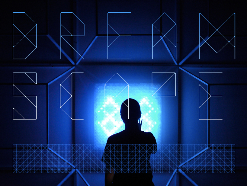
Design interactive Dreamscape in Shanghai

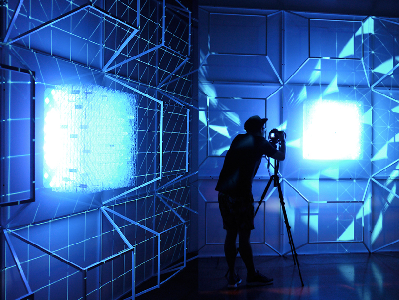
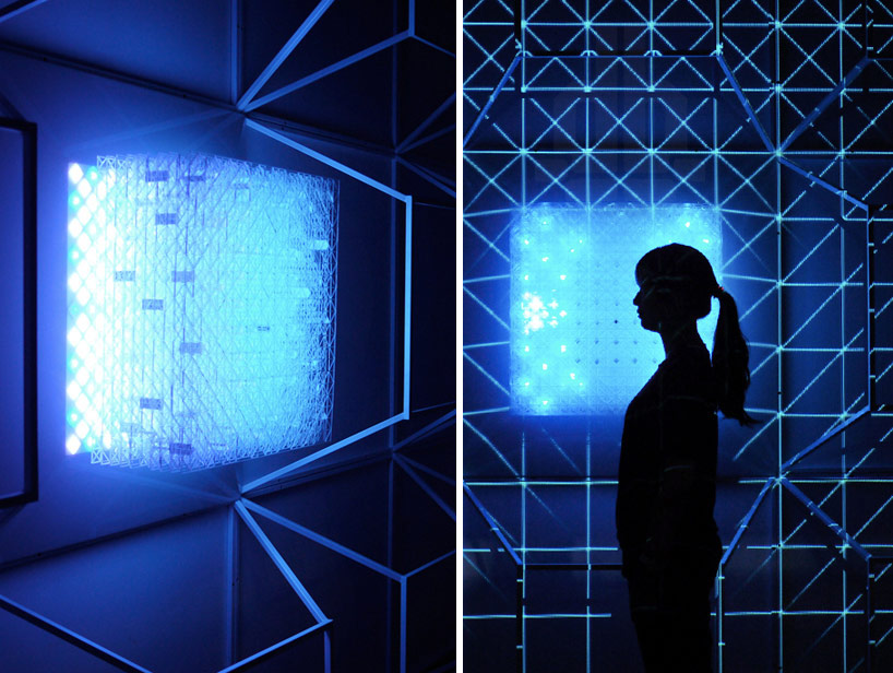
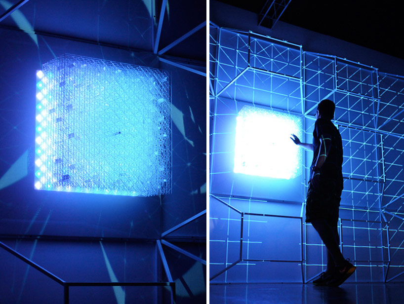
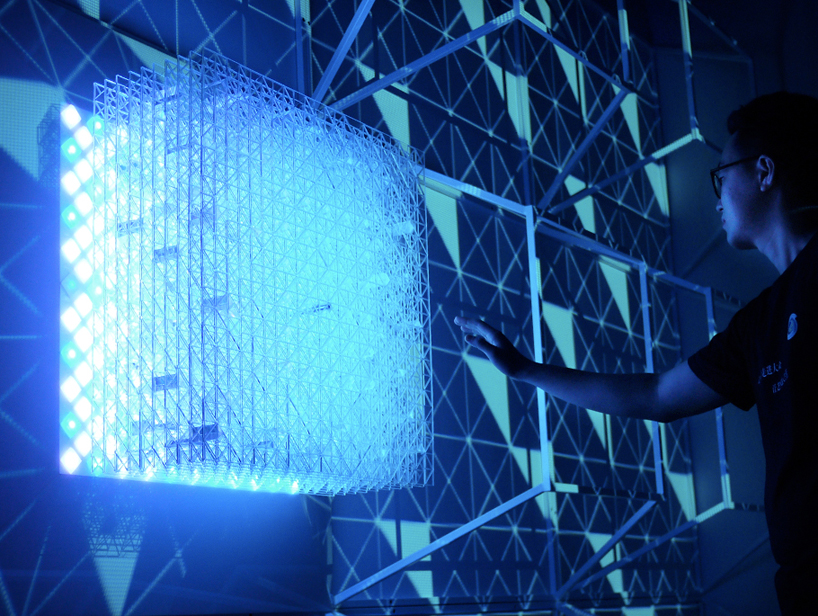
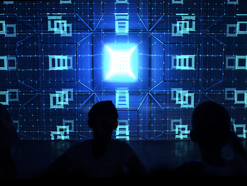
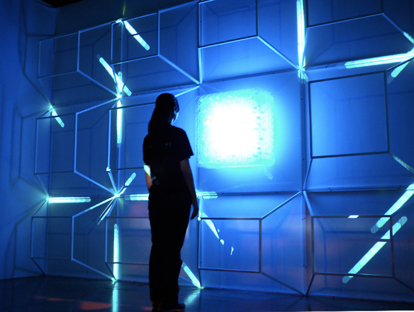
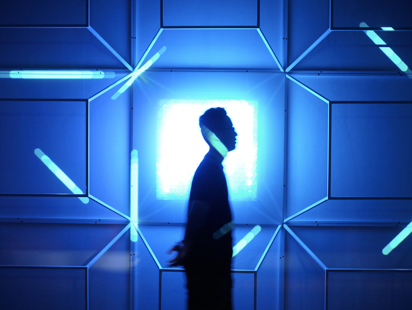
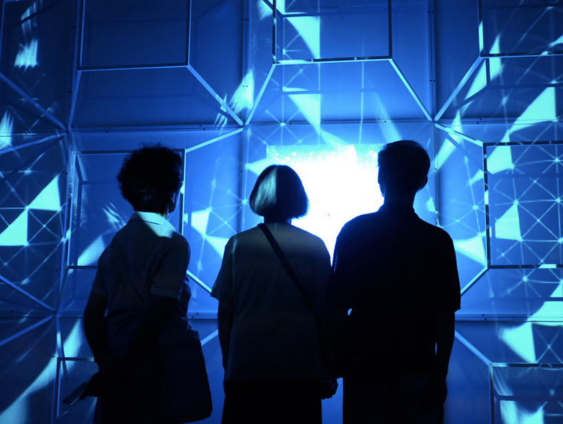
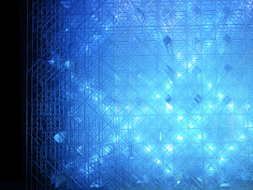
A super nature design interactive dreamscape in shanghai based on the characteristic of a ‘hypercube’ and its fourth dimension, the ‘dreamscape’ by super nature design is aninteractive art installation. manipulating vision and representation via explorations of architectural landscapes,the lighting sculpture creates an immersive environment. mesmerizing hidden messages within the cubic structure grab people’s attention with each layer offering a new sense of dimension and different field of depth. looking though the elements a strong, visual experience of light motion and illusion is produced. 


‘dreamscape’
video courtesy of super nature design 


dreamscape exhibition


the interactive piece is based on the characteristic of a ‘hypercube’


mesmerizing hidden messages within the cubic structure grab people’s attention with each layer offering a new sense of dimension


lighting reflects onto the surroundings


interacting with the installation


the lighting sculpture creates an immersive environment


each layer offers a new sense of dimension


person in the dreamscape


each layer offers a new sense of dimension


Source

Read More
1980k 1980k

Tokujin Yoshioka solo exhibition Crystallize


Japanese artist and designer tokujin yoshioka is presenting his largest solo exhibition to date at the museum of contemporary art tokyo
‘tokujin yoshioka_crystallize’ showcases a collection of retrospective artworks that document the evolution of his creative exploration, as well as new works that emphasize his dedication to the crystal medium. throughout his career, yoshioka has experimented with this material, particularly the formation of natural structures that are composed through a crystallization process. yoshioka adopts the practice for a variety of sculptural media and installation work, which includes furniture such as ‘spider’s thread’, a seven-stranded chair suspended in the air created by crystals growing onto seven fine threads (see designboom’s coverage of the crystallized piece, here). 


‘rainbow church’ at museum of contemporary art tokyo

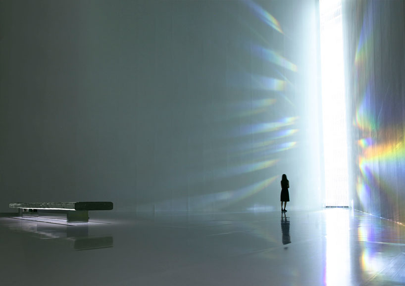
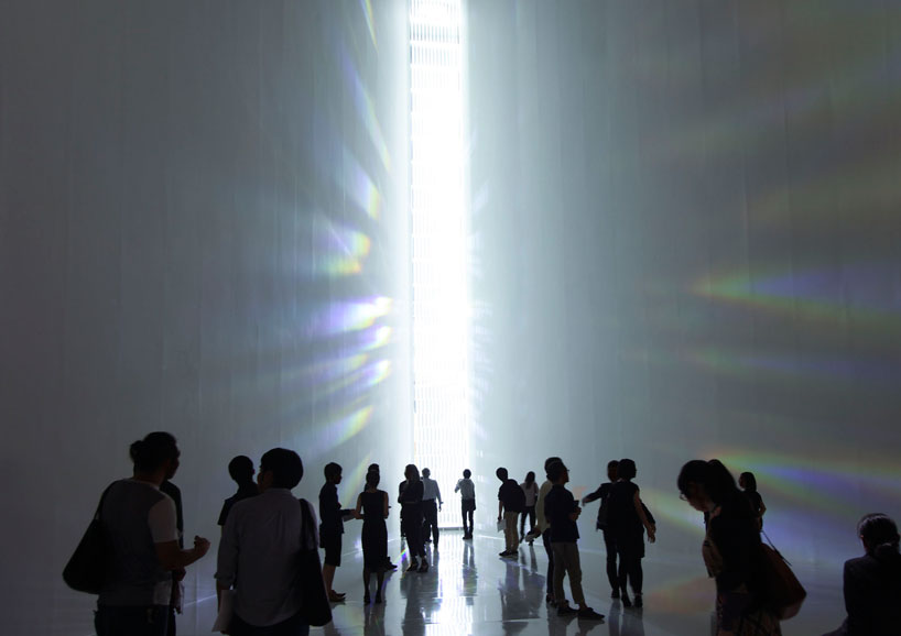
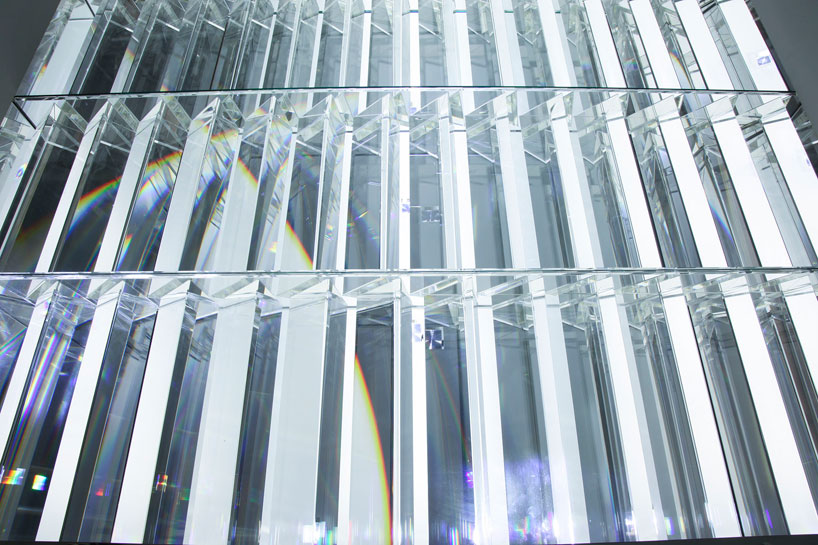
the renowned ‘rainbow church’ is at the main atrium space of the exhibition. the re-conceived installation stands at 12 meters high  a towering, immersive architectural work composed of 500 crystal prisms that convert natural rays of light into rainbow colors, filling the interior with an overwhelming luminous chroma. following a visit to the rosaire chapel designed by henri matisse, yoshioka was driven to build a structure which could mirror the kaleidoscopic visuals that surround the inside of the church as outside light filters through.


visitors experiencing ‘rainbow church’


a detail of the crystal prisms that make up ‘rainbow church’


‘ray of light’ at museum of contemporary art tokyo

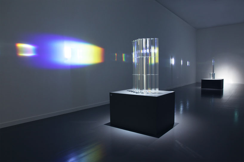
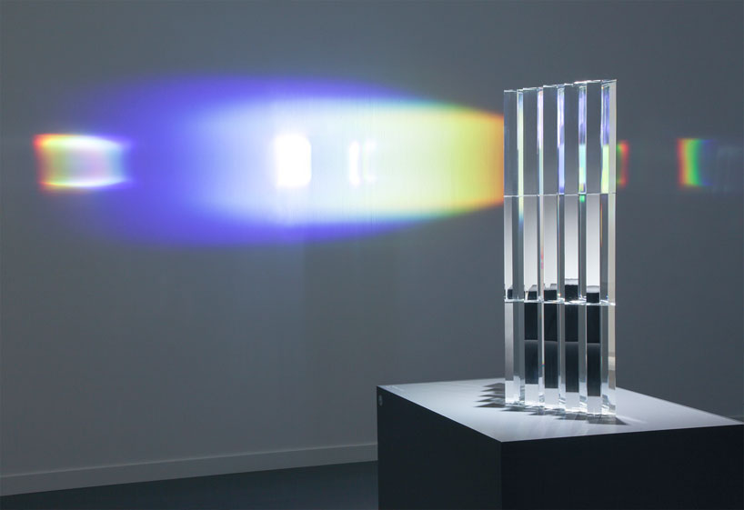
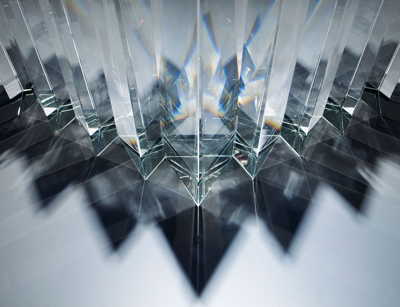
‘ray of light’ is a solid and transparent sculpture made by crystal prisms, which emits an aura of rainbow light.the luminous structure reveals radiant beams of color as light filters through, which is translated throughout the interior gallery walls.


chroma is revealed through the sculpture


a detail of the pointed prisms that make up ‘ray of light’

Source

Read More
1980k 1980k

Diffraction is a Photograph Series

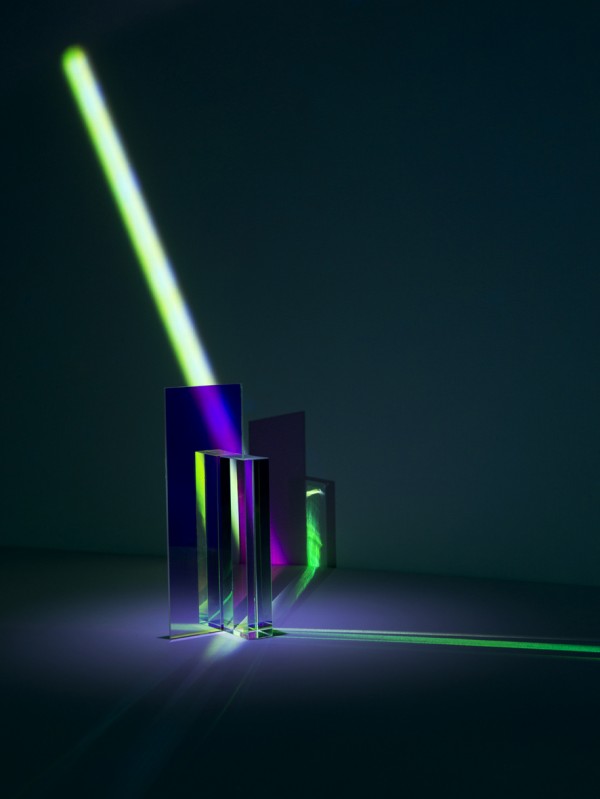
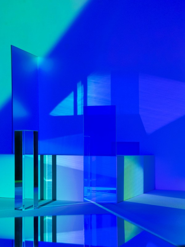
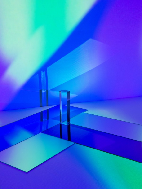
Mitch Payne TRIANGULATION BLOG 04Mitch Payne TRIANGULATION BLOG 03  Mitch Payne TRIANGULATION BLOG 05Mitch Payne TRIANGULATION BLOG 02

Mitch Payne

Work from Diffractions

“Diffraction is a photograph series created by Mitch Payne, consisting in several abstract colorful compositions made using opaque and transparent forms and shapes where the light is reflected

Diffraction: A modification which light undergoes especially in passing by the edges of opaque bodies or through narrow openings and in which the rays appear to be deflected; also : a similar modification of other waves (as sound waves) or of moving particles (as electrons)”

Source

Read More
1980k 1980k

Why you should move that button 3px to the left

When a product is close to launch, I become a perfectionist. Each misaligned element or awkward interaction is like a thorn in my side. There’ll be a dozen tiny implementation mistakes that taunt me each time I run into them. Everything seems so broken.

But to everyone else on the team, the product seems fine! It’s functional. They ask, “Will moving that button by 3 pixels really improve our product?” They argue, “The last time we fixed a small design bug, the product didn’t feel any different.” And so the team moves onto the next big idea and the next set of features.

If you’re anything like me, this situation can be incredibly frustrating. As designers, we are held responsible for the overall quality of the experience. Yet we’re at the mercy of our teams. We can design beautiful, intricate, delightful details — but we can’t build, test, and deploy them all.

How do we convince our engineering and product counterparts to care about design fit and finish? I’ve struggled with this issue many times. Here’s what I’ve learned.

It’s not design for design’s sake

Designers notice the gap between functional and delightful, and that’s why we obsess over the little details. (littlebigdetails.com) But there’s a very real tradeoff between perfecting the design details and building more functionality: getting the details right often means moving slower.

So it’s not enough to say “it looks better this way”. Designers need to make a case for why the team should spend time on fit and finish.

Trust increases when we get the details right

Customers judge online credibility by evaluating visual design, copywriting, and interactions. If trust matters to your business, then design details should matter too. Check out the academic literature on the topic of interface design and trust, or look into Stanford’s Web Crediblity Project.

MintSquare, and Simple have all done a fantastic job of getting design details right, and earning customer trust. They all began as unproven products, yet customers trusted them to store financial details, process payments, and safeguard accounts.

Usability improves when we get the details right

The MailChimp logo makes me smile every time! The lack of clutter on the Google homepage is so peaceful. The glossy pixel-perfection of Apple interfaces is delightful. They got the design details right, and it’s creating a positive emotional state, but why does that matter?

There’s a curious brain hack at work here. Our minds are deeply tied to emotional states. Being frustrated or happy changes the way we approach problems. I have certainly been in a bad mood, gotten confused by a product, and found myself repeatedly smashing a button to no effect. In my frustration, I try the same thing, justharder. But it doesn’t help me accomplish my goal.

When we’re happy, using an interface feels like play. The world looks like a puzzle, not a battle. So when we get confused, we’re more likely to explore and find other paths to success. There’s a whole book on this topic: Emotional Design by Don Norman. But here’s the important bit: Getting design details right can create positive emotional states that actually make products easier to use.

Batch up the work

If your product needs a massive helping of fit and finish, fixing one issue won’t do much to delight you or your users. Filling one pothole won’t turn a bumpy street into a smooth one — you’ll barely notice the change!

So here’s the trick: Batch up UI bugs into one sprint. If your team regularly holds a fix-it day to squash bugs, then piggyback on that habit and hold a design fix-it day. As a designer, you can do advance work like putting all the changes into a spreadsheet or bug tracker and prioritizing issues.

On the day of the sprint, everyone can just focus and crank through the list. Maybe you don’t fix everything — that’s OK. The small changes you do make will add up, and by the end of the day your product will be noticeably better. That makes everyone feel great and it’ll be easier to get people focused on fit and finish issues in the future.

Polish as you go

I really screwed up the first time I tried to keep quality high as we were building features. It always started fine: an engineer and I would agree to a design, I’d send him a few mockups, and the next day he’d show me the progress. What I saw: a sloppy version of my design. Ugh.

I’d moan and complain and point out all the mistakes, which wasn’t any fun. So the next time he was less likely to ask for my feedback, quality slipped further, and I became more upset. Classic death spiral.

I came to realize that when a feature is 90% done from an engineering perspective, it can still feel about 10% done to a designer. Now I get excited about the functionality and celebrate that there’s only a bit of surface details to finish before the feature is perfect.

I also try to build in triggers for feedback sessions while engineers are in context. I’ll say, “Grab me right before you check this in.” That way we can go over any small changes while all the files are open and checked out.

Avoid customization icebergs

Designing a custom button in Photoshop is easy — that’s the part of the iceberg we can all see. Below the surface it takes a lot of effort to get the details right: building pressed and inactive states, preventing text highlighting on double-click, adding right-to-left support, testing accessibility, and so on.

I often hit this iceberg when I stray from native controls. For example, Ajax interactions require more polish than basic web pages. Custom mobile menus require more polish than the built-in version. If the team doesn’t have the time to polish custom UI, it’s often better to stick to the boring native controls that work.


Those are some of the techniques that I’ve learned over the years to get design details built. And I’ve noticed along the way that teams vary widely in their culture around quality. Some teams obsess over the details and take their time. Other teams tend to launch sloppy products fast.

I’m interested in how teams create norms for quality. How do you create a culture where a team can quickly come to agreement about whether to spend more time on design details? What has worked for you? What hasn’t? Let’s discuss in the comments below.

Source

Read More
1980k 1980k

Legged Squad Support System (LS3) is a four-legged robot designed to travel 20 miles on rough terrain carrying 400 lbs of load. The video shows field testing at Twentynine Palms, CA. Testing includes rough-terrain mobility, endurance, visually guided following, GPS guided maneuver, and overall reliability. LS3 is being developed by Boston Dynamics with funding from DARPA and the US Marine Corps. Source

Read More