Quotes from Steve Jobs Lost Interview
I had the pleasure of catching the opening night showing of Robert X. Cringely’s rediscovered TV interview with Steve Jobs in 1995. In the interview Steve mused about what makes companies and products great so I jotted down a lot of his insights. Here’s a few of my favorites. Note this was typed hastily on an iPad in a crowded theater so wording is probably not exact.
"No one thinks about why they do things very deeply."
"If you are willing to work hard and ask lots of questions, you can learn business pretty fast."
"Learning to program teaches you how to think. Computer science is a liberal art."
"Money is wonderful because it allows you to invest in things without having to worry about short term gain."
"Many companies forget what it means to make great products. After initial success, sales and marketing people take over and the product people eventually make their way out."
"When companies get bigger they try to replicate their success. But they assume their magic came from process. They try to use processes to substitute content."
"The best people are the ones that understand content. They are a pain in the butt to manage but you put up with it because they are so good at content."
"Many companies get the disease of thinking that a really great idea is 90 percent of the work. And if you just tell all these other people here’s this great idea then of course they can go off and make it happen. And the problem with that is that there’s just a tremendous amount of craftsmanship in between a great idea and a great product. Designing a product is keeping five thousand things in your brain and fitting them all together in new and different ways to get what you want. And every day you discover something new that is a new problem or a new opportunity to fit these things together a little differently."
"It’s that through the team, through that group of incredibly talented people bumping up against each other, having arguments, having fights sometimes, making some noise, and working together they polish each other and they polish the ideas, and what comes out is really beautiful."
"With really good people all that matters is the work. They all know that."
"I don’t care about being right. I care about success and doing the right thing."
"The only problem with Microsoft is that they have no taste. They don’t bring a lot of innovation. They don’t push culture into their products. They make really third rate products that have no spirit in them."
"The way to ratchet up our species is to get better things to more people -products with spirit and creativity."
"Humans are tool builders. We create things to amplify ourselves. The computer will rank at the top -it’s the most awesome tool ever."
"How do you know the direction to head with products? It boils down to taste. Emerge yourself with the best ideas from the humanities. And integrate them. Pull interests from diverse areas."
"What causes people to be poets instead of bankers? When you put that into products people can sense that. And they love it."
How to decide between a responsive website or a native mobile app
Many business owners and entrepreneurs struggle with whether they shoulddesign a responsive website that works across devices or focus exclusively on building a native mobile app.
It’s a difficult choice to make since both options present advantages and disadvantages that must be taken into consideration when moving forward.
As of last year, apps from retail businesses took up to 27 percent of consumer’s time, which sheds lights on how critical a mobile app can be to reaching your customers where they are active online. At the same time, 67 percent of consumers say they are more likely to purchase from a mobile-friendly websitethan they are from a website not optimized for devices other than desktop.
It’s a tough call to make when deciding between responsive design or an app, but in the end, it depends on the goals of your business.
If your company can afford it, it’s highly recommended that you build both a responsive site and a native mobile app in order to help your business work towards capturing the attention of your entire mobile audience. The native mobile app will provide a mobile centric experience for your existing and most loyal customers, while your responsive website can help provide an optimized experience to new and old visitors browsing your website or discovering it for the very first time.
For example, popular ecommerce brand Nasty Gal has a responsive website and a mobile app to help provide the best experience for its shoppers however they wish to shop the brand’s products.
Most companies can’t afford to do both, which is why it’s important to understand the advantages of both options when addressing your company’s mobile priorities.
Responsive design isn’t a cure-all
Responsive Web design is certainly the most affordable option for your business as compared to the development of a mobile app. Take into consideration the initial costs of redesigning your website to be mobile friendly, then the cost of occasional upkeep and upgrades.
If visibility in the search engines is an increasingly important part of your strategy to grow your business, then a responsive website is critical in helping grow traffic to your website. A mobile app lives in a closed environment and cannot be indexed by the search engines, which requires driving traffic to this app through alternate methods.

Depending on your designer and the size of your website, a responsive Web design often takes far less time to create then does a mobile app since there’s no app store approval or extensive guidelines to follow as compared to what GooglePlay, the Apple app store and the Windows Phone app store require for launching an app.
If the goal of your destination online is to be universally accessible from any device, then responsive design is the solution. A mobile app is designed for a unique experience; exclusive to the operating system it lives on, which means it isn’t a one size fits all fix.
However, don’t think of responsive design as the easy way out when it comes to optimizing your website across mobile devices. Although a responsive website optimizes your experience, it doesn’t incorporate all the smart phone features like the camera or GPS that a native mobile app can.
A mobile app will provide users with unique functionality and speed that can’t be achieve with a responsive website, but can be experienced on the operating system you choose to design your app on.
It’s better than not having a mobile-friendly version of your website, but it’s not the finally solution for your customer’s experience with your business on mobile. Again, the choice between responsive and a mobile app depends on what your goals are for mobile.
Consult analytics to inform your native mobile app
A mobile app offers a compelling, unique and mobile specific experience for your customers, which is one of the main reasons why your company should consider designing an app over worrying about making your existing website mobile-friendly.
First and foremost, if you have existing data to analyze than it is important to use your analytics tools like Google Analytics or Omniture to see what mobile devices are used the most to visit your website in the past few months. This can help inform what operating system you decide to design your app on.

Whether you decide to go with iOS, Android, Windows Phone or another less popular operating system, it’s essential to match the features of the operating system with the type of app you’re looking to create whether it’s an ecommerce store, a content focused website etc.
Besides being able to utilize more of the features incorporated in a mobile device into the experience, a mobile app often has access to more data from a user and therefore, can provide a more personalized experience.
This personalization through data could play out in the types of push notifications an app sends you, product recommendations, suggested content to view or other specific user-driven actions. When a user makes a profile on an app, it makes gathering data about a person and their online habits much easier for a business and much quicker and smoother for the user continually using this app to shop, find events to attend, listen to music and perform other tasks.
As of now, a native mobile app offers the best user experience for a person on a mobile device since there are still limitations to how HTML 5 can be parsed on mobile.
As the complexity of the responsive website increases, the more likely the user experience will begin to suffer. A native mobile app offers the best user experience to your audience, taking advantage of the phone’s functions and the expectations of customers using these devices.
Lastly, in-app purchasing drives 76 percent of all app marketplace revenues to date since once it is setup, it’s particularly easy for users to make a purchase with pre-entered credit card information.
This is best suited if your app will offer micro-purchases, which our low price point products or services within the app, like buying virtual goods, membership to the premium version of the app or access to additional content.
Nostalgia: A Product Designer’s Secret Weapon

Remember pogs?
Remember Tubthumping?
Remember Nickelodeon GUTS?
Now pause…
How do you feel right now? Did reading those words stimulate any emotional reaction? Did it bring back memories? Excite you? Make you smile?
Nostalgia is powerful. Simply mentioning the names of childhood toys, old TV shows, classic video games, and other pastime activities often instigate an emotional response, reminiscence. But why? Why is nostalgia so compelling and how can product creators use this to build more engaging products?
The Influence of Nostalgia
The term nostalgia was coined by 17th century physician, Johannes Hofer, based off the Greek words nostos (return) and algos (pain). He prescribed nostalgia as a mental illness, attributing it to Swiss soldiers’ symptoms of anxiety, homesickness, insomnia, and anorexia. Hofer believed“continuous vibration of animal spirits through those fibers of the middle brain in which impressed traces of ideas of the Fatherland still cling,” was the cause of these ailments.
Since then, we’ve acquired a better understanding of nostalgia, now defined in the Oxford Dictionary as “a sentimental longing or wistful affection for the past, typically for a period or place with happy personal associations.” Nostalgia generally instills positive emotions of happiness, social connectedness, confidence, and optimism of the future. When feeling down, people seek nostalgia to raise their spirits. Dr. Clay Routledge, a Professor of Psychology at North Dakota State University, posits that “nostalgia increases positive mood, perceptions of meaning, and a sense of connectedness to others. Thus, people may naturally turn to nostalgia if positive mood is threatened, a sense of meaning in life is undermined, or feelings of social connectedness are compromised.”
Negative emotions are powerful triggers, influencing our behavior. Feelings of loneliness, boredom, or insignificance prompt people to browse their Facebook feed, search for a match on OkCupid, or send a photo to a friend on Snapchat. People turn to these services, often subconsciously, to improve their mood. In one study Dr. Routledgeexamined the effects of music-induced nostalgia, playing popular songs and providing lyrics to participants. Those exposed to the music were more likely to report that they felt “loved” and that “life is worth living” than a control group.
Routledge further explains, “[Nostalgia] is a psychological resource that people employ to counter negative emotions and feelings of vulnerability. Nostalgia allows people to use experiences from the past to help cope with challenges in the present.” Smart product designers and marketers recognize the influence of nostalgia, integrating it into apps and services we use every day. Here are a few products that use nostalgia to spark engagement and build compelling experiences.
Timehop
Nostalgia is a core component of Timehop’s design. Each day the service revives past status updates and photos shared exactly one or more years ago. Instantly, memories resurface as these shared moments encourage people reminisce with friends and family.
The other day Timehop resurfaced this photo:

This was from an incredibly fun 80’s KOFY TV Dance Party, two years ago. Instantly, I shared this with my friends to reminisce.
Heyday
Heyday uses a similar approach, reminding users of the past. But it adds another dimension: location. Last month when I visited my hometown, I received a delightful push notification from Heyday, prompting me to “Look back at your photos shared in Eugene, OR.”
Using the location data stored within the photo, Heyday generates a historical map of one’s travels to surface delightful, contextual memories from the thousands of pictures stored on my iPhone.
Facebook Year in Review
Facebook amused the world toward the end of 2012 with a special year in review, surfacing the 20 most popular posts in one’s timeline. People enjoyed the digital scrapbook, reviewing and sharing memories of the past year. Facebook repeated the successful campaign again at the end of 2013.

Visit your 2013 year in review and observe your emotions and behaviors. Does it make you smile? Are you compelled to comment on these memories? This nostalgic look-back also helps communicate the value of Facebook as a destination to store and relive memories the following year.
Mindie
As Dr. Routledge’s research shows, music has remarkable nostalgia-inducing powers. Mindie, a mobile app to watch and create 7-second music videos, leverages this potent power to quickly deliver an aha! moment, hooking users on day one. Browse the feed of user-created videos to listen to the classics or create your own, selecting your favorite song from yesteryear, surfacing memories and nostalgia.

Polar
Polar, a mobile app of visual polls, covers a wide range of topics from current day politics to modern memes. But many of its most engaging polls, as found in its feed of top submissions, are based on old pop culture references and childhood activities like:
- Who’s cooler? Marty Mcfly or Ferris Bueller.
- Favorite Pokemon Tourney: Round XY-Finals? Dedenne or Mega Absol.
- What game did you play? Hide and Seek or Tag.

Boya
Boya, a new product from the folks at Monkey Inferno, thrives off of nostalgia. After registering any account, users are prompted to describe themselves, entering things they’ve done.

These shared experiences ignite conversation as community members ask users about their experiences, further digging into the archives of the brain.
Foursquare Timemachine
In the summer of 2013, Foursquare Timemachine, hit the internet, igniting a wave of attention in the press and social media.

People loved the data-rich, interactive map of their check-in history. My memories moving from Portland to San Francisco was most notable for me, marking a new chapter in my life. Others reminisced of past vacations as the map traveled across the world.
Glimpse
Glimpse, a dating app that uses Instagram photos to express oneself, creatively uses nostalgia in its on-boarding process. When first signing up, it prompts users to login with Instagram and select nine photos to express one’s personality.

Browsing years of beautiful photos from the past is delightful and although it’s not core to the product, the experience is fun and engages users when they’re most susceptible to churn, before they’ve recognized the value of the app.
Be it a one-time marketing tactic like Foursquare’s Time Machine or core part of the product design like Timehop, nostalgia is a powerful tool to re-engage users and create compelling experiences. Consider how you can use nostalgia to:
- Promote your product and provide interesting content people want to share
- Deliver an aha! moment on day one, encouraging users to return
- Build sustainable value and delightful experiences by making people feel good
To learn more about product design and influencing user behavior, check out Hooked: How to Build Habit-Forming Products and subscribe to receive the first chapter for free.
This essay was originally published on Pando.
Notifications are a UX Anti-Pattern
Don Knuth, one of the fathers of modern computer science, has this to say on email:
I have been a happy man ever since January 1, 1990, when I no longer had an email address. I’d used email since about 1975, and it seems to me that 15 years of email is plenty for one lifetime.
Email is a wonderful thing for people whose role in life is to be on top of things. But not for me; my role is to be on the bottom of things. What I do takes long hours of studying and uninterruptible concentration. I try to learn certain areas of computer science exhaustively; then I try to digest that knowledge into a form that is accessible to people who don’t have time for such study.
His distinction captures a remarkable fact for those of us who keep our email tabs open all day: email allows anyone to interrupt you, at any time, for any reason.
Imagine describing the analogous interaction design pattern for old-school snail mail to a version of yourself from thirty years ago, before the widespread emergence of email and the web: “Well, instead of having your mail delivered once per day, it will be delivered constantly, at all times, with each new piece of mail. And each time a new piece is received, the postman will call you, and tell you who the mail is from, what it looks like it’s about, and so on. If you want, you can have the postman open the mail, and you can hear its contents.”
Absurd, right?
Gmail has acknowledged this absurdity with its recent introduction of tabs; emails sorted into the Promotions tab do not trigger the same kinds of notifications as emails sorted into the Primary tab, etc.
But when you step back for a moment, it’s easy to see how the problem is much, much bigger than just email: the notification design pattern has crept its way into the interaction design of almost every major tech product we use.
New text? Buzz buzz.
New comment on a facebook thread? New notification.
New mention on twitter? New notification.
To be fair, not all notifications interrupt attention at all times: whereas the buzz of a text message will probably distract you no matter what you’re doing, notifications in things like facebook and twitter are just a bit softer and more customizable attentionally, and won’t necessarily interrupt you, unless you hear an associated sound, or opt in to a buzz on your phone, etc.
The problem is, whether they happen to interrupt your attention or not, they reinforce a cycle of behavior that benefits the app creator, but damages you, as a user. I call it the “(Interrupt)-Check-Interact-Reward” cycle.
Here’s how it works—if you’re familiar with classical conditioning, this story will be a familiar one to you:
Let’s start with the end of the cycle since it’s the most straightforward. Using facebook, Gmail, twitter are satisfying activities; that’s what keeps us using them. Call it fun, productive, pleasurable, whatever: using the software is a positive experience by our definition, and that’s what keeps us coming back. This is “Interact-Reward.”
Notifications that interrupt your attention take this cycle outside of the world of the app. Instead of opting to visit facebook.com and have a rewarding interaction, facebook decides it’s going to interrupt whatever you’re doing, and notifies you of some activity. Suddenly, the behavior that you go through to get the reward looks slightly different: you are interrupted, you check your notifications, you complete your interaction, and you get your reward. This is Interrupt-Check-Interact-Reward.
Already this starts to make us a look a bit like Pavlov’s dogs. Whatever pleasure we got out of the interaction on the app originally, we learn to associate with the new stimulus of the notification itself. We start to crave the notification for its own sake, instead of the interaction that the app is designed for.
But it gets worse. The “leaky,” soft notification that I referenced above, which is how facebook and twitter operate by default, doesn’t alwaysinterrupt you when you have a “notification.” This is where the parenthetical “(Interrupt)” part of the cycle comes in. Associating the notification with the reward of using the software and then withdrawing it some of the time reinforces the desire for the Check part of the cycle.
Does that make sense? Imagine if your phone only notified you of textssome of the time, and you didn’t have full control when or why. You’d get caught in a loop of wanting to check your phone for texts, wondering whether anything had happened since the last time you checked. And if, just often enough when you checked, someone new had texted, this behavior of Checking would be reinforced by the pleasure of seeing the new text, and the Checking behavior itself would come to be what you craved.
This is why facebook stopped emailing copies of notifications to people’s inboxes by default: they learned that emailing people less about what’s happening in the app actually keeps them coming back more. If the Interrupt always happens, why bother Checking? This is like randomly checking your phone for texts even though you haven’t noticed a buzz or notification. You might do it once in a blue moon when you’re bored or an awkward situation calls for it, but since the Interrupt always happens, it’s what you associate with the pleasure of receiving a new text, and you don’t feel a compulsion to constantly Check. Once the Interrupt is selectively withdrawn, the Checking behavior is what becomes associated with the pleasure of the interaction.
Notifications start to look like a great way to keep you glued to an app, and not such a great way to serve your interests as a user.
Indeed, facebook, Gmail, twitter, et al. all suffer from the same fundamental dilemma: they profit from advertising, and the longer a user spends on the site, the more ads they can be served. So on the one hand, in simple terms, it’s their absolute goal to maximize time on site for every user.
On the other hand, time on site is clearly inversely correlated with good design for a whole host of tasks from the user’s perspective. All other things being equal, the longer it takes to compose an email in gmail, to search for an old tweet, to look up a friend on facebook, the worse, for the user. Longer times indicate more difficulty doing whatever it is the user intended to do.
Put another way, to maximize user happiness/productivity/goals, what is theoptimal number of times that a user should check gmail, facebook, or twitter, in a day, for example?
Of course, this question has no answer—not all users are alike, not all days are alike for any given user, and so on. But app designers and the companies who pay them have to strike a delicate balance between their short- and long-term interests: in the short-term, their interests are heavily aligned towards maximizing the number of interactions that you have with the app, regardless of whether or not it’s to your detriment. In the long-term, ruthlessly squeezing logins out of you may hurt them if they fear that it will eventually cause so much fatigue in you that you’ll abandon the app, having recognized that it was all just a con game to get you to login again, and again, and again.
But is that a realistic fear for facebook, twitter, Gmail? I am reminded of this brilliant piece by Alexis Madrigal on the “machine zone.” It’s the place that MIT anthropologist Natasha Schüll says that slot players go when they’re at the slots, and, perhaps surprisingly, it’s not about winning money at all: it’s a hypnotic, trance-like state where distinctions between you and the machine, even feelings of time and space, feel like they have fallen away. These are the gamblers’ words, not mine.
Reading Madrigal’s piece, I wonder: are modern web products the most sophisticated addiction machines in the history of mankind? Schüll’s book is called Addiction By Design, and it seems clear to me that notifications in most modern web products are designed to addict, not to help us live better lives.
The test for the appropriateness of the notification design pattern is simple, because the modern mobile phone is essentially just an always-on notification machine. Wherever we see notifications, we should ask: would it be absurd if, instead of receiving these notifications, I received a phone call or text letting me know of the same activity? If the notifications fail this test, they are probably designed to addict, as well as or instead of being designed to be informative.
This is not an entirely fair test, and it is oversimplifying. A phone call is not a text is not an email; there is a time and place for all sorts of information and interruption. But I think it still stands as a useful thought experiment to begin to distinguish between well-designed notifications and those that are designed to create a coerced, unbreakable loop of app usage.
Let’s kill notifications that exist to addict and set each other free from the never-ending arms race of cheap con games to compete for user attention.
We set out to build software to help communities we are passionate about, to solve their problems; what a travesty it would be if we allow ourselves to become the designers of ever-more-sophisticated ad-serving slot machines.
UX Consulting in 2014: Predictions and Pain
As we enter the beginning of 2014, it is almost impossible to avoid reading articles that discuss the trends we saw in the previous year—noting what trends have gone mainstream or failed gloriously. We’re also getting bombarded with UX predictions for what will be trends in the new year. This cycle repeats year after year, along with predictions that thisyear we’ll finally see—insert UX trend here—go mainstream.
From a professional perspective, this kind of stuff is fun. If you are passionate about user experience, there are bound to be some trends that really speak to your own personal design sense. And you can derive an abundance of amusement from reading about the really silly UX trends.
But predictions and trends can also be a source of pain when you work in the consulting world. As user experience—and let’s be honest, anything with the word experience in the title is trendy in and of itself—continues its well-deserved climb into the hearts and minds of regular folk, chances are that your clients and customers are reading the same UX articles you are. Since they will undoubtedly bombard you with questions about new trends, you’ll need to have a decent amount of knowledge about them so you’ll come off well informed.
In addition, you should prepare some good defenses to justify why you would not recommend following any UX trends that you find silly. What you find silly might turn out to be something a client truly believes would elevate their products to providing a world-class user experience.
In my first column of 2014, I’ll offer three predictions of my own for 2014—all relating to UX consulting—in the hope that this discussion will help prepare us for the conversations we are inevitably going to have with our clients.
Prediction #1: Mobile Is Not Going Away
In fact, design for mobile is only getting stronger and more sophisticated. But having a mobile-first strategy is not going to be enough. Instead, we must come up with a much better story to tell and a strategy to sell the truly mobile user experience. Here are some questions that our clients may ask and we should be prepared to answer:
- What do our users need to do on a mobile device now? And two releases from now?
- What shouldn’t our users want to do on a mobile device?
- How is our content going to change? Should it change?
- How should we streamline our business processes to make it easier for users to do real work on a mobile device?
- What types of operational efficiencies will result from adopting a mobile-first approach?
These are just a few of the questions that our clients will start asking once they get their sites and apps looking good on mobile. This is going to be a great year to strive to attain the next level of maturity for mobile apps.
Prediction #2: Responsive Is Here to Stay
UX professionals need to be cognizant of the fact that, for every client who knows about responsive Web design (RWD), there are many more who will get exposed to this concept for the first time in 2014. As UX consultants, we are in a strong position to help our clients realize that RWD goes beyond looking good on a phone. We should really hammer home the SEO (Search Engine Optimization) and future adaptability benefits that we can gain with RWD. We will also see bigger demand for higher-performing RWD solutions. And finally, we can begin to apply RWD in industries that don’t yet really have a demand for mobile access. (Yes, they still exist!)
Prediction #3: If Simplicity Is King, Complexity Is Queen
Everyone knows it’s the Queen who has the real power. We’ll continue to see some design trends from last year:
- a desire to keep things simple
- stripping away heavy content and visual-design elements
- icon fonts replacing text in a cleaner fashion
- giving amazing typography its rightful place as one of the most important visual elements of an application or site
However, with the push toward visual simplicity, whatever elements remain must convey increasing levels of complexity. We’ll have to communicate messaging and brand, available actions, workflows, and whatever else clients want their products to convey with less. That is both very exciting and deeply frightening for lots of UX people. However, it also helps us to wade through the trends that lack substance and get back to the core of user experience.
This trend impels us to be creative with our navigation design, our information architecture, and our visual design. Coupling simple design with complex ideas forces us to make critical decisions about what to put on the screen—and it hardens our design skills in positive ways. On the user-research side, it also forces us to be laser focused in structuring our research to help us understand what elements a screen really needs to display, enabling users to do their job faster and more effectively.
More often than not, simple is not all that simple to achieve. It will be a great year for stretching our UX design creativity to deliver world-class user experiences.
Not Losing Sight of What Is Important
No matter what the trend is, if we fail to apply core UX design principles, we can mess things up. You could have the simplest, most responsive app, working on every device imaginable, and it could still be a usability horror show if you don’t focus on users and what they really need from the user experience. This is what UX professionals do every day without really thinking about what principles supersede trends, but produce user experiences that are a delight to behold. So, we definitely need to be cognizant of design trends and incorporate them into our repertoire of knowledge and practice wherever it makes sense to do so. However, let’s not forget that the core principles of user experience provide the foundation for all successful design trends.![]()
- See more at: http://uxmatters.com/mt/archives/2014/01/ux-consulting-in-2014-predictions-and-pain.php#sthash.ldbiJEuV.dpuf
How Do Users Really Hold Mobile Devices?
As UX professionals, we all pay a lot of attention to users’ needs. When designing for mobile devices, we’re aware that there are some additional things that we must consider—such as how the context in which users employ their devices changes their interactions or usage patterns. [1] However, some time ago, I noticed a gap in our understanding: How do people actually carry and hold their mobile devices? These devices are not like computers that sit on people’s tables or desks. Instead, people can use mobile devices when they’re standing, walking, riding a bus, or doing just about anything. Users have to hold a device in a way that lets them view its screen, while providing input.
In the past year or so, there have been many discussions about how users hold their mobile devices—most notably Josh Clark’s. [2] But I suspect that some of what we’ve been reading may not be on track. First, we see a lot of assumptions—for example, that all people hold mobile devices with one hand because they’re the right size for that—well, at least the iPhone is. [3] Many of these discussions have assumed that people are all the same and do not adapt to different situations, which is not my experience in any area involving real people—much less with the unexpected ways in which people use mobile devices.
For years, I’ve been referring to my own research and observations on mobile device use, which indicate that people grasp their mobile phones in many ways—not always one handed. But some of my data was getting very old, so included a lot of information about hardware input methods using keyboard- and keypad-driven devices that accommodate the limited reach of fingers or thumbs. These old mobile phones differ greatly from the touchscreen devices that many are now using.
Modern Mobile Phones Are Different
Everything changes with touchscreens. On today’s smartphones, almost the entire front surface is a screen. Users need to be able to see the whole screen, and may also need to touch any part of it to provide input. Since my old data was mostly from observations of users in the lab—using keyboard-centric devices in too many cases—I needed to do some new research on current devices. My data needed to be more unimpeachable, both in terms of its scale and the testing environment of my research.
So, I’ve carried out a fresh study of the way people naturally hold and interact with their mobile devices. For two months, ending on January 8, 2013, I—and a few other researchers—made 1,333 observations of people using mobile devices on the street, in airports, at bus stops, in cafes, on trains and busses—wherever we might see them. Of these people, 780 were touching the screen to scroll or to type, tap, or use other gestures to enter data. The rest were just listening to, looking at, or talking on their mobile devices.
What My Data Does Not Tell You
Before I get too far, I want to emphasize what the data from this study is not. I did not record what individuals were doing because that would have been too intrusive. Similarly, there is no demographic data about the users, and I did not try to identify their devices.
Most important, there is no count of the total number of people that we encountered. Please do not take the total number of our observations and surmise that n% of people are typing on their phone at any one moment. While we can assume that a huge percentage of all people have a mobile device, many of these devices were not visible and people weren’t interacting with them during our observations, so we could not capture this data.
Since we made our observations in public, we encountered very few tablets, so these are not part of the data set. The largest device that we captured in the data set was the Samsung Galaxy Note 2.
What We Do Know
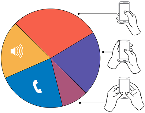
In over 40% of our observations, a user was interacting with a mobile phone without inputting any data via key or screen. Figure 1 provides a visual breakdown of the data from our observations.
Figure 1—Summary of how people hold and interact with mobile phones
To see the complete data set:
Voice calls occupied 22% of the users, while 18.9% were engaged in passive activities—most listening to audio and some watching a video. We considered interactions to be voice calls only if users were holding their phone to their ear, so we undoubtedly counted some calls as apparent passive use.
The users who we observed touching their phone’s screens or buttons held their phones in three basic ways:
- one handed—49%
- cradled—36%
- two handed—15%
While most of the people that we observed touching their screen used one hand, very large numbers also used other methods. Even the least-used case, two-handed use, is large enough that you should consider it during design.
In the following sections, I’ll describe and show a diagram of each of these methods of holding a mobile phone, along with providing some more detailed data and general observations about why I believe people hold a mobile phone in a particular way.
In Figures 2–4, the diagrams that appear on the mobile phones’ screens are approximate reach charts, in which the colors indicate what areas a user can reach with the finger or thumb to interact with the screen. Green indicates the area a user can reach easily; yellow, an area that requires a stretch; and red, an area that requires users to shift the way in which they’re holding a device. Of course, these areas are only approximate and vary for different individuals, as well as according to the specific way in which a user is holding a phone and the phone’s size.
Users Switch How They Hold a Mobile Phone
Before I get to the details, I want to point out one more limitation of the data-gathering method that we used. The way in which users hold their phone is not a static state. Users change the way they’re holding their phone very often—sometimes every few seconds. Users’ changing the way they held their phone seemed to relate to their switching tasks. While I couldn’t always tell exactly what users were doing when they shifted the way they were holding their phone, I sometimes could look over their shoulder or see the types of gestures they were performing. Tapping, scrolling, and typing behaviors look very different from one another, so were easy to differentiate.
I have repeatedly observed cases such as individuals casually scrolling with one hand, then using their other hand to get additional reach, then switching to two-handed use to type, switching back to cradling the phone with two hands—just by not using their left hand to type anymore—tapping a few more keys, then going back to one-handed use and scrolling. Similar interactions are common.
One-Handed Use
While I originally expected holding and using a mobile phone with one hand to be a simple case, the 49% of users who use just one hand typically hold their phone in a variety of positions. Two of these are illustrated in Figure 2, but other positions and ways of holding a mobile phone with one hand are possible. Left-handers do the opposite.
Figure 2—Two methods of holding a touchscreen phone with one hand
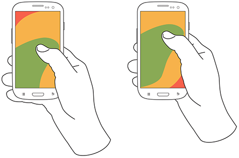
Note—The thumb joint is higher in the image on the right. Some users seemed to position their hand by considering the reach they would need. For example, they would hold the phone so they could easily reach the top of the screen rather than the bottom.
One-handed use—with the
- right thumb on the screen—67%
- left thumb on the screen—33%
I am not sure what to make of these handedness figures. The rate of left-handedness for one-handed use doesn’t seem to correlate with the rate of left-handedness in the general population—about 10%—especially in comparison to the very different left-handed rate for cradling—21%. Other needs such as using the dominant hand—or, more specifically, the right hand—for other tasks may drive handedness. [4]
One-handed use seems to be highly correlated with users’ simultaneously performing other tasks. Many of those using one hand to hold their phone were carrying out other tasks such as carrying bags, steadying themselves when in transit, climbing stairs, opening doors, holding babies, and so on.
Cradling in Two Hands
Cradling is my term for using two hands to hold a mobile phone, but using only one hand to touch the screen or buttons, as shown in Figure 3. The 36% of users who cradle their mobile phone use it in two different ways: with their thumb or finger. Cradling a phone in two hands gives more support than one-handed use and allows users to interact freely with their phone using either their thumb or finger.
Figure 3—The two methods of cradling a mobile phone
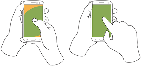
Cradling—with a
- thumb on the screen—72%
- finger on the screen—28%
With thumb usage, users merely added a hand to stabilize the phone for one-handed use. A smaller percentage of users employed a second type of cradling, in which they held the phone with one hand and used a finger to interact with the screen. This is similar to the way people use pens with their mobile devices. (We observed so few people using pens with their mobile devices—only about six—that I have not included them as a separate category in the data set.)
Cradling—in the
- left hand—79%
- right hand—21%
Anecdotally, people often switched between one-handed use and cradling. I believe this was sometimes for situational security—such as while stepping off a curb or when being jostled by passersby—but sometimes to gain extra reach for on-screen controls outside the normal reach.
Two-Handed Use
We traditionally associate two-handed use with typing on the QWERTY thumbboards of devices like the classic Blackberry or on slide-out keyboards. Two-handed use is prevalent among 15% of mobile phone users. In two-handed use, as shown in Figure 4, users cradle their mobile phone in their fingers and use both thumbs to provide input—much as they would on a desktop keyboard.
Two-handed use—when holding a phone
- vertically, in portrait mode—90%
- horizontally, in landscape mode—10%
Figure 4—Two-handed use when holding a phone vertically or horizontally
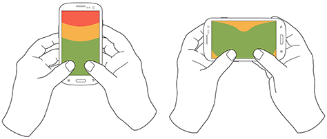
People often switched between two-handed use and cradling, with users typing with both thumbs, then simply no longer using one hand for input and reverting to using just one of the thumbs consistently for interacting with the screen.
However, not all thumb use was for typing. Some users seemed to be adept at tapping the screen with both thumbs or just one thumb. For example, a user might scroll with the right thumb, then tap a link with the left thumb moments later.
Also notable is the overwhelming use of devices in their vertical orientation, or portrait mode—despite theories about the ease of typing with a larger keyboard area. However, a large percentage of slide-out keyboards force landscape use. [5] All ways of holding a phone typically orient the device vertically, but for two-handed use, use of landscape mode was unexpectedly low. Though several of my clients have received numerous customer complaints in app store reviews for not supporting landscape mode.
What Do These Findings Mean?
I expect some to argue that one-handed use is the ideal—and that assuming one-handed use is a safe bet when designing for almost half of all users. But I see more complexity.
Some designers may interpret charts of one-handed use to mean that they should place low-priority or dangerous functions in the hard to reach area in the upper-left corner of the screen. [6] But I wouldn’t recommend that. What if a user sees buttons at the top, so switches to cradling his phone to more easily reach all functionality on the screen—or just prefers holding it that way all the time?
Even if we don’t understand why there are such large percentages for handedness, we cannot assume that people will hold their phone in their right or left hand. When targeting browsers or mobile-device operating systems, I am always uncomfortable ignoring anything with a market share over 5%. That’s a general baseline for me, though I adjust it for individual clients or products. But I would never, ever ignore 20 to 30% of my user base. While I am personally very right handed, now that I have these numbers, I am spending a lot more time paying attention to how interactions might work when using the left hand.
Another factor that I had not adequately considered until putting together these diagrams is how much of the screen a finger may obscure when holding a mobile phone in any of these ways. With the display occupying so much of the device’s surface, this may explain part of the reason for a user’s shifting of his or her grasp. As designers, we should always be aware of what content a person’s fingers might obscure anywhere across the whole screen. Just remembering that a tapping finger or thumb hides a button’s label is not enough.
Now, my inclination to test my user interface designs on devices is stronger than ever. Whether I’ve created a working prototype, screen images, or just a paper prototype that I’ve printed at scale, I put it on a mobile device or an object with similar dimensions and hold it in all of the ways that users would be likely to hold it to ensure that my fingers don’t obscure essential content and that buttons users would need to reach aren’t difficult to reach.
Next Steps
I don’t consider this the ultimate study on how users hold mobile devices, and I would like to see someone do more work on it, even if I’m not the one to carry it out. It would be very helpful to get some solid figures on how much people switch the ways they’re holding their mobile phone—from one-handed use to cradling to two-handed use. Having accurate percentages for how many users prefer each way of holding a phone would be useful. Do all users hold their phones in all three of these ways at different times? This is not entirely clear. It would also be helpful to determine which ways of holding a mobile phone are appropriate for specific tasks. With clear correlations between tasks and ways of holding a phone, we could surmise likely ways of holding devices for particular types of interactions rather than making possibly false assumptions based on our own behavior and preferences.![]()
- See more at: http://uxmatters.com/mt/archives/2013/02/how-do-users-really-hold-mobile-devices.php#sthash.dqoD7V8L.dpuf
The Latest Advancement in Ice Fishing From Lakemaid Beer. Drone delivery of beer right to your doorstep. It’s should be arriving soon in a fish house or ice shack near you. Each bottle will feature one of 12 Lakemaids properly attired for the cold, winter months. And each bottle cap will feature Lakemaid Beer’s new unique winter bottle cap icons for hours of fun in the ice-fishing shack. Source
Robots May Replace One-Fourth Of U.S. Combat Soldiers By 2030, Says General

By the middle of this century, U.S. Army soldiers may well be fighting alongside robotic squadmates. General Robert Cone revealed the news at an Army Aviation symposium last week, noting that the Army is considering reducing the size of a Brigade Combat Team from 4,000 soldiers to 3,000, with robots and drones making up for the lost firepower. Cone is in charge of U.S. Army Training and Doctrine Command (TRADOC), the part of the Army responsible for future planning and organization. If the Army can still be as effective with fewer people to a unit, TRADOC will figure out what technology is needed to make that happen.
While not explicitly stated, a major motivation behind replacing humans with robots is that humans are expensive. Training, feeding, and supplying them while at war is pricey, and after the soldiers leave the service, there’s a lifetime of medical care to cover. In 2012, benefits for serving and retired members of the military comprised one-quarter of the Pentagon’s budget request.
To understand what Cone is proposing (besides robot soldiers), we need to understand two fundamental building blocks of the modern U.S. Army. The first is the nine-man squad, almost the smallest useful unit of force. For some purposes, it can be split into two smaller fireteams, but the Army designs vehicles with the nine-man squad in mind, and then writes doctrine for how these squads (some with, some without vehicles) will move and fight.
The second building block worth knowing is the Brigade Combat Team. It’s the smallest large unit that can be sent into combat independently. If the Army can reduce number of people in squads, it can reduce the total manpower everywhere, and it can acquire vehicles that are both smaller and cheaper. In order to reduce manpower without reducing fighting ability, the Army will need to make sure that Brigades have everything they need to be just effective. In order for that to happen, Cone said the Army will “need to fundamentally change the nature of the force, and that would require a breakthrough in science and technology.” Cone expects this to happen by 2030 to 2040.

This is a huge change under consideration, but the Army already has some robot warriors on hand. In October, the Army tested multiple remote-controlled gun-firing robots. Bomb squad robots were used Iraq and Afghanistan to dispose of IEDS. BigDog, a robotic pack mule now owned by Google, received funds from DARPA for further development. The RQ-11 Raven drone is a remote-controlled scout, tossed into the air like a javelin, that streams video back to soldiers, letting them know what’s lurking behind the next hill.
Moving from the adoption of new technologies to actually making doctrine that relies on the new technology would be a huge step for the military. Cone’s comments suggest that the military is at least willing to consider a day when soldier and robot will fight alongside one another.
- interactive
- interaction
- installation
- design
- led
- light
- art
- technology
- projectionmapping
- projectmapping
- robotics
- ui
- mobile
- projection
- interactivedesign
- lightdesign
- apple
- web
- 3d
- ux
- userinterface
- lightart
- robot
- artinstallation
- touchscreen
- application
- app
- webdesign
- touch
- motion
- responsive
- adobe
- multitouch
- future
- robots
- drone
- photoshop
- productdesign
- ledinstallation
- lightsculpture
- video
- user experience
- iphone
- creative
- interactivelight
- digitalart
- motiondesign
- ar
- 3dprinting
- responsivedesign
- augmentedreality
- drones
- kinetic
- data
- development
- kinect
- microsoft
- display
- immersive
- process
- painting
- timelapse
- dronerobotics
- 3dprojection
- ios
- vr
- virtualreality
- earth
- ai
- device
- user interface
- engineering
- laser
- lightpainting
- kineticsculpture
- lightinstallation
- touchinstallation
- animation
- programmableleds
- graffiti
- interactions
- neon
- performance
- leapmotion
- watch
- mobiledesign
- pixel
- environment
- exoskeleton
- interactiveenvironment
- sound
- lcd
- social
- leds
- lukew
- artlight
- patterns
- internet
- carui
- November 2011 128
- December 2011 65
- January 2012 25
- February 2012 27
- March 2012 33
- April 2012 31
- May 2012 16
- June 2012 32
- July 2012 20
- August 2012 37
- September 2012 24
- October 2012 34
- November 2012 31
- December 2012 6
- January 2013 21
- February 2013 11
- March 2013 10
- April 2013 35
- May 2013 45
- June 2013 10
- July 2013 49
- August 2013 33
- September 2013 40
- October 2013 57
- November 2013 31
- December 2013 28
- January 2014 86
- February 2014 49
- March 2014 24
- April 2014 40
- May 2014 6
- June 2014 9
- July 2014 1
- August 2014 34
- September 2014 30
- October 2014 45
- November 2014 21
- December 2014 6
- January 2015 5
- February 2015 17
- March 2015 18
- April 2015 14
- May 2015 1
- June 2015 10
- July 2015 4
- August 2015 1
- October 2015 11
- March 2016 4
- December 2016 18
- September 2017 6
- October 2017 13
- November 2017 5
- June 2018 8
- July 2018 2
- November 2018 7
- February 2019 8
- March 2019 6
- July 2019 1
- August 2019 1
- October 2019 1
- July 2020 5
- November 2020 9
- December 2020 1
- January 2021 1
- April 2021 1
- May 2021 9
- June 2021 3
- August 2022 3
- May 2023 2
- September 2023 1
- May 2025 6