Colossal Skateboard Ramp Floats Gracefully on Lake Tahoe

As a professional skateboarder, it’s safe to say that Bob Burnquist has shredded his share of railings, streets, and ramps. So, when Visit California challenged him to dream big in 2013, Burnquist took them up on the offer. His idea was a twist on the conventional skating ramp. Instead of existing on land, it would float on water.
Creatives Jerry Blohm and Jeff King designed the structure and, together, they faced many challenges, including leakage, weight, construction, and material. “The valves are most important because [if] they leak, the thing will rest on the bottom and Bob will be skating underwater,” Bolhm explained. Construction lasted for four days and took over 300 man hours. The final product weighted in at a massive 7,300 lbs, but floated gracefully over the waters of Lake Tahoe.
The ramp looks spectacular set against the beautiful California landscape. It’s an unexpected treat to see someone skating in the middle of water. Burnquist’s sun-soaked idea came to fruition thanks to Dream365, an initiative started by Visit Californiathat inspires people to dream big in California.


Bob Burnquist website, Jerry Blohm website, and Visit California website
Artificial Organs May Finally Get a Blood Supply
Artificial tissue has always lacked a key ingredient: blood vessels. A new 3-D printing technique seems poised to change that.

Living layers: Harvard researchers demonstrate their method for creating vascularized tissue constructs by printing cell-laden inks in a layered zig-zag pattern.
In what may be a critical breakthrough for creating artificial organs, Harvard researchers say they have created tissue interlaced with blood vessels.
Using a custom-built four-head 3-D printer and a “disappearing” ink, materials scientist Jennifer Lewisand her team created a patch of tissue containing skin cells and biological structural material interwoven with blood-vessel-like structures.Reported by the team in Advanced Materials, the tissue is the first made through 3-D printing to include potentially functional blood vessels embedded among multiple, patterned cell types.
In recent years, researchers have made impressive progress in building tissues and organ-like structures in the lab. Thin artificial tissues, such as a trachea grown from a patient’s own cells, are already being used to treat patients (see “Manufacturing Organs”). In other more preliminary examples, scientists have shown that specific culture conditions can push stem cells to grow into self-organized structures resembling a developing brain, a bit of a liver, or part of an eye (see “Researchers Grow 3-D Human Brain Tissues,” “A Rudimentary Liver Is Grown from Stem Cells,” and “Growing Eyeballs”). But no matter the method of construction, all regenerative projects have run up against the same wall when trying to build thicker and more complex tissues: a lack of blood vessels.
Lewis’s group solved the problem by creating hollow, tube-like structures within a mesh of printed cells using an “ink” that liquefies as it cools. The tissue is built by the 3-D printer in layers. A gelatin-based ink acts as extracellular matrix—the structural mix of proteins and other biological molecules that surrounds cells in the body. Two other inks contained the gelatin material and either mouse or human skin cells. All these inks are viscous enough to maintain their structure after being laid down by the printer.
A third ink with counterintuitive behavior helped the team create the hollow tubes. This ink has a Jell-O-like consistency at room temperature, but when cooled it liquefies. The team printed tracks of this ink amongst the others. After chilling the patch of printed tissue, the researchers applied a light vacuum to remove the special ink, leaving behind empty channels within the structure. Then cells that normally line blood vessels in the body can be infused into the channels.
The smallest channels printed were about 75 micrometers in diameter, which is much larger than the tiny capillaries that exchange nutrients and waste throughout the body. The hope is that the 3-D printing method will set the overall architecture of blood vessels within artificial tissue and then smaller blood vessels will develop along with the rest of the tissue. “We view this as a method to print the larger vessels; then we want to harness biology to do the rest of the work,” says Lewis
Your Face on a Giant Screen of Morphing Pistons


One of the most impressive spectacles visitors can find at the Sochi games this month doesn’t have anything to do with sports at all. It’s their own face, over 20 feet tall, rendered on a giant morphing wall at the entrance to Olympic Park.
The Mt. Rushmore-style monument is “the first thing you see when you go in,” says Asif Khan, the British designer who conceived of the pavilion for Megafon, one of the games’ sponsors. Spectators start by getting their likeness captured at one of seven photo booths throughout the park. A five-camera array generates a 3D image of the face, which is then processed for the facade, where it’s rendered with 11,000 pistons, each acting as its own LED-tipped pixel. (After getting their picture taken, visitors get a QR code to scan that lets them know when to expect to see their mug go big.)
Kahn worked with Basel-based engineering firm iart to bring the idea to life. Scott Eaton, a digital sculptor whose worked with animators at Lucasfilm and Pixar and contributed to films including Captain America and World War Z, was brought on as a sort of creative director for the project, creating a piece of software that situated each face at a certain angle. The faces, shown three at a time and cycled through every 20 seconds or so, are 8 meters tall–larger than the face on the Statue of Liberty.
For Khan, the concept perfectly captured the spirit of the Olympics. “I thought, if we can harness that latent emotive potential in the face, we can communicate with everyone–without language, without any text, without anything,” he explains. But he had to be careful about what he was communicating. At one point, Megafon wanted to explore the idea of rendering the faces in true color, using the LEDs to recreate spectators’ skin tones. “We had to pull that back a bit,” Khan says. “It looked like a giant was there. I mean, it was really scary.”
Still, even in monochrome, the faces are a striking sight, harkening back to monumental sculptures of antiquity. If you want to put a more contemporary spin on the installation, you could think of it as a Mt. Rushmore for the Selfie Age. “The iconography of the face and the expressive potential behind it hasn’t been surpassed,” Khan says. “And actually, I don’t think it will ever be.”
http://www.wired.com/design/2014/02/weirdest-thing-sochi-face-giant-morphing-screen/
Two Keys to Building a Great Product

In the product group at HubSpot there are two guiding principles to building amazing products, they come from David Cancel and he’s 100% right in my experience:
- Be customer-driven
- Show meaningful progress
Each of these means different things at different stages in the product lifecycle, but they are strong guiding principles from early stage research through MVP to mature product.
Here’s a starting point to think about how to lean into each of these principles, and a view of how that changes as a product comes to market and matures.
- Customer-driven: Narrow your focus to your target go-to-market end user. Find where they spend their time, where their pain is. Watch them in their natural environment.
- Meaningful progress: Consider doing a minimum of X interviews, and/or defining the output as being the top Y painpoints to start addressing.
- Customer-driven: Be insanely impatient to get an early working product in front of one user. That’s the hardest part, getting one person to the point where they would pay, or be seriously disappointed if you took the product away from them. super hard stage, from zero to one user. Then move from one user to ten, another extremely hard stage. Put your cell phone in the product, follow up with people as they use the product, and watch every motion they take using it. Start doing user testing as well.
- Meaningful progress: Live and die by activated user count. From zero to one, and from one to ten.
- Customer-driven: The product team should directly support their customers. When applicable work with sales to understand how to iterate on *validated* learnings - not “all i need to close every deal is XYZ” requests but actual records of painpoints, blockers, competitive landscape, potential for product differentiation, shortcomings against existing solutions, etc. It helps here to have consultative sales folks who don’t do “feature dumps” but rather do a great, scalable job of customer pain discovery. If product/dev can overhear these conversations some magic can happen :)
- Meaningful progress: Measure, chart and distribute to the team: active users, activation rate, recurring revenue, net churn, referral loop, tickets/customer (whatever makes the most sense as a yardstick for product/market fit). Company demo (monthly) of new features LIVE for real customers, not mockups or qa.
- Customer-driven: Record and distribute top support inquiry drivers, measure decrease in these drivers month over month. Heavy use of user testing to optimize the core flows and usage patterns in the product.
- Meaningful progress: Measure, chart and distribute to the company: tickets/customer, call drivers (and delta month-over-month), uptime/availability, performance/speed. Continue company demos, include performance improvements in addition to features.
Hope someone out there finds this useful, it’s been a breakthrough for me and my colleagues to embrace these principles and to dive deeper and deeper on both.
Stephen Wolfram introduces the Wolfram Language in this video that shows how the symbolic programming language enables powerful functional programming, querying of large databases, flexible interactivity, easy deployment, and much, much more. To learn more about the Wolfram Language, visit reference.wolfram.com/language. Source
Customizing Help & Tips By Input Type
On today’s multi-device Web, your audience might be using a mouse, keyboard, touchscreen, trackpad, or increasingly, more than one of these input types to interact with your service. Given all these possibilities, how do you let people know how they can get things done in your app?
A common way to provide relevant bits of guidance inside an application is throughinline help. Inline help is positioned where it’s most useful in an interface and made visible by default so people don’t have to do anything to reveal it. This makes it an effective way to tell people how to use an interface. But what happens when those instructions vary by input type?
For instance, we recently built a fully responsive Web application that can be used on smartphones, tablets, desktops, and more. In this application, people can add and manipulate images by zooming, resizing, and moving these images around. Depending on the input type their device supports, however, they have different ways of accomplishing these tasks.
To position an image using touch, you simply drag it with your finger. Zooming-in and zooming-out is accomplished through pinch and spread gestures. Sizing an image to fit happens through a double-tap action.
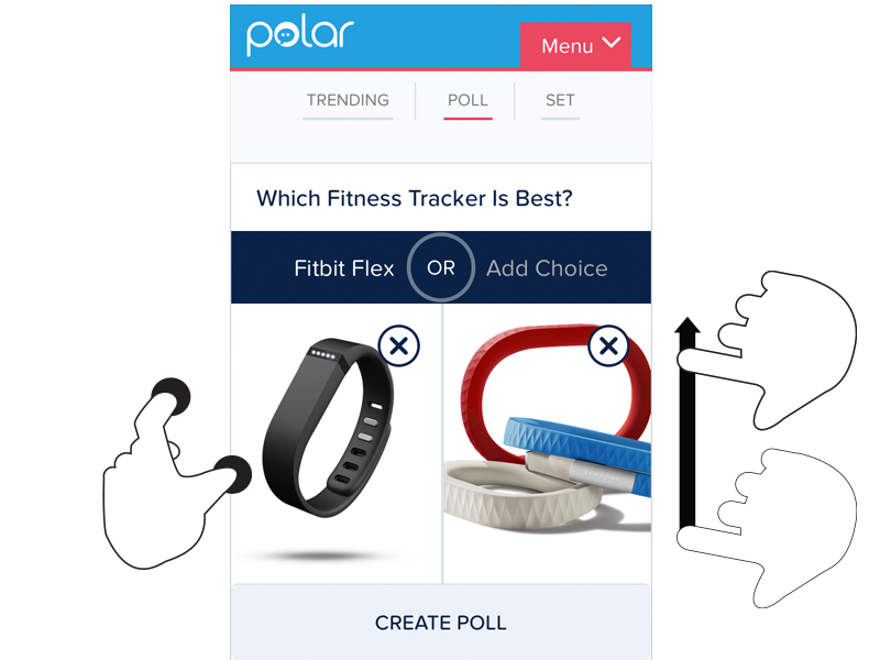
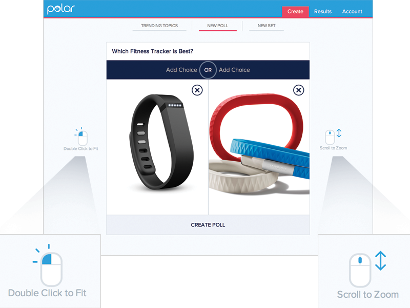
These same features are supported on mouse and keyboard devices as well. To move an image around, click and hold to drag it. Zooming in and out happens with the scroll wheel or a multi-touch gesture on the trackpad. Sizing an image to fit takes a double-click of the mouse.
As you can see, the touch and mouse actions are similar but not the same. We were also concerned that while touch users are quick to pinch and spread when trying to zoom an image, mouse users are less familiar with using scroll wheels and two-finger trackpad gestures to accomplish the same thing. So we wanted to let our mouse users know what’s possible with a few simple bits of inline help.
Easy, right? Just check if someone’s device has a mouse or trackpad attached and reveal the tip. Well, no.
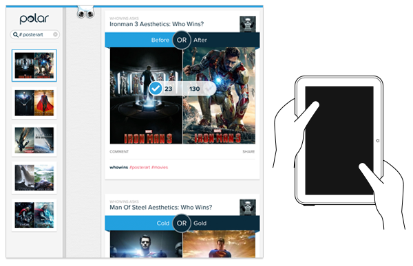
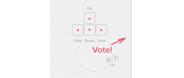
On an earlier project, we faced a similar situation. While our smartphone and tablet users could easily interact with our lists of polls by scrolling and voting with their thumbs, mouse and keyboard users had more work cut out for them. They couldn’t simply keep their fingers in one place and vote, scroll, vote.
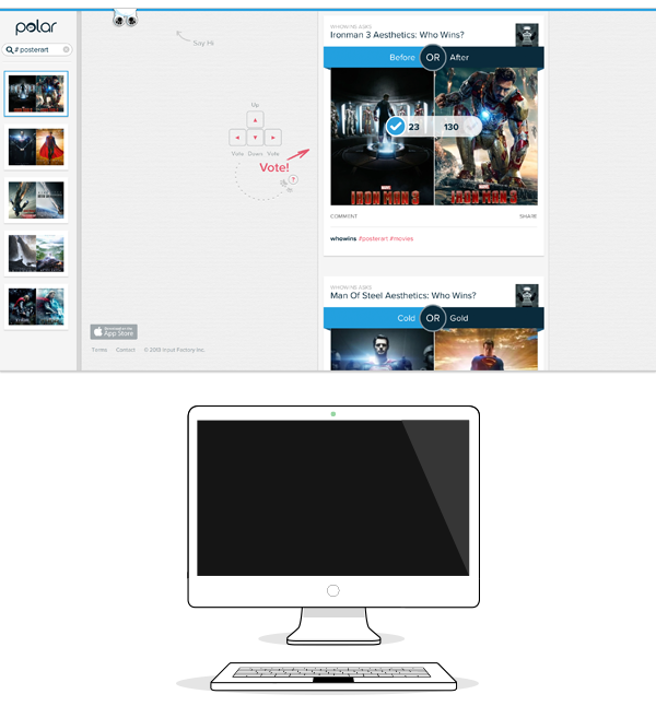
So we developed a keyboard interaction that allowed people to vote with left/right keys and move through polls with up/down keys. While this made keyboard users much faster and effective, we again were faced with a hidden interface: people didn’t know keyboard voting was possible unless we told them.
That meant we had to detect if a keyboard was present and surface a simple inline tip that explained the voting interface. After a few failed attempts at doing this, I reached out to friends on the Internet Explorer team at Microsoft. After all, if anyone would have a good handle on how to manage different input types on the Web, it would be the company with a Web browser that not only runs on phones, tablets, laptops, and desktops but hybrid devices and even game consoles as well.
Sadly, we learned there’s not a great way to do this in Web browsers today and browser makers are hesitant to reveal information like this in a navigator.hardware object because of concerns it could be used to fingerprint users. So instead, we opted to proxy the presence of a keyboard using screen width. That is, if the screen is wide we assume there’s a higher chance of a keyboard being present and show the keyboard interface tip by default.
This is the same solution we now have in our new publisher tool. When the screen crosses a certain width, we reveal two inline tips explaining how to zoom and fit an image using a mouse.
As I’ve written before, using screen width as a proxy for available input types is not ideal and increasingly unreliable in today’s constantly changing device landscape. But the alternative solutions don’t seem much better.
For instance, we could provide a help section that explains how to do things with every input type. But then we loose the immediacy and effectiveness of concise inline help. We could wait until someone interacts with the app to determine if they are a touch or mouse user, save that information and display device-appropriate tips from that point on. But even if we get this info up front it can change as people switch between touch screens and trackpads or their mouse.
While the need for input-appropriate help text in a Web application may seem like a small detail, it’s reflective of the broader challenge of creating interfaces that not only work across different screen sizes but across many different capabilities (like input type) as well. Inline help is just one of many components that need be rethought for today’s multi-device Web.
A guide for creating a better retina web. Preparing the web for a new era of displays.
It’s been almost one year since Apple released the Retina MacBook Pro, the first device produced for the masses that is not a mobile phone or tablet and offers a screen with an incredibly high pixel density. While almost all major apps for OSX have been updated already to appear in a super crisp look, the web still isn’t retina ready at all. Most web designers and developers out there still produce low-resolution content for the web – which is a bad thing, because retina actually matters.
Why?
Because high-resolution displays are the future. Almost all up-to-date mobile phones and tablets on the market have one and desktop products are now following this trend. I’m sure we will see a lot of new devices with retina displays in the next two years. When launching a new web product these days you should totally optimize it for retina screens since more and more people will be able to enjoy your awesome sharp pixels and less people will be annoyed by your incredibly blurry interface, which caused eye infections before you optimized for retina.
Most people I’ve spoken with about this issue didn’t really understand why optimizing actually matters. Here is a screenshot of a start-up’s website which looks great but isn’t optimized for retina:
– can you see these pixels? Ugh. I’m sorry about this stupid joke. Square, you rock, but you should really take retina serious.
Solutions for background images
Modern browsers support retina screens and are able to serve different assets depending on the device screen density. Basically, you need to know that everything except images are rendered in retina resolution automatically. If your site relies heavily on CSS effects such as gradients, box-shadows, and borders you don’t need to optimize too much at all, apart from the images.
Bitmap background images
If you are using bitmap graphics as background images, you should create versions of these images that have double the resolution of the original image. By using CSS media queries you can serve these high–resolution images automatically to retina devices.
Example
We have two images, one for normal display and one for high-definition displays. I recommend using the same file name for both, but adding “@2x” at the end for the retina assets (known from iOS development).
By adding a CSS media query that detects high-definition displays you can change the image path of the original background-image to the @2x image for those displays. Adding the background size property is important since it will tell the browser the dimensions of the original image (the size the image will actually appear).
/*CSS for basic styling and non-retina image path:*/.icon{width: 100px;height: 100px;background-image: url(icon.png);}/*CSS for serving the retina image to devices with a high "device-pixel-ratio":*/@media only screen and (-moz-min-device-pixel-ratio: 1.5), only screen and (-o-min-device-pixel-ratio: 3/2), only screen and (-webkit-min-device-pixel-ratio: 1.5), only screen and (min-devicepixel-ratio: 1.5), only screen and (min-resolution: 1.5dppx) {.icon{background-image: url(icon@2x.png);background-size: 100px 100px;}}
There is a different technique coming (already implemented in current webkit browsers), called image-sets. With this new CSS feature you won‘t need CSS media queries to overwrite your image path, you can simply serve two different assets and the browser will automatically decide which to download. However, since this is currently only working in webkit browsers I do not recommend using this in production yet.
.icon{width: 100px;height: 100px;background-image: -webkit-image-set( url(icon.png) 1x, url(icon@2x.png) 2x);}
SVG background images
SVG is seriously awesome. As long as your graphics do not contain too many crazy filters and effects that you have stitched together in Photoshop, the chances that you can export your graphics to svg are high (note: does only work for vector graphics, not photos). You should take it even further and create a SVG sprite which contains all your graphics to reduce the amount of http requests. Just use these sprite graphics as you are used to. The amazing part of this technique is that there is absolutely nothing more required to make your graphics look sharp on retina displays.
Example
.icon{width: 100px;height: 100px;background: url(svgSprite.svg) 0 -200px no-repeat;}

– if you are not on a retina device, zoom in to see what’s great about SVGs. They are always sharp.
Unfortunately in the current version of Firefox (19, while I’m writing this), the browser doesn‘t renders SVG sprites in retina resolution – only single image SVG‘s. Hopefully Mozilla will fix this soon. Opera has some serious bugs when it comes to SVG sprites – these will probably be fixed automatically since they are switching to the webkit engine soon.
High-resolution <img>
Serving high-resolution assets for <img> tags works a bit differently. Since the image path isn’t set in the CSS but in HTML you can’t use media queries. Again, there are different approaches to serve sharp images to users with a retina device.
The easy but bandwidth-hungry way
By adding an @2x image by default and resizing it to the original size you are serving the same asset to non-retina and retina devices. This isn’t optimal since the file size of @2x assets is actually a lot bigger than for normal-resolution ones. This means non-retina users are unnecessarily loading the large file, however in some cases it might not matter that much because you are not loading a lot of images or the images are pretty small.
Example
<!-- The image itself is 640x240px. Scaling is done into HTML. --><img src="photo.jpg" width="320" height="120">


– Note: you might only notice a difference between these two photos if you are viewing them on a retina ready device. Image credits: Cristina Strazzoso.
Pro Tip: use jpgs when possible and use a higher compression rate than you would do normally. The guys at Netvlies have proven that in some cases you can have a smaller file size and better quality.
The easy and even more bandwidth-hungry way
Retina.js is another easy way to serve high-resolution assets to retina devices. The pro is that you’re no longer serving big files to non-retina devices. The con is that with retina.js you are serving normal-sized and @2x images to retina devices, which dramatically increases the loading time of your site. In addition, if there is no @2x version of the image available the script will cause a 404 error which is never really nice. The script has a few issues with svg graphics as well – when using a svg image in the src of your <img> it will look for a @2x version which is of course not available since it is not required. I cannot recommend using retina.js if you care about a fast loading time and an empty error console.

– in this example, the missing @2x assets are causing 404 errors.

– when the script is working as expected, retina devices will request the normal sized image first and after downloading the @2x version as well. This means doubled requests and a longer page loading time.
The hard, server-side way
“Retina Images” is a pretty nice solution to serve high-resolution images automatically without double loading resources. It relies on javascript, enabled cookies, PHP, and a modified .htaccess file – if this isn’t a big problem for you it’s probably the best solution to offer your visitors the full retina experience. In case an @2x image isn’t available it will just revert back to the normal sized image. If you are using Wordpress, there is also a plugin available which makes the installation even easier.
A side note about icon fonts
In the last year, icon fonts were hyped pretty hard. Of course, they are a pretty useful way to include glyph icons in your website which can be scaled endlessly, and they are easy to modify by applying CSS. Since it’s a font these icons are retina optimized by default. Still, I can’t recommend using icon fonts when you care about pixel perfection. Almost every browser out there renders fonts in a different way than others, which makes it impossible to optimize icon fonts. Especially on non-retina screens you will often see blurry lines (known as half pixels) and due to different anti-aliasing settings on OSX and Windows, lines might look really bold on one system and thin on another one.

Instead use SVGs – they will appear as you’ve exported them and will not be harmed by browser or OS settings.
Retina-ready favicons
Favicons might be a small part of a website but they are also the part that represents a website link in bookmark bars, news readers, when pinned to a Windows task bar, and on “most visited” tabs in browsers. A blurry favicon next to high-resolution favicons in a bookmark bar will look pretty out of place on a retina display (Twitter and Quora users will know).
I can highly recommend x-icon editor for creating retina-ready favicons in .ico file format. Just upload one 64 x 64 sized image and you can export an .ico file which also includes downsized versions of your uploaded icon. If you need to fine-tune each of the four included icons (64, 32, 24, 16 pixels) you can also upload a single icon for each size separately.

Also, don’t forget to provide Apple touch icons which will be displayed when a website is added to the iPhone/iPad home screen.
Some sites that got it right

– Kickoff App Website, absolutely great - except the non-retina favicon.

– Shipment App Website, great experience but a few non-retina elements into the footer.

– LayerVault Website, perfectly retina optimized - great example for using SVGs to achieve retina optimization.
I hope this little guide helps designers and developers out there to produce better retina content. If you have any questions or know some other tricks to create a better retina web, please let me know in the comments!
- interactive
- interaction
- installation
- design
- led
- light
- art
- technology
- projectionmapping
- projectmapping
- robotics
- ui
- mobile
- projection
- interactivedesign
- lightdesign
- apple
- web
- 3d
- ux
- userinterface
- lightart
- robot
- artinstallation
- touchscreen
- application
- app
- webdesign
- touch
- motion
- responsive
- adobe
- multitouch
- future
- robots
- drone
- photoshop
- productdesign
- ledinstallation
- lightsculpture
- video
- user experience
- iphone
- creative
- interactivelight
- digitalart
- motiondesign
- ar
- 3dprinting
- responsivedesign
- augmentedreality
- drones
- kinetic
- data
- development
- kinect
- microsoft
- display
- immersive
- process
- painting
- timelapse
- dronerobotics
- 3dprojection
- ios
- vr
- virtualreality
- earth
- ai
- device
- user interface
- engineering
- laser
- lightpainting
- kineticsculpture
- lightinstallation
- touchinstallation
- animation
- programmableleds
- graffiti
- interactions
- neon
- performance
- leapmotion
- watch
- mobiledesign
- pixel
- environment
- exoskeleton
- interactiveenvironment
- sound
- lcd
- social
- leds
- lukew
- artlight
- patterns
- internet
- carui
- November 2011 128
- December 2011 65
- January 2012 25
- February 2012 27
- March 2012 33
- April 2012 31
- May 2012 16
- June 2012 32
- July 2012 20
- August 2012 37
- September 2012 24
- October 2012 34
- November 2012 31
- December 2012 6
- January 2013 21
- February 2013 11
- March 2013 10
- April 2013 35
- May 2013 45
- June 2013 10
- July 2013 49
- August 2013 33
- September 2013 40
- October 2013 57
- November 2013 31
- December 2013 28
- January 2014 86
- February 2014 49
- March 2014 24
- April 2014 40
- May 2014 6
- June 2014 9
- July 2014 1
- August 2014 34
- September 2014 30
- October 2014 45
- November 2014 21
- December 2014 6
- January 2015 5
- February 2015 17
- March 2015 18
- April 2015 14
- May 2015 1
- June 2015 10
- July 2015 4
- August 2015 1
- October 2015 11
- March 2016 4
- December 2016 18
- September 2017 6
- October 2017 13
- November 2017 5
- June 2018 8
- July 2018 2
- November 2018 7
- February 2019 8
- March 2019 6
- July 2019 1
- August 2019 1
- October 2019 1
- July 2020 5
- November 2020 9
- December 2020 1
- January 2021 1
- April 2021 1
- May 2021 9
- June 2021 3
- August 2022 3
- May 2023 2
- September 2023 1
- May 2025 6