Super Crisp Font Anti-Aliasing In Photoshop With Sub-Pixel Hinting
Article Source: Click Here
Working with font in Adobe Photoshop can be incredibly frustrating at times, especially when working with small font using anti-aliasing. Creating consistent letterforms and crisp characters can be a bit troublesome given the default anti-aliasing options.
To catch some of you up, anti-aliasing is a technique for rendering smooth fonts. This is best illustrated with a simple example:
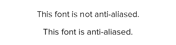
By adding semi-transparent pixels to a font, our type loses jagged edges found in aliased font, and create a more accurate representation of the actual letterform. Typically, anti-aliasing is handled by whatever program is displaying the font (ie: your browser and operating system determine how the font in this article is being displayed), but in Photoshop, the user determines how anti-aliasing is used.

The Problem
The problem for Photoshop users becomes this: When working with anti-aliased font in Photoshop, especially at small sizes, there simply aren’t enough pixels per character to render super crisp letterforms.
Physically speaking, there are not enough pixels. Since anti-aliasing will alter the opacity of pixels, smaller fonts sometimes won’t have enough room for both the 100% opaque pixels and the semi-transparent pixels. The result is blurry, fuzzy type.

In the example above, the “T” and “j” seem especially out of focus. There are very few 100% opaque pixels in several of the letters since there are not enough physical pixels to render into.
It may seem like your only option is to increase the font size so there are more pixels to use, but what if there was a way to actually add more physical pixels?
Adding More Physical Pixels With Sub-Pixels
Every pixel on your monitor is made up of 3 sub-pixels (some newer display technologies may actually have 4). Ignoring these 4-channel displays, every pixel on your monitor has a Red, Green, and Blue sub-pixel. You’re probably already very familiar with the concept that a pixel takes it’s overall color and brightness by combining the brightness of these 3 sub-pixels (and for some displays, such as plasma, the ability to completely turn off pixels for very deep blacks).
Smashing Magazine has explored this concept, and more regarding anti-aliasing in their post The Ails Of Typographic Anti-Aliasing.
Essentially, sub-pixel rendering allows us to use each sub-pixel of the monitor as a pixel in the letterform. The resulting character may have subtle color fringing, but also more desirable definition.
The difference is often subtle, but definitely perceivable. Unfortunately, there is no sub-pixel rendering anti-aliasing option in Adobe Photoshop.
Using Sub-Pixel Rendering In Photoshop
Photoshop smooths fonts by doing anti-aliasing in greyscale. We want photoshop to anti-alias font by blending different color channels though. To do this, we can manually create 3 separate text layers, each only showing a certain color channel (via advanced blending options), and then manually moving the layers barely to the right and left of each other. That’s awfully complex though.
Instead, Thomas Maier has created a Photoshop Action that will automatically do all of the work for you. The action takes your input type layer, duplicates it 3 times (while setting each layer to blend only a specific channel), and does all of the translating to simulate sub-pixel rendering.
To use the action, download it from Thomas’s website, and load it from Photoshop’s action window (Window → Actions). From the Actions tab, select “Load Actions” from the dropdown menu.

Load the Photoshop Action file that you downloaded from Thomas Maier’s website. Select the type layer you want to apply the action to. From the action tab, select the “subpixel-hinting” action, and click “Play selection“.
Some Notes
This technique is really most useful in creating concepts in Photoshop. When you’re working on a website layout in Photoshop, and want an accurate representation of what a font is going to look like in your content body, this action really will do a fantastic job displaying well defined type. Outside of conceptual design, there aren’t many applications for this.
Also, as Thomas notes, running this action will create 3 separate type layers. This means that whenever you want to edit type that’s been run through this action, you’ll have to edit that type 3 times. This can be simplified by duplicating the layer once, hiding one of the duplicate layers, and then running the action on the other. If you have to change something in the future, simply delete the 3 layers, make changes to the hidden layer, and run the action again.
Finally, if you want to learn more about antialiasing, sub-pixel rendering, and pixel hinting, you really should giveThe Ails of Typographic Anti-Aliasing a read.
Imagine a flexible touch screen film that can be made to any size between 30” and 116” and attached to any non-metallic surface such as glass or acrylic. Screen Solutions 888-631-5880 providing Interactive Thru Glass Touch Screen Film Technology that can attract, inspire and engage your target audience right from your existing storefront glass window.
10 steps to an engaging interactive user experience
Article Source: Click Here
These days, building websites or applications that attract and retain customers has become somewhat of a science. For people who aren’t well versed in the digital space, I often compare the work that I do as a UX designer to an architect. Like the architect who builds your home, my UX team builds a comprehensive blueprint, which outlines every single detail of the site’s features and functionality.
But it’s not a one-shot deal. Getting to an intuitive and engaging user interaction requires many steps. Here’s my top 10 tips to help you deliver an amazing interactive experience for your users.
1. Design for the user, really
Back when online interaction was still in its infancy, and not much thought had been given to whom we were designing for, users were all too willing to spend their time learning the interaction required to complete tasks on websites. If users were confused, people often assumed they just weren’t tech savvy or well-informed on how to navigate the internet. As more and more websites, mobile devices and tablets started popping up; users weren’t as willing or patient to “learn” on their own. Nowadays, you’ll see more users becoming frustrated and even angry when they feel a product, application or website is substandard – and rightfully so.
It’s tempting to design with your own preferences and tastes in mind. But that won’t help users complete tasks on the site if they have a whole different set of preferences and needs. Think about what users want to do and help them complete those tasks in the easiest and most intuitive way possible. Are they browsing? Searching? Gaming? Watching video? Trying to complete a task? Looking for specific content? It’s the UX team’s job to look at the entire experience holistically and make sure that users’ needs are always met.
It’s this “design for the user” strategy that shaped every decision we made on Civil War 150. The biggest challenge with this project was the huge amount of Civil War related facts and statistics. To make it fun and relatable, we used colorful infographics to guide users through the top 150 Civil War related topics including Who They Were, Weapons of War, How They Died, 5 Deadliest Battles, Paying for the War and West Point Warriors. By giving users what they want, learning about the Civil War becomes richly engaging, informative and fun experience for hardcore Civil War fanatics and 7th grade history students alike.

2. Do your homework
Listen and absorb. The more conversations you have with clients, the better informed you’ll be. Dive deep into every piece of documentation, research their field, examine all content with a fine-tooth comb, understand the client’s goals, document thoroughly all of the client’s wishes (no matter how small) and talk to as many people across as many departments as possible. Only then will you have the most complete and accurate picture and be prepared to move to the next phase of the project.
Another crucial part of listening comes from doing a thorough analysis of what competitors are doing in the same space. Are there any innovators that you can learn from? Have they made any mistakes you want to avoid? Is there one universal component that ties all of them together? Were there any missed opportunities? Use the answers to these questions as inspiration in your own project.
The types of sites you may look at during this analysis phase can vary dramatically. You could even look at sites that sell cat food as points of reference when designing an application for audio equipment. It’s still relative and can be helpful because the user behaviour could very well be the same for cat food sites and audio equipment sites. Either way, you can learn valuable lessons from UX best practices across completely different industries and form factors.
3. Be an advocate for the user
We often think of the user as our client, though it’s not entirely true. In any project, there are sets of business objectives that need to be met and it’s the UX designer’s responsibility to meet those objectives, while at the same time informing the client about the user’s needs. That’s why the greatest digital projects are often those where there is a perfect equilibrium between the client’s objectives and the user’s needs. Sit on that fence, and balance well.
4. Forget about Nancy, think user types
Personas are vital when it comes to structuring the content. Look at all the content holistically and think about what people are trying to accomplish. Doing this helps prioritise the content and allows the site to be structured around the user’s goals. But traditional personas – “Nancy, who is 28-35 years old, drives an economy car, has a four-year-old PC she primarily uses for email, earns between $30K-$50K a year and wants to comparison shop for a cheap airfare to visit her mother in Florida” – won’t offer much insight into the user’s actual behaviour.
Instead, group basic User Types into categories according to what they want to do on the site such as “browsing,” “comparison shopping,” “killing time,” “looking for specific content.” These groupings will provide you with much more useful insights about why users come to sites or applications, the context of use (where and how), what content they’re seeking and how much time they have. In turn, you’ll be better equipped to design the website or application around their behaviour patterns, thus making their fictional names, ages, professions and income levels irrelevant.
5. Less really is more
You may think this is obvious and doesn’t need further explanation. But most sites and applications still manage to get it wrong. The key is to cut down tasks required by users to the bare minimum. I can’t stress this enough. Get rid of all that extra clutter that doesn’t add value, or worse, distracts and confuses the user. Know exactly how you want users to travel through your site or application and then guide the user as if you were holding their hand through the entire process. Again, users want things to be as simple, worry-free and fast as possible. If they can see what’s coming next before even clicking on something, they’ll be happy users.
To give you an example of using the “less is more” strategy, we worked together with Google on a project called 20 Things I Learned About the Web and Browsers. The challenge was to take the tactile experience of reading a book and reinvent it for online users. Using interactive features such as instant search, animated canvas page flips, enhanced canvas illustrations, offline mode, bookmarking and lights out mode, we made it simple, fun and informative for users to learn about the web and browsers. By focusing on what and how users wanted to travel through the website, learning about the web and browsers became enjoyable and informative for users.

6. Pretend you’re working for Fisher Price
Our CEO David Martin has this saying – and it’s really resonated for me. “All interaction should feel like Fisher Price.” In other words, when you make things bulky and oversized (like most children’s toys) and design digital experiences for “fat fingers,” it will automatically be easier to use. So how do we translate this to designing engaging and interactive user experiences?
Rather than using the standard input fields, radio buttons or checkboxes, try using big buttons, jumbo sliders and giant input fields. You’ll see user engagement increase and bounce rates drop. Isn’t that what all UX designers strive for?
Labeling is also extremely important. Whenever you ask users to provide information, try to use cheeky, simple, and to-the-point terminology so that it will feel less like a hassle. The result will be that users will feel more emotionally compelled to complete the process. And that could mean a boost in signups, web traffic, online sales and ROI.
When a 9.0 earthquake struck Japan earlier this year, earthquake relief efforts and support poured in from around the world. Working with Google, we created a platform for the global community to share their Messages for Japan. Taking a cue from Fisher Price, the site featured big buttons to group messages into categories of “Love” and “Hope”, as well as giant input fields asking users to “Write Your Message” and “Make a Donation.”

7. Take cues from tablets
Because you’re already limited by the amount of real estate on tablets, the need to simplify interactions is even greater. Ask yourself if your design would work on a tablet. If the answer is yes, you already have the two basic building blocks in place for a strong user experience: clear hierarchy and intuitive way finding.
These are the same questions we asked when we teamed up with CBSNews.com to create an elegant and visually rich online news experience for viewers of America’s #1 news program, 60 Minutes.

8. Design your UX
Adding placeholders for copy (lorem ipsum) next to some gray boxes underneath a row of navigation links does not constitute design. Visual hierarchy, content grouping, spacing, positioning and size are all things that should be solved in wireframes before a visual designer even sets eyes on it. If in your wireframes you’re working within the actual site or application width, and 12px text in your template is actually 12px in design, you’re on track.
9. Collaborate with all departments
User experience design alone is not enough to make great work and it will surely not provide all the answers. Listen, collaborate and become the liaison between the client, the user and the rest of your internal team. Only then can you create the best possible experience for the user while still meeting all business objectives.
Remember, you’re not alone. UX designers, visual designers and interactive developers all have a hand in making a project a success – it truly is a collaborative and multi-disciplinary effort. When it’s a shared passion and everybody pitches in with their level of expertise and voices their opinions, magic happens.
10. Don’t grade your own homework
The chance of you hitting the bulls eye with your first shot is very slim so be prepared to design iteratively as you gather more information about the performance of your site or application. One of the things that I am adamant about is that you should only do quantitative analysis on your own work. Tracking the performance and understanding where people are dropping off is extremely important and should be done in-house. But a third party should always conduct the qualitative user data analysis so you can truly have an objective testing environment. Doing this in-house is much like grading your own homework and won’t give you the depth of truth and insight that you’re looking for. If you want real objective answers, let someone else do the user testing and take those learnings into your next iteration.
In interaction design, human understanding is key
Article Source: Click Here
The Interaction 12 conference on interaction design was held over the last few days in Dublin, where designers were encouraged to develop a greater level of human understanding when creating user interfaces.
Organised by the Interaction Design Association, the four-day event gathered more than 750 designers from 32 countries at IADT in Dun Laoghaire and the Convention Centre at the IFSC in Dublin. It’s the first time the event has been hosted outside of North America.
Speakers with expertise in interaction design gave talks throughout the event to inspire and educate the community, discussing how better to improve relations between people and the products and services they use.
Dirk Knemeyer, founder of Sprout, Involution Studios and Conquistador Games, said that just as designers developed their coding skills to design user interfaces a decade ago, interaction designers must become experts in human understanding to develop their craft.
He pointed out how the evolution of technology has grown from a novelty to become fully integrated into our lifestyles. He argued that interaction designers should have some understanding of psychology, sociology, neuroscience, endocrinology and economics to take the opportunity to create meaningful interfaces for the future.
Users don’t have goals
Andrew Hinton, principal user experience architect at Macquarium, spoke about how many designers often create interfaces assuming that users have specific tasks or goals in mind, however, this is often not the case.
“Evoking the word ‘goal’ comes with a lot of assumptions and baggage that can misdirect our work as designers,” said Hinton.
“There’s a deep assumption in our profession’s cultural background that our users have explicitly, consciously articulated goals that they are working towards,” he said.
He argued that often, people were treated like another highly rational system when mapping out how they behave when using products and services.
“In user experience design, we like to think that we’re considering all the dimensions of a person and often we really do. But we still tend to focus on these tasks and goals,” said Hinton.
“And more often than not, the goal is actually only the fuzzy, distant possibility in the future that really, nobody even thinks about until you ask them.
“What we know now is that even if you think you have a goal, it’s likely that it’s going to shift and change as you find your way to it because right now, the user is just going to muddle their way through a situation that’s emerged in their life,” he said.
Rethinking user testing
Dana Chisnell, researcher and co-author of the Handbook of Usability Testing, expanded on this concept, pointing out that the traditional user testing method - where one person is put on one computer to see how they run through a program – may not get designers the answers they need, particularly as the web gets more social.
“Usability testing is not telling us what we need to know for social interactions online,” said Chisnell.
“In fact, the techniques that we’re using can only really tell us what we know already. What we know about is how to eliminate frustration. We’re very good at eliminating hindrances and identifying obstacles in interaction.
“We’re not sure how to do user research that’s going to tell us about what we really need to know about relationships,” she said.
She argued that people don’t operate in the real world in the same way as they are asked to act in user research and usability testing. She mentioned how, when booking a hotel, people like to consult with friends, spouses or relatives, which the human/computer model of user testing doesn’t cater for.
She also pointed out that services can get used for purposes beyond what the designers could ever believe they could be used for, mentioning how in the Arab Spring movement, many people sent coded messages through Facebook and eHarmony to arrange protests.
“The human/computer model simply doesn’t work. This model of interaction probably never worked. More and more, it’s human-to-human interaction, mediated by technology. And this might always have been true but it’s more evident now,” she said.
The future of user design
Knemeyer believes that in the future, products will be designed not at scale for mass audiences and demographics, but for individuals, pointing out technologies such as 3D printers. He believes that products will be designed for who we are, even for elements that we don’t talk about or don’t fully understand.
He says that while the technology isn’t quite there yet, consumers are beginning to know what they want and that the technology is aligning for it.
He thinks that when this happens, the concept of the genius designer, such as Apple cofounder Steve Jobs, could be threatened and that designs will cater to the individual needs of people.
He encouraged designers to think of frameworks for understanding people in a much deeper way to truly understand their needs.
A Day Made of Glass 2: Unpacked,” to see how Corning’s highly engineered glass, with companion technologies, will help shape our world. Take a journey with our narrator for details on these technologies, answers to your questions, and to learn about what’s possible — and what’s not — in the near future.
- interactive
- interaction
- installation
- design
- led
- light
- art
- technology
- projectionmapping
- projectmapping
- robotics
- ui
- mobile
- projection
- interactivedesign
- lightdesign
- apple
- web
- 3d
- ux
- userinterface
- lightart
- robot
- artinstallation
- touchscreen
- application
- app
- webdesign
- touch
- motion
- responsive
- adobe
- multitouch
- future
- robots
- drone
- photoshop
- productdesign
- ledinstallation
- lightsculpture
- video
- user experience
- iphone
- creative
- interactivelight
- digitalart
- motiondesign
- ar
- 3dprinting
- responsivedesign
- augmentedreality
- drones
- kinetic
- data
- development
- kinect
- microsoft
- display
- immersive
- process
- painting
- timelapse
- dronerobotics
- 3dprojection
- ios
- vr
- virtualreality
- earth
- ai
- device
- user interface
- engineering
- laser
- lightpainting
- kineticsculpture
- lightinstallation
- touchinstallation
- animation
- programmableleds
- graffiti
- interactions
- neon
- performance
- leapmotion
- watch
- mobiledesign
- pixel
- environment
- exoskeleton
- interactiveenvironment
- sound
- lcd
- social
- leds
- lukew
- artlight
- patterns
- internet
- carui
- November 2011 128
- December 2011 65
- January 2012 25
- February 2012 27
- March 2012 33
- April 2012 31
- May 2012 16
- June 2012 32
- July 2012 20
- August 2012 37
- September 2012 24
- October 2012 34
- November 2012 31
- December 2012 6
- January 2013 21
- February 2013 11
- March 2013 10
- April 2013 35
- May 2013 45
- June 2013 10
- July 2013 49
- August 2013 33
- September 2013 40
- October 2013 57
- November 2013 31
- December 2013 28
- January 2014 86
- February 2014 49
- March 2014 24
- April 2014 40
- May 2014 6
- June 2014 9
- July 2014 1
- August 2014 34
- September 2014 30
- October 2014 45
- November 2014 21
- December 2014 6
- January 2015 5
- February 2015 17
- March 2015 18
- April 2015 14
- May 2015 1
- June 2015 10
- July 2015 4
- August 2015 1
- October 2015 11
- March 2016 4
- December 2016 18
- September 2017 6
- October 2017 13
- November 2017 5
- June 2018 8
- July 2018 2
- November 2018 7
- February 2019 8
- March 2019 6
- July 2019 1
- August 2019 1
- October 2019 1
- July 2020 5
- November 2020 9
- December 2020 1
- January 2021 1
- April 2021 1
- May 2021 9
- June 2021 3
- August 2022 3
- May 2023 2
- September 2023 1
- May 2025 6