Ongoing Discussion - What's the difference between UI Design and UX Design? Product Design (physical goods)
Article Source: Click Here
Answer Wiki
• UX design deals with the overall experience associated with the use of a product or service.
• UI design deals with the specific user interface(s) of a product or service. The UI can be a component of UX, but many user experiences don’t have UIs. The design of a UI will be heavily informed by the UX design. The UX design will be less informed by the UI.
This is UI Design:
And this is UX Design:
There are a lot of erroneous answers in this thread.
Simply put: UX is the overall experience one has with a product or service, which can include a UI. A UI is typically a combination of visual design (the look and feel) and the interaction design (how it works). UX, however, can encompass a wide range of disciplines, from industrial design to architecture to content.
A diagram I did a few years ago:
The UI is what people use to interact with your product, and the UX is how they feel while they do.
UX, or User Experience is an umbrella term that refers to pretty much any activity/discipline associated with product or service design. This can include:
- User research
- Usability testing
- Information architecture
- Interaction design
- UI design
- Visual design
- Prototyping
- Development
- Experience and content strategy
- Service design and delivery
UI design is an activity/discipline that focuses on the way someone interfaces with the system—graphical, physical, or otherwise. UI is an activity/discipline that is part of the UX umbrella.
User Experience Design - how the user thinks and feels
Information Architecture - how the system is organized
User Interface Design - how the content is organized
Interaction Design - how the user and device act and react
Visual Design - how it looks
Some or all of the above studies can be applied across of the following fields:
Architecture, when related to buildings
Interior Design, when related to internal spaces
Industrial Design, when related to tangible objects
Graphic Design, when related to text and images
Application Design, when related to digital I/O
Web Design, when related to the browser
—
This is why I don’t favor using studies as terms for design fields. Someone who designs websites is unlikely to practice just the UI component, and have others complete the rest. In my opinion, the only time you can really label yourself as a “UI designer,” is if you specialize in this study and can apply it across numerous fields—industrial and interior design have a lot of user interface elements, not just web and application design.
The same applies for a user experience designer. This is someone who practices user testing, user behaviour studies, post-launch evaluation etc. regardless of the design field.
To understand UX, read Don Norman (http://www.jnd.org/index.html). Norman finds the elements of everyday things to help explain how the user experience is affected by the smallest of details.
To understand UI, read Bruce Tognazzini (http://www.asktog.com/tog.html). Tog exposes the details that make good UIs into great UIs, couched in the foundations of cognitive psychology.
To support both of them, read Edward Tufte (http://www.edwardtufte.com/). Better yet, spend a day in one of his classes. You’ll learn more about presenting information from him than any one person.
When I design, or these days, review designs, Norman, Tog, and Tufte are top of mind as you analyze every element of a design.
Been following this thread for a while, and while this may not be as cut and dry as the fly urinal example (great example Xianhang), it certainly seems quite a good breakdown of the roles involved in the area of UX - if its too small below heres a direct link : http://www.viscomstudio.com/quor…
If I get confused about UX/UI, I refer to this. (Image taken from About Face book)
Historical context
The word “user” tells us both concepts come from Computer Science. It’s often confusing when business and marketing ideas are mapped onto a technical field.
Common usage
At least on the web, UI is used twice as often as UX (http://www.googlefight.com/index…). It’s simpler to grasp for both laymen and engineers.
Organizational context
In a small startup, the person who sketches the wireframe calling for a UI element might be the same one designing and coding it. To go to the other extreme, in a large corporation producing many lines of hardware and software products, there’s much more specialization.
In other words, different specialty definitions might be reflecting real organizational differences related to division of labor, team size, hierarchy and roles across the industry or industries.
Considering it as an organizational phenomena, you can research the subtleties of UX, UI, IX, and Usability by using LinkedIn. Compare relevant titles in companies in different sectors, eras, locations, and sizes.
Some real-world observations
- Multiple UI solutions may exist for a single UX need. For example, people need documents to be maintained between sessions so they are available for later use/edits. Providing the experience of permanence can be done with a “Save” UI (as in Microsoft Word), sometimes followed by confirmations. Other software may choose to silently “save” continuously, and the “saving” action is replaced with a “Name version” action. A different UI, similar result.
Another example is “Undo”. Software might pop up a “Are you sure?” dialog to confirm a destructive action, while other software (e.g., Gmail) might execute the command without a pop-up, but then display “Done. Click here to undo”. Again, two different UI flows support the same product feature: the ability to reverse an action.
- Opening multiple windows side by side is a UI feature that fills no corresponding UX need. I believe it was Alan Cooper who pointed out how it’s odd that this feature became the logo and differentiating feature for Microsoft Windows.
- Sometimes, a bad UI is intentionally designed to deliver the intended UX. InContent Farms, the browsing experience (UX) is intentionally designed to be “slippery”, not “sticky”, to encourage clicking on ads. UIs are tested to encourage leaving the page. Leaving the page without clicking on an ad would still be considered bad.
Continuing discussion can be seen here Click Here
Visible Narratives: Understanding Visual Organization
Art vs. engineering. Aesthetics vs. usability. Usability experts are from Mars, graphic designers are from Venus . The debate between design (of the visual sort) and design (of the technical sort) remains ongoing. A website, however, can’t take sides: it needs both to be successful.
“Interactive design [is] a seamless blend of graphic arts, technology, and psychology.”—Brad Wieners Wired, 2002
So, why the debate? Perhaps the dividing line sits in our minds: left brain (logical) vs. right brain (intuitive). Or, if we take a less deterministic view: few engineers have taken the time to study art and few artists have spent time programming or conducting usability tests. But times are changing. Visual designers working on the web need an understanding of the medium in which they work, so many have taken to code. Many have entered the usability lab.
But what about the other side? Are developers and human factors professionals immersed in literature on gestalt and color theory? They certainly have the tools for it—programming environments make it very easy to throw around images, colors, and fonts (of all shapes and sizes). But with power comes responsibility. And in this case, the need to understand how visual information communicates with your audience.
“We find that people quickly evaluate a site by visual design alone.”—Stanford Guidelines for Web Credibility, 2002
Visual communication can be thought of as two intertwined parts: personality, or look and feel, and visual organization. The personality of a presentation is what provides the emotional impact —your instinctual response to what you see. Creating an appropriate personality requires the use of colors, type treatments, images, shapes, patterns, and more, to “say” the right thing to your audience. This article, however, focuses on the other side of the visual communication coin: visual organization.
How we see: visual relationships
Whenever we attempt to make sense of information visually, we first observe similarities and differences in what we are seeing. These relationships allow us to not only distinguish objects but to give them meaning. For example, a difference in color implies two distinct objects (or different parts of the same object), a difference in scale suggests one object is further from us than the other, a difference in texture (one is more blurry) enforces this idea, and so on. Once we have an understanding of the relationships between elements, we can piece together the whole story and understand what we are seeing.
This process is accelerated by our ability to group information visually. When we observe one blade of grass, nearby objects that share a similar color, shape, size, and position are grouped together and given meaning: a lawn. We don’t have to compare each blade to the others.
The principles of perception give us valuable insight into how we visually group information. For example, objects near each other are grouped (proximity), as are objects that share many visual characteristics (similarity).
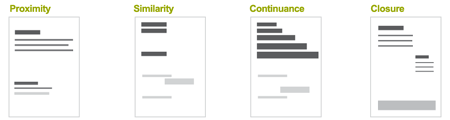
Fig 1: Principles of perception: proximity, similarity, continuance, and closure.
But understanding the psychological manner in which we group visual information is not enough if we want to be able to communicate a specific message. In order to do that, we need to know how to use visual relationships to our advantage—we need to know what makes things different.
Though lots of variations are possible, we can group distinct visual characteristics into five general categories: color, texture, shape, direction, and size. Introducing variations in one or all of these categories creates visual contrast. The more contrast between two objects, the more likely they will be perceived as distinct and unrelated.
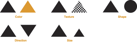
Fig 2: Visual differences between objects.
Telling a story: visual hierarchy
“Designers can create normalcy out of chaos; they can clearly communicate ideas through the organizing and manipulating of words and pictures.”—Jeffery Veen, The Art and Science of Web Design
Now that we understand the basic ways to visually distinguish objects, we can look at the big picture: using visual relationships to tell a coherent story. Elements within a “visual narrative” are arranged in an easily understood order of importance. A center of attention attracts the viewer’s attention, and each subsequent focal point adds to the story. This logical ordering is known as a visual hierarchy.
To build effective visual hierarchies, we use visual relationships to add more or less visual weight to page elements and thereby establish a pattern of movement through the layout. Visual weight can be measured by the degree to which a page element demands our attention or keeps our interest. Large red type, for example, contrasts with a white background much more than a light gray dot. As a result, the visual weight of the red type grabs our attention first, though it might not keep our attention as long as a detailed image.
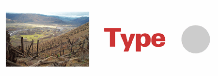
Fig 3: Three objects with differing visual weights created by variations in color, shape, and texture.
Visually dominant elements (those with the heaviest visual weight) get noticed the most. They are the center of interest in a layout and they determine where the story begins. The hierarchy of subsequent elements guides our eyes through the rest of the composition, giving us pieces of the story as we go. The relative position of each element in the hierarchy provides valuable information about its importance to the big picture.
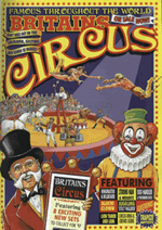
Fig 4: The heaviest (most visually dominant) elements in this circus poster are the images of the performers and the title. They communicate the big picture: the circus is in town. The lightest (least visually dominant) elements in the hierarchy are the ticket prices and features. If the hierarchy were reversed, few people would know the circus was in town. Instead they would be confused as they passed posters seemingly promoting “$5.50.”
A balanced hierarchy provides not only a clear path for recognizing and understanding information, it also helps unify the disparate elements within a page layout into a cohesive whole. This creates a sense of order and balance. Without visual hierarchy, page elements compete for attention, and as a result, none of them win. In all hierarchies, only certain elements should be on top; the rest need to follow suit. The appropriate position of each element in the hierarchy depends on the message you are trying to communicate.
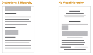
Fig 5: In a layout with an effective visual hierarchy, the distinct visual weight of each element guides viewers through the page in an informative and appropriate manner.
Putting it to use
Any given web page is composed of many distinct elements. Navigation menus (possibly several layers deep), contact information, search boxes, site identifiers, and shopping carts are just a few. The visual organization of a web page can communicate valuable information about the similarities and differences between elements and their relative importance. Once your audience understands the significance of your page elements, they can apply that knowledge to the rest of the site.
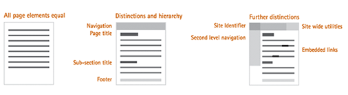
Fig 6: If all the elements in a page layout are given equal visual weight, making sense of the page is difficult. Meaning is created through the differences and similarities among elements and their place in the page’s visual hierarchy.
Generally, the hierarchy of a web page is based on distinctions between the content, navigation, and supporting information on a page. Within each of these sections further distinctions can also be made. A general web page hierarchy (from highest to lowest importance) may look like the following:
Content
- Page title
- Subsection title
- Embedded links
- Supplementary information (captions, etc.)
Navigation
- Location indicator
- Top-level navigation options
- Sub-navigation options
- Trace route (breadcrumbs)
Supporting elements
- Site identifier
- Site-wide utilities (shopping cart, site map, etc.)
- Footer information (privacy policy, contact info, etc.)
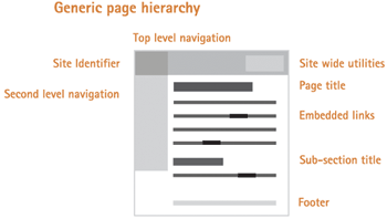
Fig 7: The visual hierarchy of a generic web page.
Of course, there are many situations where deviating from this formula is advised (on navigation pages, home pages, etc.). The content, audience, and goals of each page should determine its exact hierarchy. Nonetheless, the visual representation of each element on a web page should always be:
- Appropriate for and indicative of the element’s function
- Applied consistently throughout the site
- Positioned properly in the page’s visual hierarchy (in a manner reflective of its relative importance)
Visual hierarchy, however, does more than simply explain page elements. It guides users through the site’s content and interactions. Armed with an understanding of each element’s place in a hierarchy, we can emphasize important elements (such as content or interaction points), and subdue other elements (supporting information).
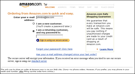
Fig 8: In this online form, visual hierarchy guides the user through the necessary steps to place an order. It also emphasizes (with color, positioning, and scale) the first step (“Ordering from…”) and the last step (the “Sign-In” button). Simultaneously, the supporting information is subdued (it has little visual weight) and does not interfere with the main interaction sequence.
Similarly, visual hierarchy can provide users with a sense of where they are within a website, to direct their attention (to special offers, for example), to suggest distinct choices, to explain new elements, and more. However, effective visual communication does not “speak” loudly. It quietly educates and guides the audience through the interface.
Given the massive number of web pages and applications, users often rely on visual cues (especially initially) to assess web interfaces. Therefore, a well thought-out visual organization can greatly enhance usability by grouping information into meaningful page elements and sequences. Such a system relies on an understanding of how people use visual relationships to distinguish objects and what those relationships reveal to viewers (through visual weight and hierarchy). But visual organization is only half of visual communication. The rest, personality (or look and feel), is another story…
Why did you decide to move to California?
“ There’s not a sense of looking to generate money, its about having an idea and doing it - I think that characterizes this area and its focus. ”
- Sir Jonathan Ive
Apple’s Jony Ive
Article Source: Click Here
Our competitors want to be different and appear new, but they are the wrong goals
Apple’s Senior Vice President of Industrial Design, Jony Ive, doesn’t often give interviews but when he does, we are really able to gain an understanding Apple’s design ethos and how prototypes become bestselling electronic products.
When asked what makes design different at Apple, the Apple SVP believes the company’s focus on “designing and prototyping and making” is what sets it apart, that if a person or a company tries to separate those parts, the final result suffers.
He adds:
If something is going to be better, it is new, and if it’s new you are confronting problems and challenges you don’t have references for. To solve and address those requires a remarkable focus. There’s a sense of being inquisitive and optimistic, and you don’t see those in combination very often.
The Evening Standard’s Mark Prigg also asked Ive how Apple products come to be:
What I love about the creative process, and this may sound naive, is this idea that one day there is no idea, and no solution, but then the next day there is an idea. Where you see the most dramatic shift is when you transition from an abstract idea to a slightly more material conversation. But when you make a 3D model, however crude, you bring form to a nebulous idea and everything changes — the entire process shifts. It galvanises and brings focus from a broad group of people. It’s a remarkable process.
Ive also reiterates that Apple strives to “design and make better products,” adding that if the company can’t do something better “we won’t do it.”
This translates into how Apple percieves its competitors. When asked how its rivals have struggled to do the same, Ive notes:
Most of our competitors are interested in doing something different, or want to appear new — I think those are completely the wrong goals. A product has to be genuinely better. This requires real discipline, and that’s what drives us — a sincere, genuine appetite to do something that is better.
Apple’s success does bring its share of negative experiences, especially for Apple’s design lead. “One of the things that really irritates me in products is when I’m aware of designers wagging their tails in my face,” Ive states, adding that Apple’s goal “is to create simple objects, objects that you can’t imagine any other way.”
When consumers can make or break a product, the fact that “they sense where there has been great care in the design, when there is cynicism and greed” encourages Apple, says Ive.
This is reinforced by the fact that Apple is now the world’s biggest technology company and leads the smartphone and tablet markets in terms of sales, not only because they are easy to use but they have set design standards for the industry.
The Future of Retail. Interactive displays and mobile devices have made the possibilities endless with ideas on how we can improve the retail experience.
The Future of Retail. Interactive displays and mobile devices have made the possibilities endless with ideas on how we can improve the retail experience.
The Future of Retail. Interactive displays and mobile devices have made the possibilities endless with ideas on how we can improve the retail experience.
How The Mobile Checkbook Will Change The Future Of Commerce
Article Source: Click Here
Much headway has been made recently in the world of mobile payments. Google Wallet, NFC, Square and other Mobile POS systems are making the smartphone the device on which smaller, personal transactions are taking place. However, the majority of people are still using physical checks to pay for larger items or services such as rent with checks that need processing time, carry fees, and are not always reliable. Jay Bhattacharya, the founder of Zipmark, spoke to PSFK about how he sees the ‘checkbook of the future’ developing.
What is ‘the checkbook of the future’ and how is Zipmark making it a reality?
Across all industries we’re seeing time and resources being wasted on something that should be streamlined and carefree — payment collections. We’re aiming to help people focus on their actual business by streamlining cash flow and decreasing the hassle (interchange fees, bounced checks) that comes with existing payments structures — this is what ‘the checkbook of the future’ can accomplish. We just announced the launch of our Developer Program, giving businesses and application developers access to an entirely new kind of fast and secure payment system for online and mobile transactions. Our platform brings sophisticated check-processing infrastructure directly to billers and their customers, enabling businesses to accept secure payments from any bank, thrift or credit union checking account without onerous fees or long delays. We charge 1% for each transaction with a cap at $5 regardless of the payment amount and offers secure, Check21 compliant digital checks. Our iPhone app is debuting at South by Southwest Interactive, and will enable users to make payments for items such as rent, fees or subscriptions directly from paper invoices via QR codes.
What are the challenges involved with getting merchants to sign up?
At Zipmark, we view merchants as users of our product, and as such we work with them to understand how our product can help their business. For example, if a small business proprietor wants to be able to collect from a client online, we can help them with that without having to get a merchant account or pay credit card or Paypal fees. The lower fees, faster settlement and the good funds model seems to resonate with billers and merchants. Also the fact that our payments are realtime, authorized checks provides immediate understanding of our transaction process unlike some of the alternatives that use stored value or intermediary accounts.
Zipmark works closely with businesses that are already servicing merchants as partners and collaborators. There is so much change happening in eCommerce and mobile commerce and payments is often part of a larger suite of tools that help business owners and managers. If you can get Zipmark from someone with whom you already do business, that works better from our perspective
Other than convenience and efficiency, are you planning on building any incentives (loyalty, discounting etc.) into the system to encourage people to use the system?
We have rewards and loyalty on our radar, but right now we feel that if we are the best way for a merchant to get paid, they are going to ask for Zipmark. One of our early test clients is putting “convenience” fees on every other way to pay except for Zipmark, which is driving a lot more adoption than any miles program would.
Are you considering offering any other services on top of the payments platform, recommendations etc.?
There are businesses that do a great job of creating those services and Zipmark secure digital check transactions may become a valuable data for them.
Alongside mobile tech, where do you see the payments space heading?
Mobile is a big change for the financial services space. I entered the industry when the prevailing attitude was that the Internet, as a whole, was going to be where the riff-raff would be so the industry was wrong back then. One trend in general is the overall control of payments going to where the actual business relationship is, between the payer and the payee. We see that with merchant funded rewards, stored value, etc. Major behavior changes such as NFC and P2P are going to take time and service providers will need to be reactive to what the market says. We are now living during the coming of age of the first generation of consumers who never went to a bank branch or questioned an online transaction, at Zipmark we’re planning so that we can be open to the changes that emerge.
- interactive
- interaction
- installation
- design
- led
- light
- art
- technology
- projectionmapping
- projectmapping
- robotics
- ui
- mobile
- projection
- interactivedesign
- lightdesign
- apple
- web
- 3d
- ux
- userinterface
- lightart
- robot
- artinstallation
- touchscreen
- application
- app
- webdesign
- touch
- motion
- responsive
- adobe
- multitouch
- future
- robots
- drone
- photoshop
- productdesign
- ledinstallation
- lightsculpture
- video
- user experience
- iphone
- creative
- interactivelight
- digitalart
- motiondesign
- ar
- 3dprinting
- responsivedesign
- augmentedreality
- drones
- kinetic
- data
- development
- kinect
- microsoft
- display
- immersive
- process
- painting
- timelapse
- dronerobotics
- 3dprojection
- ios
- vr
- virtualreality
- earth
- ai
- device
- user interface
- engineering
- laser
- lightpainting
- kineticsculpture
- lightinstallation
- touchinstallation
- animation
- programmableleds
- graffiti
- interactions
- neon
- performance
- leapmotion
- watch
- mobiledesign
- pixel
- environment
- exoskeleton
- interactiveenvironment
- sound
- lcd
- social
- leds
- lukew
- artlight
- patterns
- internet
- carui
- November 2011 128
- December 2011 65
- January 2012 25
- February 2012 27
- March 2012 33
- April 2012 31
- May 2012 16
- June 2012 32
- July 2012 20
- August 2012 37
- September 2012 24
- October 2012 34
- November 2012 31
- December 2012 6
- January 2013 21
- February 2013 11
- March 2013 10
- April 2013 35
- May 2013 45
- June 2013 10
- July 2013 49
- August 2013 33
- September 2013 40
- October 2013 57
- November 2013 31
- December 2013 28
- January 2014 86
- February 2014 49
- March 2014 24
- April 2014 40
- May 2014 6
- June 2014 9
- July 2014 1
- August 2014 34
- September 2014 30
- October 2014 45
- November 2014 21
- December 2014 6
- January 2015 5
- February 2015 17
- March 2015 18
- April 2015 14
- May 2015 1
- June 2015 10
- July 2015 4
- August 2015 1
- October 2015 11
- March 2016 4
- December 2016 18
- September 2017 6
- October 2017 13
- November 2017 5
- June 2018 8
- July 2018 2
- November 2018 7
- February 2019 8
- March 2019 6
- July 2019 1
- August 2019 1
- October 2019 1
- July 2020 5
- November 2020 9
- December 2020 1
- January 2021 1
- April 2021 1
- May 2021 9
- June 2021 3
- August 2022 3
- May 2023 2
- September 2023 1
- May 2025 6