Apolline & Leon : interactive book for Apple Android Playbook touchpads. Share the extraordinary adventures of Apolline and Léon set in the Tuileries Gardens in Paris.
SOLAR - A hyper-sensorial display of the day’s weather in dazzling, haptically rendered colorscapes. Just a keen and visually arresting way to climatically size up the day. In other words… Weather has never been cooler.
Concept & Design: Frank Lazik, Paul Svoboda, Katharina Boepple, Marcus Naumann
Near field technology has been around for a couple of years now, but will it finally have its breakthrough later this year when the new iPhone comes out? A good reason for us to take another closer look at the technology.
IKEA Catalog is alive with smart ideas, fun stories and beautiful products. Download the IKEA Catalog App for your smartphone or tablet, and scan select pages to unlock films, interactive experiences, photo galleries and more home furnishing inspiration.
Fast User Interfaces for the Cross-Device Web
Article: Source
In his Fast User Interfaces for the Cross-Device Web presentation at Google I/O in San Francisco, CA Boris Smus discussed the challenges of building Web interfaces that work across an increasing number of devices with different screen sizes and input methods. Here are my notes from his talk:
- What are the issues for cross-device Web design & development? Variety of form factors, CPUs and networks are slow, new kinds of input (touch, voice), development on actual devices.
- How are Web developers dealing with this? Two extreme options exist.
- Extreme 1: create one version for all screens without any adaptation. This will lead to sub-optimal experiences on many devices.
- Extreme 2: create a different version for each device. This is not theasible as the number of devices continues to increase.
- You need to seek a middle ground between level of effort and creating an optimized experience for each device.
Cross Device Options
- Align with Platforms: You might consider building to the specifics of each platform. After all, there are less platforms than devices
- Native platforms make it easy to build consistent user interfaces through SDKs and interface guidelines. So there are design references.
- But beware of emulating specific platform guidelines on the Web. They are hard to implement exactly and what you make will always be slightly off. Some differences between platforms are easy to deal with (visuals) others are more substantial (form factor of devices).
- Device Classes: create phone, tablet, desktop versions of your Web site. You can start from one version and tweak it to adapt to other versions.
- Adaptive Design: use responsive Web design to change screen layouts based on different screen sizes. However, in responsive design the DOM is shared between device experiences, which makes some adapations harder. One way to manage some of these issues is to use Javascript (matchMedia) to make adjustments on the client.
- 650pixels is a good dividing line between smartphones and tablets that considers landscape mode and different device size sizes.
- Client Redirects: Device.js can be used to have the same URL load a different version of the site to a different device. This requires a redirect, which could slow things down a bit.
- Server Detection: On the server all we have is a user agent string, which is pretty messy to deal with. Yet many Web properties redirect users based on UA string and a device database. Device Atlas and WURFL can be used to identify devices but they are not easy to get up and running and not free.
- If you are using separate templates, start with device.js, see if the overhead is too much, if so then move on to server-side UA solutions if you need them to boost performance.
- To manage the issue of multiple templates, make sure you use a MVC structure for your app that separates the presentation layers.
Design Considerations
- Jank-free UIs: the limit of human perception is 60 frames per second. Use hardware acceleration as much as possible to get your animations close to this frame rate.
- You can use transform and translate (esp 3D) to force hardware acceleration in CSS animations
- -webkit-overflow-scrolling: touch custom Webkit property that works on iOS and Chrome which forces hardware accelerated scrolling. This results in really fast scrolling on mobile devices. iOS also adds intertia scroll and bounce-back effects.
- Touch is not the same as mouse: no hover states, multiple points, less precise inputs, and will eventually will also measure pressure, size, and more.
- Touch events are usually delayed in the browser (300ms) to figure out what kind of gesture it is. Use touchend to react faster to touch inputs.
- The browser has its own set of gestures that can be over-ridden with Javascript. Some can’t though and usually it is not a good idea to override native browser functions.
- Create separate handlers for input and drawing to manage the speed at which touch gestures come in. Request Animation Frame will give you as smooth an animation as possible.
- Microsoft’s MSPointer consolidates pen, touch, and mouse inputs into a single input model. However it works as another event type and isn’t well supported yet.
- Pointer.js consolidates the input model across browsers. It will also have gesture models on top of the pointer events.
- The easiest path to mobile development is to emulate it on the desktop through screen size, UA agent changing, and emulating touch events.
- Ultimately, you need to test on your device. Chrome has remote debugging tools available.
The crayola-fication of the world: How we gave colors names, and it messed with our brains
Article: Source
“Who in the rainbow can draw the line where the violet tint ends and the orange tint begins? Distinctly we see the difference of the colors, but where exactly does the one first blendingly enter into the other? So with sanity and insanity.”
—Herman Melville, Billy Budd
In Japan, people often refer to traffic lights as being blue in color. And this is a bit odd, because the traffic signal indicating ‘go’ in Japan is just as green as it is anywhere else in the world. So why is the color getting lost in translation? This visual conundrum has its roots in the history of language.
Blue and green are similar in hue. They sit next to each other in a rainbow, which means that, to our eyes, light can blend smoothly from blue to green or vice-versa, without going past any other color in between. Before the modern period, Japanese had just one word, Ao, for both blue and green. The wall that divides these colors hadn’t been erected as yet. As the language evolved, in the Heian period around the year 1000, something interesting happened. A new word popped into being –midori – and it described a sort of greenish end of blue. Midori was a shade of ao, it wasn’t really a new color in its own right.
One of the first fences in this color continuum came from an unlikely place – crayons. In 1917, the first crayons were imported into Japan, and they brought with them a way of dividing a seamless visual spread into neat, discrete chunks. There were different crayons for green (midori) and blue (ao), and children started to adopt these names. But the real change came during the Allied occupation of Japan after World War II, when new educational material started to circulate. In 1951, teaching guidelines for first grade teachers distinguished blue from green, and the word midori was shoehorned to fit this new purpose.
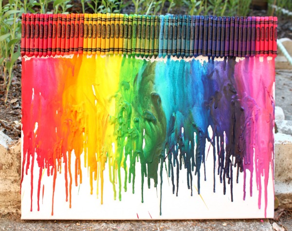
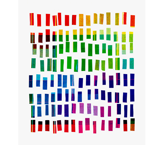
Reconstructing the rainbow. Stephanie, who blogs at 52 Kitchen Adventures, took a heat gun to a crayola set.
In modern Japanese, midori is the word for green, as distinct from blue. This divorce of blue and green was not without its scars. There are clues that remain in the language, that bear witness to this awkward separation. For example, in many languages the word for vegetable is synonymous with green (sabzi in Urdu literally means green-ness, and in English we say ‘eat your greens’). But in Japanese, vegetables are ao-mono, literally blue things. Green apples? They’re blue too. As are the first leaves of spring, if you go by their Japanese name. In English, the term green is sometimes used to describe a novice, someone inexperienced. In Japanese, they’re ao-kusai, literally they ‘smell of blue’. It’s as if the borders that separate colors follow a slightly different route in Japan.
And it’s not just Japanese. There are plenty of other languages that blur the lines between what we call blue and green. Many languages don’t distinguish between the two colors at all. In Vietnamese the Thai language, khiaw means green except if it refers to the sky or the sea, in which case it’s blue. The Korean word puruedacould refer to either blue or green, and the same goes for the Chinese word qīng.It’s not just East Asian languages either, this is something you see across language families. In fact, Radiolab had a fascinating recent episode on color where they talked about how there was no blue in the original Hebrew Bible, nor in all of Homer’s Illiad or Odyssey!
(Update: Some clarifications here. Thanks, Ani Nguyen, for catching the mistake about Vietnamese. See her comment below about how the same phenomenon holds in Vietnamese. Also, the Chinese word qīng predates modern usage, and it mingles blues with greens. Modern Chinese does indeed distinguish blue from green. Thanks to Jenna Cody for pointing this out, and see her insightful and detailed comment below.)
I find this fascinating, because it highlights a powerful idea about how we might see the world. After all, what really is a color? Just like the crayons, we’re taking something that has no natural boundaries – the frequencies of visible light – and dividing into convenient packages that we give a name.
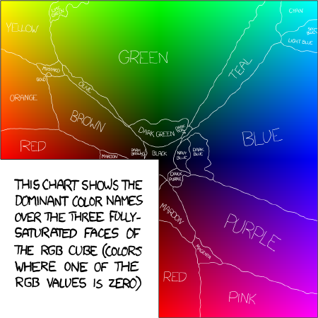
Imagine that you had a rainbow-colored piece of paper that smoothly blends from one color to the other. This will be our map of color space. Now just as you would on a real map, we draw boundaries on it. This bit here is pink, that part is orange, and that’s yellow. Here is what such a map might look like to a native English speaker.
But if you think about it, there’s a real puzzle here. Why should different cultures draw the same boundaries? If we speak different languages with largely independent histories, shouldn’t our ancestors have carved up the visual atlas rather differently?
This question was first addressed by Brent Berlin and Paul Kay in the late 1960s. They wanted to know if there are universal, guiding laws that govern how cultures arrive at their color atlas.
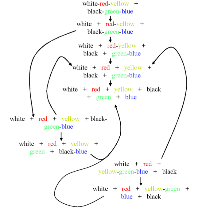
And here’s what they found. Languages have differing numbers of color words, ranging from two to about eleven. Yet after looking at 98 different languages, they saw a pattern. It was a pretty radical idea, that there is a certain fixed order in which these color names arise. This was a common path that languages seem to follow, a road towards increasing visual diversity. And they suggested that the road looked like this:

A picture worth many words. The path to a more colorful language, according to Berlin and Kay (1969).
The figure above is really telling a story. What it says is this. If a language has just two color terms, they will be a light and a dark shade – blacks and whites. Add a third color, and it’s going to be red. Add another, and it will be either green or yellow – you need five colors to have both. And when you get to six colors, the green splits into two, and you now have a blue. What we’re seeing here is a deeply trodden road that most languages seem to follow, towards greater visual discernment (92 of their 98 languages seemed to follow this basic route).
Critics of Kay and Berlin said they were reading too much from too little. Some argued that their study was too small, that they surveyed too few people from each language. They also said that study was skewed, as most the languages were from industrialized societies with written scripts. And to top it off, their methods weren’t very quantitative.
To respond to these criticisms, the authors launched what they called the World Color Survey, a project that started collecting data in the late 1970s. This was a survey of 110 languages, all spoken by pre-industrial societies, many that have no written script.
The researchers set out to map the color boundaries for each culture. To do this, they showed people a set of colored tiles in 10 different shades of 40 different hues. In all, 400 tiles of color that represent the building blocks of our visual world.

Crayons for science. How many colors can you name from these tiles? Most English speakers would come up with around 11 (including black and white). This number is a window into the linguistic history of your culture.
They then asked native speakers of these 110 different languages, many from remote tribal cultures, to painstakingly name the color of each tile. After tallying up what people said, they could divide these tiles into islands of color, similar to the map of color from before. Here’s what they learnt.
First, cultures are quite different in how their words paint the world. Take a look at this interactive map. For the 110 cultures, you can see how many basic words they use for colors. To the Dani people who live in the highlands of New Guiniea, objects comes in just two shades. There’s mili for the cooler shades, from blues and greens to black, and mola for the lighter shades, like reds, yellows and white. Some languages have just three basic colors, others have 4, 5, 6, and so on. There’s even a debate as to whether the Pirahã tribe of the Amazon have any specialized color words at all! (If you ask a Pirahã tribe member to label something red, they’ll say that it’s blood-like).
But there’s still a pattern hidden in this diversity. You might be wondering what happened to the cartoon picture of languages. Is there still a main road? Or are there languages that travel off the beaten path? The answer is yes, to both questions.
The picture looks like a mess, but keep in mind that five out of six languages surveyed follow the central route. So here’s the story. You start with a black-and-white world of darks and lights. There are warm colors, and cool colors, but no finer categories. Next, the reds and yellows separate away from white. You can now have a color for fire, or the fiery color of the sunset. There are tribes that have stopped here. Further down, blues and greens break away from black. Forests, skies, and oceans now come of their own in your visual vocabulary. Eventually, these colors separate further. First, red splits from yellow. And finally, blue from green. The forest unmingles from the sky. In the case of Japan, that last transition essentially happened in modern history!
Something eerily powerful is at work here. These cultures have largely independent histories, yet they somehow gravitate towards the same choices for how to slice up the visual cake. So you might ask, is there something special about the colors that they choose? With the color maps made available from the World Color Survey, researchers were able to take a stab at this question. The work that follows was spearheaded by Terry Regier, in collaboration with Paul Kay and Naveen Khetarpal.
Imagine doing an experiment. Let’s say you want to take the color tiles that represent the visual space, and divide them into four different patches. What’s the best way to do this? Well, you’d like your colors to be quite different from each other, so that people can easily tell them apart. However, you also want each color to contain a whole bunch of very similar shades, so that it’s easily recognizable. The researchers programmed these two conflicting tasks into a computer. They then let the algorithm fight out these conflicting instructions, until it reached some happy compromise. They were on the hunt for an optimal color map, if such a thing even existed.
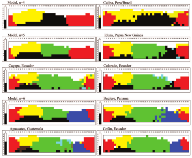
Here’s the map their computer model came up with. It takes the colored tiles and paints them, in broad strokes, into four different shades. Next to it are some of the real color maps for languages that have four basic color names.
Look similar? That’s the point. The researchers make the case that the islands of color that we carve the world into are, in some sense, the best choice.
Next, here are some examples from cultures with four, five and six different words for colors. The predictions of the computer model are shown next to the data.
It’s a little uncanny how closely well these models seem to match the data. But there are plenty of languages that don’t line up quite as well. Nonetheless, the researchers argue that there is something special about the colors that we choose. If you try to move the borders around, your new colors will actually be less optimal, in a sense that they make precise.
The picture that’s emerging is that colors aren’t quite random slices of the visual pie. They’re somewhat basic categories that humans from different cultures gravitate towards, and must have to do with how the biology of how we see the world. In other words, rainbows have seams. We can distill a rainbow into its basic visual ingredients, and a handful of colors come out. But if you were to ask a dog, a rainbow has fewer ingredients. The result is a little more boring, less rich than the visual spectacle we experience.
But don’t feel too proud. If you were a mantis shrimp, your rainbow would be unimaginably rich, with thousands, maybe tens of thousands of colors that blend together, stretching from deep reds all the way to the ultraviolet. To a mantis shrimp, our visual world is unbearably dull. (Another Radiolab plug: in their episode on Color, they use a choir to convey this idea through sound. A visual spectrum becomes a musical one. It’s one of those little touches that makes this show genius. </fanboy>)
That’s all for part one of this post, on how we gave colors names. In the next part, I’ll talk about some pretty surprising studies that show how giving a color a name can, quite literally, mess with our brains. So stay tuned for the next mind-bending chapter.
Update: Part two is up.
Update (June 11): If you really enjoyed this post, I could use your help. Please consider voting for it in the annual 3QuarksDaily Science Writing Prize. Voting will close on SATURDAY, so get your vote in today. Thanks!
Update: This post received editor’s selections at ScienceSeeker (by Cristy Gelling), ResearchBlogging (by Krystal D’costa), on the Scientific American Incubator Blog (by Khalil Cassimally), and on Bora Zivkovic‘s and Ed Yong‘s picks of the week.
Update: It’s been an exciting past few weeks. I’m blown away by the overwhelming response to this post. Here’s a manual trackback of links. It was mentioned on the Browser, on the literary blog of the New Yorker, Andrew Sullivan’s blog at the Daily Beast, Erza Klein’s blog on the Washington Post, Maria Popova’s tumblr blog Explore. Its also been tweeted by @BrainPicker and @HariKunzru, among others, and been featured on Hacker News, Reddit, Metafilter and Kottke. And to top it off, it won first place in the 3 Quarks Daily annual science writing prize, judged by Sean Carroll.
Random Article
Google:
We copied Apple’s inventions, so now they’re de facto standards, thus patents shouldn’t be enforceable.
Apple:
Apple’s point is that if you remove the IP distinctions between the two, you remove a key incentive for innovators to innovate. Apple spent billions in research and development to create the iPhone. It didn’t spend that money to create the iPhone’s competition. And this is a point Apple and CEO Tim Cook have hammered home again and again, since the smartphone IP Hundred Years War began.
- interactive
- interaction
- installation
- design
- led
- light
- art
- technology
- projectionmapping
- projectmapping
- robotics
- ui
- mobile
- projection
- interactivedesign
- lightdesign
- apple
- web
- 3d
- ux
- userinterface
- lightart
- robot
- artinstallation
- touchscreen
- application
- app
- webdesign
- touch
- motion
- responsive
- adobe
- multitouch
- future
- robots
- drone
- photoshop
- productdesign
- ledinstallation
- lightsculpture
- video
- user experience
- iphone
- creative
- interactivelight
- digitalart
- motiondesign
- ar
- 3dprinting
- responsivedesign
- augmentedreality
- drones
- kinetic
- data
- development
- kinect
- microsoft
- display
- immersive
- process
- painting
- timelapse
- dronerobotics
- 3dprojection
- ios
- vr
- virtualreality
- earth
- ai
- device
- user interface
- engineering
- laser
- lightpainting
- kineticsculpture
- lightinstallation
- touchinstallation
- animation
- programmableleds
- graffiti
- interactions
- neon
- performance
- leapmotion
- watch
- mobiledesign
- pixel
- environment
- exoskeleton
- interactiveenvironment
- sound
- lcd
- social
- leds
- lukew
- artlight
- patterns
- internet
- carui
- November 2011 128
- December 2011 65
- January 2012 25
- February 2012 27
- March 2012 33
- April 2012 31
- May 2012 16
- June 2012 32
- July 2012 20
- August 2012 37
- September 2012 24
- October 2012 34
- November 2012 31
- December 2012 6
- January 2013 21
- February 2013 11
- March 2013 10
- April 2013 35
- May 2013 45
- June 2013 10
- July 2013 49
- August 2013 33
- September 2013 40
- October 2013 57
- November 2013 31
- December 2013 28
- January 2014 86
- February 2014 49
- March 2014 24
- April 2014 40
- May 2014 6
- June 2014 9
- July 2014 1
- August 2014 34
- September 2014 30
- October 2014 45
- November 2014 21
- December 2014 6
- January 2015 5
- February 2015 17
- March 2015 18
- April 2015 14
- May 2015 1
- June 2015 10
- July 2015 4
- August 2015 1
- October 2015 11
- March 2016 4
- December 2016 18
- September 2017 6
- October 2017 13
- November 2017 5
- June 2018 8
- July 2018 2
- November 2018 7
- February 2019 8
- March 2019 6
- July 2019 1
- August 2019 1
- October 2019 1
- July 2020 5
- November 2020 9
- December 2020 1
- January 2021 1
- April 2021 1
- May 2021 9
- June 2021 3
- August 2022 3
- May 2023 2
- September 2023 1
- May 2025 6
