1980k 1980k

The State of Car UI

Everywhere you look a new car manufacturer is coming out with a screen-based User Interface. Many of these companies have a long legacy of premium designs and a focus on the driver’s experience. Why is it then most of us wince when they reveal the tacky, confusing, or overwhelming user interface?

Before we get into why, let’s review some examples of some the current Car Interfaces actually in use…

Corvette Stingray

Ford (2013)Windows Car UI (Concept)Volvo ConceptMercedes

When we look at these interfaces we intuitively know something is “off.”

Here is why:

  1. We know we shouldn’t be distracted when driving
  2. As users of mobile phones we know how hard touch can be to use
  3. Visually we have higher standards set by talented teams around the world making our apps

1. Distraction

With modern cars and especially with a dynamic new playground the touch screen offers a UI designer, there is a lot of information that can be displayed to the user: Cabin temperature, speed, car height, engine alerts, RPMs, battery percentage, avg. miles a gallon, etc. There is even more features one could add on top of that: A music player, web browser, games, driving history, maps, etc. The possibilities are endless and each company feels pressured to out do the other. This lends it’s self to the UI you saw above: cluttered, confusing, and bursting at the seems with “stuff.”

2. Touch

Touch is great, but it’s hard. Our fingers are not precise, and when we aren’t looking, like someone driving a ton of metal at 70mph might need to, touch has no tactile feedback. Have you ever tried to get directions on your phone while moving? It’s almost impossible and it’s extremely dangerous. Additionally, if touch isn’t done right technically, as Andriod learned when it first started out, it can put people off to the whole thing, it can throw users off from their actions, and cause mistakes. Here is a short example from Tesla, who has a NVDIA Tegra 3 behind their screen, yet the scroll is a little off, which breaks the “direct manipulation” illusion Apple has been able to pull off so well…

(You can pause it after a few seconds)


Scrolling with Tesla’s high end 17in screen is a little off

Touch almost seems like a bad idea in car UI, but it want’s to happen anyway. There is so much potential here to enhance the lives of people, especially considering how much time people spend in their cars.

3. Visuals

Visually car UI is in an interesting spot. It’s where the iPhone was when it first started out. People were used to real life objects and not to touch interfaces. The iPhone solved this by using a Skeuomorphic style. However, mobile design have passed that stage now. So you can see why UI designers for cars have often felt they too need to use the Skeumorphic style in order to transition from buttons and knobs to a touch interface. Another aspect is that high detail is a way to show the craftsmanship of the designers, and in luxury cars, there is a desire to show that through overly colored, textured, and detailed icons and UI elements.


With these challenges also comes the understanding that this area is new, which is why I find this challenge so fascinating. I believe with a focus on user needs and an influx of mobile designers into this new space, we will start seeing this medium mature and to serve consumers better and start to really “wow” them.


Thank you for reading. Look for my next post soon on how car UI can be better designed, plus some examples of companies who are starting to get it right.

Source

Read More
1980k 1980k

How bottom-up product design liberates designers and delights users.

We are on the cusp of a major shift in how product designers approach their jobs. The legacy method is to spend a lot of upfront time concocting a formal strategy and identifying “user needs” before getting to work building something, a top-down process that is time-consuming and costly. An alternative—and increasingly accessible—method is to focus on synthesizing individual elements and features of a product from the bottom-up, ultimately discovering new use cases that could drive a viable business strategy. If the traditional approach is “macro UX,” the new one is “micro UX.”

The best example of bottom-up design—micro UX—is building with Legos. The designer uses predefined units and works with them as starting points to create something new. In designing digital products, we similarly leverage specific technologies, gestures and features of different devices to build something without worrying about the overall strategy. With each iteration, a cohesive product takes form, and using real-time usability testing, designers continue to tweak that new product until users love it. This open-ended process might spook some clients or traditional practitioners, but it’s what’s beginning to separate truly great product design from merely adequate design.

Why micro UX now?

For the last few decades of digital product design, we’ve taken the macro UX approach. UX pioneer Don Norman was an early advocate of focusing on user needs upfront in the process. But something has changed in recent years (in fact, Norman himself repudiated the existing paradigm in a provocative essay called “Technology First, Needs Last,” in 2010). There are several big factors at play for the shift:

  • Increased access to better and cheaper technology, from Arduino to smartphones and tablets to sensors.
  • More immediate and deeper global knowledge networks, from coder forums to stackoverflow.com.
  • Easier ways to test product iterations relatively cheaply, from KickStarter to the App Store. 
  • Real-time tracking tools, from online surveys to eye tracking costing less than $200 to widely-available cursor trackers. 

These converging developments make micro UX low-risk and liberate product designers to experiment and play with small features (designer and micro UX evangelist Dan Saffer calls them microinteractions) that together affect the user in myriad ways and constitute her experience. 

When is micro UX best? 

Micro UX will not—and should not—entirely supplant macro UX. It works best with smaller, informal teams, smaller budgets and smaller products in general (though not exclusively). Other scenarios:

  • Designing experimental products with no predefined audience. Take Jelly, the app that lets users take photos and attach text messages. The way users use Jelly is still evolving, but these uses are triggers that could help the company determine its identity later. 
  • Designing an insurgent product aimed at taking out incumbents. When Facebook was still just becoming the behemoth it is today and competing with MySpace, it focused on small details like incorporating JavaScript so the user didn’t have to refresh pages constantly, like they did on MySpace. While several, complex factors contributed to Facebook’s ultimate success, micro UX played a role. Similarly, Tinder, the wildly popular dating app, is built on top of a simple swipe gesture that only makes matches when both parties accept them. The micro UX of Tinder has helped the startup supplant larger, more established sites that built services based on preconceived matching algorithms, like Match.com or OKCupid. 
  • Refreshing an established brand’s digital presence. For companies with successful, existing digital products, updating the design with a micro UX approach helps keep the focus on incremental, user-focused improvements. For example, TED.com’s recent redesign boasts several smaller adjustments that provide delightful moments, like smarter, more intuitive pull-down menus when there are many options to choose from (full disclosure, Huge worked with TED on the project). 

Marrying macro and micro UX?

Of course it’s possible that the best way forward is to adjust how traditional macro UX works informed by micro UX best practices. Designers and strategists/researchers would work together from the outset, with the latter doing audience research in parallel with the former’s iterating and real-time testing. Together, they would validate the evolving product design. This approach would let user needs, as determined by research, align with actual user use, as shown by testing. 

The advent of micro UX is exciting for both the designer and user. The designer is now able to incorporate a broader skill set—coding, visual design, psychology—in his quest to build the delightful moments that together make up the micro UX of a product, not to mention observe the impact of each iteration on actual users and adjust as necessary. The user is about to experience a host of products designed to make her life easier and much more fun. Source

Read More
1980k 1980k

14 Different Ways of Product Design

After my dribbble post with picture of a Diagram with very positive feedback and lot of questions, I was motivated to create this article about my process and what I’ve learned after 2 years of this journey.

It’s a bit hard to say that I’m always using this same process, but you can read it similar to an ideal process. I’ve divided this process into 4 parts — Pre-process, Work process, Post-process and tips for Productivity.

Pre-Process

1. I’m drawing

It doesn’t matter if it’s paper, a notebook or just a small piece of something. I need to share the ideas in my head. I need to put these ideas down where they can be saved and not forgotten. Consequently this means that I have some sketches on my bank statements, bills from restaurants, book covers etc.

Sketch of old idea

However, for me it is ideal to have something tangible, for example, on Moleskine. It’s always nice to go through these lists from time to time, look at my old ideas and try to reinvent or recreate something for this particular project or different idea.

2. Collecting Pictures

“An artist is a collector. Not a hoarder, mind you, there’s a difference: hoarders collect indiscriminately, the artist collects selectively. They only collect things that they really love.” — Steal like an Artist (Austin Kleon)

Another pre-process phase is the collecting of pictures, I do this everyday. There is definitely hundreds of styles on how to collect and view these images, however I particularly prefer old school style — Dropbox folder separate to different categories (Dashboards, iOS, Illustrations etc.). Then, when I receive an inquiry or project, I’m going through these images and I’m trying to find inspiration. Dropbox is pre-caching low quality previews of files so you’re able to list them without an internet connection.

3. Moodboard and Preparation

We have plenty of sites for inspiration — Dribbble, Behance, Pttrns, Pinterest etc. and it’s really easy to find similar projects like the one you have. Additionally, it could be a solution for a problem that you’re experiencing and you’re trying to solve.

So when I begin working on a new project, I always prepare a folder with — PSD, Screens, Inspiration and Resources folders. I’m saving everything to the Inspiration folder that I find on the internet and is related to this project.

It should be everything from swatches to full case studies from Behance. Yet it also could be pictures of attractive people if the app has users’ profiles. It sometimes happens that I don’t even use that folder but that’s different story!

Work Process

4. I don’t care about wireframes quality.

I’m not a big fan of spending half a year on wireframes. I also prefer it if a client has prepared wireframes.

A good client is one who has prepared his ideas on paper.

I’m taking wireframes as just more about understanding the purpose and not the actual final result. The final result matters about you and your UI / UX skills and ideas which you want to present. Wireframes can help with the imagination of how many screens you’ll need and what’s the client’s idea.

On another page of the wireframes is a nightmare for the designer in which someone wants just the replication of prepared wireframes and to use the right details from the wireframes. That’s monkey’s job not the designer’s. In this case, every designer would just quickly finish that job and run away from the project like Usian Bolt.

5. PSD — Big Canvas (back to the Illustrator)

When I started 7 months ago at Badoo, I saw how my colleague works (Hi Sasha!), I thought that he didn’t understand how Photoshop works. However, now I’m trying to get into this technique, and in fact this style make sense to me. It’s good to use this style when you’re working on something really big, for example, a web application or a rich dashboard.

Basically, I work with a big canvas for example 8000*5000 pixels. Furthermore, my work isn’t more than just creating one big UI kit. The work is much faster because you see every element together and I can easily see what’s happening in every state. Additionally, it is much quicker to make a screenshot for developers with a small flow or just one states for one thing.

6. All screens in one PSD

In another case, which is not that revolutionary or different. If I’m working on a mobile app I’m working in different extremes. That means — All screens are in one PSD.

In folder 14 is another 12 designs of graphs

I know in this case it will be better to use Sketch, which could be really helpful with work. But I prefer one instead of 40 because it’s hugely quicker, I can easily pick one element from a different screen and copy that to another folder/screen. So that means if I change the background or a few icons on the top bar, I don’t need to change hundreds of other PSD’s.

7. Folders and Etiquette

I’m a tidy person in every respect — I have one icon on my desktop, folders per clients, per projects. Every folder is structured in the same way as I mentioned before. The same as in PSD. Every of my PSD’s is nicely structured in every folder. I use the rule that if you have more than 8 layers in folder then you should create a new folder. I think about my PSD’s like I’m preparing them for someone else. I’m not a big fan of naming layers because you can easily go through my folders.

But lately I’ve started working with @LukášKus and he always complains that he doesn’t have these folders in AE. Therefore, a particular situation always matters.

If you would like to know anything else about PSD Etiquette you can look at this — http://photoshopetiquette.com/

8. Communication with friends

A network of people who can provide you with relevant feedback is something critical for me. I can easily do mini user testings and listen to what people think about these specific problems This usually opens the doors to other solutions and other points of view for these problems. I do these calls/tests as much as I can in every state of my project or screen. Moreover, it doesn’t matter who you are testing. It could be anyone, I prefer to combine two segments — people from the community, the UX designers and normal regular users. This is because you’re usually working on project for regular users not for designers and UX principals.

9. Diagram

After my client or I prepare wireframes, I prefer to take them and merge them in one PSD. Then I try to think about interactions, what happens when I click here or there. Usually, we find a lot of missing screens and additional errors which clients or I don’t realise, when I was thinking about just one particular screen when I was preparing wireframes. For me, it’s this pre-prototype phase which I don’t consider a double job. It’s actually also a visual overview of all the screens and the elements. When I’m working on 15+ screens project it’s hard to keep the same visual style across the whole app and I can easily break the guidelines.

3 different types of lines — first a normal line with the number of next screen. Second in app screen. Third — an external app or linkHow it looks with contentComplete overview

About style — I use the same style similar to a lot of designers, however instead of spending a lot of time with creating these lines across whole canvas, I use circles with the numbers of the next screen. It’s a little bit like gamebooks which I was reading back in the days, but it’s a better solution than creating of printed circuit boards. You can see more states on the picture.

I add a link for the Diagram PSD for a better understanding these diagrams(The iPhone render is done by GraphicBurger)

Post Process — Guidelines

And we are finally close to end of the process, the last part is the creation of the guidelines and the final check for visual consistency. It turns out for me like such an important part of the process for small and also for big projects. Usually, when I work on a big project I want to change something in this part of process and I’m never a 100% sure that I’ve changed every of these properties. I use these for myself and also for developers to be sure that they won’t use 50 shades of grey or 14 different sizes of fonts.

10. Colour Specs

The specification of colours is one of the first thing which I try to keep in mind. It’s really nice in these flat design age to keep as few colours as possible for the buttons and for text. It’s nice to prepare this in your PSD like a painter’s palette or like swatches in Photoshop, which is basically the same.

11. Typo Specification

One other thing which can remind you of the logo specification is the guide for text sizes and the weight of fonts across the application. Again, it’s good for developers, but also for your overview.

12. UI Kits

The UI kit is a really important thing if we are talking about consistency across company apps and websites. It’s also important when you’re working in team of designers or you have more front-end developers who work on that project. I can use a UI kit in way that I’m always taking these elements from UI Kits. Also the developers can easily see how this button will look on hover and they don’t need to ask about everything.

Note: I’ve realised that in big companies, it is a big problem that nobody has heard about these things and teams basically re-create these same CSS lines again and again. Then you realised that you have 3 different interpretations of one button in 3 different applications. So you can’t forget about consistency.

Productivity

13. Todo

My key aspect of tidiness is working with todo lists. It doesn’t matter what type of app or paper you use. I prefer Things by Cultured Code and sometimes piece of the paper. That feeling of completing lists is always great. I was possessed with accepting every project which ends up in my email inbox, but now I’ve realised that it is much too comfortable to focus on 1-2 projects and 100% focus just on these 2 projects and then go to another one instead of fighting with 5 different ones.

“If you chase two rabbits, you will not catch either one.” — Russian Proverb

14. Goals

It’s really nice to know what you want to achieve, but also don’t be too bound to them. I make goals for 14 days (like a sprint) and quarterly goals. Also, I try to set these goals in way that I can achieve some new experiences (for example: make my first animation in After Effects) and also keep working on current things (finish 2 Behance case studies).

And what else?

I don’t use a mouse, just a tablet, I don’t have Tools panel I have learned all keyboard shortcuts. For streaming Photoshop to iPhone I use Skala Preview and I want to learn After Effects and Sketch. For prototyping, I use InVision App for web projects and the newly MarvelApp for iOS designs. It’s quicker for me to work with a pen instead of dragging and swiping on the iPhone screen. I sometimes still work with PopApp for some early prototypes, when I have time on the Tube for clicking and dragging on Screen.

The last few words

It’s really hard to say that I will always complete and follow the exact process for each project, because I sometimes skip some steps or I start in Photoshop if I see that the design in my mind and I have an exact idea about that.

In companies where I have worked, I’m still not experiencing real feedback, user testing and these things where designers can profit and take and experience them for thinking about new projects or updates for the current one. Especially User Testings, these change the thinking about all the things and show us that regular users usually work in completely different ways than we expect.

The End

I’d be happy to hear about your work processes, which steps you usually take in your personal projects or your thoughts about additional steps in my process.

Source

Read More
1980k 1980k

Thoughts on Building a Design Driven Company

A few weeks ago, I went along to the Bloomberg BusinessWeek Design Conference. Having come across the event earlier in the year, I was curious to hear what the speakers (from companies like Asana, Frog Design, and Gap) would share around the role design plays inside their organizations, and how this has changed as they’ve grown and taken on new challenges.

Here are my takeaways from that sunny day in San Francisco:

EVALUATE PURPOSE

Regularly taking a step back and focussing the team on your core mission is vital for companies of all shapes and sizes. Evaluation brings priority to design decisions.

Gap

Sometimes taking a step back can fuel an overhaul. This is what Rebekkah Bay is currently navigating as Global Creative Director of the Gap.

In the last 10 years, the retail giant’s offering has diversified tremendously. So when Bay first joined the company, she first tasked the design team of 160 people to focus on the foundation of the brand; iconic basics such as t-shirts, shirts and pants which made the company relevant in the first place. Only after these pieces are in place does she plan to address communication and retail experiences.

EMBRACE FRICTION

Creating a space for interdisciplinary teams to meet and understand the problems they are solving is a key part of the design process. This friction creates an engine for teams to deliver great products.

asana

Establishing etiquette around design critiques has been a focus of Asana Co-Founder Justin Rosenstein. When he brings designers and engineers together to review the progress of software features and products, he asks everyone to offer problems, not solutions with their feedback. By framing critique with ‘When I look at that, I feel…’ his aim is to ask the team to engage with empathy for the user. For the critique host, he encourages them to ask questions to understand the problems their team has identified before explaining design choices.

UNIVERSAL GUIDANCE

Maintaining a familiar look, feel and tone across products and services isn’t easy for large organizations. Building tools which communicate brand DNA can inspire success.

target

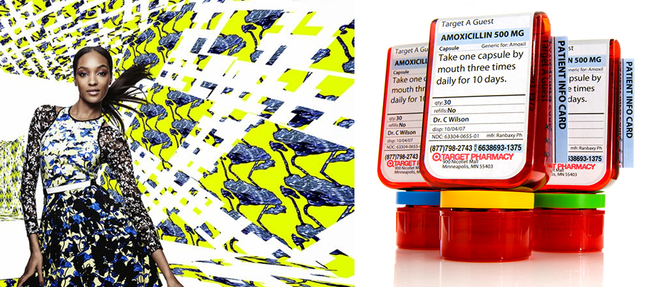
Target’s slogan has been the same since 1962  ‘Expect more, pay less’. A promise that has helped scale the business to nearly 2,000 stores worldwide. When Todd Waterbury arrived a year ago as Executive Creative Director, he installed 5 Principles: Emotional, Useful, Democratic, Simple and Purposeful.

These principles have helped guide design efforts and give ‘brand soul’ to everything Target does. You can see them at work with Target’s Feed USA collaboration and  Cartwheel app, to the championing of new designers like Peter Pilotto and the information design they bring to medication.

CHAMPION CONSTRAINTS

Embracing the opportunities, and constraints, of rapid product development is what builds an open design culture. These values establish productivity and collaboration across teams.

quirky

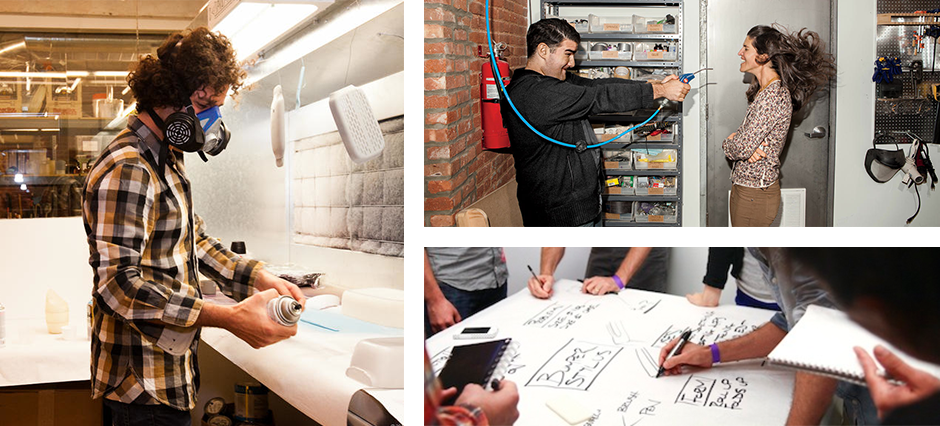
‘Constraints are king’ is the motto of Quirky, an online marketplace whose mission is to make invention accessible to everyone by crowd sourcing product ideas and bringing them to life with a team of inhouse designers and engineers. Founder Ben Kaufman let us know that if the Empire State Building could be built in 410 days in 1931, there is absolutely no reason why his company can’t help its community release three products every week in 2014.

The cycle of launching Tuesday, Wednesday, and Thursday helps focus decisions across the company everyday.

MEASURE BEHAVIOR

Feedback systems are at the heart of every great product company: Capturing it improves the experience of customers and employees.

mit

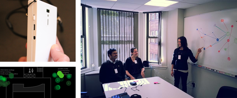
Until recently, understanding the behaviors and characteristics of successful leaders has been a pretty manual process. Timothy Morey from Frog Design shared an electronic device that could potentially change that. Sociometric Badges, the result of an MIT research project takes the idea of quantified self into the office. The devices measure conversations between colleagues, looking for patterns in tone and duration, and well, 98 other signals as it looks to build a physical graph of employees. Behaviors of effective leaders include brief, lively conversations.

Conference transmission ends.

As you may know, the role of design is something we’ve been thinking about since we started Percolate. From day one, we knew that putting a design department in place wasn’t enough.

Over the last three years, we have seen how great products and services aren’t designed by designers alone. We are working hard to create an environment where design thinking permeates the entire organization. If you are a reader of this blog, you may have come across our thoughts on how service informs design, our approach to market research and how we design with people.

Hearing the diverse and interesting ways other companies are using design to help drive their organizations forward was healthy. A mix of validation for the things we are doing at Percolate today, and thought starters for how we can grow and improve tomorrow.

It goes without saying that I absolutely recommend attending the conference next year. Those Californian breakfast burritos aren’t to be missed either.

Source

Read More
1980k 1980k

Gravity - 3D Sketching. Gravity is a tool for creatives to quickly sketch their ideas in 3D space using immersive augmented reality. A pen and a pad specifically designed for sketching in the augmented environment. Free from any screen or computer, Gravity allows you to focus on what really matters, developing your ideas in an intuitive way. As you start to draw, objects will take shape in front of you. Through the landing pad controls, you can adjust the plane in which you sketch, giving volume to your creation. With augmented reality glasses, Gravity reinvents how you and your collaborators visualize and contribute to each other’s ideas. The project started with a strong belief: the tools that are commonly used for drawing, designing and making things in 3D limit people’s ability to bring their ideas to reality. Through numerous prototypes, tests and iterations, we created Gravity as a simple and engaging tool that will shape a new wave of 3D creation. Source

Read More
1980k 1980k

This Rolling, Transforming Droid Is the Stuff of Nightmares. Outdoor video footage of MorpHex MKII. A hexapod robot that can walk on six legs and transform into a ball shape. It can also roll in all directions. Source

Read More
1980k 1980k

New bionics that let us run, climb and dance. Hugh Herr is building the next generation of bionic limbs, robotic prosthetics inspired by nature’s own designs. Herr lost both legs in a climbing accident 30 years ago; now, as the head of the MIT Media Lab’s Biomechatronics group, he shows his incredible technology in a talk that’s both technical and deeply personal — with the help of ballroom dancer Adrianne Haslet-Davis, who lost her left leg in the 2013 Boston Marathon bombing, and performs again for the first time on the TED stage. Source

Read More
1980k 1980k

Self-Designed Prosthetic Knee for Extreme Sports

The video is a bit too gimmicky, awesome and narcisstic. But it tells an incredible story. 

Edge Factor’s production Metal & Flesh features the incredibly inspiring story of snocross and motocross champion, Mike Schultz. After a tragic accident that claimed his left leg, Mike was faced with his biggest challenged yet: How could he continue to pursue his career in action sports and fulfill his dreams, when he couldn’t stand with 2 legs? Metal & Flesh tells how Mike turned his loss into victory, and through manufacturing, is powerfully impacting lives of other challenged athletes. Source

Read More